. 2021 Aug;24(4):1207-1219.
doi: 10.1111/hex.13251. Epub 2021 Jun 15.

Digital reminiscence app co-created by people living with dementia and carers: Usability and eye gaze analysis

Affiliations

Digital reminiscence app co-created by people living with dementia and carers: Usability and eye gaze analysis

Kyle Boyd et al. Health Expect. 2021 Aug.

Abstract

Background: This research reports on a pilot study that examined the usability of a reminiscence app called 'InspireD' using eye tracking technology. The InspireD app is a bespoke digital intervention aimed at supporting personalized reminiscence for people living with dementia and their carers. The app was developed and refined in two co-creation workshops and subsequently tested in a third workshop using eye tracking technology.

Intervention: Eye tracking was used to gain insight into the user's cognition since our previous work showed that the think-aloud protocol can add to cognitive burden for people living with dementia while also making the test more unnatural.

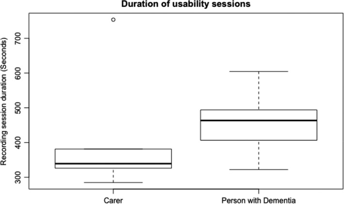
Results: Results showed that there were no barriers to using a wearable eye tracker in this setting and participants were able to use the reminiscence app freely. However, some tasks required prompts from the observer when difficulties arose. While prompts are not normally used in usability testing (as some argue the prompting defeats the purpose of testing), we used 'prompt frequency' as a proxy for measuring the intuitiveness of the task. There was a correlation between task completion rates and prompt frequency. Results also showed that people living with dementia had fewer gaze fixations when compared to their carers. Carers had greater fixation and saccadic frequencies when compared to people living with dementia. This perhaps indicates that people living with dementia take more time to scan and consume information on an app. A number of identified usability issues are also discussed in the paper.

Patient or public contribution: The study presents findings from three workshops which looked at user needs analysis, feedback and an eye tracking usability test combined involving 14 participants, 9 of whom were people living with dementia and the remaining 5 were carers.

Keywords: apps; dementia; digital interventions; eye-gaze; healthcare; human-computer interaction; reminiscence; usability; user interfaces.


Figures

FIGURE 1
FIGURE 1
This is a sample of the user interfaces from the InspireD Reminiscence application. To the left shows the main dashboard and to the right is one of the picture detail screens
FIGURE 2
FIGURE 2
The eye tracking glasses which were used to record participants. These are the Tobii Glasses 2 wearable eye tracker. (A) Recording storage, (B) scene HD camera, (C) infrared cameras (Tobii Technology / CC BY (https://creativecommons.org/licenses/by/3.0)
FIGURE 3
FIGURE 3
This boxplot shows the duration of the usability testing sessions (in seconds) for carers and people living with dementia. The two boxplots in the graph show the median average times (thick lines) for the carers and people living with dementia. The edges of the boxes represent the interquartile range (25th and 75th percentile) and the whiskers represent the minimum and maximum durations (except when there is an outlier—an outlier is a sample that is 1.5 times greater than the interquartile range). The boxplot shows that people with dementia need more time to interact with the app and to complete the tasks
FIGURE 4
FIGURE 4
This bar chart shows the task completion rate for each of the 10 tasks (rate is normalized as a percentage, hence 100% = all subjects successfully completed the task, 0% = no subject completed the task). The error bars represent the ‘standard errors of the proportion’ (otherwise known as a 68% confidence interval). According to this metric, tasks 1, 3 and 7 were the most challenging
FIGURE 5
FIGURE 5
This bar chart shows the average number of prompts made by the researcher that subjects needed while doing each of the 10 tasks. The error bars represent the ‘standard errors of the mean’ (otherwise known as a 68% confidence interval). According to this metric, tasks 1, 3, 4 and 9 were the most challenging
FIGURE 6
FIGURE 6
This boxplot shows the fixation frequency (ie number of fixations per second / Hz) for carers and people living with dementia. The two boxplots in the graph show the median average fixation frequency (thickest lines) for the carers and people living with dementia. The edges of the boxes represent the interquartile range (25th and 75th percentile) and the whiskers represent the minimum and maximum fixation frequency (except when there is an outlier—an outlier is a sample that is 1.5 times greater than the interquartile range)
FIGURE 7
FIGURE 7
This boxplot shows the fixation count for carers and people living with dementia. The two boxplots in the graph show the median average fixation count (thickest lines) for the carers and people living with dementia. The edges of the boxes represent the interquartile range (25th and 75th percentile), and the whiskers represent the minimum and maximum fixation count
FIGURE 8
FIGURE 8
This boxplot shows the saccade frequency (number of saccades per second / Hz) for carers and people living with dementia. The two boxplots in the graph show the median average saccade frequency (thickest lines) for the carers and people living with dementia. The edges of the boxes represent the interquartile range (25th and 75th percentile) and the whiskers represent the minimum and maximum saccade frequency (except when there is an outlier—an outlier is a sample that is 1.5 times greater than the interquartile range)
FIGURE 9
FIGURE 9
This boxplot shows the saccade frequency for each carer and each person living with dementia. The ten boxplots in the graph show the median average saccade frequency (thickest lines) for each carer and person living with dementia. The edges of the boxes represent the interquartile range (25th and 75th percentile) and the whiskers represent the minimum and maximum saccade frequency (except when there is an outlier—an outlier is a sample that is 1.5 times greater than the interquartile range)

References

    1. Prince M, Comas‐Herrera A, Knapp M, Guerchet M, Karagiannidou M. World Alzheimer Report 2016 Improving healthcare for people living with dementia. Coverage, Quality and costs now and in the future. Alzheimer’s Dis Int. 2016.
    1. Prince M, Knapp M, Guerchet M, et al. Dementia UK: second edition. Ann Surg. 2014.
    1. Alzheimer’s Research UK . Dementia in the Family. The impact on carers. Alzheimer’s reserach UK [Internet]. 2015;37. https://www.alzheimersresearchuk.org/about‐us/our‐influence/policy‐work/.... Accessed January 11, 2021.
    1. Hung L, Chow B, Shadarevian J, et al. Using touchscreen tablets to support social connections and reduce responsive behaviours among people with dementia in care settings: a scoping review. Dementia. 2020. 10.1177/1471301220922745 - DOI - PMC - PubMed
    1. Astell AJ, Bouranis N, Hoey J, et al. Technology and Dementia: the future is now. Dement Geriatr Cogn Disord. 2019;47:131‐139. - PMC - PubMed

Publication types