. 2021 Aug 2;218(8):e20210582.
doi: 10.1084/jem.20210582. Epub 2021 Jun 15.

Multi-omic profiling reveals widespread dysregulation of innate immunity and hematopoiesis in COVID-19

Collaborators, Affiliations

Multi-omic profiling reveals widespread dysregulation of innate immunity and hematopoiesis in COVID-19

Aaron J Wilk et al. J Exp Med. .

Abstract

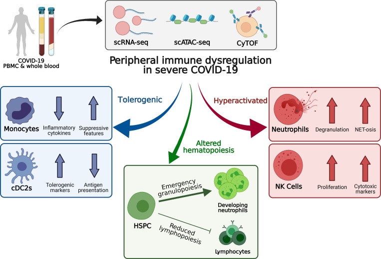
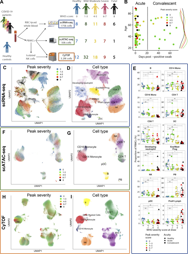
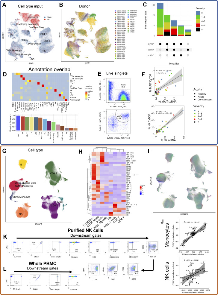
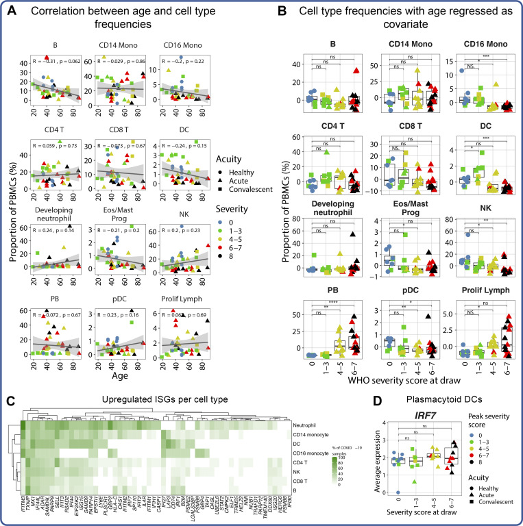
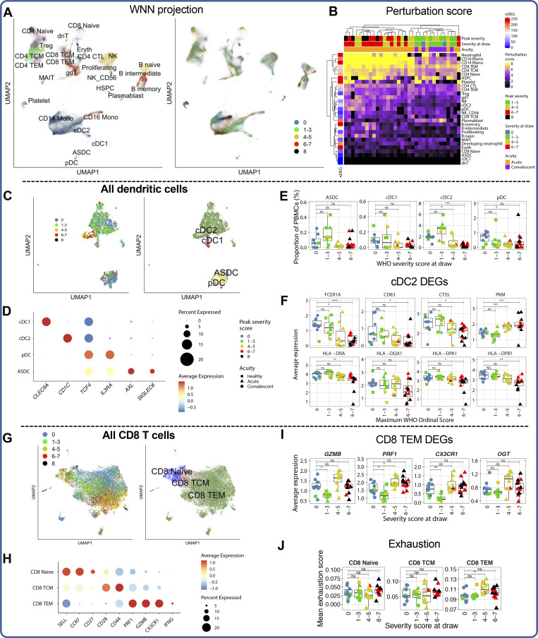
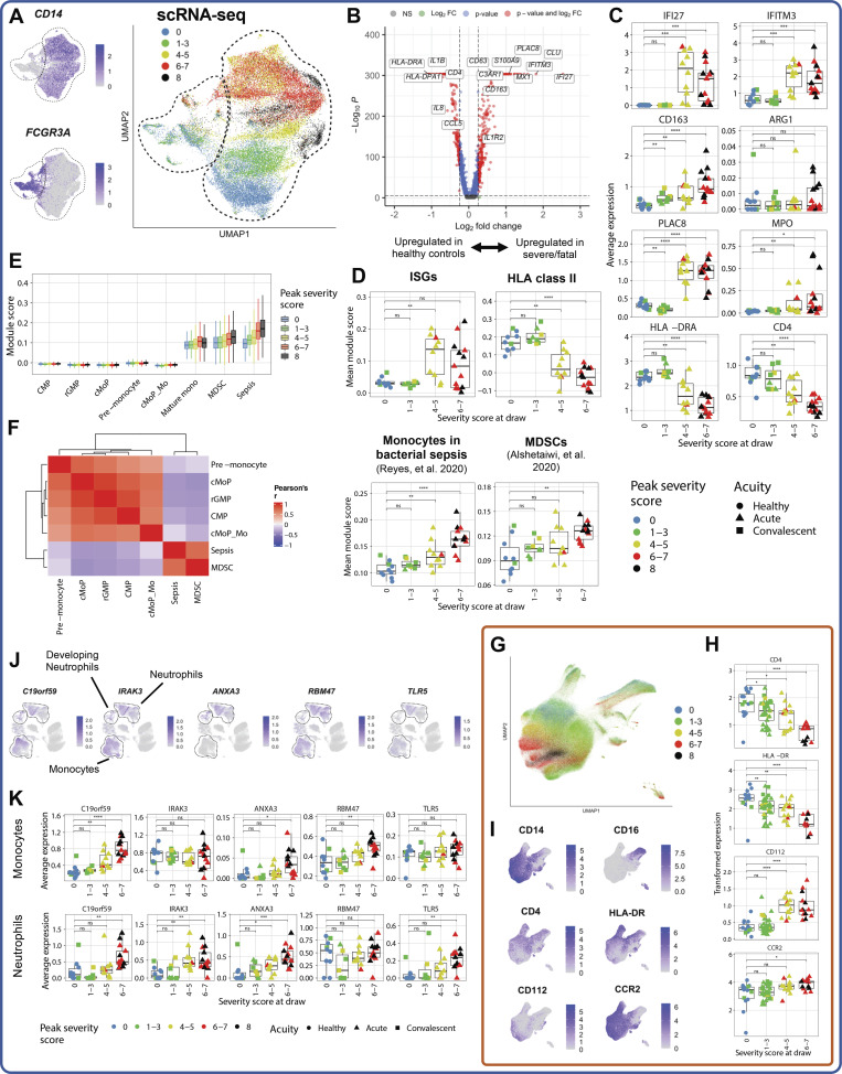
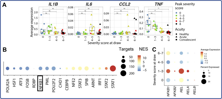
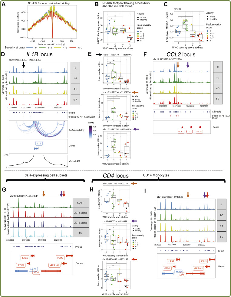
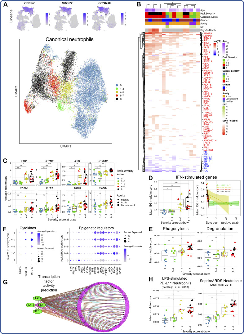
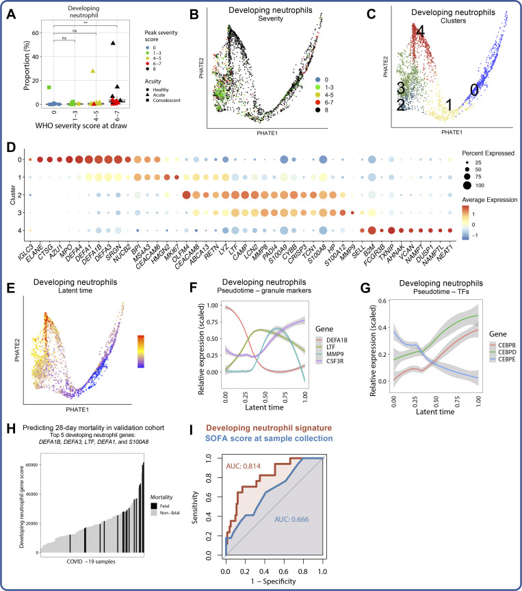
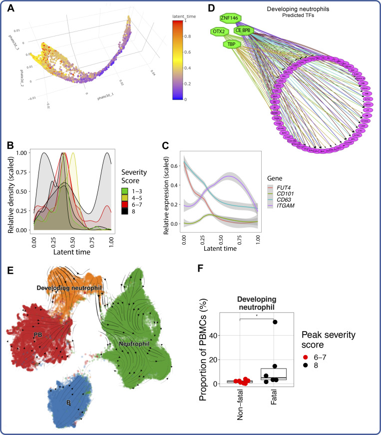
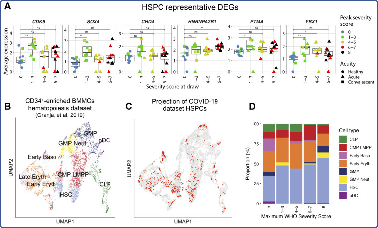
Our understanding of protective versus pathological immune responses to SARS-CoV-2, the virus that causes coronavirus disease 2019 (COVID-19), is limited by inadequate profiling of patients at the extremes of the disease severity spectrum. Here, we performed multi-omic single-cell immune profiling of 64 COVID-19 patients across the full range of disease severity, from outpatients with mild disease to fatal cases. Our transcriptomic, epigenomic, and proteomic analyses revealed widespread dysfunction of peripheral innate immunity in severe and fatal COVID-19, including prominent hyperactivation signatures in neutrophils and NK cells. We also identified chromatin accessibility changes at NF-κB binding sites within cytokine gene loci as a potential mechanism for the striking lack of pro-inflammatory cytokine production observed in monocytes in severe and fatal COVID-19. We further demonstrated that emergency myelopoiesis is a prominent feature of fatal COVID-19. Collectively, our results reveal disease severity-associated immune phenotypes in COVID-19 and identify pathogenesis-associated pathways that are potential targets for therapeutic intervention.


Conflict of interest statement

Disclosures: A.J. Wilk reported grants from Stanford University Interdisciplinary Graduate Fellowship and NIH during the conduct of the study. M.J. Lee reported grants from NIH during the conduct of the study. B. Wei reported "Stanford University." E.A. Ashley reported "other" from Personalis, Inc., DeepCell, Inc., SVEXA Inc., Astra Zeneca, Gilead, MyoKardia, Amgen, Takeda, Novartis, Genome Medical, Avive, Samsung, Apple Inc., Google, Verily, Disney Inc., Illumina Inc., PacBio, Nanopore, Foresite Capital, and Sequence Bio outside the submitted work. K.C. Nadeau reported grants from National Institute of Allergy and Infectious Diseases, National Heart, Lung, and Blood Institute, Food Allergy Research and Education, and World Allergy Organization; "other" from Cour Pharma, Before Brands, Alladapt, Latitude, IgGenix, Immune Tolerance Network, and National Institutes of Health clinical research centers outside the submitted work; in addition, K.C. Nadeau had a patent to "mixed allergen composition and methods for using the same with royalties paid (Alladapt and Before Brands), a patent to "granulocyte-based methods for detecting and monitoring immune system disorders" issued, and a patent to "methods and assays for detecting and quantifying pure subpopulations of white blood cells in immune system disorders" issued. A.J. Rogers reported personal fees from Merck outside the submitted work. W.J. Greenleaf reported personal fees from 10x Genomics during the conduct of the study, and personal fees from Guardant Health and Protillion Biosciences outside the submitted work; in addition, W.J. Greenleaf had a patent to US20160060691A1 with royalties paid (10x Genomics). C.A. Blish reported personal fees from Catamaran Bio outside the submitted work. No other disclosures were reported.

Figures

None
Graphical abstract
Figure 1.
Figure 1.
A trimodal single-cell atlas of the peripheral immune response to COVID-19 across a range of disease severities. (A) Pipeline for sample processing and number of patients analyzed, summarized by modality and peak disease severity score. For all display figures, scRNA-seq–derived data are boxed in blue, scATAC-seq–derived data are boxed in green, and CyTOF-derived data are boxed in orange. (B) Summary of key patient metadata, including age, peak disease severity score, and days after first positive nasopharyngeal PCR test. The vertical dotted line placed at 21 d after positive test indicates the threshold after which patient samples are considered convalescent. (C, D, and F–I) UMAP projections of complete scRNA-seq (C and D), scATAC-seq (F and G), and CyTOF (H and I) datasets colored by peak disease severity score of sample (C, F, and H) or cell type (D, G, and I). Eos, eosinophils; Prog, progenitor; Prolif Lymph, proliferating lymphocytes. (E) Cell type proportions from scRNA-seq data of PBMCs in each sample are colored by peak disease severity score. Platelets and neutrophils are excluded from the proportion calculations because their presence is related to sample processing. The x axes correspond to the disease severity score for each sample at the time of collection. *, P < 0.05; **, P < 0.01; ***, P < 0.001; ns, P = 0.05 by two-sided Wilcoxon rank-sum test with Bonferroni’s correction for multiple hypothesis testing.
Figure S1.
Figure S1.
Quality control of scRNA-seq and CyTOF datasets. (A and B) UMAP embeddings of complete scRNA-seq dataset, colored by cell type input (A; either PBMCs or ACK-lysed whole blood [WB]) or donor (B). (C) Upset plot depicting overlap of patient samples profiled between the three modalities, colored by peak disease severity score. (D) Top: Heatmap showing overlap in Seurat v4 annotation calls (x axis) and manual cell type annotations (y axis), colored by the percentage of a manual cell annotation within a Seurat v4 annotation (i.e., each row sums to 100%). Bottom: Bar plot showing mapping frequency of each manually assigned cell type annotation by Seurat v4. Neutrophils and developing neutrophils are the least frequently assigned cell types because they are not present in the reference dataset (Hao et al., 2021). (E) Manual gating scheme for MAIT cells in the CyTOF dataset, beginning with live singlets gated according to the scheme in L. (F) Scatter plot depicting concordance with proportions of MAITs (top) or NK cells (bottom) predicted by Seurat v4 in the scRNA-seq dataset (x axis) and proportions manually gated in the CyTOF dataset (y axis). (G) UMAP embedding of the complete PBMC CyTOF dataset, colored by cell subset. (H) Heatmap showing the z-score normalized average expression of each marker in the PBMC CyTOF panel across all cell subsets detected in that dataset. (I) UMAP embedding of our whole PBMC CyTOF dataset, colored by donor. (K and L) Gating strategies used to identify live, intact singlets (L) and live, intact, singlet NK cells (K). (J) For each marker shared between the scRNA-seq and CyTOF datasets, a linear model was used to calculate a β coefficient for the relationship between severity score at the time of sample collection and marker expression in each dataset. The scatter plots depict the correlation between these β coefficients for markers measured on monocytes (top) and NK cells (bottom). For all scatter plots, Pearson’s r, exact two-sided P values, and the 95% confidence interval are shown.
Figure S2.
Figure S2.
Impact of age on cell type proportions and conserved IFN signature in COVID-19 patients. (A) Scatter plots depicting correlation between each manually annotated cell type in scRNA-seq dataset and patient age. All points are colored by peak disease severity score. Pearson’s r, exact two-sided P values, and the 95% confidence interval are shown for each cell type. (B) Proportions of manually annotated cell types in scRNA-seq dataset after regression for age. (C) Differential gene expression testing was conducted on eight major cell types from the scRNA-seq dataset, comparing each COVID-19 sample with the cells of all healthy control subjects (see Materials and methods). The plotted heatmap depicts the percentage of COVID-19 samples in which a given ISG is up-regulated in a given cell type. (D) Expression of IRF7 by pDCs in scRNA-seq dataset. For all box plots, points are colored by the peak disease severity score, shaped according to disease acuity, and grouped by the disease severity score at the time of sample collection. *, P < 0.05; **, P < 0.01; ***, P < 0.001; ****, P < 0.0001; ns, not significant at P = 0.05 by two-sided Wilcoxon rank-sum test with Bonferroni’s correction for multiple hypothesis testing.
Figure 2.
Figure 2.
Reference-based cell subtype annotations reveal disease severity–associated perturbations in immune cell subtypes. (A) WNN projection of scRNA-seq dataset colored by cell type labels transferred from Seurat v4 (left) or by peak disease severity score (right). Eryth, erythrocyte. (B) Heatmap of cellular perturbation scores, as described by Papalexi et al. (2021), per COVID-19 sample in each Seurat v4–labeled cell type. The number of DEGs between all COVID-19 cells and healthy cells for each cell type is plotted at the left. (C) UMAP projection of all DC subsets colored by peak disease severity score (left) and Seurat v4–annotated cell type (right). (D) Dot plot depicting percentage and average expression of canonical DC genes defining the four annotated DC subsets (see Materials and methods and Table S11). (E) Box plots depicting proportions of DC subsets. (F) Box plots depicting average expression of selected DEGs (see Table S13 for complete list) by cDC2s for each sample. (G) UMAP projection of all CD8 T cells colored by peak disease severity score (left) and Seurat v4–annotated cell type (right). (H) Dot plot depicting percentage and average expression of canonical CD8 subset–defining genes (see Materials and methods). (I) Box plots depicting average expression of selected DEGs (see Table S14 for complete list) by CD8 TEM cells in each sample. (J) Box plots showing average module scores for T cell exhaustion (as reported in Miller et al., 2019) in each annotated CD8 T cell subset. For all box plots, points are colored by the peak disease severity score, shaped according to disease acuity, and grouped by the disease severity score at the time of sample collection. *, P < 0.05; **, P < 0.01; ***, P < 0.001; ****, P < 0.0001; ns, not significant at P = 0.05 by two-sided Wilcoxon rank-sum test with Bonferroni’s correction for multiple hypothesis testing. TCM, T central memory; gdT, γδ T; dnT, double negative T cell; TEM, T effector memory cell; TCM, T central memory cell.
Figure 3.
Figure 3.
Monocytes with dysfunctional and suppressive features emerge in severe and fatal COVID-19. (A) UMAP projections of monocytes from scRNA-seq dataset, colored by CD14 and FCGR3A (encoding CD16) expression (left) and colored by peak disease severity score (right). (B) Volcano plot depicting DEGs in monocytes of patients with severe and fatal COVID-19 versus healthy control subjects. (C) Box plots depicting average expression of selected DEGs by monocytes (see Table S15 for complete DEG list). (D) Box plots showing average module scores for ISG, HLA class II, bacterial sepsis (Reyes et al., 2020), and MDSC (Alshetaiwi et al., 2020) gene signatures in monocytes (see Materials and methods). (E) Box plots depicting monocyte precursor subset gene module score (see Materials and methods and Table S16; Kawamura et al., 2017), colored by peak COVID-19 severity. (F) Heatmap showing per-cell correlations between module scores plotted in E. cMoP_Mo, CD14 monocytes derived from the cMoP. (G) UMAP projection of all monocytes from CyTOF dataset, colored by peak disease severity score. (H and I) Feature plots (H) and box plots (I) depicting arcsinh-transformed expression of selected protein markers by monocytes in CyTOF dataset. (J) UMAP projections of complete scRNA-seq dataset colored by expression of stroke-predictive genes (Raman et al., 2016). (K) Box plots depicting average expression of the five stroke-predictive genes in monocytes (top) or canonical neutrophils (bottom). For all box plots, points are colored by the peak disease severity score, shaped according to disease acuity, and grouped by the disease severity score at the time of sample collection. *, P < 0.05; **, P < 0.01; ***, P < 0.001; ****, P < 0.0001; ns, not significant at P = 0.05 by two-sided Wilcoxon rank-sum test with Bonferroni’s correction for multiple hypothesis testing. CMP, common myeloid progenitor.
Figure 4.
Figure 4.
Absent pro-inflammatory cytokine–encoding gene induction by monocytes in severe COVID-19. (A) Box plots depicting average expression of pro-inflammatory cytokine–encoding genes by monocytes. (B) Dot plot depicting results of iRegulon TF activity prediction analysis. Positive normalized enrichment scores (NES) indicate that the TF activity is higher in patients with severe COVID-19 relative to that in healthy control subjects. (C) Dot plot depicting average and percentage expression of NF-κB subunits. For all box plots, points are colored by the peak disease severity score, shaped according to disease acuity, and grouped by the disease severity score at the time of sample collection. **, P < 0.01; ns, not significant at P = 0.05 by two-sided Wilcoxon rank-sum test with Bonferroni’s correction for multiple hypothesis testing.
Figure 5.
Figure 5.
Identification of putative enhancers regulating pro-inflammatory cytokine expression by monocytes in COVID-19. (A) Genome-wide footprinting of the NF-κB2 binding motif in CD14 monocytes from different severity groups shown in different colors. (B) Box plot depicting quantification of the “flanking accessibility” (Baek et al., 2017; Corces et al., 2018) for NF-κB2 motif footprints in CD14 monocytes from different samples. Each dot indicates the average “flanking accessibility” value for each sample. (C) Box plot depicting the average chromVAR z-scores of NF-κB2 binding motifs in CD14 monocytes from different samples. (D and F) The genome tracks show genomic regions near IL1B (D) and CCL2 (F) genes. The top panel indicates coverage at different peak regions for CD14 monocytes in different severity groups; the box below shows peaks called from all CD14 monocytes (dark blue) in the 100-kb region and peaks containing putative strong NF-κB2 binding sites (red); the CoAccessibility box in D shows the accessibility correlated peak pairs across all CD14 monocytes near the IL1B locus; the Genes box shows the location of IL1B (D) or CCL2 (F) together with other adjacent genes; the bottom Virtual 4C track in D shows Knight-Ruiz–normalized contact frequencies to the IL1B promoter in THP-1 monocytic cells; blue color means the gene is located on the minus strand, and red color means the gene is located on the plus strand. The arrows indicate peaks of interest whose accessibility is quantified in the corresponding box plots (E). (G and I) The genome tracks show genomic regions near the CD4 gene. The top panel indicates coverage at different peak regions for different cell subsets (G) and for CD14 monocytes in different severity groups (I); the box below shows peaks called from all PBMCs (G) or from the CD14 monocytes (I) in that region (dark blue); the bottom Genes box shows the location of CD4 and other adjacent genes; blue color means the gene is located on the minus strand, and red color means the gene is located on the plus strand. The arrows indicate monocyte-specific peaks with higher accessibility in monocytes and DCs than in CD4 T cells. (E and H) Box plots depicting the Tn5 insertions per million at the peaks marked with the corresponding arrows in CD14 monocytes. Exact P values for E: top, P = 0.0081 healthy versus severe; middle, P = 0.014 healthy versus mild; bottom, P = 0.0037. Exact P values for H: top, P = 0.0047 healthy versus severe; middle, P = 0.0047 healthy versus severe; bottom, P = 0.022 healthy versus mild. Points are colored by the peak disease severity score, shaped according to disease acuity, and grouped by the disease severity score at the time of sample collection. *, P < 0.05; **, P < 0.01; ns, not significant at P = 0.05 by two-sided Wilcoxon rank-sum test with Bonferroni correction for multiple hypothesis testing.
Figure S3.
Figure S3.
Impact of disease acuity on transcriptomic phenotype of mild and moderate COVID-19 patients. (A) Upset plot depicting overlap of DEGs between acute mild, acute moderate, acute severe, and convalescent samples when each is compared with healthy control samples. DEG testing is performed on PBMCs and filtered for adjusted P < 1e-4. (B) Box plot depicting cumulative perturbation score of all cell types per patient calculated on a perturbation vector between acute and convalescent samples. Points are colored and grouped by the peak disease severity score. ***, P < 0.001 by two-sided Wilcoxon rank-sum test. (C and F) Heatmaps of cellular perturbation score, as described by Papalexi et al. (2021), per mild (C) or moderate (F) COVID-19 sample in each Seurat v4–labeled cell type. DEGs between acute and convalescent samples in each severity group are used as input for each perturbation score (see Materials and methods). (D and G) UMAP projections of all cells from mild (D) or moderate (G) COVID-19 patients colored by disease acuity (left) and Seurat v4–annotated cell type (right). (E and H) Dot plots depicting percentage and unscaled average expression for all DEGs with |log(fold-change)| > 1 in CD8 TEM cells (left) and CD14 monocytes (right) of mild (E) or moderate (H) COVID-19 patients. (I) Dot plot depicting percentage and unscaled average expression for all DEGs with |log(fold-change| > 1 in B cells of moderate COVID-19 patients.
Figure 6.
Figure 6.
NK cells of severe COVID-19 patients exhibit a unique proteomic and transcriptional profile. (A) Box plots of manually annotated NK cell proportions from CyTOF dataset (left), Seurat v4–annotated NK cell proportions from scRNA-seq dataset (center), and Seurat v4–annotated NK cell proportions from scATAC-seq dataset (right; see Materials and methods). (B) Box plots showing the frequency of CD56bright, CD56dim, and CD56 NK cells as a proportion of NK cells in the CyTOF dataset. (C) UMAP projections of NK cells from scRNA-seq dataset colored by peak disease severity score (left) and selected DEGs (right; see Table S17 for complete list). (D) Box plots of average ISG signature and NK cell exhaustion (defined as expression of LAG3, PDCD1, and HAVCR2; see Materials and methods) module scores in Seurat v4–annotated NK cells. (E) Heatmap depicting Z-score normalized protein-level expression of canonical NK cell activation and cytotoxicity markers (perforin, Ki-67, CD38, CD69, and FasL) in each sample. (F) Box plots quantifying arcsinh-transformed average expression of markers depicted in E by NK cells, grouped by peak disease severity score. For all box plots except F, points are colored by the peak disease severity score, shaped according to disease acuity, and grouped by the disease severity score at the time of sample collection. *, P < 0.05; **, P < 0.01; ***, P < 0.001; ****, P < 0.0001; ns, not significant at P = 0.05 by two-sided Wilcoxon rank-sum test with Bonferroni’s correction for multiple hypothesis testing.
Figure 7.
Figure 7.
Ligation of DNAM-1 and NKG2D may drive activation of NK cells in severe COVID-19. (A) Representative flow plots showing the gating scheme used to identify activated (CD38+CD69+) NK cells in patients from each severity bin. (B) Box plot showing the proportion of CD38+CD69+ NK cells in each severity bin. (C) Box plots showing arcsinh-transformed protein-level expression of the activating receptors DNAM-1 (left) and NKG2D (right) in CD38+CD69+ NK cells. (D) Box plots showing the average expression of CD226 (which encodes DNAM-1; left) and KLRK1 (which encodes NKG2D; right) from the scRNA-seq dataset (E) Box plots depicting arcsinh-transformed protein-level expression of NK cell ligands CD112 and ULBP-1,2,5,6 in monocytes. (F) Box plots showing arcsinh-transformed expression of the inhibitory receptors TIGIT and CD96/TACTILE in CD38+CD69+ NK cells in our CyTOF dataset. (G) Box plot depicting arcsinh-transformed average protein-level expression of NK cell ligands LLT-1 in monocytes. (H) Box plots showing arcsinh-transformed protein-level expression of the inhibitory receptor CD161 on all NK cells. (I) Schematic illustrating the changes in protein-level expression of NK cell activating and inhibitory receptors as well as their ligands. Text color indicates whether a receptor/ligand is activating (green), inhibitory (red), or either, depending on the context (yellow). Arrows and dashes indicate whether abundance of a protein is increased, decreased, or unchanged in severe COVID-19 compared with healthy controls. Dashed lines indicate interactions between receptors and ligands. For all box plots, points are colored by the peak disease severity score, shaped according to disease acuity, and grouped by the disease severity score at the time of sample collection. *, P < 0.05; **, P < 0.01; ***, P < 0.001; ****, P < 0.0001; ns, not significant at P = 0.05 by two-sided Wilcoxon rank-sum test with Bonferroni’s correction for multiple hypothesis testing.
Figure S4.
Figure S4.
Seq-Well enables high-quality single-cell transcriptomic analysis of primary human neutrophils. Whole blood (WB) from a healthy donor was collected into CPT vacutainers, from which PBMCs were isolated and neutrophils were isolated from the PBMC-depleted cell pellet. Additionally, aliquots of whole blood were subjected to neutrophil isolation or red blood cell lysis with ACK buffer. These cell populations were then analyzed by Seq-Well (see Materials and methods). (A) UMAP projection colored by cell type preparation method. (B) Box plots showing comparisons of the number of UMIs sequenced (top) and the number of genes detected (bottom) in cells annotated to be PBMCs or in cells annotated as granulocytes (neutrophils and eosinophils). The median number of UMIs or genes in each group is plotted above the respective box. The difference in recovered UMIs and gene capture between PBMCs and granulocytes is comparable to that expected by RNA content (Xie et al., 2020; Monaco et al., 2019). (C) Bar plot depicting the proportions of cells from each cell sample preparation method for each annotated cell type. (D) Dot plot depicting percentage and unscaled average expression of the 15 top neutrophil-defining DEGs (see Table S24) between the three cell sample preparation methods that yielded neutrophils. (E) Dot plot depicting average and percentage expression of the top five DEGs for each cell type (see Table S24), demonstrating comparable expression patterns between PBMCs isolated through centrifugation and PBMC subsets present in ACK-lysed whole blood.
Figure 8.
Figure 8.
Neutrophil activation is a hallmark of severe and fatal COVID-19. (A) UMAP projections of complete scRNA-seq dataset colored by expression of canonical neutrophil markers (top) and of canonical neutrophils alone colored by peak disease severity score (bottom). (B) Heatmap of DEGs between neutrophils of each COVID-19 sample compared with neutrophils of all healthy controls, colored by average log(fold-change). All displayed DEGs are statistically significant at the P < 0.05 confidence level by Seurat’s implementation of the Wilcoxon rank-sum test (two-sided, adjusted for multiple comparisons using Bonferroni correction). DPT, days post first positive COVID-19 test. (C) Box plots depicting average expression of selected neutrophil DEGs by severity group (see Table S18 for complete DEG list). (D) Plots depicting median ISG signature score of neutrophils in each sample grouped by disease severity score at the time of sample collection (left) and by days after first positive NP swab (right). All points are colored by peak disease severity score. For scatter plot at right, Pearson’s r, exact two-sided P values, and the 95% confidence interval are shown for each peak disease severity score grouping. (E) Box plots depicting average module scores for genes sets of neutrophil phagocytosis and neutrophil degranulation (see Materials and methods and Table S16). (F) Dot plots depicting average and percentage expression of pro-inflammatory cytokine encoding genes (left) and epigenetic regulators (right) by canonical neutrophils. The y axis corresponds to the peak disease severity score. (G) Results of TF activity prediction analysis performed by iRegulon (Janky et al., 2014). DEGs between neutrophils from severely ill patients (peak severity 6–8) and neutrophils from healthy controls were used as input (see Materials and methods and Table S19). (H) Box plots of average module scores for PD-L1+ neutrophils in an in vitro model of endotoxemia (de Kleijn et al., 2013) and granulocytes in the setting of sepsis and ARDS (Juss et al., 2016; see Materials and methods and Table S16). For all box plots, points are colored by the peak disease severity score, shaped according to disease acuity, and grouped by the disease severity score at the time of sample collection. *, P < 0.05; **, P < 0.01; ***, P < 0.001; ****, P < 0.0001; ns, not significant at P = 0.05 by two-sided Wilcoxon rank-sum test with Bonferroni’s correction for multiple hypothesis testing.
Figure 9.
Figure 9.
Emergency granulopoiesis is a feature of fatal COVID-19. (A) Box plot depicting proportions of developing neutrophils in each sample from the scRNA-seq dataset. (B and C) Two-dimensional PHATE projection of developing neutrophils colored by peak disease severity score (left) and cluster number (right). (D) Dot plot depicting percentage and average expression of DEGs between developing neutrophil clusters (see Table S20). (E) Two-dimensional PHATE projection of developing neutrophils colored by latent time calculated by scVelo (Bergen et al., 2020). (F and G) Scaled expression of selected neutrophil granule-encoding genes (F) and CCAAT-enhancer-binding protein (CEBP) TF family–encoding genes (G) by developing neutrophils across inferred latent time. (H) Bar plot representing the ranked developing neutrophil signature score (aggregated expression of DEFA1B, DEFA3, LTF, DEFA1, and S100A8; see Materials and methods) for each COVID-19 sample in a validation cohort from a publicly available bulk transcriptomic dataset (Overmyer et al., 2021), colored by the 28-d mortality. (I) ROC curve depicting sensitivity and specificity of 28-d mortality prediction of a five-gene signature of developing neutrophils (DEFA1B, DEFA3, LTF, DEFA1, and S100A8) or of Sequential Organ Failure Assessment (SOFA) score at the time of sample collection in an independent validation cohort of 103 samples where 17 cases are fatal (Overmyer et al., 2021). For all box plots, points are colored by the peak disease severity score, shaped according to disease acuity, and grouped by the disease severity score at the time of sample collection. AUC, area under the curve. **, P < 0.01; ns, not significant at P = 0.05 by two-sided Wilcoxon rank-sum test with Bonferroni’s correction for multiple hypothesis testing.
Figure S5.
Figure S5.
Additional analysis of emergency granulopoiesis in severe and fatal COVID-19. (A) Three-dimensional PHATE projection of developing neutrophils. (B) Scaled abundances of developing neutrophils present in individual COVID-19 patients across latent time. (C) Scaled expression of genes reported to define different stages of immature neutrophil development in COVID-19 (Schulte-Schrepping et al., 2020). (D) TF activity prediction analysis by iRegulon (Janky et al., 2014), using positive DEGs for developing neutrophils relative to all other cells as input (Table S19). (E) UMAP projection of developing neutrophils, canonical neutrophils, B cells, and PBs overlaid with RNA velocity stream (Bergen et al., 2020). (F) Box plot depicting proportion of developing neutrophils in patients with nonfatal severe versus fatal severe COVID-19. Points are colored and grouped by the peak disease severity score. *, P < 0.05 by two-sided Wilcoxon rank-sum test.
Figure 10.
Figure 10.
Myeloid skewing of circulating HSPCs and other hematopoietic abnormalities in COVID-19. (A) Box plots of average expression of selected HSPC DEGs (see Table S21). (B and C) UMAP projection of Seurat v4–annotated HSPCs from scRNA-seq dataset into a publicly available blood and bone marrow hematopoiesis dataset (Granja et al., 2019) colored by published cell type annotations (B) and with projected HSPCs colored in red (C). (D) Bar plot depicting proportions of cell type identities transferred after projection into the publicly available hematopoiesis dataset for each peak disease severity score bin. For all box plots, points are colored by the peak disease severity score, shaped according to disease acuity, and grouped by the disease severity score at the time of sample collection. *, P < 0.05; **, P < 0.01; ns, not significant at P = 0.05 by two-sided Wilcoxon rank-sum test with Bonferroni’s correction for multiple hypothesis testing. CLP, common lymphoid progenitor; CMP, common myeloid progenitor; BMMC, bone marrow mononuclear cells; LMPP, lymphomyeloid-primed multipotent progenitor; GMP, granulocyte-monocyte progenitor; HSC, hematopoietic stem cell.

Similar articles

Cited by

References

    1. Alshetaiwi, H., Pervolarakis N., McIntyre L.L., Ma D., Nguyen Q., Rath J.A., Nee K., Hernandez G., Evans K., Torosian L., et al. 2020. Defining the emergence of myeloid-derived suppressor cells in breast cancer using single-cell transcriptomics. Sci. Immunol. 5:eaay6017. 10.1126/sciimmunol.aay6017 - DOI - PMC - PubMed
    1. Andres-Terre, M., McGuire H.M., Pouliot Y., Bongen E., Sweeney T.E., Tato C.M., and Khatri P.. 2015. Integrated, multi-cohort analysis identifies conserved transcriptional signatures across multiple respiratory viruses. Immunity. 43:1199–1211. 10.1016/j.immuni.2015.11.003 - DOI - PMC - PubMed
    1. Arunachalam, P.S., Wimmers F., Mok C.K.P., Perera R.A.P.M., Scott M., Hagan T., Sigal N., Feng Y., Bristow L., Tak-Yin Tsang O., et al. 2020. Systems biological assessment of immunity to mild versus severe COVID-19 infection in humans. Science. 369:1210–1220. 10.1126/science.abc6261 - DOI - PMC - PubMed
    1. Aschenbrenner, A.C., Mouktaroudi M., Krämer B., Oestreich M., Antonakos N., Nuesch-Germano M., Gkizeli K., Bonaguro L., Reusch N., Baßler K., et al. German COVID-19 Omics Initiative (DeCOI) . 2021. Disease severity-specific neutrophil signatures in blood transcriptomes stratify COVID-19 patients. Genome Med. 13:7. 10.1186/s13073-020-00823-5 - DOI - PMC - PubMed
    1. Baek, S., Goldstein I., and Hager G.L.. 2017. Bivariate genomic footprinting detects changes in transcription factor activity. Cell Rep. 19:1710–1722. 10.1016/j.celrep.2017.05.003 - DOI - PMC - PubMed

Publication types

MeSH terms