. 2021 Jun 26;21(1):134.
doi: 10.1186/s12874-021-01306-w.

Comparison of six statistical methods for interrupted time series studies: empirical evaluation of 190 published series

Affiliations

Comparison of six statistical methods for interrupted time series studies: empirical evaluation of 190 published series

Simon L Turner et al. BMC Med Res Methodol. .

Abstract

Background: The Interrupted Time Series (ITS) is a quasi-experimental design commonly used in public health to evaluate the impact of interventions or exposures. Multiple statistical methods are available to analyse data from ITS studies, but no empirical investigation has examined how the different methods compare when applied to real-world datasets.

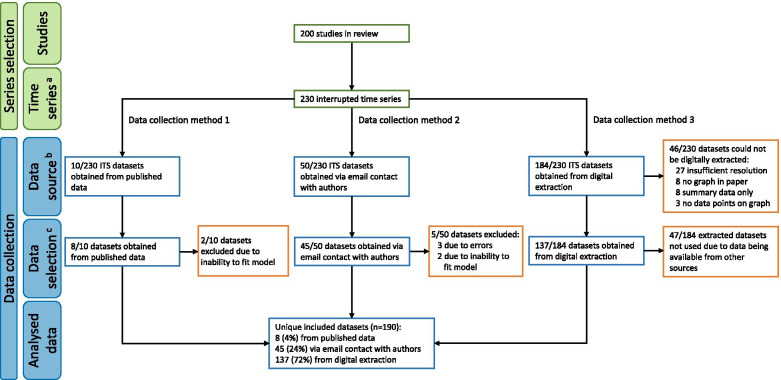
Methods: A random sample of 200 ITS studies identified in a previous methods review were included. Time series data from each of these studies was sought. Each dataset was re-analysed using six statistical methods. Point and confidence interval estimates for level and slope changes, standard errors, p-values and estimates of autocorrelation were compared between methods.

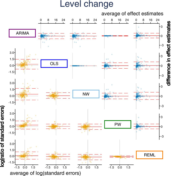
Results: From the 200 ITS studies, including 230 time series, 190 datasets were obtained. We found that the choice of statistical method can importantly affect the level and slope change point estimates, their standard errors, width of confidence intervals and p-values. Statistical significance (categorised at the 5% level) often differed across the pairwise comparisons of methods, ranging from 4 to 25% disagreement. Estimates of autocorrelation differed depending on the method used and the length of the series.

Conclusions: The choice of statistical method in ITS studies can lead to substantially different conclusions about the impact of the interruption. Pre-specification of the statistical method is encouraged, and naive conclusions based on statistical significance should be avoided.

Keywords: Autocorrelation; Empirical study; Interrupted Time Series; Public Health; Segmented Regression; Statistical Methods.


Conflict of interest statement

The authors declare that they have no competing interests.

Figures

Fig. 1
Fig. 1
Graphical depiction of a segmented linear regression model fitted to ITS data. Secular trends (indicated by solid blue lines) for the pre and post interruption periods (indicated by the vertical dashed line) are estimated from the data (indicated by blue crosses). A counterfactual trend line (extrapolation of the pre-interruption trend line shown as a dashed blue line) is compared with the post interruption trend to estimate the immediate and longer term impact of the interruption. Model parameters are indicated as the intercept (β0); pre-interruption slope (β1); change in level at the interruption (β2), and the change in slope (β3)
Fig. 2
Fig. 2
Flowchart of selected datasets. Green boxes denote the number of included studies and time series, blue boxes denote the numbers corresponding to dataset collection, and orange boxes denote the numbers corresponding to dataset exclusion.a Some studies included multiple interrupted time series, hence the number of time series is greater than the number of studies. b As multiple methods were potentially available for obtaining an interrupted time series dataset (e.g. some datasets were obtained via both email contact and digital extraction), the numerators across the data sources do not sum to 230. c For each interrupted time series, only one data source was selected for analysis, yielding a total of 190 unique time series datasets. The hierarchy for the data source selection was (i) published data, (ii) contact with authors, and (iii) digital extraction
Fig. 3
Fig. 3
Bland Altman plot of standardised level change. Plots in the top triangle (blue points) show the difference in point estimates (row method – column method) on the vertical axis and average of the parameter estimates on the horizontal axis. Plots in the bottom triangle (orange points) show differences in standard errors on the vertical axis (= log(ratio of standard errors)) (column method – row method) and the average of the log of the standard errors on the horizontal axis. Red horizontal lines depict the average, red dashed lines depict the 95% limits of agreement (calculated as the average ± 1.96*standard deviation of the differences). Grey lines indicate zero. Abbreviations: ARIMA, autoregressive integrated moving average; OLS, ordinary least squares; NW OLS with Newey-West standard error adjustments; PW, Prais-Winsten; REML, restricted maximum likelihood. Note that REML with the Satterthwaite approximation is not presented because it only makes an adjustment to the confidence intervals, and not the standard errors
Fig. 4
Fig. 4
Bland Altman plot of standardised slope change. Plots in the top triangle (blue points) show the difference in point estimates (row method – column method) on the vertical axis and average of the parameter estimates on the horizontal axis. Plots in the bottom triangle (orange points) show differences in standard errors on the vertical axis (= log(ratio of standard errors)) (column method – row method) and the average of the log of the standard errors on the horizontal axis. Red horizontal lines depict the average, red dashed lines depict the 95% limits of agreement (calculated as the average ± 1.96*standard deviation of the differences). Grey lines indicate zero. Abbreviations: ARIMA, autoregressive integrated moving average; OLS, ordinary least squares; NW OLS with Newey-West standard error adjustments; PW, Prais-Winsten; REML, restricted maximum likelihood. Note that REML with the Satterthwaite approximation is not presented because it only makes an adjustment to the confidence intervals, and not the standard errors
Fig. 5
Fig. 5
Pairwise confidence interval comparisons for level change. Each plot displays up to 190 confidence intervals (CIs) (depicted as vertical lines), with each scaled so that the confidence interval from the reference method spans -0.5 to 0.5 (shaded area). The reference method is the column method (e.g. the plot in the second row, first column shows OLS CIs (blue) compared to ARIMA (purple)). Vertical lines falling entirely within the shaded area have smaller confidence intervals than the comparison (left of the vertical dashed line), while lines extending beyond the shaded area have larger confidence intervals than the comparison (right of the vertical dashed line). White dots indicate the point estimate. Black vertical lines indicate scenarios in which the point estimate from one method does not lie within the confidence interval of the other. Abbreviations: ARIMA, autoregressive integrated moving average, purple; OLS, ordinary least squares, blue; NW OLS with Newey-West standard error adjustments, light blue; PW, Prais-Winsten, light green; REML, restricted maximum likelihood, orange; REML-Satt, restricted maximum likelihood with Satterthwaite small sample adjustment, red
Fig. 6
Fig. 6
Pairwise confidence interval comparisons for slope change. Each plot displays up to 190 confidence intervals (CIs) (depicted as vertical lines), with each scaled so that the confidence interval from the reference method spans -0.5 to 0.5 (shaded area). The reference method is the column method (e.g. the plot in the second row, first column shows OLS CIs (blue) compared to ARIMA (purple)). Vertical lines falling entirely within the shaded area have smaller confidence intervals than the comparison (left of the vertical dashed line), while lines extending beyond the shaded area have larger confidence intervals than the comparison (right of the vertical dashed line). White dots indicate the point estimate. Black vertical lines indicate scenarios in which the point estimate from one method does not lie within the confidence interval of the other. Abbreviations: ARIMA, autoregressive integrated moving average, purple; OLS, ordinary least squares, blue; NW OLS with Newey-West standard error adjustments, light blue; PW, Prais-Winsten, light green; REML, restricted maximum likelihood, orange; REML-Satt, restricted maximum likelihood with Satterthwaite small sample adjustment, red
Fig. 7
Fig. 7
Pairwise agreement in statistical significance of estimates of p-value comparisons for level change. In the top triangle, boxes are divided into 16 cells with p-values categorised using a fine gradation of statistical significance, namely, p-value ≤ 0.01, 0.01 < p-value ≤ 0.05, 0.05 < p-value ≤ 0.1, p-value > 0.1. In the bottom triangle, boxes are divided into four cells with p-values categorised at the 5% level of statistical significance (i.e. ≤ 5%, > 5%). Each cell within a box contains the percentage of datasets falling within the row and column defined statistical significance levels. The colour bands surrounding the left/right and top/bottom side of the plot indicate the two methods being compared. Concordant results are shown in blue. Discordant results are shown as either white (0–5% discordance), orange (5–10% discordance), red (10–20% discordance) or purple (over 20% discordance). For example, within the box comparing ARIMA and OLS in the bottom triangle, in 12% of the datasets the ARIMA method yields a p-value > 0.05 while the OLS method yields a p-value ≤ 0.05 (bottom right cell). Numbers may not add to 100 due to rounding. Abbreviations: ARIMA, autoregressive integrated moving average; OLS, ordinary least squares; NW OLS with Newey-West standard error adjustments; PW, Prais-Winsten; REML, restricted maximum likelihood; Satt, Satterthwaite adjustment
Fig. 8
Fig. 8
Pairwise agreement in statistical significance of estimates of p-value comparisons for slope change. In the top triangle, boxes are divided into 16 cells with p-values categorised using a fine gradation of statistical significance, namely, p-value ≤ 0.01, 0.01 < p-value ≤ 0.05, 0.05 < p-value ≤ 0.1, p-value > 0.1. In the bottom triangle, boxes are divided into four cells with p-values categorised at the 5% level of statistical significance (i.e. ≤ 5%, > 5%). Each cell within a box contains the percentage of datasets falling within the row and column defined statistical significance levels. The colour bands surrounding the left/right and top/bottom side of the plot indicate the two methods being compared. Concordant results are shown in blue. Discordant results are shown as either white (0–5% discordance), orange (5–10% discordance), red (10–20% discordance) or purple (over 20% discordance). For example, within the box comparing ARIMA and OLS in the bottom triangle, in 14% of the datasets the ARIMA method yields a p-value > 0.05 while the OLS method yields a p-value ≤ 0.05 (bottom right cell). Numbers may not add to 100 due to rounding. Abbreviations: ARIMA, autoregressive integrated moving average; OLS, ordinary least squares; NW OLS with Newey-West standard error adjustments; PW, Prais-Winsten; REML, restricted maximum likelihood; Satt, Satterthwaite adjustment
Fig. 9
Fig. 9
Autocorrelation coefficient estimates. Scatterplot showing the autocorrelation estimate on the vertical axis and length of data series on the (log scale) horizontal axis. LOESS lines are overlaid to show trends in autocorrelation coefficient with data series length. Dashed lines on the left show the distribution of the estimates with overlaid symbols showing the median value. Abbreviations: ARIMA, autoregressive integrated moving average; PW, Prais-Winsten; REML, restricted maximum likelihood
Fig. 10
Fig. 10
Autocorrelation coefficient estimates using the restricted maximum likelihood (REML) method. Data from 172 datasets. Red horizontal lines show the median and IQR of 0.2 (-0.02, 0.52). Blue circular markers indicated 95% confidence intervals that lie entirely above zero, red triangular markers indicate 95% confidence interval that lie entirely below zero

Similar articles

Cited by

References

    1. Lopez Bernal J, Cummins S, Gasparrini A. Interrupted time series regression for the evaluation of public health interventions: a tutorial. Int J Epidemiol. 2016;46(1):dyw098. - PMC - PubMed
    1. Wagner AK, Soumerai SB, Zhang F, Ross-Degnan D. Segmented regression analysis of interrupted time series studies in medication use research. J Clin Pharm Ther. 2002;27(4):299–309. doi: 10.1046/j.1365-2710.2002.00430.x. - DOI - PubMed
    1. Kontopantelis E, Doran T, Springate DA, Buchan I, Reeves D. Regression based quasi-experimental approach when randomisation is not an option: interrupted time series analysis. BMJ: Brit Med J. 2015;350:h2750. doi: 10.1136/bmj.h2750. - DOI - PMC - PubMed
    1. Penfold RB, Zhang F. Use of Interrupted time series analysis in evaluating health care quality improvements. Acad Pediatr. 2013;13(6):S38–S44. doi: 10.1016/j.acap.2013.08.002. - DOI - PubMed
    1. Biglan A, Ary D, Wagenaar A. The value of interrupted time-series experiments for community intervention research. Prev Sci. 2000;1(1):31–49. doi: 10.1023/A:1010024016308. - DOI - PMC - PubMed

Publication types

LinkOut - more resources