. 2021 Jun;11(6):e422.
doi: 10.1002/ctm2.422.

Single-cell analyses reveal suppressive tumor microenvironment of human colorectal cancer

Affiliations

Single-cell analyses reveal suppressive tumor microenvironment of human colorectal cancer

Yan Mei et al. Clin Transl Med. 2021 Jun.

Abstract

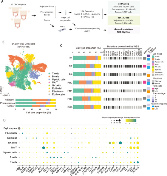
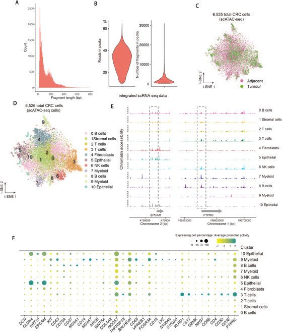
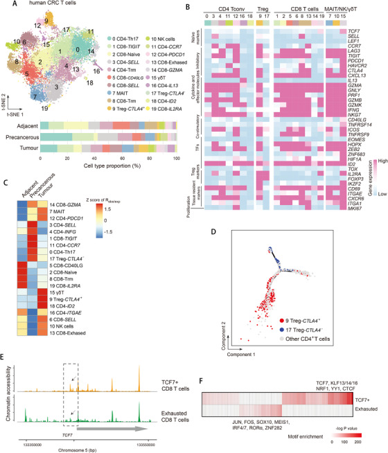
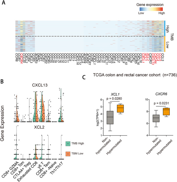
Profiling heterologous cell types within tumors is essential to decipher tumor microenvironment that shapes tumor progress and determines the outcome of therapeutic response. Here, we comprehensively characterized transcriptomes of 34,037 single cells obtained from 12 treatment-naïve patients with colorectal cancer. Our comprehensive evaluation revealed attenuated B-cell antigen presentation, distinct regulatory T-cell clusters with different origin and novel polyfunctional tumor associated macrophages associated with CRC. Moreover, we identified expanded XCL1+ T-cell clusters associated with tumor mutational burden high status. We further explored the underlying molecular mechanisms by profiling epigenetic landscape and inferring transcription factor motifs using single-cell ATAC-seq. Our dataset and analysis approaches herein provide a rich resource for further study of the impact of immune cells and translational research for human colorectal cancer.

Keywords: human colorectal cancer; scATAC-seq; scRNA-seq; tumor immune microenvironment.


Conflict of interest statement

All of the authors declare no interest of conflicts.

Figures

FIGURE 1
FIGURE 1
Single‐cell RNA‐seq profiles of the human CRC. (A) Schematic of the experimental design for scRNA‐seq of human CRC. FFPE, formalin‐fixed paraffin‐embedded tissue specimens. (B) t‐SNE plot of 34,037 cells from 12 CRC patients showing eight major cell types (top). Bar plot of cell proportions in adjacent, precancerous, and tumor tissues (bottom). MAIT, mucosal‐associated invariant T (MAIT) cells. (C) Proportions of the major cell types, the clinical information and mutations for individual samples are shown. Mutations were detected by whole exome sequencing (WES). Colors denote corresponding clusters. (D) Dot plot showing average expression of representative marker genes of major cell clusters of integrated human CRC data. Dot size represents proportion of cells
FIGURE 2
FIGURE 2
Single‐cell ATAC‐seq profiles of the human CRC. (A and B) Quality control of scATAC‐seq data. Plot showing the fragment length periodicity of signal from all single cells (A) and the proportion of all fragments that fall within ATAC‐seq peaks (B, left), total number of fragments in peaks (B, right). (C) t‐SNE plots showing scATAC‐seq data of human CRC cells color‐coded by adjacent and tumor tissues. (D) t‐SNE plots showing scATAC‐seq data of human CRC cells. (E) Aggregated ATAC‐seq tracks of individual clusters of genomic regions of indicated locus. (F) Dot plot showing average promoter activity of representative marker genes calculated based on scATAC‐seq signal. Dot size represents proportion of cells
FIGURE 3
FIGURE 3
Presence of activated tumor Tregs, proliferative exhausted T cells in human CRC. (A) t‐SNE plot of T cells color‐coded by cell type and annotated by cluster numbers (top). Bar plot of cell proportions in adjacent, precancerous and tumor tissues (bottom). (B) Heatmap showing average expression of selected T‐cell function‐associated genes in each cell cluster. (C) Tissue preference of each cluster estimated by observed‐to‐expected ratio (R obs/exp). The R obs/exp was z‐score transformed. (D) t‐SNE plots showing pseudo‐time paths of all CD4+ T cells. CTLA4+ and CTLA4 Treg cells are denoted in red and blue, respectively, and other cells are in grey. (E) Genomic region of indicated locus showing ATAC‐seq tracks of aggregated single cells of TCF7 + and exhausted T cells. (F) Heatmap showing the enrichment of transcription factor motifs in TCF7 + and exhausted T cells. p‐Values were calculated from the hypergeometric distribution
FIGURE 4
FIGURE 4
Tumor mutational burden‐related T‐cell heterogeneity. (A) Heatmap showing gene expression of chemokine genes in T cells of TMB high and low samples. (B) Violin plot showing gene expression of indicated genes in T cells of TMB high and low samples. The dots represent outliers. (C) Normalized expression of indicated genes in TCGA COADREAD data. Hypermutated and nonhypermutated samples are separated based on genome‐wide gene mutation rates. Boxplot showing the first quartile, median, and the third quartile. Whiskers extend 1.5 times of the interquartile range. p‐Value was calculated using Student's t‐test
FIGURE 5
FIGURE 5
Tumor‐associated macrophage subpopulations in CRC. (A) UMAP plot of myeloid cells (top). Bar plot of cell proportions in adjacent, precancerous, and tumor tissues (bottom). (B) Tissue preference of each cluster estimated by observed‐to‐expected ratio (R obs/exp). The R obs/exp was z‐score transformed. (C) Pathway enriched in C1QC + and SPP1 + TAMs, and CXCL5 + and CD55+ macrophages. Prominent pathway terms are highlighted in red. Mean score of GSVA was z‐score transformed. (D) t‐SNE plots showing pseudo‐time paths of monocytes, C1QC + and SPP1 + TAMs, and CXCL5 + and CD55+ macrophages. (E) Genomic region of HLA‐DRB locus showing ATAC‐seq tracks of aggregated single cells of myeloid cells
FIGURE 6
FIGURE 6
Tumor‐associated B‐cell subpopulations in CRC. (A) t‐SNE plot of B cells (top). Bar plot of cell proportions in adjacent, precancerous, and tumor tissues (bottom). (B) Tissue preference of each cluster estimated by observed‐to‐expected ratio (R obs/exp). The R obs/exp was z‐score transformed. (C) Tertiary lymphoid structure score (left) and MHC class II gene score (right) in adjacent and tumor tissues. Boxplot showing the first quartile, median, and the third quartile. Whiskers extend 1.5 times the interquartile range. p‐Value was calculated using Student's t‐test. (D and E) IHC staining (D) and statistical bar plot (E) of CD19 and MHCII in adjacent and tumor tissues. The serial sections of the same specimen are used to co‐localize CD19 with MHCII in the same region. IHC staining pictures are exemplified by patient Pt12. Bar plots represent results of Pt9, Pt12, and Pt17. The scale bar represents 100 μm (left panels) and 50 μm (right panels). p‐Value was calculated using Student's t‐test
FIGURE 7
FIGURE 7
Single‐cell RNA‐seq of B cells of the human CRC. (A) Dot plot showing differentially expressed genes in each cluster. Dot size represents proportion of cells. (B) Heatmap showing similarity score of B‐cell clusters comparing with reference cells. The numbers indicate the same clusters as clusters in (A). (C) Tissue preference of each B‐cell cluster estimated by observed‐to‐expected ratio (R obs/exp). The R obs/exp was z‐score transformed. (D) Violin plots showing gene expression of marker genes across B‐cell subpopulations. The y‐axis was log‐scaled. Numbers indicate the same clusters as clusters in (A). (E) Heatmap showing gene expression of MHC genes in B cells. Numbers indicate the same clusters as clusters in (A)
FIGURE 8
FIGURE 8
MHCII expression of cancer‐associated fibroblast subpopulations and putative cell–cell communications between non‐immune and immune cells. (A) t‐SNE plot of non‐immune cells (top). Bar plot of cell proportions in adjacent, precancerous, and tumor tissues (bottom). (B) Tissue preference of each cluster estimated by observed‐to‐expected ratio (R obs/exp). The R obs/exp was z‐score transformed. (C) Heatmap showing expression of selected MHC and antigen presentation related genes in each cell cluster. (D) Circos plot showing the interactions between ligands and receptors across cell types in adjacent (top) and tumor tissues (bottom). The interactions between non‐immune and immune cells are highlighted in red, other interactions are in grey. (E and F) Heatmap showing ligands and receptor interaction pairs in tumor tissues between non‐immune and myeloid (E) or T cells (F)

References

    1. Binnewies M, Roberts EW, Kersten K, et al. Understanding the tumor immune microenvironment (TIME) for effective therapy. Nat Med. 2018;24:541‐550. - PMC - PubMed
    1. Aran D, Looney AP, Liu L, et al. Reference‐based analysis of lung single‐cell sequencing reveals a transitional profibrotic macrophage. Nat Immunol. 2019;20:163‐172. - PMC - PubMed
    1. Papalexi E, Satija R. Single‐cell RNA sequencing to explore immune cell heterogeneity. Nat Rev Immunol. 2018;18:35‐45. - PubMed
    1. Bian S, Hou Y, Zhou X, et al. Single‐cell multiomics sequencing and analyses of human colorectal cancer. Science. 2018;362:1060‐1063. - PubMed
    1. Lee H‐O, Hong Y, Etlioglu HE, et al. Lineage‐dependent gene expression programs influence the immune landscape of colorectal cancer. Nat Genet. 2020;52:594‐603. - PubMed

Publication types

MeSH terms

Substances