. 2021 Sep;24(9):1302-1312.
doi: 10.1038/s41593-021-00886-6. Epub 2021 Jul 8.

Genomic atlas of the proteome from brain, CSF and plasma prioritizes proteins implicated in neurological disorders

Affiliations

Genomic atlas of the proteome from brain, CSF and plasma prioritizes proteins implicated in neurological disorders

Chengran Yang et al. Nat Neurosci. 2021 Sep.

Abstract

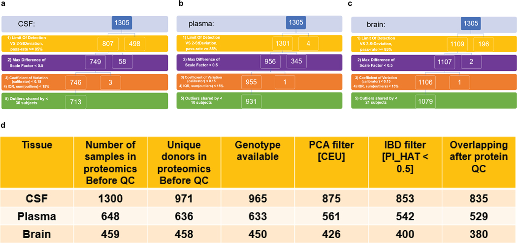
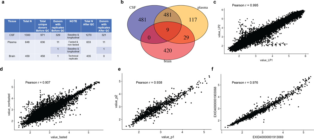
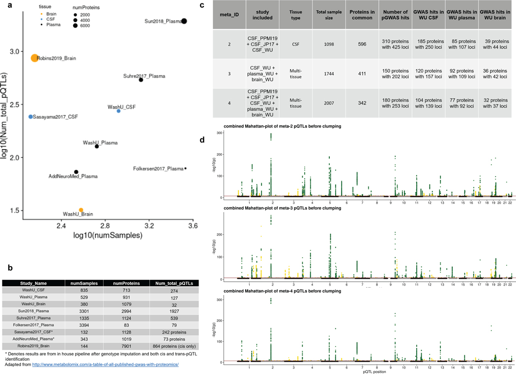
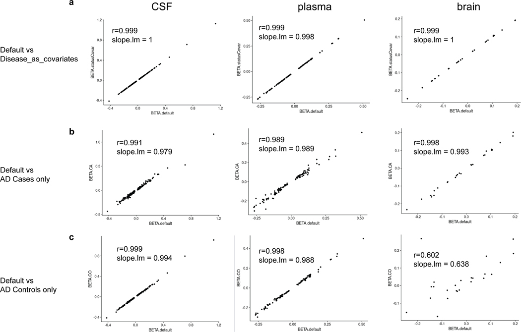
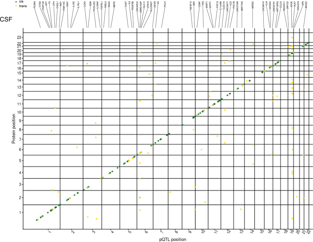
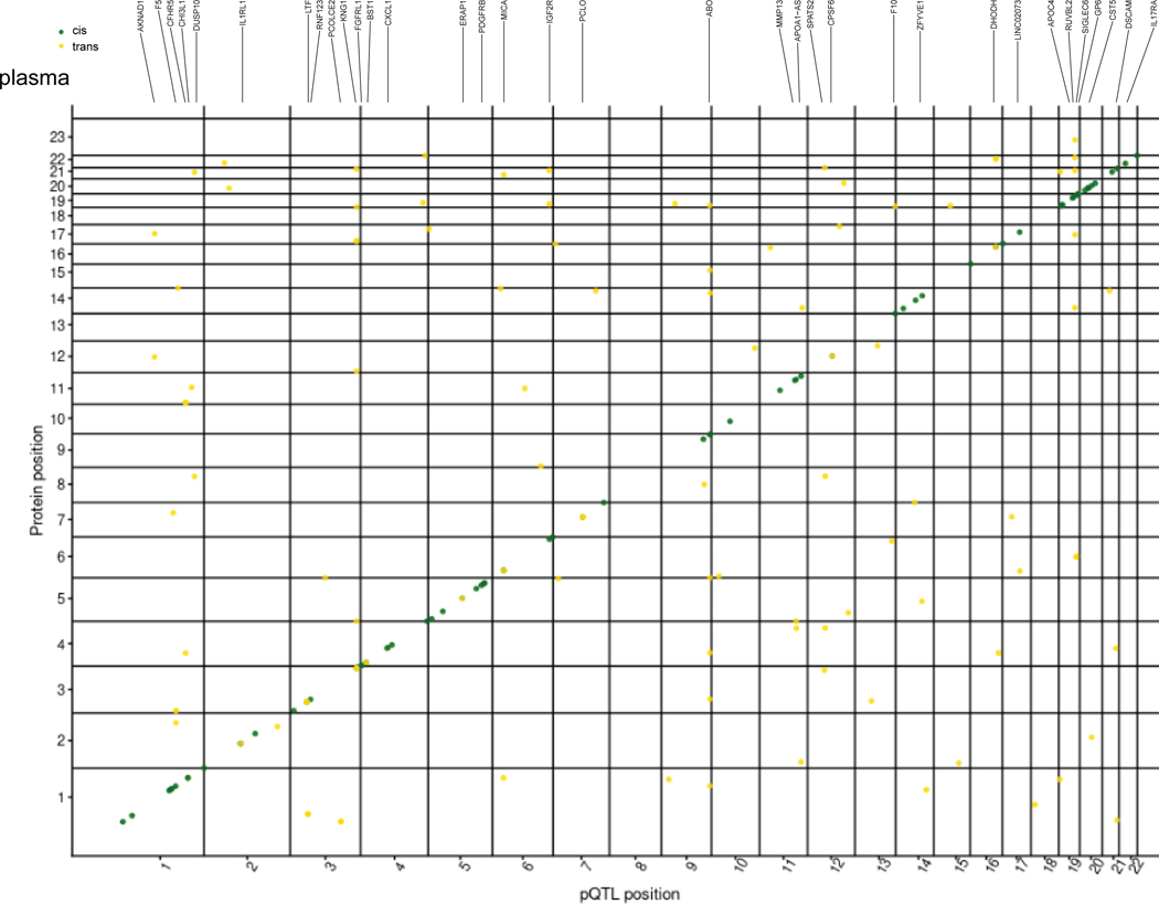
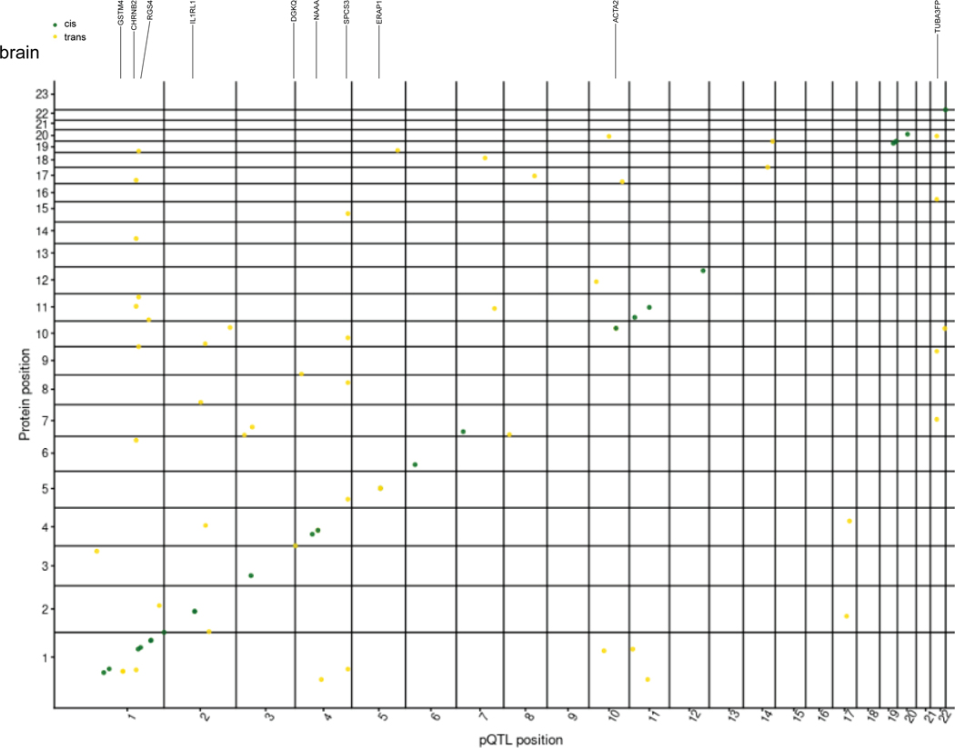
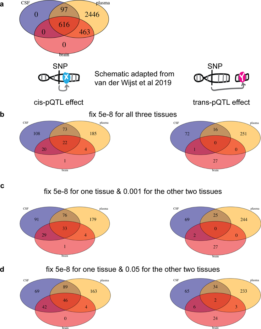
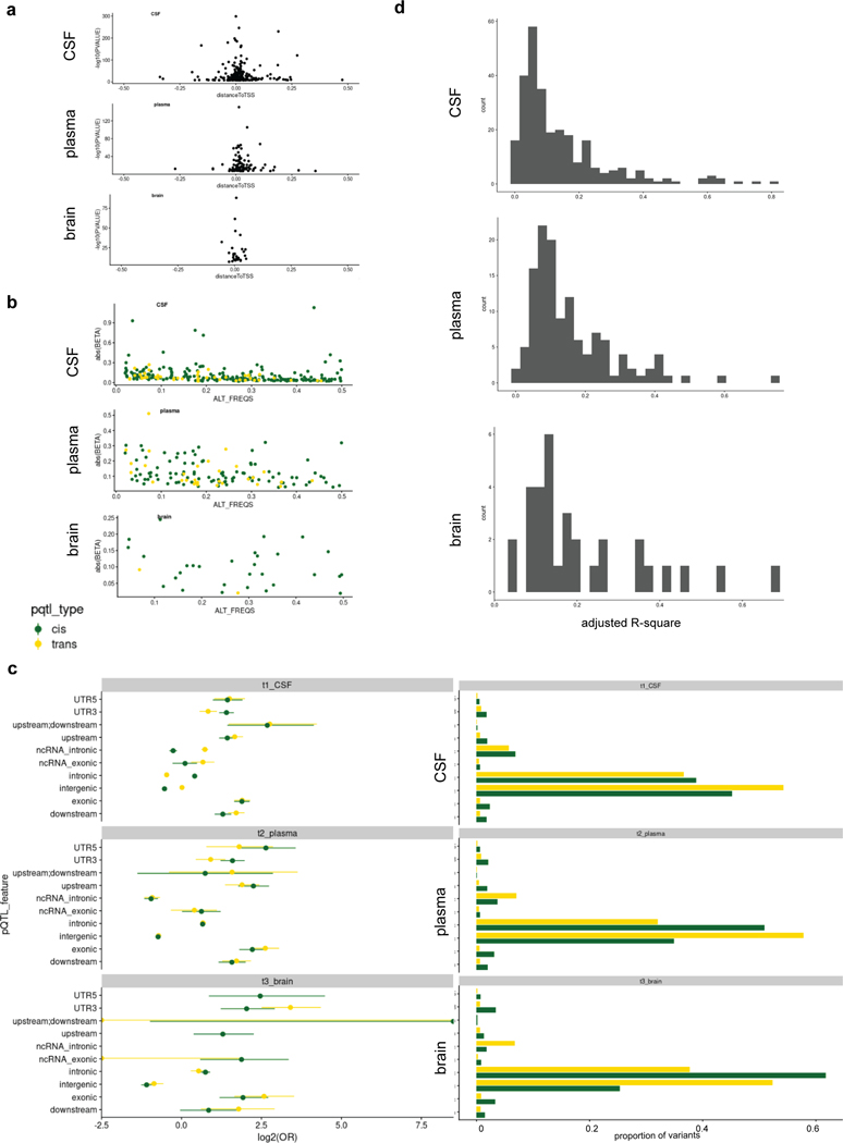
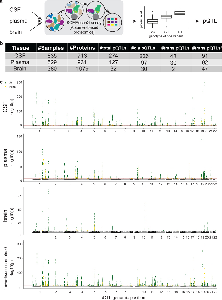
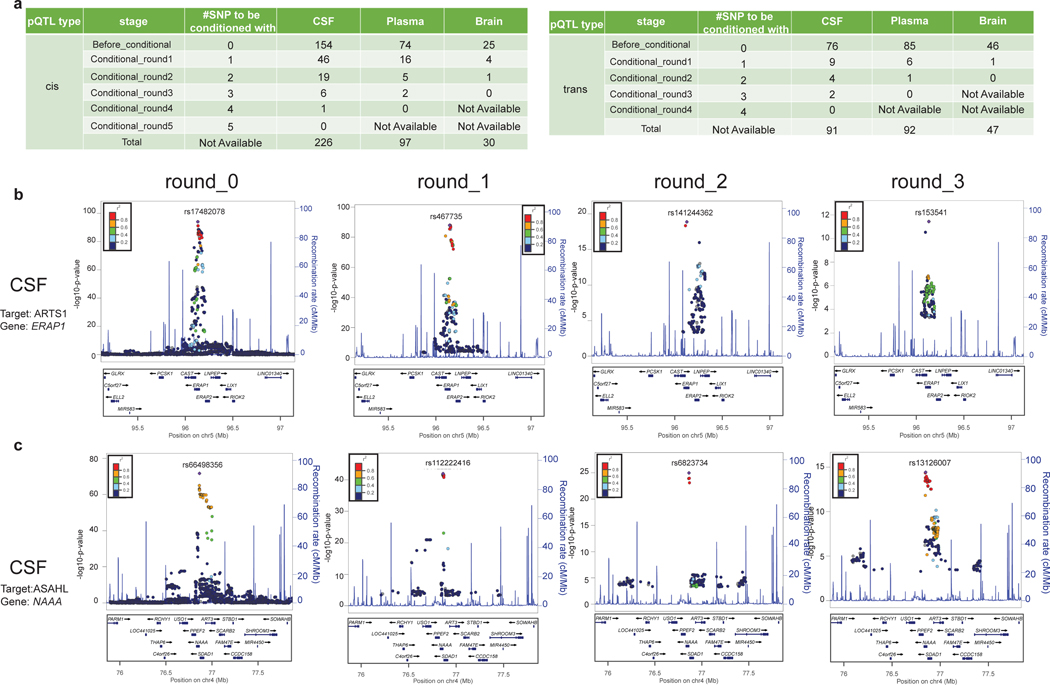
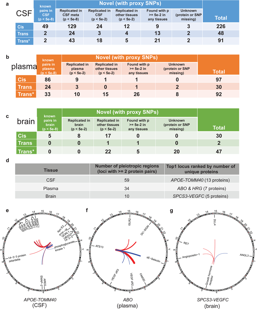
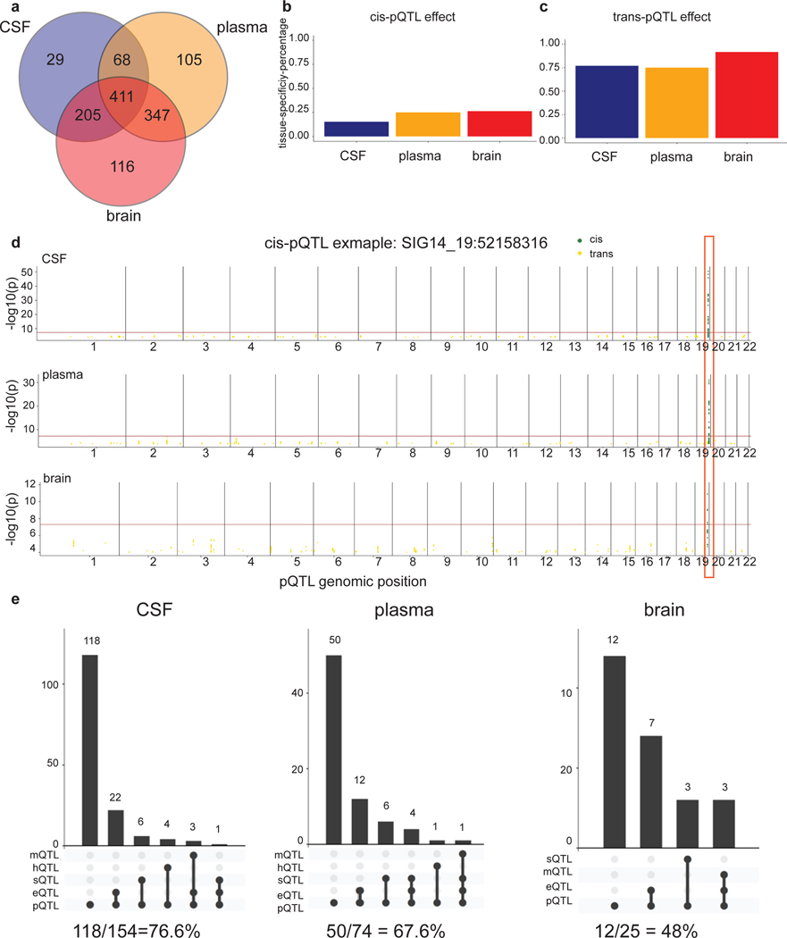
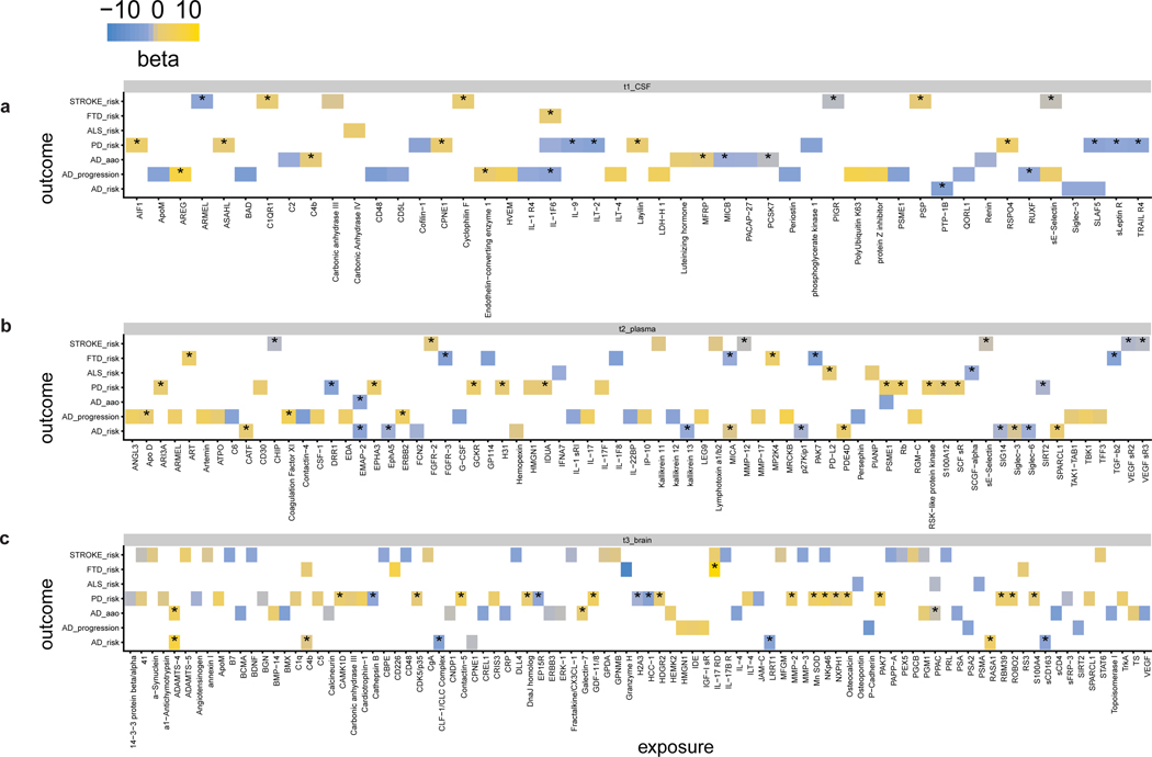
Understanding the tissue-specific genetic controls of protein levels is essential to uncover mechanisms of post-transcriptional gene regulation. In this study, we generated a genomic atlas of protein levels in three tissues relevant to neurological disorders (brain, cerebrospinal fluid and plasma) by profiling thousands of proteins from participants with and without Alzheimer's disease. We identified 274, 127 and 32 protein quantitative trait loci (pQTLs) for cerebrospinal fluid, plasma and brain, respectively. cis-pQTLs were more likely to be tissue shared, but trans-pQTLs tended to be tissue specific. Between 48.0% and 76.6% of pQTLs did not co-localize with expression, splicing, DNA methylation or histone acetylation QTLs. Using Mendelian randomization, we nominated proteins implicated in neurological diseases, including Alzheimer's disease, Parkinson's disease and stroke. This first multi-tissue study will be instrumental to map signals from genome-wide association studies onto functional genes, to discover pathways and to identify drug targets for neurological diseases.


Figures

Extended Data Fig. 1
Extended Data Fig. 1. QC pipeline.
QC on both proteins (a to c) and samples (d) were described as follows: (a) Flowchart of CSF protein level QC, starting from 1305; after step-1, Limit Of Detection VS 2-StDeviation, 807 proteins were kept with a pass-rate >= 85%; after step-2, given Max Difference of Scale Factor < 0.5, 749 proteins were kept; after step-3, given Coefficient of Variation (of calibrator) < 0.15 & step-4, given IQR, sum(outliers) < 15%, 746 proteins were kept. After step-5, 713 proteins that shared by < 30 samples (shared by ~80% of the subject outliers) were kept. (b) Flowchart of plasma protein level QC, starting from 1305; after step-1, 1301 proteins were kept with a pass-rate >= 85%; after step-2, 956 proteins were kept; after step-3 & step-4, 955 proteins were kept. After step-5, 931 proteins that shared by < 10 samples were kept. (c) Flowchart of brain protein level QC, starting from 1305; after step-1, 1109 proteins were kept with a pass-rate >= 85%; after step-2, 1107 proteins were kept; after step-3 & step-4, given IQR, sum(outliers) < 15%, 1106 proteins were kept. After step-5, 1079 proteins that shared by < 21 samples were kept. (d) Table of sample size after each step of QC in genotype and proteomics. Within each tissue (1st column), we profiled proteomics from 1300 CSF, 648 plasma and 459 samples (2nd column). From unique donors in proteomics data (3rd column), we first kept donors with genotyping array data (4th column). We next kept only the donors with a European ancestry after checking principal components (5th column). Moreover, we kept donors that were not close with each other (PI_HAT < 0.05) after checking identity by descent (6th column). Finally, the samples remained only passing both the genotype and protein data QC (7th column).
Extended Data Fig. 2
Extended Data Fig. 2. Reproducibility of proteomic data.
(a) Table of total sample size for each tissue before and after QC, including the biological and technical replicates. (b) Venn diagram on the designed donor overlap across tissues. (c) Scatterplot of 321 subjects with both longitudinal and baseline samples from CSF indicates a Pearson correlation coefficient of 0.995 (95% confidence interval from 0.995 to 0.995). (d) Scatterplot of 11 subjects with both fasted and nonfasted samples from plasma indicates a Pearson correlation coefficient of 0.907 (95% confidence interval from 0.904 to 0.911). (e) Scatterplot of one subject with both longitudinal and baseline samples from plasma indicates a Pearson correlation coefficient of 0.938 (95% confidence interval from 0.930 to 0.945). (f) Scatterplot of one subject with two technical replicates from brain indicates a Pearson correlation coefficient of 0.976 (95% confidence interval from 0.976 to 0.981). All statistical tests used were two-sided from (c) to (f).
Extended Data Fig. 3
Extended Data Fig. 3. Overview of the sample size and number of pQTLs from pQTL studies mentioned in this paper and the summary statistics from the meta-analyses.
(a) Scatter plot of sample size (log10-scaled) and number of total pQTLs after clumping or unique proteins when no clumping was performed (log10-scaled). Dot color represents the tissue type; dot size represents total number of proteins profiled. (b) Table of these nine datasets listed the exact numbers for drawing the scatter plot. (c) Table of three different combinations of meta-analyses: 2) meta2_WUcsf_PPMI19_JP17: meta-analysis on all three CSF studies by Sasayama and colleagues published in 2017, by PPMI released in 2019, and by Washington University cohort (this study); 3) meta3_WUcsf_WUplasma_WUbrain: meta-analysis on all three-tissue findings from CSF, plasma and brain respectively by Washington University cohort (this study); 4) meta4_ WUcsf_WUplasma_WUbrain_ PPMI19_JP17: meta-analysis on both the CSF studies by Sasayama and colleagues published in 2017 and by PPMI released in 2019 plus all three-tissue findings from CSF, plasma and brain respectively by Washington University cohort (this study). The columns include number of proteins in common, number of protein-level GWAS hits after meta-analysis, number of protein-level GWAS hits before meta-analysis using only the common proteins within each tissue for each combination. (d) Stacked Manhattan plots for all three different combinations of meta-analyses. The darkred line represents P = 5×10⁻⁸.
Extended Data Fig. 4
Extended Data Fig. 4. Disease stratified analysis on comparing pQTLs effect size.
To investigate of disease status effect on pQTLs, we performed linear regression on the same protein-loci pairs (before conditioning on top variants) identified from above default model using three additional models: (a) joint analysis but with disease status as another covariate (CO vs non-CO). Pearson correlation coefficient was 0.999 (p-value < 2.2×10⁻¹⁶, 95%CI = 0.999 to 0.999), 0.999 (p-value = 4.3×10−202, 95%CI =0.999 to 0.999), 0.999 (p-value = 9.5×10−52, 95%CI = 0.999 to 0.999) for CSF, plasma, and brain respectively. Sample size for this joint analysis was 835, 529, and 380 for CSF, plasma, and brain respectively. (b) AD case (CA) only using the same covariates as default model. Pearson correlation coefficient of 0.991 (p-value = 3.9×10−160, 95%CI =0.988 to 0.993), 0.989 (p-value = 1.8×10−83, 95%CI =0.983 to 0.992), 0.998 (p-value = 2.4×10⁻²⁹, 95%CI =0.995 to 0.999) for CSF, plasma, and brain respectively. Sample size for this AD case (CA) only analysis was 217, 168, and 248 for CSF, plasma, and brain respectively. (c) Cognitive unimpaired (CO) only using the same covariates as default model. Pearson correlation coefficient of 0.999 (p-value = 5.2×10−234, 95%CI =0.998 to 0.999), 0.998 (p-value = 1.17×10−122, 95%CI =0.997 to 0.999), 0.602 (p-value = 0.002, 95%CI =0.262 to 0.809) for CSF, plasma, and brain respectively. Sample size for this cognitive unimpaired (CO) only analysis was 614, 357, and 24 for CSF, plasma, and brain respectively. The relatively low correlation in default model comparison with control only in brain samples was due to much smaller sample size as a control for brain samples. All statistical tests used were two-sided from (a) to (c).
Extended Data Fig. 5
Extended Data Fig. 5. Global view of pleiotropic regions in CSF.
In total, 59 Pleiotropic regions passing genome-wide significance threshold (5×10⁻⁸) in CSF (sample size = 835). Unique non-overlapping regions associated with a given SOMAmer were first defined as 1-Mb region upstream and downstream of each significant variant for that SOMAmer. Within the region (2Mb) containing the variant with the smallest P value, any overlapping regions were then merged into the same locus. Next, an LD-based clumping approach was adapted to identify whether a region was associated with multiple SOMAmers. Variants were combined into a single region per LD (EUR) defined loci. Any loci associated with more than one protein were identified as pleiotropic regions. Genomic locations of pQTLs were visualized by a squared-Manhattan plot. Dark-green represents cis-pQTLs; gold represents trans-pQTLs. X-axis indicates the positions of the top variant; and Y-axes indicates the gene encoding the protein. All pleiotropic genomic regions are annotated at the top of each plot along the X-axis.
Extended Data Fig. 6
Extended Data Fig. 6. Global view of pleiotropic regions in plasma.
In total, 34 pleiotropic regions passing genome-wide significance threshold (5×10⁻⁸) in plasma (sample size = 529). Genomic locations of pQTLs were visualized by a squared-Manhattan plot, same as Extended Data Fig.5.
Extended Data Fig. 7
Extended Data Fig. 7. Global view of pleiotropic regions in brain.
In total, 10 pleiotropic regions passing genome-wide significance threshold (5×10⁻⁸) in brain (sample size = 380). Genomic locations of pQTLs were visualized by a squared-Manhattan plot, same as Extended Data Fig.5.
Extended Data Fig. 8
Extended Data Fig. 8. Tissue specificity exploration with permissive thresholds.
To determine whether our tissue-specificity results were biased by statistical power, we performed similar analyses with two more permissive p-values on the 411 proteins. (a) Venn diagrams of all pQTLs across all three tissues by fixing genome-wide significance threshold (5×10⁻⁸) for all three tissues. (b) Venn diagrams of all pQTLs across all three tissues by fixing genome-wide significance threshold for one tissue and 0.001 for the other two tissues. For example, when checking CSF pQTLs shared in plasma or brain, we chose 5×10⁻⁸ as threshold for CSF and 0.001 for plasma or brain. (c) Venn diagrams of all pQTLs across all three tissues by fixing genome-wide significance threshold for one tissue and 0.05 for the other two tissues. For example, when checking CSF pQTLs shared in plasma or brain, we chose 5×10⁻⁸ as threshold for CSF and 0.05 for plasma or brain.
Extended Data Fig. 9
Extended Data Fig. 9. Tissue specificity exploration with plasma result from INTERVAL study.
To further demonstrate that tissue-specificity findings are not a product of different sample size, we performed similar comparisons by analyzing the plasma pQTLs from the INTERVAL study on 616 proteins that passed QC in our CSF, brain and plasma INTERVAL. (a) Venn diagrams of proteins passing QC across all three tissues: CSF and brain results are from WashU cohort, plasma result is from INTERVAL study. (b) Venn diagrams of all pQTLs across all three tissues by fixing genome-wide significance threshold (5×10⁻⁸) for all three tissues. (c) Venn diagrams of all pQTLs across all three tissues by fixing genome-wide significance threshold for one tissue and 0.001 for the other two tissues. For example, when checking CSF pQTLs shared in plasma or brain, we chose 5×10⁻⁸ as threshold for CSF and 0.001 for plasma or brain. (d) Venn diagrams of all pQTLs across all three tissues by fixing genome-wide significance threshold for one tissue and 0.05 for the other two tissues. For example, when checking CSF pQTLs shared in plasma or brain, we chose 5×10⁻⁸ as threshold for CSF and 0.05 for plasma or brain.
Extended Data Fig. 10
Extended Data Fig. 10. Properties of pQTLs.
(a) Dot plots of -log10(P) from all significant associations (via linear regression) against the distance of sentinel SNPs from TSS within each tissue. (b) Dot plots of absolute effect size associated with MAF within each tissue. (c) Forest plot of enrichment on the predicted functional annotation classes of pQTLs versus null sets of variants from permutation within each tissue (Data are presented as mean values of Odds Ratio +/− 95% confidence interval from Fisher’s Exact Test) and Bar plots of the proportion of variants annotate in each class. (Note: Features on exonic_splicing/ncRNA_splicing/splicing/UTR5_UTR3 are not shown due to not all tissues have these features). (d) Histograms of variance explained by conditionally independent variants within each tissue. For CSF, the mean = 0.141, standard deviation = 0.144, mode = 0.061; For plasma, the mean = 0.157, standard deviation = 0.125, mode = 0.188; For brain, the mean = 0.208, standard deviation = 0.151, mode = 0.092.
Fig. 1.
Fig. 1.. Study design and overview of the significant pQTLs within each tissue.
(a) Schematic of study design. CSF, plasma, and brain tissues were profiled using a high-throughput aptamer-based proteomics platform. We identified common genetic variants associated with each protein within each tissue after integrating both the genotype for each variant and protein level. The box-plot of pQTL is just for illustration purpose, showing the median (line), quartiles (box) and whiskers extending to ±1.5 times the interquartile range. (b) Table of sample size after QC and total number of pQTLs (split by cis, P < 5×10⁻⁸, and trans P < 5×10⁻⁸/number_PCs) for each tissue. For trans-pQTLs, the p-value cutoff for CSF is 3×10⁻¹⁰ (5×10⁻⁸/169), for plasma it is 2×10⁻¹⁰ (5×10⁻⁸/230), and for brain it is 7×10⁻¹⁰ (5×10⁻⁸/75). Trans* represents replication of trans-pQTLs given genome-wide significance (p-value < 5×10⁻⁸). (c) Stacked Manhattan plots for all three tissues mapping genomic locations of these pQTL within each tissue (cis: dark-green; trans: gold). The X-axis denotes the positions of the common variants. The darkred line represents P = 5×10⁻⁸.
Fig. 2.
Fig. 2.. Identification of conditionally independent local pQTLs.
(a) Tables of conditionally independent pQTLs (cis and trans) locally (2 Mb window) after each round for each tissue. Before conditional, no SNPs were used as a covariate given one region. For round_1 conditioning, the top SNP from before-conditioning stage given the same region was used as an additional covariate in the default model. For round_2 conditioning, the top SNP from before-conditioning stage and top SNP from round_1 stage was used as an additional covariate in the default model. Both SNPs were within the same region. For each round we added the previous independent top hits from the prior rounds until no variants passed genome-wide significance threshold given the same region. (b) Regional association plots of the ERAP1 region associated with CSF ARTS1 protein: (round_0) before conditional analyses, centered on rs17482078; (round_1) after conditioning on the prior top SNP (rs17482078, centered on rs467735; (round_2) after conditioning on the prior top SNPs (rs17482078 and rs467735, centered on rs141244362; (round_3) after conditioning on the prior top SNPs (rs17482078 and rs467735 and rs141244362, centered on rs153541. No genome-wide significant SNPs was observed in round_4 after conditioning on all prior top SNPs. (c) Regional association plots of the NAAA region associated with CSF ASAHL protein: (round_0) before conditional analyses, centered on rs66498356; (round_1) after conditioning on the prior top SNP (rs66498356, centered on rs112222416; (round_2) after conditioning on the prior top SNPs (rs66498356 and rs112222416, centered on rs6823734; (round_3) after conditioning on the prior top SNPs (rs66498356 and rs112222416and rs6823734, centered on rs13126007. No genome-wide significant SNP was observed in round_4 after conditioning on all prior top SNPs. The SNPs for each regional plot are denoted as a purple diamond. Each dot represents individual SNPs, and dot colors in the regional plots represent linkage disequilibrium with the named SNP at the center. Blue vertical lines in the regional plots show recombination rate as marked on the right-hand Y-axis.
Fig. 3.
Fig. 3.. Overview of the replication of the pQTLs and identification of pleiotropic regions within each tissue.
(a-c) Tables of replication of these pQTLs within CSF, plasma, and brain, given different p-value thresholds for different datasets. Overall, we classified pQTLs into five mutually exclusive groups: 1) known pQTLs in the matched-tissue (single-study) with a p-value less than 5×10⁻⁸; 2) replicated pQTLs in the matched-tissue with a p-value less than 5×10⁻² but greater than or equal to 5×10⁻⁸ [*NOTE: for CSF, we split this group into two sub-groups: 2a) replicated only in the meta-analysis of two external CSF studies with a p-value less than 5×10⁻⁸; 2b) replicated pQTLs in the matched-tissue with a p-value less than 5×10⁻² but greater than or equal to 5×10⁻⁸]; 3) replicated pQTLs in the other tissues with a p-value less than 5×10⁻²; 4) pQTLs found in any tissues (matched or not) with a p-value greater than or equal to 5×10⁻²; 5) unknown (either protein or SNP missing). For CSF, we further split the 2nd group into 2a) replicated pQTLs in the matched-tissue (meta-analysis, Table S6) with a p-value less than 5×10⁻⁸ and 2b) replicated pQTLs in the matched-tissue (meta-analysis and/or single-study) with a p-value less than 5×10⁻² but greater than or equal to 5×10⁻⁸. Trans* represents replication of trans-pQTLs given genome-wide significance (p-value < 5×10⁻⁸) but not necessarily passing study-wide significance. Actual p-values (two-sided) without multiple comparison adjustments for each variant–protein pair were estimated using an additive linear regression model. (d) Table of all pleiotropic regions within each tissue given genome-wide significance threshold for both cis and trans-pQTLs and the name of top-1 locus ranked by number of unique proteins. (e) Circos plot of top-1 locus (mapped to APOE-TOMM40) associated with 13 unique CSF proteins. (f) Circos plot of top-1 locus (mapped to ABO or HRG) associated with 7 unique plasma proteins. (g) Circos plot of top-1 locus (mapped to SPCS3-VEGFC) associated with 5 unique brain proteins. Outermost numbers denote chromosomes. Lines link the genomic location of this locus with genes encoding significantly associated proteins. Associations denote genome-wide significance. Line thickness is proportional to effect size of linear regression (red, positive; blue, negative).
Fig. 4.
Fig. 4.. Summary of the tissue-specificity analyses and colocalization of pQTLs with other molecular QTLs.
(a) Venn diagrams of proteins passing QC across all three tissues. (b) Bar plot of tissue specificity percentage inferred from mashr on all cis-pQTLs across all three tissues given p-value < 0.05 threshold. (c) Bar plot of tissue specificity percentage inferred from mashr on all trans-pQTLs across all three tissues given p-value < 0.05 threshold. (d) Manhattan plots of the SIG14-chr19:52158316 within each tissue as an example of three-tissue-shared cis-pQTL. The darkred line represents P = 5×10⁻⁸. Actual p-values (two-sided) without multiple comparison adjustments for each variant–protein pair were estimated using an additive linear regression model. (e) Upset plots for colocalization investigation on pQTLs vs expression-QTLs vs splicing-QTLs vs DNA-methylation-QTLs vs histone-acetylation-QTLs for each tissue in cis and the bottom panel with the percentage of remaining pQTLs not colocalized.
Fig. 5.
Fig. 5.. Mendelian randomization prioritized proteins in the associated relationship with seven neurological traits.
MR results were calculated using the TwoSampleMR R package, and the effects for each protein-disease pair are visualized using Heatmap of MR inference of (a) CSF, (b) plasma, and (c) brain protein effect on seven neurological-related traits. The p-value threshold for significance is 0.05 after multiple testing correction accounting for both tissues and diseases. The color represents whether the effect size is positive (yellow) or negative (blue). Alzheimer disease (AD); Parkinson’s disease (PD); Amyotrophic lateral sclerosis (ALS); Frontotemporal dementia (FTD). Stroke is the general risk, not a specific subset of the stroke. The asterisk sign* represents colocalization with a PP.H4 > 0.8 for the protein-disease pair. The summary statistics are curated from published datasets (see Table S27 & S28 for details).

References

    1. Altshuler D, Daly MJ & Lander ES Genetic Mapping in Human Disease. Science 322, 881–888 (2008). - PMC - PubMed
    1. Morris AP et al. Large-scale association analysis provides insights into the genetic architecture and pathophysiology of type 2 diabetes. Nature Genetics 44, 981–990 (2012). - PMC - PubMed
    1. Kunkle BW et al. Genetic meta-analysis of diagnosed Alzheimer’s disease identifies new risk loci and implicates Aβ, tau, immunity and lipid processing. Nature Genetics 51, 414 (2019). - PMC - PubMed
    1. Claussnitzer M. et al. A brief history of human disease genetics. Nature 577, 179–189 (2020). - PMC - PubMed
    1. Aguet F. et al. The GTEx Consortium atlas of genetic regulatory effects across human tissues. bioRxiv 787903 (2019) doi:10.1101/787903. - DOI - PMC - PubMed

Publication types