. 2021 Jul 13;118(28):e2024150118.
doi: 10.1073/pnas.2024150118.

Ecology of the Anthropocene signals hope for consciously managing the planetary ecosystem

Affiliations

Ecology of the Anthropocene signals hope for consciously managing the planetary ecosystem

Clarence Lehman et al. Proc Natl Acad Sci U S A. .

Abstract

Human populations have grown to such an extent that our species has become a dominant force on the planet, prompting geologists to begin applying the term Anthropocene to recognize the present moment. Many approaches seek to explain the past and future of human population growth, in the form of narratives and models. Some of the most influential models have parameters that cannot be precisely known but are estimated by expert opinion. Here we apply a unified model of ecology to provide a macroscale summary of the net effects of many microscale processes, using a minimal set of parameters that can be known. Our models match estimates of historic and prehistoric global human population numbers and provide predictions that correspond to some of the more complicated current models. In addition to fitting the data well they reveal that, amidst enormous complexity in our human and prehuman past, three key ecological discontinuities have occurred in turn: 1) becoming dominant competitors of large predators rather than their prey, 2) becoming mutualists with food species rather than acting as predators upon them, and 3) changing from a regime of uncontrolled population growth to one of controlled fertility instead. All three processes have been interlinked with cultural evolution and all three ushered in developments of the Anthropocene. Understanding the trajectories that have delivered us to this stage can help guide prudent paths into the future.

Keywords: anthropology; demographic transition; logistic and orthologistic growth; possibilist agenda; sustainability.


Conflict of interest statement

The authors declare no competing interest.

Figures

Fig. 1.
Fig. 1.
Dynamics of the three major stages in human ecology, enabled by cultural change. Representative predator abundance is shown in red, prey abundance in green, and hominin abundance in blue. All solid curves are numerical solutions to the ecological equation 1 in Fig. 2, using parameters of SI Appendix, section S1. (A) The hunter-gatherer phase, beginning in the remote past when parameter s1,2 in equation 1 in Fig. 2 became negative. Top predators in red were engaged by weapons-wielding hominins (left of dashed line), top predators declined to low levels, and hominins rose to dominate the food web, illustrated here with predator–prey cycling (right of dashed line). Such cycling is one of multiple possible outcomes from predator–prey interactions, which can also include equilibrium, extinction, and chaotic dynamics. (B) Agricultural phase, beginning when parameter s3,2 became positive, creating a form of mutualism with agricultural animals and crops. The dashed vertical line marks a singularity—a time before which population growth is guaranteed to be arrested by some ecological, social, or physical limitation. Advances in health contribute to the latter parts of this curve, although the runaway nature of the curve appears to have been invariant for millennia. (C) Contemporary phase, when moderation of human fertility arose in recent centuries as parameter s2,2 declined. The dashed horizontal lines mark hypothetical carrying capacities—approximate populations where growth rates approach zero, according to equation 1 in Fig. 2, even with mutualistic interactions intact. The dotted lines represent possible planned or unplanned reductions in global population to unknown levels, as suggested by Fig. 4, indicating fertilities falling below replacement.
Fig. 2.
Fig. 2.
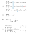
Ecological dynamics. Here the r parameters represent density-independent growth rates that dominate at low population levels, while the s parameters are largely ecological and social, representing interactions between and within species. N1 symbolizes the abundance of predators of hominins and other prey, N2 symbolizes hominin abundance, and N3 symbolizes the abundance of species eaten by hominins. (1) Coupled equations representing three trophic levels. Boxed in blue are the three relationships that were under control by us or our hominin ancestors and that changed to cause the discontinuities, (a) from predation (+,) to competition (,), causing the first discontinuity, leading to Fig. 1A; (b) from predation (+,) to mutualism (+,+), causing the second discontinuity, leading to Fig. 1B; and (c) from orthologistic (+) to logistic (), causing the third discontinuity, leading to Fig. 1C. A generic procedure to solve these coupled equations and exhibit the dynamics of Fig. 1 appears in SI Appendix, section S2. (2) Reduced dynamics of conditions after the second discontinuity. It can be shown that for mutualists interacting according to the equations for N2 and N3, when the mutual enhancement terms si,j overpower the self-interaction terms si,i, the species move toward fixed ratios and then the multiple equations describing their growth collapse to this single equation (4). This is a first-order approximation of the general power-series expansion of Hutchinson for population growth (5), which suffices for long-term human dynamics. (3) Explicit solution to equation 2, used to fit population data. (4) Summary of changes in sign causing the discontinuities. The sign of the self-limiting term s2,2 is unclear during the primordial phase. Signs of parameters not shown, such as s2,1, do not necessarily change; for example, predators would still pose risks to hominins when present, but the overall effect would become negligible as predators were reduced to low levels in areas where hominins resided.
Fig. 3.
Fig. 3.
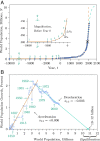
World population data. (A) Blue dots show estimated world population over time (SI Appendix, section S3). The red curve is equation 3 in Fig. 2 fitted to the data from 10,000 BCE to the 1960s AD, characterized by accelerating growth. The green curve is equation 3 in Fig. 2 fitted to the data since the discontinuity in the mid1960s, characterized by decelerating growth. The × marks the discontinuity. Arrows labeled p and q in the main graph are stretched vertically to matching arrows marked p and q in Inset. Points labeled 1 to 8 in the main graph are the same as points 1 to 8 in Inset. (B) Per capita growth of the population as a percentage plotted against the population itself. The vertical axis is calculated as 1/NiΔNi/Δti, between successive population points, as depicted for ΔN6 and Δt6 in A, Inset. The light gray lines form a timeline connecting successive data points. The upward-sloping red line fits equation 3 in Fig. 2 to the data before the discontinuity marked by × in A, representing a 12,000-y-long period of rapid orthologistic growth. The downward-sloping green line fits the data following the discontinuity marked by the × and projects the data forward to a hypothetical equilibrium. The ecological parameter s2,2 shown for both the red-line acceleration phase and the green-line deceleration phase represents human population growth interacting with mutualistic plants and animals and with continuing cultural development, reaching equilibration as the percentage growth approaches zero. Note how abruptly the global average slope indicated by parameter s2,2 changed from positive to negative at the time of the third discontinuity.
Fig. 4.
Fig. 4.
Fertility and education. Fertility tends to decline with increasing years of education (SI Appendix, section S4). Each circle represents a nation of 10 million people or more, with the areas of the circles proportional to population size. The horizontal line marks the replacement rate, where the population growth rate is zero. The green curve is a fitted hyperbola to illustrate the pattern. Similar patterns arise in graphs of fertility versus per capita national income, per capita energy use, ratio of female to male education, and other correlates. Of nations with fewer than 7 average years of education, none have fertility below replacement levels (area a). With one exception, among all nations with over 11 average years of education, fertility is below replacement (area b).

References

    1. Crutzen P. J., Geology of mankind. Nature 415, 23 (2002). - PubMed
    1. Ruddiman W. F., Ellis E. C., Kaplan J. O., Fuller D. Q.., Defining the epoch we live in. Is a formally designated Anthropocene a good idea? Science 348, 38–39 (2015). - PubMed
    1. Balter M., Archaeologists say the ‘Anthropocene’ is here—but it began long ago. Science 340, 261–262 (2013). - PubMed
    1. Lehman C., Loberg S., Clark A. T., Schmitter D., Unifying the basic models of ecology to be more complete and easier to teach. Bioscience 70, 415–426 (2020).
    1. Hutchinson G. E., An Introduction to Population Ecology (Yale University Press, New Haven, CT, 1978).

LinkOut - more resources