Observational Study
. 2021 Jul 9;12(1):4237.
doi: 10.1038/s41467-021-24306-2.

Genetic influences on hub connectivity of the human connectome

Affiliations
Observational Study

Genetic influences on hub connectivity of the human connectome

Aurina Arnatkeviciute et al. Nat Commun. .

Abstract

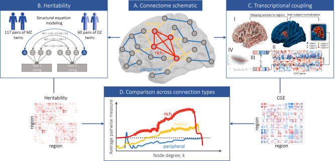
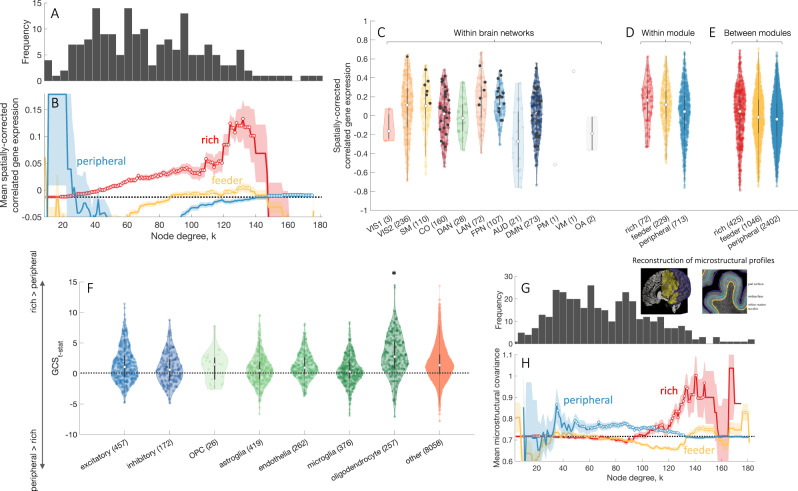
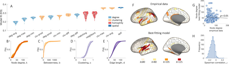
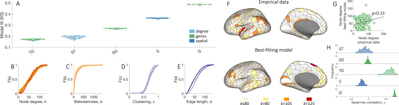
Brain network hubs are both highly connected and highly inter-connected, forming a critical communication backbone for coherent neural dynamics. The mechanisms driving this organization are poorly understood. Using diffusion-weighted magnetic resonance imaging in twins, we identify a major role for genes, showing that they preferentially influence connectivity strength between network hubs of the human connectome. Using transcriptomic atlas data, we show that connected hubs demonstrate tight coupling of transcriptional activity related to metabolic and cytoarchitectonic similarity. Finally, comparing over thirteen generative models of network growth, we show that purely stochastic processes cannot explain the precise wiring patterns of hubs, and that model performance can be improved by incorporating genetic constraints. Our findings indicate that genes play a strong and preferential role in shaping the functionally valuable, metabolically costly connections between connectome hubs.


Conflict of interest statement

The authors declare no competing interests.

Figures

Fig. 1
Fig. 1. Workflows used to characterize genetic influences on hub connectivity.
A A schematic representation of the connectome showing different connection types in the brain. Given a distinction between hub nodes (red outline) and nonhub nodes (gray outline), we can delineate three classes of connections: rich links—connections between two hubs (red); feeder links—connections between a hub and a nonhub (yellow); and peripheral links—connections between two nonhubs (blue). B Connectome-wide heritability analysis. We use structural equation modeling to fit a classic ACTE biometric model to every connection within the brain, resulting in estimates of genetic and environmental influences for each link. C Analysis of transcriptional coupling. (I) Each of 3702 tissue samples in the Allen Human Brain Atlas (AHBA) is mapped to a given region in our brain parcellation. (II) Expression values are then subjected to quality control and processing pipeline to construct a region × gene matrix of expression values. (III) We estimate correlated gene expression (CGE) between each pair of brain regions as the Pearson correlation between region-specific gene-expression profiles. (IV) Inter-regional CGE is corrected for spatial autocorrelation of the expression data via regression of an exponential distance trend. D Schematic representation of how values assigned to each edge are compared across connection types. We compare the mean of edge-level (pairwise) measures of heritability and CGE for rich, feeder, and peripheral links across all possible hub-defining thresholds (horizontal axis). As k increases, the definition of a hub becomes more stringent and identifies the actual hubs of the network. Thus, if a given effect is stronger for rich links, we expect the pairwise estimates to increase as a function of k, with the increase for rich links being particularly large relative to the feeder and peripheral links.
Fig. 2
Fig. 2. Genetic influences on connectivity strength are preferentially concentrated on rich-club links.
A Anatomical locations of hubs defined at different levels of k. B The degree distribution of the representative group-level connectome. Mean genetic (C) and unique environmental (D) influences for rich (hub–hub), feeder (hub–nonhub), peripheral (nonhub–nonhub) connections as a function of the hub-defining threshold, k. The mean of the corresponding measure across all network links is shown as a dotted black line. Shaded area corresponds to the standard error of the mean, circles indicate a statistically significant increase of the measure in a given link type compared to the rest of the network (one-sided Welch’s t-test, uncorrected p < 0.05). E Regional assignments to canonical functional network modules, represented using color. F The proportion of nodes with degree > k in each functional network module as a function of k. G Distributions of heritability estimates across edges within functionally defined networks: VIS1—primary visual; VIS2—secondary visual; SM—somatomotor; CO—cingulo-opecular; DAN—dorsal attention; LAN—language; FPN—frontoparietal; AUD—auditory; DMN—default mode; PM—posterior multimodal; VM—ventral multimodal; OA—orbito-affective. Rich links within each module are represented as black dots, as defined for k > 105. Heritability distributions for edges within (H) and between (I) functional modules across rich, feeder, and peripheral link types for k > 105. Rich links show significantly higher heritability compared to both feeder and peripheral links, within and between functional modules (one-sided Welch’s t-test, all p < 1.9 × 10−12). For distributions presented in GI, white dots represent median values for each distribution. The interquartile range is represented with a dark gray box, whiskers are represented with a light gray line. Source data are provided as a Source Data file.
Fig. 3
Fig. 3. Transcriptional coupling is elevated for connected brain network hubs.
A The degree distribution of the representative group-level connectome of brain regions in the left cortical hemisphere. Degree is computed from whole-brain connectivity. B Mean correlated gene expression (CGE) for rich (hub–hub), feeder (hub–nonhub), peripheral (nonhub–nonhub) connections as a function of the degree threshold, k, used to define hubs. The mean CGE across all network links is shown as a dotted black line. The shaded area corresponds to the standard error of the mean, circles indicate a statistically significant increase in CGE in a given link type compared to the rest of the network (one-sided Welch’s t-test, uncorrected p < 0.05). CGE estimates are corrected for distance effects, as detailed in the Methods section. C CGE within functionally defined networks as in Fig. 2E. Black dots represent CGE values for rich links (k > 105). CGE values within (D) and between (E) functional modules in the left hemisphere across different link types (rich, feeder, and peripheral). Inter-module rich links show significantly higher CGE compared to both feeder (one-sided Welch’s t-test, p = 0.03) and peripheral links (p = 1.5 × 10−4). Within functional modules, rich links show higher CGE compared to peripheral (p = 1.2 × 10−4) but not to feeder links (p = 0.5). F Gene contribution score t-statistic values (GCSt-stat) for cell-specific gene groups quantifying the contribution of individual genes towards increased CGE for rich compared to peripheral links. Neuronal gene groups (excitatory—excitatory neurons; inhibitory—inhibitory neurons) are colored blue; glial gene groups (OPC—oligodendrocyte progenitor cells, astroglia, endothelia—endothelial cells, microglia, oligodendrocytes) colored green; values for all other genes presented in light orange. Oligodendrocyte-related genes show a statistically significant increase in GCC compared to all other genes (one-sided Welch’s t-test, p = 2 × 10−11). For distributions presented in CF white dots represent median values for each distribution. The interquartile range is represented with a dark gray box, whiskers are represented with a light gray line. G The degree distribution of the representative group-level cortical connectome. H Mean microstructural profile covariance (MPC) for rich (hub–hub), feeder (hub–nonhub), peripheral (nonhub–nonhub) connections as a function of degree threshold, k used to define hubs. The MPC across all network links is shown as a dotted black line. Shaded area corresponds to the standard error of the mean, circles indicate a statistically significant increase in MPC in a given link type compared to the rest of the network (one-sided Welch’s t-test, uncorrected p < 0.05). Inset near the degree distribution shows examples of the intermediate surfaces used to assay microstructure across the cortical depth (reproduced with permission from). Source data are provided as a Source Data file.
Fig. 4
Fig. 4. Generative brain network models do not reproduce the spatial topography of brain network hubs.
A Each distribution represents estimates of model fit, as quantified by the maximum KS value of the top 100 networks (out of 10,000) produced by the model optimization procedure. The color of each box indicates conceptually related models, as determined by the specific topology metric used in the model [Table 2]. White dots represent median values for each distribution. The interquartile range is represented with a dark gray box, whiskers are represented with a light gray line. Models favoring homophilic connectivity between node pairs are shown in red, those favoring clustering in orange, those based on the degree in light blue, and a purely spatial model considering wiring costs alone is in dark blue. The specific wiring-rule names are shown along the horizontal axis, with formal definitions provided in Table 2. Cumulative distributions of: B node degree, k; C betweenness centrality, b; D clustering coefficient, c; and E edge length, d, for the empirical connectome (darker line) and 100 runs (lighter lines) of the best-fitting “deg-avg” model corresponding to the data points shown in A. F Anatomical locations of hubs defined for a single hemisphere at selected k thresholds for the empirical data (top) and the single run of the optimized “deg-avg” generative model demonstrating the best model fit across 10,000 runs (bottom). G Correlation between the degree sequences of the empirical data and the best-fitting generative model within a single hemisphere (Spearman’s ρ = −0.05, p = 0.49). H The distribution of correlation values quantifying the relationship between left hemisphere degree sequences of the empirical data and synthetic networks generated using the top 100 best-fitting parameter combinations for each of the 13 considered models, corresponding to the data points shown in A. Source data are provided as a Source Data file.
Fig. 5
Fig. 5. Adding genetic constraints to generative models can improve fits to network topology and topography.
A Each distribution represents estimates of model fit, as quantified by the maximum KS value of the top 100 networks (out of 10,000) produced by the model optimization procedure. The color of each box indicates conceptually related models, as determined by the specific metric used in the model: models favoring connectivity between regions with similar gene expression are in green, a model based on degree and wiring cost is in light blue, and a purely spatial model considering wiring costs alone is in dark blue. “S”, “T”, “G” stand for space (wiring cost), topology, and gene expression, respectively. White dots represent median values for each distribution. Interquartile range is represented with a dark gray box, whiskers are represented with a light gray line. Cumulative distributions of B node degree, k; C betweenness centrality, b; D clustering coefficient, c; and E edge length, d, for the empirical connectome (darker line) and 100 runs (lighter lines) of the best-fitting “TG” model corresponding to the data points shown in A. F Anatomical locations of hubs defined for a single hemisphere at selected k thresholds for the empirical data (top) and the single run of the optimized “TG” generative model demonstrating the best model fit across 10,000 runs (bottom). These networks contain 177 regions (instead of 180 presented in Fig. 4F) due to the limited coverage of gene-expression data. G Correlation between the degree sequences of the empirical data and the best-fitting generative model within a single hemisphere (Spearman’s ρ = 0.23, p = 3.3 × 10−5). H The distributions of correlation values quantifying the relationship between left hemisphere degree sequences of the empirical data and synthetic networks generated using the top 100 best-fitting parameter combinations for each of the 6 considered models, corresponding to the data points shown in A. Source data are provided as a Source Data file.

References

    1. Bullmore E, Sporns O. Complex brain networks: graph theoretical analysis of structural and functional systems. Nat. Rev. Neurosci. 2009;10:186. doi: 10.1038/nrn2575. - DOI - PubMed
    1. Fornito, A., Zalesky, A. & Bullmore, E. Fundamentals of Brain Network Analysis (Academic Press, 2016).
    1. Harriger L, van den Heuvel MP, Sporns O. Rich club organization of macaque cerebral cortex and its role in network communication. PLoS ONE. 2012;7:e46497. doi: 10.1371/journal.pone.0046497. - DOI - PMC - PubMed
    1. Towlson EK, Vértes PE, Ahnert SE, Schafer WR, Bullmore ET. The rich club of the C. elegans neuronal connectome. J. Neurosci. 2013;33:6380. doi: 10.1523/JNEUROSCI.3784-12.2013. - DOI - PMC - PubMed
    1. van den Heuvel MP, Sporns O. Rich-club organization of the human connectome. J. Neurosci. 2011;31:15775. doi: 10.1523/JNEUROSCI.3539-11.2011. - DOI - PMC - PubMed

Publication types