. 2021 Jul 22;17(7):e1009126.
doi: 10.1371/journal.pcbi.1009126. eCollection 2021 Jul.

Optimizing testing for COVID-19 in India

Affiliations

Optimizing testing for COVID-19 in India

Philip Cherian et al. PLoS Comput Biol. .

Abstract

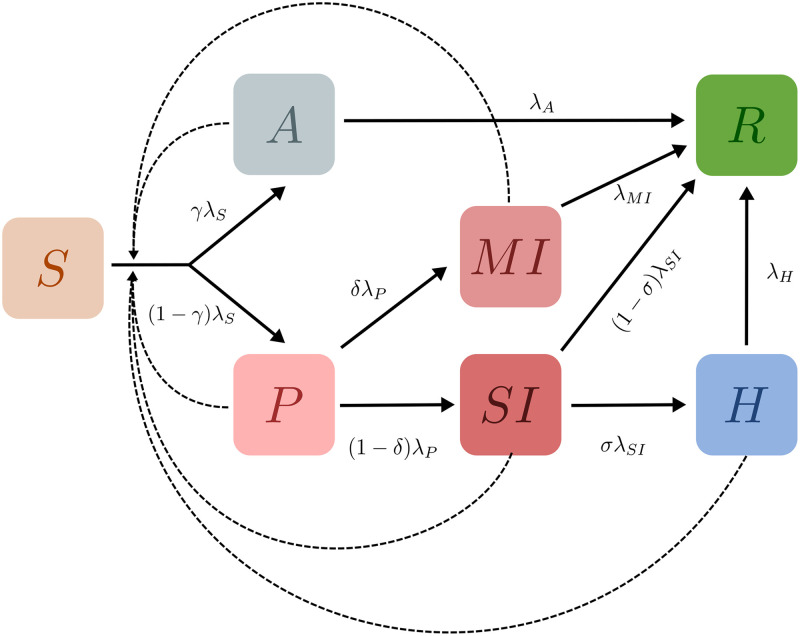
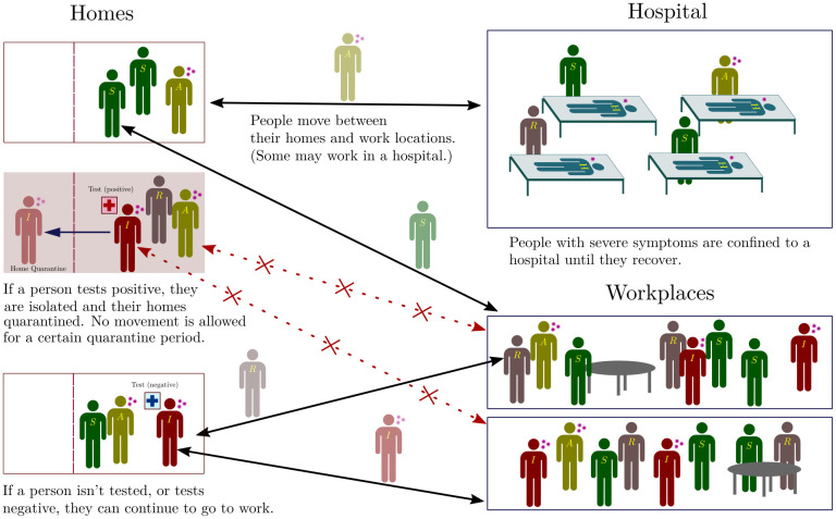
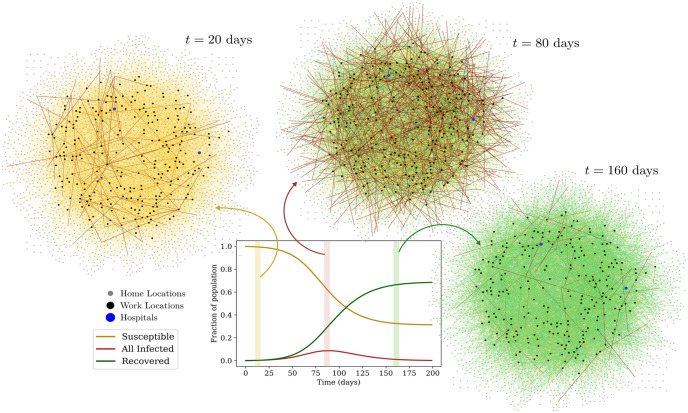
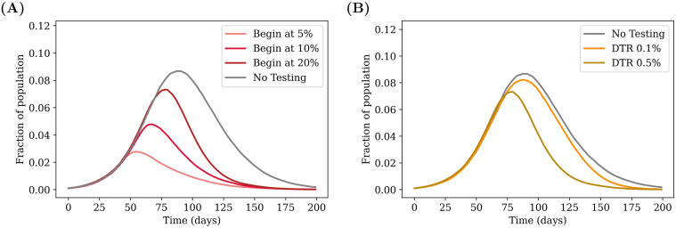
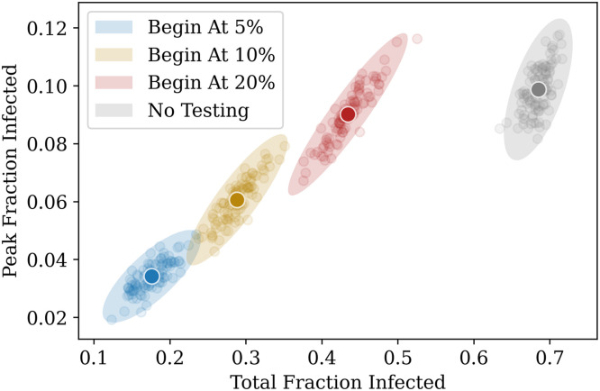
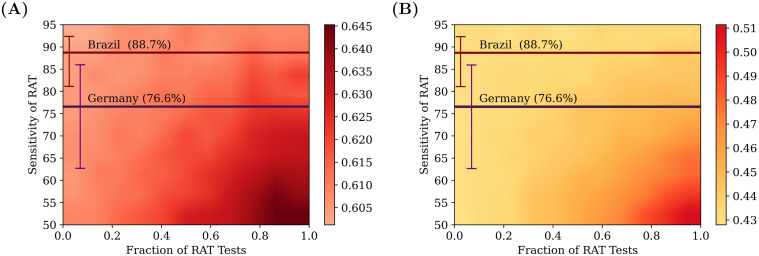
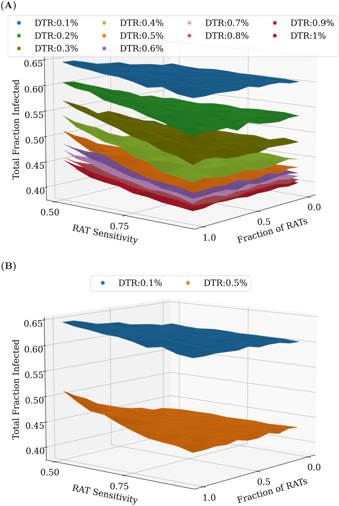
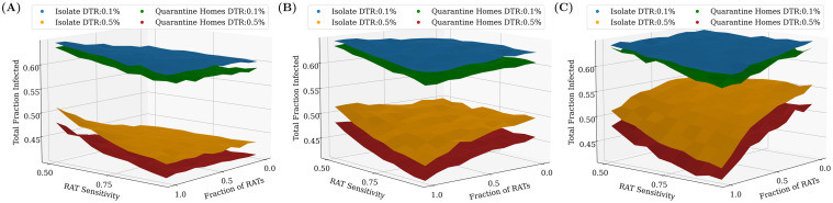
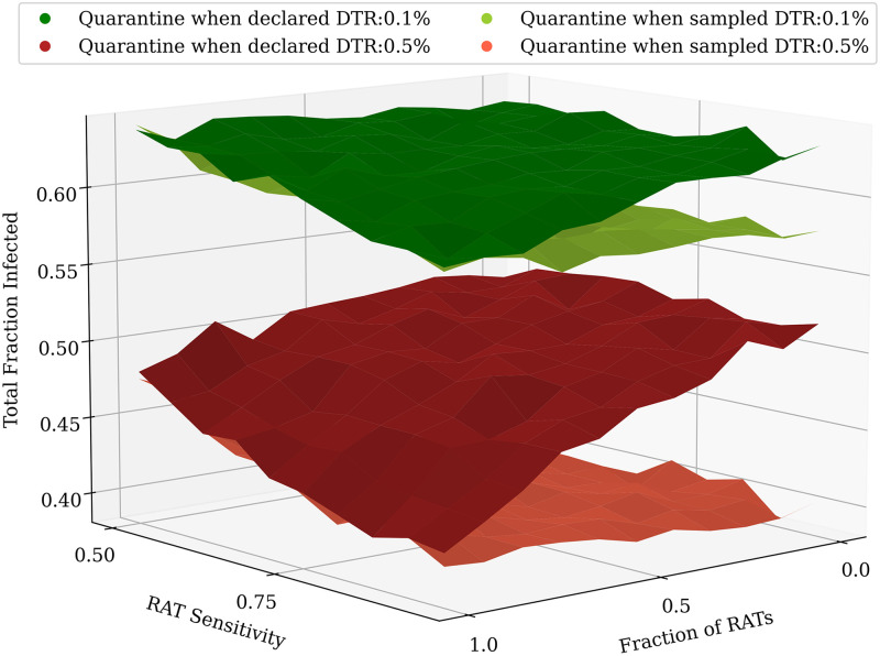
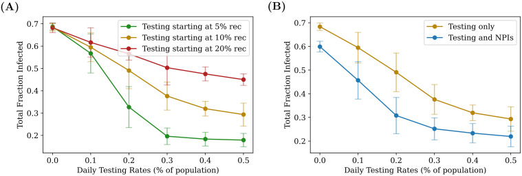
COVID-19 testing across India uses a mix of two types of tests. Rapid Antigen Tests (RATs) are relatively inexpensive point-of-care lateral-flow-assay tests, but they are also less sensitive. The reverse-transcriptase polymerase-chain-reaction (RT-PCR) test has close to 100% sensitivity and specificity in a laboratory setting, but delays in returning results, as well as increased costs relative to RATs, may vitiate this advantage. India-wide, about 49% of COVID-19 tests are RATs, but some Indian states, including the large states of Uttar Pradesh (pop. 227.9 million) and Bihar (pop. 121.3 million) use a much higher proportion of such tests. Here we show, using simulations based on epidemiological network models, that the judicious use of RATs can yield epidemiological outcomes comparable to those obtained through RT-PCR-based testing and isolation of positives, provided a few conditions are met. These are (a) that RAT test sensitivity is not too low, (b) that a reasonably large fraction of the population, of order 0.5% per day, can be tested, (c) that those testing positive are isolated for a sufficient duration, and that (d) testing is accompanied by other non-pharmaceutical interventions for increased effectiveness. We assess optimal testing regimes, taking into account test sensitivity and specificity, background seroprevalence and current test pricing. We find, surprisingly, that even 100% RAT test regimes should be acceptable, from both an epidemiological as well as a economic standpoint, provided the conditions outlined above are met.


Conflict of interest statement

The authors have declared that no competing interests exist.

Figures

Fig 1
Fig 1. Schematic of the epidemiological model.
Boxes show the 7 compartments of the model, i.e., the set of states that characterise each individual in the population. The compartments are (S)usceptible, (A)symptomatic, (P)resymptomatic, Mildly Infected (MI), Severely Infected (SI), (H)ospitalized, and (R)ecovered. Black arrows indicate possible transitions between states. The dotted lines indicate that the rate of infection of Susceptible individuals is an increasing function of the number of infected individuals they are in contact with. Recovered individuals are assumed to be immune to further infection.
Fig 2
Fig 2. Schematic of the network.
Individuals exist on a location network, consisting of homes and work places, connected by links along which people can move. For each individual there is a link between their home and their work place. Within each location, individuals can transition between the different infection states described in Fig 1. A subset of work places are designated as hospitals, where people are moved (and quarantined) when they transition from the SI to the H state. When they recover, they are moved back to their homes and can resume movement between their home and work. In addition, if a person tests positive they and their home are quarantined, with no movement being allowed out of the home for 14 days (we explore several variants of this protocol as described in subsequent sections).
Fig 3
Fig 3. Visualization of the network.
The plot shows the aggregate number of susceptible, infected (A + P + SI + MI + H) and recovered individuals across all locations as a function of time. In the three graphs, the nodes represent locations; the grey nodes are homes and the black nodes are work locations. Hospitals are represented by blue nodes. Individuals are represented by (undirected) links between a home and a work location. The color of these links represents their infection state: Yellow links represent susceptible individuals, while red links represent the infected across the infected compartments, and green links represent the recovered.
Fig 4
Fig 4. Effect of targeted testing.
(A) Comparing the effect of delays in starting testing. The daily testing rate is fixed at 0.5% of the population per day, but testing is started at different points during the infection, depending on the number of recovered individuals present in the population. The greatest advantage is obtained when testing is started earlier. (B) Varying the daily testing rate. Testing is started when 20% of the population has recovered from the disease, and the effects of different testing rates are compared. Higher testing rates reduce the value of the peak and push it earlier in the infection. The grey curves in both cases represent the case of no testing. All tests are PCR (sensitivity and specificity of 100%) with results declared immediately (zero delay), and individuals (but not family members) are isolated when a test is declared positive (see strategy (a) in Methods). The curves are obtained after averaging over 100 simulation runs.
Fig 5
Fig 5. Another representation of Fig 4A.
The daily test rate is fixed at 0.5% of the population per day, and testing is started at different fractions. The x–axis represents the total fraction who have contracted the illness by the end of the pandemic, and the y–axis represents the peak infected fraction. Each point represents the result of a single simulation. A total of 100 simulation runs of 200 days each were performed for each case. The ellipses are centered around the average point (highlighted) and their radii represent 3 standard deviations of the distribution across simulations.
Fig 6
Fig 6. Comparing different test mixtures.
Heatmaps comparing the effects of different test mixtures for two daily testing rates: 0.1% (left) and 0.5% (right), with testing starting when the recovered fraction reaches 20% of the population. The colours represent the total fraction of the population that had contracted the disease at some time. The x–axis represents the fraction of RAT tests in the testing mixture used, and the y–axis represents the test sensitivity of the RAT in the mixture. The horizontal lines represent the sensitivities of the SD Biosensor STANDARD Q COVID-19 Ag Test from surveys conducted in Germany and Brazil [46]. The specificity of the RAT is kept at 98%. At lower RAT sensitivities, there is a benefit of using a larger fraction of PCR tests, however as the RAT sensitivity is increased, this benefit is soon lost. The tests were assumed to have no delay between sampling and declaring of results; individuals who tested positive were confined to their homes and assumed to be ten-fold less infectious. However, homes were not quarantined, and other family members were allowed to move to work. 100 simulation runs of 200 days each were averaged over.
Fig 7
Fig 7. Comparing different test mixtures across a range of testing rates.
An increase in the overall daily testing rate causes a large decrease in the total fraction of infected. (A) shows the effect of varying testing rates between 0.1% and 1% of the population per day, while (B) only shows 0.1% and 0.5% daily testing rates (the same as in Fig 6). In most cases, even at RAT:PCR mixtures of 80:20, good results can be obtained. As before, the plots were obtained by averaging over 100 simulation runs of 200 days each.
Fig 8
Fig 8. Effects of PCR test delays and quarantining homes.
Testing is started when 20% of the population has recovered. (A) No PCR delay. Quarantining the home locations of the individuals in addition to isolating them at home is seen to have a small but not-insignificant benefit when there is no test delay. (B) 2 day PCR delay. When the PCR delay is increased to 2 days, the relative benefit of having PCR tests in the mixture is seen to disappear. (C) 5 day PCR delay. As the delay is further increased, the trend becomes clear: using even weak point-of-care RAT tests would be preferable to PCR tests with high delays. Additionally, when there are PCR delays, the benefit of increased testing is greatly diminished. In this case, however, the improvement that comes from quarantining of homes is much more significant at higher testing rates. As before, the plots were obtained by averaging over 100 simulation runs of 200 days each.
Fig 9
Fig 9. Effects of quarantining when the sample is taken.
Including a larger test delay of 5 days for PCR tests while keeping RAT as point-of-care tests diminishes the benefit of having more PCR tests in the mixture, even when their homes are quarantined, as shown in Fig 8C. However, a new quarantining strategy where all tested individuals and homes are quarantined upon taking the test sample until the result is declared can be used to make up for this. The results were found to be qualitatively similar for a delay of 2 days as well, although the relative benefit of quarantining individuals at home was slightly offset by the lower test delay. The plots were obtained after averaging over 100 simulation runs of 200 days each.
Fig 10
Fig 10. Relative benefits of different quarantining strategies.
Each point on the graphs represents the result of a single simulation run for an RAT:PCR ratio of 80:20, and an RAT sensitivity of 75%. The darker coloured points represent the centre of mass of the points, and the ellipse radii represent three standard deviations from the mean in each direction. Ideally, we would require the peak and the total infected fraction to both be as low as possible, and therefore results closer to the bottom-left are “better” than those closer to the top-right. The top panel represents the case for a daily testing rate of 0.1%, while the bottom panel represents 0.5% testing daily. The panels on the left represent tests which have no delay (the result is declared immediately), while those in the middle and on the right represent mixtures in which PCR tests have a 2 day and 5 day delay respectively (RAT results are obtained instantaneously). The three quarantining strategies (see Methods) are compared—we find that quarantining when the test sample is taken is the most effective strategy. 100 simulation runs were conducted for each strategy, for a duration of 200 days.
Fig 11
Fig 11. Daily Testing Rates required to attain a target total fraction infected of 50% for varying RAT sensitivity and fraction.
As expected, when the test sensitivity is low and the test mixture is pure RAT, the required daily testing rate is largest, since much more testing is needed to compensate for the poor sensitivity. As before, the data for the above plot was obtained from 100 simulation runs of 200 days each.
Fig 12
Fig 12. Cost benefit analysis of test mixtures.
Comparisons of the total daily cost, taking into account test sensitivity and fraction of RAT and PCR tests in mixture, as well as the daily testing rate in order to attain a target recovered fraction of 50% of the population. The daily cost is measured in units of the cost of a single RAT. (A) Cost (PCR/RAT) = 1.5. (B) Cost (PCR/RAT) = 2. (C) Cost (PCR/RAT) = 3. Clearly, in all of the above cases, the highest cost occurs when the RAT sensitivity is lowest (0.5). At this point, depending on the relative cost of PCR to RAT, it may be more advantageous to choose a pure PCR or a pure RAT mixture. The optimal mixture may then be decided using other parameters, for example the largest attainable daily testing rate. At higher RAT sensitivities, typically it would be cheaper to attain the same target fraction of infected using a pure RAT mixture, despite the higher daily testing rate that would require.
Fig 13
Fig 13. Synergy between NPIs and testing.
Comparing the effects of two different types of interventions, given an RAT sensitivity of 75%, and an RAT:PCR ratio of 80:20. On the left, the total number of people recovered is plotted as function of daily testing rate: for a later start, testing has a weaker effect, and there exists a “threshold” (here roughly 0.3%, for the green curve) beyond which diminishing returns are gained from increasing testing. On the right, testing with and without NPIs are compared, when the interventions are both turned on when 10% of the population have recovered. NPIs are assumed to bring about a global reduction of 8% in the transmission parameter λS. The fact that the two curves initially separate as daily testing rate is increased, shows that the two interventions act in synergy (see also S7 Appendix). As before, the plots were obtained by averaging over 100 simulation runs of 200 days each.

Similar articles

Cited by

References

    1. Worldometers. India Coronavirus: 10,245,276 Cases and 148,470 Deaths–Worldometer; 2020. Available from: https://www.worldometers.info/coronavirus/country/india/.
    1. Menon GI. The Novel Coronavirus Variants and India’s Uncertain Future; 2021. Available from: https://science.thewire.in/health/sars-cov-2-variants-b117-b1617-india-s....
    1. Murhekar MV, Bhatnagar T, Selvaraju S, Rade K, Saravanakumar V, Thangaraj JWV, et al.. Prevalence of SARS-CoV-2 infection in India: Findings from the national serosurvey, May-June 2020. Indian Journal of Medical Research. 2020;152(1):48. doi: 10.4103/ijmr.IJMR_3290_20 - DOI - PMC - PubMed
    1. Malani A, Shah D, Kang G, Lobo GN, Shastri J, Mohanan M, et al.. Seroprevalence of SARS-CoV-2 in slums and non-slums of Mumbai, India, during June 29-July 19, 2020. medRxiv. 2020; p. 2020.08.27.20182741.
    1. Delhi sero-survey results: Over 23% residents have coronavirus antibodies; 2020. Available from: https://www.livemint.com/news/india/delhi-sero-survey-results-over-23-re....

Publication types

Substances