. 2021 Sep 1;109(17):2740-2754.e12.
doi: 10.1016/j.neuron.2021.06.028. Epub 2021 Jul 21.

Bridging neuronal correlations and dimensionality reduction

Affiliations

Bridging neuronal correlations and dimensionality reduction

Akash Umakantha et al. Neuron. .

Abstract

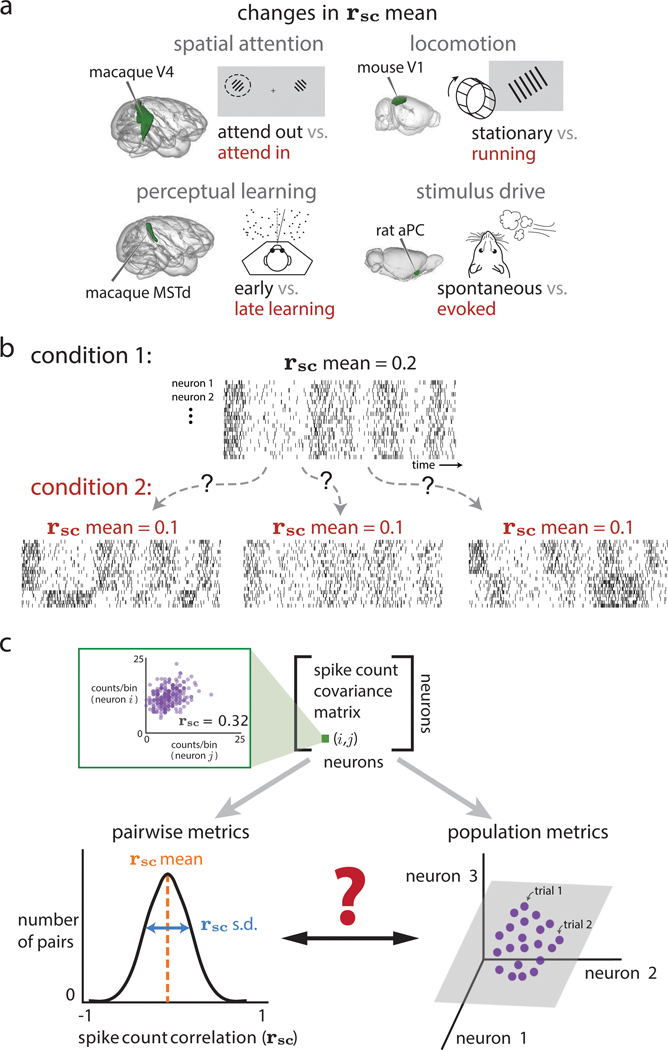
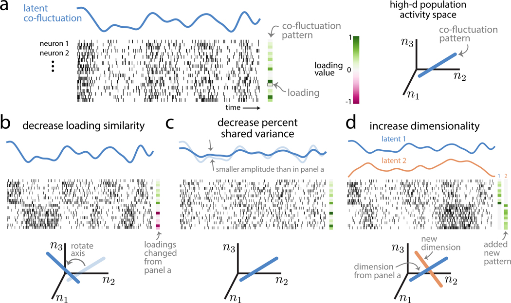
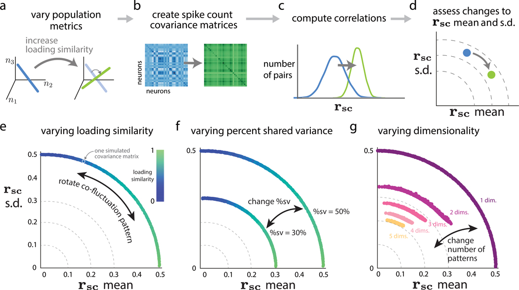
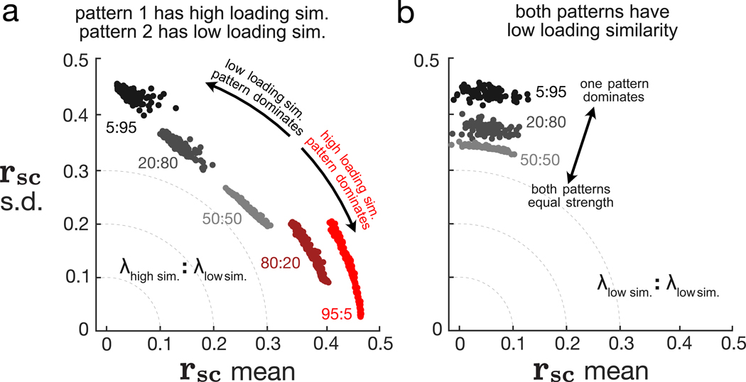
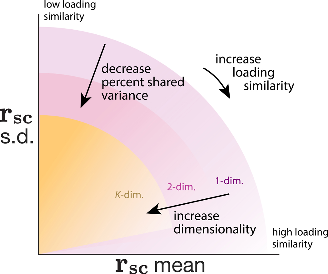
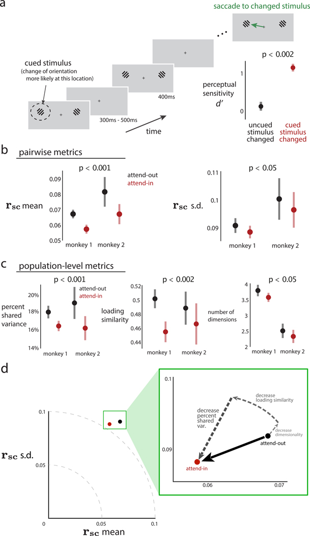
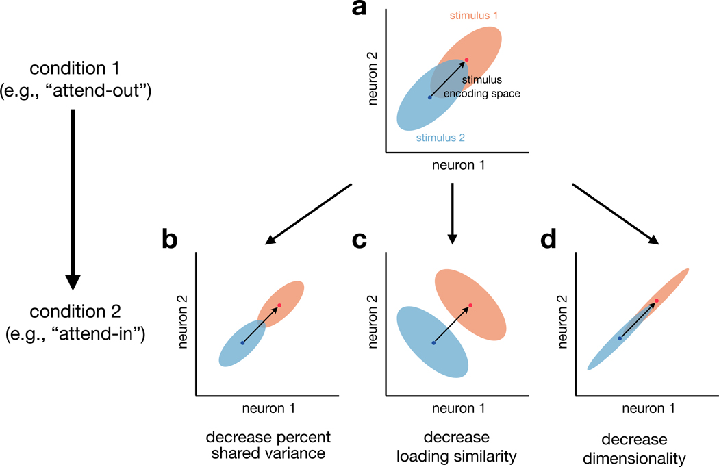
Two commonly used approaches to study interactions among neurons are spike count correlation, which describes pairs of neurons, and dimensionality reduction, applied to a population of neurons. Although both approaches have been used to study trial-to-trial neuronal variability correlated among neurons, they are often used in isolation and have not been directly related. We first established concrete mathematical and empirical relationships between pairwise correlation and metrics of population-wide covariability based on dimensionality reduction. Applying these insights to macaque V4 population recordings, we found that the previously reported decrease in mean pairwise correlation associated with attention stemmed from three distinct changes in population-wide covariability. Overall, our work builds the intuition and formalism to bridge between pairwise correlation and population-wide covariability and presents a cautionary tale about the inferences one can make about population activity by using a single statistic, whether it be mean pairwise correlation or dimensionality.

Keywords: dimensionality reduction; neuronal population; spatial attention; spike count correlation; visual area V4.


Conflict of interest statement

Declaration of interests The authors declare no competing interests.

Figures

Figure 1.
Figure 1.. How do spike count correlations between pairs of neurons (i.e., pairwise metrics) relate to how the entire population co-fluctuates (i.e., population metrics)?
(A) Four example experiments in which mean spike-count correlation (rsc mean) has been observed to change between experimental conditions. These include spatial attention (macaque visual area V4; Cohen and Maunsell, 2009; Mitchell et al., 2009; Gregoriou et al., 2014; Luo and Maunsell, 2015; Snyder et al., 2018), perceptual learning (macaque dorsal medial superior temporal area; Gu et al., 2011), locomotion (mouse visual area V1; Erisken et al., 2014), and stimulus drive (rat anterior piriform cortex; Miura et al., 2012). (B) The same change in rsc mean (from 0.2 to 0.1 between conditions 1 and 2) could correspond to multiple distinct changes in the activity of the population of neurons. Condition 2, left: a decrease in rsc mean could correspond to some neurons becoming anti-correlated with others in the population; in this case, some neurons that were previously positively correlated are now anti-correlated with the rest of the population (bottom rows of raster plot). Condition 2, middle: a decrease in rsc mean could correspond to a decrease in how strongly neurons co-fluctuate together; in this case, neurons covary as in condition 1, but each neuron does not co-fluctuate with other neurons as strongly. Condition 2, right: a decrease in rsc mean could correspond to the introduction of another “mode” of covariation (i.e., an increase in the dimensionality of population activity); in this case, neurons in the top half of the raster covary as in condition 1, but neurons in the bottom half of the raster covary in a manner independent from those in the top half. (C) Pairwise (rsc) and population (dimensionality reduction) metrics both arise from the same spike count covariance matrix, but the precise relationship between these two sets of metrics remains unknown. Top row: each element of the spike count covariance matrix corresponds to the covariance across responses to repeated presentations of the same stimulus for two simultaneously recorded neurons (e.g., neurons i and j, left inset). Bottom row: pairwise metrics (left) typically summarize the distribution of spike count correlation with the mean (rsc mean); in this work, we propose additionally reporting the standard deviation (rsc SD). Population metrics (right) of the spike count covariance matrix are identified by applying dimensionality reduction to the population activity (e.g., gray plane depicts a low-dimensional space describing how neurons covary; see also Figure S5). By understanding the relationship between pairwise and population metrics, we can better interpret how changes in pairwise statistics (e.g., experiments in A) correspond to changes in population metrics and vice versa.
Figure 2.
Figure 2.. Intuition about population metrics: loading similarity, percent shared variance (%sv), and dimensionality
(A) Population activity (where each row is the spike train for one neuron over time; simulated data) is characterized by a latent co-fluctuation (blue) and a co-fluctuation pattern made up of loadings (green rectangles). Each neuron’s time-varying firing rate is a product of the latent co-fluctuation and that neuron’s loading (which may either be positive or negative). One may also view population activity through the lens of the population activity space (right plot), where each axis represents the activity of one neuron (n1; n2; n3 represent neuron 1, neuron 2, and neuron 3). In this space, a co-fluctuation pattern corresponds to an axis whose orientation depends on the pattern’s loadings (right plot, blue line). (B) Population activity with a lower loading similarity than in (A). The loadings have both positive and negative values (i.e., dissimilar loadings), leading to neurons that are anti-correlated (compare top rows with bottom rows of population activity). Changing the loading similarity will rotate a pattern’s axis in the population activity space (bottom plot, “rotate axis”). (C) Population activity with a lower %sv than in (A). The latent co-fluctuation shows smaller amplitude changes over time than in (A), which leads to a lower %sv. Changing %sv leads to no changes of the co-fluctuation pattern (bottom plot, axis is same as that in A). (D) Population activity with a dimensionality of 2, compared to a dimensionality of 1 in (A). Adding a new dimension leads to a new latent co-fluctuation (orange line) and a new co-fluctuation pattern (“added new pattern”). Each neuron’s time-varying firing rate is expressed as a weighted combination of the latent co-fluctuations, where the weights correspond to the neuron’s loadings in each co-fluctuation pattern. Here, each dimension corresponds to a distinct subset of neurons (top rows versus bottom rows); in general, this need not be the case, as each neuron typically has non-zero weights for both dimensions. In the population activity space (bottom plot), the activity varies along the two axes (i.e., a 2D plane) defined by the two co-fluctuation patterns. See also Figure S5. The spike trains shown in this figure were created for the sole purpose of illustrating the population metrics in this figure and were not used in subsequent analyses. The spike trains were generated by first creating latent co-fluctuations using Gaussian processes. These latent co-fluctuations were then linearly combined using loading weights (drawn from a standard normal distribution), yielding a time-varying firing rate for each neuron. Spike trains were generated according to an inhomogeneous Bernoulli process based on the time-varying firing rates. The intended duration of each spike train plotted is around 10 s.
Figure 3.
Figure 3.. Relationship between population metrics and pairwise metrics
(A–D) The simulation procedure to assess how systematic changes in population metrics lead to changes in pairwise metrics. (A) We first systematically varied one of the population metrics while keeping the others fixed. For example, we can increase the loading similarity from a low value (left, blue) to a high value (right, green), while keeping %sv and dimensionality fixed. (B) Then, we constructed covariance matrices corresponding to each value of the population metric in (A) (see STAR Methods), without generating synthetic data. (C) For each covariance matrix from (B), we directly computed the correlations (i.e., the rsc distributions). (D) We computed rsc mean and rsc SD from the rsc distributions in (C) and then assessed how the change in a given population metric from (A) changed pairwise metrics. In this case, the increase in loading similarity increased rsc mean and decreased rsc SD (blue dot to green dot). (E) Varying loading similarity with a fixed %sv of 50% and dimensionality of 1. Each dot corresponds to the rsc mean and rsc SD of one simulated covariance matrix with specified population metrics (dots are close together and appear to form a continuum). The color of each dot corresponds to the loading similarity (see STAR Methods), where a value of 1 indicates that all loading weights have the same value. (F) Varying %sv. The same setting as in (E), except we consider two different values of percent shared variance (50% and 30%). (G) Varying dimensionality (i.e., number of co-fluctuation patterns) while sweeping loading similarity between 0 and 1 and keeping %sv fixed at 50%. In this simulation, the relative strengths of each dimension uniform across dimensions (i.e., flat eigenspectra; see STAR Methods). See also Figure S7.
Figure 4.
Figure 4.. Relative strengths of dimensions affect rsc distributions
With dimensionality of 2, we systematically varied the relative strengths of the two dimensions with a fixed total %sv of 50%. We considered two scenarios: (1) one dimension has high loading similarity and the other dimension has low loading similarity (A) and (2) both dimensions have low loading similarity (B). Each dot represents one simulated covariance matrix and rsc distribution. The colors of the dots indicate different relative strengths between the two dimensions, and numbers next to each cloud of dots indicate the ratio between the relative strength associated with each dimension. For example, in (A), red dots correspond to the high loading similarity dimension being 19 times stronger (95:5) than the low loading similarity dimension. Black dots correspond to the low loading similarity dimension being 19 times stronger (5:95) than the high loading similarity dimension. In (B), because both patterns have low loading similarity, clouds for 80:20 and 95:5 are very similar to clouds for 20:80 and 5:95, respectively, and are thus omitted for clarity. See also Figure S1.
Figure 5.
Figure 5.. Summary of relationship between pairwise and population metrics
A change in rsc mean and rsc SD may correspond to changes in loading similarity, %sv, dimensionality, or a combination of the three. Shaded regions indicate the possible rsc mean and rsc SD values for different dimensionalities; increasing dimensionality tends to decrease rsc mean and rsc SD (shaded regions for larger dimensionalities become smaller). Within each shaded region, decreasing %sv decreases both rsc mean and SD radially toward the origin. Finally, rotating co-fluctuation patterns such that the loadings are more similar (going from low to high loading similarity) results in moving clockwise along an arc such that rsc mean increases and rsc SD decreases. We also note two subtle trends. First, there are more possibilities for loading similarity to be low than high (Math Note E), suggesting that rsc SD will generally tend to be larger than rsc mean if neuronal activity varied along a randomly chosen co-fluctuation pattern (shading within each region is darker near the vertical axis than the horizontal axis). Second, this effect becomes exaggerated for higher dimensional neuronal activity, as many dimensions can have low loading similarity but only one dimension can have high loading similarity (Math Note E). Thus, it becomes progressively unlikely for rsc SD to be 0 as dimensionality increases (shaded regions for larger dimensionalities lifted off the horizontal axis).
Figure 6.
Figure 6.. An observed decrease in rsc mean of macaque V4 neurons during a spatial attention task corresponds to changes in multiple population metrics
(A) Experimental task design. On each trial, monkeys maintained fixation while Gabor stimuli were presented for 400 ms (with 300–500 ms in between presentations). When one of the stimuli changed orientation, animals were required to saccade to the changed stimulus to obtain a reward. At the beginning of a block of trials, we performed an attentional manipulation by cuing animals to the location of the stimulus that was more likely to change for that block (dashed circle denotes the cued stimulus and was not presented on the screen). The cued location alternated between blocks. Animals were more likely to detect a change in stimulus at cued rather than uncued locations (inset in bottom right, p < 0.002 for both animals; data for monkey 1 are shown). During this task, we recorded activity from V4 neurons whose receptive fields (RFs) overlapped with one of the stimulus locations. (B) rsc mean (left panel) and rsc SD (right panel) across recording sessions for two animals. Black denotes “attend-out” trials (i.e., the cued location was outside the recorded V4 neurons’ RFs), and red denotes “attend-in” trials (i.e., the cued location was inside the RFs). Data were pooled across both animals to compute p values reported in titles for comparison of attend-out (black) and attend-in (red). For individual animals, rsc mean was lower for attend-in than attend-out (p < 0.001 for each animal). rsc SD was also lower for attend-in than attend-out (p < 0.05 for monkey 1 and p = 0.148 for monkey 2). (C) Population metrics identified across recording sessions for two animals (same data as in B). Black denotes attend-in trials; red denotes attend-out trials. Data were again pooled across animals to compute p values reported in titles for comparing attend-out and attend-in. %sv was lower for attend-in than attend-out (p < 0.001 for monkey 1 and p < 0.02 for monkey 2). Loading similarity was lower for attend-in than attend-out (p < 0.001 for monkey 1 and p = 0.162 for monkey 2). Dimensionality was lower for attend-in than attend-out (p = 0.113 for monkey 1 and p = 0.174 for monkey 2). In (A)–(C), dots indicate means and error bars indicate 1 SEM, both computed across recording sessions. See also Figure S2. (D) Summary of the real data results. Attention decreases both rsc mean and rsc SD (black dot to red dot). These decreases in pairwise metrics correspond to a combination of decreases in %sv, loading similarity, and dimensionality (dashed arrows). See also Figures S3, S4, and S6.
Figure 7.
Figure 7.. Population metrics and information coding
For illustrative purposes, we consider the responses of two neurons to two different stimuli. (A) In “condition 1” (e.g., attend-out in our V4 analyses), the two neurons have positively correlated trial-to-trial variability (blue and orange clouds each have positive correlation) and a stimulus encoding space (black arrow) defined by the span of the trial-averaged responses (blue and orange dots). Then, we consider how changes in trial-to-trial neuronal variability (i.e., shapes of the clouds) from one experimental condition to another (e.g., spatial attention) can influence decoding of the two stimuli. For simplicity, we construct examples in which the stimulus encoding space remains constant between the two conditions. We illustrate here the changes in population metrics that we observed in our V4 data (Figure 6D). (B) First, a decrease in percent shared variance (both clouds are smaller in size) results in more accurate decoding of the population responses to the two stimuli (the blue and orange ellipses are less overlapping here than in A). (C) Second, a decrease in the loading similarity of the strongest dimension (both clouds have been rotated to have negative correlation) also leads to an improvement in decoding performance. In this case, the improvement stems from the fact the stimulus encoding space (black arrow) and the strongest dimension of trial-to-trial variability (negative correlation) are misaligned (Averbeck et al., 2006; Moreno-Bote et al., 2014; Ruff and Cohen, 2019a). (D) Third, a decrease in dimensionality (the less dominant dimension has been squashed for both clouds) could either improve or have no impact on decoding performance. Here, the dimension that was squashed (negative correlation direction) was orthogonal to the stimulus encoding dimension (black arrow), leading to no impact on decoding performance. In general, all else being equal, higher dimensional trial-to-trial variability (distinct from high-d signal; Rigotti et al., 2013) is more likely to overlap with stimulus encoding dimensions and thus limit the amount of information encoded.

References

    1. Abbott LF, and Dayan P. (1999). The effect of correlated variability on the accuracy of a population code. Neural Comput. 11, 91–101. - PubMed
    1. Adibi M, McDonald JS, Clifford CW, and Arabzadeh E. (2013). Adaptation improves neural coding efficiency despite increasing correlations in variability. J. Neurosci 33, 2108–2120. - PMC - PubMed
    1. Ahrens MB, Li JM, Orger MB, Robson DN, Schier AF, Engert F, and Portugues R. (2012). Brain-wide neuronal dynamics during motor adaptation in zebrafish. Nature 485, 471–477. - PMC - PubMed
    1. Ahrens MB, Orger MB, Robson DN, Li JM, and Keller PJ (2013). Whole-brain functional imaging at cellular resolution using light-sheet microscopy. Nat. Methods 10, 413–420. - PubMed
    1. Ames KC, and Churchland MM (2019). Motor cortex signals for each arm are mixed across hemispheres and neurons yet partitioned within the population response. eLife 8, e46159. - PMC - PubMed

Publication types

LinkOut - more resources