. 2021 Jul 7;8(7):210506.
doi: 10.1098/rsos.210506. eCollection 2021 Jul.

June: open-source individual-based epidemiology simulation

Affiliations

June: open-source individual-based epidemiology simulation

Joseph Aylett-Bullock et al. R Soc Open Sci. .

Abstract

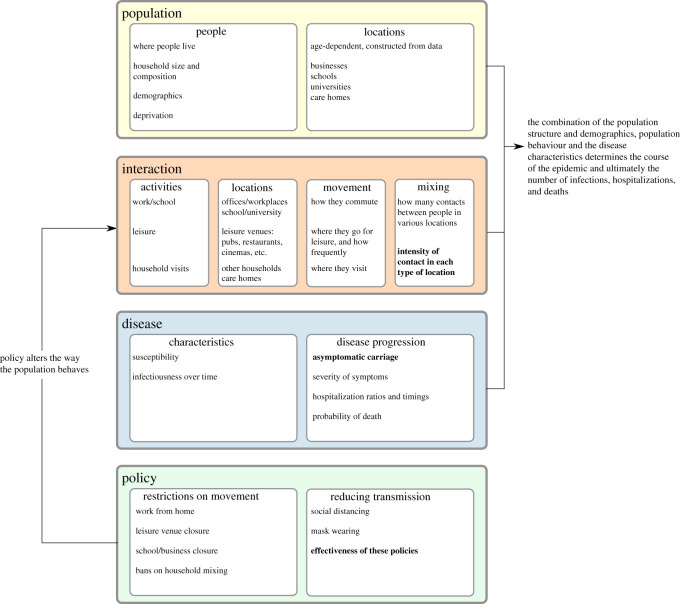
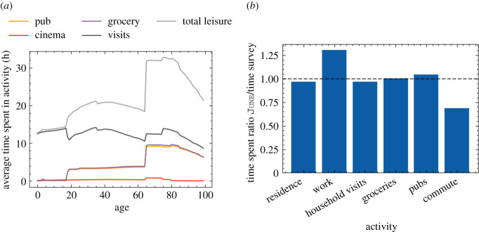
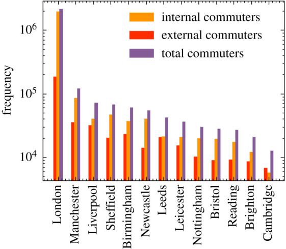
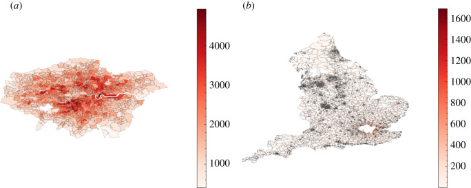
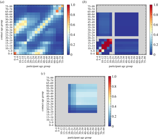
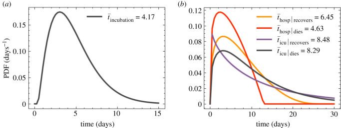
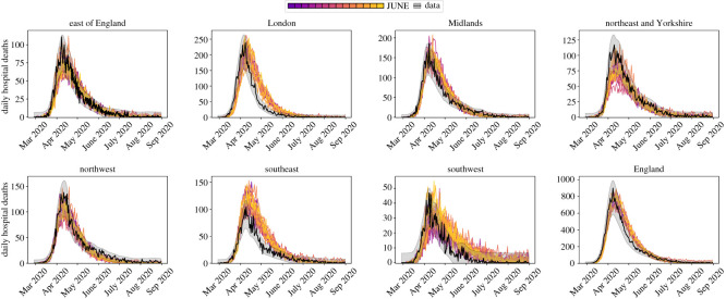
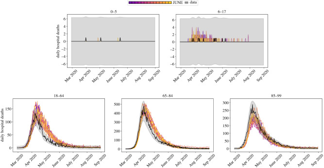
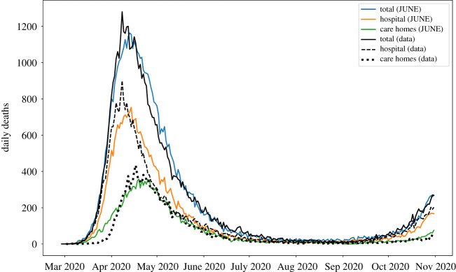
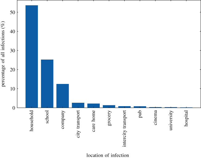
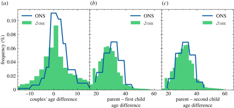
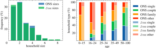
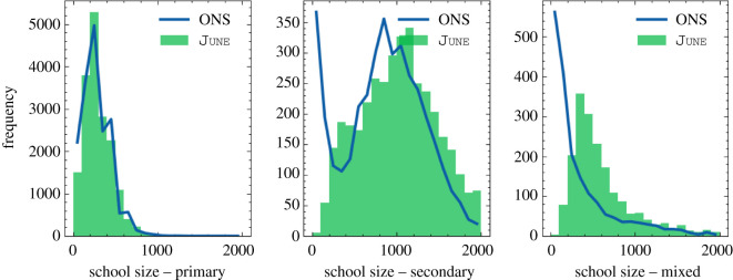
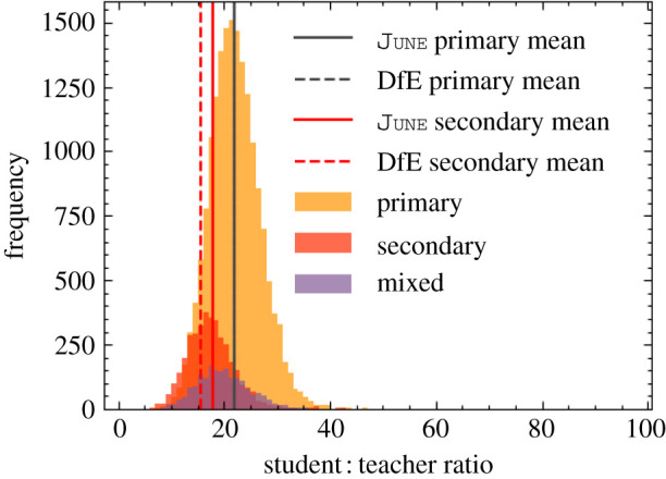
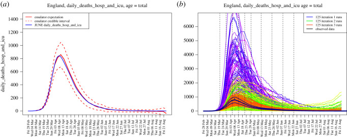
We introduce June, an open-source framework for the detailed simulation of epidemics on the basis of social interactions in a virtual population constructed from geographically granular census data, reflecting age, sex, ethnicity and socio-economic indicators. Interactions between individuals are modelled in groups of various sizes and properties, such as households, schools and workplaces, and other social activities using social mixing matrices. June provides a suite of flexible parametrizations that describe infectious diseases, how they are transmitted and affect contaminated individuals. In this paper, we apply June to the specific case of modelling the spread of COVID-19 in England. We discuss the quality of initial model outputs which reproduce reported hospital admission and mortality statistics at national and regional levels as well as by age strata.

Keywords: individual-based model; infectious disease; simulation.


Figures

Figure 1.
Figure 1.
Overview of the structure of June. Fitted parameters are shown in bold.
Figure 2.
Figure 2.
Graphical representation of how the census data for England are structured, from the level of local authority districts (LAD), down to the level of output areas (OA), with middle layer super output area (MSOA) in between.
Figure 3.
Figure 3.
Age profiles in different regions of England, taken from the ONS database and implemented in June.
Figure 4.
Figure 4.
A geographical visualization of the location of student residences in Durham in June, with the university location represented as a red star in the middle. Output areas are colour-coded according to the fraction of students they host. Note that the large southern area is where most of the university accommodation blocks are located.
Figure 5.
Figure 5.
Number of workers by sex and company sector (denoted by SIC code identifiers, see table 1) in June.
Figure 6.
Figure 6.
Leisure activities in June. (a) Time spent in leisure by age in June. (b) Comparison of the fraction of time spent in different activities in June and the time survey.
Figure 7.
Figure 7.
Number of internal and external commuters by city as modelled in June.
Figure 8.
Figure 8.
Commuting maps for London as derived from June. Any visible super area (MSOA) which is not completely white has at least one commuter from that location. (a) Number of internal commuters in London. (b) Number of external commuters in London.
Figure 9.
Figure 9.
Social contact matrices for England derived from June, before any mitigation strategies are implemented. Colour bars show (average) number of contacts in social settings between age groups, with all colour scales truncated at one to show differences between settings, while still clearly showing the structure in the matrices. (a) Household, (b) school, (c) company.
Figure 10.
Figure 10.
Time-dependent infectiousness profile, fI(t′), shown for the same realization of the infection but where the infected person is symptomatic or asymptomatic.
Figure 11.
Figure 11.
Pathways for the infection progression and possible outcomes. Note that in our model a patient can only go to the intensive care once, and that a patient that returns from the intensive care to the hospital will survive.
Figure 12.
Figure 12.
IFR comparison of June with various estimates of community transmission. Error bars show 95% CI on the IFRs as estimated from data. (a) IFR comparison of June with [54], (b) IFR comparison of June with [42].
Figure 13.
Figure 13.
Rates of different infection outcomes for males and females living in households and care homes. For care home residents, we only show the rates for people aged over 50, as the younger ones are assumed to follow the general population rates.
Figure 14.
Figure 14.
Probability density functions for symptom and progression timing. (a) Time taken for an infected individual to develop symptom. (b) Time spent in hospital by patients given their infection.
Figure 15.
Figure 15.
Example scenario of different intensity parameters, β(L,g), over time normalized to unity (see equation (5.1)). The parameters change due to the effects of compliance with social distancing and mask wearing advice and regulations.
Figure 16.
Figure 16.
School attendance in June compared with data collected by the UK’s Department for Education [67].
Figure 17.
Figure 17.
Year-on-year restaurant attendance from OpenTable [68] including a fit to the simulated reopening change in probabilities used to derive the probability that people attend restaurants in June.
Figure 18.
Figure 18.
Daily hospital deaths for each region in England, and England itself, for 14 realizations of June as described in this section. Each realization is illustrated as a separate colour for visibility. Observed data in black with 3 s.d. error bands. Data from CPNS [72].
Figure 19.
Figure 19.
Daily hospital deaths in England stratified by age, for the same realizations as in figure 18. Observed data in black with 3 s.d. error bands. Data from CPNS [72].
Figure 20.
Figure 20.
Deaths in England illustrated as different lines for total deaths, hospital deaths and deaths within care homes. Note that the total curve is the sum of hospital deaths and residence deaths (care homes as plotted, and usual households which are not plotted). Data from ONS [43].
Figure 21.
Figure 21.
Locations where infections take place in one realization of June from figure 18. This is a simple illustrative example of the type of analysis that you can carry out using the detailed outputs of June.
Figure 22.
Figure 22.
Two-dimensional projections of the 18-dimensional input space, for the 12 most interesting input parameters, coloured by the optical depth of the non-implausible region, which gives the depth or thickness of the non-implausible region conditioned on the two given inputs [81]. The ranges for each parameter are given below the parameter name in the diagonal panels. These plots are formed from 500 000 emulator evaluations over the input space. The emulators were trained on three iterations of 125 June model evaluations.
Figure 23.
Figure 23.
Distributions of age differences between partners (a), between parents and their first (b) and second child (c): outputs of June compared with the input data from the ONS database.
Figure 24.
Figure 24.
Comparisons between outputs of June and data from the ONS database for all England. (a) Household sizes, (b) household composition by age.
Figure 25.
Figure 25.
Distribution of school sizes comparing the June simulation with data.
Figure 26.
Figure 26.
Distribution of student to teacher ratios for primary schools, secondary schools and mixed schools.
Figure 27.
Figure 27.
Distance travelled to work by sex according to June. Here we see that men are more likely to travel further to work then women. This is in broad agreement with data presented in [30].
Figure 28.
Figure 28.
(a) An example diagnostic showing the emulator prediction ED(fi(x)) for fi(x) across several time points (the solid red line) and the prediction interval ED(fi(x))±3VarD(fi(x)) (the red dashed lines) along with the held out smoothed run output f(x) (the blue line). The emulator captures the behaviour of the June model well. (b) Daily hospital deaths for all of England, showing the progression of the runs from iterations 1, 2 and 3 used in the history matching process (in purple, green and red respectively). Observed data (smoothed and original) in black. Vertical dashed lines: emulated outputs.

References

    1. Russell RE, Katz RA, Richgels K, Walsh DP, Grant E. 2017. A framework for modeling emerging diseases to inform management. Emerg. Infect. Dis. 23, 1-6. ( 10.3201/eid2301.161452) - DOI - PMC - PubMed
    1. Brandon N, Dionisio KL, Isaacs K, Tornero-Velez R, Kapraun D, Setzer RW, Price PS. 2018. Simulating exposure-related behaviors using agent-based models embedded with needs-based artificial intelligence. J. Expo. Sci. Environ. Epidemiol. 30, 184-193. ( 10.1038/s41370-018-0052-y) - DOI - PMC - PubMed
    1. Auchincloss AH, Gebreab SY, Mair C, Diez Roux AV. 2012. A review of spatial methods in epidemiology, 2000–2010. Annu. Rev. Public Health 33, 107-122. ( 10.1146/annurev-publhealth-031811-124655) - DOI - PMC - PubMed
    1. El-Sayed AM, Scarborough P, Seemann L, Galea S. 2012. Social network analysis and agent-based modeling in social epidemiology. Epidemiol. Perspect. Innov. 9, 1. ( 10.1186/1742-5573-9-1) - DOI - PMC - PubMed
    1. Rockett RJ et al. 2020. Revealing COVID-19 transmission in Australia by SARS-CoV-2 genome sequencing and agent-based modeling. Nat. Med. 26, 1398-1404. ( 10.1038/s41591-020-1000-7) - DOI - PubMed