. 2021 Jul 27:10:e65128.
doi: 10.7554/eLife.65128.

Perception of microstimulation frequency in human somatosensory cortex

Affiliations

Perception of microstimulation frequency in human somatosensory cortex

Christopher L Hughes et al. Elife. .

Abstract

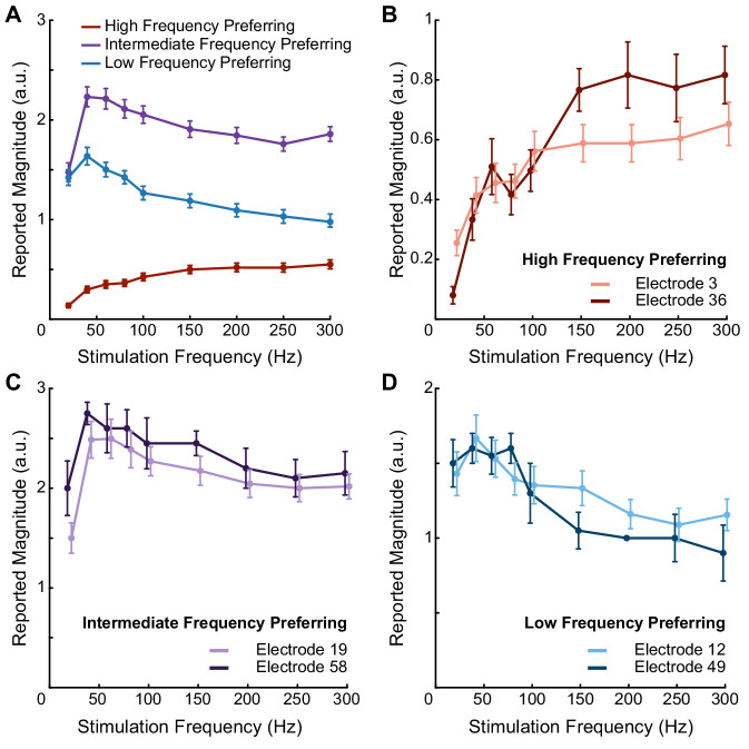
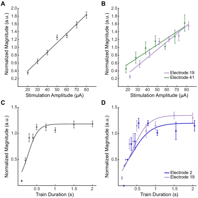
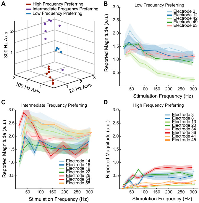
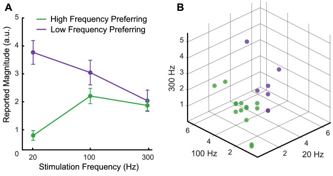
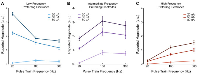
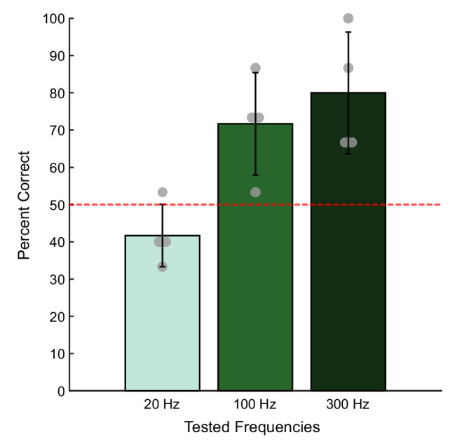
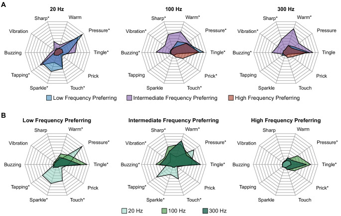
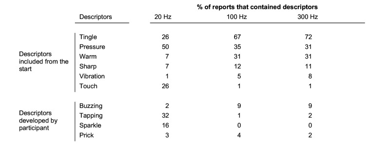
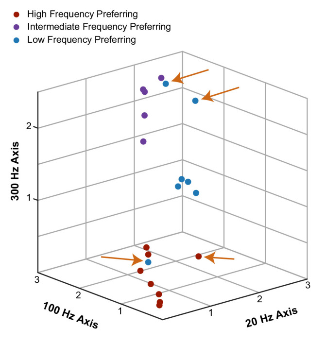
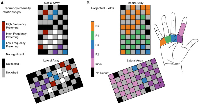
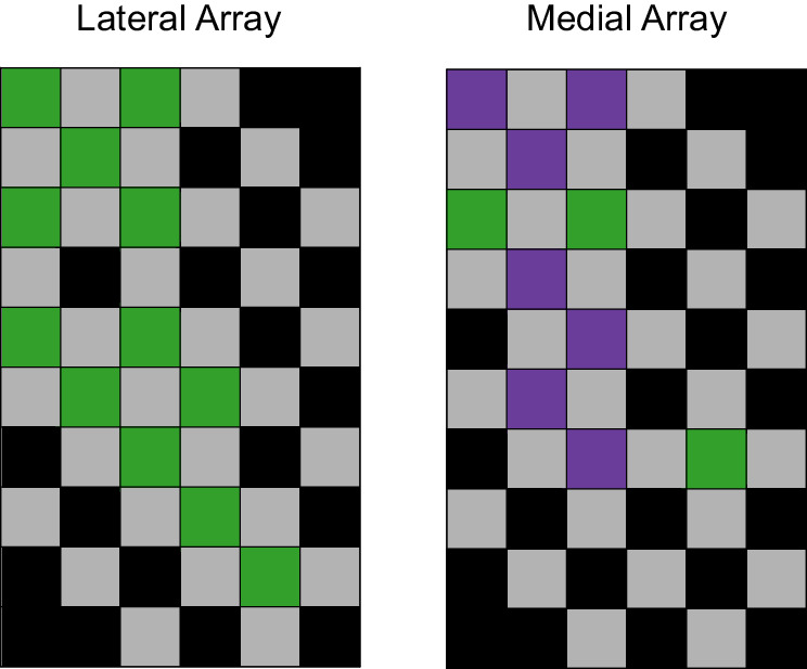
Microstimulation in the somatosensory cortex can evoke artificial tactile percepts and can be incorporated into bidirectional brain-computer interfaces (BCIs) to restore function after injury or disease. However, little is known about how stimulation parameters themselves affect perception. Here, we stimulated through microelectrode arrays implanted in the somatosensory cortex of two human participants with cervical spinal cord injury and varied the stimulus amplitude, frequency, and train duration. Increasing the amplitude and train duration increased the perceived intensity on all tested electrodes. Surprisingly, we found that increasing the frequency evoked more intense percepts on some electrodes but evoked less-intense percepts on other electrodes. These different frequency-intensity relationships were divided into three groups, which also evoked distinct percept qualities at different stimulus frequencies. Neighboring electrode sites were more likely to belong to the same group. These results support the idea that stimulation frequency directly controls tactile perception and that these different percepts may be related to the organization of somatosensory cortex, which will facilitate principled development of stimulation strategies for bidirectional BCIs.

Keywords: brain-computer interfaces; human; intracortical microstimulation; neuroscience; sensory feedback; somatosensory cortex.


Conflict of interest statement

CH, SF, JW, MB, JC, RG No competing interests declared

Figures

Figure 1.
Figure 1.. Pulse frequency drives electrode-specific changes in intensity which can be grouped into three categories.
(A) Perceived intensity for each aggregated frequency preference group. Different colors represent different categories. Each data point shows the mean intensity response of all of the electrodes in a given category. (B) Perceived intensity for two examples of high-frequency preferring electrodes that evoked the most intense percepts at the highest pulse frequencies and that generated the least intense percepts overall. (C) Perceived intensity for two examples of intermediate-frequency preferring electrodes that generated the most intense overall percepts, which occurred between 40 Hz and 100 Hz. (D) Perceived intensity for two examples of low-frequency preferring electrodes, which generated intermediate overall intensities that were maximized between 20 and 100 Hz. Error bars represent the standard error. The points are connected with piecewise fits. Axes are scaled differently between panels for clarity.
Figure 1—figure supplement 1.
Figure 1—figure supplement 1.. Increases in current amplitude and train duration consistently drive increases in perceived intensity.
(A, B) Normalized intensity as a function of current amplitude for all nine tested electrodes (A), and for two individual electrodes (B). The data were fit with a linear function. (C, D) Normalized intensity as a function of train duration for all four tested electrodes (C) and two individual electrodes (D). The data were fit with a logistic function. In all panels, data points are the median-reported intensity at each stimulus parameter. Samples were normalized to the median intensity value for each test. Error bars show the standard error. Note that the Y-axes are scaled differently for each panel for clarity. Colors represent different electrodes as indicated by the legends. Data points for individual electrodes are jittered slightly on the x-axis for visualization.
Figure 1—figure supplement 2.
Figure 1—figure supplement 2.. Electrodes divide into three categories based on their frequency–intensity relationships.
(A) K-means clustering of individual electrodes based on intensity responses at 20, 100, and 300 Hz. Individual data points are the median intensities at each frequency across all repetitions. (B–D) Perceived intensity responses at different frequencies for all electrodes classified as low-frequency preferring (B), intermediate-frequency preferring (C), and high-frequency preferring (D). Shaded regions show the smoothed standard error for each electrode.
Figure 1—figure supplement 3.
Figure 1—figure supplement 3.. Electrodes maintain same frequency–intensity relationships over time.
Plots of magnitude estimation results on all electrodes tested three or more times. Each set of points and the corresponding fit indicate a single post-implant date, as indicated in the legend. Data from each test session were normalized by the median intensity. Different colors show different post-implant dates in each plot as indicated by the legend. Shaded regions show the smoothed standard error.
Figure 1—figure supplement 4.
Figure 1—figure supplement 4.. Electrode-specific frequency–intensity relationships and spatial clustering generalize to a second participant.
(A) The mean intensity response across two frequency preference groups. Each data point represents the mean intensity response at the given frequency. The error bars represent the standard error of the mean. The points are connected with piecewise fits. (B) K-means clustering of individual electrodes based on intensity responses at 20, 100, and 300 Hz. Individual data points are the median intensities at each frequency across all repetitions. Some points may overlap due to having the same median intensities.
Figure 2.
Figure 2.. Stimulus current amplitude does not change the relationship between pulse frequency and intensity at suprathreshold amplitudes.
Magnitude estimation data for different current amplitudes and pulse frequencies. Data were aggregated across electrodes by their category, where each plot shows a different category of electrodes. Perceived intensity values for (A) LFP electrodes, (B) IFP electrodes, and (C) HFP electrodes at different current amplitudes and pulse frequencies. Different colored bars represent different current amplitudes. Error bars indicate the standard error across electrodes. We tested two LFP electrodes, three IFP electrodes, and two HFP electrodes which were each tested twice in different sessions.
Figure 2—figure supplement 1.
Figure 2—figure supplement 1.. Higher pulse frequencies always improved detection at perithreshold current amplitudes.
Bar plots showing the probability of correctly identifying the window containing a stimulus train with different pulse frequencies at a fixed perithreshold current amplitude (6–16 μA). Each bar represents the mean detection accuracy at each pulse frequency on four tested electrodes. The error bar indicates the standard deviation. The gray dots show the individual electrode performance accuracies. Chance performance was 50% and is indicated with the red dotted line.
Figure 3.
Figure 3.. Perceptual qualities are associated with specific electrode categories and stimulus pulse frequencies.
Radar plots showing the distribution of reported qualities at different pulse frequencies for each electrode category. (A) Percepts sorted by pulse frequency. Electrode categories are indicated with different colors. (B) Percepts sorted by electrode categories. Pulse frequencies are indicated with different colors. In each plot, qualities on which there was a significant difference between categories, as determined with Fisher’s exact test, are marked with an asterisk.
Figure 3—figure supplement 1.
Figure 3—figure supplement 1.. All reported percepts and their percent occurrence at each pulse frequency.
Since multiple percepts can be reported for a single stimulus, columns will add to more than 100%. There were 152 samples at 20 Hz, 621 samples at 100 Hz, and 85 samples at 300 Hz.
Figure 3—figure supplement 2.
Figure 3—figure supplement 2.. Clustering by evoked qualities results in nearly identical clusters to those identified from perceived intensity.
Individual electrodes are plotted on the same axes as shown in Figure 1—figure supplement 1. The data were clustered in a 10-dimensional quality space and then plotted in the three-dimensional frequency-intensity space. Clusters are labeled based on the three categories defined by frequency-intensity responses. For example, the blue point in the lower portion of the figure represents an electrode that shared similar frequency-intensity properties with other high-frequency preferring electrodes but shared qualities that were similar to low-frequency preferring electrodes. However, the majority of the electrodes were identified as being in the same clusters regardless of whether the clustering was performed on quality or frequency-intensity data. Electrodes that were classified differently between quality and frequency-intensity data are indicated with orange arrows.
Figure 4.
Figure 4.. Electrode location is significantly related to electrode categorization.
(A) Map of the medial electrode array (top) and lateral electrode array (bottom) implanted in somatosensory cortex and the distribution of the frequency preference categorizations. The electrode arrays were implanted close to the central sulcus with the left edge of the medial array being approximately parallel to the central sulcus. The arrays are oriented to reflect the implant orientation. Colored squares represent different types of electrodes as indicated by the color bar. (B) The projected field locations for each tested electrode. The label for each electrode corresponds to the most reported projected field for each electrode on all 100 Hz surveys taken in the same year as the magnitude estimation data.
Figure 4—figure supplement 1.
Figure 4—figure supplement 1.. The spatial mapping of the two groups on the arrays for P3.
Spatial clustering was significant across the arrays (p=0.0045, LISA). Gray square represents unwired electrodes, and black squares represent untested electrodes.

References

    1. Anselin L. Local indicators of spatial Association-LISA. Geographical Analysis. 1995;27:93–115. doi: 10.1111/j.1538-4632.1995.tb00338.x. - DOI
    1. Armenta Salas M, Bashford L, Kellis S, Jafari M, Jo H, Kramer D, Shanfield K, Pejsa K, Lee B, Liu CY, Andersen RA. Proprioceptive and cutaneous sensations in humans elicited by intracortical microstimulation. eLife. 2018;7:e32904. doi: 10.7554/eLife.32904. - DOI - PMC - PubMed
    1. Birznieks I, McIntyre S, Nilsson HM, Nagi SS, Macefield VG, Mahns DA, Vickery RM. Tactile sensory channels over-ruled by frequency decoding system that utilizes spike pattern regardless of receptor type. eLife. 2019;8:e46510. doi: 10.7554/eLife.46510. - DOI - PMC - PubMed
    1. Butovas S, Schwarz C. Detection psychophysics of intracortical microstimulation in rat primary somatosensory cortex. European Journal of Neuroscience. 2007;25:2161–2169. doi: 10.1111/j.1460-9568.2007.05449.x. - DOI - PubMed
    1. Callier T, Brantly NW, Caravelli A, Bensmaia SJ. The frequency of cortical microstimulation shapes artificial touch. PNAS. 2020;117:1191–1200. doi: 10.1073/pnas.1916453117. - DOI - PMC - PubMed

Publication types