. 2021 Aug 5;21(1):235.
doi: 10.1186/s12911-021-01598-4.

Home blood pressure data visualization for the management of hypertension: using human factors and design principles

Affiliations

Home blood pressure data visualization for the management of hypertension: using human factors and design principles

Pete Wegier et al. BMC Med Inform Decis Mak. .

Abstract

Background: Home blood pressure measurements have equal or even greater predictive value than clinic blood pressure measurements regarding cardiovascular outcomes. With advances in home blood pressure monitors, we face an imminent flood of home measurements, but current electronic health record systems lack the functionality to allow us to use this data to its fullest. We designed a data visualization display for blood pressure measurements to be used for shared decision making around hypertension.

Methods: We used an iterative, rapid-prototyping, user-centred design approach to determine the most appropriate designs for this data display. We relied on visual cognition and human factors principles when designing our display. Feedback was provided by expert members of our multidisciplinary research team and through a series of end-user focus groups, comprised of either hypertensive patients or their healthcare providers required from eight academic, community-based practices in the Midwest of the United States.

Results: A total of 40 participants were recruited to participate in patient (N = 16) and provider (N = 24) focus groups. We describe the conceptualization and development of data display for shared decision making around hypertension. We designed and received feedback from both patients and healthcare providers on a number of design elements that were reported to be helpful in understanding blood pressure measurements.

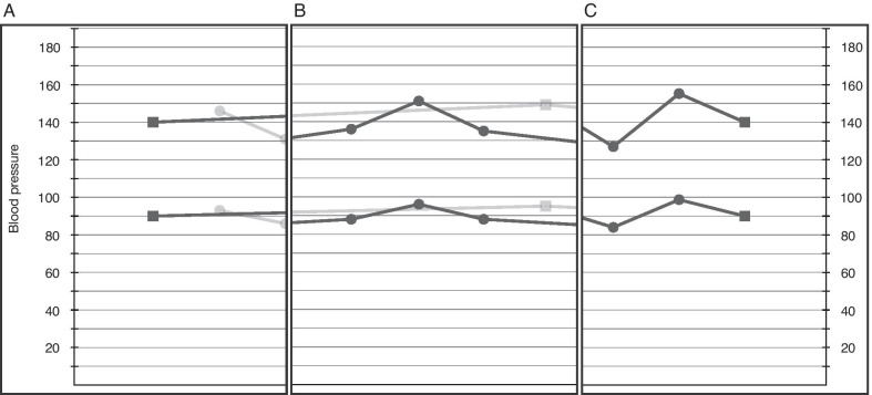
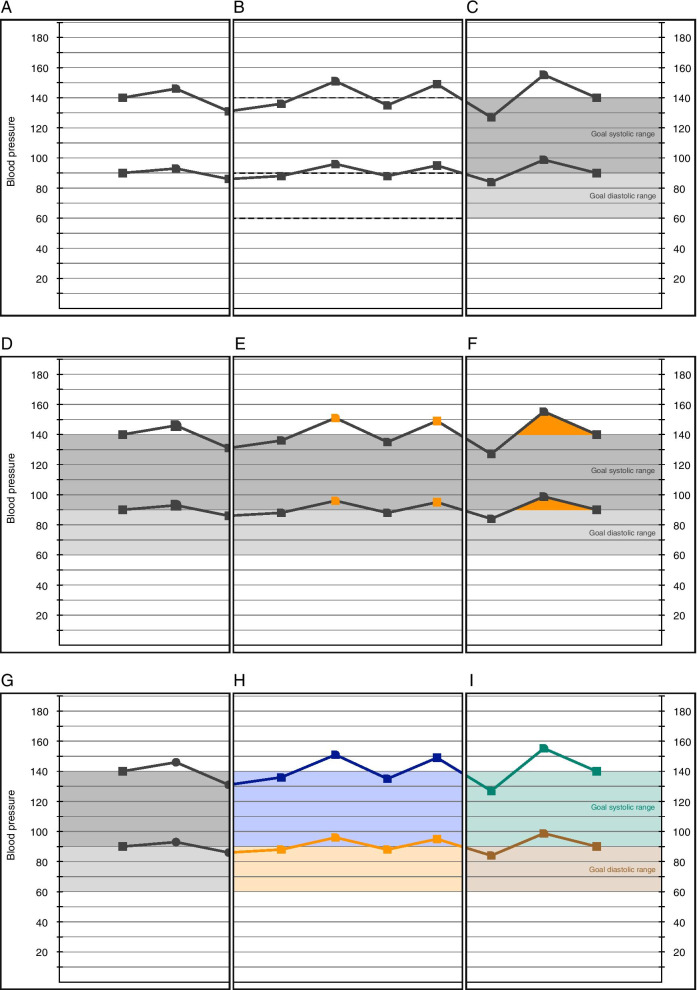
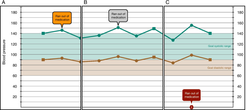
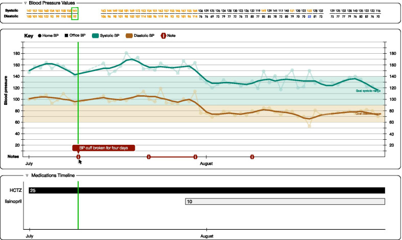
Conclusions: We developed a data display for substantial amounts of blood pressure measurements that is both simple to understand for patients, but powerful enough to inform clinical decision making. The display used a line graph format for ease of understanding, a LOWESS function for smoothing data to reduce the weight users placed on outlier measurements, colored goal range bands to allow users to quickly determine if measurements were in range, a medication timeline to help link recorded blood pressure measurements with the medications a patient was taking. A data display such as this, specifically designed to encourage shared decision making between hypertensive patients and their healthcare providers, could help us overcome the clinical inertia that often results in a lack of treatment intensification, leading to better care for the 35 million Americans with uncontrolled hypertension.

Keywords: Blood pressure; Data visualization; Hypertension; Interface design; Shared decision making.


Conflict of interest statement

None to declare.

Figures

Fig. 1
Fig. 1
Sample anesthesia record showing the system of inverted carets to mark SBP and carets to mark DBP. Reproduced with permission from University of Nebraska Medical Center
Fig. 2
Fig. 2
Examples of the different styles of BP plots we designed. A and B show the 4-line paradigm, in which office and home measurements are plotted on separate lines, with squares and circles denoting office and home measurements, respectively. Users could switch focus between the office and home lines—A shows the office measurements in focus and B shows the home measurements in focus. C shows our combined 2-line paradigm, with office and home values connected and differentiated by the shape of the data points (squares and circles for office and home measurements, respectively)
Fig. 3
Fig. 3
Examples of different approaches to illustrating BP goals ranges and how to communicate if a BP measurement is out of the goal range. A shows no goal range and B shows dotted lines as goal ranges; both approaches are used in EHRs and neither are informative for patients or physicians. C illustrates our greyscale goal range bands—two different shades of grey are used to denote the systolic and diastolic BP goal ranges, with no special affordances to denote out of range values. We tried several techniques to denote out of goal range BP measurements. D illustrates the use of larger symbols for out of range values; however, these were difficult to distinguish from in range values unless the symbols became obnoxiously large. E used colored symbols and F used colored fills below the line; however, neither option was well received by patients or physicians. G, H and I demonstrate our use of color to replace the grey bands and the introduction of the like-with-like paradigm—if the data points and connecting line are within the goal range band of matching color then the BP is in a healthy range; otherwise the BP is too high/low
Fig. 4
Fig. 4
Examples of different ways user annotations could be displayed. A Our color-coded design, where the color of the annotation bubble was linked with the type of annotation content. This introduced too many new colors, so we used a single grey scheme shown in (B). Concerns over crowding of the display and the logic needed to decide the best location for the annotation bubbles led us to design the annotation timeline seen in (C). Here, the presence of annotations is denoted on the x-axis of the graphical display and the annotation bubble appears only when a user hovers their cursor over it
Fig. 5
Fig. 5
Mock-up of our entire display, including the graphical display and smoothing line, annotations, data table, medication timeline, and scrubber bar

References

    1. National Healthcare Quality and Disparity Reports: Adults with hypertension with blood pressure less than 140/90 mm/Hg, United States, 1999–2014. https://nhqrnet.ahrq.gov/inhqrdr/.
    1. Go AS, Mozaffarian D, Roger VL, et al. Heart disease and stroke statistics—2013 update. Circulation. 2013;127(1):e11–240. doi: 10.1161/01.CIR.102.1.11. - DOI - PMC - PubMed
    1. Benjamin EJ, Virani SS, Callaway CW, et al. Heart disease and stroke statistics—2018 update. Circulation. 2018;137(12):116–426. doi: 10.1161/CIR.0000000000000558. - DOI - PubMed
    1. Mancia G, Bertinieri G, Grassi G, et al. Effects of blood-pressure measurement by the doctor on patient’s blood pressure and heart rate. Lancet. 1983;2(8352):695–698. doi: 10.1016/S0140-6736(83)92244-4. - DOI - PubMed
    1. Neufeld PD, Johnson DL. Observer error in blood pressure measurement. Can Med Assoc J. 1986;135(6):633–637. - PMC - PubMed

Publication types