

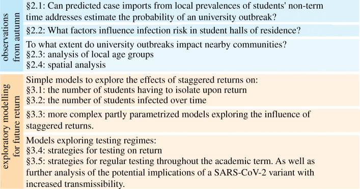
SARS-CoV-2 infection in UK university students: lessons from September-December 2020 and modelling insights for future student return
- PMID: 34386249
- PMCID: PMC8334840
- DOI: 10.1098/rsos.210310
SARS-CoV-2 infection in UK university students: lessons from September-December 2020 and modelling insights for future student return
Abstract
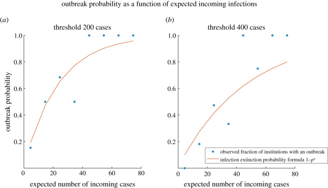
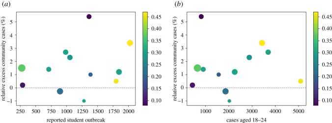
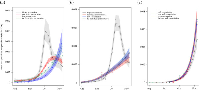
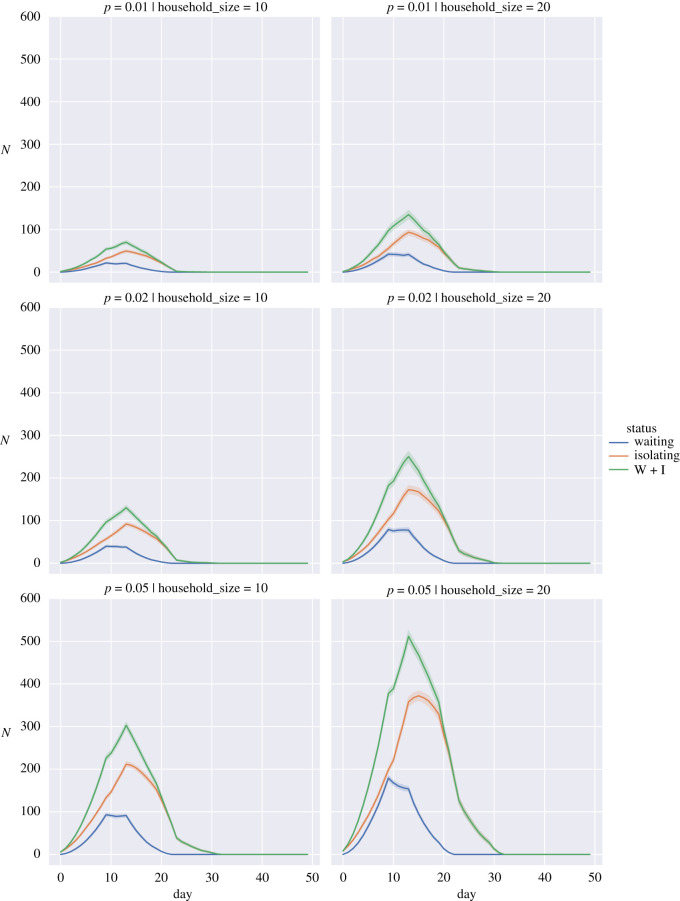
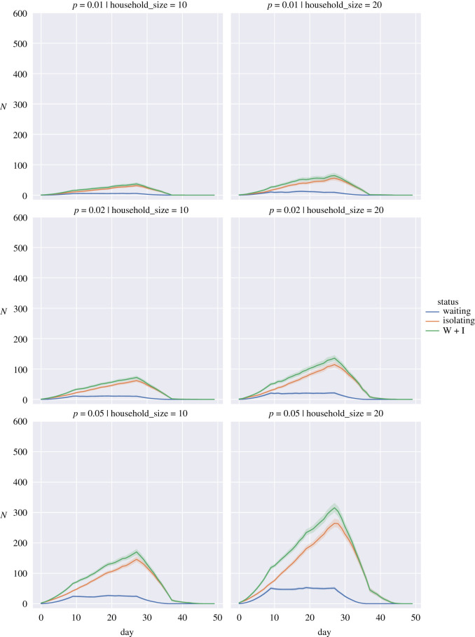
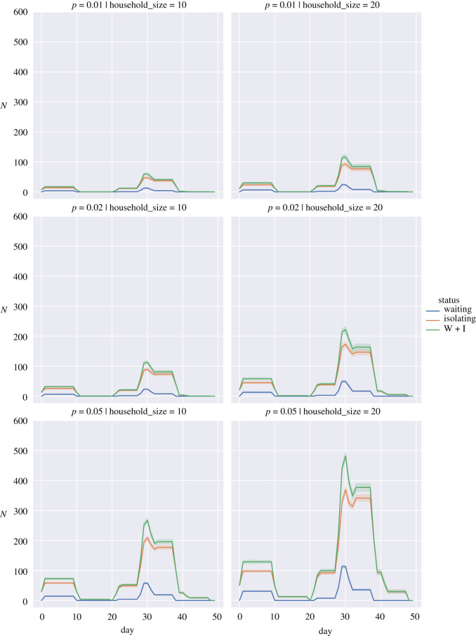
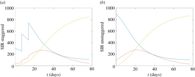
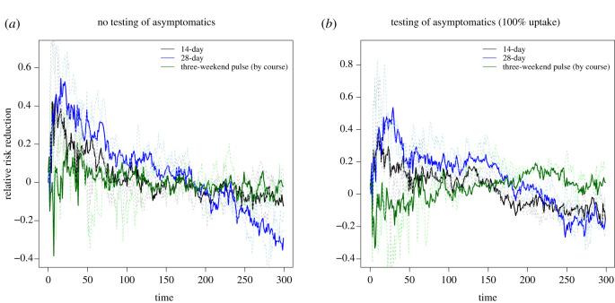
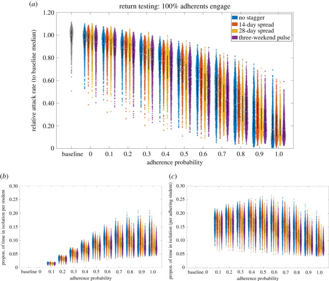
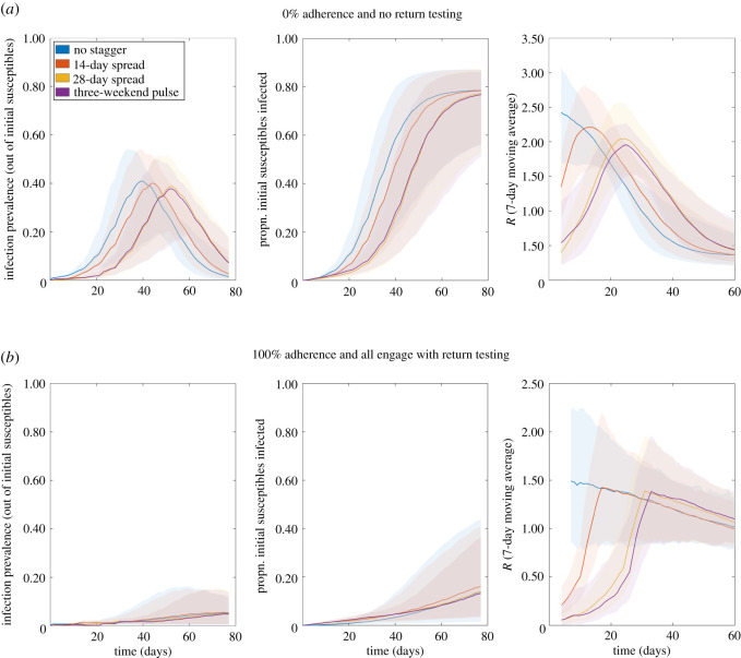
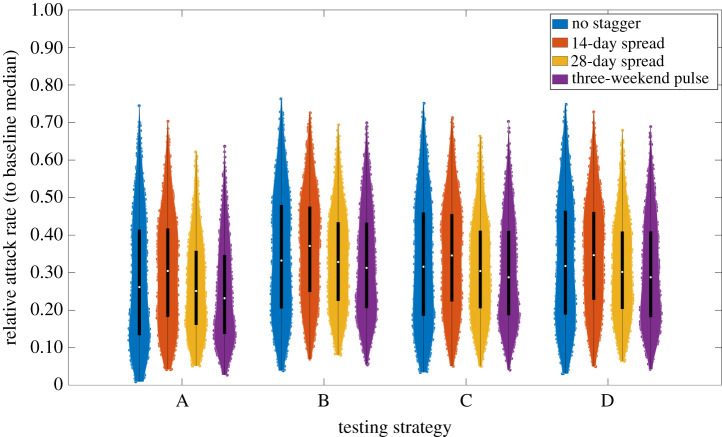
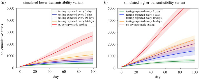
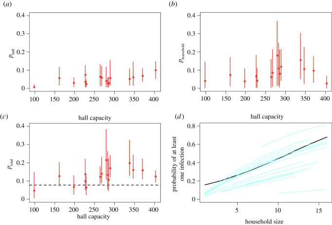
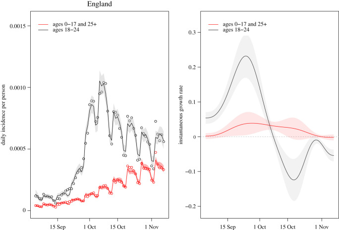
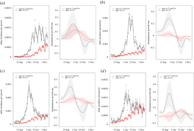
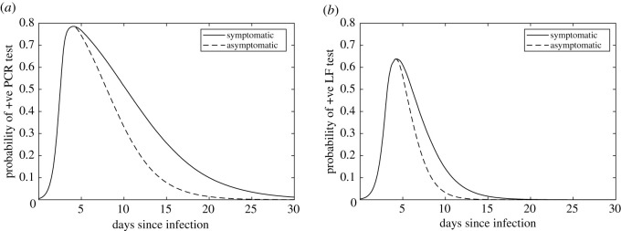
In this paper, we present work on SARS-CoV-2 transmission in UK higher education settings using multiple approaches to assess the extent of university outbreaks, how much those outbreaks may have led to spillover in the community, and the expected effects of control measures. Firstly, we found that the distribution of outbreaks in universities in late 2020 was consistent with the expected importation of infection from arriving students. Considering outbreaks at one university, larger halls of residence posed higher risks for transmission. The dynamics of transmission from university outbreaks to wider communities is complex, and while sometimes spillover does occur, occasionally even large outbreaks do not give any detectable signal of spillover to the local population. Secondly, we explored proposed control measures for reopening and keeping open universities. We found the proposal of staggering the return of students to university residence is of limited value in terms of reducing transmission. We show that student adherence to testing and self-isolation is likely to be much more important for reducing transmission during term time. Finally, we explored strategies for testing students in the context of a more transmissible variant and found that frequent testing would be necessary to prevent a major outbreak.
Keywords: COVID-19; SARS-CoV-2; epidemic modelling; higher education; pandemic modelling.
© 2021 The Authors.
Figures
References
-
- Higher Education Statistics Agency. Who’s studying in HE? 2020. See https://www.hesa.ac.uk/data-and-analysis/students/whos-in-he (visited on 4 February 2021).
-
- Virtual Forum for Knowledge Exchange in the Mathematical Sciences (V-KEMS). Unlocking Higher Education Spaces – What Might Mathematics Tell Us? 2020. See https://gateway.newton.ac.uk/sites/default/files/asset/doc/2007/Unlockin... (visited on 4 February 2021).
-
- Isaac Newton Institute for Mathematical Sciences. Infectious Dynamics of Pandemics: Mathematical and statistical challenges in understanding the dynamics of infectious disease pandemics. 2020. See https://www.newton.ac.uk/event/idp (visited on 4 February 2021).
-
- Department for Education. Press release: Updated guidance for universities ahead of reopening. 2020. See https://www.gov.uk/government/news/updated-guidance-for-universities-ahe... (visited on 3 February 2021).
-
- Task and Finish Group on Higher Education/Further Education. Principles for managing SARS-CoV-2 transmission associated with higher education, 3 September 2020. 2020. See https://www.gov.uk/government/publications/principles-for-managing-sars-... (visited on 5 February 2021)).
Grants and funding
LinkOut - more resources
Full Text Sources
Miscellaneous