Multicenter Study
. 2021 Aug 30;11(1):17054.
doi: 10.1038/s41598-021-95866-y.

Functional data analysis characterizes the shapes of the first COVID-19 epidemic wave in Italy

Affiliations
Multicenter Study

Functional data analysis characterizes the shapes of the first COVID-19 epidemic wave in Italy

Tobia Boschi et al. Sci Rep. .

Abstract

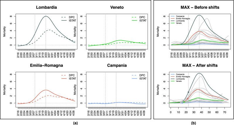
We investigate patterns of COVID-19 mortality across 20 Italian regions and their association with mobility, positivity, and socio-demographic, infrastructural and environmental covariates. Notwithstanding limitations in accuracy and resolution of the data available from public sources, we pinpoint significant trends exploiting information in curves and shapes with Functional Data Analysis techniques. These depict two starkly different epidemics; an "exponential" one unfolding in Lombardia and the worst hit areas of the north, and a milder, "flat(tened)" one in the rest of the country-including Veneto, where cases appeared concurrently with Lombardia but aggressive testing was implemented early on. We find that mobility and positivity can predict COVID-19 mortality, also when controlling for relevant covariates. Among the latter, primary care appears to mitigate mortality, and contacts in hospitals, schools and workplaces to aggravate it. The techniques we describe could capture additional and potentially sharper signals if applied to richer data.


Conflict of interest statement

The authors declare no competing interests.

Figures

Figure 1
Figure 1
Mortality curves. (a) DPC (dashed) and ISTAT (solid) differential mortality curves (per 100,000 inhabitants) in four example regions; Lombardia, Veneto, Emilia Romagna and Campania. Curves are smoothed with splines, with degree of smoothing selected by generalized cross-validation (see Methods). ISTAT curves “take off” earlier and in some regions are as much as twice as high at their peak—possibly due to many COVID-19 deaths happening at home and/or not being recorded as such in hospitals, especially in the early stages of the epidemic. (b) MAX mortality curves (per 100,000 inhabitants) in the 20 Italian regions, before (top) and after (bottom) the shifts produced by probKMA run with K=2. In the bottom panel, time is marked as a day number (as opposed to a date); this represents the region-specific time of the epidemic unfolding, and corresponds to actual time (starting on February 16 and ending on April 30) only for regions with no shifts, e.g., Lombardia). Curves are again smoothed with splines, with degree of smoothing selected by generalized cross-validation. Lombardia, Veneto, Emilia Romagna and Campania, also shown in (a), are highlighted in color. In all panels, vertical lines mark the dates of the national lock-down (March 9) and of the suspension of all nonessential production activities (March 23). In the bottom panel of (b) vertical lines still show these dates without shifts; stars on the curves mark the lock-down after the region specific shifts.
Figure 2
Figure 2
Characterizing two epidemics. (a) MAX mortality curves are shown in the top left panel with 65-day portions identified by probKMA with K=2 in red (Group 1; “exponential” pattern) and blue (Group 2; “flat(tened)” pattern). The curve portions are shown again, this time aligned with each other and separated by group, in the bottom panels. Black lines indicate group averages. The shifts produced by probKMA are shown in the top right panel (motifs, groups and shifts for Group 1 are stable across data sets; shifts for Group 2 are less stable and less interpretable—see Fig. S3). (b) Shifted Group 1 and Group 2 MAX mortality curves are tested against each other with IWTomics. The heatmap at the top shows p-values adjusted at all possible scales (from 1 to 65 days). The middle panel shows in detail the top-most row of the heatmap; i.e. the p-values adjusted across the whole 65-day interval. The bottom panel shows again the shifted curves. Gray areas in the middle and bottom panels mark days when the difference between the two groups has an adjusted p-value 5% (see Table S1). Starting a little over two weeks from the beginning of their epidemic, curves in the two groups differ at all temporal scales with adjusted p-values5%.
Figure 3
Figure 3
Functional boxplot and ranking. (a) Functional boxplot of the MAX data set (top) and MAX mortality curves (bottom) color-coded according to their ranking, as shown in the MAX column of (b). In the boxplot, Toscana is the median (black continuous line); Lombardia, Valle d’Aosta and Liguria are identified as outliers (red dashed lines); and the 50% innermost “box” (grey area) include the curves for Trento/Bolzano, Emilia-Romagna, Marche, Friuli Venezia Giulia, Veneto, Toscana, Molise, Abruzzo, Sardegna, Umbria, and Basilicata. Note that the “box” is skewed upwardly. (b) Rankings of the ISTAT (left), MAX (center) and DPC (right) mortality curves. The median regions are in bold, gray rectangles mark the 50% innermost boxes, and pale red rectangles mark outliers (no region is labeled as an outlier in the ISTAT data set; see Methods). The dots representing each region are color-coded (from intense red, through gray, to intense blue) according to their signed depth values (see Methods). In all three data sets, Lombardia’s curve is the most extreme at the very top of the ranking and, in contrast, Veneto’s curve is deep in the bulk close to the median (Toscana for ISTAT and MAX, Friuli Venezia Giulia for DPC). Segments joining the regions across the three rankings show how the top portion remains rather stable, while the mid- and bottom portions contain several crossings. Regions at the top are those characterized by “exponential” epidemics (Group 1), while regions in the middle and at the bottom are those with “flat(tened)” epidemics (Group2), whose curves can more easily switch in their depth ranks.
Figure 4
Figure 4
Associating mortality to local mobility and positivity. (a) Local mobility curves (Google’s “Groceries & pharmacy”) and positivity curves (regularized ratios of new cases to number of tests performed) in the 20 Italian regions. Curves are smoothed with splines, with degree of smoothing selected by generalized cross-validation, and shifted based on probKMA run on the MAX mortality curves with K=2; time is marked as a day number representing the region-specific time of the epidemic unfolding, and corresponds to actual time (starting on February 16 and ending on April 30) only for regions with no shifts, e.g., Lombardia. Vertical lines show the days corresponding to the nationwide lock-down (March 9) and the suspension of all nonessential production activities (March 23) without shifts, stars on the curves mark the lock-down after the region specific shifts. The example regions of Fig. 1(a) are highlighted in color. (b) Estimated effect surfaces from the joint function-on-function regression of MAX mortality on local mobility and positivity shown in 3D and as contour plots (March 9, without shift, is again marked on both). Early and mid-period local mobility levels are strong positive predictors of mortality at its peak. Positivity has similar but much weaker predictive signals, likely because the effects are subsumed by mobility. Late local mobility has a negative association with mortality at its peak (mobility resumed faster in regions with milder epidemics), and late positivity a strong positive one (positivity remained elevated in regions with worse epidemics). The regression captures a large share of the variability in mortality curves (in-sample R2=0.90, LOO-CV R2=0.52), with substantial and comparable contributions of the two predictors (partial R2s =0.62,0.53).
Figure 5
Figure 5
Interdependencies among scalar covariates and regions. (a) Heatmap of the 20 (regions) × 12 (covariates) data matrix, with dendrograms from separate hierarchical clustering (correlation distance, complete linkage) of the regions (left) and the covariates (top). Color coding within cells represents values of the standardized covariates (centered and scaled to mean 0 and standard deviation 1). Color coding of some cell borders identifies the biclusters in (b). The dendrograms capture a distinct interdependence structure. For instance, there are marked similarities among Lombardia, Veneto, Emilia Romagna and Piemonte, as well as among some groups of southern regions (Sicilia, Campania, Puglia and Calabria; Basilicata, Abruzzo and Molise). There are also marked associations among groups of covariates. The contagion hubs proxies for hospitals, schools and work places, and number of adults per family doctor, vary closely together. So do the contagion hub proxy for public transport and pollution levels; the percentages of individuals affected by diabetes and allergies; and ICU beds and the percentage of individuals over 65. (b) Restricted heat-maps further illustrating interdependencies through two biclusters of regions and covariates. Color-coding within cells corresponds to that in (a), and each bicluster is identified by a border color and its adjusted H-score (an inverse measure of bicluster strength; see Methods). The first bicluster (adjusted H-score =0.0902) comprises central and southern regions with “flat(tened)” epidemics (Group 2). The second bicluster (adjusted H-score =0.0942) comprises northern regions with “exponential” epidemics (Group 1) but also northern and central regions from Group 2.
Figure 6
Figure 6
Associating mortality to socio-demographic, infrastructural and environmental factors. (a) Results from marginal function-on-scalar regressions. Mortality curves are regressed against each of the scalar covariates in Table 1. The top plot displays the signs of the effect curves estimated on the MAX data. Time, marked as the 65 days of the region specific epidemic unfoldings, is on the vertical axis (the nationwide lock down on March 9, without shift, is marked by a horizontal line. Red, blue and green indicate, respectively, positive, negative and non-significant portions (i.e., where 95% confidence bands around the estimated effect curve are entirely above, entirely below, or contain 0; see Methods). The bottom plot displays in-sample R2s for the regressions fitted on MAX, ISTAT and DPC data; these are remarkably consistent. The names in red on the horizontal axes indicate the top 5 covariates selected by SnNAL-EN on all three data sets (see Methods); these are also the ones with the largest R2s. (b) Results from the joint function-on-function regression of MAX mortality on local mobility, positivity, and the first principal component (pc1) of the top 5 covariates, used as a “summary” control. This control does not modify the shapes of the estimated effect surfaces for mobility and positivity (shown on top)—which are very similar to the ones in Fig. 4(b). The estimated effect curve for pc1 shows a positive and significant association with mortality at its peak (bottom right; 95% confidence band in dashes, gray corresponds to non significant portions, vertical dashed line corresponds to March 9, without shift). The sign of this effect is consistent with marginal findings, based on the loadings of the first principal component (bottom left; positive for adults per family doctor, average beds per hospital, average students per classroom and average employees per firm, and negative for average members per household). With the addition of pc1, the regression reaches an in-sample R2=0.94 and a LOO-CV R2=0.7. The contributions of local mobility and positivity remain high (partial R2=0.66 and 0.61, respectively). That of our “summary” covariate is also substantial (partial R2=0.39).

References

    1. La Rosa G, et al. SARS-CoV-2 has been circulating in northern Italy since December 2019: Evidence from environmental monitoring. Sci. Total Environ. 2021;750:141711. doi: 10.1016/j.scitotenv.2020.141711. - DOI - PMC - PubMed
    1. Mugnai G, Bilato C. COVID-19 in Italy: Lesson from the Veneto region. Eur. J. Internal Med. 2020;77:161–162. doi: 10.1016/j.ejim.2020.05.039. - DOI - PMC - PubMed
    1. Lavezzo E, et al. Suppression of COVID-19 outbreak in the municipality of Vo’, Italy. Nature. 2020;584:425–429. doi: 10.1038/s41586-020-2488-1. - DOI - PMC - PubMed
    1. ISTAT. Demographic indicators. http://dati.istat.it/Index.aspx?DataSetCode=DCIS_INDDEMOG1&Lang=en.
    1. Lim S, Bae JH, Kwon H-S, Nauck MA. Covid-19 and diabetes mellitus: From pathophysiology to clinical management. Nat. Rev. Endocrinol. 2021;17:11–30. doi: 10.1038/s41574-020-00435-4. - DOI - PMC - PubMed

Publication types