. 2021 Mar;21(1):69-110.
doi: 10.1007/s10742-020-00236-2. Epub 2021 Feb 13.

Nonparametric Estimation of Population Average Dose-Response Curves using Entropy Balancing Weights for Continuous Exposures

Affiliations

Nonparametric Estimation of Population Average Dose-Response Curves using Entropy Balancing Weights for Continuous Exposures

Brian G Vegetabile et al. Health Serv Outcomes Res Methodol. 2021 Mar.

Abstract

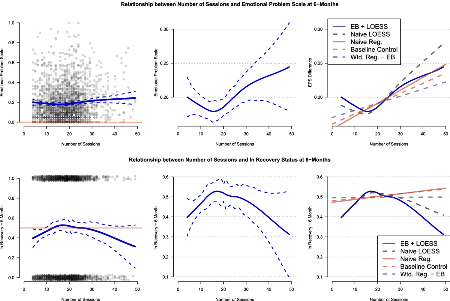
Weighted estimators are commonly used for estimating exposure effects in observational settings to establish causal relations. These estimators have a long history of development when the exposure of interest is binary and where the weights are typically functions of an estimated propensity score. Recent developments in optimization-based estimators for constructing weights in binary exposure settings, such as those based on entropy balancing, have shown more promise in estimating treatment effects than those methods that focus on the direct estimation of the propensity score using likelihood-based methods. This paper explores recent developments of entropy balancing methods to continuous exposure settings and the estimation of population dose-response curves using nonparametric estimation combined with entropy balancing weights, focusing on factors that would be important to applied researchers in medical or health services research. The methods developed here are applied to data from a study assessing the effect of non-randomized components of an evidence-based substance use treatment program on emotional and substance use clinical outcomes.

Keywords: causal inference; local linear regression; mental health; substance abuse; weighted estimation.


Figures

Fig. 1
Fig. 1
Visualization of the distribution of exposure variable (left) and relationship between exposure and outcome (right). In the left figure, the high-density region of A is highlighted and generally lies between 1.5 and 45. In the right figure, the true marginal relationship is shown in red, a simple unweighted linear smoother is shown in blue, and an unweighted quadratic estimation is provided in green.
Fig. 2
Fig. 2
Performance estimating the dose-response curve across repeated simulated samples: Local Linear Regression. The red line is the true population dose-response curve. The blue lines represent the estimated curves; the solid line is the mean across replications and the dotted lines represent a 95% equal-tail interval of the density of estimates.
Fig. 3
Fig. 3
Performance estimating the dose-response curve across repeated simulated samples: Linear Regression - second order polynomial in treatment. The red line is the true population dose-response curve. The blue lines represent the estimated curves; the solid line is the mean across replications and the dotted lines represent a 95% equal-tail interval of the density of estimates.
Fig. 4
Fig. 4
Simulation results for bootstrap confidence intervals. Upper left panel shows a single visualization of a bootstrapped confidence interval for the curve. Throughout the red curves represent the “truth” and the blue solid line represents the estimated curve; the dotted blue lines represent estimated 95% confidence intervals. Upper right panel contains the point-wise coverage of the 95% bootstrapped confidence intervals. Lower panels contain the magnitude (left) and ratio (right) of the average point-wise bootstrap standard error across the bootstrap simulations as compared to the standard error of the estimated curves obtained in this simulation. In all figures the vertical lines represent the 1st, 5th, 95th, 99th quantiles of the distribution of the exposure variable A in the high-density region.
Fig. 5
Fig. 5
Relationships among treatment exposure (number of sessions) and outcomes of interest. The lower figures are focused only on the highest density region of the treatment exposure, i.e., number of sessions ∈ [4,45]
Fig. 6
Fig. 6
Estimated relationships between the number of treatment sessions and the emotional problem scale (EPS) at the 6-month follow-up (top) and “in recovery” status at the 6-month follow-up (bottom). The left panels are the estimated relationships and bootstrapped 95% confidence intervals. The right panel of each row compares estimates for the proposed method (EB + LOESS) to 1) a naïve (unweighted) local linear regression, 2) a naïve (unweighted) regression modeled such that exposure is the only covariate, i.e., YA, 3) a simple linear regression controlling for the baseline value of the outcome measure, i.e., YA + X, and 4) a weighted linear regression only controlling for the exposure variable, i.e., YA.
Fig. 7
Fig. 7
Comparing the joint distribution of the observed data points and the product distribution where inference is desired. Panel on the left plots the sample against the contours of the joint distribution. Panel on the right plots the sample against the contours of the product distribution.
Fig. 8
Fig. 8
Comparing the contours of the joint distribution over which inference is desired and weighted bivariate histograms representing the weighted joint density of A and X. The bins represent the sum of the weights in that region and the color has been normalized such that each bin has been divided by the max of the sum of weights across all bins. The darkest blue represents the bin with the largest sum of weights and the smooth transition to white represents no weight in that bin.
Fig. 9
Fig. 9
Visualization of the distribution of exposure variable (left) and relationship between exposure and outcome (right) when N = 200. In the left figure, the high-density region of A is highlighted and generally lies between 1.5 and 45. In the right figure, the true marginal relationship is shown in red, a simple unweighted linear smoother is shown in blue, and an unweighted quadratic estimation is provided in green.
Fig. 10
Fig. 10
Simulation results for bootstrap confidence intervals. The upper left panel shows a single visualization of a bootstrapped confidence interval for the curve. Throughout the red curves represent the “truth” and the blue solid line represents the estimated curve; the dotted blue lines represent estimated 95% confidence intervals. The upper right panel contains the point-wise coverage of the 95% bootstrapped confidence intervals. Lower panels contain the magnitude (left) and ratio (right) of the average point-wise bootstrap standard error across the bootstrap simulations as compared to the standard error of the estimated curves obtained in this simulation. In all figures the vertical lines represent the 1st, 5th, 95th, 99th quantiles of the distribution of the exposure variable A in the high-density region.
Fig. 11
Fig. 11
Visualization of the distribution of exposure variable (left) and relationship between exposure and outcome (right). In the left panel, the high-density region of A is highlighted. In the right panel, the true marginal relationship is shown in red, a simple unweighted linear smoother is shown in blue, and an unweighted linear estimation is shown in green.
Fig. 12
Fig. 12
Performance estimating the dose-response curve across repeated simulated samples: Local Linear Regression
Fig. 13
Fig. 13
Performance estimating the dose-response curve across repeated simulated samples: Linear Regression - outcome is correctly modeled using linear relationship with exposure
Fig. 14
Fig. 14
Simulation results for bootstrap confidence intervals. The upper left panel contains a single visualization of a bootstrapped confidence interval for the curve. The upper right panel contains the point-wise coverage of the 95% bootstrapped confidence intervals. Lower panels contain the magnitude (left) and ratio (right) of the average point-wise bootstrap standard error across the bootstrap simulations as compared to the standard error of the estimated curves obtained in the simulation. In all figures, the vertical lines represent the 1st, 5th, 95th, 99th quantiles of the distribution of A in the high-density region.

References

    1. Austin PC, Stuart EA (2017) Estimating the effect of treatment on binary outcomes using full matching on the propensity score. Statistical Methods in Medical Research 26(6):2505–2525, DOI 10.1177/0962280215601134, URL https://doi.org/10.1177/0962280215601134 , https://doi.org/10.1177/0962280215601134https://doi.org/10.1177/0962280215601134, https://doi.org/10.1177/0962280215601134 - DOI - DOI - DOI - PMC - PubMed
    1. Cleveland WS, Devlin SJ (1988) Locally weighted regression: An approach to regression analysis by local fitting. Journal of the American Statistical Association 83(403):596–610, URL http://www.jstor.org/stable/2289282
    1. Dennis ML, Titus JC, White MK, Unsicker JI, Hodgkins D (2003) Global appraisal of individual needs: Administration guide for the gain and related measures. Bloomington, IL: Chestnut Health Systems
    1. Deville JC, Särndal CE (1992) Calibration estimators in survey sampling. Journal of the American Statistical Association 87(418):376–382
    1. Deville JC, Särndal CE, Sautory O (1993) Generalized raking procedures in survey sampling. Journal of the American Statistical Association 88(423):1013–1020

LinkOut - more resources