. 2021 Nov 19;374(6570):989-994.
doi: 10.1126/science.abk0414. Epub 2021 Oct 7.

COVID-19 transmission dynamics underlying epidemic waves in Kenya

Affiliations

COVID-19 transmission dynamics underlying epidemic waves in Kenya

Samuel P C Brand et al. Science. .

Abstract

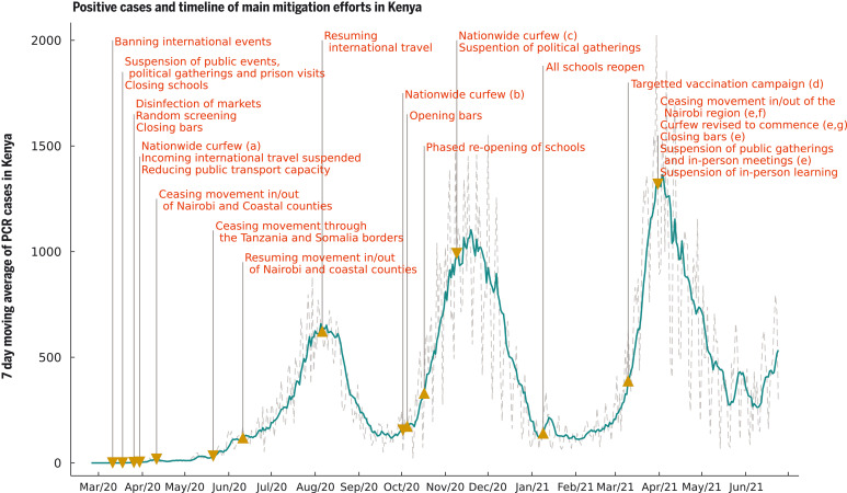
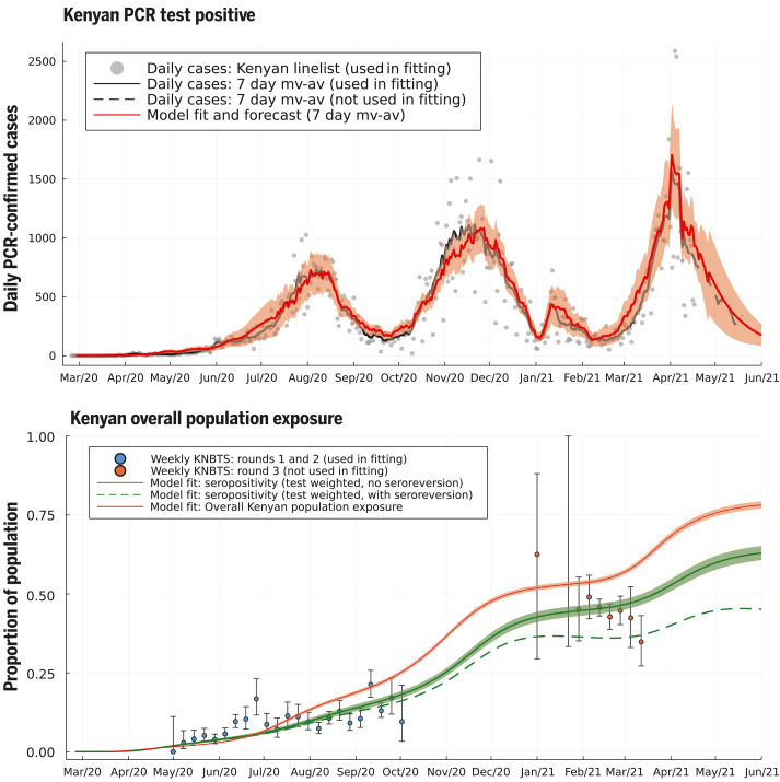
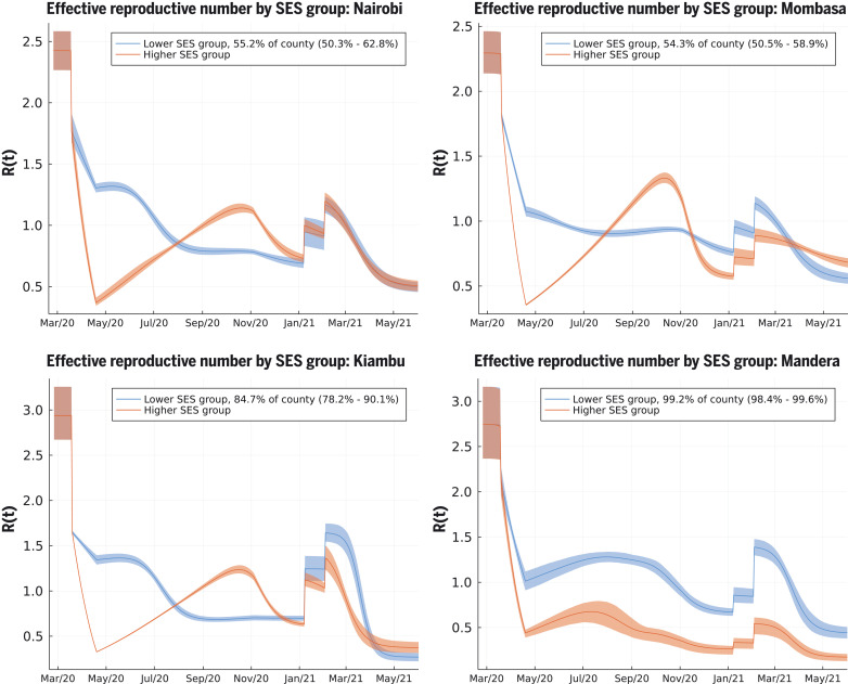
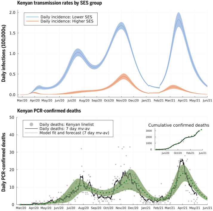
Policy decisions on COVID-19 interventions should be informed by a local, regional and national understanding of severe acute respiratory syndrome coronavirus 2 (SARS-CoV-2) transmission. Epidemic waves may result when restrictions are lifted or poorly adhered to, variants with new phenotypic properties successfully invade, or infection spreads to susceptible subpopulations. Three COVID-19 epidemic waves have been observed in Kenya. Using a mechanistic mathematical model, we explain the first two distinct waves by differences in contact rates in high and low social-economic groups, and the third wave by the introduction of higher-transmissibility variants. Reopening schools led to a minor increase in transmission between the second and third waves. Socioeconomic and urban–rural population structure are critical determinants of viral transmission in Kenya.


Figures

Fig. 1.
Fig. 1.. Seven-day moving average of daily positive PCR tests from the Kenyan national linelist and a timeline of the main mitigation events applied by the Kenyan government representing tightening (down-arrow) and relaxation (up-arrow) of measures.
(a) Curfew from 7 p.m. to 5 a.m.; (b) curfew from 11 p.m. to 4 a.m.; (c) curfew from 10 p.m. to 4 a.m.; (d) front-line workers and individuals older than 58 years (~1.2 million doses); (e) the region includes Nairobi, Kajiado, Machakos, Kiambu, and Nakuru; (f) this restricted movement into and out of the block of counties in (e) but not between these counties; (g) curfew from 8 p.m. to 4 a.m.
Fig. 2.
Fig. 2.. Daily PCR-confirmed COVID-19 cases (top) and weekly serology estimates from KNBTS donors with overall attack rate estimates (bottom).
Shown are daily numbers of PCR test positives from the Kenyan national linelist (top; gray dots are daily reports used in fitting the model, curves are 7-day moving averages). The model prediction for the 7-day moving average of daily case incidence (top; red dashed curve, shading shows 3-σ intervals) were derived from inference on the county-specific linelist PCR data and rounds 1 and 2 of the KNBTS serology survey (bottom; blue dots). Predictions before mid-April 2021 are back-calculations using known numbers of PCR tests per day, whereas after mid-April 2021, model predictions are forecasts that also estimate the number of PCR tests that will occur per day in each county. We show the next month of PCR test positive data, not used in fitting, as a validation of the model’s short-term predictive accuracy (top; black dashed curve). Back-calculated model estimates of seropositivity (bottom; green solid curve) are shown with round 3 of the KNBTS serology survey data (bottom; red dots, not used in model inference). We also show back-calculated estimates of seropositivity under the assumption that median time to seroreversion (loss of detectable antibodies rather than loss of immunity) from infection was 1 year. Model estimates of overall Kenyan seropositivity are adjusted from county-specific estimates by weighting by number of serology tests in each county (over KNBTS rounds 1 and 2). The overall estimated Kenyan attack rate (population exposure) is shown as unweighted (bottom; red curve).
Fig. 3.
Fig. 3.. Effective reproduction number over time [R(t)] for lower and higher SES groups in four representative counties.
These include Nairobi (top left), Mombasa (top right), Kiambu (bottom left), and Mandera (bottom right). Nairobi and Mombasa are Kenya’s two largest cities and form fully urban counties; Mandera county has a largely rural population and is remote from the main urban conurbations; Kiambu county borders Nairobi and has a ~60% urban population. The transmission model infers the proportion of the population in each SES group in each county. The highest proportion of higher SES group individuals are inferred to be in Nairobi and Mombasa out of all counties, whereas for Mandera county, very close to all individuals are inferred as being in the lower SES group, and the model effectively defaults to one group SEIRS transmission. The model inference for R(t) in Kiambu represents a county between these two extremes. In each county, the first discontinuous increase in R(t) is due to schools reopening, and the second is due to more transmissible variants becoming dominant in transmission.
Fig. 4.
Fig. 4.. Model-inferred underlying true incidence rates by SES group relative to the whole Kenyan population size (top) and reported PCR-confirmed deaths due to COVID-19 disease (bottom).
The size of the upper SES group was estimated to be 11% of the Kenyan population, explaining the lower absolute rate of incidence (red curve) compared to the lower SES group (blue curve). We inferred that the lower SES group has experienced three waves of SARS-CoV-2 transmission, whereas the upper SES group has experienced two. The model fit for 7-day moving average (green dashed curve, with shading as 95% prediction intervals) is shown against the 7-day moving average for deaths reported in the Kenyan linelist (black curve). Cumulative observed and fitted deaths are shown in the top-right inset.

References

    1. E. Barasa et al., “Assessing the Indirect Health Effects of the COVID-19 Pandemic in Kenya” (2021); https://www.cgdev.org/publication/assessing-indirect-health-effects-covi.... - PMC - PubMed
    1. Uyoga S., Adetifa I. M. O., Karanja H. K., Nyagwange J., Tuju J., Wanjiku P., Aman R., Mwangangi M., Amoth P., Kasera K., Ng’ang’a W., Rombo C., Yegon C., Kithi K., Odhiambo E., Rotich T., Orgut I., Kihara S., Otiende M., Bottomley C., Mupe Z. N., Kagucia E. W., Gallagher K. E., Etyang A., Voller S., Gitonga J. N., Mugo D., Agoti C. N., Otieno E., Ndwiga L., Lambe T., Wright D., Barasa E., Tsofa B., Bejon P., Ochola-Oyier L. I., Agweyu A., Scott J. A. G., Warimwe G. M., Seroprevalence of anti-SARS-CoV-2 IgG antibodies in Kenyan blood donors. Science 371, 79–82 (2021). 10.1126/science.abe1916 - DOI - PMC - PubMed
    1. S. P. C. Brand et al., Forecasting the scale of the COVID-19 epidemic in Kenya. medRxiv 2020.04.09.20059865 [Preprint]. 16 April 2020. 10.1101/2020.04.09.20059865 - DOI
    1. Diop B. Z., Ngom M., Pougué Biyong C., Pougué Biyong J. N., The relatively young and rural population may limit the spread and severity of COVID-19 in Africa: A modelling study. BMJ Glob. Health 5, e002699–e11 (2020). 10.1136/bmjgh-2020-002699 - DOI - PMC - PubMed
    1. S. Mwalili, M. Kimathi, V. N. Ojiambo, D. K. Gathungu, T. N. O.Achia, Age-structured Impact of Mitigation Strategies on COVID-19 Severity and Deaths in Kenya. ResearchSquare (2020); 10.21203/rs.3.rs-105797/v1.10.21203/rs.3.rs-105797/v1 - DOI - DOI

Publication types