. 2021 Oct 8;4(1):146.
doi: 10.1038/s41746-021-00511-7.

A prospective evaluation of AI-augmented epidemiology to forecast COVID-19 in the USA and Japan

Affiliations

A prospective evaluation of AI-augmented epidemiology to forecast COVID-19 in the USA and Japan

Sercan Ö Arık et al. NPJ Digit Med. .

Abstract

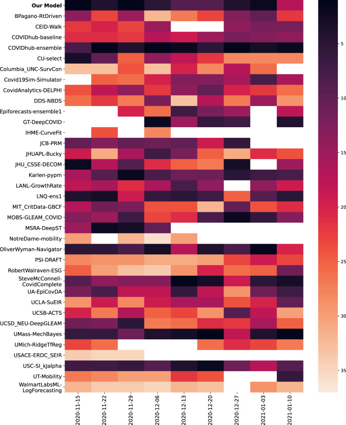
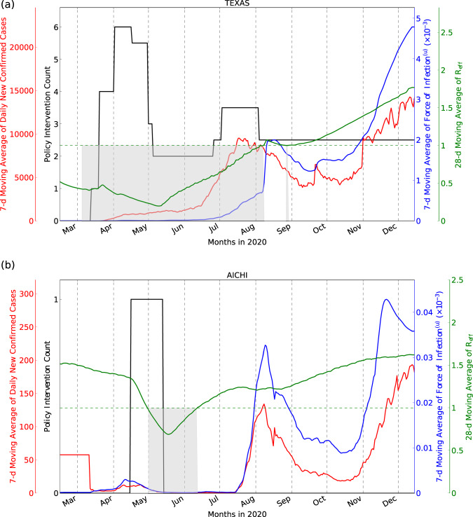
The COVID-19 pandemic has highlighted the global need for reliable models of disease spread. We propose an AI-augmented forecast modeling framework that provides daily predictions of the expected number of confirmed COVID-19 deaths, cases, and hospitalizations during the following 4 weeks. We present an international, prospective evaluation of our models' performance across all states and counties in the USA and prefectures in Japan. Nationally, incident mean absolute percentage error (MAPE) for predicting COVID-19 associated deaths during prospective deployment remained consistently <8% (US) and <29% (Japan), while cumulative MAPE remained <2% (US) and <10% (Japan). We show that our models perform well even during periods of considerable change in population behavior, and are robust to demographic differences across different geographic locations. We further demonstrate that our framework provides meaningful explanatory insights with the models accurately adapting to local and national policy interventions. Our framework enables counterfactual simulations, which indicate continuing Non-Pharmaceutical Interventions alongside vaccinations is essential for faster recovery from the pandemic, delaying the application of interventions has a detrimental effect, and allow exploration of the consequences of different vaccination strategies. The COVID-19 pandemic remains a global emergency. In the face of substantial challenges ahead, the approach presented here has the potential to inform critical decisions.


Conflict of interest statement

H.M. and S.N. are recipients of a Google.org Fellowship grant. The remaining authors declare no competing interests.

Figures

Fig. 1
Fig. 1. Proposed framework and timeline for model development and prospective evaluation.
a Our proposed AI-augmented epidemiology framework for COVID-19 forecasting is an extension to the standard Susceptible-Exposed-Infectious-Removed (SEIR) model,. We model compartments for undocumented cases explicitly as they can dominate COVID-19 spread, and introduce compartments for hospital resource usage as they are crucial to forecasts for COVID-19 healthcare planning. Learnable encoders infer the rates at which individuals move through different compartments, trained on static and time-varying public data, to model the changing disease dynamics over time and extract the predictive signals from relevant data. The models are trained daily on all available data up to the day each prediction is made (see “Methods”). b Public dashboard that shows generated 28-day forecasts at county- and state level for the USA. A dashboard was similarly created in Japan at the prefecture level. c Predictions for the effective R number and force of infection that come from the compartmental nature of the model, as well as feature importances for the rates from the variable encoder architectures. d Simulations of counterfactual scenarios can be used to estimate the potential impact of vaccines or policy measures. e Prospective evaluation of the forecasts— on each prediction date, 28-day forecasts are released publicly, and the evaluation of the accuracy is performed at the end of the 28-day horizon.
Fig. 2
Fig. 2. Prospective forecasts for the US and Japan models.
Ground truth cumulative deaths counts (cyan lines) are shown alongside the forecasts for each day. Each daily forecast contains a predicted increase in cases for each day during the prediction window of 4 weeks (shown as colored dots, where shading shifting to yellow indicates days further from the date of prediction in the forecasting horizon, up to 4 weeks). Predictions of deaths are shown for (a) the USA, and (b) Japan.
Fig. 3
Fig. 3. Model rankings for incident death MAPE.
Model rankings for incident death MAPE in the prospective evaluation period. The darker the color, the higher the ranking of the model is for the corresponding prediction date.
Fig. 4
Fig. 4. Model uncertainty.
a Model disagreement due to model uncertainty, measured as average prediction variance across the top k = 5 models, versus the MAE performance, both plotted in log space. From this, we see that higher model disagreement correlates with worse metric performance. For the best fit line, R2 = 0.539, 4.39x + 3.37. b A rejection diagram showing the percentage of dates on which a prediction is made, after thresholding on model disagreement due to model uncertainty, versus the MAPE performance on those dates. From this, we can see that better average metric performance (on the days for which a forecast is released) can be achieved by withholding forecasts on days with higher model disagreement. Thus, we find the reliability of the forecasting system can be improved through model uncertainty thresholding. For the best fit line, R2 = 0.941, f(x) = 2.18x + 9.50.
Fig. 5
Fig. 5. Retrospective and prospective 28-day MAPE over time.
Performance over time is shown for the (a) state-level US models using 4-week incidental predictions (b) state-level US models using cumulative predictions (c) prefecture-level Japan model using cumulative predictions. Japan’s 4-week incidental deaths and cases were too low to meaningfully report. Metrics shown are the “mean absolute percentage error” for predicted deaths and predicted confirmed cases compared to ground truth. Retrospective performance during model development periods for confirmed cases (orange) and deaths (light blue) are shown alongside performance reported during the prospective study for cases (dark blue) and deaths (green).
Fig. 6
Fig. 6. Model outputs.
New daily confirmed cases, number of NPIs, F(u) and Reff for Texas, USA (a) and Aichi, Japan (b), chosen to represent a location with high and low COVID-19 associated deaths, respectively. Seven-day moving average of the daily confirmed case counts and number of Non-Pharmaceutical Interventions (NPIs) are plotted on the left y axis, and the 7-day moving average of F(u) (see Eq. (11)) and the 28-day moving average of Reff (see Eq. (13)) are plotted on the right y axis. For Reff < 1 (shaded gray regions below the horizontal dotted line), dynamics are tending toward the Disease-Free Equilibrium (DFE). These areas often overlap with the dates when multiple NPIs are imposed.
Fig. 7
Fig. 7. Counterfactual analysis on the count of predicted exposed individuals for different vaccination rates in tandem with NPIs, for the prediction date of March 1, 2021.
a As shown for the three US states, when vaccination rates (low: 0.2 % population/day, medium: 0.5% population/day, high: 1.0% population/day) are increased compared to the expected baseline, which is obtained from the past 4 weeks’ trend, there is around 1% extra reduction in the predicted exposed. Here, the predicted baseline exposed individual counts are 69,700, 67,600, and 63,700 for Texas, Washington, and South Carolina, respectively. b For these US states, when NPI levels are increased while keeping the vaccination rate 0.5% population/day, we observe a significant reduction in the number of predicted exposed, >17% across the three states. The majority of the benefit is coming from the low-level NPI, due to the school closures being the NPI with the largest impact according to the fitted model. c In Japan, we show counterfactual analysis assuming a very high vaccination rate (2% population/day), and considering the cases of applying or removing the State of Emergency. Here, the baseline exposed individual counts are 5800, 3800, and 3300 for Osaka, Okinawa, and Hokkaido, respectively. Applying the state of emergency is observed to be effective in reducing the predicted exposed cases. When the State of Emergency is removed in Osaka, despite the high vaccination rate, the predicted exposed cases are observed to go up significantly. Note that in all cases, because of the uncertainty in counterfactual outcome is high—the 95% confidence intervals for baseline and counterfactual outcomes often overlap (see Supplementary Discussion). This suggests that although the statistical significance on the directionality of the change would be high, the statistical significance on the exact amount of change would not be as high. Thus, it is important to stress that if used, the forecasts should be used alongside other information and with the support of epidemiology experts. The percentage change of the exposed individual counts on March 29, 2021 against the forecasted features baseline is shown in both cases.

References

    1. Shaman J, Karspeck A. Forecasting seasonal outbreaks of influenza. Proc. Natl Acad. Sci. USA. 2012;109:20425–20430. doi: 10.1073/pnas.1208772109. - DOI - PMC - PubMed
    1. Wendlandt, M., Colabella, J. M., Krishnamurthy, A. & Cobb, L. Mathematical modelling of the west African ebola virus epidemic. URSCA Proc.3, (2017).
    1. Ray, E. L. et al. Ensemble forecasts of coronavirus disease 2019 (COVID-19) in the U.S. Preprint at https://www.medrxiv.org/content/10.1101/2020.08.19.20177493v1 (2020). - DOI
    1. Reiner, R. C. et al. Modeling COVID-19 scenarios for the united states. Nat. Med.27, 94–105 (2020). - PMC - PubMed
    1. Bedford J, et al. COVID-19: towards controlling of a pandemic. Lancet. 2020;395:1015–1018. doi: 10.1016/S0140-6736(20)30673-5. - DOI - PMC - PubMed