[Preprint]. 2021 Oct 5:2021.10.04.21264434.
doi: 10.1101/2021.10.04.21264434.

Acute COVID-19 gene-expression profiles show multiple etiologies of long-term sequelae

Affiliations

Acute COVID-19 gene-expression profiles show multiple etiologies of long-term sequelae

Ryan C Thompson et al. medRxiv. .

Abstract

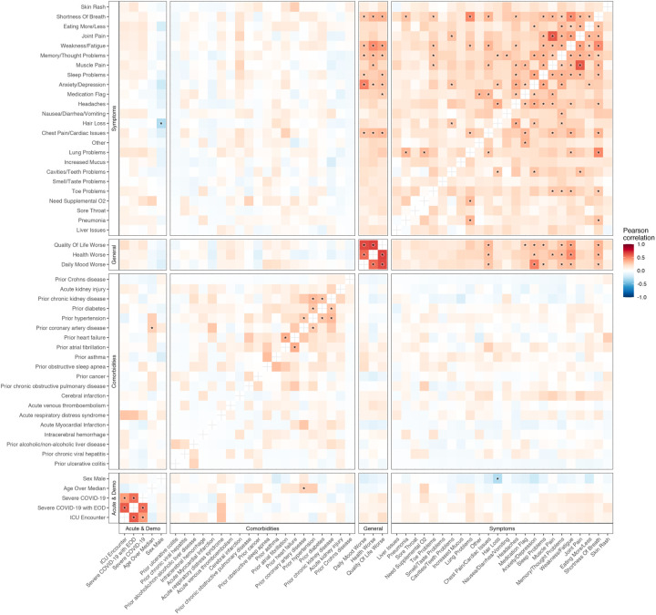
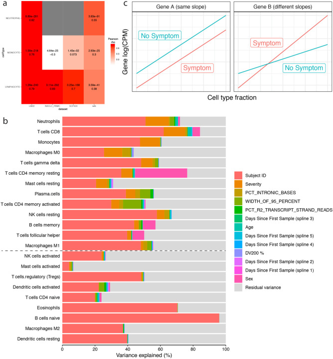
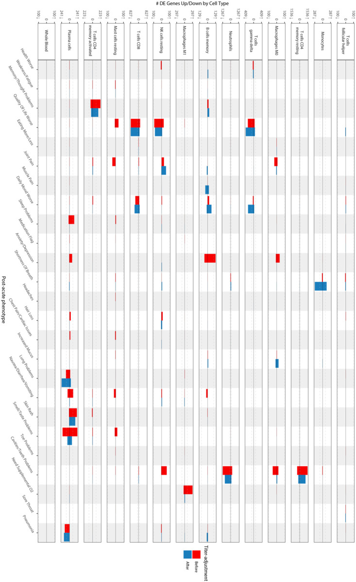
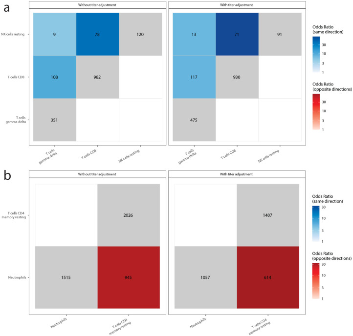
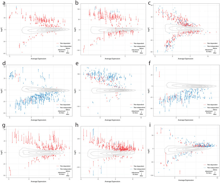
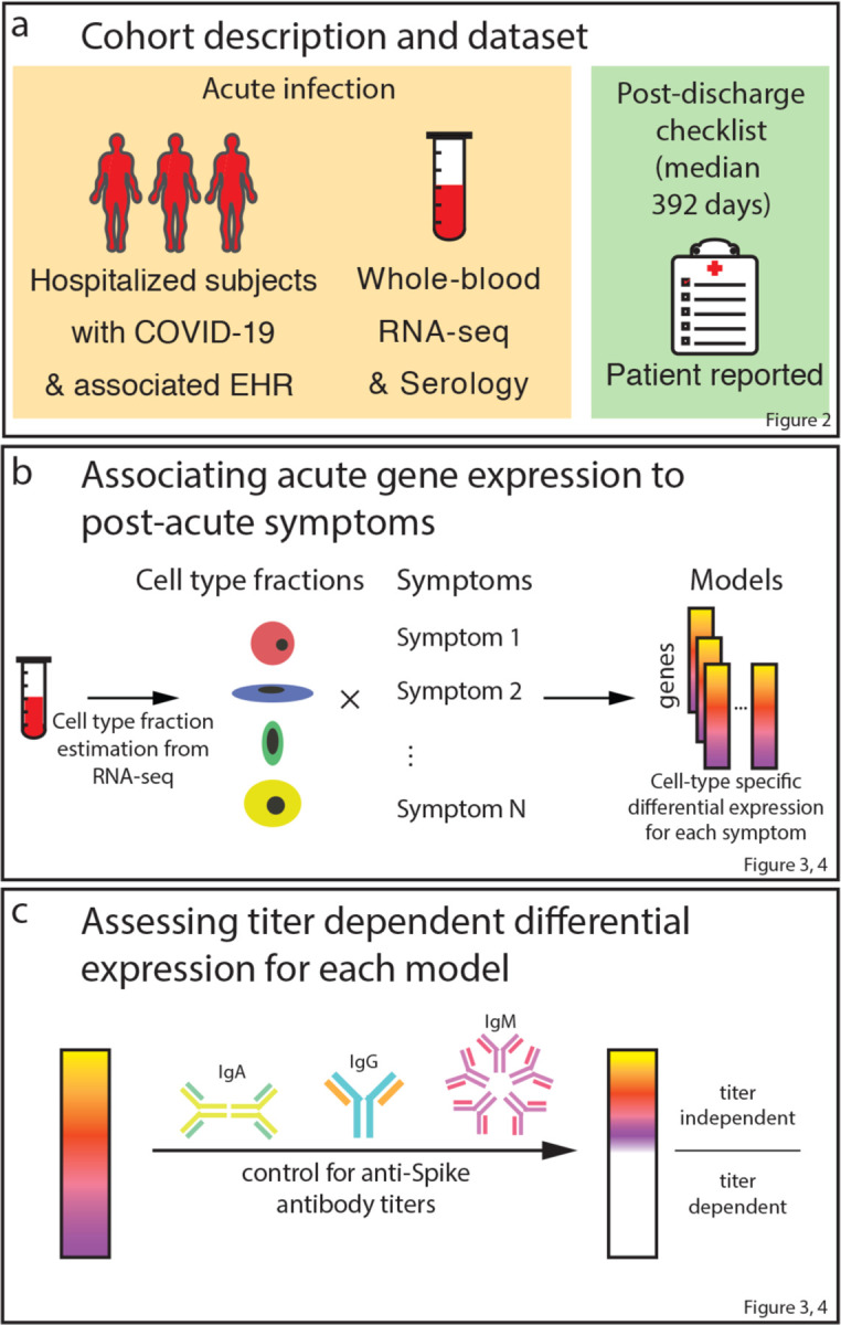
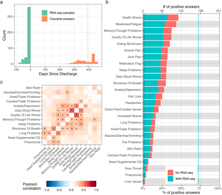
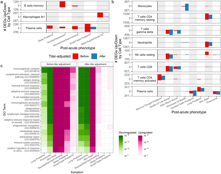
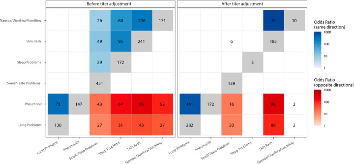
Two years into the SARS-CoV-2 pandemic, the post-acute sequelae of infection are compounding the global health crisis. Often debilitating, these sequelae are clinically heterogeneous and of unknown molecular etiology. Here, a transcriptome-wide investigation of this new condition was performed in a large cohort of acutely infected patients followed clinically into the post-acute period. Gene expression signatures of post-acute sequelae were already present in whole blood during the acute phase of infection, with both innate and adaptive immune cells involved. Plasma cells stood out as driving at least two distinct clusters of sequelae, one largely dependent on circulating antibodies against the SARS-CoV-2 spike protein and the other antibody-independent. Altogether, multiple etiologies of post-acute sequelae were found concomitant with SARS-CoV-2 infection, directly linking the emergence of these sequelae with the host response to the virus.


Figures

Extended Data Figure 1:
Extended Data Figure 1:. Correlation of occurrences of PASC checklist items, comorbidities, demographics, and acute disease metrics.
The axes are representative of the symptoms, comorbidities, demographics, and acute disease metrics, and the color represents the Pearson correlation of their coincidence. Comorbidities present before COVID-19 hospitalization are defined with the prefix “prior” in the axis label. Correlations with family wise error rate (FWER, Holm 1979) adjusted p values < 0.05 are indicated with a star. Rows and columns are ordered by hierarchical clustering and optimal leaf ordering.
Extended Data Figure 2:
Extended Data Figure 2:. Cell-type fraction estimations and interaction model
a) Validation heatmap of estimated cell-type fractions with clinical complete blood counts. The x axis shows the literature reference dataset used for the deconvolution procedure and the y axis is the cell-type fractions validated. The colors represent the Pearson correlation values between the estimated cell-type fractions and the corresponding complete blood count from the clinical data. The adjusted p-values (FWER, Holm 1979) and correlation values are noted in each box. b) Estimated cell-type fraction variance explained by biological and technical variables. The x axis is the percent of variance of the cell-type fractions explained by covariates (colors) and the y axis the cell type assessed. Cell types are ordered by the decreasing percent of their variance explained by COVID-19 severity. The black dashed line represents the cutoff for inclusion in the cell-type-specific analyses. c) Schematic of interaction model for mock genes A and B. The x axis is the cell-type fraction of a specific cell-type of interest and the y axis the gene expression in log2(counts per million). The color represents the presence (red) and absence (blue) of a symptom. The left and right facets show a gene not differentially expressed (same slope) and a differentially expressed gene (different slopes) respectively.
Extended Data Figure 3:
Extended Data Figure 3:. Cell-type-specific differential expression for PASC checklist items (full)
The x axes are PASC checklist items and the y axes the number of upregulated (up arrow) and downregulated (down arrow) DEGs at FDR<0.05. Checklist items are arranged in order of descending prevalence. Each facet presents DE results for the indicated cell type. The dashed grey lines indicate the 100 DEG mark. The color of the bars indicates whether the signatures have been adjusted for anti-spike antibody titers.
Extended Data Figure 4:
Extended Data Figure 4:. GO enrichments for DEGs for other PASC checklist items.
Box sizes are relative to the −log10(adjusted p values) of the GO term enrichments for the corresponding DEGs and the term is noted in each box. Related terms are grouped by similarity and groupings are indicated by proximity and shared color. Consensus terms are indicated in bold for each group. a) Upregulated genes in memory resting CD4+ T cells for cavities/teeth problems. b) Downregulated genes in CD8+ T cells for quality of life. c) Upregulated genes in M1 macrophages for need supplemental O2. d) Upregulated genes in memory B cells for anxiety/depression. e) Upregulated genes in memory activated CD4+ T cells for memory/thought problems.
Extended Data Figure 5:
Extended Data Figure 5:. Shared PASC checklist DEGs between cell-types.
The x and y axes are the cell types associated with more than 100 DEGs. The numbers in each box are the numbers of shared DEGs between the two checklist items defined in the axes, and the color represents whether they are same-direction (blue), opposite direction (red) or the total number of DEGs for that checklist item (grey). The shadings of red and blue are the ORs of the Fisher’s exact tests for the enrichment of shared DEGs in that box, and are shown only if the associated enrichment adjusted p-value < 0.05 (FWER, Holm 1979). The left and right facets represent the shared DEGs before and after adjustment for anti-spike antibody titers respectively. Symptoms in rows and columns are ordered by hierarchical clustering and optimal leaf ordering based on the shared same-direction DEGs. a) Quality of life shared DEGs. b) Cavities and teeth problems shared DEGs.
Extended Data Figure 6:
Extended Data Figure 6:. Delta-MA plot of anti-spike antibody titer effect on differential expression log2(fold change)
The x and y axes represent the average normalized gene expression and the differential expression log2(fold change) respectively. Each arrow shows a single DEG. The arrow colors indicate the anti-spike antibody titer dependent (red) and independent (blue) DEGs. The contours show the distribution of all log2(fold changes) before controlling for antibody titers. The effect of controlling for antibody titers on DEGs is shown by the arrows, with the arrow tail being the log2(fold change) before adjustment and the arrow head the log2(fold change) after adjustment. a) Sleep problems in plasma cells. b) Nausea/diarrhea/vomiting in plasma cells. c) Smell/taste problems in plasma cells. d) Lung problems in plasma cells. e) Skin rash in plasma cells. f) Pneumonia in plasma cells. g) Anxiety/depression in memory B cells. h) Need Supplemental O2 in M1 macrophages. i) Memory/Thought problems in memory activated CD4+ T cells.
Figure 1:
Figure 1:
Study workflow
Figure 2:
Figure 2:. Description of PASC checklist items
a) Histogram of the timing of blood sampling and PASC checklist completion. The x and y axes are the number of days since discharge and a count of observations respectively. The green bars are counts of RNA-seq samples and orange bars the number of days between COVID-19 hospitalization discharge (black dashed line) and PASC checklist completion (dashed orange line is the median). b) Prevalence of PASC checklist items in our cohort. The y axis is symptoms, the upper and lower x axes are the number of positive answers and percentage of subjects from the entire cohort with a positive answer, respectively. The blue line represents the subset of subjects with RNA-seq who completed the checklist. The dashed black line is the cutoff used for inclusion in follow up analyses. c) PASC checklist item correlations. The axes are representative of the symptoms of interest (Methods) and the color the Pearson correlation of their coincidence. Correlations with family wise error rate (FWER, Holm 1979) adjusted p values < 0.05 are indicated with a star. Rows and columns are ordered to minimize distance between adjacent symptoms.
Figure 3:
Figure 3:. Cell-type-specific differential expression for PASC checklist items
a,b) Anti-spike antibody titer dependent (a) and independent (b) cell-type specific expression signatures. The x axes are PASC checklist items and the y axes the number of upregulated (up arrow) and downregulated (down arrow) DEGs at FDR<0.05. Checklist items are arranged in order of descending prevalence. Each facet presents DE results for the indicated cell type. The dashed grey lines indicate the 100 DEG mark. The color of the bars indicates whether the signatures have been adjusted for anti-spike antibody titers. Only cell types and checklist items with more than 100 dependent/independent DEGs respectively are shown. c) GO term enrichments for plasma cell DEGs. The x and y axes are the checklist items with more than 100 DEGs and GO terms respectively. The union of the top three GO terms for all selected checklist items are shown. The color indicates the direction of the DEGs enriched for that term. Shading of color is representative of the FDR and only FDR < 0.05 are colored. The facets represent before (left) and after (right) controlling for anti-spike antibody titers.
Figure 4:
Figure 4:. Shared plasma cell DEGs between PASC checklist items
The x and y axes are the PASC checklist items associated with more than 100 DEGs. The numbers in each box are the numbers of shared DEGs between the two checklist items defined in the axes, and the color represents whether they are same-direction (blue), opposite direction (red) or the total number of DEGs for that checklist item (grey). The shadings of red and blue are the odds ratios (ORs) of the Fisher’s exact tests for the enrichment of overlapping genes in that box, and are shown only if the associated enrichment adjusted p-value < 0.05 (FWER, Holm 1979). The left and right facets represent the shared DEGs before and after adjustment for anti-spike antibody titers respectively. Symptoms in rows and columns are ordered by hierarchical clustering and optimal leaf ordering based on the shared same-direction DEGs.

References

    1. Logue J. K. et al. Sequelae in Adults at 6 Months After COVID-19 Infection. JAMA Netw Open 4, e210830, doi: 10.1001/jamanetworkopen.2021.0830 (2021). - DOI - PMC - PubMed
    1. Tenforde M. W. et al. Characteristics of Adult Outpatients and Inpatients with COVID-19 – 11 Academic Medical Centers, United States, March-May 2020. MMWR Morb MortalWkly Rep 69, 841–846, doi: 10.15585/mmwr.mm6926e3 (2020). - DOI - PMC - PubMed
    1. Nalbandian A. et al. Post-acute COVID-19 syndrome. Nat Med 27, 601–615, doi: 10.1038/s41591-021-01283-z (2021). - DOI - PMC - PubMed
    1. Bell M. L. et al. Post-acute sequelae of COVID-19 in a non-hospitalized cohort: Results from the Arizona CoVHORT. PLoS One 16, e0254347, doi: 10.1371/journal.pone.0254347 (2021). - DOI - PMC - PubMed
    1. Huang Y. et al. COVID Symptoms, Symptom Clusters, and Predictors for Becoming a Long-Hauler: Looking for Clarity in the Haze of the Pandemic. medRxiv, doi: 10.1101/2021.03.03.21252086 (2021). - DOI - PMC - PubMed

Publication types