

Epidemic versus economic performances of the COVID-19 lockdown: A big data driven analysis
- PMID: 34703071
- PMCID: PMC8531026
- DOI: 10.1016/j.cities.2021.103502
Epidemic versus economic performances of the COVID-19 lockdown: A big data driven analysis
Abstract
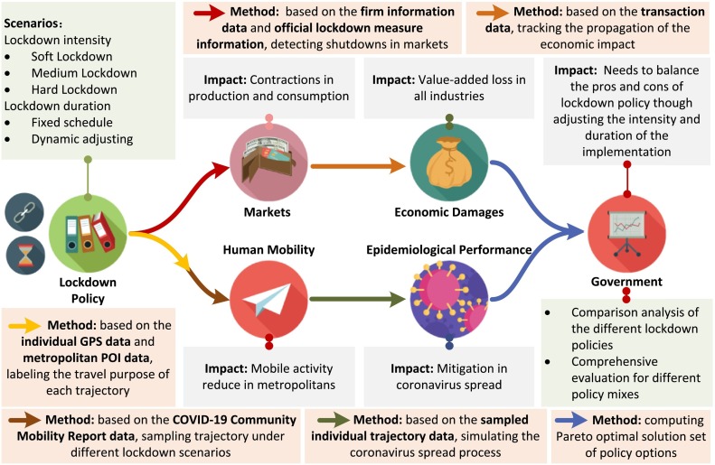
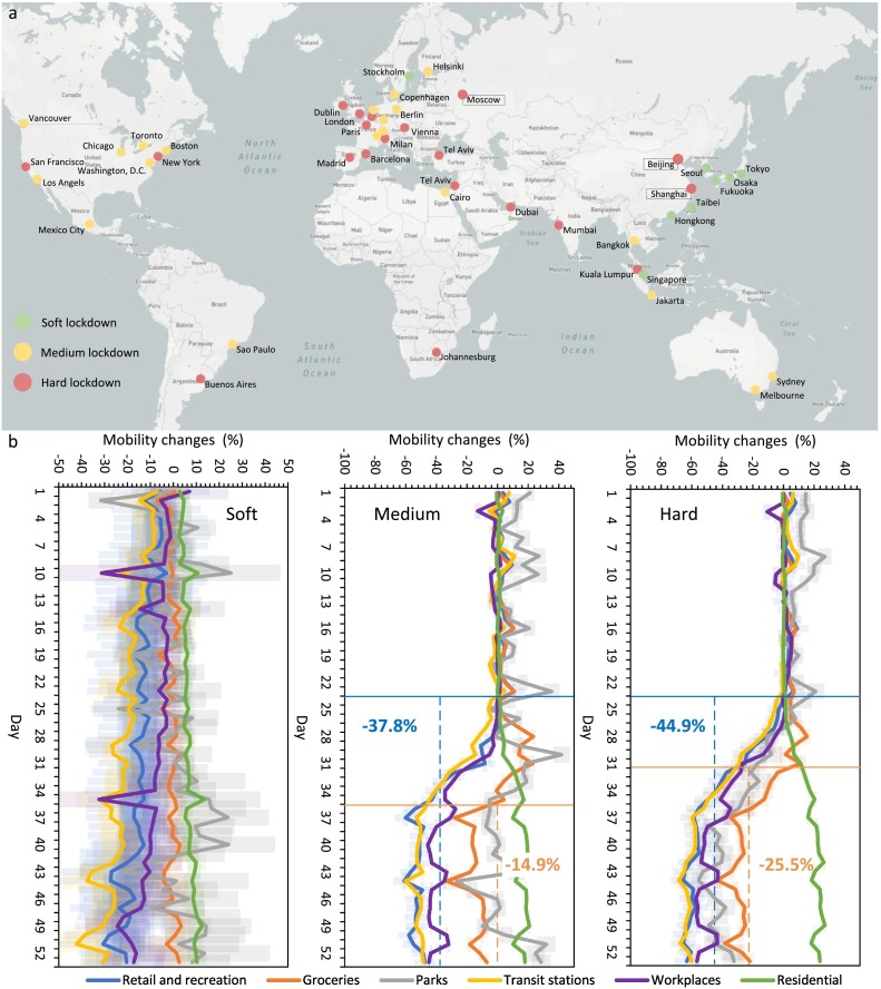
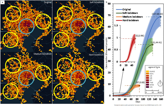
Lockdown measures have been a "panacea" for pandemic control but also a violent "poison" for economies. Lockdown policies strongly restrict human mobility but mobility reduce does harm to economics. Governments meet a thorny problem in balancing the pros and cons of lockdown policies, but lack comprehensive and quantified guides. Based on millions of financial transaction records, and billions of mobility data, we tracked spatio-temporal business networks and human daily mobility, then proposed a high-resolution two-sided framework to assess the epidemiological performance and economic damage of different lockdown policies. We found that the pandemic duration under the strictest lockdown is less about two months than that under the lightest lockdown, which makes the strictest lockdown characterize both epidemiologically and economically efficient. Moreover, based on the two-sided model, we explored the spatial lockdown strategy. We argue that cutting off intercity commuting is significant in both epidemiological and economical aspects, and finally helped governments figure out the Pareto optimal solution set of lockdown strategy.
Keywords: COVID-19; Economic damage; Epidemiological performance; Metropolitan lockdown.
© 2021 Published by Elsevier Ltd.
Conflict of interest statement
The authors declare that they have no known competing financial interests or personal relationships that could have appeared to influence the work reported in this paper.
Figures
Similar articles
-
Lockdown Policies, Economic Support, and Mental Health: Evidence From the COVID-19 Pandemic in United States.Front Public Health. 2022 Jun 2;10:857444. doi: 10.3389/fpubh.2022.857444. eCollection 2022. Front Public Health. 2022. PMID: 35719685 Free PMC article.
-
Trade-Off between COVID-19 Pandemic Prevention and Control and Economic Stimulus.Int J Environ Res Public Health. 2022 Oct 27;19(21):13956. doi: 10.3390/ijerph192113956. Int J Environ Res Public Health. 2022. PMID: 36360836 Free PMC article.
-
EpiMob: Interactive Visual Analytics of Citywide Human Mobility Restrictions for Epidemic Control.IEEE Trans Vis Comput Graph. 2023 Aug;29(8):3586-3601. doi: 10.1109/TVCG.2022.3165385. Epub 2023 Jun 29. IEEE Trans Vis Comput Graph. 2023. PMID: 35385385
-
Social inequalities in mobility during and following the COVID-19 associated lockdown of the Madrid metropolitan area in Spain.Health Place. 2021 Jul;70:102580. doi: 10.1016/j.healthplace.2021.102580. Epub 2021 May 19. Health Place. 2021. PMID: 34022543 Free PMC article. Review.
-
Pandemic lockdown, healthcare policies and human rights: integrating opposed views on COVID-19 public health mitigation measures.Rev Cardiovasc Med. 2020 Dec 30;21(4):509-516. doi: 10.31083/j.rcm.2020.04.274. Rev Cardiovasc Med. 2020. PMID: 33387996 Review.
Cited by
-
Association of government effectiveness, logistics performance, IT systems and income with COVID-19 mortality.Heliyon. 2023 Apr;9(4):e15214. doi: 10.1016/j.heliyon.2023.e15214. Epub 2023 Apr 5. Heliyon. 2023. PMID: 37035369 Free PMC article.
-
Data-driven analysis of the impact of COVID-19 on Madrid's public transport during each phase of the pandemic.Cities. 2022 Aug;127:103723. doi: 10.1016/j.cities.2022.103723. Epub 2022 May 2. Cities. 2022. PMID: 35530724 Free PMC article.
-
Ambiguity in a pandemic recession, asset prices, and lockdown policy.J Public Econ Theory. 2022 May 5:10.1111/jpet.12591. doi: 10.1111/jpet.12591. Online ahead of print. J Public Econ Theory. 2022. PMID: 35936653 Free PMC article.
-
How has COVID-19 impacted the economic resilience of retail clusters?: Examining the difference between neighborhood-level and district-level retail clusters.Cities. 2023 Jun 28:104457. doi: 10.1016/j.cities.2023.104457. Online ahead of print. Cities. 2023. PMID: 38620167 Free PMC article.
-
Therapeutic effects of herbal-medicine combined therapy for COVID-19: A systematic review and meta-analysis of randomized controlled trials.Front Pharmacol. 2022 Sep 1;13:950012. doi: 10.3389/fphar.2022.950012. eCollection 2022. Front Pharmacol. 2022. PMID: 36120361 Free PMC article.
References
-
- Alvarez F. 2020. A simple planning problem for COVID-19 lockdown a simple planning problem for.
-
- Barro R.J., Ursúa J.F., Weng J. National Bureau of Economic Research; 2020. The coronavirus and the great influenza pandemic: Lessons from the "spanish flu" for the coronavirus's potential effects on mortality and economic activity.
-
- Barton C.M., Alberti M., Ames D., Atkinson J.-A., Bales J., Burke E., Chen M., Diallo S.Y., Earn D.J.D., Fath B. Call for transparency of COVID-19 models. Science. 2020;368(6490):482–483. - PubMed
-
- Bonaccorsi G., Pierri F., Cinelli M., Flori A., Galeazzi A., Porcelli F., Schmidt A.L., Valensise C.M., Scala A., Quattrociocchi W., Pammolli F. Economic and social consequences of human mobility restrictions under COVID-19. Proc. Natl. Acad. Sci. U. S. A. 2020;117(27):15530–15535. doi: 10.1073/pnas.2007658117. - DOI - PMC - PubMed
-
- Bonato P., Cintia P., Fabbri F., Fadda D., Giannotti F., Lopalco P.L., Mazzilli S., Nanni M., Pappalardo L., Pedreschi D. Mobile phone data analytics against the COVID-19 epidemics in Italy: Flow diversity and local job markets during the national lockdown. ArXiv Preprint. 2020 ArXiv:2004.11278.
LinkOut - more resources
Full Text Sources
Miscellaneous