. 2021:20:100168.
doi: 10.1016/j.mcpro.2021.100168. Epub 2021 Oct 27.

Proximity Extension Assay in Combination with Next-Generation Sequencing for High-throughput Proteome-wide Analysis

Affiliations

Proximity Extension Assay in Combination with Next-Generation Sequencing for High-throughput Proteome-wide Analysis

Lotta Wik et al. Mol Cell Proteomics. 2021.

Abstract

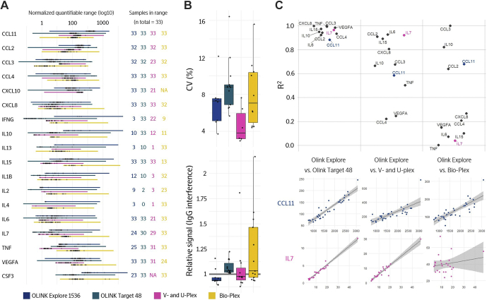
Understanding the dynamics of the human proteome is crucial for developing biomarkers to be used as measurable indicators for disease severity and progression, patient stratification, and drug development. The Proximity Extension Assay (PEA) is a technology that translates protein information into actionable knowledge by linking protein-specific antibodies to DNA-encoded tags. In this report we demonstrate how we have combined the unique PEA technology with an innovative and automated sample preparation and high-throughput sequencing readout enabling parallel measurement of nearly 1500 proteins in 96 samples generating close to 150,000 data points per run. This advancement will have a major impact on the discovery of new biomarkers for disease prediction and prognosis and contribute to the development of the rapidly evolving fields of wellness monitoring and precision medicine.

Keywords: antibody; biomarker; immunoassay; multiplex; next-generation sequencing; plasma; proteomics; proximity extension assay; serum.


Conflict of interest statement

Conflict of interest All authors are employees of Olink Proteomics AB commercializing the described method. An author may or may not be named as an inventor on current patents owned and controlled by Olink Proteomics AB, https://www.olink.com/patents/, as amended from time to time. All authors have financial interest in Olink Holding AB.

Figures

None
Graphical abstract
Fig. 1
Fig. 1
Schematic overview of Olink Explore.A, matched PEA probes (pairs of specific oligonucleotide-coupled antibodies) generate detectable amplicons only upon pairwise binding to a target protein. B, sequence elements of PEA amplicons for NGS readout: Illumina P5 and P7 adapters and read 1 sequencing primer site (Rd1SP), assay specific forward and reverse barcodes (FBC and RBC), hybridization site between probe arms (Hyb), and a sample-specific index. C, the highly automated workflow of Olink Explore is divided into the following steps: (i) A serial dilution of 96 samples (different sample dilutions are used depending on the concentration of the target proteins). (ii) The undiluted and diluted samples are distributed into four 384-well plates and combined with probes from each of the four 384-plex protein panels generating four abundance blocks (A–D) for each panel. (iii) The combined samples and probes are incubated over night at 4 °C. (iv) Amplicons are generated and preamplified from proximal binding probe pairs (PCR1). (v) Abundance blocks are pooled into a single 384-well plate and (vi) combined with unique sample index primers. (vii) The sample index sequences are incorporated via PCR (PCR2). (viii) PCR amplicons are pooled into four sequence libraries. (ix) The libraries are purified using AMPure XP beads and (x) quality controlled using the Agilent 2100 Bioanalyzer system before (xi) sequenced on an Illumina NovaSeq 6000 instrument to generate close to 150,000 data points.
Fig. 2
Fig. 2
Internal and external controls. Olink Explore uses three internal and three external controls that are used for quality control and data normalization.
Fig. 3
Fig. 3
The almost 150,000 data points generated from one Olink Explore run are visualized in the plot where protein abundances from 88 samples are plotted as Delta Normalized Protein eXpression (dNPX) values for all assays. The 88 samples are paired plasma and serum samples from 40 individuals, six of which are analyzed as technical triplicates. The assays are sorted based on decreasing mean dNPX as measured in plasma among all individuals. The 40 individuals could be stratified into two distinct groups based on BMI (normal or high), with 20 individuals each. The data points from the individual with the highest BMI as measured in plasma are connected by a pink line to visualize the shape of a protein profile fingerprint. The black horizontal line denotes limit of detection (LOD).
Fig. 4
Fig. 4
Validation of range and precision for Olink Explore assays.A, standard curves were generated from a dilution series of the target recombinant antigens. Four different parameters: limit of detection (LOD), lower limit of quantitation (LLOQ), upper limit of quantitation (ULOQ), and hook were defined from the generated standard curves. LOD was defined as three SD above the signal generated from the Olink Explore negative control sample. LLOQ, ULOQ, and hook were defined using four parameter logistic regressions (details can be found on the Olink website, www.olink.com). The four parameters for each assay are visualized in the figure as a gray line for each assay indicating LOD and hook. The gray line is overlayed with a blue line indicating the quantifiable range. The assays are sorted based on decreasing mean of the quantifiable range. Four lines (gray dashed lines for LOD and hook and blue solid lines for LLOQ and ULOQ) of smoothing averages using generalized additive models (GAM) were plotted on top of the vertical lines of the individual assay values. The area between the smoothed averages for LLOQ and ULOQ is filled with a semitransparent blue color representing the quantifiable range. B, intra- and inter-CV values were calculated individually for each assay from linearized NPX values from samples run on the same and different plate(s), respectively, here visualized using density plots (details can be found on the Olink website, www.olink.com). The dashed vertical lines denote average values.
Fig. 5
Fig. 5
Three biological assays (IL6, IL8/CXCL8, and TNF) were used to assess interplate correlation. These are present in all four 384-panels and used to verify the high quality of the data. The following plots represent the protein abundances (NPX) for all three assays measured in the different 384-assay panels. This was done for 64 individuals from one run demonstrating high correlation between panels.
Fig. 6
Fig. 6
A small subset of Olink Explore assays targeting cytokines (n = 18) were compared to the corresponding assays from the Olink Target 48, MSD and Luminex platforms.A, the number of quantifiable plasma measurements from 33 tested individuals. The quantifiable data generated from each method (black dots) are plotted within the corresponding normalized quantifiable range (colored line) on a log10 scale. B, technical triplicates were used to calculate intraassay precision for the different methods (top) and a pooled plasma sample with and without additional IgG was used to calculate interference as the percentage difference in the sample with added IgG (bottom). Only quantifiable data were used for the evaluation. C, r2 values were calculated between Olink Explore and the other methods for all assays with at least six pairwise quantifiable measurements. Two assays (CCL11 and IL7) are highlighted with colored dots together with the corresponding correlation plots including linear regressions and confidence intervals (Olink Explore values on the y-axis and the comparison method on the x-axis, linear scales).
Fig. 7
Fig. 7
Comparison between protein abundances measured from paired EDTA plasma and serum samples for a set of 40 individuals.A, the EDTA plasma and serum samples from one individual were analyzed in duplicates and are summarized in a four correlation figures. All axes are positive and represent the measurements in NPX from one of the four replicates. The correlation between technical replicates of the same sample type was high (r2 of 0.994 and 0.996 for plasma and serum, respectively) as seen in the upper right and lower left quadrant. In contrast, a clear difference is observed between plasma and serum (r2 of 0.897) as seen in the lower right and upper left quadrant. The blue lines are not linear regressions but denote theoretical equality between replicates (i.e., x = y). B, paired t-tests were applied to all the 1472 proteins measured in EDTA plasma and serum from the 40 individuals and are summarized in a volcano plot. The y-axis represents the probability of an actual difference between the two sample matrices and the x-axis represents the estimated difference. The lower and upper horizontal lines denote nominal (p < 0.05) and Bonferroni (p < 0.05/1472) significance, respectively. The blue (n = 192) and pink (n = 243) data points represent proteins that are increased in serum and EDTA plasma, respectively, using the Bonferroni significance.
Fig. 8
Fig. 8
Protein profile comparison between 20 obese (high BMI, 30–37.5 kg/m2) and 20 normal weight (low BMI, 18–22.5 kg/m2) individuals as measured from EDTA plasma and serum samples.A, t-tests assuming equal variance within the groups (high and low BMI) were individually applied to all the 1463 proteins screened in EDTA plasma and serum, presented here as two volcano plots. The y-axis represents the probability of an actual protein assay difference between the two BMI groups, whereas the x-axis represents the size of the estimated difference. The lower and upper horizontal lines denote nominal (p < 0.05) and Bonferroni (p < 0.05/1472) significance, respectively. The blue and pink data points represent assays that are increased in low and high BMI groups, respectively, using Bonferroni significance. B, distribution of BMI in the two groups (H: high BMI, L: low BMI). C, the distribution in protein level for the most significantly affected protein, Leptin (LEP), demonstrates no overlap between the high and low BMI groups in neither of the matrices.
Appendix 2
Appendix 2

References

    1. Hortin G.L., Sviridov D. The dynamic range problem in the analysis of the plasma proteome. J. Proteomics. 2010;73:629–636. - PubMed
    1. Anderson N.L., Anderson N.G. The human plasma proteome: History, character, and diagnostic prospects. Mol. Cell. Proteomics. 2002;1:845–867. - PubMed
    1. Smith J.G., Gerszten R.E. Emerging affinity-based proteomic technologies for large-scale plasma profiling in cardiovascular disease. Circulation. 2017;135:1651–1664. - PMC - PubMed
    1. Joshi A., Rienks M., Theofilatos K., Mayr M. Systems biology in cardiovascular disease: A multiomics approach. Nat. Rev. Cardiol. 2021;18:313–330. - PubMed
    1. Assarsson E., Lundberg M., Holmquist G., Björkesten J., Thorsen S.B., Ekman D., Eriksson A., Rennel Dickens E., Ohlsson S., Edfeldt G., Andersson A.C., Lindstedt P., Stenvang J., Gullberg M., Fredriksson S. Homogenous 96-plex PEA immunoassay exhibiting high sensitivity, specificity, and excellent scalability. PLoS One. 2014;9(4) - PMC - PubMed