. 2021 Oct 26;10(21):4971.
doi: 10.3390/jcm10214971.

Machine Learning Refutes Loss of Smell as a Risk Indicator of Diabetes Mellitus

Affiliations

Machine Learning Refutes Loss of Smell as a Risk Indicator of Diabetes Mellitus

Jörn Lötsch et al. J Clin Med. .

Abstract

Because it is associated with central nervous changes, and olfactory dysfunction has been reported with increased prevalence among persons with diabetes, this study addressed the question of whether the risk of developing diabetes in the next 10 years is reflected in olfactory symptoms. In a cross-sectional study, in 164 individuals seeking medical consulting for possible diabetes, olfactory function was evaluated using a standardized clinical test assessing olfactory threshold, odor discrimination, and odor identification. Metabolomics parameters were assessed via blood concentrations. The individual diabetes risk was quantified according to the validated German version of the "FINDRISK" diabetes risk score. Machine learning algorithms trained with metabolomics patterns predicted low or high diabetes risk with a balanced accuracy of 63-75%. Similarly, olfactory subtest results predicted the olfactory dysfunction category with a balanced accuracy of 85-94%, occasionally reaching 100%. However, olfactory subtest results failed to improve the prediction of diabetes risk based on metabolomics data, and metabolomics data did not improve the prediction of the olfactory dysfunction category based on olfactory subtest results. Results of the present study suggest that olfactory function is not a useful predictor of diabetes.

Keywords: data science; diabetes mellitus; human olfaction; machine-learning; patients.


Conflict of interest statement

The authors have declared that no competing interest exist.

Figures

Figure 1
Figure 1
Flowchart showing the number of patients, the main items of data acquisition, and the steps of data analysis. The main steps of data analysis ranged from preprocessing to unsupervised and supervised analyses that assessed the extent to which olfactory and metabolomics databased subgroup assignments were mutually identified from the respective information. The figure has been created using Microsoft PowerPoint® (Redmond, WA, USA) on Microsoft Windows 11 running in a virtual machine powered by VirtualBox 6.1 (Oracle Corporation, Austin, TX, USA).
Figure 2
Figure 2
Distribution and group structures of one-dimensional main data: TDI olfactory score and FINDRISK score of diabetic risk. The dotplots show the individual values arranged in bins along with the range of values. The dots are colored according to predefined groups. Group boundaries are shown as vertical dashed black lines. The distribution of the data is shown as probability density function (PDF) estimated by means of the Pareto density estimation (PDE [61]; blue line) and overlaid on the histogram-like dotplots. For the olfactory TDI score, a GMM fit is shown as a red line, and the M = 2 single mixes are indicated as different colored lines. The Bayesian boundary between the Gaussians is indicated as a perpendicular magenta dashed line. The figure has been created using the R software package (version 4.0.5 for Linux; https://CRAN.R-project.org/ [54]) and the library “ggplot2” (https://cran.r-project.org/package=ggplot2 [112]). The colors were selected from the “colorblind_pal” and “stata_pal” palettes provided with the R library “ggthemes” (https://cran.r-project.org/package=ggthemes [113]).
Figure 3
Figure 3
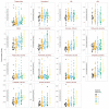
Raw metabolomics data. The data are plotted separately for the five diabetes risk groups according to the FINDRISK score (1 = “low risk”, 2 = “slightly increased risk”, 3 = “medium risk”, 4 = “high risk”, and 5 = “very high risk”). Individual data are shown as dots; six outliers removed from the further analysis are not shown to ensure discernibility of the projection of data points onto the ordinate. The original data are overlaid with boxplots, constructed using the minimum, quartiles, median (solid line within the box), and maximum. The whiskers add 1.5 times the interquartile range (IQR) to the seventy-fifth percentile or subtract 1.5 times the IQR from the twenty-fifth percentile. The figure has been created using the R software package (version 4.0.5 for Linux; https://CRAN.R-project.org/ [54]) and the R package “ggplot2” (https://cran.r-project.org/package=ggplot2 [112]). The colors were selected from the “colorblind_pal” palette provided with the R library “ggthemes” (https://cran.r-project.org/package=ggthemes [113]).
Figure 4
Figure 4
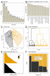
Results of principal component analysis (PCA) and Ward/k-means based clustering of the metabolomics data. (A): Scree-plot of the amount of variation of the data captured by each PC. The dashed horizontal reference dashed denotes the limit for PC selection for clustering set at an eigenvalue > 1 [66,67]. (B): Barplot of the contribution of each metabolomics parameter to PCs #1–#6 as the PCs with eigenvalues > 1. (C): Factorial plot of the individual data points on the principal component map, obtained following Ward clustering followed by k-means based cluster consolidation [68]. The colored areas visualize the cluster separation. (D): Cluster dendrogram obtained with the Ward algorithm. The two-cluster solution was the majority vote of 26 different indices [72] calculated to determine the number of clusters. (E): Silhouette plot [73] for the two-cluster solution. Positive values indicate that the sample is away from the neighboring cluster, while negative values would indicate that samples might have been assigned to the wrong cluster because they are closer to neighboring clusters than to their own cluster (not found). (F): Mosaic plot, visualizing the contingency table between the original group structure with respect to the diabetes risk (1 = “low risk”, 2 = “slightly increased risk”, 3 = “medium risk”, 4 = “high risk”, and 5 = “very high risk”) and the cluster identified on the PCA projection of the metabolomics data. The results of χ2 testing are indicated on the panel. The figure has been created using the R software package (version 4.0.5 for Linux; https://CRAN.R-project.org/ [54]) and the R packages “ggplot2” (https://cran.r-project.org/package=ggplot2 [112]) and “FactoMineR“ (https://cran.r-project.org/package=FactoMineR [65]). The colors were selected from the “colorblind_pal” palette provided with the R library “ggthemes” (https://cran.r-project.org/package=ggthemes [113]).
Figure 5
Figure 5
Correlations of metabolomics and olfactory data. Age and BMI are additionally included as control variables. In the lower-left part, the correlations are color-coded for both correlation strength and direction (bars in the upper right corner). The color-coding of the correlation ranges from the blue for a high negative correlation, to gray/white for no correlation, to green for a strong positive correlation. The more intense the color, the higher the correlation. The correlation strength is additionally coded by the size of the square symbolizing the correlation. Cell labels indicate Pearson’s r [114] values, crossed out if not statically significant. Correlations with the FINDRISK score as the main target of this analysis are marked with a red frame. The figure has been created using the R software package (version 4.0.5 for Linux; https://CRAN.R-project.org/ [54]) and the library “corrplot” (https://cran.r-project.org/package=corrplot [115]).
Figure 6
Figure 6
Relevant regressors of either diabetes risk or olfactory test score. Feature selection results for regression analyses using three different methods, including (i) the random forest-based “Boruta” method [100] (panels (A,D)), (ii) the least absolute shrinkage and selection operator (LASSO [101]) (panels (B,E)), and (iii) the analysis of the relative importance of variables for linear regression [103] (panels (C,F)), followed by the selection of the most relevant variables using the calculated ABC analysis [104,105]. The bar charts show the variables that were identified as important by the feature selection algorithms in 1000 runs on two-thirds of the instances selected by random Monte Carlo selection from the original dataset. The final feature set (green bars) indicates the members of the ABC set “A” that results from subjecting the number of selections as relevant variables in the 1000 replicates to item categorization via computerized ABC analysis. The size of the final feature set is the most common size of the set of selected features during the 1000 runs. Variable name abbreviations: T: olfactory threshold, D: odor discrimination, I: odor identification, BMI: body mass index, HDL: high-density lipoprotein (HDL cholesterol), LDL: low density lipoprotein. The figure has been created using the R software package (version 4.0.5 for Linux; https://CRAN.R-project.org/ [54]) and the R package “ggplot2” (https://cran.r-project.org/package=ggplot2 [112]).

References

    1. Doty R.L. Clinical disorders of olfaction. Handb. Olfaction Gustation. 2015:375–402. doi: 10.1002/9781118971758.ch17. - DOI
    1. Upadhyay U.D., Holbrook E.H. Olfactory loss as a result of toxic exposure. Otolaryngol. Clin. North Am. 2004;37:1185–1207. doi: 10.1016/j.otc.2004.05.003. - DOI - PubMed
    1. Klopfenstein T., Kadiane-Oussou N.J., Toko L., Royer P.Y., Lepiller Q., Gendrin V., Zayet S. Features of anosmia in COVID-19. Med. Mal. Infect. 2020;50:436–439. doi: 10.1016/j.medmal.2020.04.006. - DOI - PMC - PubMed
    1. Hummel T., Whitcroft K.L., Andrews P., Altundag A., Cinghi C., Costanzo R.M., Damm M., Frasnelli J., Gudziol H., Gupta N., et al. Position paper on olfactory dysfunction. Rhinology. Suppl. 2017;54:1–30. doi: 10.4193/Rhino16.248. - DOI - PubMed
    1. Ansari K.A., Johnson A. Olfactory function in patients with Parkinson’s disease. J. Chron. Dis. 1975;28:493–497. doi: 10.1016/0021-9681(75)90058-2. - DOI - PubMed

LinkOut - more resources