

A Novel Bayesian Optimization-Based Machine Learning Framework for COVID-19 Detection From Inpatient Facility Data
- PMID: 34786301
- PMCID: PMC8545233
- DOI: 10.1109/ACCESS.2021.3050852
A Novel Bayesian Optimization-Based Machine Learning Framework for COVID-19 Detection From Inpatient Facility Data
Abstract
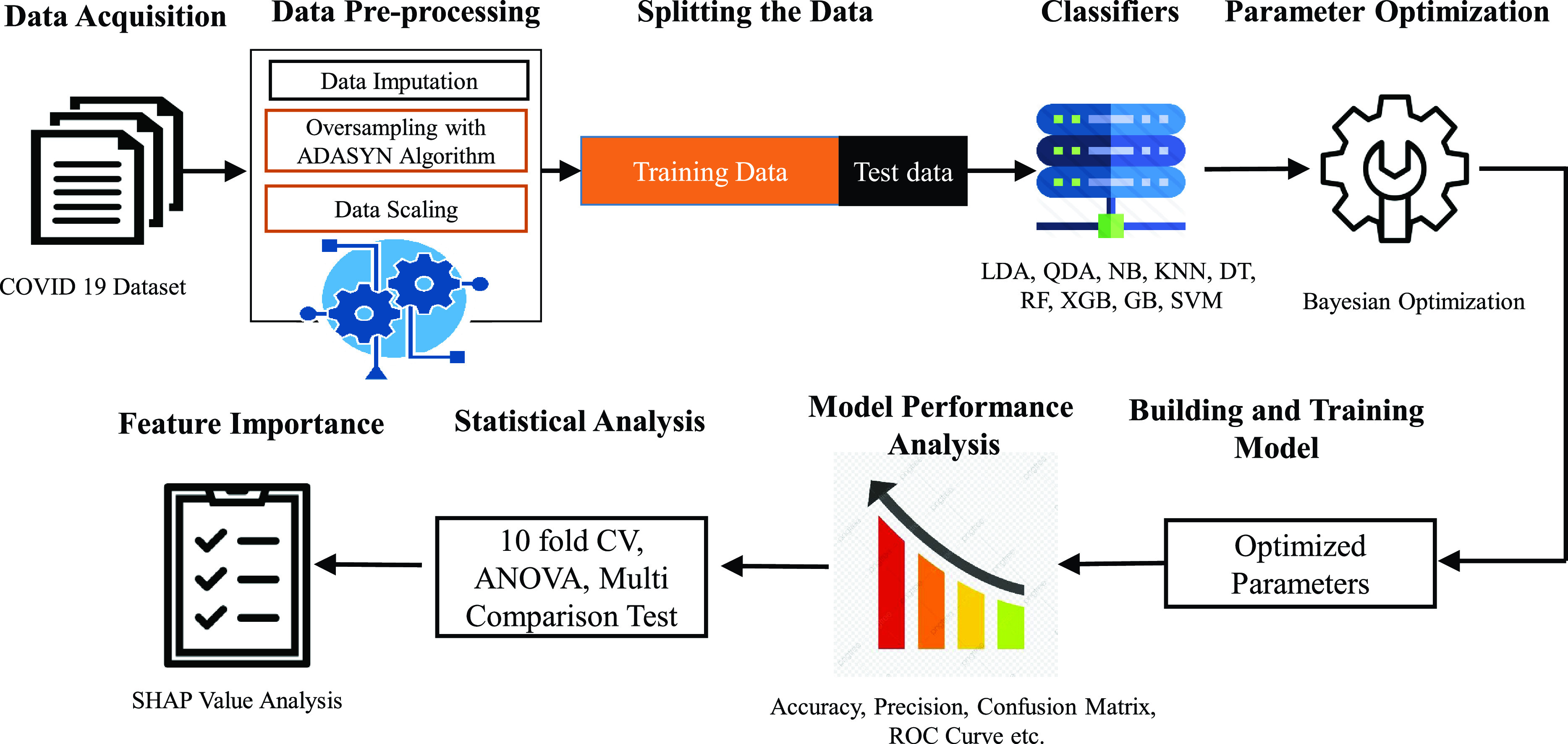
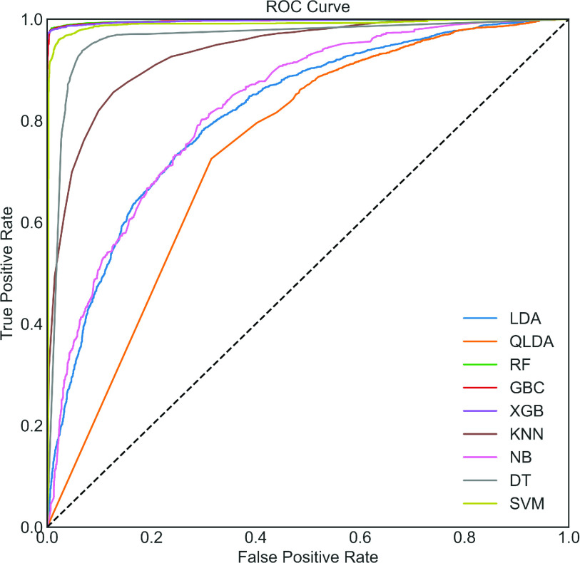
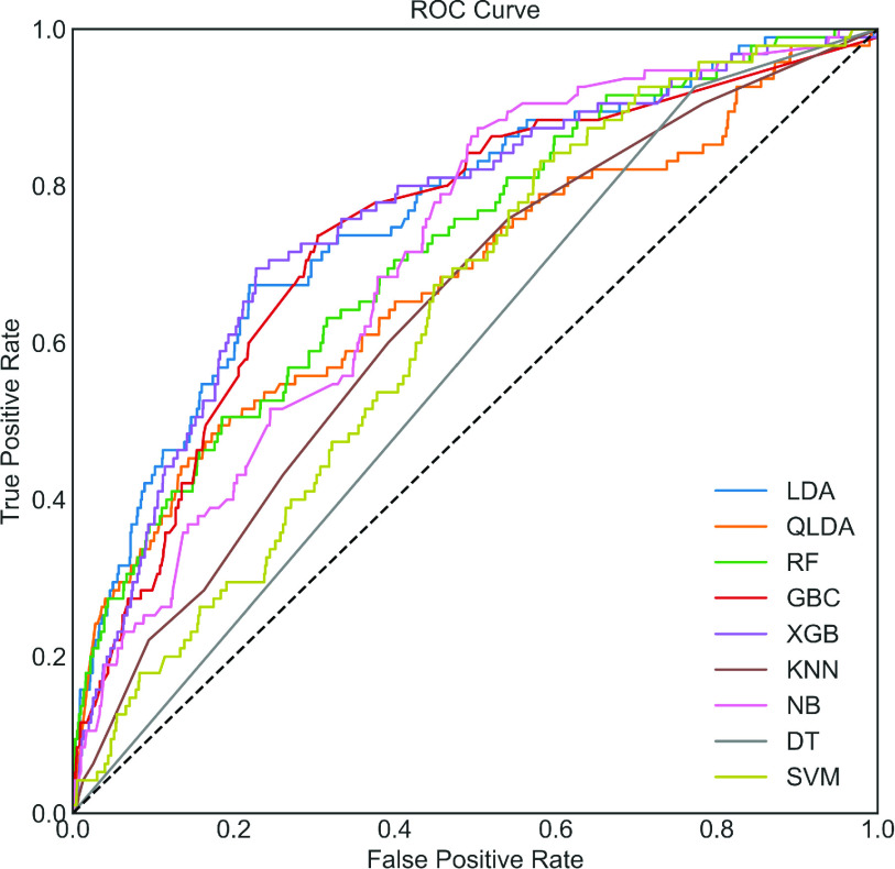
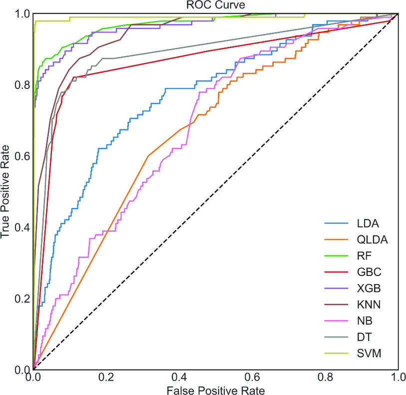
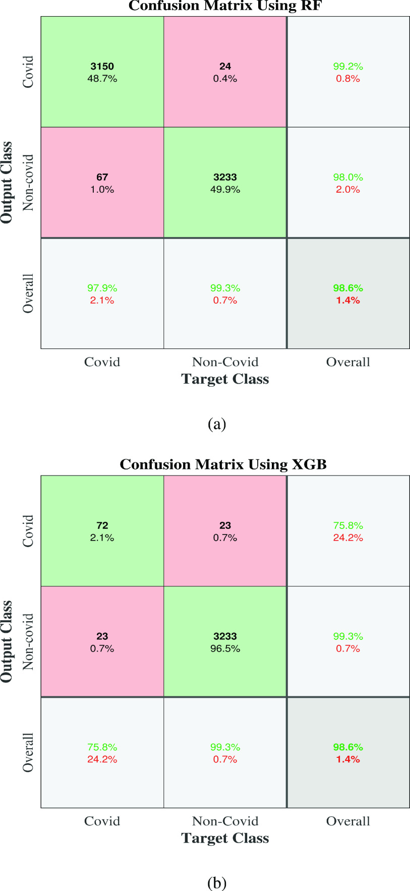
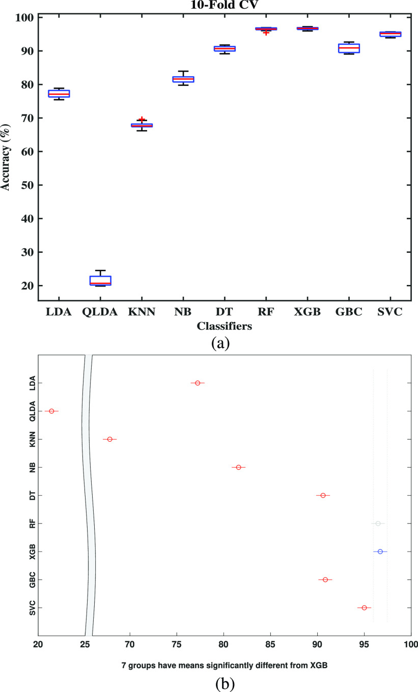
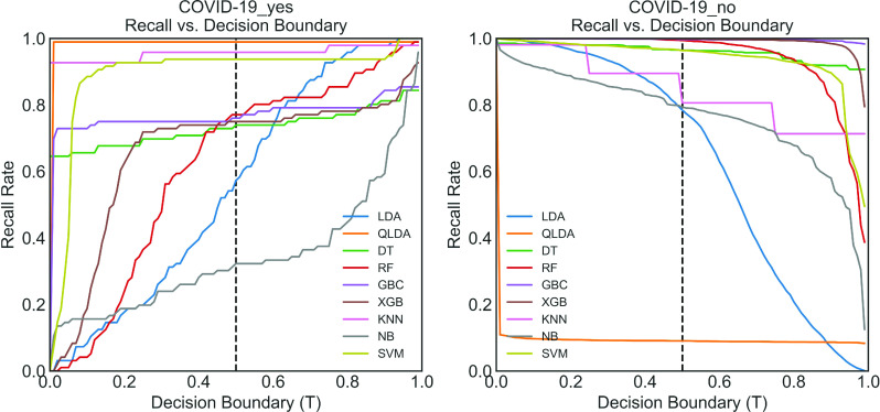
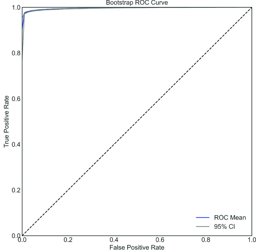
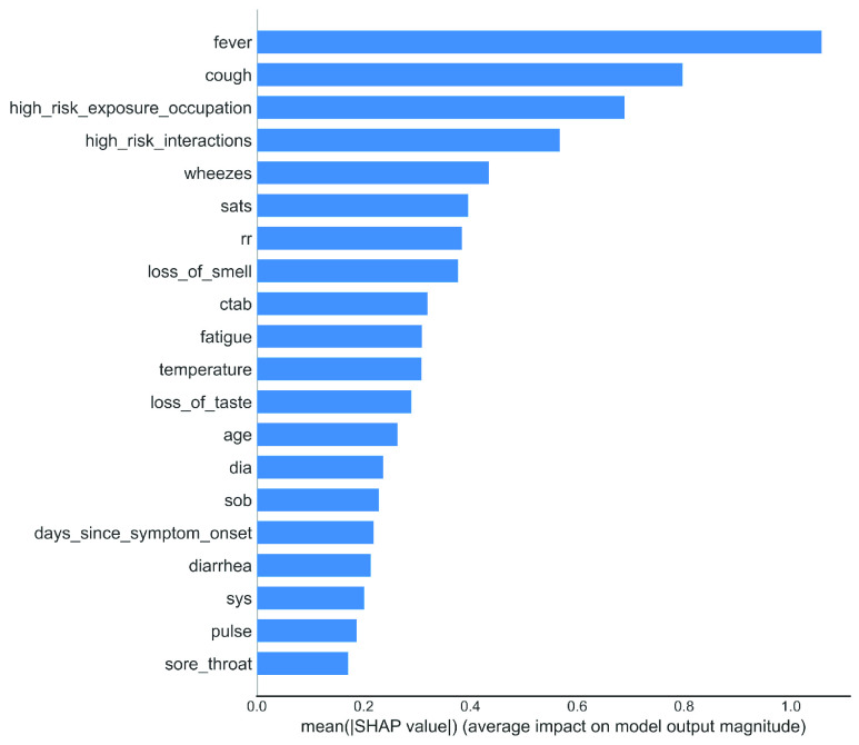
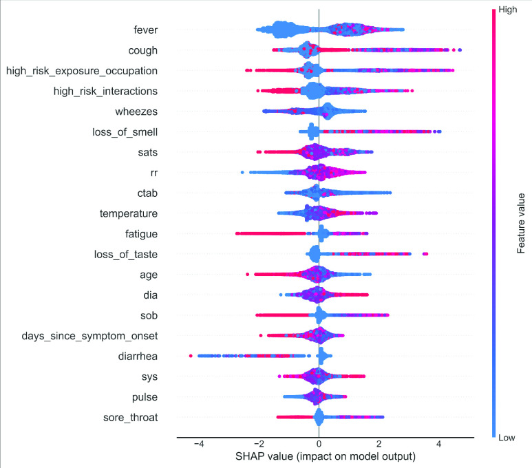
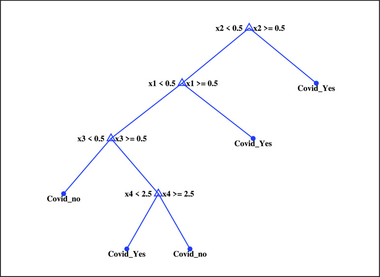
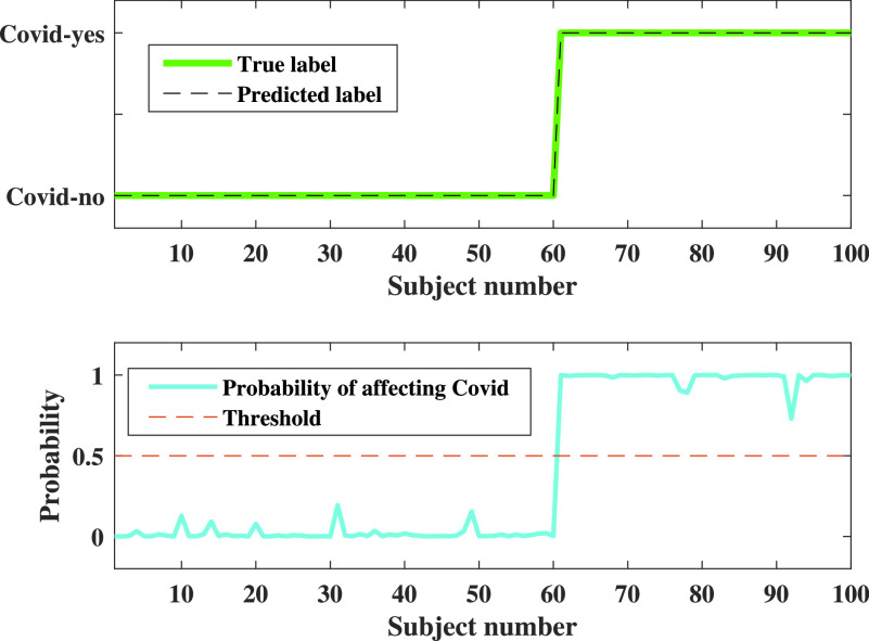
The whole world faces a pandemic situation due to the deadly virus, namely COVID-19. It takes considerable time to get the virus well-matured to be traced, and during this time, it may be transmitted among other people. To get rid of this unexpected situation, quick identification of COVID-19 patients is required. We have designed and optimized a machine learning-based framework using inpatient's facility data that will give a user-friendly, cost-effective, and time-efficient solution to this pandemic. The proposed framework uses Bayesian optimization to optimize the hyperparameters of the classifier and ADAptive SYNthetic (ADASYN) algorithm to balance the COVID and non-COVID classes of the dataset. Although the proposed technique has been applied to nine state-of-the-art classifiers to show the efficacy, it can be used to many classifiers and classification problems. It is evident from this study that eXtreme Gradient Boosting (XGB) provides the highest Kappa index of 97.00%. Compared to without ADASYN, our proposed approach yields an improvement in the kappa index of 96.94%. Besides, Bayesian optimization has been compared to grid search, random search to show efficiency. Furthermore, the most dominating features have been identified using SHapely Adaptive exPlanations (SHAP) analysis. A comparison has also been made among other related works. The proposed method is capable enough of tracing COVID patients spending less time than that of the conventional techniques. Finally, two potential applications, namely, clinically operable decision tree and decision support system, have been demonstrated to support clinical staff and build a recommender system.
Keywords: ADASYN; Bayesian optimization; COVID-19; classification; inpatient's facility data.
This work is licensed under a Creative Commons Attribution 4.0 License. For more information, see https://creativecommons.org/licenses/by/4.0/.
Figures
Similar articles
-
An Improved Machine-Learning Approach for COVID-19 Prediction Using Harris Hawks Optimization and Feature Analysis Using SHAP.Diagnostics (Basel). 2022 Apr 19;12(5):1023. doi: 10.3390/diagnostics12051023. Diagnostics (Basel). 2022. PMID: 35626179 Free PMC article.
-
HGSORF: Henry Gas Solubility Optimization-based Random Forest for C-Section prediction and XAI-based cause analysis.Comput Biol Med. 2022 Aug;147:105671. doi: 10.1016/j.compbiomed.2022.105671. Epub 2022 May 30. Comput Biol Med. 2022. PMID: 35660327
-
Development of a Smartphone-Based Expert System for COVID-19 Risk Prediction at Early Stage.Bioengineering (Basel). 2022 Jun 27;9(7):281. doi: 10.3390/bioengineering9070281. Bioengineering (Basel). 2022. PMID: 35877332 Free PMC article.
-
Weighted butterfly optimization algorithm with intuitionistic fuzzy Gaussian function based adaptive-neuro fuzzy inference system for covid-19 prediction.Mater Today Proc. 2022;56:3317-3324. doi: 10.1016/j.matpr.2021.10.153. Epub 2021 Oct 25. Mater Today Proc. 2022. PMID: 34722166 Free PMC article.
-
Reviewing ensemble classification methods in breast cancer.Comput Methods Programs Biomed. 2019 Aug;177:89-112. doi: 10.1016/j.cmpb.2019.05.019. Epub 2019 May 20. Comput Methods Programs Biomed. 2019. PMID: 31319964 Review.
Cited by
-
An Improved Machine-Learning Approach for COVID-19 Prediction Using Harris Hawks Optimization and Feature Analysis Using SHAP.Diagnostics (Basel). 2022 Apr 19;12(5):1023. doi: 10.3390/diagnostics12051023. Diagnostics (Basel). 2022. PMID: 35626179 Free PMC article.
-
Detection of COVID-19 Patients Using Machine Learning Techniques: A Nationwide Chilean Study.Int J Environ Res Public Health. 2022 Jun 30;19(13):8058. doi: 10.3390/ijerph19138058. Int J Environ Res Public Health. 2022. PMID: 35805713 Free PMC article.
-
Early-Stage Detection of Ovarian Cancer Based on Clinical Data Using Machine Learning Approaches.J Pers Med. 2022 Jul 25;12(8):1211. doi: 10.3390/jpm12081211. J Pers Med. 2022. PMID: 35893305 Free PMC article.
-
Early Prediction of Diabetes Using an Ensemble of Machine Learning Models.Int J Environ Res Public Health. 2022 Sep 28;19(19):12378. doi: 10.3390/ijerph191912378. Int J Environ Res Public Health. 2022. PMID: 36231678 Free PMC article.
-
A Modified Aquila-Based Optimized XGBoost Framework for Detecting Probable Seizure Status in Neonates.Sensors (Basel). 2023 Aug 9;23(16):7037. doi: 10.3390/s23167037. Sensors (Basel). 2023. PMID: 37631573 Free PMC article.
References
-
- Mental Health and Psychosocial Considerations During the COVID-19 Outbreak, World Health Org., Geneva, Switzerland, 2020. Accessed: Mar. 18, 2020.
-
- Coronavirus Disease 2019 (COVID-19): Situation Report 88, World Health Org., Geneva, Switzerland, 2020.
-
- Jebril N. M. T., “World Health Organization declared a pandemic public health menace: A systematic review of the coronavirus disease 2019‘COVID-19,”’ Int. J. Psychosocial Rehabil., vol. 24, no. 9, pp. 2784–2795, May 2020.
-
- WHO. Coronavirus Disease (COVID-19) Dashboard. Accessed: Aug. 4, 2020. [Online]. Available: https://covid19.who.int/
-
- Van Doremalen N., Bushmaker T., Morris D. H., Holbrook M. G., Gamble A., Williamson B. N., Tamin A., Harcourt J. L., Thornburg N. J., Gerber S. I., and Lloyd-Smith J. O., “Aerosol and surface stability of SARS-CoV-2 as compared with SARS-CoV-1,” New England J. Med., vol. 382, no. 16, pp. 1564–1567, 2020. - PMC - PubMed
LinkOut - more resources
Full Text Sources