. 2021 Dec;22(12):1577-1589.
doi: 10.1038/s41590-021-01059-0. Epub 2021 Nov 22.

Single-cell proteo-genomic reference maps of the hematopoietic system enable the purification and massive profiling of precisely defined cell states

Affiliations

Single-cell proteo-genomic reference maps of the hematopoietic system enable the purification and massive profiling of precisely defined cell states

Sergio Triana et al. Nat Immunol. 2021 Dec.

Abstract

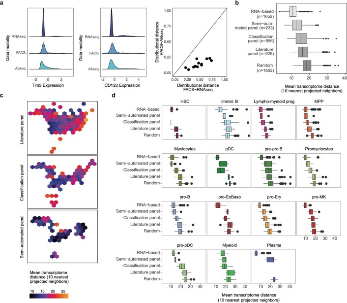
Single-cell genomics technology has transformed our understanding of complex cellular systems. However, excessive cost and a lack of strategies for the purification of newly identified cell types impede their functional characterization and large-scale profiling. Here, we have generated high-content single-cell proteo-genomic reference maps of human blood and bone marrow that quantitatively link the expression of up to 197 surface markers to cellular identities and biological processes across all main hematopoietic cell types in healthy aging and leukemia. These reference maps enable the automatic design of cost-effective high-throughput cytometry schemes that outperform state-of-the-art approaches, accurately reflect complex topologies of cellular systems and permit the purification of precisely defined cell states. The systematic integration of cytometry and proteo-genomic data enables the functional capacities of precisely mapped cell states to be measured at the single-cell level. Our study serves as an accessible resource and paves the way for a data-driven era in cytometry.


Conflict of interest statement

The oligo-coupled antibodies used in this study were a gift from BD Biosciences. The authors declare no other relevant conflicts of interest.

Figures

Fig. 1
Fig. 1. A comprehensive single-cell proteo-genomic map of young, aged and malignant BM.
a, Overview of the study. See Methods and main text for details. b, Top: UMAP display of single-cell proteo-genomics data of human BM from healthy young, healthy aged and AML patients (n = 70,017 single cells, 97 surface markers), integrated across n = 9 samples and data modalities. Clusters are color-coded. ery, erythroid; prog, progenitor. Bottom: UMAPs highlighting sample identities. See Supplementary Note 5 for details of cluster annotation. The whole transcriptome Abseq data is presented in Supplementary Note 2, the Abseq experiments with measurements of 197 surface markers are presented in Extended Data Fig. 4. c, Normalized expression of selected mRNAs and surface proteins highlighted on the UMAP space from b. Top: expression of mRNAs encoding surface markers widely used to identify main cell types. Middle: expression of the corresponding surface proteins. Bottom: expression of markers widely used to stratify main cell types into subtypes. Only the parts of the UMAPs highlighted by dashed polygons in the middle row are shown. For all data shown throughout the manuscript, BM mononuclear cells from iliac crest aspirations from healthy adult donors or AML patients were used unless stated otherwise.
Fig. 2
Fig. 2. Association of surface marker expression with cell type identities, cellular differentiation and biological processes.
a, For each surface marker measured in our 97-plex Abseq data, the fraction of variance explained by different covariates (colored insets in top row) is displayed. For this, every single cell from healthy young individuals (n = 3 samples, 28,031 single cells) was assigned to a cell type identity (blue inset, see Fig. 1b), and cytotoxicity, stemness and cell cycle scores (red inset, see Extended Data Fig. 5e) as well as technical covariate scores were determined. Additionally, pseudotime analyses were used to assign differentiation scores to HSPCs (orange inset, see Fig. 3a). These covariates were then used to model surface marker expression in a linear model. The fraction of variance explained by each of the processes was quantified. See Methods, section Modeling variance in surface marker expression for details. b, Cell type identity markers. Dot plot depicting the expression of the 25 surface markers with the highest fraction of variance explained by cell type across main populations. Colors indicate mean normalized expression, point size indicates the fraction of cells positive for the marker. Automatic thresholding was used to identify positive cells, see Methods, section Thresholding of surface marker expression for details. c, T cell subtype markers. The expression of the 20 surface markers with the highest fraction of variance explained by T cell subtype is displayed, legend as in b. mem, memory; tissue-r, tissue-resident. d, HSPC differentiation markers. Megakar, megakaryocytic. Dot plot depicting expression changes of markers across pseudotime in CD34+ HSPCs. Color indicates logarithmic fold change (FC) between the start and the end of each pseudotime trajectory. Point size indicates the mutual information in natural units of information between pseudotime and marker expression. The 25 surface markers with the highest fraction of variance explained by pseudotime covariates are displayed.
Fig. 3
Fig. 3. Validation of novel stage-specific HSPC differentiation markers.
a, UMAP plot depicting CD34+ HSPCs and their pseudotime scores along five differentiation trajectories, see Methods, section Pseudotime analysis. The normalized pseudotime score across all lineages is color-coded. b, Scheme illustrating the experiments performed to validate the importance of selected markers. See main text and Supplementary Note 8 for details. c, UMAP display of mRNA expression of n = 630 CD34+ cells from a single-cell Smart-seq2 experiment where surface markers were recorded using FACS. For a detailed description of the experiment, see Supplementary Note 8. Upper left panel: cells with myeloid and erythroid gene expression signatures are highlighted on the UMAP. Remaining panels: surface protein expression (FACS data) of indicated markers is shown. d, UMAP display highlighting the normalized CD326 surface protein expression (Abseq data). e, Line plots depicting normalized CD326 surface protein expression (Abseq data) smoothed over the different pseudotime trajectories illustrated in a. Error ribbon indicates 95% confidence interval from the smoothing GAM model. f, Boxplots depicting the ratio in erythroid cells produced in single-cell cultures in relation to the CD326 expression of the founder cell (n = 231 single-cell derived colonies). See Methods, section Data visualization for a definition of boxplot elements. g, Left panel: scatter plots depicting the differentiation potential of single founder cells in relation to their CD326 and CD71 surface expression. The founder cell potential was categorized by its ability to give rise to (red) erythroid only progeny, (skyblue) a mix of erythroid, myeloid or any other progeny, (blue) only myeloid progeny or (gray) remaining, immature cells. Right panel: founder cells were subset according to their CD326 and CD71 surface expression status and relative fractions of their respective potential are summarized as pie charts. ho, Analysis of CD11a and Tim3. hk as in dg except that CD11a is shown in the UMAP (h), line plot (i), boxplot (j) and scatter plot (k). lo, Panels are analogous to dg, except that Tim3 expression is shown in the UMAP (l) line plot (m), boxplot (n) and scatter plot (o). For scatter plots in k and o, CD11a or Tim3 expression was plotted against the myeloid differentiation marker CD33. For j,k,n,o, n = 214 single-cell derived colonies. Source data
Fig. 4
Fig. 4. Adaptation of surface protein expression in healthy aging and cancer.
a, Correlation of surface marker expression between matched cell types from aged and young BM donors. For each cell type, mean surface marker expression across all cells was computed, separately for all ‘young’ and ‘aged’ samples. Left panel: histogram of Pearson correlation coefficients. Right panel: sample scatter plots depicting the mean surface expression of all measured markers in indicated cell types. b, Volcano plot depicting log2 fold change and false discovery rate (FDR) for a test for differential surface marker expression between cells from young and aged individuals, while accounting for cell types as covariates. See Methods for details. c, Boxplots depicting CD27 surface expression in naïve T cell populations from young and aged individuals. Sample size is provided as Figure Source Data. See Methods, section Data visualization for a definition of boxplot elements. d, Projection of AML samples onto healthy reference. See Supplementary Note 7 for details. e, Clustering of leukemia samples by their projected cell type composition. Lymphoid cells are excluded from the clustering. f, Density plots of monocyte pseudotime, resulting from projection on the healthy reference. See Methods for details. g, Heatmap depicting surface markers with differential expression between the phenotypic classes defined in e. The eight markers with the most significant P values from DESeq2 were selected for each comparison between classes. Average expression across all nonlymphoid cells is shown. ITD, internal tandem duplication; mut, mutation; wt, wild type. h, Surface expression of immunotherapy targets CTLA4 (CD152) and PD-L1 (CD274) in different myeloid compartments of healthy donors and AMLs. Sample size is provided as Figure Source Data. i, Scatter plot depicting the average expression of all surface markers in healthy HSCs and MPPs (x axis) and leukemic stem cells (LSC) projecting to the HSC and MPP cell state (y axis). Cells from four patients where the HSC/MPP class was covered with more than 20 cells are included (AML1, AML2, AML3 and AML Q6). P values for differential expression were computed using DESeq2 and are encoded in the symbol size, and previously described LSC markers are depicted as a triangle. Interpatient variability is color-coded, see Methods, for details. See also Supplementary Data 2. Source data
Fig. 5
Fig. 5. Data-driven definition of gating schemes for rare cell types.
Boxplot sample sizes are provided in the figure. See Methods, section Data visualization for a definition of boxplot elements. a, Purity and recall of published or data-driven gating schemes for cell populations within CD34+ and CD34 compartments, see also Extended Data Fig. 8. b, Different CD4+ T cell subsets are highlighted (central and right panels) and the corresponding distributions of cytotoxicity scores for every subset are displayed (left panel). c, Hypergate was used to identify a gating scheme for the isolation of cytotoxic CD4+ T cells. The suggested gate is highlighted on a scatter plot of CD4 and CD28 expression as identified from pregated CD45+ CD3+ Abseq data. Pie charts indicate precision and recall. d, FACS plot displaying the expression of CD4 and CD28 on pregated CD45+ CD3+ cells, and respective gates. e, Boxplot depicting the expression of surface markers with differential expression between CD4+ cytotoxic T cells and other CD4+ subsets, as identified from Abseq data (left panel) and validated with FACS using the gating strategy from d (right panel). f, Heatmap depicting gene expression of cytotoxicity-related genes in FACS-sorted CD4+ CD28 and CD4+ CD28+ cells, as quantified by qPCR (n = 3 patients). gj, Analogous to be. MSCs were identified via high CXCL12 expression (g) and a CD11aCD13+ gate on total BM cells was predicted for the isolation of CXCL12+ mesenchymal stem cells (h), which was confirmed using flow cytometry (i). j, Confirmation of differentially expressed surface markers on MSCs, derived from Abseq data, by flow cytometry. k, Heatmap depicting gene expression of common hematopoietic and MSC signature genes in FACS-sorted CD11aCD13+ MSCs and total BM cells outside the gate, as quantified by qPCR (n = 3 patients). Source data
Fig. 6
Fig. 6. Data-driven definition of gating schemes for HSPCs.
a, UMAP depicting all CD34+ HSPCs cells from one healthy young individual. See b for color scheme. b, Decision tree using surface marker expression from the Abseq data to classify cells into cell types. See Methods and main text for details. c, UMAP highlighting cell type classification obtained from the decision tree. Colors correspond to ‘gates’ applied to the expression levels of the 12 markers shown in b, not gene expression clusters. d, UMAP highlighting classification obtained from a decision tree recapitulating the classical gating scheme used in the field. Since CD135 was not part of the Abseq panel, the expression of FLT3 was smoothed using MAGIC. e, Boxplot depicting the intragate dissimilarity for cell classification with panels from Doulatov et al., the gating scheme from Karamitros et al., a ‘consensus gating’ scheme (see Extended Data Fig. 9) and the data-driven gating scheme (c). Intragate dissimilarity is defined as one minus the average Pearson correlation of normalized gene and surface antigen expression values of all cells within the gate. P values are from a two-sided Wilcoxon test. Sample size is shown in the figure. See Methods, section Data visualization for a definition of boxplot elements. f, Implementation of FACS gating scheme from b. g, UMAP display of mRNA expression of n = 630 CD34+ HSPCs from an indexed single-cell Smart-seq2 experiment where the expression of relevant surface markers was recorded using FACS. Left panel: color indicates gene expression cluster, see Supplementary Note 8 for details. Right panel: color indicates classification by the FACS scheme from f. h, Precision of the classification scheme shown in b, computed on the training data (Abseq) and the test data (Smart-seq2). Precision was computed per gate as the fraction of correctly classified cells. For comparison with the Doulatov gating scheme, the dataset from Velten et al. was used. NS, not significant. P values are from a two-sided Wilcoxon test. Sample size is shown in the figure.
Fig. 7
Fig. 7. Systematic integration of single-cell genomics, flow cytometry and functional data.
a, Illustration of the concept. b, Projection of indexed Smart-seq2 data onto a reference UMAP. Single cells with recorded FACS measurements of surface markers were subjected to Smart-Seq2 based scRNA-seq. FACS measurements of surface markers were used to project cells onto the UMAP (Methods). Colors denote cell type identified from RNA-seq. See Supplementary Table 6 for composition of the FACS panels. c, FACS-based projection of indexed Smart-seq2 data onto reference pseudotime trajectories. Line plots depict the RNA expression of differentiation markers smoothed over projected pseudotime values (red). For comparison, expression values determined from Abseq data are shown (blue). The selected genes correspond to the five genes with the strongest statistical association with the respective trajectory. d, Projection of indexed single-cell culture data onto a reference UMAP. Single cells with available FACS measurements of 12 surface markers were projected onto the UMAP defined by Abseq. Single cells were seeded into culture medium supporting the formation of erythroid, megakaryocytic and distinct myeloid cell types. UMAPs highlight the ability of single cells to give rise to erythroid cells and neutrophils, colony size and total number of cell types per colony. Colony and total number of cell types per colony are also plotted against projected pseudotime. e, Analysis of cell type combinations in n = 397 colonies. For any combination of Erythroid (Ery), Neutrophil (Neutro), Monocytic (Mono), Eosinophil or Basophil (EoBaso), Lymphoid (Lympho), Megakaryocytic (Mk) and Dendritic (cDC1 and cDC2) potential, the scatter plot depicts the fraction of colonies containing this exact combination of cell types (y axis) and the theoretical fraction of colonies containing the same combination under the assumption that cell fates are independently realized with the same marginal probabilities (x axis). Significance from a binomial test is color-coded. n.s., not significant. These analyses do not exclude that other combinations of fates are not biologically selected as well; that is, absence of evidence does not constitute evidence for absence. f, Principal component analysis of colony compositions. PC, principal component. g, Distribution of colonies with frequent combinations of cells types in the projected UMAP space. Erythromyeloid, exclusively EoBaso, Mk and/or Ery cells; Lymphomyeloid, all other combinations.
Extended Data Fig. 1
Extended Data Fig. 1. A proteo-genomic single-cell map of 97 surface markers in human bone marrow.
Related to Fig. 1. Dot plot depicting the expression of all surface markers by cell type. Color indicates mean normalized expression, point size indicates the fraction of cells positive for the marker. Automatic thresholding was used to identify positive cells, see Methods, section ‘Thresholding of surface marker expression’ for details. The panel on the right depicts the fraction of total reads obtained for each marker as a proxy for absolute expression levels. Bottom panel illustrates the distribution of CD34 + expression across populations, similar plots can be generated for any marker using the Abseq App.
Extended Data Fig. 2
Extended Data Fig. 2. Representative gating schemes used for the enrichment of CD34+ cells.
Related to Fig. 1. For additional information on cell sorting setups, see Methods, section ‘Cell sorting for Abseq’.
Extended Data Fig. 3
Extended Data Fig. 3. Sequencing statistics.
Related to Fig. 1. Plots depict a. The number of cells passing filters. Note that samples AML Q1-Q6 and APQ1–6 were multiplexed (hashed) into one experiment. b, c. The sequencing depth on the surface and mRNA level and d, e. The number of surface and mRNA molecules per cell observed. Note that targeted mRNA sequencing was performed as described in the main text.
Extended Data Fig. 4
Extended Data Fig. 4. A single-cell proteo-genomic map of 197 surface markers in human bone marrow and blood.
Related to Fig. 1. a. Left: UMAP projection on the original coordinate system from the healthy dataset (see Supplementary Note 7). Cells are colored by the mapped cell type. Right: UMAP colored by sample origin (blood and bone marrow). b. Violin plot depicting the expression of the bone marrow homing receptor CXCR4 on matching cell types of the blood and bone marrow. c. Dot plot depicting the expression of all surface markers by cell type. Color indicates mean normalized expression, point size indicates the fraction of cells positive for the marker. Automatic thresholding was used to identify positive cells, see Methods, section ‘Thresholding of surface marker expression’ for detail.
Extended Data Fig. 5
Extended Data Fig. 5. Markers of cell types and biological processes.
Related to Fig. 2. a. Heatmap investigating if the fraction of variance explained by the different covariates is correlated to antigen-level technical covariates. P values were calculated from Pearson correlation using a one-sided test based on the t-distribution. b-d. Dot plot depicting the expression of the 10–20 surface markers with the highest fraction of variance explained by B cell subtype (b), myeloid subtype (c) and NK cell subtype (d). Color indicates mean normalized expression, point size indicates the fraction of cells positive for the marker. Automatic thresholding was used to identify positive cells, see Methods, section ‘Thresholding of surface marker expression’ for details. e. UMAPs highlighting the scores for various biological processes, as computed using the gene lists from Supplementary Table 7. f. Bar charts depicting the markers with the highest fraction of variance explained by cytotoxicity score (pink), stemness score (red) and S-phase score (dark red), and the corresponding model coefficients. See Supplementary Table 7 for the gene lists used for calculating these scores. g. Pseudotime of all 97 surface proteins for the five trajectories (B cells, cDCs, Monocytes, Late erythroid progenitor and Megakaryocyte progenitor). Markers were clustered according to their expression pattern using tradeseq (van den Berge, 2020). The density plots indicate the differentiation stages along the pseudotime.
Extended Data Fig. 6
Extended Data Fig. 6. Surface markers associated with HSC and B cell differentiation.
Related to Figs. 2 and 3. See methods, section Data visualization for a definition of boxplot elements. a. Top: Line of surface protein expression smoothened over pseudotime (see Fig. 3a). Error ribbon indicates 95% confidence interval from the smoothing GAM model. Bottom: UMAP display of marker expression in CD34 + HSPCs. b. Left: Gating strategy for subsetting CD71 + erythroid/megakaryocytic HSPCs into CD41 + megakaryocyte and CD326 + erythroid progenitors. Right: UMAP display of flow cytometric data from CD34 + cells from a healthy donor analyzed with a 12-color FACS panel for erythroid/megakaryocytic differentiation (Supplementary Table 6). Feature plots of CD71, CD326 and CD41 expression highlight the bifurcation within CD71 + HSPCs. c. Culture outcome categories described in Fig. 3g were analyzed with regards to their CD326, CD11a or Tim3 surface expression. A two-sided Wilcoxon rank sum test was used for comparison of individual groups and significance levels between groups. P-values were adjusted for multiple comparisons using the Holm method. d, e. Like Fig. 3d, e, except that CD98 expression is shown. f. UMAP display of flow cytometric data from CD34 + cells from five healthy donors analyzed with a 12-color FACS stem and progenitor panel (Supplementary Table 6). Left: shows CD98 surface expression, right panel shows assignment of individual gates to the UMAP according, as follows: HSC: CD34 + CD38-CD45RA-CD90 + ; MPP: CD34 + CD38-CD45RA-CD90-; MLP: CD34 + CD38-CD45RA + ; MEP: CD34 + CD38 + CD10-CD45RA-; GMP: CD34 + CD38 + CD10-CD45RA + ; CLP: CD34 + CD38 + CD10 + CD45RA + . g. Boxplots showing CD98 expression in individual cell populations mentioned in f. h. Boxplots showing co-expression of CD98 and CD38 markers. i. Like Fig. 3a, UMAP depicting the pseudotime score along the B cell differentiation trajectory emanating from CD34 + HSCs & MPPs and Lymphomyeloid progenitors. jp. Line plots depicting surface expression representative for different biological processes smoothened over the B cell pseudotime trajectory. Source data
Extended Data Fig. 7
Extended Data Fig. 7. Changes in surface protein expression and cell type abundance induced by ageing and leukemia.
Related to Fig. 4. a. Frequency of selected cell types in young and aged individuals. Only cell types with the highest significant changes are shown, see Methods, section ‘Changes in cell type abundance between experimental groups’. b. UMAP display of all AML patients. Data were integrated using scanorama and MOFA (see Method ‘Data analysis of Abseq data’ and ‘MOFA integration, Clustering, and identification of cell type markers’). c. For every myeloid cell state with sufficient representation of ≥ 20 cells in at least three patients, surface marker expression between AML (x-axis) and healthy individuals (y-axis) is compared. AML cell types were defined using a projection as in Fig. 4d, e. P-values for differential expression were computed using DESeq2 and encoded in the symbol size. Inter-patient variability is color-coded (n = number of patients included), see Methods, section ‘Differential expression testing between experimental groups and estimation of inter-patient variability’ and Supplementary Data 2. d. Heatmap depicting cell state specific gene expression in leukemic and healthy individuals. Five most significantly overexpressed markers were identified for each cell state, using only leukemic cells. The expression of all markers selected is shown and compared to their expression in the corresponding healthy cell states. e. Correlations of surface marker expression are shown for matching cell types from young versus aged individuals, from healthy individuals versus AML patients, and for cell types versus the transcriptomically most similar cell type available in the dataset. See Methods, section Data visualization for a definition of boxplot elements. f. Boxplot depicting the expression of CD152 and CD274 in different cell states from different patients. Only populations covered with ≥ 50 cells per patient are included (Fig. 4h) and see source data (Source Data Extended Data Fig. 7) for sample size. Source data
Extended Data Fig. 8
Extended Data Fig. 8. Comparison of data-defined and state-of-the-art (expert-defined) gating schemes.
Related to Fig. 5. a. Performance of different methods for the definition of gates of CD34- populations. Gates for each cell type were defined from CD34- Abseq data as follows: Black dots correspond to gates identified from literature (Supplementary Table 5). Yellow dots correspond to gates that were set using the hypergate algorithm (Becht et al., 2019). Light blue and violet dots correspond to gates that were set using a decision tree with or without predefined thresholds, respectively. See also Methods. For each gating scheme, precision (purity) and recall were calculated. b. Automated and expert-defined gates of class switched memory B cells. Orange and blue dots on the UMAP correspond to class switched memory B cells located within and outside of the selected gate, respectively (that is true positives and false negatives). Green and gray dots correspond to other cells located inside and outside the gate, respectively (that is false positives and true negatives). Pie charts indicate precision and recall. Top: Shows an expert-defined state of the art gating scheme (CD3-CD19 + CD27 + IgD-). Bottom: Shows a data-defined gating scheme (CD80 + CD21 + IgG+IgD-). c. Like a, except that CD34 + populations are shown. d. Like b, except that gating schemes to define pDC progenitors are shown. e. Paired scatter plot depicting the mean fluorescence intensities (MFI) of CD127 and CD7 in CD4 + CD28- cytotoxic CD4 + T cells (yellow) and CD4 + CD28 + other CD4 + T cells (blue) in BM samples from healthy, AML and MDS patients. n = 6, 6 and 9 patients in the respective groups. f. Representative FACS histograms showing surface expression of well-known MSC surface markers. No significance = ns, P < 0.05 *, P < 0.01 **, P < 0.001 ***, P < 0.0001 ****. CD4 + CD28- and CD4 + CD28 + paired cell populations within the same BM donors from different disease entities were compared using paired two-tailed t-test. P-values were adjusted for multiple comparisons using the Bonferroni method. Source data
Extended Data Fig. 9
Extended Data Fig. 9. Evaluation of different gating schemes.
Related to Fig. 6. a. UMAP highlighting classification obtained from the gating scheme described by Karamitros et al., 2018, that is HSC: CD34 + CD38-CD10-CD45RA-CD90 + ; MPP: CD34 + CD38-CD10-CD45RA-CD90-; LMPP:CD34 + CD38-CD10-CD45RA + ; MLP: CD34 + CD38-CD10 + ; MEP: CD34 + CD38 + CD10-CD45RA-CD123-; CMP: CD34 + CD38 + CD10-CD45RA-CD123 + ; GMP: CD34 + CD38 + CD10-CD45RA + CD123 + ; B-NK: CD34 + CD38 + CD10 + . b. UMAP highlighting classification obtained from a consensus scheme combining the schemes of Doulatov et al., Karamitros et al. and Psaila et al., HSC: CD34 + CD38-CD10-CD45RA-CD90 + ; MPP:CD34 + CD38-CD10-CD45RA-CD90-; LMPP:CD34 + CD38-CD10-CD45RA + ; MLP: CD34 + CD38-CD10 + ; CD71-CD41- MEP: CD34 + CD38 + CD10-CD45RA-FLT3-ITGA2B-TFRC-; CD71 + CD41- MEP: CD34 + CD38 + CD10-CD45RA-FLT3-ITGA2B-TFRC + ; CD71 + CD41 + MEP: CD34 + CD38 + CD10-CD45RA-FLT3-ITGA2B + ; CMP: CD34 + CD38 + CD10-CD45RA-FLT3 + ; GMP: CD34 + CD38 + CD10-CD45RA + ; B-NK: CD34 + CD38 + CD10 + . The marker CD135, CD41, CD71 were not part of the 97 Abseq panel. The expression of the corresponding genes, FLT3, ITGA2B and TFRC, were smoothened using MAGIC respectively (van Dijk et al., 2018). c. UMAP of additional CD34 + cells with specific enrichment of CD34 + CD38- cells, projected on the original coordinate system, colored by mapped cell types d. Same as c but colored by immunophenotypic classification obtained from a consensus scheme recapitulating the scheme of Karamitros et al. and Psaila et al. (see above). e. Separation of functional potential by the data-driven and the literature ‘consensus gating’ scheme. Single cells were sorted according to the two gating schemes and cultured for 19 days. Colonies were scored as Ery/Mk if they contained at least 5 erythroid or megakaryocytic cells, and as Ly/My if they contained at least 5 cells of types Neutrophil, cDC, Monocyte, or B/NK. Unipotent: Only one of these cell types was formed with at least 5 cells; oligopotent: At least two of these cell types were formed. Only gates for which at least 9 colonies were observed are shown. f. Mutual information (in nats) between the gate identity and the ability to form any of the cell types, or the total mutual information across all cell types.
Extended Data Fig. 10
Extended Data Fig. 10. Projection and classification of cytometry data using a single-cell proteo-genomic reference.
Related to Fig. 7. a. Distribution of normalized, scaled expression values of Tim3 (left panel) and CD123 (central panel) measured by scRNA-seq, Abseq, and FACS. Right panel: Scatter plot depicts the dissimilarity between the distribution of expression values measured by FACS, and the distribution measured by scRNA-seq (x-axis) or Abseq (y-axis) as quantified using Kolmogorov-Smirnov distance. Data for all markers included in the panel from main Fig. 6f is shown. bd. Comparison of data integration strategies. Smart-seq2 data and Abseq data were integrated with five different strategies. RNA-based: Integration by Seurat v3, based on gene expression (transcriptome). Random: Random selection of ten nearest neighbors. Others: Surface marker-based integration using NRN, using defined sets of surface markers (Classification panel, Semi-automated panel: see Supplementary Table 6. Literature panel: CD34, CD38, CD45RA, CD90, CD10, CD135/FLT3, CD49f). For every cell projected on the UMAP, the ten nearest neighbors in projected UMAP space were identified. Subsequently, the mean Euclidean distance between their location in a gene expression-based PCA space (Smart-seq2) was computed. Sample size n = 1652. b. Boxplot summarizing the distance across data integration strategies. See figure for sample size. See Methods, section ‘Data visualization for a definition of boxplot elements’. c. Hexagonal plot summarizing the projection accuracy for different regions of the UMAP. d. Boxplots stratified by cell type demonstrate that projection using the semiautomated panel performs close to an RNA-based integration in most cases. See panel b for sample size.

References

    1. Stuart T, Satija R. Integrative single-cell analysis. Nat. Rev. Genet. 2019;20:257–272. - PubMed
    1. Tanay A, Regev A. Scaling single-cell genomics from phenomenology to mechanism. Nature. 2017;541:331–338. - PMC - PubMed
    1. Giladi A, Amit I. Single-cell genomics: a stepping stone for future immunology discoveries. Cell. 2018;172:14–21. - PubMed
    1. Schaum N, et al. Single-cell transcriptomics of 20 mouse organs creates a Tabula Muris. Nature. 2018;562:367–372. - PMC - PubMed
    1. Han X, et al. Mapping the mouse cell atlas by Microwell-seq. Cell. 2018;172:1091–1107.e17. - PubMed

Publication types

MeSH terms