. 2021 Dec 3;12(1):7063.
doi: 10.1038/s41467-021-26774-y.

Modeling serological testing to inform relaxation of social distancing for COVID-19 control

Affiliations

Modeling serological testing to inform relaxation of social distancing for COVID-19 control

Alicia N M Kraay et al. Nat Commun. .

Abstract

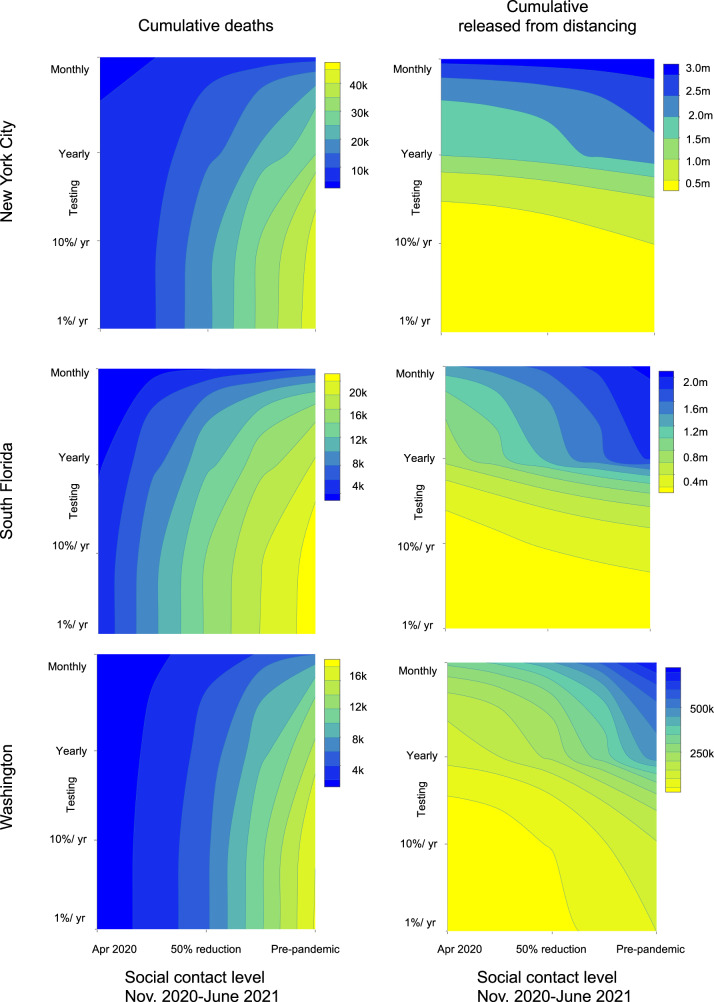
Serological testing remains a passive component of the public health response to the COVID-19 pandemic. Using a transmission model, we examine how serological testing could have enabled seropositive individuals to increase their relative levels of social interaction while offsetting transmission risks. We simulate widespread serological testing in New York City, South Florida, and Washington Puget Sound and assume seropositive individuals partially restore their social contacts. Compared to no intervention, our model suggests that widespread serological testing starting in late 2020 would have averted approximately 3300 deaths in New York City, 1400 deaths in South Florida and 11,000 deaths in Washington State by June 2021. In all sites, serological testing blunted subsequent waves of transmission. Findings demonstrate the potential benefit of widespread serological testing, had it been implemented in the pre-vaccine era, and remain relevant now amid the potential for emergence of new variants.


Conflict of interest statement

B.A.L. reports grants and personal fees from Takeda Pharmaceuticals and personal fees from World Health Organization outside the submitted work. A.N.M., K.N.N., J.S.W., C.Y.Z., and D.D. declare no competing interests.

Figures

Fig. 1
Fig. 1. Overall model diagram.
Serological antibody testing is shown by dashed arrows. Red dashed arrows indicate either false positives (i.e., someone is not immune, but is moved to the test-positive group) and occur at a rate that is a function of 1-specificity, or false negatives (i.e., someone is recovered, but stays in the test-negative group). True positives occur at a rate that is a function of the sensitivity. The hospitalization compartments are located in the “Not tested/test-negative” layer for simplicity, though individuals who incorrectly test positive could move to these compartments after developing a symptomatic infection.
Fig. 2
Fig. 2. The first row shows the consistency between the fitted model and the deaths/seroprevalence data for New York City, South Florida, and Washington Puget Sound.
Daily critical care cases through July 1. The second row shows the cumulative number of recovered (previously infected) individuals. Red squares show the seroprevalence estimates from Havers et al. in each location. In the third row, the cumulative deaths are shown, with death data shown in blue squares. Data are presented as mean (black line) ±1.96 sd (gray bands), calculated from 100 random samples. Gray bands show 95% credible intervals, derived from the last 5000 iterations of converged MCMC chains.
Fig. 3
Fig. 3. Critical care cases over time by testing level and location assuming 5:1 shielding.
Dates corresponding to the start of general social distancing in March 2020 and lifting at stay-at-home (SAH) orders in May and June 2020, are based on the dates that policies were enacted, or restrictions lifted, in each location. We assume that schools reopened at 50% capacity on September 1, 2020 in South Florida and October 1, 2020 in Washington and New York. Dotted lines show the impacts of a test with 90% specificity and solid lines show a test with 99.8% specificity. The 99.8% specificity scenario represents the accuracy reported among antibody tests currently authorized for use in the U.S., whereas the 90% specificity scenario is meant to capture reductions in accuracy that might be expected in a mass testing program.
Fig. 4
Fig. 4. Cumulative deaths and number released from social distancing.
The top row shows cumulative deaths by location (panels) by daily testing rate from March 2020 to February 2021 for the scenario with 5:1 shielding, with schools reopening on September 1, 2020 in South Florida and October 1, 2020 in Washington and New York. Colored lines show test specificity. The gray horizontal line shows the number of deaths in the no-testing scenario for each location. The bottom row shows the fraction of the population of each metropolitan area released from social distancing by June 1, 2021, assuming 5:1 shielding. Line colors correspond to testing levels; blue is monthly testing (10 million tests/day) of the U.S. population. Dashed lines show expected results with a highly specific test (specificity = 99.8%) and solid lines show expected results with a test with 90% specificity. The 99.8% specificity scenario represents the accuracy reported among antibody tests currently authorized for use in the U.S., whereas the 90% specificity scenario is meant to capture reductions in accuracy that might result from the implementation of a mass testing program. The 50% specificity level represents a scenario in which an antibody test cannot distinguish between immune and non-immune individuals.
Fig. 5
Fig. 5. Cumulative deaths and number released from distancing by testing level and contact reductions.
Contour plot of cumulative deaths in each location from November 1, 2020 to June 1, 2021 (left column) and the number of people released from social distancing (right column) as a function of the degree of relaxation of social distancing and number of tests per day. The far right of the x-axis corresponds to a pre-pandemic level of contact and the far left corresponds to the contact levels in each location during stay-at-home orders in March–June 2020. Both panels assume a test specificity of 99.8% and a shielding factor of 5:1.

Update of

References

    1. COVID-19 Map [Internet]. Johns Hopkins Coronavirus Resource Center. https://coronavirus.jhu.edu/map.html. Accessed 12 Nov 2020.
    1. Aylin, W. H. S. About 95% of Americans have been ordered to stay at home. This map shows which cities and states are under lockdown [Internet]. Business Insider. https://www.businessinsider.com/us-map-stay-at-home-orders-lockdowns-2020-3. Accessed 16 Apr 2020.
    1. Kaplan, J., Frias, L. & Morgan, M.-F. A third of the global population is on coronavirus lockdown—here’s our constantly updated list of countries and restrictions [Internet]. Business Insider. https://www.businessinsider.com/countries-on-lockdown-coronavirus-italy-.... Accessed 20 Apr 2020.
    1. American Enterprise Institute - AEI. National coronavirus response: a road map to reopening [Internet]. https://www.aei.org/research-products/report/national-coronavirus-respon.... Accessed 14 Apr 2020.
    1. Li, Y. et al. The temporal association of introducing and lifting non-pharmaceutical interventions with the time-varying reproduction number (R) of SARS-CoV-2: a modelling study across 131 countries. Lancet Infect. Dis.21, 193–202 (2021). - PMC - PubMed

Publication types