. 2021 Nov;2(11):1224-1242.
doi: 10.1038/s43018-021-00259-9. Epub 2021 Nov 22.

Proteogenomics of non-small cell lung cancer reveals molecular subtypes associated with specific therapeutic targets and immune evasion mechanisms

Affiliations

Proteogenomics of non-small cell lung cancer reveals molecular subtypes associated with specific therapeutic targets and immune evasion mechanisms

Janne Lehtiö et al. Nat Cancer. 2021 Nov.

Abstract

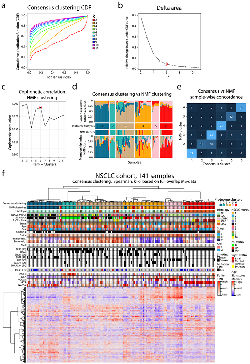
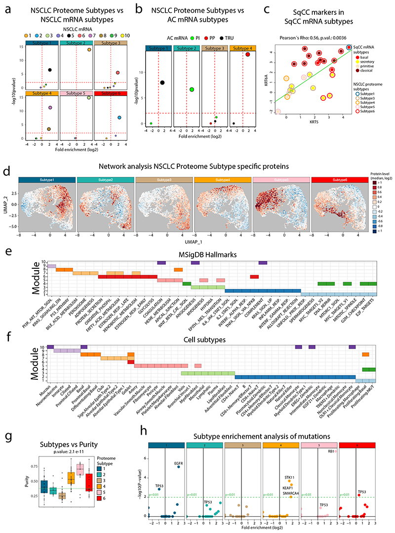
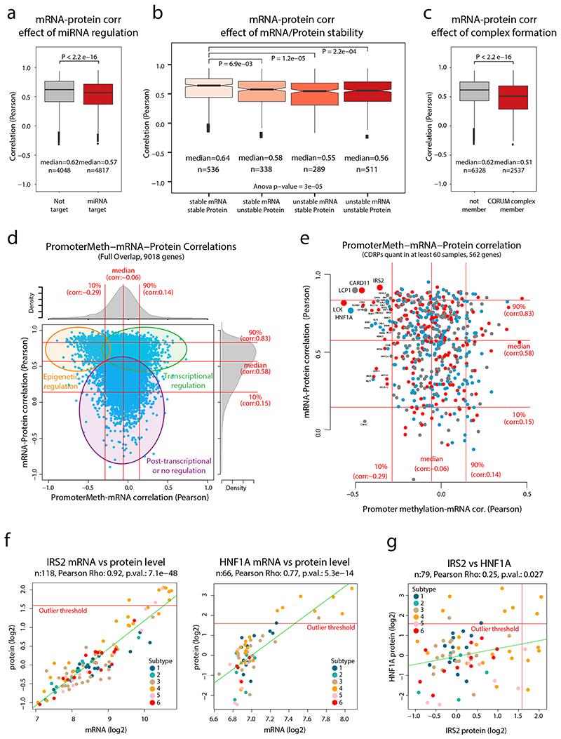
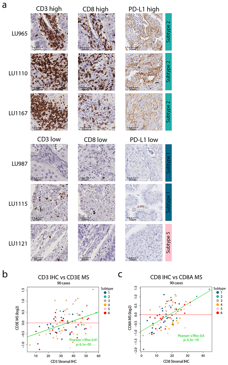
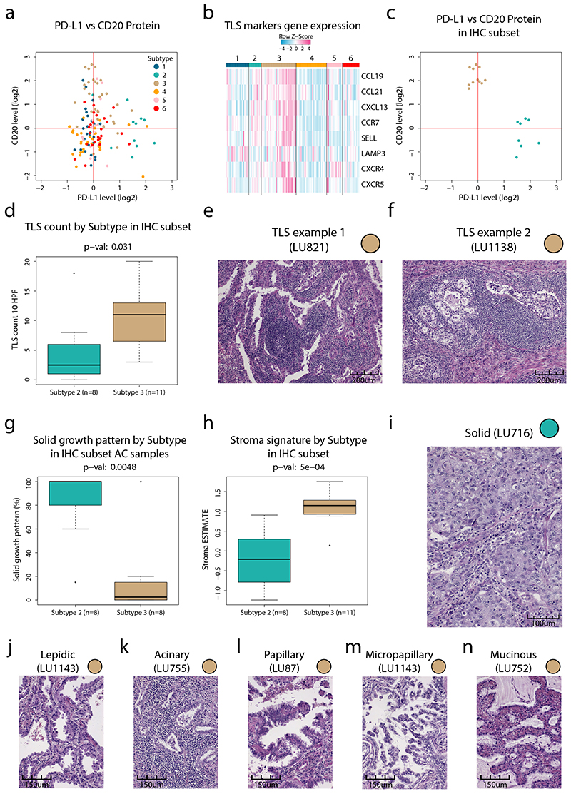
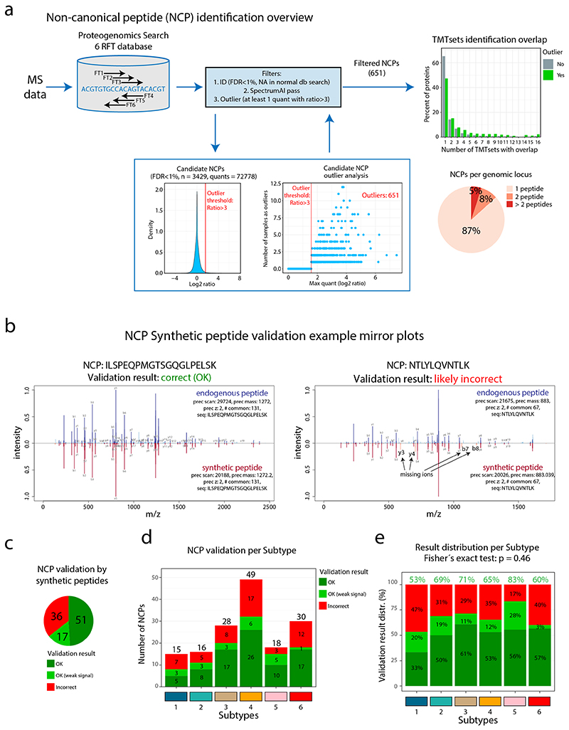
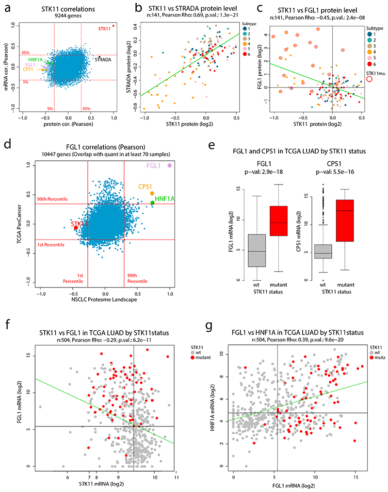
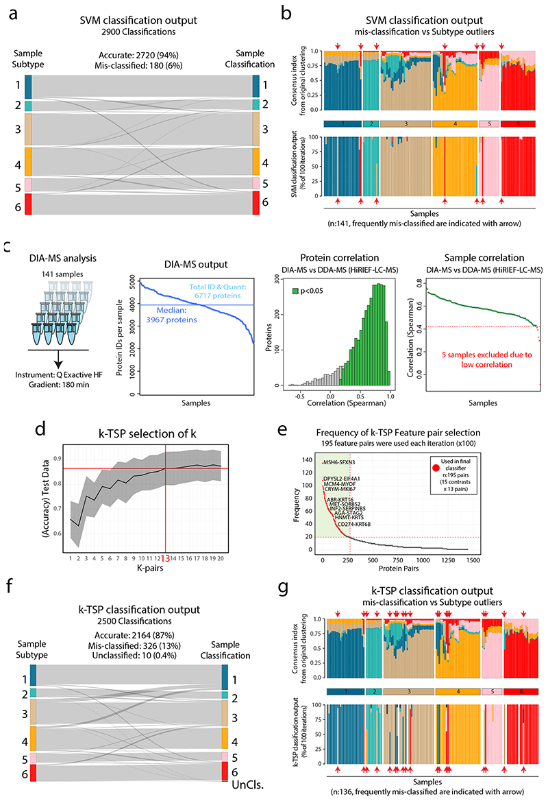
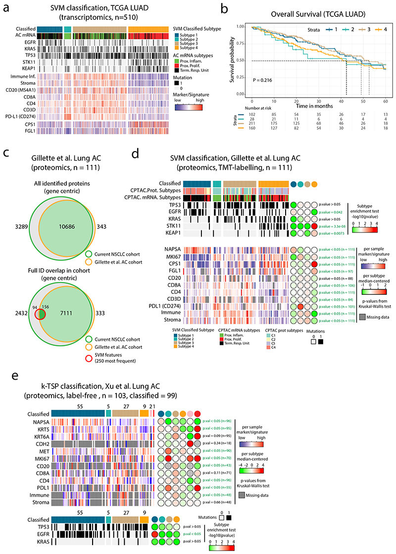
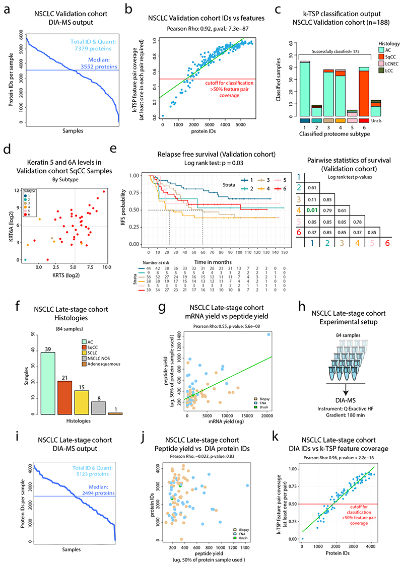
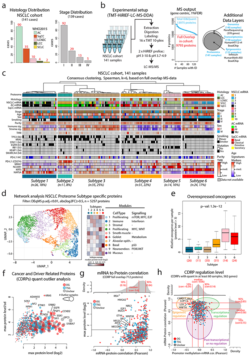
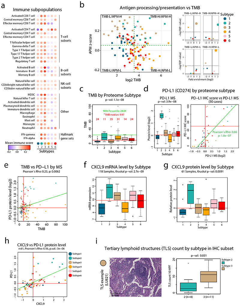
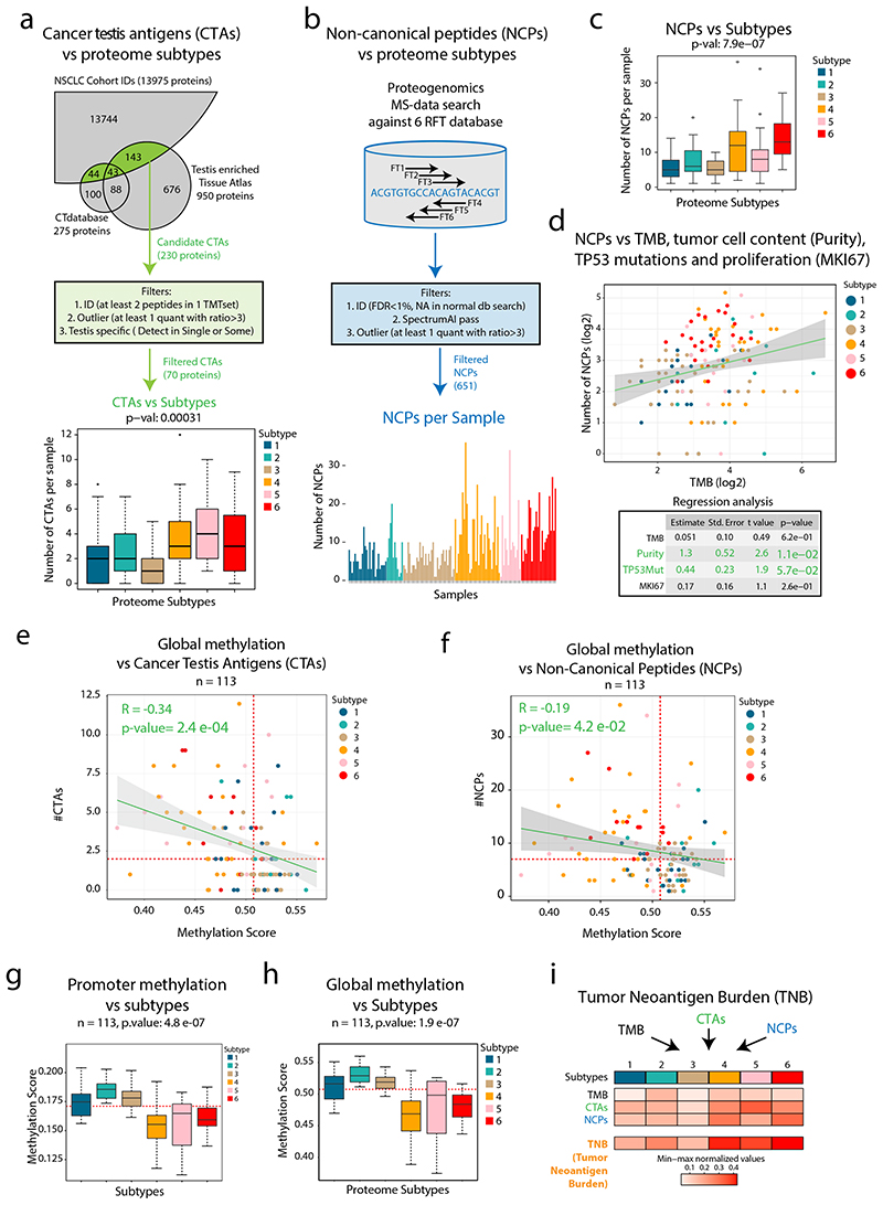
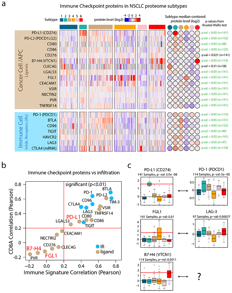
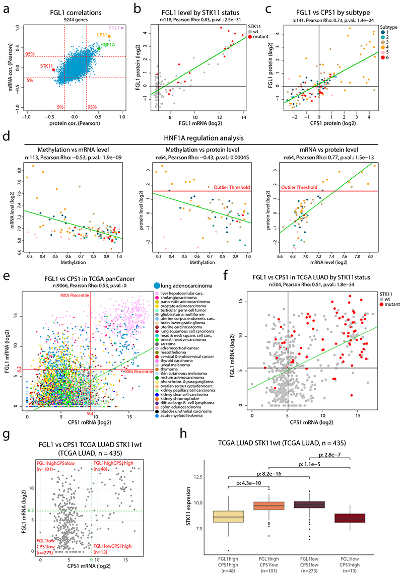
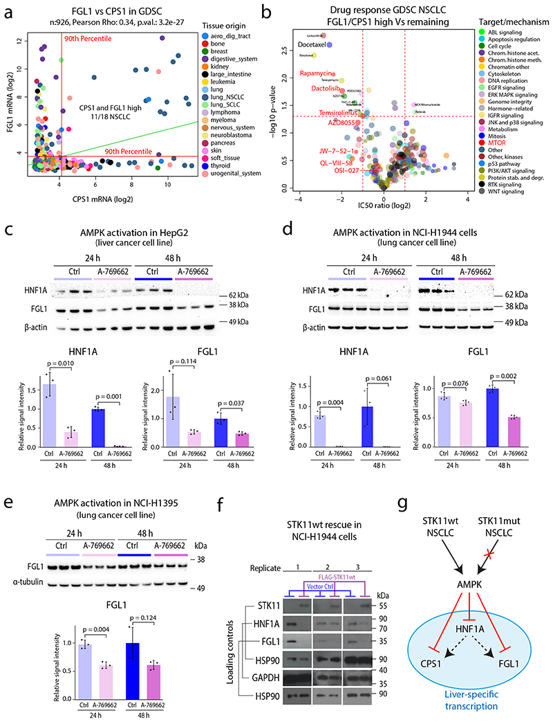
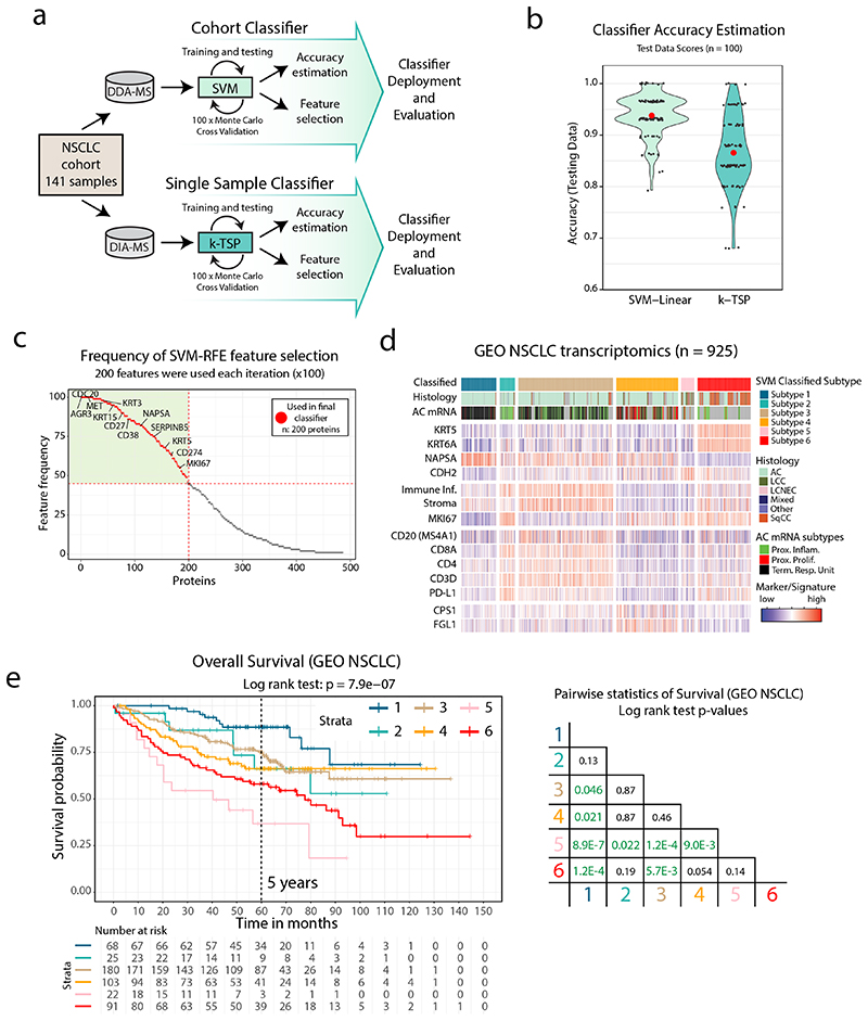
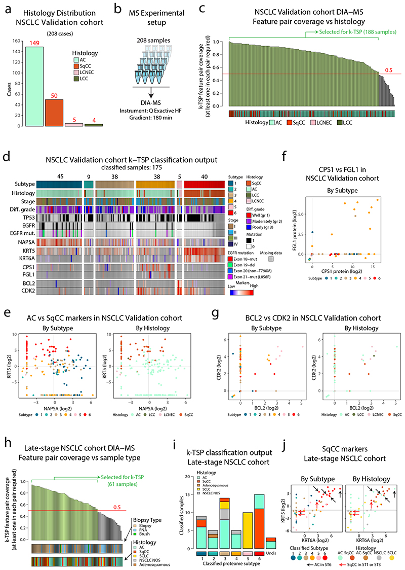
Despite major advancements in lung cancer treatment, long-term survival is still rare, and a deeper understanding of molecular phenotypes would allow the identification of specific cancer dependencies and immune evasion mechanisms. Here we performed in-depth mass spectrometry (MS)-based proteogenomic analysis of 141 tumors representing all major histologies of non-small cell lung cancer (NSCLC). We identified six distinct proteome subtypes with striking differences in immune cell composition and subtype-specific expression of immune checkpoints. Unexpectedly, high neoantigen burden was linked to global hypomethylation and complex neoantigens mapped to genomic regions, such as endogenous retroviral elements and introns, in immune-cold subtypes. Further, we linked immune evasion with LAG3 via STK11 mutation-dependent HNF1A activation and FGL1 expression. Finally, we develop a data-independent acquisition MS-based NSCLC subtype classification method, validate it in an independent cohort of 208 NSCLC cases and demonstrate its clinical utility by analyzing an additional cohort of 84 late-stage NSCLC biopsy samples.


Conflict of interest statement

Competing interests J.L. has received grant funding from AstraZeneca, Roche and Novartis (not financing of the current manuscript). J.L. and L.M.O. are share holders of FenoMark Diagnostics. J.L., T.A., I.S., and L.M.O are co-inventors on a patent application related to this work. J.L. and D.T. are associate with Roche financed Cancer Core Europe clinical trial (not associated to current manuscript). Since completing his contribution to the current work, M.Pirmoradian has become an employee of AstraZeneca. All other authors declare no competing interests.

Figures

Extended Data Fig. 1
Extended Data Fig. 1. Consensus clustering vs NMF clustering based on proteome data in NSCLC cohort.
Consensus clustering vs NMF clustering based on proteome data in NSCLC cohort. Clustering of NSCLC based on 9,793 proteins identified and quantified across all 141 samples in the cohort. a. ConsensusClusterPlus graphic output of Cumulative Distribution Function (CDF) plot, number of clusters k = 2:11. b. ConsensusClusterPlus graphic output for relative change in area (delta area) under the CDF curve, number of clusters k = 2:11. c. Cophonetic correlation coefficient for the different choice of rank (clusters) in the non-negative matrix factorization (NMF) clustering. d. Consensus clustering index and NMF membership index across the six subtypes in the NSCLC cohort. e. Overlap of samples in subtype assignment between Consensus clustering and NMF. f. Annotated heatmap showing the results of the consensus clustering including the six identified clusters. Annotations include: Histology, mRNA subtypes1-3, Stage, Age, Sex, Smoking, Tumor cell content (“Purity”), Immune and Stromal Signatures as described in (Yoshihara et al. 2013), TMB calculated from panel sequencing data, selected putative functional mutations from panel sequencing analysis, PD-L1 from IHC, PD-L1 from MS, KI-67 from MS, and Histological subtype markers from MS (NCAM1, KRT5, NAPSA).
Extended Data Fig. 2
Extended Data Fig. 2. Enrichments for the NSCLC Proteome Subtypes.
Enrichments for the NSCLC Proteome Subtypes. Volcano plots showing the output from enrichment tests of NSCLC mRNA subtypes (a) and AC mRNA subtypes (Proximal Inflammatory (PI), Proximal Proliferative (PP) and Terminal Respiratory Unit (TRU)) (b). P-values were calculated using one-sided hypergeometric test with Benjamini-Hochberg adjustment. c. Scatter plot indicating the expression of SqCC markers KRT5 and KRT6A across the SqCC samples in the cohort (n = 25) colored by SqCC mRNA subtype (center) and proteome subtype (border). The associated Pearson’s correlation coefficient (Rho) and two-sided p-value from t-distribution with n − 2 degrees of freedom are provided. d. Network analysis of NSCLC proteome subtypes. UMAP plots or each proteome subtype separately. Colors indicate subtype median protein level (log2) for the 5,257 proteins. e. Module enrichment analysis performed against MSigDB Hallmarks gene sets. Indicated in the figure for each module are significantly enriched gene sets (One-sided hypergeometric test, Benjamini-Hochberg adjusted p-values < 0.05). f. Module enrichment analysis performed against cell subtypes gene sets gene sets. Indicated in the figure for each module are significantly enriched gene sets (One-sided hypergeometric test, Benjamini-Hochberg adjusted p-values < 0.05). g. Boxplot indicating the tumor cell content (“purity”, calculated based on panel sequencing data) across the NSCLC Proteome Subtypes (n = 140). Green dotted line indicates cohort median. Middle line, median; box edges, 25th and 75th percentiles; whiskers, most extreme points that do not exceed ±1.5 × the interquartile range (IQR). P-value was calculated by Kruskal-Wallis test. Dunn’s multiple comparison tests with Benjamini–Hochberg adjustment are available in Supplementary Table 3. h. Volcano plots showing mutation enrichment analysis for the six NSCLC proteome subtypes. Horizontal red and green dotted lines in all volcano plots indicate p-value=0.01. P-values were calculated using Two-sided Fisher’s exact test with Benjamini-Hochberg adjustment.
Extended Data Fig. 3
Extended Data Fig. 3. CDRP outlier regulation level analysis.
CDRP outlier regulation level analysis. a. mRNA-protein correlation for genes (n = 8,865) divided based on annotation as either miRNA targets or not according to previously published data (Helwak et al. 2013). Statistical testing was performed using two-sided Welch’s t-test (exact p-value = 1.56 × 10⁻¹⁹). b. mRNA-protein correlation for genes (n = 1,674 gene symbols) divided based on mRNA and protein stability as previously determined (Schwanhausser et al. 2011). Statistical testing was performed using one-way analysis of variance (ANOVA) and pairwise two-sided Welch’s t-test uncorrected for multiple testing. c. mRNA-protein correlation for genes (n = 8865 gene symbols) divided based on corresponding proteins annotation as member of a protein complex according to CORUM (Giurgiu et al. 2019). Statistical testing was performed using two-sided Welch’s t-test (exact p-value = 1.13 × 10-56). d. Scatter plot showing promoter methylation to mRNA correlation vs mRNA to protein correlation for full gene-wise overlap (n = 9,018 gene symbols). Indicated on top and to the right are the corresponding density plots. e. Same as in a. but showing only CDRPs with quantification in at least 60 samples. f. Scatter plots indicating the mRNA and protein levels of IRS2 (n = 118 samples) and HNF1A (n = 66 samples). g. Scatter plot indicating the protein levels of IRS2 and HNF1A (n = 79 samples). For boxplots (a-c): middle line, median; box edges, 25th and 75th percentiles; whiskers, most extreme points that do not exceed ±1.5 × the interquartile range (IQR). Indicated in scatter plots is the number of samples with quantitative information at both mRNA and protein level (f), or for both proteins (g), a linear regression trendline (green) and outlier expression threshold (red). The associated Pearson’s correlation coefficients (Rho) and two-sided p-values from t-distribution with n − 2 degrees of freedom are provided.
Extended Data Fig. 4
Extended Data Fig. 4. Immunohistochemistry (IHC) evaluation of selected proteins.
Immunohistochemistry (IHC) evaluation of selected proteins. a. Examples of positive (high) and negative (low) CD3, CD8 and PD-L1 determined by IHC. Images showing example stainings for the immune cell markers CD3 (left) and CD8 (center), and PD-L1 (right). Top three rows show high stromal staining of CD3 and CD8 as well as cancer cell staining of PD-L1 as exemplified from three Subtype 2 samples. Bottom three rows show examples of low/negative staining for all three proteins from proteome Subtype 1 and Subtype 5. b. Immune cell marker expression in NSCLC proteome subtypes. Scatter plots showing MS-based quantification vs stromal staining determined by IHC for CD3E (left, n = 90 samples), and CD8A (right, n = 90 samples). IHC scores were based on at least 100 cells per sample and staining. Indicated in the plots are the linear regression trendlines in green. The associated Pearson’s correlation coefficients (Rho) and two-sided p-values from t-distribution with n − 2 degrees of freedom are provided.
Extended Data Fig. 5
Extended Data Fig. 5. Tertiary lymphoid structures (TLSs) and B-cell infiltration in NSCLC proteome subtypes.
Tertiary lymphoid structures (TLSs) and B-cell infiltration in NSCLC proteome subtypes. a. Scatter plot indicating protein levels of PD-L1 vs the B-cell marker CD20 (MS4A1) in the entire NSCLC cohort (n = 141). b. Heatmap indicating mRNA expression levels of known TLS marker genes. Cohort samples are ordered as in main Figure 1. c. Scatterplot indicating protein levels of PD-L1 vs the B-cell marker CD20 in cohort subset selected for whole section IHC evaluation (n = 19). d. TLS count (10 high power fields per sample) by subtype (n = 19 samples). e-f. IHC images showing examples of tertiary lymphoid structures from two different Subtype 3 samples (out of 11 stained samples). g. Boxplot indicating percent solid growth pattern in AC samples analyzed by whole section IHC (n = 16 samples). h. Boxplot indicating stromal signature in Subtype 2 and 3 samples analyzed by whole section IHC (n = 19 samples). i-n. IHC images showing examples of different growth patterns in six AC samples analyzed by whole section IHC (out of 16 stained samples). For boxplots: middle line, median; box edges, 25th and 75th percentiles; whiskers, most extreme points that do not exceed ±1.5 × the interquartile range (IQR). P-values in boxplots were calculated using two-sided Wilcoxon rank-sum test.
Extended Data Fig. 6
Extended Data Fig. 6. Proteogenomic analysis for detection of non-canonical peptides (NCPs) in the NSCLC cohort.
Proteogenomic analysis for detection of non-canonical peptides (NCPs) in the NSCLC cohort. a. Overview of the proteogenomic analysis. Six reading frame translation (6FT) database search was performed as previously described (Branca et al. 2014, Zhu et al. 2018) and search hits were filtered based on FDR<1%; SpectrumAI for automatic MS2 spectrum inspection/validation of single-substitution peptide identifications; and outlier expression pattern. Resulting 651 NCPs showed low identification overlap across cohort samples indicating sample specific expression. Thirteen percent of corresponding genetic loci were supported by more than one unique peptide. b. Examples of mirror plots from NCP synthetic peptide validation for a peptide that passed the manual inspection (left) and a peptide that failed the manual inspection (right). For each example the upper part shows the annotated MS2 spectrum of the NCP identified in the original proteogenomic analysis, and the lower part shows the MS2 spectrum of the corresponding synthetic peptide. In the right figure, missing fragment ions in the spectrum of the synthetic peptide are indicated. Mirror plots of all 104 NCPs that were evaluated by synthetic peptides can be found in Supplementary Data 1. c. Pie chart indicating the results of the NCP synthetic peptide validation. d. Bar plot showing the results of the NCP synthetic peptide validation for each of the six NSCLC Subtypes. In total, the 104 NCPs evaluated were identified in 156 samples (the same NCP can be identified in several samples). e. Distribution of NCP synthetic peptide validation results per subtype indicating no statistically significant difference between subtypes. P value was calculated using two-sided Fisher’s exact test.
Extended Data Fig. 7
Extended Data Fig. 7. FGL1 and STK11 in NSCLC proteome landscape and TCGA dataset.
FGL1 and STK11 in NSCLC proteome landscape and TCGA dataset. a. Scatter plot showing protein vs mRNA level Pearson’s correlations in the NSCLC cohort for 9,244 genes where mRNA data and quantitative protein data was available for at least 70 samples. Red dotted lines indicate 5th and 95th percentiles of mRNA and protein level correlations. b. Scatterplot showing STK11 vs STRADA protein levels in NSCLC cohort colored by proteome subtype (n = 141 samples). c. Scatter plot showing STK11 vs FGL1 protein levels in NSCLC cohort colored by proteome subtype (n = 141 samples). Indicated by red circles are samples with STK11 mutations. d. Scatter plot showing protein level Pearson’s correlations in the NSCLC cohort vs mRNA level correlation in the TCGA PanCancer dataset for 10,447 genes where mRNA data and quantitative protein data were available for at least 70 samples. Red lines indicate 5th and 95th percentiles of mRNA and protein level correlations. e. Boxplots showing FGL1 (left) and CPS1 (right) mRNA levels by STK11 mutation status in the TCGA lung adenocarcinoma (LUAD) dataset (n = 504 samples). Middle line, median; box edges, 25th and 75th percentiles; whiskers, most extreme points that do not exceed ±1.5 × the interquartile range (IQR). P-values were calculated using two-sided Wilcoxon rank-sum test. f. Scatter plot showing STK11 vs FGL1 mRNA levels in the TCGA LUAD dataset colored by STK11 mutation status (n = 504 samples). g. Scatterplot showing FGL1 vs HNF1A mRNA levels in the TCGA LUAD dataset colored by STK11 mutation status (n = 504 samples). For scatter plots b, c, f, and g, linear regression trendlines are indicated in green. The associated Pearson’s correlation coefficients (Rho) and two-sided p-values from t-distribution with n − 2 degrees of freedom are provided.
Extended Data Fig. 8
Extended Data Fig. 8. Support-vector machine (SVM) and k-Top Scoring Pairs (k-TSP) based classification of NSCLC subtype.
Support-vector machine (SVM) and k-Top Scoring Pairs (k-TSP) based classification of NSCLC subtype. a. Sankey plot showing the SVM classification output from the SVM testing (100 Monte Carlo cross-validation (MCCV) iterations) with 94% accuracy. b. Stacked bar plots showing the subtype outlierness indicated by consensus index from the original clustering (top) and the classification output form the 100 MCCV iterations (bottom). Indicated by red arrows are seven samples that were frequently mis-classified by the SVM. c. DIA-MS analysis of the 141 samples resulted in the identification of 6,717 proteins (FDR<1%) with a minimum of 2220 proteins per sample and a full overlap of 1202 proteins across all samples. Right part shows protein-wise and sample-wise correlation between DIA-MS based, and DDA-MS based quantifications. d. Selection of (k) for the k-TSP classifier was performed based on accuracy in test data, resulting in k=13 feature pairs. e. k-TSP classifier feature pair importance evaluated by the frequency each feature pair was used across the 100 MCCV iterations. After training, the accuracy of the classifier was estimated using the test set samples. The overall accuracy was reported as the average accuracy of the 100 iterations. The 13 most frequently used feature pairs for each binary model (15 models), resulting in 195 final feature pairs, were used to build the final model. f. Sankay plot showing the classification output from the k-TSP test data (100 iterations) resulting in 87% accuracy. g. Stacked bar plots showing the subtype outlierness indicated by consensus index from the original clustering (top) and the classification output form the 100 MCCV iterations (bottom). Indicated by red arrows are 19 samples that were frequently mis-classified by the k-TSP.
Extended Data Fig. 9
Extended Data Fig. 9. SVM and k-TSP based classification of public domain AC transcriptomics and proteomics data.
SVM and k-TSP based classification of public domain AC transcriptomics and proteomics data. a. Output from SVM-based classification of the TCGA lung adenocarcinoma (LUAD) cohort based on mRNA-level data. Indicated below is sample annotation by mRNA subtype, mutation patterns and marker/signature levels. b. Kaplan-Meier plot showing overall survival in the TCGA LUAD cohort by classified subtype (n = 501 samples). P-value was calculated using log-rank test. c. Venn diagrams showing overlap between current early-stage NSCLC cohort and the Gillette et al. lung AC cohort in all identified proteins (top) and proteins with full overlap in respective cohorts (bottom). Indicated by red circle is the overlap with 250 most frequently used features from the SVM classifier optimization. d. Output from SVM-based classification of the Gillette et al. AC cohort (n = 111 samples). Indicated below is sample annotation by mRNA and protein subtype, mutation patterns and marker/signature levels. To the right, results are displayed by classified subtype including p-values from Kruskal-Wallis test (markers and signatures) or one-sided hypergeometric test with Benjamini-Hochberg adjustment (mutations). e. Output from k-TSP-based classification of the Xu et al. lung AC cohort (n = 99 samples). Indicated below is sample annotation by mutation patterns and marker/signature levels. To the right, results are displayed by classified subtype including p-values from Kruskal-Wallis test (markers and signatures) or one-sided hypergeometric test with Benjamini-Hochberg adjustment (mutations).
Extended Data Fig. 10
Extended Data Fig. 10. DIA-MS analysis and k-TSP based classification of NSCLC Validation and late-stage cohorts.
DIA-MS analysis and k-TSP based classification of NSCLC Validation and late-stage cohorts. a. DIA-MS analysis of the 208 samples in the NSCLC validation cohort resulted in the identification of 7,379 proteins (FDR<1%), with a median number of identified proteins per sample of 3,552. b. Scatter plot showing k-TSP feature pair coverage vs number of identified proteins per sample. Red line indicate threshold for classification inclusion. c. k-TSP classifier output for the 188 samples where at least 50% of k-TSP feature pairs were covered colored by histological subgroup. d. Scatter plot indicating the levels of SqCC markers Keratin 5 (KRT5) and Keratin 6A (KRT6A) in the SqCC subset of the NSCLC validation cohort color-coded by classified subtype as quantified by DIA-MS. e. (Left) Kaplan-Meier plot showing relapse-free survival in the NSCLC validation cohort by classified subtype (n = 171 samples). P-value was calculated using log-rank test. (Right) Pairwise statistics for relapse free survival in classified subtypes of the NSCLC validation cohort with p-values calculated by log-rank test with Benjamini-Hochberg adjustment. f. Bar plot showing the histologies of the 84 samples included in the late-stage cohort. g. Scatter plot showing mRNA and peptide yields from the sample prep of biopsy samples using Allprep kit followed by digestion, colored by biopsy type (n = 84 samples). h. Experimental setup for DIA-MS analysis of late-stage cohort samples. i. DIA MS analysis of the 84 samples resulted in the identification of 5,124 proteins (FDR<1%), with a median number of identified proteins per sample of 2,494. j. Scatter plot showing peptide yield vs number of identified proteins per sample, colored by biopsy type (n = 84 samples). k. Scatter plot showing k-TSP feature pair coverage vs number of identified proteins per sample (n = 84 samples). Red line indicate threshold for classification inclusion. For scatter plots (b, g, and k), linear regression trendlines are indicated in green. The associated Pearson’s correlation coefficients (Rho) and two-sided p-values from t-distribution with n − 2 degrees of freedom are provided.
Figure 1
Figure 1. MS-based identification of NSCLC proteome subtypes.
a. Bar plots showing histology and stage distribution in the patient cohort. b. Overview of experimental setup for MS-based proteome profiling, analysis output, and supporting data levels. c. Hierarchical tree showing the results from consensus clustering used to identify NSCLC proteome subtypes. Annotation bars below indicate clinical information of samples, mRNA subtypes, infiltration signatures, common mutations, and protein levels of selected markers. d. NSCLC proteome subtype network analysis with UMAP plot colored by modules (left), modules vs subtypes heatmap (center), and cell types/signaling pathway enrichment analysis output for the 10 modules (right). e. Boxplot indicating the number of overexpressed oncogenes per sample by NSCLC proteome subtype (n = 141 samples). Middle line, median; box edges, 25th and 75th percentiles; whiskers, most extreme points that do not exceed ±1.5 × the interquartile range (IQR). P-value was calculated using Kruskal-Wallis test and the number of samples per subtype is indicated in red. f. Bubble plot indicating cancer- and driver-related proteins (CDRPs) commonly overexpressed in the NSCLC cohort. g. Scatterplot indicating mRNA to protein Pearson’s correlation of CDRPs. The corresponding correlation density plot is displayed on top. h. Scatterplot showing promoter methylation to mRNA correlation vs mRNA to protein correlation for CDRPs. Indicated on top and to the right are the corresponding density plots for the full gene-wise overlap (9,018 genes). Dunn’s multiple comparison tests with Benjamini-Hochberg adjustment for boxplot (e) are available in Supplementary Table 3.
Figure 2
Figure 2. Immune landscape in NSCLC.
a. Overview of infiltrating immune cell subpopulations for each NSCLC proteome subtype. b. Scatter plot showing antigen processing/presentation machinery (APM) scores vs tumor mutation burden (TMB) for each sample. Dotted lines indicate subdivision of the samples into four subgroups: TMB-Low/APM-High, TMB-High/APM-High, TMB-Low/APM-Low, TMB-High/APM-Low as described in methods. Right side panels show for each subgroup enrichment analysis of NSCLC proteome subtypes. Y-axes denote enrichment p-values calculated using two-sided Fisher’s exact test with Benjamini-Hochberg adjustment. c. Boxplots indicating TMB by proteome subtype in tumor mutation burden (TMB) analysis in NSCLC cohort (n = 139 samples). Red line, TMB median; green line, TMB 90th percentile. d. Boxplot indicating protein levels (n = 141 samples) of PD-L1 by proteome subtype based on MS-data (left). Right figure shows the result of PD-L1 immunohistochemistry (IHC) vs MS analysis for a subset of the samples (n = 50 samples). e. Scatterplots indicating TMB vs PD-L1 protein level quantified by MS (n = 139 samples). f. Boxplots indicating the mRNA levels of the cytokine CXL9 by proteome subtype (n = 118 samples). g. Boxplots indicating the protein levels of the cytokine CXL9 by proteome subtype (n = 61 samples). h. Scatter plot indicating the protein levels (n = 61 samples) of CXCL9 and CD274 (PD-L1). i. IHC analysis of tertiary lymph node structures (TLSs) in selected subtype 2 and 3 samples (n = 19 samples). For scatter plots (d, e, and h): Samples are colored by proteome subtype and a linear regression trendline is displayed in green. The associated Pearson’s correlation coefficients (Rho) and two-sided p-values from t-distribution with n − 2 degrees of freedom are provided. For boxplots: middle line, median; box edges, 25th and 75th percentiles; whiskers, most extreme points that do not exceed ±1.5 × the interquartile range (IQR). P-values were calculated by Kruskal-Wallis test (c, d, f, and g) or two-sided Wilcoxon rank-sum test (i). Dunn’s multiple comparison tests with Benjamini-Hochberg adjustment for boxplots are available in Supplementary Table 3.
Figure 3
Figure 3. Cancer-Testis (CT) antigens, neoantigen burden and methylation in NSCLC.
a. Overview of cancer testis antigen (CTA) evaluation in NSCLC. Bottom part shows boxplot indicating the number of CTAs expressed per sample by proteome subtype (n = 141 samples). b. Overview of proteogenomic analysis by 6-reading frame translation (6FT) database searching. Lower part shows bar plot indicating the number of identified NCPs per sample (n = 141 samples). c. Boxplot indicating the number of non-canonical peptides (NCPs) per sample by proteome subtype (n = 141 samples). d. Scatter plot (top) showing the number of NCPs per sample vs TMB (n = 139 samples) and output from a multivariate linear regression analysis (bottom) between the number NCPs and TMB, tumor cell content (“purity”), TP53 mutations and proliferation (Ki67 quantified by MS) (n = 139 samples). e-f. Scatter plot indicating the global methylation plotted against the number of CT antigens per sample or the number of NCPs per sample (n = 113 samples). g-h. Boxplots indicating the global and promoter methylation by proteome subtype (n = 113 samples). i. Heatmap showing Tumor Neoantigen Burden (TNB) by proteome subtype where TNB is defined as a summary score based on TMB, CTAs and NCPs. In figures e, f, g, and h, red dotted lines indicate median values and the number of samples with quantitative information at both methylation and protein level is provided. For scatter plots d, e, and f: Samples are colored by proteome subtype. The number of samples with quantitative information at both methylation and protein level is provided and a linear regression trendline is displayed in green. 95% confidence intervals are shown in grey. The associated Pearson’s correlation coefficients (Rho) and two-sided p-values from t-distribution with n − 2 degrees of freedom are provided. For boxplots a, c, g, and h: middle line, median; box edges, 25th and 75th percentiles; whiskers, most extreme points that do not exceed ±1.5 × the interquartile range (IQR). P-values were calculated by Kruskal-Wallis test. Dunn’s multiple comparison tests with Benjamini-Hochberg adjustment for boxplots are available in Supplementary Table 3.
Figure 4
Figure 4. Immune Checkpoints in NSCLC proteome subtypes.
a. Heatmap indicating protein levels of inhibitory receptors (IRs) and their ligands. All values represent protein level quantifications (log2) except for CTLA4 where mRNA levels (log2) are displayed since it was not detected by the MS data. P-values were calculated using Kruskal-Wallis test. b. Scatter plot indicating the correlation between checkpoint proteins and overall immune infiltration signature (x-axis) vs the correlation between checkpoint proteins and CD8A as a marker of cytotoxic T-cells (y-axis). All values were estimated using protein-level quantifications (log2) except for CTLA4 where mRNA levels (log2) were used since it was not detected by the MS analysis. Red lines indicate significant Pearson’s correlation coefficient threshold (p-value < 0.01, two-sided, t-distribution with n − 2 degrees of freedom). c. Boxplots indicating protein levels of inhibitory receptors (IRs) and their ligands (n = 141 samples (PD-L1, FGL1), 114 samples (PD-1, B7-H4) and 97 samples (LAG-3)). The number of samples with quantitative information at protein level is provided. Red lines in boxplots, where present, indicate outlier expression threshold. P-values were calculated using Kruskal-Wallis test. Dunn’s multiple comparison tests with Benjamini-Hochberg adjustment for heatmap (a) and boxplots (c) are available in Supplementary Table 3.
Figure 5
Figure 5. FGL1 and STK11 status in NSCLC cohort and TCGA pan cancer data a.
FGL1 mRNA- and protein-level correlations in the NSCLC cohort for 9,244 genes with overlapping information at mRNA and protein level and quantitative protein level information in at least 70 samples. b. FGL1 mRNA expression plotted against the FGL1 protein level colored by STK11 mutation status (n = 118 samples). c. FGL1 and CPS1 protein levels in the NSCLC cohort colored by proteome subtype (n = 141 samples). d. Scatterplots for evaluation of HNF1A regulation showing promotor methylation vs mRNA level (n = 113 samples) (left), promotor methylation vs protein level (n = 64 samples) (center) and mRNA level vs protein level (n = 64 samples) (right) in NSCLC cohort colored by proteome subtype. e. CPS1 and FGL1 mRNA expression in the TCGA pan cancer dataset colored by cancer type (n = 9,066 samples). Indicated by red lines are the 90th percentiles of mRNA expression for both genes. f. CPS1 and FGL1 mRNA expression in the TCGA lung adenocarcinoma (LUAD) dataset colored by STK11 mutation status (n = 504 samples). Indicated by black lines is the median mRNA expression of both genes. g. Scatterplot showing CPS1 vs FGL1 mRNA levels of STK11wt samples in the TCGA LUAD dataset (n = 435 samples). Indicated in the figure are four expression subgroups, FGL1highCPS1high, FGL1highCPS1low, FGL1lowCPS1low, FGL1lowCPS1high (cut-offs arbitrarily chosen). f. Boxplot indicating the STK11 mRNA expression by expression subgroups as defined in (g) (n = 435 samples). Middle line, median; box edges, 25th and 75th percentiles; whiskers, most extreme points that do not exceed ±1.5 × the interquartile range (IQR). Two-sided Wilcoxon rank-sum tests uncorrected for multiple testing. For scatter plots b-f: linear regression trendline is displayed in green. The associated Pearson’s correlation coefficients (Rho) and two-sided p-values from t-distribution with n − 2 degrees of freedom are provided.
Figure 6
Figure 6. Co-expression of FGL1 and CPS1 predicts sensitivity to docetaxel and mTOR inhibitors and mechanism investigation of STK11-FGL1 signaling.
a. CPS1 and FGL1 mRNA expression in the GDSC dataset colored by cell line tissue origin. Indicated by red lines are the 90th percentiles of mRNA expression for both genes (n = 926 cell lines). Linear regression trendline is displayed in green. The associated Pearson’s correlation coefficient (Rho) and two-sided p-value from t-distribution with n − 2 degrees of freedom are provided. b. Volcano plot indicating differences in drug sensitivity between NSCLC cells with high mRNA expression of CPS1/FGL1 vs remaining NSCLC cells. Indicated in the plot is docetaxel and several drugs targeting mTOR. P-values were calculated by two-sided Welch’s t-test uncorrected for multiple testing. c. HNF1A and FGL1 levels in HepG2 cells after 24 and 48 h treatment with an AMPK activator (250 μM A-769662). The densitometric values were normalized to α-actin and then to the 48-h control mean and are represented as mean ± SD (n = 3 independent cell cultures). The p-values were calculated using Welch’s two-sided t-test. d. HNF1A and FGL1 levels in STK11-mutant NCI-H1944 cells after 24- and 48-h treatment with an AMPK activator (250 μM A-769662). The densitometric values were normalized to β-actin and then to the 48-h control mean and are represented as mean ± SD (n = 3 independent cell cultures). The p-values were calculated using Welch’s two-sided t-test. e. FGL1 levels in STK11-mutant NCI-H1395 cells after 24 and 48 h treatment with an AMPK activator (250 μM A-769662). The densitometric values were normalized to β-tubulin and then to the 48-h control mean and are represented as mean ± SD (n = 3 independent cell cultures). The p values were calculated using Welch’s two-sided t-test. f. STK11, HNF1A, and FGL1 levels in NCI-H1944 cells expressing FLAG-STK11wt or vector control after retroviral transduction. The Western blots show results from three separately transduced cell cultures. g. Model showing the suggested impact of STK11 inactivation in lung cancer cells. STK11 inactivation by e.g., mutation results in loss of AMPK dependent control over liver-specific transcription resulting in upregulation of HNF1A, FGL1, and CPS1. HNF1A is a known master regulator of liver specific transcription and potentially responsible for transactivation of FGL1 and CPS1.
Figure 7
Figure 7. NSCLC classification pipelines validate NSCLC proteome subtypes and indicate clinical utility a.
Overview of NSCLC Proteome Subtype classification pipelines. b. Violin plot indicating the accuracy of the SVM classifier and the k-TSP classifier based on test data output from Monte Carlo cross-validation (MCCV) iterations. Median accuracy is shown in red. c. Scatterplot showing SVM classifier feature importance evaluated by the frequency each feature was used across the MCCV iterations. Indicated by dotted red lines is the lowest feature frequency for the 200 features that were selected for the final classifier. d. SVM-based classification of the GEO NSCLC cohort based on mRNA-level data. Indicated below each subtype is sample annotation by histology, mRNA subtype and marker/signature levels. e. Kaplan-Meier plot showing overall survival in the GEO NSCLC cohort by classified subtype (n = 489 samples) with associated pairwise statistics as calculated by log-rank test with Benjamini-Hochberg adjustment.
Figure 8
Figure 8. Validation of DIA-MS based NSCLC classification pipelines in two separate NSCLC cohorts.
a. Barplot showing the histology distribution of the 208 cases included in the validation cohort. b. Experimental setup for DIA-MS analysis of validation cohort samples. c. DIA-MS data coverage of the k-TSP feature pairs in the validation cohort in relation to histology. Indicated in the plot are the 188 samples with more than 50% coverage of the k-TSP feature pairs that were included for classification. d. Output from k-TSP-based classification of the NSCLC validation cohort for the 175 samples that were successfully classified. Indicated below is sample annotation by histology, stage, differentiation grade, mutation patterns, and marker levels. e. Scatter plot indicating Napsin A (AC marker) vs Keratin 5 (SqCC marker) protein levels in the classified subset of the validation cohort as quantified by DIA-MS. Left plot is color-coded by classified subtype and right plot by histology. f. FGL1 and CPS1 protein levels in the validation cohort colored by classified proteome subtype. g. Scatter plot indicating BCL2 and CDK2 protein levels in the classified subset of the validation cohort as quantified by DIA-MS. Left plot is color-coded by classified subtype and right plot by histology. h. DIA-MS data coverage of the k-TSP feature pairs in the late-stage NSCLC cohort in relation to biopsy type and histology. Biopsy = forceps biopsy by bronchoscopy, FNA = fine needle aspiration by EBUS (endobronchial ultrasound), Brush = bronchial brush by bronchoscopy. i. k-TSP classifier output for the 61 late-stage cohort samples where at least 50% of k-TSP feature pairs were covered colored by histological subgroup. j. Scatter plots indicating the protein levels of SqCC markers Keratin 5 (KRT5) and Keratin 6A (KRT6A) in the classified subset of the late-stage NSCLC cohort as quantified by DIA-MS. Left plot is color-coded by classified subtype and right plot by histology. Indicated by arrows in the plots are cases with unexpected classification output. Lines indicate median abundances.

References

    1. Cancer Genome Atlas Research, N. Comprehensive genomic characterization of squamous cell lung cancers. Nature. 2012;489:519–525. doi: 10.1038/nature11404. - DOI - PMC - PubMed
    1. Cancer Genome Atlas Research, N. Comprehensive molecular profiling of lung adenocarcinoma. Nature. 2014;511:543–550. doi: 10.1038/nature13385. - DOI - PMC - PubMed
    1. Egeblad M, Nakasone ES, Werb Z. Tumors as organs: complex tissues that interface with the entire organism. Dev Cell. 2010;18:884–901. doi: 10.1016/j.devcel.2010.05.012. - DOI - PMC - PubMed
    1. Stewart PA, et al. Proteogenomic landscape of squamous cell lung cancer. Nat Commun. 2019;10:3578. doi: 10.1038/s41467-019-11452-x. - DOI - PMC - PubMed
    1. Gillette MA, et al. Proteogenomic Characterization Reveals Therapeutic Vulnerabilities in Lung Adenocarcinoma. Cell. 2020;182:200–225.:e235. doi: 10.1016/j.cell.2020.06.013. - DOI - PMC - PubMed

Publication types