Clinical Trial
. 2021 Dec 20;18(12):e1003872.
doi: 10.1371/journal.pmed.1003872. eCollection 2021 Dec.

Access to and safety of COVID-19 convalescent plasma in the United States Expanded Access Program: A national registry study

Affiliations
Clinical Trial

Access to and safety of COVID-19 convalescent plasma in the United States Expanded Access Program: A national registry study

Jonathon W Senefeld et al. PLoS Med. .

Abstract

Background: The United States (US) Expanded Access Program (EAP) to coronavirus disease 2019 (COVID-19) convalescent plasma was initiated in response to the rapid spread of severe acute respiratory syndrome coronavirus 2 (SARS-CoV-2), the causative agent of COVID-19. While randomized clinical trials were in various stages of development and enrollment, there was an urgent need for widespread access to potential therapeutic agents. The objective of this study is to report on the demographic, geographical, and chronological characteristics of patients in the EAP, and key safety metrics following transfusion of COVID-19 convalescent plasma.

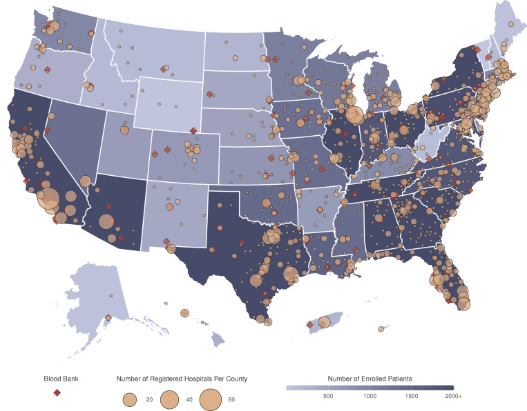
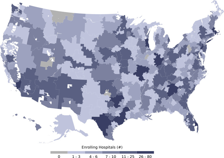
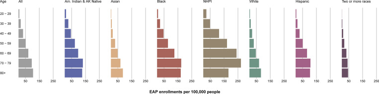
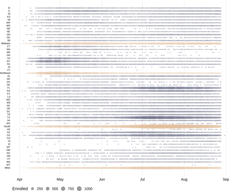
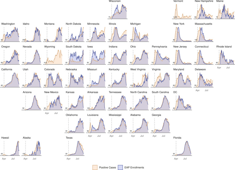
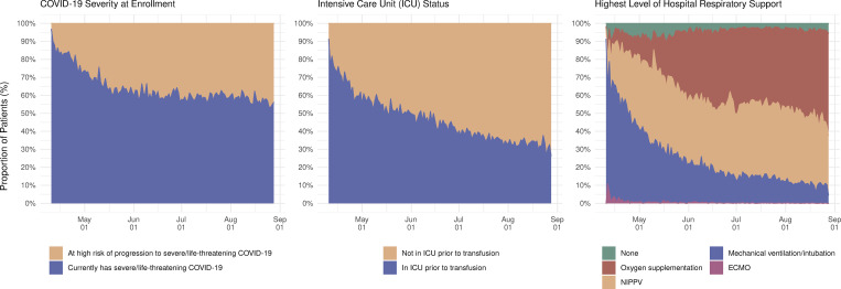
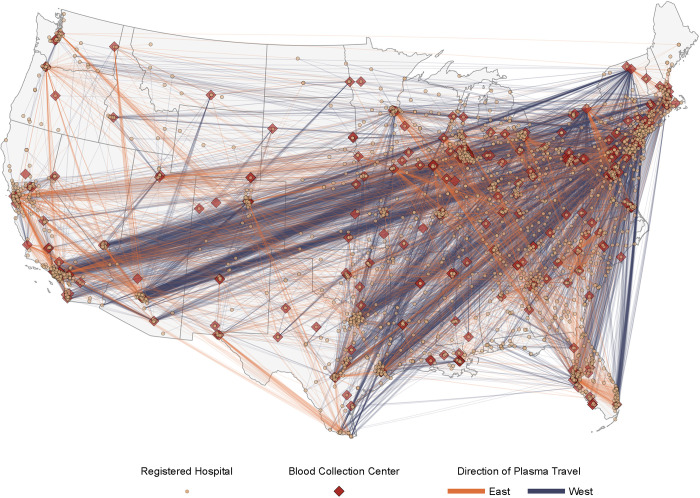
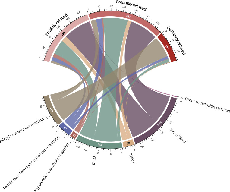
Methods and findings: Mayo Clinic served as the central institutional review board for all participating facilities, and any US physician could participate as a local physician-principal investigator. Eligible patients were hospitalized, were aged 18 years or older, and had-or were at risk of progression to-severe or life-threatening COVID-19; eligible patients were enrolled through the EAP central website. Blood collection facilities rapidly implemented programs to collect convalescent plasma for hospitalized patients with COVID-19. Demographic and clinical characteristics of all enrolled patients in the EAP were summarized. Temporal patterns in access to COVID-19 convalescent plasma were investigated by comparing daily and weekly changes in EAP enrollment in response to changes in infection rate at the state level. Geographical analyses on access to convalescent plasma included assessing EAP enrollment in all national hospital referral regions, as well as assessing enrollment in metropolitan areas and less populated areas that did not have access to COVID-19 clinical trials. From April 3 to August 23, 2020, 105,717 hospitalized patients with severe or life-threatening COVID-19 were enrolled in the EAP. The majority of patients were 60 years of age or older (57.8%), were male (58.4%), and had overweight or obesity (83.8%). There was substantial inclusion of minorities and underserved populations: 46.4% of patients were of a race other than white, and 37.2% of patients were of Hispanic ethnicity. Chronologically and geographically, increases in the number of both enrollments and transfusions in the EAP closely followed confirmed infections across all 50 states. Nearly all national hospital referral regions enrolled and transfused patients in the EAP, including both in metropolitan and in less populated areas. The incidence of serious adverse events was objectively low (<1%), and the overall crude 30-day mortality rate was 25.2% (95% CI, 25.0% to 25.5%). This registry study was limited by the observational and pragmatic study design that did not include a control or comparator group; thus, the data should not be used to infer definitive treatment effects.

Conclusions: These results suggest that the EAP provided widespread access to COVID-19 convalescent plasma in all 50 states, including for underserved racial and ethnic minority populations. The study design of the EAP may serve as a model for future efforts when broad access to a treatment is needed in response to an emerging infectious disease.

Trial registration: ClinicalTrials.gov NCT#: NCT04338360.


Conflict of interest statement

The authors have declared that no competing interests exist.

Figures

Fig 1
Fig 1. Participation in the US Expanded Access Program (EAP) for convalescent plasma.
Choropleth map displaying the number of cumulatively enrolled patients in the EAP within each state of the US and participating territories, with lower enrollment values displayed in a lighter shade of blue and higher enrollment values displayed in a darker shade of blue. Registered acute care facilities are represented as filled yellow circles, with circle size corresponding to the number of registered facilities within the county. Blood collection centers are represented as filled red diamonds. All sites with registered patients were included. The choropleth map does not display Guam or the Northern Mariana Islands. The base layer of the geographical map was created using geographical data retrieved from the US Census Bureau (https://www2.census.gov/geo/tiger/TIGER2019/STATE/). No copyrighted material was used.
Fig 2
Fig 2. Participation of acute care facilities in the US Expanded Access Program (EAP) for convalescent plasma stratified by US hospital referral region.
Choropleth map displaying the number of participating acute care facilities that enrolled patients in the EAP within each hospital referral region—a geographical region that represents a catchment region of patients who get healthcare at similar facilities. Lower numbers of participating acute care facilities are displayed in a lighter hue of blue, and higher numbers of participating acute care facilities are displayed in a darker hue of blue. Hospital referral regions with 0 participating acute care facilities are displayed in grey. Hospital referral regions are not defined in US territories; thus, the choropleth map does not display data from Puerto Rico, the US Virgin Islands, Guam, or the Northern Mariana Islands. The base layer of the geographical map was retrieved from the Dartmouth Atlas Project (https://data.dartmouthatlas.org/supplemental/#boundaries) [32].
Fig 3
Fig 3. Patient enrollment in the US Expanded Access Program (EAP) stratified by age, race, and ethnicity group, per 100,000 people (from the US census).
The length of each colored bar is proportional to the number of patients enrolled in the US EAP within the identified age group (years) and race or ethnicity category. The patient enrollment values are presented relative to analogous categorical data retrieved from the US Census Bureau. Am. Indian & AK Native, American Indian or Alaska Native; NHPI, Native Hawaiian or Other Pacific Islander.
Fig 4
Fig 4. Daily patient enrollment in the US Expanded Access Program.
Each circle represents 1 day in which at least 1 patient was enrolled within the indicated US state or region. Grey circles represent daily US state enrollments, and tan circles represent daily US region enrollments. The size of the circle corresponds to the number of daily enrollments within the specified US state or region. States are ordered alphabetically within each US region, followed by the aggregate for each region.
Fig 5
Fig 5. Daily rates of confirmed COVID-19 infections and patient enrollment in the US Expanded Access Program (EAP).
Chronological line charts represent the daily number of statewide confirmed COVID-19 infections and EAP patient enrollments sequentially arranged in a geofaceted depiction of the US. Daily rates are presented as a moving average across 7 days, scaled between 0 (least cases/enrollments) and 1 (most cases/enrollments) for any day in each state. Vertical dashed grey lines represent the start date of the EAP (April 3, 2020). Values in the lower left corner of each panel indicate the scaling factor between the 2 plots (cases/enrollments), which approximates the number of COVID-19 cases that contributed to 1 enrollment in the EAP. EAP enrollment data are not presented for Vermont or Wyoming because total enrollments were not greater than 10 patients. DC, District of Columbia.
Fig 6
Fig 6. Daily patient enrollment in the US Expanded Access Program (EAP) relative to COVID-19 patient symptomatology.
Stacked area chart displaying daily rates of patient enrollment in the EAP as a proportion of the sum total daily enrollment stratified by patient symptomatology, including 2 categories of COVID-19 disease severity, dichotomous representation of intensive care unit (ICU) status, and categorical level of respiratory support prior to COVID-19 convalescent plasma transfusion (none, oxygen supplementation, noninvasive positive-pressure ventilation [NIPPV], mechanical ventilation, or extracorporeal membrane oxygenation [ECMO]). Only patients who received a COVID-19 convalescent plasma transfusion are included in the 2 rightmost panels.
Fig 7
Fig 7. Travel paths of units of convalescent plasma from blood collection centers to sites of plasma transfusion within the contiguous US in the Expanded Access Program (EAP) for convalescent plasma.
Map displaying the distance and direction of travel of convalescent plasma units in support of the EAP, with the thickness of each colored line directly proportional to the number of convalescent plasma units represented. Lines colored in blue represent a travel direction of east to west (e.g., New York City, NY, to Los Angeles, CA), and lines colored in orange represent a travel direction of west to east (e.g., Minneapolis, MN, to Tampa, FL). The US FDA–licensed or–registered blood collection facilities supplying plasma are presented as filled red diamonds, and acute care facilities are presented as filled yellow circles. The map does not display data from noncontiguous US locations, including facilities in Puerto Rico, Hawaii, and Alaska. The base layer of the geographical map was created using geographical data retrieved from the US Census Bureau (https://www2.census.gov/geo/tiger/TIGER2019/STATE/). No copyrighted material was used.
Fig 8
Fig 8. Chord diagram of the attributions associated with serious transfusion reactions.
Attribution to a category of relatedness is depicted by a line connecting from each serious transfusion reaction type. The width of each line and the circumferential axis indicate the number of patients in each combined serious transfusion reaction and relatedness category group. Other transfusion reactions that were adjudicated to be possibly related to the transfusion (n = 3) included leukomoid reaction (n = 1), pulmonary embolism (n = 1), and red cell dilution (n = 1). TACO, transfusion-associated circulatory overload; TRALI, transfusion-related acute lung injury.

Update of

References

    1. Lancet The. COVID-19 in the USA: a question of time. Lancet. 2020;395:1229. doi: 10.1016/S0140-6736(20)30863-1 - DOI - PMC - PubMed
    1. Oran DP, Topol EJ. Prevalence of asymptomatic SARS-CoV-2 infection: a narrative review. Ann Intern Med. 2020;173:362–7. doi: 10.7326/M20-3012 - DOI - PMC - PubMed
    1. Mahajan S, Caraballo C, Li SX, Dong Y, Chen L, Huston SK, et al. SARS-CoV-2 infection hospitalization rate and infection fatality rate among the non-congregate population in Connecticut. Am J Med. 2021;134:812–6.e2. doi: 10.1016/j.amjmed.2021.01.020 - DOI - PMC - PubMed
    1. Angulo FJ, Finelli L, Swerdlow DL. Estimation of US SARS-CoV-2 infections, symptomatic infections, hospitalizations, and deaths using seroprevalence surveys. JAMA Netw Open. 2021;4:e2033706. doi: 10.1001/jamanetworkopen.2020.33706 - DOI - PMC - PubMed
    1. Menachemi N, Dixon BE, Wools-Kaloustian KK, Yiannoutsos CT, Halverson PK. How many SARS-CoV-2-infected people require hospitalization? Using random sample testing to better inform preparedness efforts. J Public Health Manag Pract. 2021;27:246–50. doi: 10.1097/PHH.0000000000001331 - DOI - PubMed

Publication types

MeSH terms

Associated data