. 2022 Jan;7(1):97-107.
doi: 10.1038/s41564-021-01029-0. Epub 2021 Dec 31.

Improving local prevalence estimates of SARS-CoV-2 infections using a causal debiasing framework

Affiliations

Improving local prevalence estimates of SARS-CoV-2 infections using a causal debiasing framework

George Nicholson et al. Nat Microbiol. 2022 Jan.

Abstract

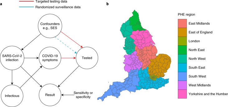
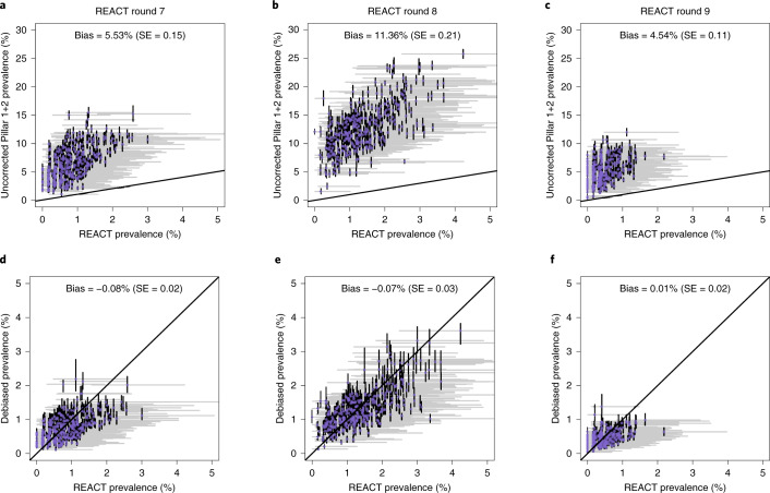
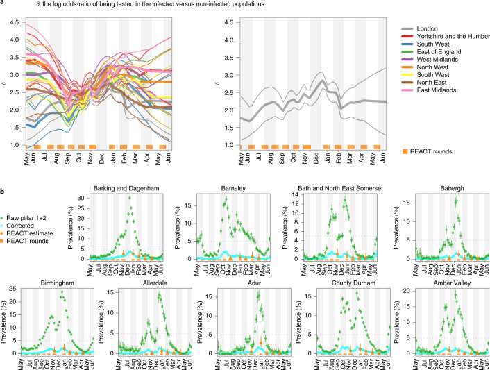
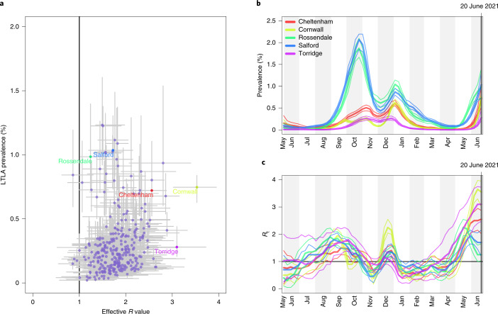
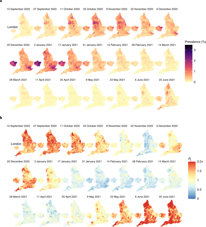
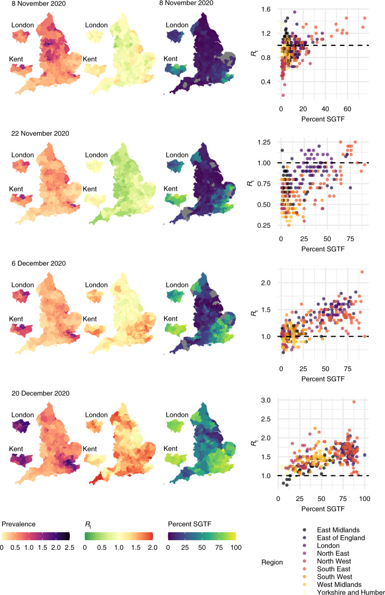
Global and national surveillance of SARS-CoV-2 epidemiology is mostly based on targeted schemes focused on testing individuals with symptoms. These tested groups are often unrepresentative of the wider population and exhibit test positivity rates that are biased upwards compared with the true population prevalence. Such data are routinely used to infer infection prevalence and the effective reproduction number, Rt, which affects public health policy. Here, we describe a causal framework that provides debiased fine-scale spatiotemporal estimates by combining targeted test counts with data from a randomized surveillance study in the United Kingdom called REACT. Our probabilistic model includes a bias parameter that captures the increased probability of an infected individual being tested, relative to a non-infected individual, and transforms observed test counts to debiased estimates of the true underlying local prevalence and Rt. We validated our approach on held-out REACT data over a 7-month period. Furthermore, our local estimates of Rt are indicative of 1-week- and 2-week-ahead changes in SARS-CoV-2-positive case numbers. We also observed increases in estimated local prevalence and Rt that reflect the spread of the Alpha and Delta variants. Our results illustrate how randomized surveys can augment targeted testing to improve statistical accuracy in monitoring the spread of emerging and ongoing infectious disease.


Conflict of interest statement

The authors declare no competing interests.

Figures

Fig. 1
Fig. 1. Causal diagram and spatial structure underlying the test count data.
a, A DAG representing the causal models underlying SARS-CoV-2 swab testing data for targeted test-and-trace data (Pillar 1+2) and randomized surveillance data (for example, REACT). Randomization breaks the causal link between COVID-19 symptoms and swab testing. The nodes represent binary (yes/no) states for an individual in the relevant population. SES is shown as an example confounder (in addition to symptom status). The dashed line represents residual ascertainment effects stemming from non-ignorable non-response in the REACT study. b, A map of LTLAs in England and their corresponding PHE regions.
Fig. 2
Fig. 2. Uncorrected (top) and corrected (bottom) Pillar 1+2 prevalence estimates against REACT estimates.
af, Uncorrected (raw positivity rates) and corrected (debiased) Pillar 1+2 PCR-positive prevalence estimates against (gold-standard) REACT estimates from randomized surveillance. Each point corresponds to a LTLA. Each scatter plot compares pillar 1+2 prevalence estimates against unbiased estimates from the REACT study. a,d, REACT round 7 data (13 November 2020 to 3 December 2020). b,e, Round 8 (6–22 January 2021. c,f, Round 9 (4–23 February 2021). Uncorrected results are shown in ac and bias-corrected cross-sectional estimates in df. Horizontal grey lines are 95% exact binomial confidence intervals from the REACT data. The number of independent tests underlying each mean and (horizontal) credible intervals for the REACT data varied between 248 and 2,387. Vertical black lines in ac are 95% exact binomial confidence intervals for from the raw, non-debiased Pillar 1+2 data. Vertical black lines in df are 95% posterior credible intervals from the debiased Pillar 1+2 data. The number of independent tests underlying each mean and (vertical) credible interval for the Pillar 1+2 data varied between 1,117 and 42,458. Neither set of prevalence estimates has been corrected for false positives or negatives. Note that in df, the credible interval widths are systematically tighter for the debiased Pillar 1+2 compared with the REACT data, which highlights the useful information content in debiased Pillar 1+2 data.
Fig. 3
Fig. 3. Ascertainment bias parameters and LTLA-level prevalence estimates.
a, Smooth EB priors on bias parameters δ1:T. Left: heterogeneous bias across the nine PHE regions. Right: London only. The thick curves show the prior means and the narrow curves show 95% credible intervals. Note that δ is the log odds-ratio, so, for example, δ = 3 implies that the odds of being tested are e3 ≈ 20 times higher in individuals with infection compared with individuals without infection. b, LTLA-level prevalence estimates: raw Pillar 1+2 estimates (that is, positivity rate), cross-sectionally corrected Pillar 1+2 and gold-standard REACT estimates. For each of the nine PHE regions, we present the constituent LTLA whose name is ranked top alphabetically. The number of independent tests underlying each (orange) mean and credible interval based on the REACT data varied between 288 and 620. The number of independent tests underlying each (green or cyan) mean and credible interval based on the Pillar 1+2 data varied between 390 and 43,650. The green symbols and error bars show the mean exact binomial 95% confidence intervals. The cyan symbols and error bars show posterior median and 95% credible intervals. The orange symbols and error bars show the mean and 95% exact binomial confidence intervals.
Fig. 4
Fig. 4. Outputs of the longitudinal local prevalence model.
a, Scatterplot of prevalence against effective R number (each point corresponds to one LTLA) for the week of 20 June 2021. b, Longitudinal posteriors for prevalence at a selection of LTLAs. c, Longitudinal posteriors for Rt at a selection of LTLAs. The vertical line and horizontal line in b and c, respectively, indicate an effective reproduction number of Rt = 1; when Rt > 1, the number of cases occurring in a population will increase. In a, the symbols show posterior medians and the error bars show 95% credible intervals. In b and c, the thick lines show posterior medians and the narrow lines show 95% credible intervals.
Fig. 5
Fig. 5. Maps of estimated prevalence and effective reproduction number.
a, Fortnightly maps of estimated local prevalence in England from 13 September 2020 to 20 June 2021. b, Fortnightly maps of estimated local Rt in England from 13 September 2020 to 20 June 2021.
Fig. 6
Fig. 6. Maps of estimated prevalence, effective reproduction number and Alpha variant frequency.
Maps of estimated local prevalence (left), estimated local Rt (middle) and frequency of SGTF (right), and scatter plots of SGTF frequency against estimated Rt (far right). Grey-coloured LTLAs denote missing data.
Extended Data Fig. 1
Extended Data Fig. 1. Longitudinal model DAG for SIR epidemic model at local level (for example LTLA).
Directed paths characterise conditional probability distributions, in contrast to the paths showing transitions between model compartments in Supplementary Fig. 1. Inference is for a region, for example an LTLA, based only on targeted test data collected in this region, nt of Nt. A prior on δt parameterized (μ^t, σ^t2) brings information on the Pillar 1+2 ascertainment bias learned from randomized surveillance testing data available for the PHE region in which the LTLA lies. The T × T covariance matrix Σδ imparts temporal smoothness on δ1:T. Effective reproduction numbers are denoted R1:T, number of infectious individuals by I1:T, and the number of immune individuals by R1:T+.
Extended Data Fig. 2
Extended Data Fig. 2. Maps of estimated local prevalence (left), estimated local Rt (middle), and frequency of the delta variant (right), and scatter plot of Delta variant frequency against estimated Rt.
Grey-coloured areas denote where the total number of variant sequencing assays performed (across all variants) is less than 10; in these cases the delta variant frequency estimates are omitted due to having high standard error.
Extended Data Fig. 3
Extended Data Fig. 3. Uncorrected (raw positivity rates) and corrected (debiased) Pillar 1+2 PCR-positive prevalence estimates against (gold-standard) REACT estimates from randomised surveillance for REACT rounds 10 and 11.
Each point corresponds to an LTLA. Each scatter plot compares Pillar 1+2 prevalence estimates against unbiased estimates from the REACT study. Panels (a,c) show REACT round 10 data (11th Mar - 30th Mar 2021), and panels (b,d) show round 11 (15th Apr - 3rd May 2021). Uncorrected results are shown in panels (a-b) and bias-corrected cross-sectional estimates in (c-d). Horizontal grey lines are 95% exact binomial confidence intervals from the REACT data. Vertical black lines in panels (a-b) are 95% exact binomial confidence intervals from the raw, non-debiased Pillar 1+2 data. Vertical black lines in panels (c-d) are 95% posterior credible intervals from the debiased Pillar 1+2 data. Neither set of prevalence estimates has been corrected for false positives/negatives. Note that in panels (c-d), the CI widths are systematically tighter for the debiased Pillar 1+2 compared to the REACT data, pointing to the useful information content in debiased Pillar 1+2 data. The number of independent tests underlying each mean and (horizontal) CI for the REACT data varied between 289 and 1,894. The number of independent tests underlying each mean and (vertical) CI for the Pillar 1+2 data varied between 977 and 29,998.
Extended Data Fig. 4
Extended Data Fig. 4. Uncorrected (raw positivity rates) and corrected (debiased) Pillar 1+2 PCR-positive prevalence estimates against (gold-standard) REACT estimates from limited randomised surveillance.
Each point corresponds to an LTLA. Each scatter plot compares Pillar 1+2 prevalence estimates against unbiased estimates from the REACT study. Left to right the columns of panels show results from REACT round 7 (13th Nov - 3rd Dec 2020), round 8 (6th-22nd Jan 2021), and round 9 (4th-23rd Feb 2021). On the vertical axes: (a-c) show uncorrected test positivity rates; (d-f) show bias-corrected prevalence estimates; (g-i) show bias-corrected prevalence estimates where the bias δ was estimated at the ultra-coarse national level; and (j-l) show bias-corrected prevalence estimates where data from REACT round 8 was omitted, in order to assess the impact of a more limited randomised surveillance regime. Horizontal grey lines are 95% exact binomial confidence intervals from the REACT data. Vertical black lines in (a-c) are 95% exact binomial confidence intervals from the raw, non-debiased Pillar 1+2 data. Vertical black lines in panels (d-l) are 95% posterior credible intervals from the debiased Pillar 1+2 data. Neither set of prevalence estimates has been corrected for false positives/negatives. The number of independent tests underlying each mean and (horizontal) CI for the REACT data varied between 248 and 2,387. The number of independent tests underlying each mean and (vertical) CI for the Pillar 1+2 data varied between 1,117 and 42,458.
Extended Data Fig. 5
Extended Data Fig. 5. Predicting future change in case numbers from current estimated Rt.
Each point corresponds to an (LTLA, week) pair, predicting future case numbers in the LTLA using Rt for that week. Future case numbers are represented by forward-in-time log2 fold change log2(nt+k/nt). Case data underlying the plot are from the period 2020-10-18 - 2021-06-20. Note the number of points in each column differs based on how many LTLA-week pairs have baseline case numbers in the intervals in blue shown at the top of the plot.
Extended Data Fig. 6
Extended Data Fig. 6. Comparison of Rt estimates between de-biasing model and Imperial model.
For each of the nine PHE regions, we present the constituent LTLA whose name is ranked top alphabetically.

References

    1. PHE Data Series on Deaths in People with COVID-19: Technical Summary—12 August Update (Public Health England, 2020).
    1. The Official UK Government Website for Data and Insights on Coronavirus (COVID-19) (GOV.UK, accessed 15 February 2021); https://coronavirus.data.gov.uk
    1. Summary of Effectiveness and Harms of NPIs. Scientific Advisory Group for Emergencies (21 September 2020); https://www.gov.uk/government/publications/ summary-of-the-effectiveness...
    1. Prime Minister Announces New local COVID Alert Levels. Prime Minister’s Office, 10 Downing Street (12 October 2020); https://www.gov.uk/government/news/ prime-minister-announces-new-local- ...
    1. COVID-19 Response—Spring 2021 (Summary). Cabinet Office (22 February 2021); https://www.gov.uk/government/ publications/covid-19-response-spring-202...

Publication types