. 2021 Dec 16:9:724362.
doi: 10.3389/fpubh.2021.724362. eCollection 2021.

Modeling Early Phases of COVID-19 Pandemic in Northern Italy and Its Implication for Outbreak Diffusion

Affiliations

Modeling Early Phases of COVID-19 Pandemic in Northern Italy and Its Implication for Outbreak Diffusion

Daniela Gandolfi et al. Front Public Health. .

Abstract

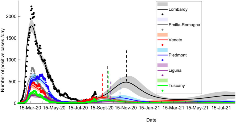
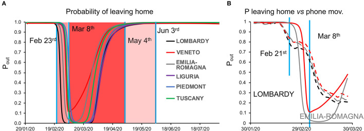
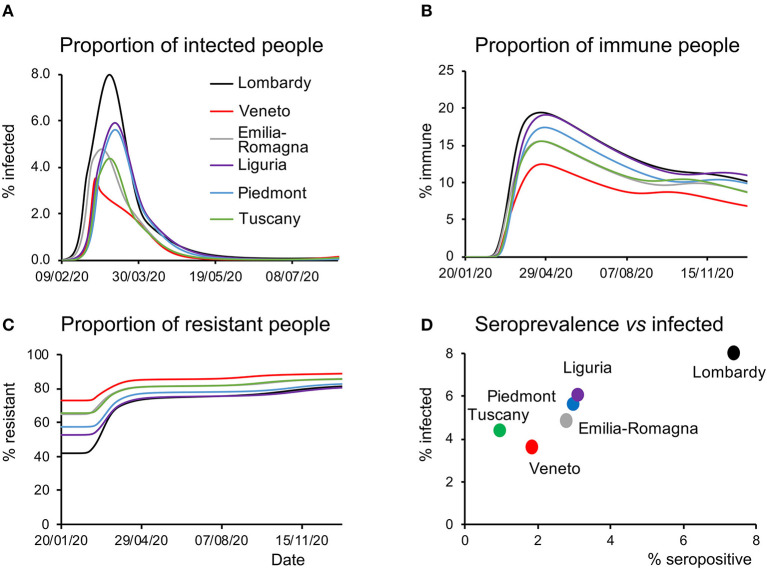
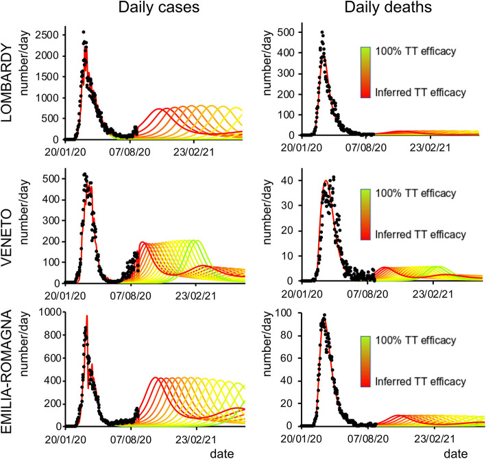
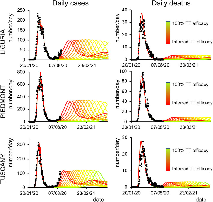
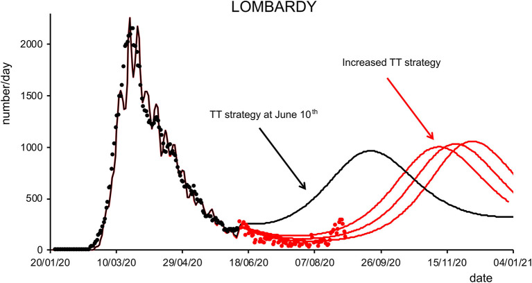
The COVID-19 pandemic has sparked an intense debate about the hidden factors underlying the dynamics of the outbreak. Several computational models have been proposed to inform effective social and healthcare strategies. Crucially, the predictive validity of these models often depends upon incorporating behavioral and social responses to infection. Among these tools, the analytic framework known as "dynamic causal modeling" (DCM) has been applied to the COVID-19 pandemic, shedding new light on the factors underlying the dynamics of the outbreak. We have applied DCM to data from northern Italian regions, the first areas in Europe to contend with the outbreak, and analyzed the predictive validity of the model and also its suitability in highlighting the hidden factors governing the pandemic diffusion. By taking into account data from the beginning of the pandemic, the model could faithfully predict the dynamics of outbreak diffusion varying from region to region. The DCM appears to be a reliable tool to investigate the mechanisms governing the spread of the SARS-CoV-2 to identify the containment and control strategies that could efficiently be used to counteract further waves of infection.

Keywords: COVID-19; DCM—dynamic causal modeling; brain modeling; computational modeling; predictive modeling.


Conflict of interest statement

AG is employed by TerrAria s.r.l. The remaining authors declare that the research was conducted in the absence of any commercial or financial relationships that could be construed as a potential conflict of interest.

Figures

Figure 1
Figure 1
Long-term prediction following BMC. Comparison of data fitting and prediction for the six regions under consideration, obtained via a BMC of 32 models for each region on dataset 2 (similar results could be obtained with dataset 1; see Methods for specification on datasets). Dots represent data on daily positive cases reported by the “National Civil Protection Agency.” Data are averaged with a sliding window of 7 days. The lines reproduce posterior expectations with corresponding 90% Bayesian confidence bands (shaded). Note the different timings of the peak of the second wave and its relative intensity in the different regions. Vertical dashed arrows indicate the peak of the second wave for each prediction.
Figure 2
Figure 2
(A) Dynamics of the probability of leaving home. The plot shows the time course of the probability of leaving home inferred by model inversion (colored lines) in the temporal window from January 22 to August 22, 2021. During this period, the Italian government imposed a lockdown with different degrees of severity from February 23 (soft lockdown: country-wide closing of schools, universities, and all non-essential industrial and commercial activities; limiting the activities of public offices) to March 8 (tight lockdown: prohibition of any kind of mobility, apart from specific health or professional needs). May 4 is the date where the tight lockdown was relaxed and people were allowed to freely move within their region, while on June 3, people were allowed to freely move within the whole country. Vertical blue lines indicate the dates of lockdown, whereas the shaded red and pink areas represent the lockdown time windows. Note the peculiar behavior of Veneto (red line), showing a lesser reduction in the probability of leaving home, indicating a reduced adherence to the lockdown orders. (B) Dynamics of the probability of leaving home, compared with cell phone movements. The graph shows the trajectory of the probability of leaving home inferred by the model (solid lines) and the monitored cell phone movements (dashed lines) for the three most hit regions (Lombardy, Veneto, and Emilia-Romagna) in the period from February 21 to March 27.
Figure 3
Figure 3
Latent causes. (A) Time course of the proportion of infected people during the epidemic and in the following months for all the regions considered. Note that Veneto shows a steep rise at the beginning of the epidemic but quickly drops to the initial values, whereas other regions display slower kinetics. (B) Time course of the proportion of immune people during the epidemic and in the subsequent months for all the regions considered. As in the case of infected people, this proportion is the lowest in Veneto throughout most of the considered time window. (C) Time course of the proportion of resistant people during the epidemic and in the subsequent months for all the regions considered. Notice how at the beginning of the epidemic this proportion was highest in Veneto. (D) Data on the serological test (% of the population that have been infected) are plotted against the peak value of the proportion of infected people inferred by the model and shown in (A).
Figure 4
Figure 4
Second-wave forecasts (Lombardy, Veneto, and Emilia-Romagna): Predicted number of daily positive cases (left) and deaths (right) under increasing levels of testing and tracking efficacy. The curves go from the value inferred by the model (red line) to 100% efficacy (green line). Black dots represent daily data averaged with a sliding window of 7 days.
Figure 5
Figure 5
Second-wave forecasts (Liguria, Piedmont, and Tuscany): The format of this figure follows that of Figure 4.
Figure 6
Figure 6
Effects of testing and tracking strategies in Lombardy. Black dots are daily data from January 22 to June 10 (7-day sliding window averages) of positive cases reported by the “National Civil Protection Agency” for Lombardy. The black line represents the posterior expectation for the same quantity following model inversion. Colored lines represent the predicted number of positive cases under increasing levels of testing and tracking, starting from the level that the model inferred to be the one adopted on June 10, to 12% (first red trace), 18% (middle red trace), and 24% (right red trace) of the maximum efficacy (see Methods). Red dots represent daily data from June 11 to August 31 (7-day sliding window averages).

Similar articles

Cited by

References

    1. Vinceti M, Filippini T, Rothman KJ, Ferrari F, Goffi A, Maffeis G, et al. . Lockdown timing and efficacy in controlling COVID-19 using mobile phone tracking. eClinicalMedicine. (2020) 25:10045. 10.1016/j.eclinm.2020.100457 - DOI - PMC - PubMed
    1. Bonaccorsi G, Pierri F, Cinelli M, Flori A, Galeazzi A, Porcelli F, et al. . Economic and social consequences of human mobility restrictions under COVID-19. Proc Natl Acad Sci USA. (2020) 117:15530–5. 10.1073/pnas.2007658117 - DOI - PMC - PubMed
    1. Di Domenico L, Pullano G, Sabbatini CE, Boelle PY, Colizza V. Impact of lockdown on COVID-19 epidemic in Ile-de-France and possible exit strategies. BMC Med. (2020) 18:240. 10.1186/s12916-020-01698-4 - DOI - PMC - PubMed
    1. Kucharski AJ, Klepac P, Conlan AJK, Kissler SM, Tang ML, Fry H, et al. . Effectiveness of isolation, testing, contact tracing, and physical distancing on reducing transmission of SARS-CoV-2 in different settings: a mathematical modelling study. Lancet Infect Dis. (2020) 20:1151. 10.1016/S1473-3099(20)30457-6 - DOI - PMC - PubMed
    1. Metcalf CJE, Morris DH, Park SW. Mathematical models to guide pandemic response. Science. (2020) 369:368–9. 10.1126/science.abd1668 - DOI - PubMed

Publication types