. 2022 Feb;19(2):179-186.
doi: 10.1038/s41592-021-01343-9. Epub 2022 Jan 13.

Identifying temporal and spatial patterns of variation from multimodal data using MEFISTO

Affiliations

Identifying temporal and spatial patterns of variation from multimodal data using MEFISTO

Britta Velten et al. Nat Methods. 2022 Feb.

Abstract

Factor analysis is a widely used method for dimensionality reduction in genome biology, with applications from personalized health to single-cell biology. Existing factor analysis models assume independence of the observed samples, an assumption that fails in spatio-temporal profiling studies. Here we present MEFISTO, a flexible and versatile toolbox for modeling high-dimensional data when spatial or temporal dependencies between the samples are known. MEFISTO maintains the established benefits of factor analysis for multimodal data, but enables the performance of spatio-temporally informed dimensionality reduction, interpolation, and separation of smooth from non-smooth patterns of variation. Moreover, MEFISTO can integrate multiple related datasets by simultaneously identifying and aligning the underlying patterns of variation in a data-driven manner. To illustrate MEFISTO, we apply the model to different datasets with spatial or temporal resolution, including an evolutionary atlas of organ development, a longitudinal microbiome study, a single-cell multi-omics atlas of mouse gastrulation and spatially resolved transcriptomics.


Conflict of interest statement

The authors declare no competing interests.

Figures

Fig. 1
Fig. 1. Overview of MEFISTO.
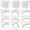
a, Illustration of MEFISTO for time-resolved data: MEFISTO decomposes a high-dimensional dataset with measurements from multiple views (for example, omics, tissues, genomic regions), sample groups (for example, individuals, biological conditions, species) and time points into a small number of factors in a time-aware manner. The inferred factors can explain temporally smooth variation that is shared across sample groups, smooth variation that is specific to sample groups or non-smooth variation. The boxes below illustrate additional features of MEFISTO, including data-driven alignment between misaligned sample groups, interpolation and imputation of missing data, clustering and outlier identification and enrichment analysis to annotate factors. b, Comparison of MEFISTO with conventional factor analysis that is not aware of time (MOFA) using simulated data. Shown are results from the application of both models to a simulated dataset with one non-smooth factor (Factor 1), one smooth, non-shared factor (Factor 2) and one smooth, shared factor (Factor 3). c,d, Recovery of the latent factors (Pearson R2) (c) and the imputation performance on missing values (mean squared error (MSE)) (d) for varying number of time points, groups and levels of missingness in the comparison of MEFISTO and MOFA on simulated data. Shown are the mean and standard error of the mean estimated across 10 independent repeat experiments. The dashed vertical line denotes the base parameter value kept constant when varying other parameters (Methods).
Fig. 2
Fig. 2. Application of MEFISTO to an evolutionary gene expression atlas across development.
a, Illustration of the input data covering gene expression measurements for 7,696 orthologous genes from five species (groups) and five organs (views) across 14–23 developmental stages. Correspondences of stages between species are not given and are learnt by the model. b, Percentage of variance (var.) explained by MEFISTO in the gene expression data for each species and organ. The barplot (top) shows the percentage of variance explained by all of the factors, and the heatmap (bottom) shows the values for individual factors. c, Scatterplot showing the embedding of the samples given by the first two factors. Samples are colored by the inferred common developmental time. d, Learnt factor values as a function of the inferred developmental time. Points correspond to individual factor values, and the lines and shaded zones correspond to the mean and variance, respectively, of the underlying latent process that generates the factor values. The bars at the top indicate the estimated smoothness along development and the sharedness across species of the factor. e, Learnt correlation structure across species for each latent factor in d.
Fig. 3
Fig. 3. Application to a longitudinal microbiome study following infants after birth.
a, Factor values as a function of month of life colored by delivery mode (left, Factor 1) and predominant feeding mode, termed diet (right, Factor 2). Dots represent inferred factor values per infant; lines correspond to the median across all samples in the respective category with the shaded zones indicating the interquartile range. b, Scatterplot of Factor 1 versus Factor 2 across samples, with colors denoting delivery mode (left), diet (middle) and month of life (right). Boxplots show the median (black horizontal line), the first and third quartiles (ends of the box), the largest and smallest value within the 1.5 interquartile ranges (ends of the whiskers) and the outliers (dots) for the n = 1,032 factor values of the 43 infants (groups) and 24 time points. c, Taxonomic tree annotated by mean positive and negative weights for Factor 1 and 2. Shown are genera with at least three sOTUs. Significance of enrichment is given as *adjusted P < 0.05, **adjusted P < 0.01 and ***adjusted P < 0.001 (one-sided Wilcoxon test, adjusted for multiple testing, Methods).
Fig. 4
Fig. 4. Application to a single-cell multi-omics dataset from early mouse development.
a, Scatterplots of UMAP (uniform manifold approximation and projection for dimension reduction) coordinates obtained from the RNA expression data that were used as covariates for MEFISTO. Each dot corresponds to a cell, colored by lineage assignments derived from the Argelaguet el al. study. b, Percentage of variance explained by each factor in each data modality. c, Scatterplot of UMAP coordinates as in a, colored by factor values. The bars at the top indicate the estimated smoothness of the respective factor. d, Scatterplot of DNA methylation weights versus chromatin accessibility weights for Factor 1 (relative values). Each dot corresponds to a transcription factor motif, error bands indicate the 95% confidence interval of the linear regression. Highlighted are the transcription factor motifs with the largest absolute values. Shown in the corner is Pearson R. The P value is based on a two-sided correlation test on the Pearson’s product moment correlation coefficient. e, Molecular variation of MSGN1 along the trajectory. Left: RNA expression level. Middle: DNA methylation (top) and chromatin accessibility (bottom) raw data values (~33% of cells covered). Right: DNA methylation (top) and chromatin accessibility estimates (bottom) using imputed values obtained from MEFISTO. f, Scatterplots of UMAP coordinates, as in a. Each cell is colored by cell cycle state, inferred using cyclone. g, Gene set enrichment analysis (GSEA) applied to the RNA weights of Factor 4. Shown is the false discovery rate-adjusted P value for the top significant pathways from the Molecular Signatures Database.
Extended Data Fig. 1
Extended Data Fig. 1. Additional results from evaluating MEFISTO on simulated data.
(a, b) Assessing the inference of factor smoothness (a) and sharedness (b, as defined based on the covariance of a factor across groups, Methods) on simulated data for varying simulation parameters (panels, Methods). Solid lines and dots show the average scores inferred by MEFISTO, intervals indicate the standard error of the mean across ten independent trials and dashed lines the values used in the simulation per factor (colors). (c,d) Comparison of interpolation performance to univariate Gaussian processes in terms of mean squared error of imputation (c) and memory and time requirements (d) for varying simulation parameters (panels, Methods). Dots indicate mean, intervals indicate standard error of the mean across ten independent trials.
Extended Data Fig. 2
Extended Data Fig. 2. Inferred alignment of developmental stages in the evo-devo application.
Factor values as a function of time before (a) and after (b) alignment. (a) shows the factor values (y-axis) against the developmental stages without alignment across species (x-axis), (b) shows the factor values (y-axis) against the developmental stages with alignment across species (x-axis). (c,d,e) show a latent embedding given by the factor values for each species- time point combination for Factor 1 (x-axis) and Factor 2 (y-axis) colored by unaligned times (c), aligned times (d) and species (e).
Extended Data Fig. 3
Extended Data Fig. 3. Pan-organ developmental programs on Factor 1 in the evo-devo application.
(a) Gene sets at a false discovery rate of 5% that are enriched in the weights of Factor 1 in at least 4 organs. Dots are colored by organ and indicate the significance of a gene set (x-axis) based on a parametric t-test with multiple testing correction using Benjamini-Hochberg procedure as implemented in MOFA2. Gray bars indicate the number of organs with significant enrichment. (b) Top 10 genes (y-axis) with highest absolute mean weight across organs. Dots indicate the absolute weight per organ (colors), gray bars show the mean across organs. Symbols on the right indicate the sign of the weights. (c) Gene expression along the inferred developmental time in all organs (columns) for the top 3 genes of panel (b).
Extended Data Fig. 4
Extended Data Fig. 4. Organ-wise weights of Factor 1 in the evo-devo application.
(a) Genes with highest absolute weight (x-axis) for the three organs with highest variance explained by Factor 1. Symbols on the right in each panel indicate the sign of the weight. (b) Gene expression trajectories along the inferred developmental time for the top 3 genes of the corresponding panel in (a).
Extended Data Fig. 5
Extended Data Fig. 5. Organ-wise weights of Factor 2 in the evo-devo application.
(a) Genes with highest absolute weight (x-axis) for the three organs with highest variance explained by Factor 2. Symbols on the right in each panel indicate the sign of the weight. (b) Gene expression trajectories along the inferred developmental time for the top 3 genes of the corresponding panel in (a).
Extended Data Fig. 6
Extended Data Fig. 6. Testis weights of Factor 3 in the evo-devo application.
(a) Genes with highest absolute weight (x-axis) in Testis on Factor 3. Symbols on the right indicate the sign of the weight. (b) Gene expression trajectories along the inferred developmental time for the top 3 genes in (a). (c) Top ten enriched gene set of the Molecular Signatures Database (MSigDB) in the weights of Factor 3. Colors indicate the negative logarithm of the adjusted p-values (per organ and factor) based on a parametric t-test with multiple testing correction using Benjamini-Hochberg procedure as implemented in MOFA2.
Extended Data Fig. 7
Extended Data Fig. 7. Organ-wise weights of Factor 4 in the evo-devo application.
(a) Genes with highest absolute weight (x-axis) for the three organs with highest variance explained by Factor 4. Symbols on the right in each panel indicate the sign of the weight. (b) Gene expression trajectories along the inferred developmental time for the top 3 genes of the corresponding panel in (a). (c) Weights of Factor 4 split by the classification in Cardoso-Moreira et al. Shown are violin plots of the weights (n = 7,696) in the model for each organ (panels) separated by whether they have previously been identified as having changed developmental trajectories for human compared to rodents or rabbit (x-axis). Inner boxplots show the median, the first and third quartiles (box), the largest and smallest value within the 1.5 interquartile ranges from the hinges (end of whiskers) and outliers (dots).
Extended Data Fig. 8
Extended Data Fig. 8. Organ-wise weights of Factor 5 in the evo-devo application.
(a) Genes with highest absolute weight (x-axis) for the three organs with highest variance explained by Factor 5. Symbols on the right in each panel indicate the sign of the weight. (b) Gene expression trajectories along the inferred developmental time for the top 3 genes of the corresponding panel in (a). (c) Weights of Factor 5 split by the classification in Cardoso-Moreira et al. Shown are violin plots of the weights (n = 7,696) in the model for each organ (panels) separated by whether they have previously been identified as having changed developmental trajectories for opossum compared to the other mammals (x-axis). Inner boxplots show the median, the first and third quartiles (box), the largest and smallest value within the 1.5 interquartile ranges from the hinges (end of whiskers) and outliers (dots).
Extended Data Fig. 9
Extended Data Fig. 9. Application to spatial transcriptomics data.
(a) Recovered factor values across space. The x- and y-axis denote the spatial coordinates, the colors indicate the inferred factor values. Bars below show the inferred smoothness scores for each factor. (b) Genes with highest absolute weight for the corresponding factor in (a). Symbols on the right of each panel indicate the sign of the weight. (c) Normalized gene expression values (colors) across space for the gene with the highest absolute weight on the corresponding factor in (a).

References

    1. Stegle O, Parts L, Piipari M, Winn J, Durbin R. Using probabilistic estimation of expression residuals (PEER) to obtain increased power and interpretability of gene expression analyses. Nat. Protoc. 2012;7:500–507. - PMC - PubMed
    1. Gehring JS, Fischer B, Lawrence M, Huber W. SomaticSignatures: inferring mutational signatures from single-nucleotide variants. Bioinformatics. 2015;31:3673–3675. - PMC - PubMed
    1. Alexandrov LB, Nik-Zainal S, Wedge DC, Campbell PJ, Stratton MR. Deciphering signatures of mutational processes operative in human cancer. Cell Rep. 2013;3:246–259. - PMC - PubMed
    1. Witten DM, Tibshirani R, Hastie T. A penalized matrix decomposition, with applications to sparse principal components and canonical correlation analysis. Biostatistics. 2009;10:515–534. - PMC - PubMed
    1. Hore V, et al. Tensor decomposition for multiple-tissue gene expression experiments. Nat. Genet. 2016;48:1094–1100. - PMC - PubMed

Publication types