. 2022 Jan 18;18(1):e1009778.
doi: 10.1371/journal.pcbi.1009778. eCollection 2022 Jan.

Longitudinally monitored immune biomarkers predict the timing of COVID-19 outcomes

Affiliations

Longitudinally monitored immune biomarkers predict the timing of COVID-19 outcomes

Gorka Lasso et al. PLoS Comput Biol. .

Abstract

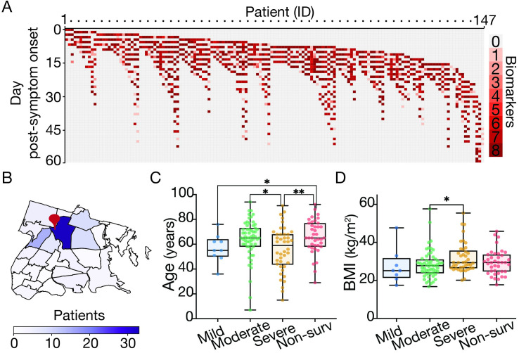
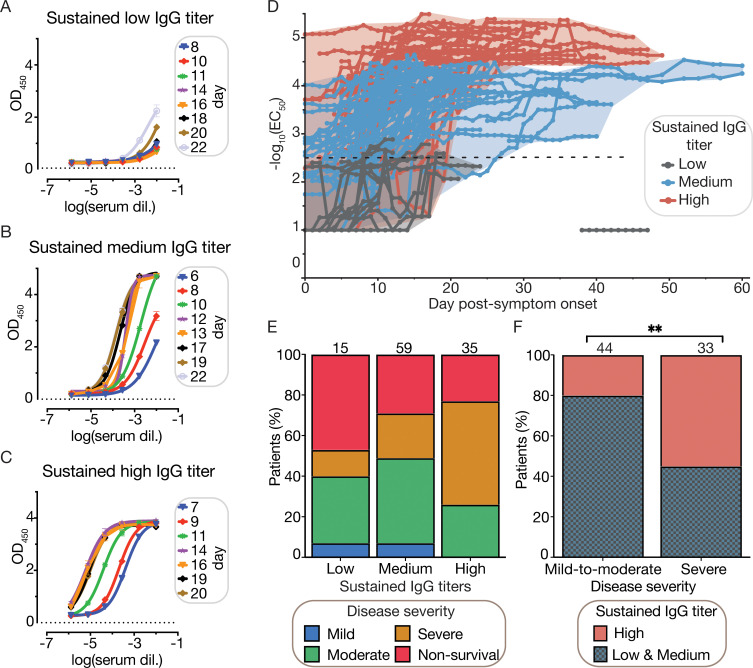
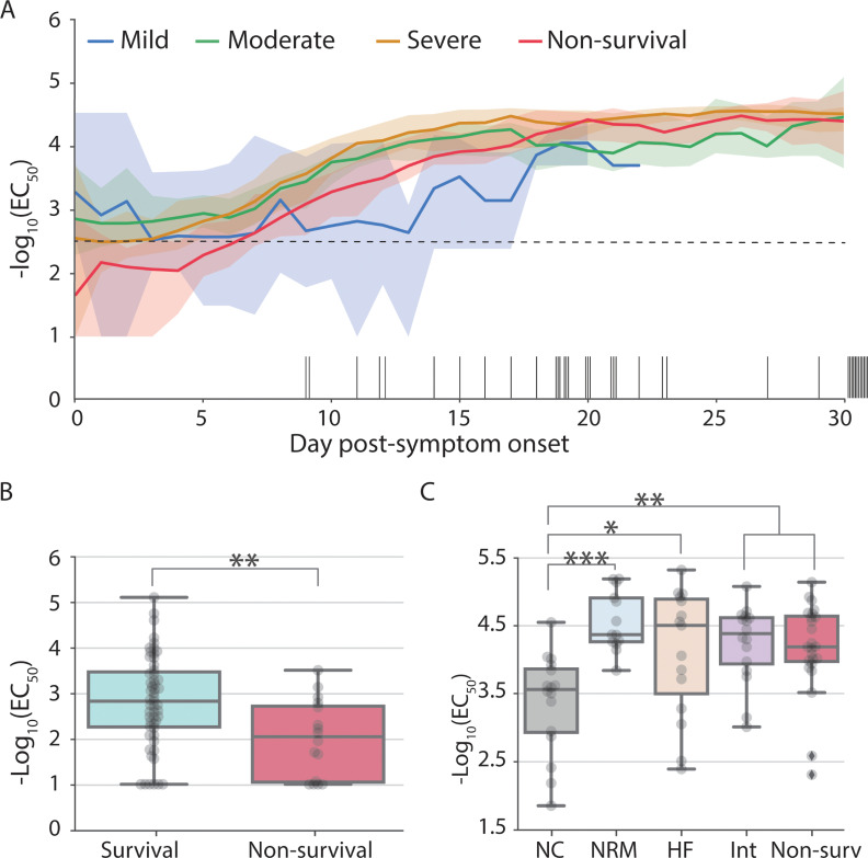
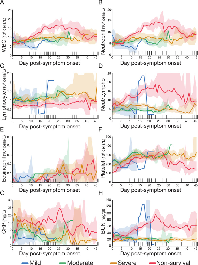
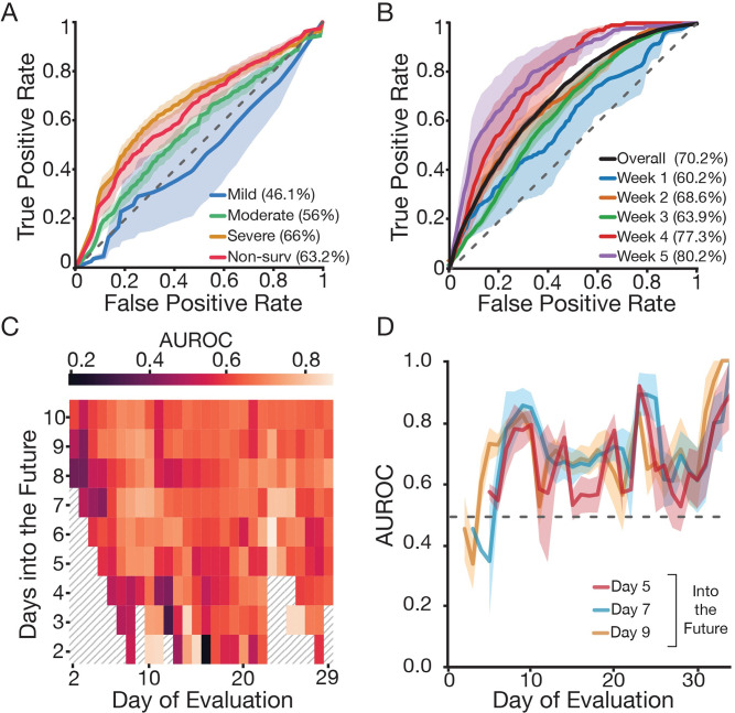
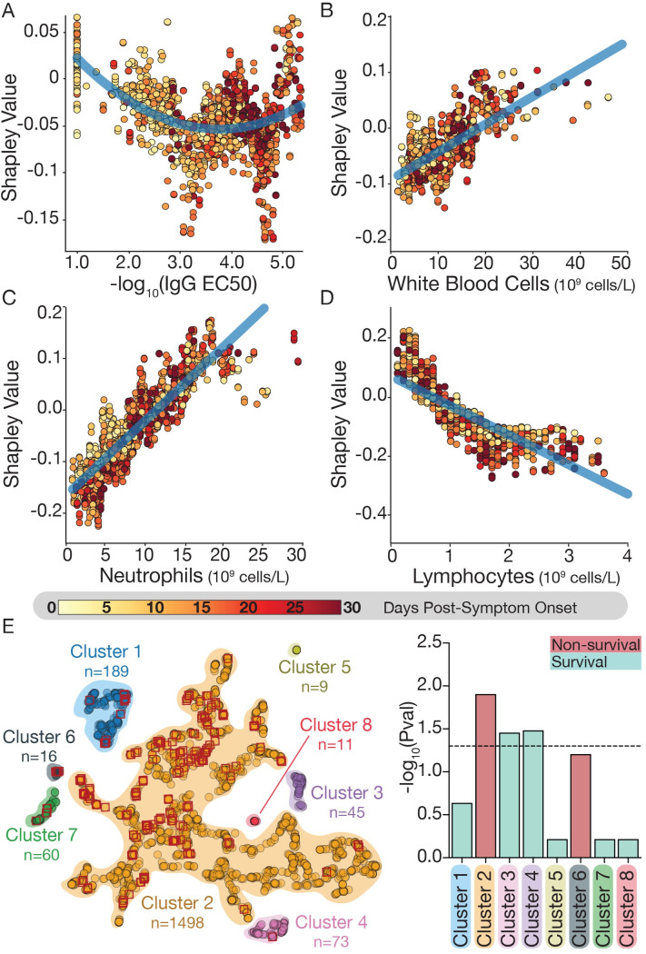
The clinical outcome of SARS-CoV-2 infection varies widely between individuals. Machine learning models can support decision making in healthcare by assessing fatality risk in patients that do not yet show severe signs of COVID-19. Most predictive models rely on static demographic features and clinical values obtained upon hospitalization. However, time-dependent biomarkers associated with COVID-19 severity, such as antibody titers, can substantially contribute to the development of more accurate outcome models. Here we show that models trained on immune biomarkers, longitudinally monitored throughout hospitalization, predicted mortality and were more accurate than models based on demographic and clinical data upon hospital admission. Our best-performing predictive models were based on the temporal analysis of anti-SARS-CoV-2 Spike IgG titers, white blood cell (WBC), neutrophil and lymphocyte counts. These biomarkers, together with C-reactive protein and blood urea nitrogen levels, were found to correlate with severity of disease and mortality in a time-dependent manner. Shapley additive explanations of our model revealed the higher predictive value of day post-symptom onset (PSO) as hospitalization progresses and showed how immune biomarkers contribute to predict mortality. In sum, we demonstrate that the kinetics of immune biomarkers can inform clinical models to serve as a powerful monitoring tool for predicting fatality risk in hospitalized COVID-19 patients, underscoring the importance of contextualizing clinical parameters according to their time post-symptom onset.


Conflict of interest statement

I have read the journal’s policy and the authors of this manuscript have the following competing interets: K.C. is a member of the scientific advisory board of Integrum Scientific, LLC. J.R.L is a consultant for Celdara Medical.

Figures

Fig 1
Fig 1. Overview of patient cohort by sampling strategy, residence and demographic associations with COVID-19 disease severity.
(A) Heatmap describing the number of biomarkers (y-axis; up to eight different biomarkers, see materials and methods) measured for any given patient (x-axis; described by an internal identifier) and day PSO over course of hospitalization (patients = 147, blood samples analyzed = 1,954). (B) Choropleth map of the Bronx zip codes colored by the number of patients enrolled in the study. The red pin denotes the location of Montefiore Medical Center. (C-D) Box plot of patient’s age (C) and Body Mass Index (D) by oxygen supplementation or non-survival outcome (Blue: Mild, green: moderate, orange: severe, red: non-survival). Boxes extend from the 25th to 75th percentiles, the whiskers represent the minimum and maximum values and the middle line corresponds to the median. Statistical significance is denoted with asterisks (Mann-Whitney; *p < 0.05, **p < 0.01). We define “day post-symptom onset” (PSO) as the day relative to the patient-reported onset of symptoms. We downloaded the raw data to make the map from NYC Open Data (https://data.cityofnewyork.us/City-Government/Borough-Boundaries/tqmj-j8zm) and plotted it using pandas and geopands.
Fig 2
Fig 2. Sustained IgG titers are associated with severity of disease.
(A-C) SARS-CoV-2 spike IgG ELISA titration of plasma samples over the course of hospitalization for representative patients showing three distinct evolutions of IgG titers. ELISA experiments were carried out as two experimental replicates, each consisting of two technical replicates. (A) Representative patient with a sustained low IgG titer during hospitalization. (B) Representative patient with a sustained medium IgG titer during hospitalization. (C) Representative patient with a sustained high IgG titer during hospitalization. (D) EC50 titers over time were used to categorize patients with ≥ 7 days of hospitalization (n = 130) into three categories that describe the sustained IgG titer: i) low (grey), medium (blue) and high (red). Categorized patients are required to show daily IgG EC50 titers for at least for 5 consecutive days within the range delimited by the 25th and 75th EC50 percentiles (sustained low IgG: -log10(EC50) ≤ 25th perc; sustained medium IgG: 25th perc > -log10(EC50) ≤ 75th perc; and sustained high IgG: -log10(EC50) > 75th perc; see materials and methods and S1 Fig). (A-D) We define “day post-symptom onset" (PSO) as the day relative to the patient-reported onset of symptoms. (E) Mosaic plot describing the distribution of severity of COVID-19 relative to the sustained IgG titer class. (F) Distribution of sustained IgG titers relative to the severity of disease among survivors (77 patients), patients with mild and moderate disease were merged into a single category (Chi-square, **p < 0.01).
Fig 3
Fig 3. IgG titers are associated with mortality early post-symptom onset and with severity of disease later during hospitalization.
(A) Median IgG titer at a given day during hospitalization by disease severity: mild (blue), moderate (green), severe (orange) and non-survivors (red). Back bars on the x-axis describe the day of death for each deceased patient. For clarity purposes, only the first 30 days of hospitalization are shown (blood samples were collected up to day 60 PSO). Shaded areas correspond to the 90% confidence intervals. IgG positivity threshold is indicated with a horizontal black dotted line at -log10(EC50) = 2.5. We define “day post-symptom onset" (PSO) as the day relative to the patient-reported onset of symptoms. (B) IgG titers for survivors (cyan) and non-survivors (red) at day 4 PSO (used here to represent the statistical differences observed between convalescent and deceased patients from days 3 to 8). (C) Box-plot at day 18 PSO (representative day of the statistical differences observed from days 18 to 24) describing IgG titers (-log10 EC50) by patient outcome: survival patients requiring oxygen supplementation (nasal canula: grey, non-rebreather mask: blue; high-flow: salmon; intubation: pink) and non-survival patients (red). Boxes extend from the 25th to 75th percentiles, whiskers extend to the lowest and highest data point within 1.5 interquartile range of the lower and upper quartiles, the middle line corresponds to the median. Statistical significance is denoted with asterisks (Mann-Whitney; *p < 0.05, **p < 0.01).
Fig 4
Fig 4. Dynamic variation of leucocytes, inflammatory biomarkers and renal function during hospitalization is associated with mortality.
Levels of (A) total white blood cell count (WBC), (B) neutrophils, (C) lymphocytes, (D) neutrophil to lymphocyte ratio, (E) eosinophil, (F) platelet, (G) CRP and (H) BUN during hospitalization. Patients are categorized according to the severity of disease: mild–blue, moderate—green, severe—orange and non-survival—red. Cell count and CRP and BUN levels are averaged using a five-day sliding window. Back bars on the x-axis are the day of death for each deceased patient. Shaded areas correspond to 90% confidence intervals. The group size of the mild category is reduced to one to three patients after day 11 PSO. We define “day post-symptom onset" (PSO) as the day relative to the patient-reported onset of symptoms.
Fig 5
Fig 5. Time-dependent clinical and laboratory data outperform day of admission data to predict fatal outcome.
(A) ROC performance on predicting severity of disease and mortality using a random forest classifier based on data from the EMR (including clinical, laboratory data and demographics; see S7 Fig) on admission. Shaded areas correspond to ± 2 standard error of the mean. (B) ROC performance on predicting mortality within the next five days (k = 5) using a neural network based on time dependent clinical features (IgG titers, total white blood cell count, neutrophils, lymphocytes, eosinophils, platelets, CRP and BUN; see Fig 4). ROC curves correspond to the overall performance (purple) as well as weekly predictions (relative to the patient-reported onset of symptoms) during the length of hospitalization. A-B) Legend describes the corresponding area under the curves. (C) Heatmap shows AUROC for daily mortality classifier (neural network) for different values of k (number of days into the future to predict; y-axis) and day of evaluation (restrict test set to a given day). (D) AUROC as a function of day of evaluation for various values of k. Regardless of k, the performance of the classifier remains consistent and improves over the course of a month. (C-D) We define “day of evaluation” as the day relative to the patient-reported onset of symptoms when mortality risk was assessed. ROC: receiver operating characteristic; EMR: electronic medical record; AUROC: area under the receiver operating characteristic.
Fig 6
Fig 6. Shapley value analysis reveals how immune biomarkers relate to mortality.
(A-D) For each of 4 immune biomarkers, the mean Shapley value compared to the biomarker value was plotted for each sample in the dataset (see materials and methods for details). The higher the Shapley value, the more the variable is predictive for mortality (and vice-versa): (A) IgG titers; (B) WBC count; (C) neutrophil count; (D) lymphocyte counts. Shapley values are colored based on the corresponding day PSO. (E) UMAP clustering of mean Shapley values. Red diamonds correspond to samples from patients that died within five days (k = 5) of the evaluation day. Right panel describes the significance of the enrichment for survivors (cyan) or non-survivors (red) in each of the obtained clusters using the hypergeometric test corrected for multiple hypothesis testing by Benjamini/Hochberg. Dotted horizontal line corresponds to the significance level at p = 0.05.PSO: post symptom onset.

Similar articles

Cited by

References

    1. Holshue ML, DeBolt C, Lindquist S, Lofy KH, Wiesman J, Bruce H, et al.. First Case of 2019 Novel Coronavirus in the United States. N Engl J Med. 2020;382(10):929–36. doi: 10.1056/NEJMoa2001191 - DOI - PMC - PubMed
    1. Amor S, Fernandez Blanco L, Baker D. Innate immunity during SARS-CoV-2: evasion strategies and activation trigger hypoxia and vascular damage. Clin Exp Immunol. 2020;202(2):193–209. doi: 10.1111/cei.13523 - DOI - PMC - PubMed
    1. He X, Lau EHY, Wu P, Deng X, Wang J, Hao X, et al.. Temporal dynamics in viral shedding and transmissibility of COVID-19. Nat Med. 2020;26(5):672–5. doi: 10.1038/s41591-020-0869-5 - DOI - PubMed
    1. Richardson S, Hirsch JS, Narasimhan M, Crawford JM, McGinn T, Davidson KW, et al.. Presenting Characteristics, Comorbidities, and Outcomes Among 5700 Patients Hospitalized With COVID-19 in the New York City Area. JAMA. 2020;323(20):2052–9. doi: 10.1001/jama.2020.6775 - DOI - PMC - PubMed
    1. Wu C, Chen X, Cai Y, Xia J, Zhou X, Xu S, et al.. Risk Factors Associated With Acute Respiratory Distress Syndrome and Death in Patients With Coronavirus Disease 2019 Pneumonia in Wuhan, China. JAMA Intern Med. 2020;180(7):934–43. doi: 10.1001/jamainternmed.2020.0994 - DOI - PMC - PubMed

Publication types