. 2022 Jan 21;13(1):440.
doi: 10.1038/s41467-021-27716-4.

Single-cell multi-omics reveals dyssynchrony of the innate and adaptive immune system in progressive COVID-19

Collaborators, Affiliations

Single-cell multi-omics reveals dyssynchrony of the innate and adaptive immune system in progressive COVID-19

Avraham Unterman et al. Nat Commun. .

Abstract

Dysregulated immune responses against the SARS-CoV-2 virus are instrumental in severe COVID-19. However, the immune signatures associated with immunopathology are poorly understood. Here we use multi-omics single-cell analysis to probe the dynamic immune responses in hospitalized patients with stable or progressive course of COVID-19, explore V(D)J repertoires, and assess the cellular effects of tocilizumab. Coordinated profiling of gene expression and cell lineage protein markers shows that S100Ahi/HLA-DRlo classical monocytes and activated LAG-3hi T cells are hallmarks of progressive disease and highlights the abnormal MHC-II/LAG-3 interaction on myeloid and T cells, respectively. We also find skewed T cell receptor repertories in expanded effector CD8+ clones, unmutated IGHG+ B cell clones, and mutated B cell clones with stable somatic hypermutation frequency over time. In conclusion, our in-depth immune profiling reveals dyssynchrony of the innate and adaptive immune interaction in progressive COVID-19.


Conflict of interest statement

S.H.K. receives consulting fees from Northrop Grumman. L.E.N. is a founder and shareholder in Humacyte, Inc, which is a regenerative medicine company. Humacyte produces engineered blood vessels from allogeneic smooth muscle cells for vascular surgery. L.E.N.’s spouse has equity in Humacyte, and L.E.N. serves on Humacyte’s Board of Directors. L.E.N. is an inventor on patents that are licensed to Humacyte and that produce royalties for L.E.N. L.E.N. has received an unrestricted research gift to support research in her laboratory at Yale. Humacyte did not fund these studies, and Humacyte did not influence the conduct, description, or interpretation of the findings in this report. N.D.G. is a paid consultant for Tempus Labs and the National Basketball Association. A.I.K. received consulting fees from Tata Sons and Regeneron and is a recipient of grants on COVID-19 from Merck, Regeneron, and Serimmune all of which are outside the submitted work. K.B.H. receives consulting fees from Prellis Biologics. C.D.C. is a recipient of a grant from BMS. A.U. reports personal consulting fees from Boehringer Ingelheim, RemedyCell, Augmanity Nano, and 1E Therapeutics in the last 36 months, and Equity in RemedyCell, all outside the submitted work. D.A.H. has received research funding from Bristol-Myers Squibb, Novartis, Sanofi, and Genentech. He has been a consultant for Bayer Pharmaceuticals, Bristol Myers Squibb, Compass Therapeutics, EMD Serono, Genentech, Juno Therapeutics, Novartis Pharmaceuticals, Proclara Biosciences, Sage Therapeutics, and Sanofi Genzyme. Further information regarding funding is available on: https://openpaymentsdata.cms.gov/physician/166753/general-payments. N.K. reports personal fees from Boehringer Ingelheim, Third Rock, Pliant, Samumed, NuMedii, Indalo, Theravance, LifeMax, Three Lake Partners, RohBar, Astra Zeneca, Veracyte, Augmanity, CSL Behring, and Thyron in the last 36 months, and reports equity in Pliant and Thyron. N.K. is also a recipient of a grant from Veracyte Boehringer Ingelheim, BMS, and non-financial support from MiRagen and Astra Zeneca. All outside the submitted work; in addition, N.K. has patents on New Therapies in Pulmonary Fibrosis and ARDS (optioned to biotech) and Peripheral Blood Gene Expression as biomarkers in IPF (licensed to biotech). T.S.S., N.N., X.Y., A.Y.Z., V.G., J.C.S., H.A., Y.L., C.C.Jr., W.D., M.C., M.S.B.R., G.W., Z.W., G.D., N.G.R., N.L., C.C., P.W., J.F., S.B., L.S., A.C., C.B.F.V., A.L.W., A.M., H.M., Y.S., M.M., S.M., W.E.R, I.C., K.R., R.R.M., S.F.F., A.I., A.C.S., D.V.D., and H.Z. declare no competing interests.

Figures

Fig. 1
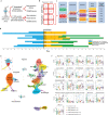
Fig. 1. Study outline and cell clustering results.
Eighteen PBMC samples from ten COVID-19 patients were included in this study, as well as 13 control samples. All COVID-19 patients had PBMC samples analyzed at two time points, except for two progressive patients who were only sampled after tocilizumab treatment. a Flowchart of the sample preparation methods and single-cell library types used in this study. Each COVID-19 PBMC sample was split into two after thawing and processed in parallel by two methods: conventional and CITE-seq. Control PBMC samples were only processed with the conventional sample preparation method, without CITE-seq. b Matrix representation of all 18 COVID-19 samples used, according to disease progression, tocilizumab treatment, and timing of blood draw. c A guide to patient codes and colors used throughout this manuscript. d A scheme depicting the timing of symptoms, hospitalization, blood draws, and tocilizumab treatment for each of the 10 COVID-19 patients. e UMAP embedding of single-cell transcriptomes from 153,554 cells from 18 COVID-19 and 13 control PBMC samples, annotated by cell types. Dashed box shows the two clusters of classical monocytes, HLADRhi (#7) and S100Ahi/HLADRlo (#1). f Comparison of differential cell counts (as % of all PBMCs) between patient groups for each of the annotated cell types shown in e. The results are depicted in boxplots, in which the value for each sample is represented by a dot, the upper and lower bounds represent the 75% and 25% percentiles, respectively. The center bars indicate the medians, and the whiskers denote values up to 1.5 interquartile ranges above the 75% or below the 25% percentiles. The number of patients (n) is indicated for each group in the figure. *p-value < 0.05; **p-value < 0.01; ***p-value < 0.001, as determined by two-tailed Wilcoxon rank-sum test. DC dendritic cells, IM intermediate, IFN interferon, MAIT mucosal-associated invariant T cells, NC non-classical, NK natural killer. Source data are provided as a Source Data file.
Fig. 2
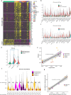
Fig. 2. Strong interferon response is observed in COVID-19 samples.
a Heatmap showing the top differentially expressed genes (logFC > 0.5, adjusted p-value < 0.05 calculated by Wilcoxon rank-sum test with Bonferroni correction for multiple comparisons) for each major cell type, comparing time-point A and B. The level of expression of these genes in control samples is shown as well. The upper part of the heatmap depicts genes that are increased at time-point A compared to B (marked “time-point A up”). bg IFN-I scores were calculated based on the expression of 12 ISGs for each sample. b IFN-I score is markedly increased in all cell types in COVID-19 at time point A, relative to controls. c IFN-I score decreases from time-point A to B in nearly all cell types. d IFN-I score is higher in progressive vs stable COVID-19 patients, and at time-point, A (earlier blood draw) compared to time-point B (later one). ****p-value < 1E−300 calculated by Wilcoxon rank-sum test. e, f Viral load for each patient was calculated based on RT-qPCR analysis of nasopharyngeal swabs or saliva samples. e Shown is a scatter plot of scaled log viral load vs scaled IFN-I score for all COVID-19 samples. Correlation coefficient (R) and p-value are indicated. Error bands denote a 95% confidence interval. p-value was calculated based on an F-test for the significance of the regression model. f Shown is a violin plot depicting the IFN-I score for each sample, with the corresponding viral loads indicated below the plot. Arrows mark the time difference (in days) between paired samples (i.e., from the same patient) at two time-points: A (early/before tocilizumab treatment) and B (late/after tocilizumab). g Scatter plot for the 8 paired samples, showing a very high correlation between the time difference from sample A to B and the respective change in scaled IFN-I score during that time. Correlation coefficient (R) and p-value are indicated. Error bands denote a 95% confidence interval. p-value was calculated based on an F-test for the significance of the regression model. IFN interferon, ND not detectable. FC fold-change. Source data are provided as a Source Data file.
Fig. 3
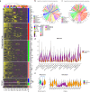
Fig. 3. Severe COVID-19 is associated with marked changes in gene expression and connectome.
a Heatmap showing the top differentially expressed genes (logFC > 0.5, adjusted p-values < 0.05 calculated by Wilcoxon rank-sum test with Bonferroni correction for multiple comparisons) for each major cell type, comparing progressive to stable patients. The upper part of the heatmap depicts genes that are increased in progressive compared to stable patients (marked “progressive up”). Hierarchical clustering separates most of the progressive samples from the stable ones based on gene expression similarities (except for some stable samples at time point A, which cluster with the progressive ones). b, c Differential connectivity maps (connectomes) of ligands (bottom half) and receptors (upper half). For each cell type, log-fold changes of ligands and receptors were calculated, comparing progressive to stable COVID-19 patients; we only plotted edges with >10% of cells expressing the ligand and receptor, and with an adjusted p-value < 0.05 for the comparison; edge size is proportional to the degree of change between progressive and stable patients. b Connectome of ligands and receptors that are both increased in progressive vs stable patients. c Connectome of ligands that are decreased and receptors that are increased in progressive vs stable patients. d A violin plot depicting differences in IFN-I score between progressive and stable COVID-19 patients in all PBMC subpopulations. e A composite score of nine HLA type 2 genes that are highly expressed in all subjects (HLA2 score) is decreased in monocytes of progressive patients relative to stable ones and controls. The right panel depicts the HLA2 scores of individual patient samples. ****p-value < 1E−300 calculated by Wilcoxon rank-sum test.
Fig. 4
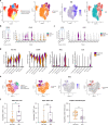
Fig. 4. Progressive COVID-19 is associated with an immune dyssynchrony in monocytes and T-cells.
a Four congruent UMAPs showing sub-clustering results of all monocytes. The left panel shows the original cell annotation. Cells from progressive patients concentrate in the high ISG pole (IFI6 is given as a representative example of ISGs). The right panel highlights a clear separation between cells from the earlier blood draw (time point A) and those from the later one (time point B) which follows the ISG expression pattern. b, c CD163 and IL1R2 are increased in progressive COVID-19. ***p-value < 1E−200; ****p-value < 1E−300 calculated by Wilcoxon rank-sum test with Bonferroni correction for multiple comparisons. d Violin plots showing the expression of HLA-DRA, S100A8, AREG, and IL1R2 in myeloid cell clusters, comparing stable to progressive patients. e Four congruent UMAPs depicting sub-clustering results of CD8+ T cells. The left panel shows the original cell annotation. Cells from progressive patients show a clear separation from those of stable ones, and seem to concentrate at the high ISG pole (IFIT3 is given as a representative example for ISGs). Most of the cells belonging to the IFN-activated CD8+ T cluster are located in the high IFN/progressive pole (right panel). f LAG-3 and HLA-DR levels were measured in the indicated cell types by flow cytometry, in an independent cohort of patients. Shown are % positive for these markers out of total cells of the same cell type, comparing patients that were admitted to the intensive care unit (ICU, comparable to progressive patients, n = 8 for LAG-3 analysis and n = 9 for HLA-DR analysis) and those that were not (non-ICU, comparable to stable patients, n = 22). The results are depicted in boxplots, in which the value for each patient is represented by a dot, the upper and lower bounds represent the 75% and 25% percentiles, respectively, the center bars indicate the medians, and the whiskers denote values up to 1.5 interquartile ranges above the 75% or below the 25% percentiles. *p-value < 0.05; **p-value < 0.01, as assessed by two-tailed Mann–Whitney test. Source data are provided as a Source Data file.
Fig. 5
Fig. 5. Tocilizumab exerts differential gene expression effects in different immune cells.
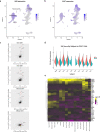
a, b UMAP representations of IL6R (a) and IL6ST (b) expression in PBMCs. Note that IL6R is highest for monocytes, dendritic cells, CD4+ T cells (including Tregs), and naive CD8+ T cells, while IL6ST expression is similar in the majority of cell types. c Scatter plots of the logFC from time-point A to B in patients treated (Y axes) compared to those not treated with tocilizumab (X axes) for several T cell subtypes. This comparative model demonstrates a marked effect of tocilizumab on IL-6 pathway genes (shown in red) in CD4+ and naive CD8+ T cells, but not in effector CD8+ T cells, in which IL6R expression is low (see Supplementary Fig. 13 for the full panel with all cell types). d IL-6 score in CD4+ T cells is decreased at time-point B in all the patients that were treated with tocilizumab, but not in the non-treated patients (NS0, NS1). e A heatmap showing the expression of genes that were significantly differentially expressed (LogFC > 0.4, adjusted p-value < 0.05 calculated by Wilcoxon rank-sum test with Bonferroni correction for multiple comparisons) between time point A and B in tocilizumab-treated patients, but not in patients that were not treated by tocilizumab, across PBMC subtypes. All the entries in the heatmap matrix are the differences of logFC in tocilizumab and in non-tocilizumab groups. Also shown is a hierarchical clustering according to cell types (horizontal) and individual genes (vertical).
Fig. 6
Fig. 6. Multi-omics immune profiling identifies HLA-DR+CD38+ T cells in progressive COVID-19 patients.
a Visualization of ADT cluster #15 (HLA-DR+CD38+ activated effector T cells) and TCR+ cells in GEX dividing T cells cluster on the GEX UMAP (red highlighted). ADT and RNA expression of MKI67 (only RNA), HLA-DR/HLADRA, and CD38/CD38 projected on GEX UMAP. b Boxplots show frequency of dividing T cells within the total T cell population at early and late time-points (top; n = 13 for HC, 8 for time A, and 10 for time B), and in stable and progressive patients at early and late time-points (bottom; n = 13 for HC, 6 for Stable-A, 6 for Stable-B, 2 for Progressive-A, and 4 for Progressive-B). One-way ANOVA and Sidak’s multiple comparisons test. c Representative contour plot of flow cytometry analysis of PBMCs from COVID-19 patients (left). The frequency of HLA-DR+CD38+ cells assessed by ADT (top right) and flow cytometry (bottom right) in samples from stable and progressive COVID-19 patients is shown. d Heatmap representation of DEGs in dividing T cells across three patient groups. e Representative histogram of LAG-3 expression on HLA-DR+CD38+ CD4+ T cells from stable and progressive patients assessed by flow cytometry. Gray shaded plot represents a fluorescence minus one staining for LAG-3 (top). Quantification of LAG-3 positive cells within HLA-DR+CD38+ CD4+ T cells (bottom). Mann–Whitney U test (two-tailed). f GSEA of a signature of progenitor exhausted versus terminally exhausted CD8+ T cells in chronic infection (GSE84105). Progenitor exhausted signature (red), terminally exhaustion signature (blue), in the ranked list of genes differentially expressed by dividing T cells from stable versus progressive patients. g Correlation between frequency of LAG-3 positive CD4+ T cells and HLA-DR+ classical monocytes in COVID-19 patients. Pearson’s r, exact two-sided p-value, and the 95% confidence interval are shown. The results in b and e are depicted in boxplots, in which the value for each patient is represented by a dot, the upper and lower bounds represent the 75% and 25% percentiles, respectively. The center bars indicate the medians, and the whiskers denote values up to 1.5 interquartile ranges above the 75% or below the 25% percentiles. Source data are provided as a Source Data file.
Fig. 7
Fig. 7. TCR data analysis of COVID-19 patients and controls.
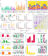
a The number of cells and clones across all samples. Cells with TCR data of low quality are excluded. b Fractional abundance of cells with high-quality TCR data among different cell types. c Rarefied diversity indices (richness and evenness) of the naive and memory CD8+ T cells at time point A are significantly different between stable (n = 5) and progressive (n = 2) patients presented in boxplots (top panels). p-value = 0.045 for richness and 0.005 for evenness by one-sided Student’s t-test. The results are depicted in boxplots, in which the value for each patient is represented by a dot, the upper and lower bounds represent the 75% and 25% percentiles, respectively. The center bars indicate the medians, and the whiskers denote values up to 1.5 interquartile ranges above the 75% or below the 25% percentiles. Changes in these diversity indices after treatment are shown between stable (n = 5) and progressive (n = 2) patients (bottom panels). p-value = 0.283 for richness and 0.240 for evenness by Student’s t-test. d Rarefied relative abundance of the top 30 clones from CD4+ T cells (top panels) and CD8+ T cells (bottom panels) between stable and progressive patients. e The number of clone clusters identified by GLIPH2 in CD4+ T cells (lower triangle) and CD8+ T cells (upper triangle) that have clones from every pair of samples based on the top 24 CD8+ and 172 CD4+ T cell SARS-CoV-2-specific clone clusters. f Clone clusters’ TRBV and TRBJ gene usage distribution in CD8+ T cells based on the 4 chosen SARS-CoV-2-specific expanded clone clusters. The CDR3β motif found in each cluster with global similarity is shown as well as the samples that contribute clones to the cluster. * Clusters with dividing CD8+ T cells. Clusters with IFN-activated CD8+ T cells. g Clone clusters’ TRBV and TRBJ gene usage distribution in CD4+ T cells based on the 2 chosen SARS-CoV-2-specific expanded clone clusters. The CDR3β motif found in each cluster is shown as well as samples that contribute clones to them. Source data are provided as a Source Data file.
Fig. 8
Fig. 8. BCR data analysis, part 1.
a Number of cells (closed-bars) and number of clones (open-bars) in patients colored based on the treatment and status of the disease. b Fractional abundance of memory B cells, naive B cells, and plasma cells in each sample. c Fractional abundance of isotypes (IGHM/D/G/A) in each sample. df CDR3 amino acid length (x axis) and mutation frequency (y axis) for each cell type (memory B cell and plasma cell columns) and isotype (IGHG and IGHM rows) of stable patients with no treatment, progressive patients under treatment, and stable patients under treatment. Colors indicate different samples. Vertical dashed line represents 15 amino acid CDR3 length reference point and horizontal line represents 5% mutation frequency reference point. Points with larger size belong to the expanded clones. g CDR3 amino acid usage at time-point B relative to A for patients grouped based on the treatment and status of the disease. h Cell type fractional abundance of expanded clones in each sample. Labels in each bar represent the number of expanded clones (top) and number of cells (bottom). i Isotype fractional abundance of expanded clones in each sample. Labels as described in h. Source data are provided as a Source Data file.
Fig. 9
Fig. 9. BCR data analysis, part 2.
a IGHV gene (x axis) fractional abundance (y axis) of expanded clones in each sample (label). Colors and shapes represent patients grouped based on the status of the disease and treatment. The results are depicted in boxplots, in which the value for each patient is represented by a dot, the upper and lower bounds represent the 75% and 25% percentiles, respectively. The center bars indicate the medians, and the whiskers denote values up to 1.5 interquartile ranges above the 75% or below the 25% percentiles. Data beyond the end of the whiskers are outliers. N = 10 for Stable and 5 for Progressive. b PCA of IGHV genes (arrows label) based on the fractional abundance from expanded clones of each sample (points label). Colors and shapes represent patients grouped based on treatment. c An example of a B cell clonal lineage tree. Branch lengths represent the expected number of substitutions per codon (see scale bar). d A root-to-tip correlation analysis. Pearson correlation coefficient between divergence and time within each B cell lineage tree (x axis), with corresponding p-values calculated using a permutation test (y axis). The size of each point corresponds to the number of distinct sequence/time point combinations within each clone. Dashed line shows p-value = 0.05. e Number of convergent antibody clusters within each sample. f Convergent antibodies (VDJ) that are specific to patients with stable status and under treatment. Source data are provided as a Source Data file.

References

    1. WHO. WHO Coronavirus Disease (COVID-19) Dashboard (2021).
    1. Berlin, D. A., Gulick, R. M. & Martinez, F. J. Severe covid-19. N. Engl. J. Med.383, 2451–2460 (2020). - PubMed
    1. Cummings MJ, et al. Epidemiology, clinical course, and outcomes of critically ill adults with COVID-19 in New York City: a prospective cohort study. Lancet. 2020;395:1763–1770. - PMC - PubMed
    1. Lucas C, et al. Longitudinal analyses reveal immunological misfiring in severe COVID-19. Nature. 2020;584:463–469. - PMC - PubMed
    1. Del Valle, D. M. et al. An inflammatory cytokine signature helps predict COVID-19 severity and death. Nat. Med.26, 1636–1643 (2020). - PMC - PubMed

Publication types

MeSH terms

Substances