. 2022 Feb 11:11:e73983.
doi: 10.7554/eLife.73983.

Barcoded bulk QTL mapping reveals highly polygenic and epistatic architecture of complex traits in yeast

Affiliations

Barcoded bulk QTL mapping reveals highly polygenic and epistatic architecture of complex traits in yeast

Alex N Nguyen Ba et al. Elife. .

Abstract

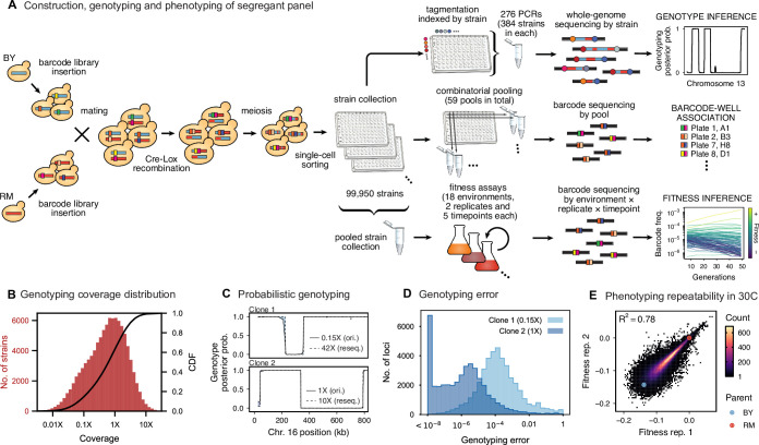
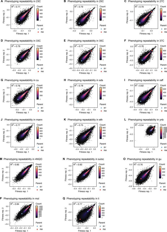
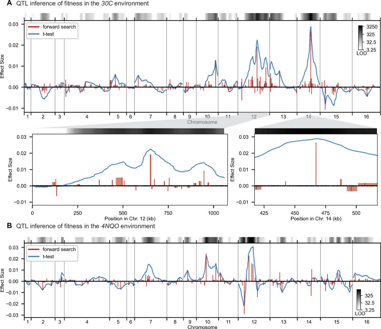
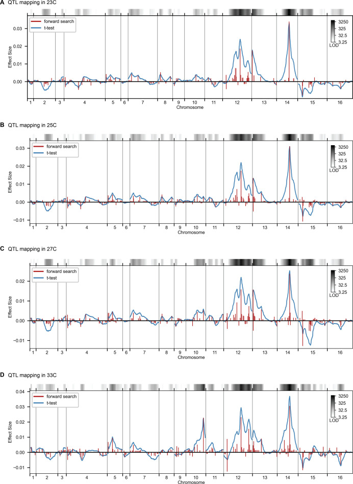
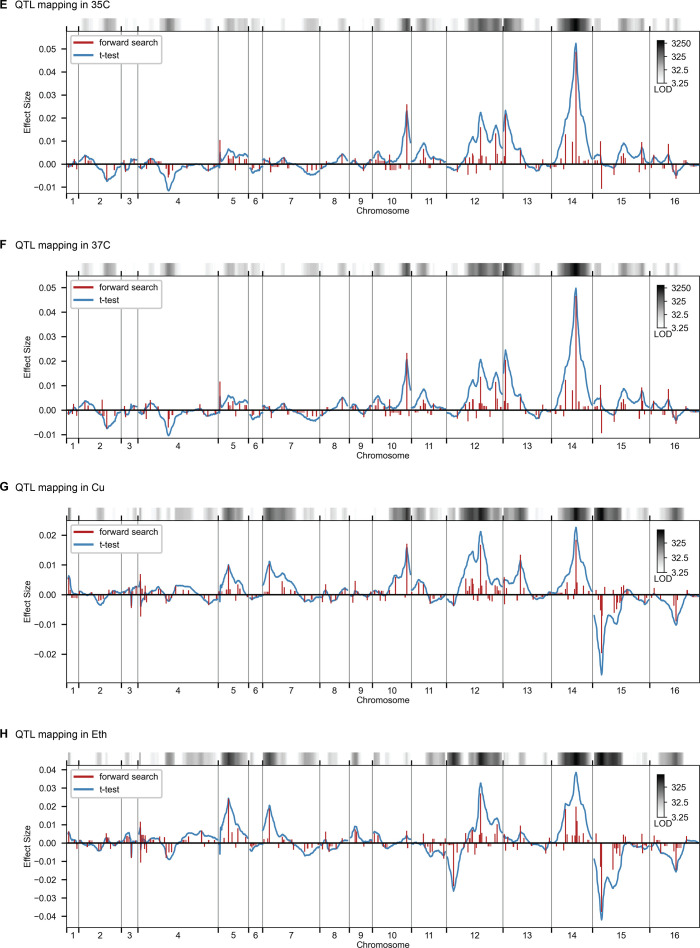
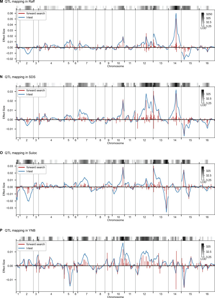
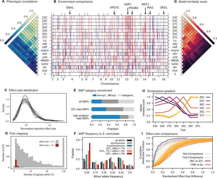
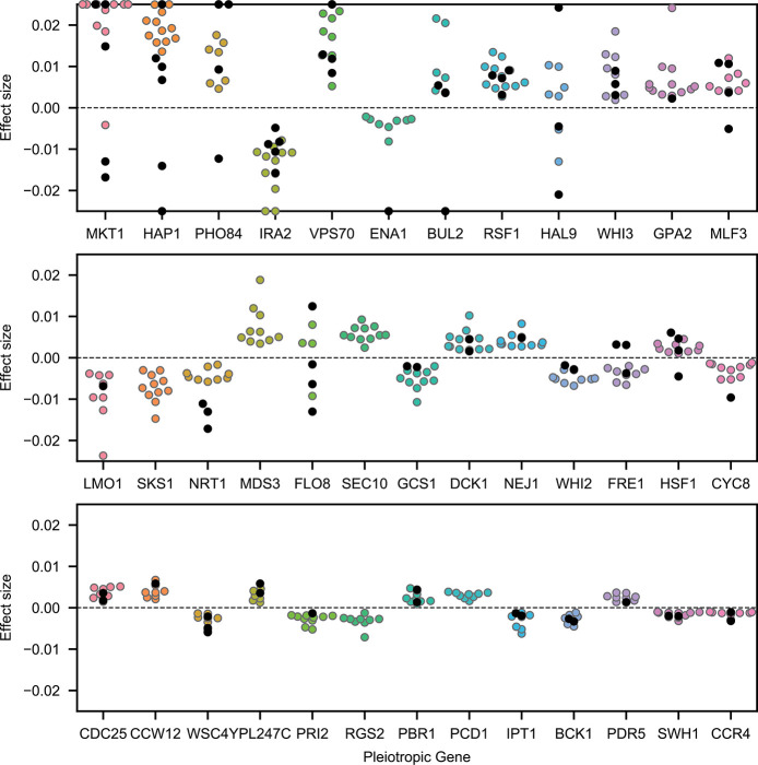
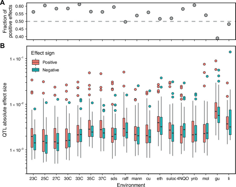
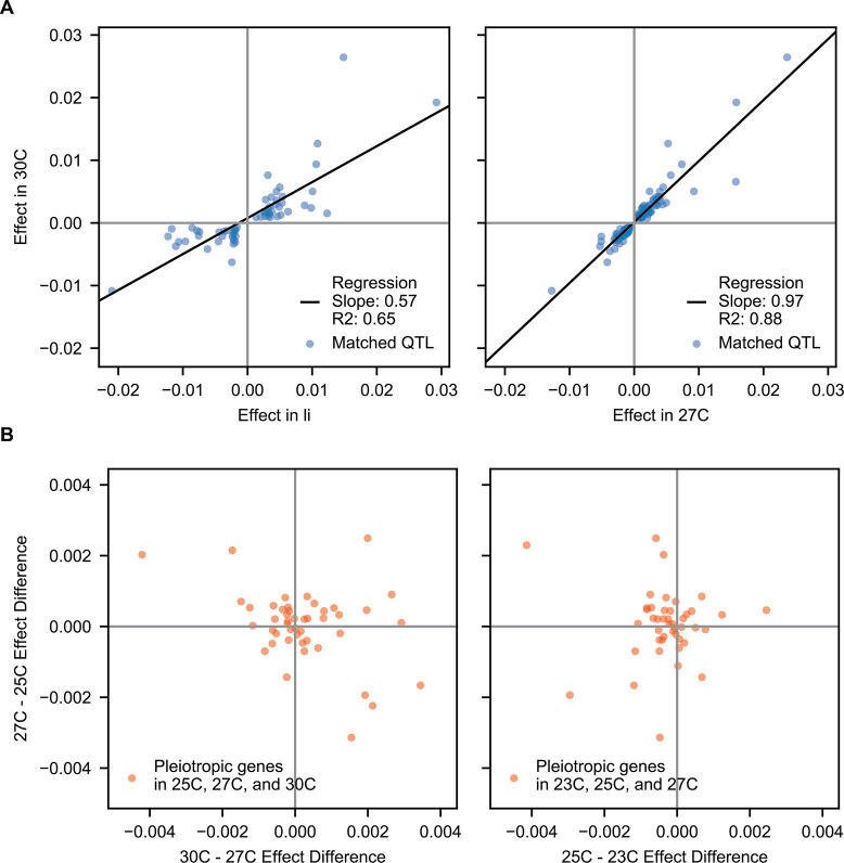
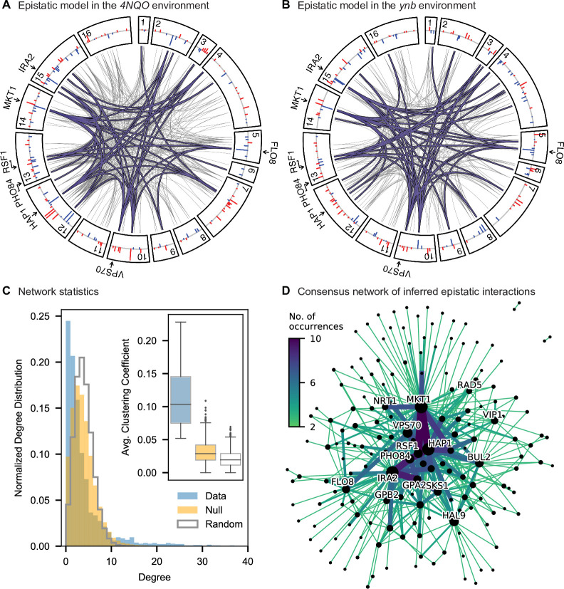
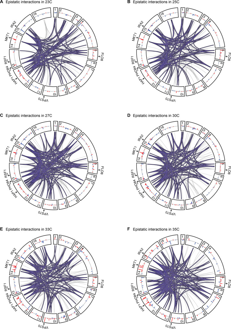
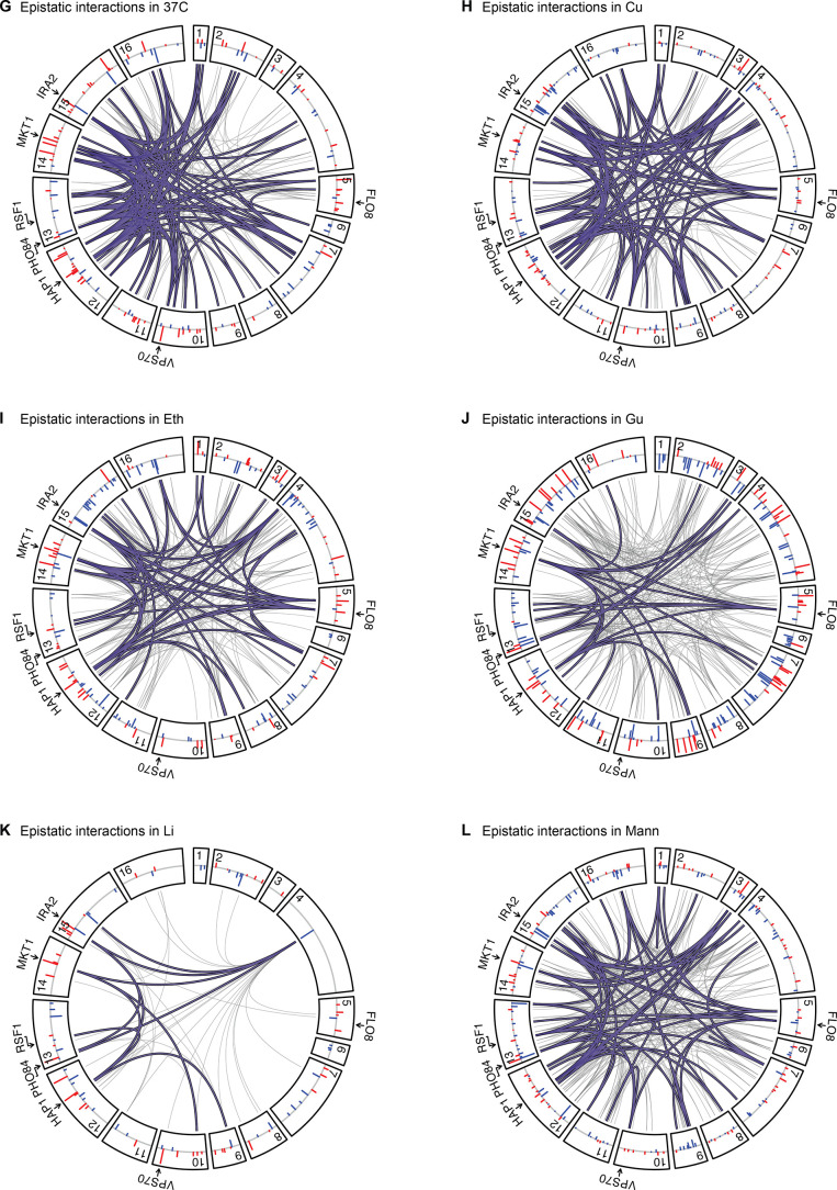
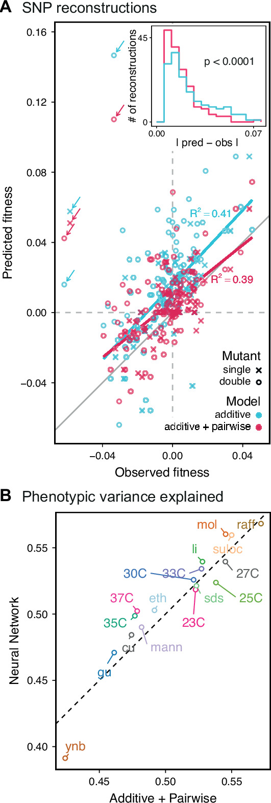
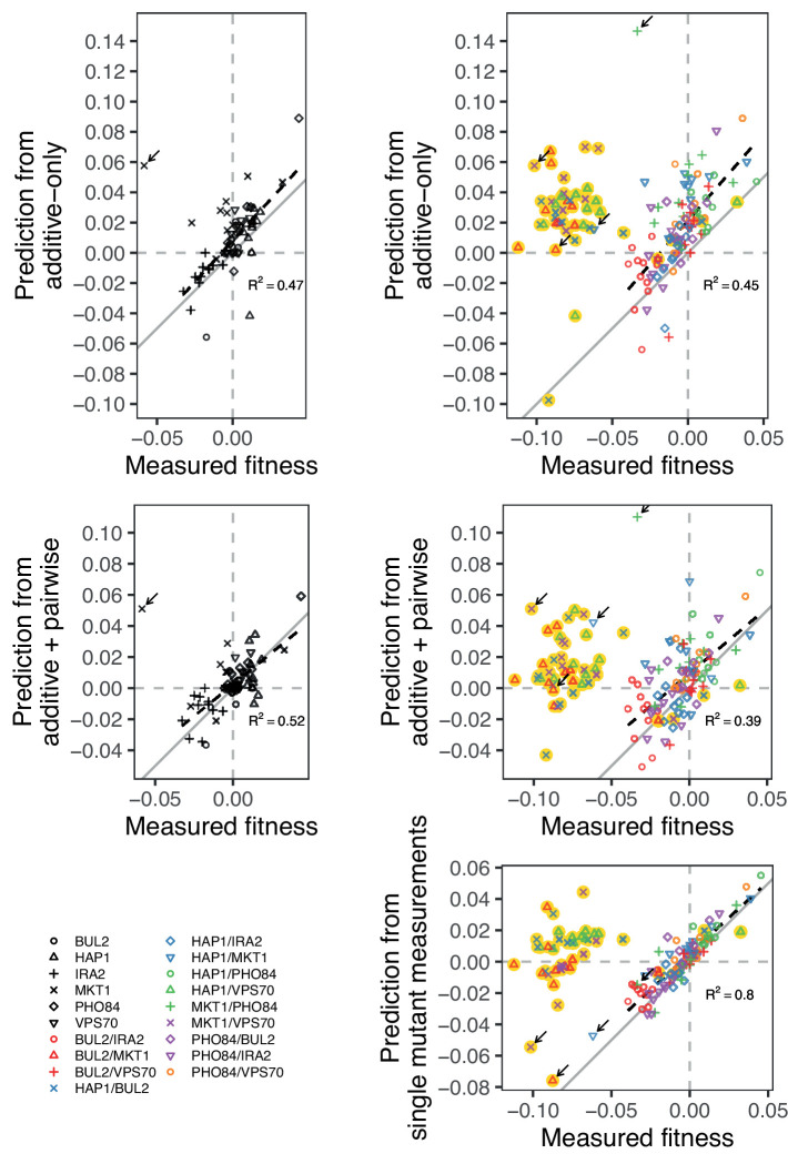
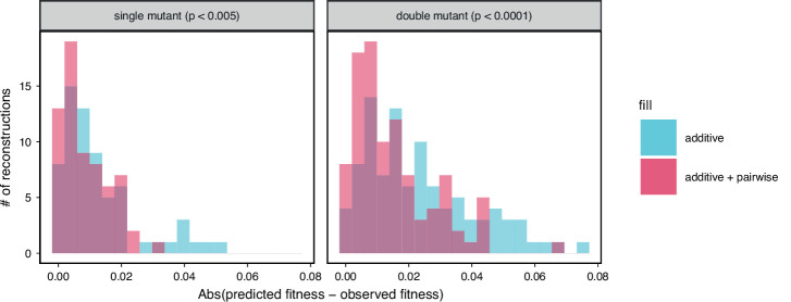
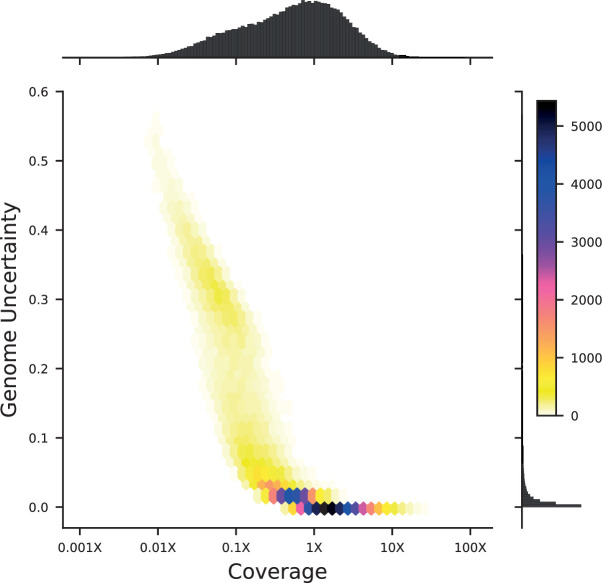
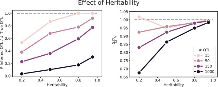
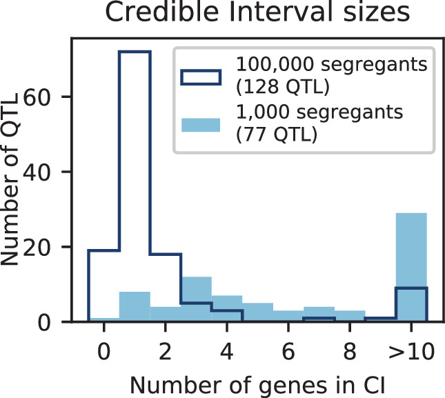
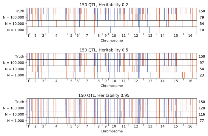
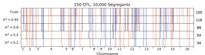
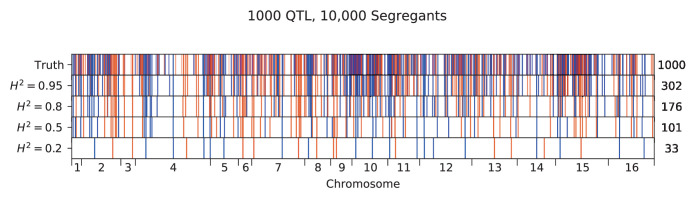
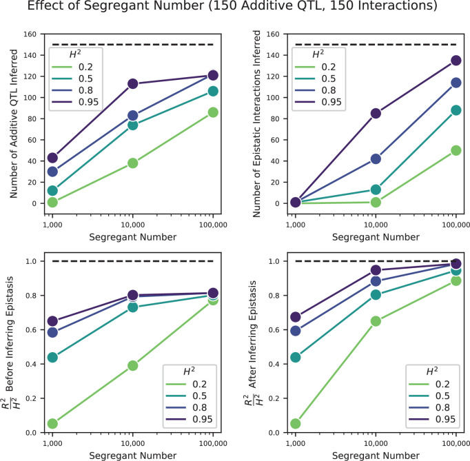
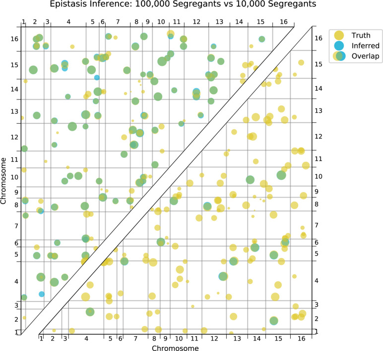
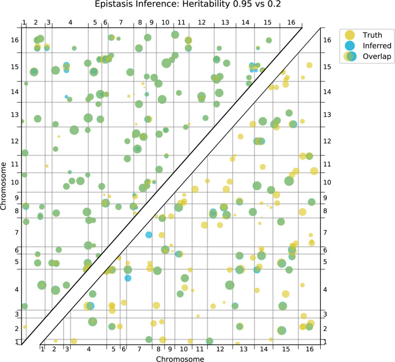
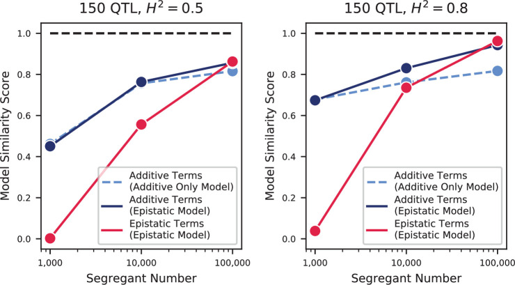
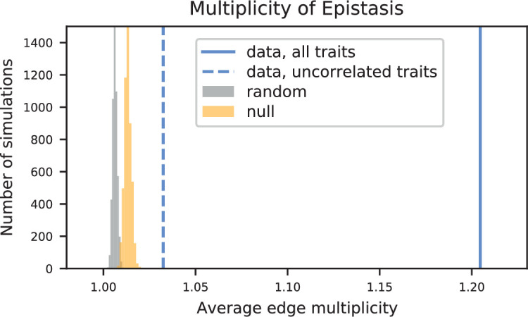
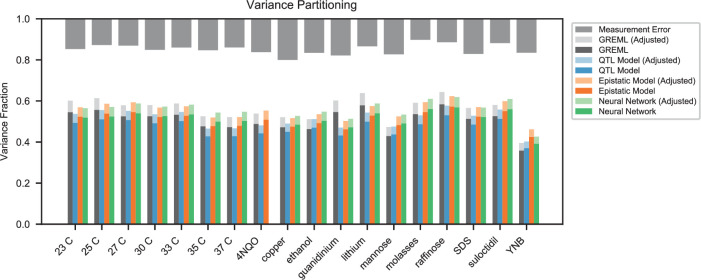
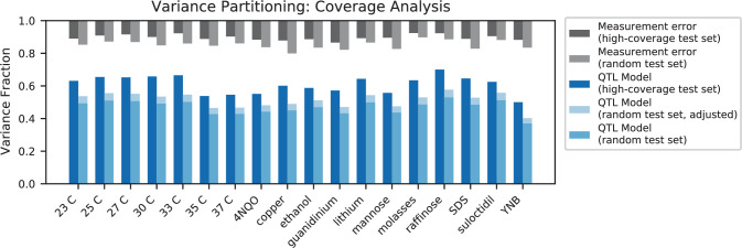
Mapping the genetic basis of complex traits is critical to uncovering the biological mechanisms that underlie disease and other phenotypes. Genome-wide association studies (GWAS) in humans and quantitative trait locus (QTL) mapping in model organisms can now explain much of the observed heritability in many traits, allowing us to predict phenotype from genotype. However, constraints on power due to statistical confounders in large GWAS and smaller sample sizes in QTL studies still limit our ability to resolve numerous small-effect variants, map them to causal genes, identify pleiotropic effects across multiple traits, and infer non-additive interactions between loci (epistasis). Here, we introduce barcoded bulk quantitative trait locus (BB-QTL) mapping, which allows us to construct, genotype, and phenotype 100,000 offspring of a budding yeast cross, two orders of magnitude larger than the previous state of the art. We use this panel to map the genetic basis of eighteen complex traits, finding that the genetic architecture of these traits involves hundreds of small-effect loci densely spaced throughout the genome, many with widespread pleiotropic effects across multiple traits. Epistasis plays a central role, with thousands of interactions that provide insight into genetic networks. By dramatically increasing sample size, BB-QTL mapping demonstrates the potential of natural variants in high-powered QTL studies to reveal the highly polygenic, pleiotropic, and epistatic architecture of complex traits.

Keywords: S. cerevisiae; epistasis; evolutionary biology; genetics; genomics; pleiotropy; polygenic traits; quantitative trait loci.


Conflict of interest statement

AN, KL, AR, SG, DT, FM, MD No competing interests declared

Figures

Figure 1.
Figure 1.. Cross design, genotyping, phenotyping, and barcode association.
(A) Construction, genotyping, and phenotyping of segregant panel. Founding strains BY (blue) and RM (red) are transformed with diverse barcode libraries (colored rectangles) and mated in bulk. Cre recombination combines barcodes onto the same chromosome. After meiosis, sporulation, and selection for barcode retention, we sort single haploid cells into 96-well plates. Top: whole- genome sequencing of segregants via multiplexed tagmentation. Middle: barcode-well association by combinatorial pooling. Bottom: bulk phenotyping by pooled competition assays and barcode frequency tracking. See Figure 1—figure supplements 1–3, and Materials and methods for details. (B) Histogram and cumulative distribution function (CDF) of genotyping coverage of our panel (Figure 1—source data 1). (C) Inferred probabilistic genotypes for two representative individuals from low coverage (solid) and high coverage (dashed) sequencing, with the genotyping error (difference between low and high coverage probabilistic genotypes) indicated by shaded blue regions (Figure 1—source data 2). (D) Distribution of genotyping error by SNP for the two individuals shown in (C). (E) Reproducibility of phenotype measurements in 30 C environment (see Figure 1—figure supplement 4 for other environments). Here, fitness values are inferred on data from each individual replicate assay. For all other analyses, we use fitness values jointly inferred across both replicates (see Appendix 2, Figure 1—source data 3).
Figure 1—figure supplement 1.
Figure 1—figure supplement 1.. Barcoding plasmids.
The first type (A) has configuration pAN3H5a-1/2URA3-KanP1-ccdB-LoxPR, while the second type (B) has configuration pAN3H5a-LoxPL-HygP1-ccdB-2/2URA3. The ccdB gene is later replaced by diverse barcode libraries, as described in the Materials and methods and shown in Figure 1—figure supplement 2.
Figure 1—figure supplement 2.
Figure 1—figure supplement 2.. Detailed schematic of procedure to generate 100,000 F1 segregants.
(a) Generating the barcode plasmid library: (1) Oligonucleotides containing random nucleotides are flanked by BsaI restriction endonuclease sites, converted to dsDNA, and cloned into a recipient plasmid using a Golden Gate reaction. The recipient plasmid contains a ccdB gene, which is toxic to sensitive E. coli strains. (2) Plasmid libraries are transformed into E. coli by electroporation and (3) the cells are recovered in a thin layer of media containing soft agar. (b) Generating sorted F1 segregants: (1) Barcode libraries are transformed into parental strains. (2) Barcoded parental strains are mated and their barcodes recombined by Cre-Lox recombination. (3) Diploid cells are sporulated, and (4) MATa haploid spores are germinated and (5) sorted into single wells.
Figure 1—figure supplement 3.
Figure 1—figure supplement 3.. Allele frequencies of the RM parental allele for the genotyped pool of 99,950 segregants.
The dashed line indicates 50% frequency. Marker loci used in the cross are indicated with arrows: the mating locus MAT on chromosome III and CAN1::pSTE2-SpHIS5 on chromosome V are selected for the BY allele, and the barcode locus HO on chromosome IV is selected for the Cre-induced recombination of two barcodes (the first from the RM parent and the second from the BY parent).
Figure 1—figure supplement 4.
Figure 1—figure supplement 4.. Phenotype measurement reproducibility, as in Figure 1D, for all other environments.
Figure 2.
Figure 2.. High-resolution QTL mapping.
QTL mapping for (A) YPD at 30 °C and (B) SD with 4-nitroquinoline (4NQO). Inferred QTL are shown as red bars; bar height shows effect size and red shaded regions represent credible intervals. For contrast, effect sizes inferred by a Student’s t-test at each locus are shown in blue. Gray bars at top indicate loci with log-odds (LOD) scores surpassing genome-wide significance in this t-test, with shading level corresponding to log-LOD score. See Figure 2—figure supplements 1–4 for other environments. See Supplementary file 2 for all inferred additive QTL models.
Figure 2—figure supplement 1.
Figure 2—figure supplement 1.. QTL mapping, as in Figure 2, for 23 C, 25 C, 27 C, and 33 C.
Figure 2—figure supplement 2.
Figure 2—figure supplement 2.. QTL mapping, as in Figure 2, for 35 C, 37 C, Cu, and Eth.
Figure 2—figure supplement 3.
Figure 2—figure supplement 3.. QTL mapping, as in Figure 2, for Gu, Li, Mann, and Mol.
Figure 2—figure supplement 4.
Figure 2—figure supplement 4.. QTL mapping, as in Figure 2, for Raff, SDS, Suloc, YNB.
Figure 3.
Figure 3.. Genetic architecture and pleiotropy.
(A) Pairwise Pearson correlations between phenotype measurements, ordered by hierarchical clustering (Figure 3—source data 1). (B) Inferred genetic architecture for each trait. Each inferred QTL is denoted by a red or blue line for a positive or negative effect of the RM allele, respectively; color intensity denotes effect size on a log scale. Notable genes are indicated above. See Figure 3—figure supplement 1 for effect size comparison of the most pleiotropic genes. (C) Smoothed distribution of absolute effect sizes for each trait, normalized by the median effect for each trait. See Figure 3—figure supplement 2 for a breakdown of the distributions by QTL effect sign. (D) Distribution of the number of genes within the 95% credible interval for each QTL (Figure 3—source data 2). (E) Distribution of SNP types. “High posterior” lead SNPs are those with >50% posterior probability. (F) Fractions of synonymous SNPs, nonsynonymous SNPs, and QTL lead SNPs as a function of their frequency in the 1011 Yeast Genomes panel (Figure 3—source data 3). (G) Pairwise model similarity scores (which quantify differences in QTL positions and effect sizes between traits; see Appendix 3) across traits. (H) Pairwise model similarity scores for each temperature trait against all other temperature traits (Figure 3—source data 4). See Figure 3—figure supplement 3 for effect size comparisons between related environments. (I) Cumulative distribution functions (CDFs) of differences in effect size for each locus between each pair of traits (orange). Grey traces represent null expectations (differences between cross-validation sets for the same trait). The least and most similar trait pairs are highlighted in red and purple, respectively, and indicated in the legend.
Figure 3—figure supplement 1.
Figure 3—figure supplement 1.. Highly pleiotropic genes.
For QTL that are observed in nine or more environments, we plot effect sizes for uncorrelated traits (4NQO, YNB, suloc, gu, li, mol; black dots) and for correlated traits (all others; colored dots). Effect sizes with magnitudes larger than 2.5% are shown on the boundaries.
Figure 3—figure supplement 2.
Figure 3—figure supplement 2.. Comparison of positive and negative QTL effect signs.
(A) Fraction of inferred QTL with a positive effect sign. (B) Effect size magnitude of both positive and negative inferred QTL.
Figure 3—figure supplement 3.
Figure 3—figure supplement 3.. Correlations of pleiotropic effects across example traits.
(A) Scatterplots of QTL effects for QTL matched by pairwise model comparison. Left, 30 C vs Li; right, 30 C vs 27 C. Regression slopes and R2 values are indicated. (B) Scatterplots of effect size changes for pleiotropic genes detected along a temperature gradient. Left, 30C–27C vs 27C–25C changes; right, 27C–25C vs 25C–23C changes.
Figure 4.
Figure 4.. Pairwise epistasis.
(A, B) Inferred pairwise epistatic interactions between QTL (with additive effects as shown in outer ring) for (A) the 4NQO environment and (B) the ynb environment. Interactions that are also observed for at least one other trait are highlighted in purple. See Figure 4—figure supplements 1–3 for other environments, Figure 4—figure supplement 4 for a simpler pairwise regression method, and Figure 4—figure supplement 5 for a breakdown of epistatic effects and comparison to additive effects. (C) Network statistics across environments (Figure 4—source data 1). The pooled degree distribution for the eighteen phenotype networks is compared with 50 network realizations generated by an Erdos-Renyi random model (white) or an effect-size-correlation-preserving null model (orange; see Appendix 3). Inset: average clustering coefficient for the eighteen phenotypes, compared to 50 realizations of the null and random models. (D) Consensus network of inferred epistatic interactions. Nodes represent genes (with size scaled by degree) and edges represent interactions that were detected in more than one environment (with color and weight scaled by the number of occurrences). Notable genes are labeled. See Figure 4—figure supplement 6 for the same consensus network restricted to either highly-correlated or uncorrelated traits.
Figure 4—figure supplement 1.
Figure 4—figure supplement 1.. Epistatic interactions, as in Figure 4A and B, for 23 C, 25 C, 27 C, 30 C, 33 C, and 35 C.
Figure 4—figure supplement 2.
Figure 4—figure supplement 2.. Epistatic interactions, as in Figure 4A and B, for 37 C, Cu, Eth, Gu, Li, and Mann.
Figure 4—figure supplement 3.
Figure 4—figure supplement 3.. Epistatic interactions, as in Figure 4A and B, for Mol, Raff, SDS, Suloc, and YNB.
Figure 4—figure supplement 4.
Figure 4—figure supplement 4.. Parwise regression in 4NQO.
(A, B) Interaction coefficient and assoociated LOD for all pairs of QTL for which we previously infer an additive effect, estimated by linear regression of the measured 4NQO fitness on the genotype posterior probabilities at two sites at a time. (C) Epistatic interaction coefficients selected by the forward search procedure described in the text. (D) Comparison of forward search interaction coefficients and their respective pairwise regression estimates. In (A–C) QTL are organized in genomic order, with vertical and horizontal lines indicating chromosome limits. Among highlighted genes, MAT and HO are marker loci used in our cross. CAN1 is linked to the the highlighted FLO8 QTL. See Figure 1—figure supplement 3 for more info.
Figure 4—figure supplement 5.
Figure 4—figure supplement 5.. Comparison between additive and epistatic effects.
(A) Sum of additive and epistatic effects versus sum of additive effects only for all pairs of interacting QTL selected across all our epistatic models. Notable examples are highlighted and labeled with corresponding pair of genes and environment. Diagonal dashed line is the identity. Inset is zoomed in the indicated region. Breakdown of epistatic interactions between (B) synergistic or compensatory, and (C) positive or negative, classified in relation to panel A as indicated in the diagrams. Error bars are 95% confidence intervals of the binomial proportion estimate.
Figure 4—figure supplement 6.
Figure 4—figure supplement 6.. Consensus epistatic networks, as in Figure 4D.
(A) Consensus network for correlated traits (23 C, 25 C, 27 C, 30 C, 33 C, 35 C, 37 C, cu, eth, mann, raff, sds). (B) Consensus network for uncorrelated traits (4NQO, li, gu, mol, suloc, ynb).
Figure 5.
Figure 5.. Evaluating model performance.
(A) Comparison between the measured fitness of reconstructions of 6 single (crosses) and nine double mutants (circles) in 11 environments, and their fitness in those environments as predicted by our inferred additive-only (cyan) or additive-plus-pairwise-epistasis models (magenta). The one-to-one line is shown in gray. R2 values correspond to to shown fitted linear regressions for each type of model (colored lines), excluding MKT1 mutants measured in gu environment (outliers indicated by arrows). Inset shows the histogram of the absolute difference between observed and predicted reconstruction fitness under our two models, with the p-value from the permutation test of the difference between these distributions indicated. See Figure 5—figure supplements 1 and 2 for a full breakdown of the data, and Figure 5—source data 1 for measured and predicted fitness values. (B) Comparison between estimated phenotypic variance explained by the additive-plus-pairwise-epistasis model and a trained dense neural network of optimized architecture.
Figure 5—figure supplement 1.
Figure 5—figure supplement 1.. Comparison between measured and predicted fitness of reconstructions, as in Figure 5, broken down by mutation (single or double) and model type (additive-only or additive-plus-pairwise).
We also compare the measured fitness of double mutants, with the sum of the measured fitness of the respective single mutants. Highlighted in yellow are outlier strains removed from analyses and Figure 5, as explained in the Materials and Methods: BUL2-MKT1, HAP1-BUL2, HAP1-VPS70, and MKT1-VPS70. Arrow indicates the strains containing the MKT1 mutation in Gu, which were also removed from analyses. In gray is the 1:1 line. Dashed lines show a linear regression (excluding outliers), with their R2-values indicated.
Figure 5—figure supplement 2.
Figure 5—figure supplement 2.. Comparison between observed and predicted reconstruction strain fitness, as in the inset of Figure 5A.
The histogram of the absolute difference between predicted and observed values is shown for both single and double mutation reconstructions with their respective permutation test p-values indicated above each.
Appendix 1—figure 1.
Appendix 1—figure 1.. Density plot of genome uncertainty as a function of coverage (on a log-10 scale) for all 99,950 segregants.
Marginal distributions show the coverage (above) and uncertainty (left) histograms for all segregants.
Appendix 1—figure 2.
Appendix 1—figure 2.. Genome inference calibration.
For a segregant initially sequenced to 0.15 X coverage, loci were binned into 10 equal bins according to their genotype posterior probability. For each bin, we plot the average posterior probability for each bin against the fraction of those loci that were found to be RM in high-coverage sequencing data (i.e. showed a posterior probability of ≥0.99). The dashed grey line represents the expectation for perfectly calibrated posterior probabilities. Error bars are given by σ=p^(1-p^)n where p^ is the fraction of RM loci and n is the total number of loci in the bin.
Appendix 1—figure 3.
Appendix 1—figure 3.. Impact of low vs high coverage on both inference and performance of QTL models.
Left: numbers of QTL inferred for a selection of 6 traits, using either the highest-coverage decile (dark blue, coverage fraction >0.79, coverage >3X) or lowest-coverage decile (light blue, coverage fraction <0.03, coverage <0.05X) as the training set. Center: performance of the QTL models inferred with high-coverage (dark blue) or low-coverage (light blue) training sets on a high-coverage test set. Right: performance of the QTL models inferred with high-coverage (dark blue) or low-coverage (light blue) training sets on a low-coverage test set.
Appendix 1—figure 4.
Appendix 1—figure 4.. Credible interval sizes in basepairs (left) or number of contained genes (right), for models inferred from high-coverage training data (dark blue) or low-coverage training data (light blue).
Distributions represent QTL from all six traits.
Appendix 2—figure 1.
Appendix 2—figure 1.. Bulk Fitness Assay simulations.
Simulated phenotypes are drawn from the distributions shown in the left plot inset, for normal, bimodal, and intermediate distributions. Left: accuracy of fitness inference (R2 of inferred fitnesses on true fitnesses) as a function of sequencing coverage, for the three distributions. Right: Inference of the strong QTL effect as a fraction of the true effect for the bimodal and intermediate distributions, as a function of sequencing coverage.
Appendix 3—figure 1.
Appendix 3—figure 1.. Distributions of credible interval (CI) sizes for inferred QTL across all traits.
Left: physical size in kilobases, with 2 kb bins. Center: number of genes that overlap each CI, with 2-gene bins. Right: density plot of number of genes that overlap each CI versus absolute effect size (on a log-10 scale). The count in each bin is indicated by the colorbar.
Appendix 3—figure 2.
Appendix 3—figure 2.. Performance of LASSO inference on simulated QTL architectures with 15, 50, or 150 true QTL at varying heritabilities.
Left: number of inferred QTL. Center: number of inferred QTL divided by number of true QTL. The dotted line indicates a value of 1 (the correct number of QTL). Right: Proportion of variance explained (R2) of the model, estimated from cross-validation, as a fraction of the simulated broad-sense heritability. H2 The dotted line indicates a value of 1 (all broad-sense heritability is explained by the model).
Appendix 3—figure 3.
Appendix 3—figure 3.. QTL inferred by LASSO plotted along the genome, for different heritabilities.
Models were inferred with a sample of 10,000 segregants, for simulated architectures with (top) 15 or (bottom) 150 true QTL. QTL are colored red (blue) if their effect is positive (negative) and opacity is given by effect size (on a log scale). The number of QTL in the true or inferred models is given to the right.
Appendix 3—figure 4.
Appendix 3—figure 4.. Effect of sample size on QTL inference.
Left: Number of inferred QTL. Dashed line represents the number of QTL in the true model (150). Center: Model performance (R2 on a test set of individuals) as a fraction of heritability H2. Dashed line represents R2/H2=1, meaning all of the genetic variance is explained by the model. Right: Model similarity score (see Section A3-2.3) between the true and inferred models. Dashed line represents perfect recovery of the true model.
Appendix 3—figure 5.
Appendix 3—figure 5.. Effect of heritability on QTL inference (for 10,000 segregants).
Left: Number of inferred QTL, as a fraction of the number of true QTL. Right: Model performance (R2 on a test set of individuals) as a fraction of heritability H2. Dashed line represents R2/H2=1, meaning all of the genetic variance is explained by the model.
Appendix 3—figure 6.
Appendix 3—figure 6.. Number of genes contained in 95% credible intervals inferred on simulated data (at 150 QTL), for 1000 segregants (light blue shaded) and 100,000 segregants (dark blue outline).
Total numbers of inferred QTL are given in the legend.
Appendix 3—figure 7.
Appendix 3—figure 7.. Inferred QTL plotted along the genome, for different sample sizes.
The true model (same for all subfigures) has 150 QTL and heritability given in the subfigure title. QTL are colored red (blue) if their effect is positive (negative) and opacity is given by effect size (on a log scale). Number of inferred QTL for each model is shown on the right.
Appendix 3—figure 8.
Appendix 3—figure 8.. Inferred QTL plotted along the genome, for different heritabilities.
The true model has 150 QTL, and all inference is performed on a sample size of 10,000 segregants. QTL are colored red (blue) if their effect is positive (negative) and opacity is given by effect size (on a log scale). Number of inferred QTL for each model is shown on the right.
Appendix 3—figure 9.
Appendix 3—figure 9.. Inferred QTL plotted along the genome, for different heritabilities.
The true model has 1000 QTL, and all inference is performed on a sample size of 10,000 segregants. QTL are colored red (blue) if their effect is positive (negative) and opacity is given by effect size (on a log scale). Number of inferred QTL for each model is shown on the right.
Appendix 3—figure 10.
Appendix 3—figure 10.. Effect of segregant number on QTL inference with epistasis.
Top left: Number of inferred additive QTL. Dashed line represents the number of QTL in the true model (150). Top right: Number of inferred epistatic interactions. Dashed line represents the number of epistatic interactions in the true model (150). Bottom left: Model performance (R2 on a test set of individuals) as a fraction of heritability H2, where performance is evaluated on the optimized model with only additive terms (before epistatic interactions are inferred). Dashed line represents R2/H2=1, meaning all of the genetic variance is explained by the model. Bottom right: Model performance (R2 on a test set of individuals) as a fraction of heritability,H2 where performance is evaluated on the fully optimized model with additive and epistatic terms. Dashed line represents R2/H2=1, meaning all of the genetic variance is explained by the model.
Appendix 3—figure 11.
Appendix 3—figure 11.. Comparison of true and inferred epistatic effects for different segregant numbers.
Upper diagonal: True model versus inferred model with 100,000 segregants and heritability H2=0.5; lower diagonal: true model versus inferred model with 10,000 segregants and heritability H2=0.5. In both plots, epistatic interactions are represented by dots with position given by the genome location of the two SNPs involved and size scaled by the magnitude of effect size of the interaction (on a log scale). Epistatic interactions in the true model are colored yellow and those in the inferred model are colored blue. Dots appear green where the true and inferred interactions overlap; thus yellow dots alone represent false negatives and blue dots alone represent false positives.
Appendix 3—figure 12.
Appendix 3—figure 12.. Comparison of true and inferred epistatic effects for different heritabilities.
Upper diagonal: True model versus inferred model with 100,000 segregants and heritability H2=0.95; lower diagonal: true model versus inferred model with 100,000 segregants and heritability.H2=0.2 Scaling and coloring as in Appendix 3—figure 11.
Appendix 3—figure 13.
Appendix 3—figure 13.. Model similarities for simulated epistatic architectures, as a function of segregant number.
In each panel, we show the model similarity scores between the true model and the additive-only model (dashed light blue), the additive terms in the additive-plus-epistatic model (dark blue), and the epistatic terms in the additive-plus-epistatic model (red). Left: heritability of 0.5; Right: heritability of 0.8. The true model (same in all cases) has 150 additive QTL and 150 epistatic interactions.
Appendix 3—figure 14.
Appendix 3—figure 14.. Empirical null distributions for average edge multiplicity (the expected number of traits in which an edge will be observed, given that it was observed in at least one trait).
Histograms, data from 5000 simulations of random (grey) and null (orange) networks. Values from data are shown as vertical lines (all 18 traits, solid line; group of 7 uncorrelated traits, dashed line).
Appendix 4—figure 1.
Appendix 4—figure 1.. Variance partitioning for all traits.
Phenotyping measurement error is shown at top (grey). We show the variance explained by a random-effects model (black), our inferred additive QTL model (blue), our inferred additive-plus-pairwise-epistasis QTL model (orange), and a trained deep neural network (green). Light shades indicate correction for genotyping uncertainty.
Appendix 4—figure 2.
Appendix 4—figure 2.. Variance partitioning for high-coverage individuals.
Measurement error for high-coverage individuals (black) and random individuals (grey) is shown at the top. For each trait, we show the variance explained by our additive QTL model on a high-coverage test set (left) or a random test set (right; correction for genotype uncertainty shown in light blue).

References

    1. Abadi M, Agarwal A, Barham P, Brevdo E, Chen Z, Citro C, Corrado GS, Davis A, Dean J, Devin M, Ghemawat S, Goodfellow I, Harp A, Irving G, Isard M, Jia Y, Jozefowicz R, Kaiser L, Kudlur M, Levenberg J. TensorFlow: Large-Scale Machine Learning on Heterogeneous Systems. 2015. [September 20, 2021]. https://www.tensorflow.org
    1. Adey A, Morrison HG, Asan XX, Kitzman JO, Turner EH, Stackhouse B, MacKenzie AP, Caruccio NC, Zhang X, Shendure J. Rapid, low-input, low-bias construction of shotgun fragment libraries by high-density in vitro transposition. Genome Biology. 2010;11:R119. doi: 10.1186/gb-2010-11-12-r119. - DOI - PMC - PubMed
    1. Albert H, Dale EC, Lee E, Ow DW. Site-specific integration of DNA into wild-type and mutant lox sites placed in the plant genome. The Plant Journal. 1995;7:649–659. doi: 10.1046/j.1365-313X.1995.7040649.x. - DOI - PubMed
    1. Allen DM. The Relationship Between Variable Selection and Data Agumentation and a Method for Prediction. Technometrics. 1974;16:125–127. doi: 10.1080/00401706.1974.10489157. - DOI
    1. Arends D, Prins P, Jansen RC, Broman KW. R/QTL: high-throughput multiple QTL mapping: Fig. 1. Bioinformatics. 2010;26:2990–2992. doi: 10.1093/bioinformatics/btq565. - DOI - PMC - PubMed

Publication types