doi: 10.1016/j.jedc.2022.104328.
Epub 2022 Feb 5.
Covid-19 in unequal societies
Affiliations
- PMID: 35153347
- PMCID: PMC8816851
- DOI: 10.1016/j.jedc.2022.104328
Item in Clipboard
Covid-19 in unequal societies
J Econ Dyn Control.
2022 Jul.
Abstract
We document the heterogeneous effect of Covid-19 on health and economic outcomes across socioeconomic strata in Bogotá. We assess its distributional impact and evaluate policy counterfactuals in a heterogeneous agent quantitative dynamic general equilibrium model intertwined with a behavioral epidemiological model.
© 2022 Published by Elsevier B.V.
Figures

Epidemiological Dynamics: CoVida and Official Estimates. Notes: Shaded areas are 95% confidence intervals. Estimates based on the restricted CoVida sample (excludes symptomatic and close contacts of infected). Confidence intervals are computed with standard errors of seemingly unrelated regressions following the methodology in Laajaj et al. (2021a). Source: Laajaj et al. (2021a) and Instituto Nacional de Salud (2020).

Epidemiological disparities across socioeconomic strata. Note: The benchmark prevalence ratio at each is the ratio of the prevalence up to in the low SES to the one in the high SES. Analogously, the benchmark odds ratio at is computed with the cumulative number of infections up to . The dashed lines are the ratios computed comparing individuals in the lowest two SES with those in the benchmark high SES. Confidence intervals are very tight, so we omit them. Black/red dots represent point estimates of prevalence/odds ratios from serological studies reported in table 8 in section A.2 for the places and across the social groups in the text next to the dots. Lower numbers represent groups of less advantaged individuals. Sources: Covida (Laajaj et al., 2021a) and references in section A.2.
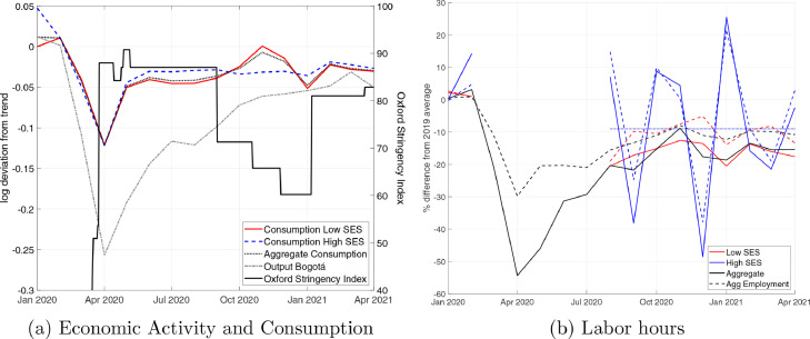
Impact of Covid-19 on Economic Activity and Disparities. Notes: Economic data in panel (a) are log deviations from the pre-pandemic (2017-19) linear trend. Labor hours are the percentage difference from the 2019 average of seasonally adjusted data. Nominal consumption expenditure was deflated by the Consumer Price Index. Consumption and labor hours are seasonally adjusted with the US Census X13 method. Sources: Output in Bogotá is real seasonally adjusted Indicador de Seguimiento Económico from DANE. Consumption is from RADDAR. Consumption includes household expenditures on previously produced goods (not counted in GDP). Oxford Stringency Index downloaded from Ritchie et al. (2020). Labor hours are computed with household survey data (Gran Encuesta Integrada de Hogares (GEIH) - DANE).

Functional Distribution of Income. Note: Nominal income figures are deflated with the implicit price deflator. Mixed income is assigned two-thirds to labor and one-third to capital. Trend is the 2018-19 linear trend. Source: DANE.w

Economic Activity and the Risk of Infection. Note: The graph shows that, as at any point the indifference curves between consumption and work are steeper for the holistic preferences than for the normal marginal rate of substitution, susceptible agents will restrict their economic activity, reducing and .

Aggregate Results (monthly). Note: Shaded bars identify the shutdown periods. Light shaded areas identify the interim period in which some restrictions were lifted. In the top left panel, red dots represent calibration targets.

Epidemiological Dynamics (monthly). Note: Shaded bars identify the shutdown periods. Light shaded areas identify the interim period in which some restrictions were lifted. In the first two figures, red dots represent data points. In the bottom right figure, the target is the average prevalence ratio in the data. In the bottom left panel, is the estimated non-behavioral basic reproductive number defined in equation (27), is the behavioral reproduction number defined in equation (30), and is the behavioral effective reproduction number. is the estimated reproduction number based on Laajaj et al. (2021a)’s estimates of Bogotá’s daily rate of growth of cases, and the dotted lines are 95% confidence intervals (see footnote for more details). The top two panels report prevalence and new cases in the non-behavioral single group SIRD model with as a reference.

Microeconomic choices (monthly). Note: Shaded bars identify the shutdown period. Light shaded areas identify the interim period in which some restrictions were lifted. In the case of labor, the solid lines represent the time average for the period in which data are available.

Capital income and investment (monthly). Note: The left panel depicts capital income net of adjustment costs (e.g., ). The right figure depicts investment (e.g., ). In both cases, values are expressed as a share of steady-state income of each group. The data line is the national gross fixed capital formation in constant prices and deseasonalized published with the NIPA by DANE. The data on investment are divided by the linear trend in GDP extrapolated from the Q102018-Q42019 linear trend.

The Private Value of a Vaccine. Note: At each period, we first compute the fraction of consumption that a recovered agent would be willing to forgo for not becoming susceptible. We then compute the USD value of steady-state consumption for each type of consumer considering an aggregate consumption value of 115 USD. The value of the vaccine is the perpetuity value of the product of the CE variation computed in the first step and the steady-state consumption computed in the second step.

Cost of social distancing. Note: Shaded bars identify the shutdown period. Light shaded areas identify the interim period in which some restrictions were lifted. The cost of social distancing for each group is computed as indicated in equation (31).

Counterfactuals: Aggregate Dynamics (monthly). Note: Shaded bars identify the shutdown period. Light shaded areas identify the interim period in which some restrictions were lifted.

Counterfactuals: Epidemiological Dynamics (monthly). Note: Shaded bars identify the shutdown period. Light shaded areas identify the interim period in which some restrictions were lifted.

Derivative of Probability of Infection (monthly). Note: Shaded bars identify the shutdown period. Light shaded areas identify the interim period in which some restrictions were lifted. The figure depicts the numerical values of the partial derivative of the probability of infection displayed in equation (3) with respect to the choice of labor by a susceptible individual—. The dashed lines take into account the direct effect of varying the labor supply, which affects the probability of infection at workplaces. The dotted lines consider the side effect of varying the labor supply, which is changing the amount of time allocated to leisure and affecting the probability of infection at consumption venues and through social interaction. These two effects have opposite signs. The solid lines capture the total effect and are simply the sum of the previous two.

Counterfactuals: Factor Prices (monthly). Note: Shaded bars identify the shutdown period. Light shaded areas identify the interim period in which some restrictions were lifted.

Counterfactuals: Microeconomic Behavior of Susceptible (monthly). Note: Shaded bars identify the shutdown period. Light shaded areas identify the interim period in which some restrictions were lifted.

Counterfactuals: Capital income and investment (monthly). Note: Shaded bars identify the shutdown period. Light shaded areas identify the interim period in which some restrictions were lifted.
References
-
- Alvarez F., Argente D., Lippi F. A simple planning problem for COVID-19 lock-down, testing, and tracing. Am. Econ. Rev.: Insights. 2021;3(3)
-
367–82.
-
- Atkeson A. On using SIR models to model disease scenarios for COVID-19. Q. Rev. 2020;41(01):1–35. doi: 10.21034/qr.4111. - DOI
-
- Atkeson A., Kopecky K., Zha T. NBER Working Papers. National Bureau of Economic Research, Inc; 2020. Four stylized facts about COVID-19.
-
- Bartik A.W., Bertrand M., Cullen Z.B., Glaeser E.L., Luca M., Stanton C.T. Working Paper. National Bureau of Economic Research; 2020. How are small businesses adjusting to COVID-19? Early evidence from a survey. - DOI
-
- Bartik A.W., Cullen Z.B., Glaeser E.L., Luca M., Stanton C.T. Working Paper. National Bureau of Economic Research; 2020. What jobs are being done at home during the Covid-19 crisis? Evidence from firm-level surveys. - DOI
LinkOut - more resources
Full Text Sources