. 2022 Feb 24;13(1):1038.
doi: 10.1038/s41467-022-28678-x.

Circulating microbial content in myeloid malignancy patients is associated with disease subtypes and patient outcomes

Affiliations

Circulating microbial content in myeloid malignancy patients is associated with disease subtypes and patient outcomes

Jakob Woerner et al. Nat Commun. .

Abstract

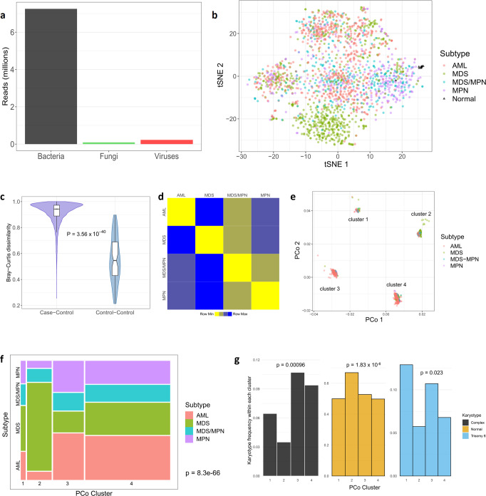
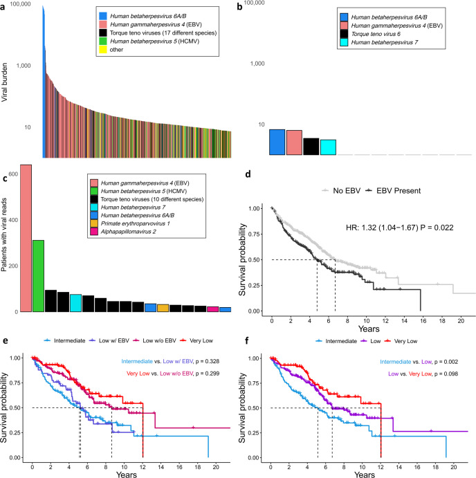
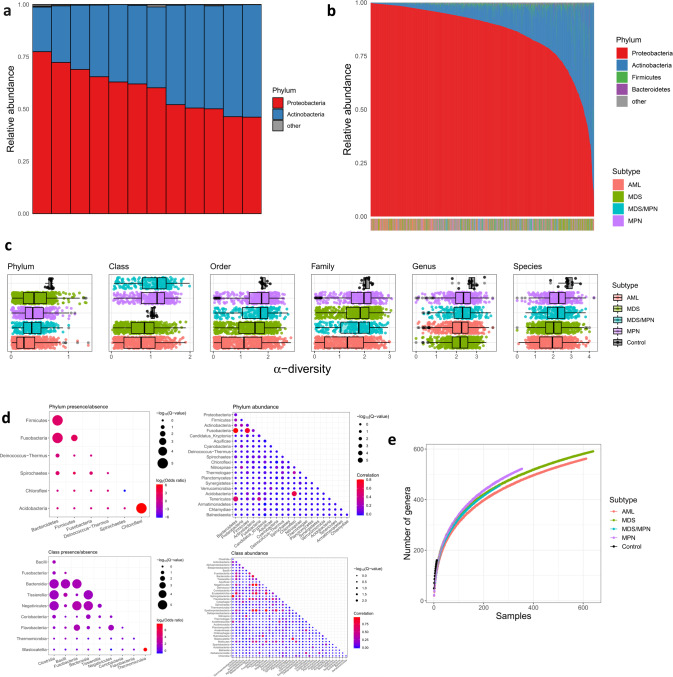
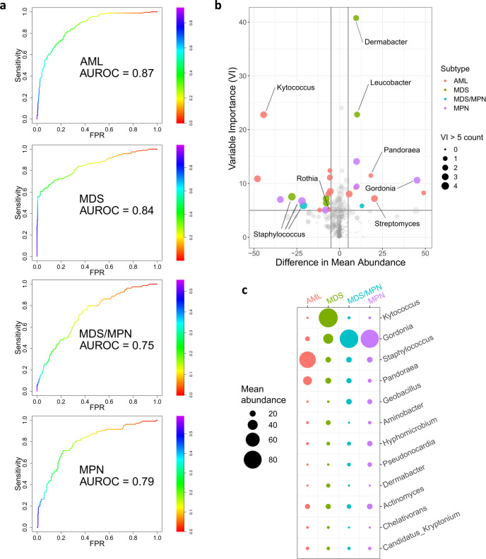
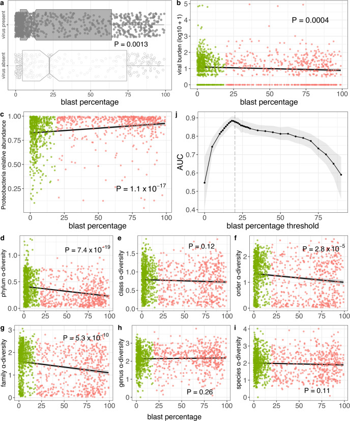
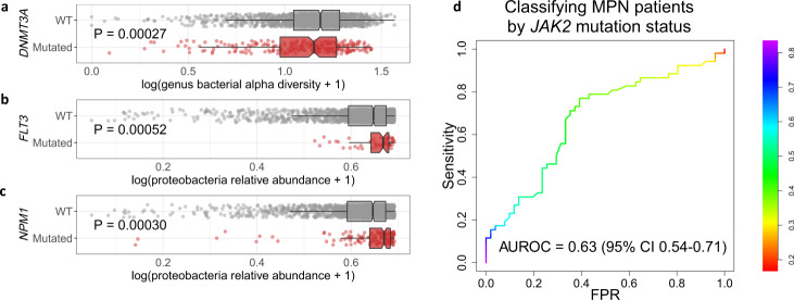
Although recent work has described the microbiome in solid tumors, microbial content in hematological malignancies is not well-characterized. Here we analyze existing deep DNA sequence data from the blood and bone marrow of 1870 patients with myeloid malignancies, along with healthy controls, for bacterial, fungal, and viral content. After strict quality filtering, we find evidence for dysbiosis in disease cases, and distinct microbial signatures among disease subtypes. We also find that microbial content is associated with host gene mutations and with myeloblast cell percentages. In patients with low-risk myelodysplastic syndrome, we provide evidence that Epstein-Barr virus status refines risk stratification into more precise categories than the current standard. Motivated by these observations, we construct machine-learning classifiers that can discriminate among disease subtypes based solely on bacterial content. Our study highlights the association between the circulating microbiome and patient outcome, and its relationship with disease subtype.


Conflict of interest statement

The authors declare no competing interests.

Figures

Fig. 1
Fig. 1. Landscape of microbial content in circulation.
a Barplot showing total numbers of reads for each of the three kingdoms. b t-SNE plot colored by case/control status (controls shown as black triangles) and disease subtype. c Bray–Curtis dissimilarity measures, on the genus level, based for all case-control pairs (left, n = 22,440 comparisons) and all pairs of control samples (right, n = 66 comparisons). In boxplots, bounds of box indicate first and third quartiles, center line indicates median, and whiskers extend to (first quartile −1.5 × IQR) and (third quartile +1.5 × IQR) or extrema, whichever is less extreme (here IQR = interquartile range, i.e. third quartile−first quartile). P-value computed using two-sided Wilcoxon test. d Heatmap representing the average of all Bray–Curtis dissimilarity measures between sample pairs from the indicated groups. Squares are colored according to rank in the row (yellow = most similar, blue = least similar). e The first two principal coordinates, on the genus level, colored by disease subtype as in panel (b). For clarity, two outliers (an MDS patient and an AML patient) are omitted. f Mosaic plot indicating the proportion of the patient cohort in each cluster/subtype pair. The area of each rectangle (colored by subtype) is proportional to the number of patients in the corresponding subtype and cluster. P-value from chi-squared test. g Barplots indicating proportion of patients, within each principal coordinate cluster, with complex karyotype, normal karyotype, and trisomy 8. P-values from two-sided logistic regression-based test. tSNE t-distributed stochastic neighbor embedding, PCo principal coordinate.
Fig. 2
Fig. 2. Circulating viral content is associated with clinical characteristics.
a Individual species among the top 1/3 of patients with regard to viral burden. b All controls are shown with their corresponding detected viruses, on the same (logarithmic) scale as panel a, for comparison. Only the leftmost four samples had any detectable viral species. c The prevalence of viral species (those found in >1% of cases are shown). d Presence of EBV (192 patients with EBV, 448 without) is associated with worse survival in MDS patients (HR and P-value are age-adjusted). E The Kaplan–Meier curves for intermediate (n = 135), low (n = 224), and very low (n = 92) IPSS-R categories. f As in panel e, but the low category is stratified by EBV status. Low-risk patients with (n= 59) and without (n = 165) EBV become statistically indistinguishable from the intermediate-risk and very low-risk categories, respectively. Two-sided P-values are computed using the Wald test applied to the Cox proportional hazards model. EBV Epstein-Barr virus; HCMV human cytomegalovirus.
Fig. 3
Fig. 3. The bacterial landscape in the bone marrow/blood of myeloid malignancy patients and controls.
a Relative abundances of phyla are represented by a colored bar for each of the 12 control bone marrow samples. b The 1870 colored bars, one for each patient, are ordered left to right by decreasing Proteobacteria relative abundance. The disease subtype of each patient is indicated in the horizontal color bar at the bottom (the enrichment of AML patients among the Proteobacteria-dominant samples is apparent by the color shift at the left side of the bar). c α-diversity of each sample within each taxonomic level, stratified by case/control status and disease subtype. Boxplots are ordered top to bottom in decreasing median α-diversity, with sample sizes 12, 612, 640, 264, and 354 for controls, AML, MDS, MDS/MPN, and MPN, respectively. In boxplots, bounds of box indicate first and third quartiles, center line indicates median, and whiskers extend to (first quartile −1.5 × IQR) and (third quartile +1.5 × IQR) or extrema, whichever is less extreme (here IQR = interquartile range, i.e. third quartile–first quartile). d Plot showing pairwise concordance/discordance of taxa, at the phylum (top) and class (bottom) levels, both with regard to presence/absence (left) and abundance (right). Sizes of the circles indicate statistical significance, and color indicates strength and direction of association (odds ratio or Pearson correlation). Only taxa with significant (Q < 0.1) concordance/discordance with at least one other taxon are shown. e Rarefaction plot showing number of genera as a function of number of patients, stratified by disease subtype. For each patient number n, a random sample of n patients was drawn from each subtype, 500 times. Solid curves represent the mean across the 500 replicates. For control samples, sampling is performed exhaustively (that is, all possible subsets of n individuals are selected for each n = 1,2,…,12).
Fig. 4
Fig. 4. Bacterial composition differs among disease subtypes.
a ROC curves showing, for each disease subtype, the performance on the test set (randomly selected 30% of samples) of binary random forest classifier trained on the training set (remaining 70%). The AUROC values shown are averaged across 1000 random 70%/30% splits. The random forest generates a probability of a sample having the disease subtype in question. The color bar indicates varying thresholds of this probability. b Volcano plot showing enrichment/depletion of bacterial genera in specific disease subtypes. Here horizontal axis indicates differences in mean abundance (subtype of interest—all others), and variable importance is shown on the vertical axis. Point size indicates number of subtypes (0 = smallest, 4 = largest) for which the corresponding genus has variable importance >5. Points with mean abundance difference >5 and variable importance >5 are colored by corresponding subtype. Points of interest are labeled with their corresponding genera. (VI variable importance). c Mean abundances, in each subtype, of the genera that are among the top five in variable importance for at least one of the subtypes. Circle size indicates the average abundance in the corresponding subtype. AUROC area under receiver operating characteristic curve; FPR false positive rate.
Fig. 5
Fig. 5. Associations between myeloblast percentage and microbial characteristics.
a Viral read presence is associated with lower blast percentage. Here 868 patients have virus present and 296 patients have virus absent. P-value from two-sided Wilcoxon test. In boxplots, bounds of box indicate first and third quartiles, center line indicates median, and whiskers extend to (first quartile −1.5 × IQR) and (third quartile +1.5 × IQR) or extrema, whichever is less extreme (here IQR = interquartile range, i.e. third quartile–first quartile). b Viral burden are both associated with lower blast percentage. c Proteobacteria relative abundance is positively correlated with blast percentage. d–i For most taxonomic levels, α-diversity is negatively correlated with blast percentage. j AUROCs for random forest classification of patients (n = 1164) above/below various blast percentage thresholds, with mean over 1000 independent training/test splits indicated in black and 95% confidence intervals indicated with gray shading. In panels bi, green indicates MDS patients (n = 638), salmon indicates AML patients (n = 526), shading indicates the 95% confidence interval, and P-values are from two-sided Spearman correlation test.
Fig. 6
Fig. 6. Associations between gene mutations and microbial characteristics.
a Genus α-diversity stratified by DNMT3A mutation status (1580 WT, 259 mutated). b, c Proteobacteria relative abundance stratified by FLT3 (1804 WT, 56 mutated) and NPM1 (1698 WT, 167 mutated) mutation status. In boxplots, bounds of box indicate first and third quartiles, center line indicates median, and whiskers extend to (first quartile −1.5 × IQR) and (third quartile +1.5 × IQR) or extrema, whichever is less extreme (here IQR = interquartile range, i.e. third quartile–first quartile). P-values are from a two-sided logistic regression-based test. d ROC curve for random forest algorithm to classify MPN patients by JAK2 mutation status from microbial content. The random forest generates a probability of a sample having a JAK2 mutation. The color bar indicates varying thresholds of this probability for calling the sample as having the mutation. WT wild type, AUROC area under receiver operating characteristic curve, CI confidence interval, FPR false positive rate.

References

    1. Arber DA, et al. The 2016 revision to the World Health Organization classification of myeloid neoplasms and acute leukemia. Blood. 2016;127:2391–2405. - PubMed
    1. Visser O, et al. Incidence, survival and prevalence of myeloid malignancies in Europe. Eur. J. Cancer. 2012;48:3257–3266. - PubMed
    1. Craig BM, Rollison DE, List AF, Cogle CR. Underreporting of myeloid malignancies by United States cancer registries. Cancer Epidemiol. Biomark. Prev. 2012;21:474–481. - PMC - PubMed
    1. Shallis RM, Wang R, Davidoff A, Ma X, Zeidan AM. Epidemiology of acute myeloid leukemia: recent progress and enduring challenges. Blood Rev. 2019;36:70–87. - PubMed
    1. de Martel C, et al. Global burden of cancers attributable to infections in 2008: a review and synthetic analysis. Lancet Oncol. 2012;13:607–615. - PubMed

Publication types

MeSH terms