. 2022 Mar 3;185(5):881-895.e20.
doi: 10.1016/j.cell.2022.01.014. Epub 2022 Jan 25.

Multiple early factors anticipate post-acute COVID-19 sequelae

Yapeng Su  1 Dan Yuan  2 Daniel G Chen  3 Rachel H Ng  2 Kai Wang  4 Jongchan Choi  4 Sarah Li  4 Sunga Hong  4 Rongyu Zhang  2 Jingyi Xie  5 Sergey A Kornilov  4 Kelsey Scherler  4 Ana Jimena Pavlovitch-Bedzyk  6 Shen Dong  7 Christopher Lausted  4 Inyoul Lee  4 Shannon Fallen  4 Chengzhen L Dai  4 Priyanka Baloni  4 Brett Smith  4 Venkata R Duvvuri  4 Kristin G Anderson  8 Jing Li  6 Fan Yang  9 Caroline J Duncombe  10 Denise J McCulloch  11 Clifford Rostomily  4 Pamela Troisch  4 Jing Zhou  12 Sean Mackay  12 Quinn DeGottardi  13 Damon H May  13 Ruth Taniguchi  13 Rachel M Gittelman  13 Mark Klinger  13 Thomas M Snyder  13 Ryan Roper  4 Gladys Wojciechowska  14 Kim Murray  4 Rick Edmark  4 Simon Evans  4 Lesley Jones  4 Yong Zhou  4 Lee Rowen  4 Rachel Liu  4 William Chour  4 Heather A Algren  15 William R Berrington  15 Julie A Wallick  15 Rebecca A Cochran  15 Mary E Micikas  15 ISB-Swedish COVID-19 Biobanking Unit  4 Terri Wrin  16 Christos J Petropoulos  16 Hunter R Cole  17 Trevan D Fischer  17 Wei Wei  4 Dave S B Hoon  17 Nathan D Price  4 Naeha Subramanian  18 Joshua A Hill  19 Jennifer Hadlock  4 Andrew T Magis  4 Antoni Ribas  20 Lewis L Lanier  21 Scott D Boyd  9 Jeffrey A Bluestone  7 Helen Chu  22 Leroy Hood  23 Raphael Gottardo  24 Philip D Greenberg  8 Mark M Davis  25 Jason D Goldman  26 James R Heath  27
Affiliations

Multiple early factors anticipate post-acute COVID-19 sequelae

Yapeng Su et al. Cell. .

Abstract

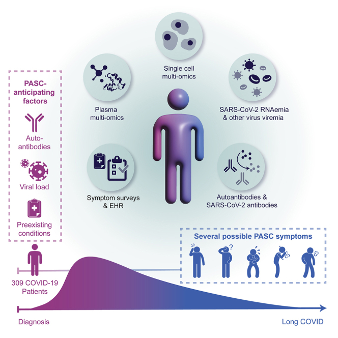
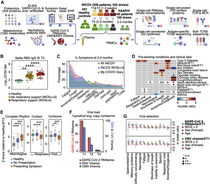
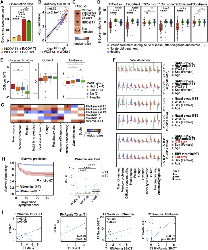
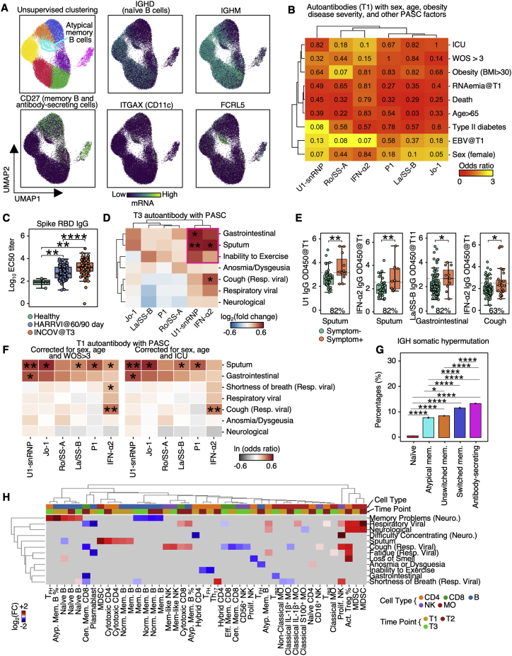
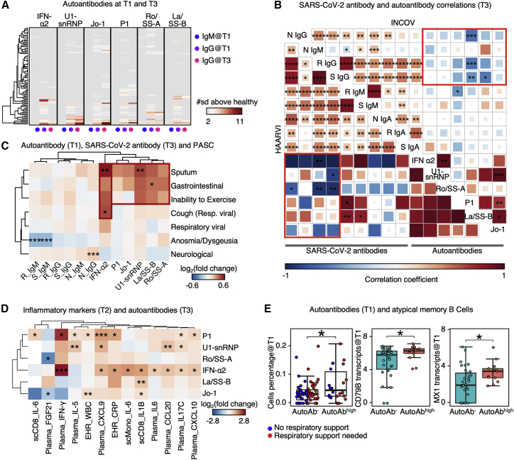
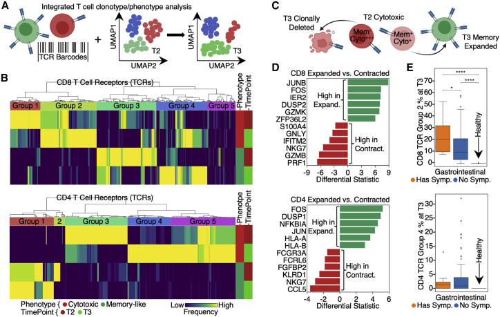
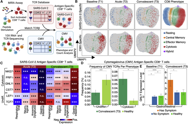
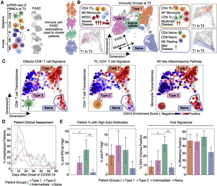
Post-acute sequelae of COVID-19 (PASC) represent an emerging global crisis. However, quantifiable risk factors for PASC and their biological associations are poorly resolved. We executed a deep multi-omic, longitudinal investigation of 309 COVID-19 patients from initial diagnosis to convalescence (2-3 months later), integrated with clinical data and patient-reported symptoms. We resolved four PASC-anticipating risk factors at the time of initial COVID-19 diagnosis: type 2 diabetes, SARS-CoV-2 RNAemia, Epstein-Barr virus viremia, and specific auto-antibodies. In patients with gastrointestinal PASC, SARS-CoV-2-specific and CMV-specific CD8+ T cells exhibited unique dynamics during recovery from COVID-19. Analysis of symptom-associated immunological signatures revealed coordinated immunity polarization into four endotypes, exhibiting divergent acute severity and PASC. We find that immunological associations between PASC factors diminish over time, leading to distinct convalescent immune states. Detectability of most PASC factors at COVID-19 diagnosis emphasizes the importance of early disease measurements for understanding emergent chronic conditions and suggests PASC treatment strategies.

Keywords: COVID-19; PASC; RNAemia; antibodies; auto-antibodies; computational biology; immune system; immunology; long COVID; metabolomics; multi-omics; proteomics; single cell; single-cell CITE-seq; single-cell RNA-seq; single-cell TCR-seq; single-cell secretome; symptoms; transcriptome; viremia.


Conflict of interest statement

Declaration of interests J.R.H. and A.R. are founders and board members of PACT Pharma. J.R.H. is a board member of Isoplexis, and A.R. is the scientific advisor to Isoplexis. M.M.D. is a member of the Scientific Advisory Board of PACT Pharma. J.A.B. is a member of the Scientific Advisory Boards of Arcus, Solid, and VIR. J.A.B. is a member of the Board of Directors of Gilead and Provention. J.A.B. is the CEO of Sonoma Biotherapeutics. L.L.L. is on the scientific advisory boards of Alector, Atreca, Dragonfly, DrenBio, Nkarta, Obsidian Therapeutics, and SBI Biotech. R.G. has received consulting income from Juno Therapeutics, Takeda, Infotech Soft, Celgene, and Merck, has received research support from Janssen Pharmaceuticals and Juno Therapeutics, and declares ownership in CellSpace Biosciences. P.D.G. is on the Scientific Advisory Board of Celsius, Earli, Elpiscience, Immunoscape, Rapt, and Nextech, was a scientific founder of Juno Therapeutics, and receives research support from Lonza. J.D.G. declared contracted research with Gilead, Lilly, and Regeneron. J.A.H. received consulting fees or honoraria from Gilead Sciences, Amplyx, Allovir, Allogene therapeutics, CRISPR therapeutics, CSL Behring, OptumHealth, Octapharma, and Takeda and research funding from Takeda, Allovir, Karius, and Gilead Sciences. Q.D., D.H.M., R.T., R.M.G., M.K., and T.M.S. have employment and equity ownership with Adaptive Biotechnologies. The remaining authors declare no competing interests.

Figures

None
Graphical abstract
Figure 1
Figure 1
Overview of longitudinal multi-omic analysis of COVID-19 patients and their association with PASC (A) Overview of study design for INCOV and HAARVI cohorts. Assays run on plasma and isolated PBMCs, and patient clinical/symptom data are shown. Bottom-right boxes of each icon denote if assay was performed for INCOV (blue) and/or HAARVI (pink). (B) Boxplots showing ELISA (enzyme-linked immunoassay) measured SARS-CoV-2 RBD IgG antibody titers in healthy individuals and T3 COVID-19 patients with and without respiratory support in their acute stage. ∗∗p value < 0.01, ∗∗∗∗p value < 0.0001. (C) Line plot showing frequency of different symptoms in full INCOV cohort (red), subset of INCOV cohort with acute severity WOS ≤ 3 (no respiratory support), and the MyCOVIDDiary cohort. (D) Heatmap showing the ln(odds ratio) for the associations between pre-existing conditions and clinical measurements from EHR and PASC, adjusted for age, sex, and disease severity (WOS > 3). Associations with significance of p > 0.05 were masked as gray. Only single PASCs that showed statistical significance or the four PASC categories were shown. SpO2, blood oxygen saturation. ∗p value < 0.05 and ∗∗p value < 0.01. (E) Boxplots showing plasma protein-based “negative regulation of the circadian rhythm” pathway enrichment (left) and cortisol and cortisone levels (middle and right) from T3 patients with (orange) and without (blue) a specific symptom or from unexposed healthy controls (green). ∗p value < 0.05, ∗∗p value < 0.01, ∗∗∗p value < 0.001, and ∗∗∗∗p value < 0.0001. (F) Barplot showing the viral load level in plasma quantified by the percentage of samples tested positive for viral fragments (RNAemia or viremia) multiplied by the average copy number/mL of these positive samples for SARS-CoV-2 (red), EBV (blue), and CMV (green). (G) Forest plot showing ln(odds ratios) with 95% confidence intervals for associations of PASC with SARS-CoV-2 RNAemia at T1 (top) or EBV Viremia at T1 (bottom), both adjusted for disease severity (WOS > 3, needed respiratory support), sex, and age. The independent associations of disease severity, sex, and age with PASC are also displayed on the same plot. ∗p value < 0.05, ∗∗p value < 0.01, and ∗∗∗p value < 0.001. See also Figure S1 and Tables S1 and S2.
Figure S1
Figure S1
Analysis of antibody titer and modeling for PASC using plasma or swab viral load, related to Figure 1 (A) Barplot showing mean ± SE for the time (days) between symptom onset of COVID-19 to each of the three blood draws for INCOV cohort and the single blood draw for HAARVI cohort. p values calculated from the Mann-Whitney U test are displayed if <0.05. ∗p value < 0.05, ∗∗∗∗p value < 0.0001. (B) Correlation between neutralizing antibody titers at T3 and RBD IgG titers at T3. Data points were fitted with a linear regression line with 95% CI (gray shaded areas), color-coded to indicate whether respiratory support (WOS > 3) was used. Pearson correlation coefficient and p values are shown. (C) Heatmap showing the ln(odds ratio) for only the significant associations between pre-existing conditions and clinical measurements from EHR, and PASC ≥ 4, adjusted for age, sex, and disease severity (WOS > 3). p values calculated from Mann-Whitney U test are displayed if <0.05. ∗p value < 0.05, ∗∗p value < 0.01. (D) Boxplots showing plasma cortisone (left) and cortisol (right) levels at T1, T2, or T3 in patient with and without steroid treatment during COVID-19 infection. p values calculated from the Mann-Whitney U test are displayed if <0.05. ∗p value < 0.05, ∗∗p value < 0.01, ∗∗∗p value < 0.001, and ∗∗∗∗p value < 0.0001. (E) Boxplots showing plasma protein-based “negative regulation of the circadian rhythm” pathway enrichment (left), cortisol (middle), and cortisone (right) levels from healthy individuals (green), T3 patients presenting ≥4 PASC (red), 1–3 PASC (orange), and no PASC (blue). ∗p value < 0.05, ∗∗p value < 0.01, ∗∗∗p value < 0.001, and ∗∗∗∗p value < 0.0001. (F) Forest plot showing ln(odds ratio) with 95% CI for associations between PASCs and variables, including SARS-CoV-2 RNAemia at T2 or T3 (top two panels) and nasal-swab viral loads at T1 and T2 (top five panels), calculated from logistic regression models, with each association/model accounting for disease severity (WOS > 3), sex, and age. Associations between PASC and SARS-CoV-2 RNAemia at T1 or EBV viremia at T1 accounting for ICU stay instead of WOS > 3 are shown (bottom two panels). p values are displayed in asterisks if <0.05. ∗p value < 0.05, ∗∗p value < 0.01, and ∗∗∗p value < 0.001. (G) A summary heatmap showing associations between various SARS-CoV-2 viral load measurements and PASC, accounted for sex, age, and disease severity (WOS > 3). Each rectangle represents the ln(odds ratio) determined through multi-variate logistic regression. p values are displayed if <0.05. ∗p value < 0.05. (H) Left: Kaplan-Meier curves for patient survival stratified by positive (cycle threshold [CT] < 36) or negative for RNAemia at T1. Right: boxplot showing the RNAemia viral load expressed as (36-CT) of patients with different disease severities (WOS ≤ 3, WOS > 3 [not including dead], or dead) at T1 (green) and T2 (orange). ∗∗∗∗p value < 0.0001. (I) Scatter plots fitted with linear regression lines showing correlations between RNAemia measurements at different time point (left two panels), as well as correlations between RNAemia and nasal-swab viral loads (right two panels). Pearson correlation coefficients and p values are displayed.
Figure S2
Figure S2
Auto-antibodies anticorrelate with anti-SARS-CoV-2 antibodies and are associated with distinct patterns of PASC, related to Figure 2 (A) UMAP visualization of single B cells color-coded by Leiden clusters (top left) and selected gene transcript levels (other panels). (B) Heatmap showing the odds ratio (color-coded) and p values (shown in numbers) from Fisher’s exact test to determine the dependence of column and row variables. (C) Boxplot showing titers of SARS-CoV-2 spike RBD antibodies in healthy, INCOV, and HAARVI at convalescence (T3 for INCOV, and 2–3 months post infection for HAARVI). p values calculated from the Mann-Whitney U test are displayed. ∗∗p value < 0.01, and ∗∗∗∗p value < 0.0001 (D) Hierarchical clustered heatmap showing log2-fold change of T3 autoantibody levels in patients with a specific PASC (rows) compared to those without. p values calculated from the Mann-Whitney U test are displayed if <0.05. ∗p value < 0.05, ∗∗p value < 0.01. (E) Boxplots showing all significant PASC- autoantibody (T1) relationships in Figure 2C. The percentages of patients with a given PASC that had autoantibody levels greater than the median antibody level of those who did not present the PASC are shown. p values calculated from the Mann-Whitney U test are displayed if <0.05. ∗p value < 0.05, ∗∗p value < 0.01. (F) Heatmap showing associations between T1 autoantibody measurements and PASC, accounted for sex, age, and disease severity (left: WOS > 3, right: ICU). Each rectangle represents the ln(odds ratio) determined through multi-variate logistic regression. p values are displayed if <0.05. ∗p value < 0.05, ∗∗p value < 0.01. (G) Bar plots showing mean ± SE somatic hypermutation rates in CDR regions of the heavy chain in different B cell populations. p values calculated from Mann-Whitney U test then corrected as FDR via the Benjamini-Hochberg method are displayed if FDR < 0.05. ∗FDR < 0.05, ∗∗∗∗FDR < 0.0001. (H) Associations between phenotype percentages as measured for all three time points (columns) and PASC (rows). The immune cell class is color-coded on the top row, and the measurement time point is color coded on the second row. Enrichment is quantified as log2-fold changes between patients with PASC compared with those without. These are colored as red for positive, blue for negative, and statistically non-significant fold changes are shown as gray (p ≥ 0.05).
Figure 2
Figure 2
Auto-antibodies anticorrelate with anti-SARS-CoV-2 antibodies and are associated with distinct patterns of PASC (A) Heatmap showing the IgM at T1, IgG at T1, and IgG at T3 for each autoantibody annotated at the top. Each row represents a patient. Only patients with measured autoantibody levels above 2 standard deviations (σ) of healthy individuals are shown. (B) Two aligned correlation matrices assembled from INCOV (upper right) and HAARVI cohorts (lower left). Each square represents the correlation coefficient between an antibody pair specified by the diagonal annotations. p values of these correlations are displayed in asterisks if <0.05. ∗p value < 0.05, ∗∗p value < 0.01, ∗∗∗p value < 0.001, and ∗∗∗∗p value < 0.0001. N, nucleocapsid protein; S, spike protein; R, RBD domain of spike; Ig, immunoglobin. Pink rectangles highlight the overall anti-correlation trends between auto-antibodies and anti-SARS-CoV-2 IgGs. (C) Hierarchical clustered heatmap showing log2-fold change of T3 SARS-CoV-2 antibody or T1 autoantibody levels in patients with a specific PASC (rows) compared with those without. p values calculated from the Mann-Whitney U test are displayed if <0.05. Only single PASCs that showed statistical significance or the four PASC categories were shown. ∗p value < 0.05, ∗∗p value < 0.01, and ∗∗∗p value < 0.001. (D) Hierarchical clustered heatmap showing log2-fold change of EHR clinical labs, plasma analytes, or transcript levels in immune cells (annotated within column names), in patients with auto-antibodies (>2σ + healthy) to those without (≤2σ + healthy). p values calculated from the Mann-Whitney U test are displayed in asterisks if <0.05. ∗p value < 0.05, ∗∗p value < 0.01, and ∗∗∗p value < 0.001. (E) Boxplots showing the cell percentage (left), CD79B transcript levels (middle), and MX1 transcript levels (right) of atypical memory B cells in patients without any auto-antibodies (autoAb, ≤2σ + healthy) and those had any autoantibody levels ≥4σ + healthy (autoAbhigh). p values calculated from the Mann-Whitney U test are displayed in asterisks if <0.05. ∗p value < 0.05. See also Figure S2 and Tables S2 and S5.
Figure 3
Figure 3
Lineage tracing of T cell clonotypes along the transcriptomic landscape resolved PASC association with global clonal and transcriptomic dynamics (A) Illustration of using TCRs as T cell lineage barcodes to trace how different clonotypes evolve along transcriptomic landscape from acute disease (T2) to convalescence. (B) Hierarchical clustering of CD8+ (upper panel) and CD4+ T cell (lower panel) TCRs (columns) based on TCR sharing patterns across select phenotypes and time points (see color key at bottom). (C) Illustration of mining differential transcriptomic features for CD8+ and CD4+ T cells that are of a cytotoxic TEMRA phenotype at T2 but expand into a memory phenotype at T3, or contract at T3. (D) Top differentially expressed genes at T2 between cytotoxic TEMRA cells that either expand into a memory phenotype, or contract by T3. CD8+ (top panel) and CD4+ T cells (bottom panel). (E) Frequencies of newly emerging cytotoxic clonotypes (TCR group 2 for CD8+ T cells in (B) top heatmap, TCR group 4 for CD4+ T cells in (B) bottom heatmap) for patients at T3 with (orange) and without (blue) GI symptoms and for unexposed healthy controls (green). p values calculated from the Mann-Whitney U test are displayed in asterisks if <0.05. ∗p value < 0.05, ∗∗p value < 0.01, ∗∗∗p value < 0.001, and ∗∗∗∗p value < 0.0001. See also Table S3.
Figure 4
Figure 4
Integration of antigen specificity with sc-CITE-seq data reveal PASC associations with SARS-CoV-2-specific and CMV-specific TCR-transcriptomic dynamics (A) Illustration of the computational pipeline that integrates SARS-CoV-2-specific TCRs from the MIRA analysis and CMV-specific TCRs from public databases, with CD8+ T cell transcriptomes from sc-CITE-seq data. (B) UMAP (Uniform Manifold Approximation and Projection) visualization of transcriptomic states of SARS-CoV-2-specific T cells and CMV-specific T cells from T1 through T3. (C) Heatmaps showing select mRNA enrichment in SARS-CoV-2-specific CD8+ T cells for patients with certain PASCs compared with those without. p values calculated from the Mann-Whitney U test are displayed in asterisks if <0.05. ∗p value < 0.05, ∗∗p value < 0.01, and ∗∗∗p value < 0.001. (D) Frequency of CMV-specific undifferentiated and cytotoxic CD8+ T cells in patients at T3 (dark green) in comparison with unexposed healthy controls (light green). Data are represented as mean ± SE. p values calculated from the Mann-Whitney U test are displayed in asterisks if <0.05. ∗p value < 0.05, ∗∗p value < 0.01, and ∗∗∗p value < 0.001. (E) mRNA levels of GNLY in CMV-specific CD8+ T cells in patients at T1 and T3 with (orange) and without (blue) GI symptoms in comparison with unexposed healthy controls (green). Data are represented as mean ± SE. p values calculated from the Mann-Whitney U test are displayed in asterisks if <0.05. ∗p value < 0.05, ∗∗p value < 0.01, ∗∗∗p value < 0.001, and ∗∗∗∗p value < 0.0001. See also Table S4.
Figure 5
Figure 5
Global immunological association of PASC revealed coordinate polarization of innate and adaptive immunity into four immune endotypes (A) Illustration of the computational pipeline that integrates the immune transcriptomes for each cell type with PASC and uses this integration to classify and place patients on a low-dimensional projection. (B) Two-dimensional projection of immune-symptom signatures. Each dot represents a patient blood draw, increased distance between dots represents increased dissimilarities. Identified patient groups in (A) are color-coded on T3 blood draws. Representative characteristics are summarized in the side boxes. Trajectories connecting the T1 and T3 patient blood draws for three of the groups are shown at the side. (C) Pathway analysis of patient-group-specific transcriptomic signatures for CD8+, CD4+ T cell, and monocytes across patients. Enrichment scores of selected pathways in CD8+, CD4+ T cells, and monocytes for each blood draw are color coded onto each dot. (D) Real-time hospitalization rates for each of the four patient endotype. (E) Left: percent of patients per immunity endotype that had high IFN-α2 or P1 auto-antibodies at T1 (defined as ≥4 standard deviations above healthy controls) when considering autoAbhigh and autoAb patients. Right: percent of patients with EBV viremia or SARS-CoV-2 RNAemia levels that cross the threshold for positivity. Data are represented as mean ± SE. p values calculated from the Mann-Whitney U test are displayed in asterisks if <0.05. ∗p value < 0.05, ∗∗p value < 0.01. See also Figures S3, S4, and S5 and Tables S5 and S6.
Figure S3
Figure S3
Bar plots showing the percentages of subtypes of CD8+, CD4+ T cells, B cells, monocytes, and NK cells as measured from 10x data at the convalescent stages for each patient group, related to Figure 5 Data are represented as mean ± SE. p values calculated from the Mann-Whitney U test are displayed in asterisks if <0.05. ∗p value < 0.05, ∗∗p value < 0.01, ∗∗∗p value < 0.001, and ∗∗∗∗p value < 0.0001.
Figure S4
Figure S4
Pathway analysis of patient-group-specific transcriptomic signatures in CD8+ T and CD4+ T cell, monocytes, and B cells across time and patient cohorts, related to Figure 5 Two pathways are shown for each cell types. Left two boxplots for each pathway indicate the enrichment score of a specific pathway across the four patient groups at T1 and T3. Unexposed healthy controls and deceased patients are also included as comparisons (see color key at bottom). The right two projections for each pathway color code the pathway-enrichment score for each blood draw onto their respective dots (each dot represents a patient blood draw) on the map of Figure 5B for INCOV (upper) and HAARVI (lower) cohorts. p values calculated from the Mann-Whitney U test are displayed in asterisks if <0.05. ∗p value < 0.05, ∗∗p value < 0.01, ∗∗∗p value < 0.001, and ∗∗∗∗p value < 0.0001.
Figure S5
Figure S5
Clinical and functional characteristics of patient groups and dimensional projection validity, related to Figure 5 (A) Bar plots showing the time between onset of COVID-19 to each of the blood draws across four patient groups. Data are represented as mean ± SE. FDR are displayed. No significant differences are seen. (B) Boxplot showing patient age upon enrollment. FDR are displayed. p values calculated from the Mann-Whitney U test then corrected as FDR via the Benjamin-Hochberg method are displayed in asterisks if FDR < 0.05. ∗FDR < 0.05, ∗∗FDR < 0.01, ∗∗∗FDR < 0.001, and ∗∗∗∗FDR < 0.0001. (C) Bar plot showing days in hospitals across patient groups. Data are represented as mean ± SE. FDR are displayed. p values calculated from the Mann-Whitney U test then corrected as FDR via the Benjamini-Hochberg method are displayed in asterisks if FDR < 0.05. ∗FDR < 0.05, ∗∗FDR < 0.01, ∗∗∗FDR < 0.001, and ∗∗∗∗FDR < 0.0001. (D) Dimension reduction visualization from Figure 5 with INCOV and HAARVI cohorts overlayed and colored by their respective definitions and measurements of disease severity. Immune endotypes are circled. (E) Boxplot showing somatic hypermutation (SHM) rates in memory B cells (upper left), percentages of IGHG1 (upper middle) and IGHM (upper right) memory B cell clones over all memory B cell clones, and RBD (lower left), spike (lower middle), and nucleocapsid (lower right) IgG log10(titers) for patients at T3. ∗p value < 0.05, ∗∗p value < 0.01, ∗∗∗p value < 0.001, and ∗∗∗∗p value < 0.0001. (F) Boxplot showing the dimension-1 (y axis of top row) and dimension-2 (y axis of bottom row) values of four patient groups controls across time points in comparison with dead patients and unexposed healthy. p values calculated from Mann-Whitney U test are displayed in asterisks if <0.05. ∗p value < 0.05, ∗∗p value < 0.01, ∗∗∗p value < 0.001, and ∗∗∗∗p value < 0.0001.
Figure S6
Figure S6
Single-cell secretome functionality analysis and phenotype-PASC association analysis, related to Figure 6 Single-cell secretome analysis of the functionalities in different immune cell types. Top row: single-cell polyfunctional strength index (PSI) of each cell type in each patient group and unexposed healthy control (see color key at the bottom). Data are represented as mean ± SE. Bottom row: heatmap visualization of average cytokine secretion frequencies for each cell type for each patient group at convalescence or healthy unexposed control (see color key at bottom). p values calculated from the Mann-Whitney U test are displayed in asterisks if <0.05. ∗p value < 0.05, ∗∗p value < 0.01, and ∗∗∗p value < 0.001.
Figure S7
Figure S7
Machine learning model evaluation and multi-omic PASC associations, related to Figure 5 (A) Receiver operating characteristic curves, per cross-validation (CV) iteration, for pair-wise classification (see subtitles) based upon the levels of five markers at T1 for different validation pairs. Area under the curve (AUC) values for different CVs (in different colors) are displayed. (B) The four axes of the radar plot indicate the enrichment score for four sets of PASC at T3 for each immune endotype. (C) Receiver operating characteristic curve for survival prediction based on T1 plasma CTSL levels for the INCOV cohort (upper) and validation of the model trained using the INCOV cohort with T1 plasma CTSL levels from an independent cohort (SJCI) (lower).
Figure 6
Figure 6
Integrated analysis of associations between multi-omics and PASC factors (A) Illustration of the analysis to identify how the different PASC factors associated with the different multi-omic measurements. (B) Cross-dataset correlations between T1 measurable PASC-associated factors (EBV viremia, RNAemia of SARS-CoV-2, and auto-antibodies) and analytes from different T3 omics (see color key at bottom). Association was quantified via log2-fold change values where red indicates positive associations, blue indicates negative association, and gray indicates no significant associations (p ≥ 0.01). (C) Heatmap visualization of the interdependence of the four PASC factors across three time points. The relatedness score represents how significantly the enriched plasma protein sets for each PASC factor overlapped with each other. These are visualized in a pair-wise manner in the matrix. (D) Bar plot illustrating the quantification of the relatedness from (C) plus an analogous analysis for plasma metabolites. The bar heights represent the average non-self pair-wise relatedness value from the heatmaps in (C) with separate y axes for plasma proteins and plasma metabolites. See also Figure S6 and Table S7.

References

    1. Altschul S.F., Madden T.L., Schäffer A.A., Zhang J., Zhang Z., Miller W., Lipman D.J. Gapped BLAST and PSI-BLAST: a new generation of protein database search programs. Nucleic Acids Res. 1997;25:3389–3402. - PMC - PubMed
    1. Annunziato F., Romagnani C., Romagnani S. The 3 major types of innate and adaptive cell-mediated effector immunity. J. Allergy Clin. Immunol. 2015;135:626–635. - PubMed
    1. Bagaev D.V., Vroomans R.M.A., Samir J., Stervbo U., Rius C., Dolton G., Greenshields-Watson A., Attaf M., Egorov E.S., Zvyagin I.V., et al. VDJdb in 2019: database extension, new analysis infrastructure and a T-cell receptor motif compendium. Nucleic Acids Res. 2020;48:D1057–D1062. - PMC - PubMed
    1. Bastard P., Gervais A., Le Voyer T., Rosain J., Philippot Q., Manry J., Michailidis E., Hoffmann H.H., Eto S., Garcia-Prat M., et al. Autoantibodies neutralizing type I IFNs are present in ∼4% of uninfected individuals over 70 years old and account for ∼20% of COVID-19 deaths. Sci. Immunol. 2021;6 eabl4340. - PMC - PubMed
    1. Blomberg B., Mohn K.G.-I., Brokstad K.A., Zhou F., Linchausen D.W., Hansen B.A., Lartey S., Onyango T.B., Kuwelker K., Sævik M., et al. Long COVID in a prospective cohort of home-isolated patients. Nat. Med. 2021;27:1607–1613. - PMC - PubMed

Publication types

MeSH terms