. 2022 Mar 3;185(5):916-938.e58.
doi: 10.1016/j.cell.2022.01.012. Epub 2022 Jan 21.

A blood atlas of COVID-19 defines hallmarks of disease severity and specificity

Collaborators

A blood atlas of COVID-19 defines hallmarks of disease severity and specificity

COvid-19 Multi-omics Blood ATlas (COMBAT) Consortium. Electronic address: julian.knight@well.ox.ac.uk et al. Cell. .

Abstract

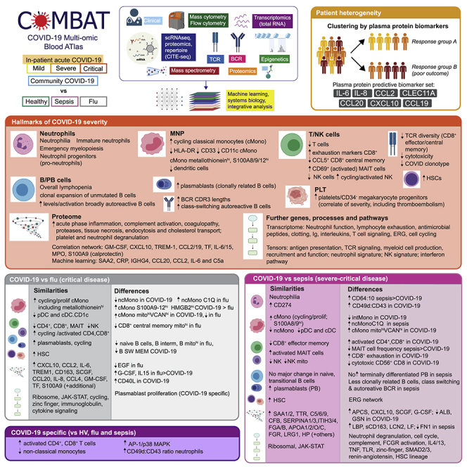
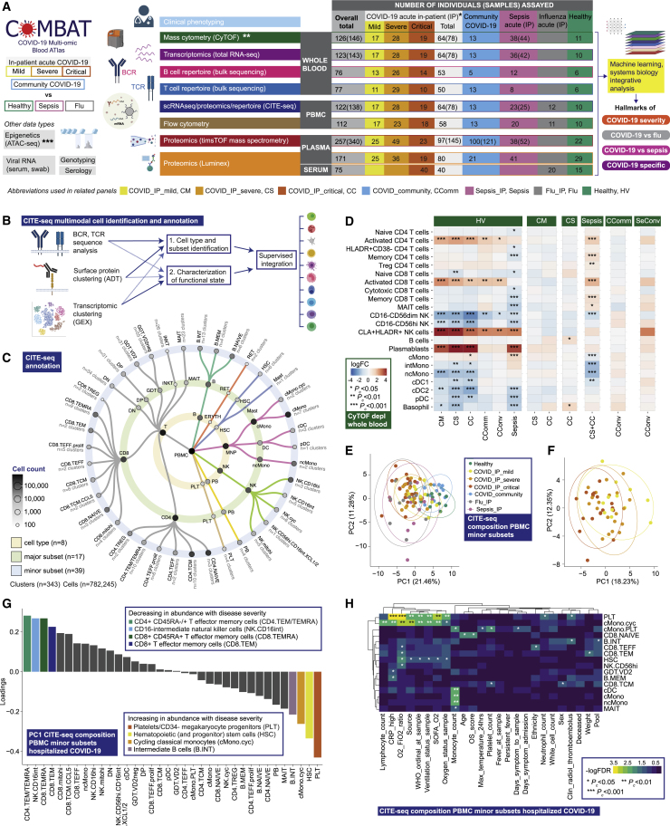
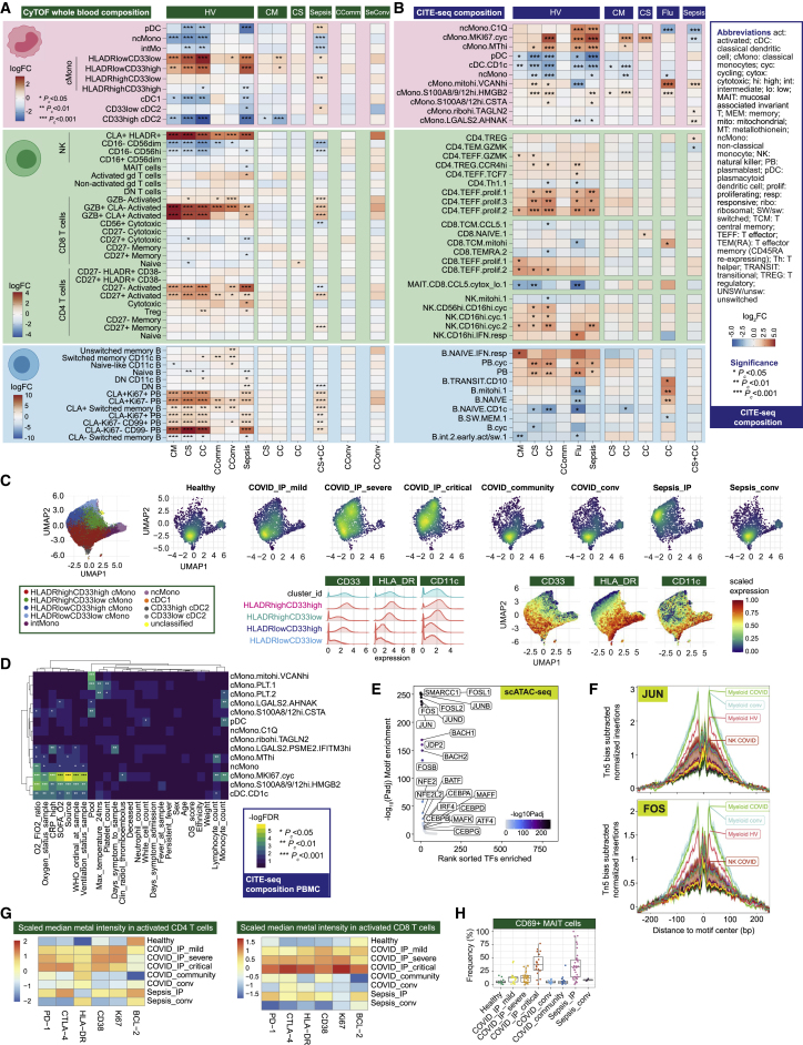
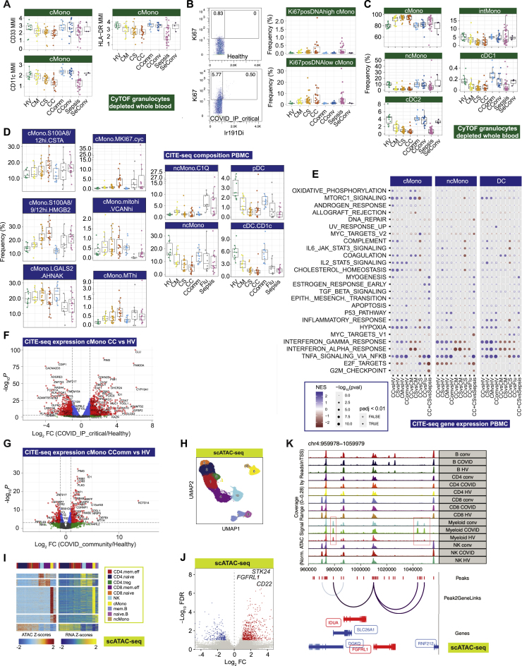
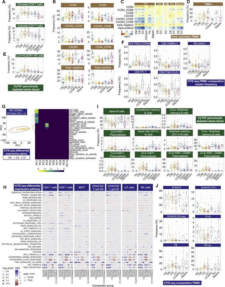
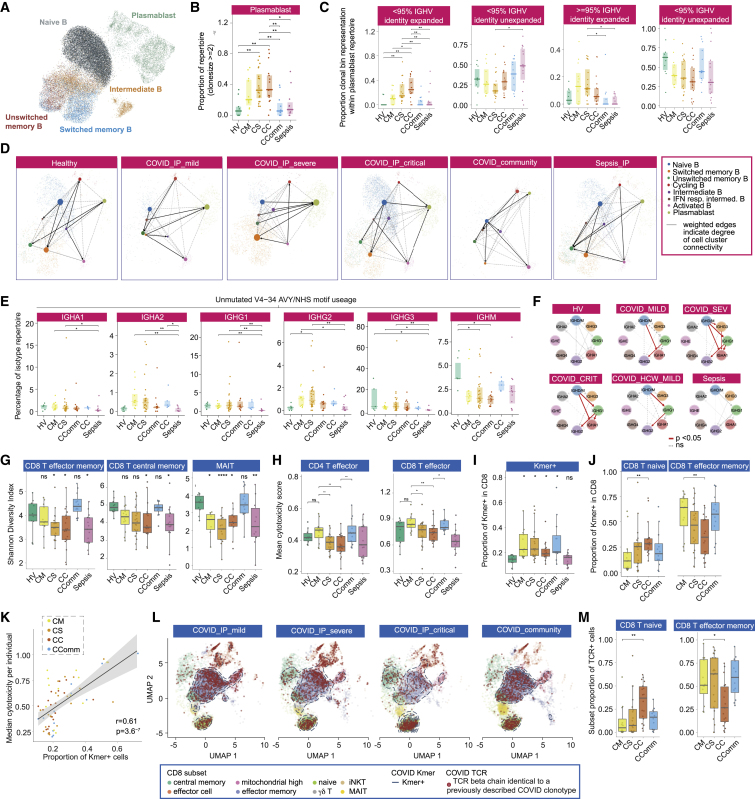
Treatment of severe COVID-19 is currently limited by clinical heterogeneity and incomplete description of specific immune biomarkers. We present here a comprehensive multi-omic blood atlas for patients with varying COVID-19 severity in an integrated comparison with influenza and sepsis patients versus healthy volunteers. We identify immune signatures and correlates of host response. Hallmarks of disease severity involved cells, their inflammatory mediators and networks, including progenitor cells and specific myeloid and lymphocyte subsets, features of the immune repertoire, acute phase response, metabolism, and coagulation. Persisting immune activation involving AP-1/p38MAPK was a specific feature of COVID-19. The plasma proteome enabled sub-phenotyping into patient clusters, predictive of severity and outcome. Systems-based integrative analyses including tensor and matrix decomposition of all modalities revealed feature groupings linked with severity and specificity compared to influenza and sepsis. Our approach and blood atlas will support future drug development, clinical trial design, and personalized medicine approaches for COVID-19.

Keywords: COVID-19; SARS-CoV-2; blood; coronavirus; epigenetics; immune; multi-omics; personalized medicine; proteomics; transcriptomics.


Conflict of interest statement

Declaration of interests R.B.-R. (co-founder and consultant Alchemab Therapeutics Ltd), R.C. (founder MIROBio), J. Hughes (director and shareholder Nucleome Therapeutics), G.S. (GSK Vaccines SAB), J.A.T. (GSK Human Genetics SAB). Other authors declare no competing interests.

Figures

None
Graphical abstract
Figure 1
Figure 1
Single cell compositional analysis reveals variance in cell populations by clinical group and severity (A) Study design, assay modalities, and workflow. Table shows number of patients assayed, with number of samples in brackets where more than one sample assayed. WHO severity categories show number of patients at time of sampling ∗∗single paired convalescent sample assayed for n = 16 COVID-19 and n = 3 sepsis patients; ∗∗∗10 samples assayed (8 samples for paired acute-convalescent COVID-19 and 2 healthy). (B) Summary of supervised multimodal annotation strategy for the CITE-seq data (described in STAR Methods; clustering of GEX modality shown in Figure S1E). (C) Summary of cell populations identified by CITE-seq (phenotypes shown in Data S4). (D) Differential abundance of major cell populations in granulocyte (CD66+) depleted whole blood where significant between comparator groups (7,118,158 cells assayed using single cell mass cytometry). (E–H) CITE-seq compositional analysis of minor cell subsets. (E and F) Principal components analysis (PCA) showing PC1 versus PC2 with 95% data ellipses (assuming a multivariate t-distribution) of (E) all comparator groups and (F) hospitalized COVID-19 cases. (G) Loadings of minor cell subsets on PC1 for hospitalized COVID-19 cases. (H) Covariate analysis for clinical, demographic, and experimental variables for hospitalized COVID-19 cases plotting significant minor cell subsets (BH adjusted ANOVA for significance). See Figures S1 and S2.
Figure S1
Figure S1
Study cohorts, clinical covariates and CITE-seq analysis, related to Figure 1 (A,B) Unsupervised clustering of samples from hospitalized COVID-19 patients by consensus k-means clustering followed by hierarchical clustering on the consensus matrix based on (A) 49 clinical features (excluding WHO severity classifiers) to determine patient groupings demonstrated the optimal cluster number was 2 or 3 (B) acute measures of physiology and clinical biomarkers of response without significant missingness (including measures of oxygenation requirements, blood cell counts, fever, ALT, CRP) (Data S2). (C) Biplot illustrating for PC1 and PC2 features driving clustering identified in Figure S1B. (D) Overview of the CITE-seq experiment. A total of n = 140 PBMC samples from COVID-19, sepsis, influenza and healthy volunteers were mixed into n = 10 pools (left). Each pool comprised of n = 14 samples from different individuals. After staining, viable cells were isolated by FACS and captured using n = 7 10X channels per pool (center). From each channel, four libraries were generated from gene expression (GEX), surface proteome (ADT), TCR repertoire and BCR repertoire modalities (right). (E) UMAP plots showing the iterative gene expression (GEX) clustering of the CITE-seq dataset. Initial GEX clustering of all cells identified four subgroups (as demarcated by the ellipses in the UMAP, top left). Re-clustering of the T and NK cells (middle left) identified two major subgroups which were extracted for final cluster analysis as the “CD4 T region” and “CD8 T/NK region” (bottom left and bottom center left). A similar process was followed for analysis of the B cells and plasmablasts (PB) (middle center and bottom center-right) and for the mononuclear phagocytes (MNP) (top center and top-right). A number of doublet clusters were identified during initial re-clustering of the B/PB and MNPs and were re-clustered separately (bottom-right). The final group of cells identified in the initial clustering consisted of platelets (PLT), hematopoietic stem (and progenitor) cells (HSC) and some dendritic cells (DC) which were extracted and clustered together (middle right). The initial and intermediate clustering steps are shown in dashed boxes, while the final set of GEX clusters that were annotated and used as an input for the multimodal annotation are shown in the solid boxes. As described in the STAR Methods, highly variable gene discovery, integration and clustering were performed separately for each of the clustering results shown. For this figure, the final six GEX clustering analyses (bottom and right) were labeled by mapping the multimodal annotations back onto the GEX manifolds: white labels indicate that > 80% of cells in the GEX cluster mapped to the given multimodal cell cluster, cyan labels indicate a mapping to multiple multimodal cell clusters (indicative names shown).
Figure S2
Figure S2
Single cell compositional approaches, related to Figure 1 (A-B) Concordance and cross validation of cell composition using single cell resolution mass cytometry (Helios CyTOF system) clustering (from granulocyte (CD66+) depleted whole blood with down sampling to a maximum of 75,000 cells and 7,118,158 cells assayed) and CITE-seq analysis of viability sorted peripheral blood mononuclear cells (PBMCs) from 140 samples profiled using the 10X Genomics platform. (A) Concordance in cell composition annotation between assay types is demonstrated with UMAP showing joint visualization of CITE-seq and CyTOF datasets including side by side plot of CITE-seq cell surface protein quantification (ADT) and mass cytometry together with a plot of cell annotations transferred between datasets and colored by cell type where concordant (94.5% of cells) or discordant (gray) (B) Plots demonstrating cross validation of mass cytometry and CITE-seq cell clusters. (C-E) Stabilized whole blood (Cytodelics) from COVID-19 patients (non-granulocyte depleted samples) analyzed by mass cytometry (including matched samples collected during convalescence from 16 COVID-19 hospitalized patients). A self-organizing map algorithm (FlowSOM) resolved 25 clusters by consensus clustering for 3,893,390 cells after down sampling to a maximum of 40,000 cells. Clusters merged to identify broad immune cell populations (Data S3). (C) Cell frequencies by clinical group. Boxplots show median, first and third quartiles; whiskers show 1.5x interquartile range. (D) Differential abundance analysis in patients compared to healthy volunteers, and different disease states clustering major cell populations using empirical Bayes analysis (statistical inference estimating priors from the data). (E) PCA with arrows indicating drivers of variation by cell population. (F) Differential abundance analysis in patients compared to healthy volunteers, and between disease categories for minor cell subsets using empirical Bayes analysis. Abbreviations for CITE-seq (panel F). B: B cell; cDC: classical dendritic cell; cMono: classical monocytes; cyc: cycling; DC: dendritic cell; DN: CD4/CD8 double negative; DP: CD4/CD8: double positive; ERYTH: erythrocyte; GDT: gamma delta T; hi: high; HSC: hematopoietic stem (and progenitor) cells; iNKT: invariant natural killer T; INT/int: intermediate; MAIT: Mucosal associated invariant T; MEM: memory; mito: mitochondrial; MNP: mononuclear phagocyte; ncMono: non-classical monocyte; neg: negative; NK: natural killer cell; PB: plasmablast; PBMC: peripheral blood mononuclear cell; pDC: plasmacytoid dendritic cell; PLT: platelet/CD34- megakaryocyte progenitor; prolif: proliferating; RET: reticulocyte; T: T cell; TCM: T central memory; TEFF: T effector; TEM(RA): T effector memory (CD45RA re-expressing); TREG: T regulatory cell. Comparator group abbreviations. HV: healthy volunteer; CM: COVID-19 in-patient mild; CS: COVID-19 in-patient severe; CC: COVID-19 in-patient critical; CComm: COVID-19 community case in the recovery phase (never admitted to hospital); CConv: COVID-19 convalescence (survivors from 28 days after discharge); Flu: influenza in-patient critical; Sepsis: in-patient severe and critical sepsis; SeConv: sepsis convalescence.
Figure 2
Figure 2
Signatures of COVID-19 response from transcriptomics (A–F) Whole blood total RNA-seq. (A and B) Principal component (PC) analysis of (A) all comparator groups and (B) hospitalized COVID-19 cases. (C) Differential gene expression critical versus mild COVID-19. (D) Pathway enrichment for COVID-19 severity as a quantitative trait ± inclusion cell proportion. (E) Differential gene expression COVID-19 versus sepsis. (F) Intramodular hub genes for weighted gene correlation network analysis module grey60. (G) Neutrophil cell surface proteins assayed by mass cytometry shown by marker or ratio of markers. Boxplots show median and first and third quartiles; whiskers show 1.5x interquartile range. (H and I) CITE-seq gene expression. (H) Association of PCs of expression variance within minor cell subsets in COVID-19 patients. (I) PC plots in classical monocytes and naive CD4+ T cells. See Figures S3 and S4.
Figure S3
Figure S3
Signatures of COVID-19 severity revealed by bulk RNA-seq, related to Figure 2 Whole blood total RNA-seq for hospitalized COVID-19 patients showing (A) matrix correlation of principal components (PCs) with covariates (B) differentially expressed immunoglobulin lambda chain gene IGLV3-25 and innate viral response gene OAS1 and (C) correlation plot showing the influence of cell proportion on detection of differentially expressed genes. (D) Pathway enrichment for COVID-19 severe and critical versus sepsis using Reactome. Bars indicate 95% confidence intervals. (E-H) Weighted gene correlation network analysis (WGCNA) of whole blood total RNA-seq. (E) Heatmap showing module trait relationships. (F,G) Enrichment of WGCNA modules using gene expression data showing for (F) 64 immune and stroma cell types (xCell), (G) MSigDB canonical pathway genesets, and (H) module eigengene values plotted by patient group. Comparator group abbreviations HV: healthy volunteer; CM: COVID-19 in-patient mild; CS: COVID-19 in-patient severe; CC: COVID-19 in-patient critical; CComm: COVID-19 community case in the recovery phase (never admitted to hospital); Sepsis: in-patient severe and critical sepsis.
Figure S4
Figure S4
Signatures of COVID-19 severity revealed by single cell RNA-seq and mass cytometry, related to Figure 2 (A) Neutrophil marker expression whole blood assayed by mass cytometry comparing across patient groups. (B) Correlations between whole blood total RNA-seq WGCNA modules and neutrophil CyTOF markers. (C) Association p values between principal components of pseudobulk GEX for specific cell clusters (minor subsets) across all clinical groups. (D) scRNA-seq MSigDB hallmark gene set enrichment by cell type. All boxplots show median, first and third quartiles; whiskers show 1.5x interquartile range. (E) Enrichment of interferon-stimulated genes for each pair of minor subset and contrasts. Circled dots have p < 1e-5 (Bonferroni-corrected threshold for the number of subsets/contrasts pairs). The most significant cell subset is highlighted for each contrast. (F) Volcano plot of differential expression between critical COVID-19 and healthy controls, restricted to interferon-stimulated genes, in the HSC minor subset. (G) A hierarchically clustered heatmap of gene expression in classical dendritic cells (cDCs) of highly differentially expressed (FDR < 0.001, absolute fold change > 3) genes from the leading edges of interferon stimulated gene sets. Color shows mean zero-centered RPM in units of standard deviations within each group. Comparator group abbreviations HV: healthy volunteer; CM: COVID-19 in-patient mild; CS: COVID-19 in-patient severe; CC: COVID-19 in-patient critical; CComm: COVID-19 community case in the recovery phase (never admitted to hospital); CConv: COVID-19 convalescence (survivors from 28 days after discharge); Flu: influenza in-patient critical; Sepsis: in-patient severe and critical sepsis; SeConv: sepsis convalescence.
Figure 3
Figure 3
Single cell gene expression modules identify hallmarks of COVID-19 response (A–H) Weighted gene correlation network analysis (WGCNA) of CITE-seq gene expression for major cell types. (A) Association of module eigengenes with disease contrasts, clinical severity scores and variables, survival and gene set scores (all significant associations shown). (B) Module pathway enrichment. (C and D) p38MAPK.AP-1 module eigengene (C) correlation with AP-1 family genes (D) expression across patient groups. (E–H) Eigengene expression and top eigengene-gene correlations for (E) ribosomal module in cMono (F) cycling module in cMono (G) JAK-STAT.interleukin module in CD4 and (H) FKB5.CD163 module in cMono. For all violin plots, median indicated by horizontal bar.
Figure 4
Figure 4
Changes in myeloid and lymphocyte cell populations associated with COVID-19 severity (A and B) Differential cell abundance in patients versus healthy volunteers, and between disease categories for myeloid, T, NK, and B cells for prioritized sample set assayed by (A) single cell mass cytometry and (B) CITE-seq, plotting cell populations where significant between comparator groups. (C) UMAP by patient group for myeloid cell clusters derived from mass cytometry and Mean Metal Intensity (MMI) of HLA-DR, CD33 and CD11c. (D) Covariate analysis of cell abundance assayed by CITE-seq and clinical, demographic, and experimental variables for hospitalized COVID-19 cases (BH adjusted ANOVA test for significance). (E and F) scATAC-seq (E) differential motif enrichment in myeloid cells, acute COVID-19 versus healthy volunteers and (F) transcription factor footprinting for myeloid enriched factors JUN and FOS. (G and H) Single cell mass cytometry (G) MMI of specific markers in activated CD4+ and CD8+ T lymphocytes (H) frequency of activated MAIT cells. Boxplots show median, first and third quartiles; whiskers 1.5x interquartile range. See Figures S5 and S6.
Figure S5
Figure S5
Changes in myeloid populations associated with COVID-19 severity, related to Figure 4 (A-C) Single cell mass cytometry. (A) Mean metal intensity (MMI) of HLA-DR, CD33 and CD11c for classical monocytes (cMono) by patient group. (B) Representative plot of Ki67+ expression and 191Iridium (DNA) labeling in a healthy volunteer and a COVID19 patient; two distinct population of Ki67+ proliferating cells were identified, one containing the same amount of DNA as Ki67 cells (Ki67+DNAlow) and a rarer population containing double the amount of DNA (Ki67+DNAhigh) which likely comprises proliferating cells in S, G2 and M phase. The boxplots describe the frequencies of Ki67+DNAlow and Ki67+DNAhigh across different disease states. (C) Myeloid cell population frequencies by patient group. (D-G) CITE-seq PBMC myeloid cell clusters. (D) Differential abundance analysis with boxplots of cell cluster frequency by patient group where abundance significantly differs relative to healthy volunteers and (E) scRNA-seq MSigDB hallmark gene set enrichment for cMono, ncMono and DC. (F,G) Differential gene expression in classical monocytes comparing (F) critical COVID-19 patients versus healthy volunteers and (G) COVID-19 community cases versus healthy volunteers with volcano plots showing significant genes (FDR < 0.01 and logFC > 2) in red. (H-K) scATAC-seq with cell lysis, nuclear extraction and tagmentation on viability sorted PBMC prior to single nuclei capture and sequencing. Data shown for 42,000 cells post QC (ArchR pipeline) for 8 COVID-19 samples (paired acute and convalescent) and 2 healthy volunteers with (H) label transfer (unconstrained method) to assign cell clusters based on CITE-seq, (I) comparison of chromatin accessibility (scATAC-seq peaks linked to genes) to CITE-seq gene expression, (J) differential chromatin accessibility in myeloid cells comparing acute COVID-19 versus healthy volunteers, and (K) scATAC-seq tracks at FGFRL1 locus comparing cell populations and condition (healthy, COVID-19 acute and convalescent). All boxplots show median, first and third quartiles; whiskers show 1.5x interquartile range. Abbreviations for CITE-seq (panels D-G). cDC: classical dendritic cell; cMono: classical monocytes; DC: dendritic cell; hi: high; MT, mitochondrial; ncMono: non-classical monocyte; pDC: plasmacytoid dendritic cell. Comparator group abbreviations. HV: healthy volunteer; CM: COVID-19 in-patient mild; CS: COVID-19 in-patient severe; CC: COVID-19 in-patient critical; CComm: COVID-19 community case in the recovery phase (never admitted to hospital); CConv: COVID-19 convalescence (survivors from 28 days after discharge); Flu: influenza in-patient critical; Sepsis: in-patient severe and critical sepsis; SeConv: sepsis convalescence.Comparator group abbreviations HV: healthy volunteer; CM: COVID-19 in-patient mild; CS: COVID-19 in-patient severe; CC: COVID-19 in-patient critical; CComm: COVID-19 community case in the recovery phase (never admitted to hospital); CConv: COVID-19 convalescence (survivors from 28 days after discharge); Flu: influenza in-patient critical; Sepsis: in-patient severe and critical sepsis; SeConv: sepsis convalescence.
Figure S6
Figure S6
Dynamic changes in lymphocyte populations associated with COVID-19 severity, related to Figure 4 (A) Frequency of activated CD4 and CD8 T cells assayed by single cell mass cytometry. (B-D) Multicolor flow cytometry analysis of PBMC. (B,C) Boxplots, dotplots and heatmap describing the phenotype and frequency of subsets of memory CD4 T cell subsets defined based on the expression of CCR4, CCR6 and CXCR3. (D) Frequency of TIM3+CD38+HLADR+ CD8+ T cells. (E) Frequency of CLA+ HLADR+ NK cells assayed by single cell mass cytometry. (F-H) CITE-seq profiling CD4+ CD8+ T and NK cell clusters. (F) Frequency between comparator groups. (G) Principal Components Analysis (PCA) and correlation with clinical covariates and severity measures for gene expression in acute hospitalized cases (mild, severe, critical) in activated NK cells. (H) scRNA-seq MSigDB hallmark gene set enrichment for T cell populations. (I) Single cell mass cytometry composition analysis of B and plasmablast cell populations comparing study groups. (J) CITE-seq compositional differential abundance analysis of B and plasmablast cell clusters. All boxplots show median, first and third quartiles; whiskers show 1.5x interquartile range. Abbreviations for CITE-seq (panels F-H,J). B: B cell; cDC: classical dendritic cell; cyc: cycling; DN: CD4/CD8 double negative; DP: CD4/CD8: double positive; hi: high; IFN, interferon; int: intermediate; mito, mitochondrial; NK: natural killer cell; PB: plasmablast; PBMC: peripheral blood mononuclear cell; resp: responsive; TCM, T central memory; TEM(RA): T effector memory (CD45RA re-expressing); Th, T helper; TREG: T regulatory cell. Comparator group abbreviations. HV: healthy volunteer; CM: COVID-19 in-patient mild; CS: COVID-19 in-patient severe; CC: COVID-19 in-patient critical; CComm: COVID-19 community case in the recovery phase (never admitted to hospital); CConv: COVID-19 convalescence (survivors from 28 days after discharge); Flu: influenza in-patient critical; Sepsis: in-patient severe and critical sepsis; SeConv: sepsis convalescence.
Figure 5
Figure 5
Differences in B and T cell repertoire associated with COVID-19 severity (A–F) B cells: (A) UMAP embedding with cluster identities from CITE-seq. (B) Plasmablast repertoire clonality. (C) Mutation and expansion proportions in plasmablast clone repertoire. (D) Partition-based graph abstraction plots of scRNA-seq by cell population and patient group. (E) IGHV4-34 AVY/NHS motif usage in unmutated VDJ sequences across IGH genes (bulk BCR-seq). (F) Class switch inference networks (RNA derived BRCs). Significance  < 0.05, ∗∗ 0.005 Kruskal Wallis. (G–M) T cells: (G) Shannon Diversity Index for specific cell populations by comparator group. (H) Mean cytotoxicity score by comparator group. (I) Proportion of CD8+ T cells carrying TCR containing COVID-19 associated Kmers. (J) Frequency of COVID-19 Kmer positive cells in CD8+ naive and effector memory cells. (K) Correlation of COVID-19 Kmer containing CD8+ T cells per individual with median cytotoxicity score. (L) UMAP of CD8+ T cells by patient group indicating density of COVID-19 Kmer positive cells (blue dashed line) and cells with previously described COVID-19 clonotype. (M) Proportion of COVID-19 known clonotype matching cells in CD8+ naive and effector memory cells. Wilcoxon Test age and sample size adjusted linear model p < 0.05, ∗∗p < 0.01, ∗∗∗p < 0.001. All boxplots show median, first and third quartiles; whiskers 1.5x interquartile range. See Figure S7.
Figure S7
Figure S7
Differences in B and T cell repertoire associated with COVID-19 severity, related to Figure 5 (A-G) Analysis of B cell immune repertoire using bulk VDJ sequencing of whole blood (1,206,531 filtered BCR sequences analyzed) and single cells (CITE-seq). (A) Clonal density plots with Kernels density estimates overlaid onto UMAP embeddings by comparator group. (B) IGHV total mutations across B cell subsets per study group (naive B cells not shown, as no mutations). (C) Clonal overlaps across B cell clusters and across constant region genes per study group. Numbers reflect binary detection events mutation and expansion proportions in plasmablast clone repertoire. (D) Junction lengths from resampled repertoires by patient group per B cell cluster and in plasmablasts and in plasmablast immunoglobulin constant gene IGHG1. The line shows mean amino acid junction length; the ribbon range is the 0.25-0.75 quantiles of bootstrapped samplings. (E) Ig constant region genes per B cell cluster (single cell VDJ data). (F) Sequence similarity network of VDJ sequences, from single cell VDJ data (central nodes), to published monoclonal antibodies (peripheral nodes; references and epitopes described in legend). Edges depict pairwise Levenshtein’s distance of CDR3s. CDR3 sequence logos are shown following multiple sequence alignment. (G) The proportion of B cells across each B cell cluster per disease group of sequences shared between patient groups (observed in at least 2 patients). (H-P) Analysis of T cell immune repertoire. (H) TRAV and TRAJ repertoire analysis. (I,J) UMAP of CD4+ T cells (I) and CD8+ T cells (J) with associated clusters used in repertoire analysis indicating Shannon Diversity Index by patent group. For clusters used in repertoire analysis see Data S3. (K) Number of enlarged clones by comparator group in CD4+ and CD8+ subsets. (L) Mean clone size CD4 and CD8. (M) Using a pre-defined cytotoxicity metric the overall cytotoxicity was calculated per individual for both the CD4+ and CD8+ subsets. For each individual the number of enlarged clones in these subsets was determined (defined as > 2 cells with the same TCR chain). Mean cytotoxicity per individual is correlated with the number of expanded clones across each individual, irrespective of cohort origin (Pearson’s r2). For illustration of the method used to identify CDR3 Kmers associated with COVID-19 compared to cells from healthy volunteers and patients with sepsis see Data S3. (N) Number of Kmers comparing COVID-19 versus healthy volunteers and sepsis. (O) Cytotoxicity of CD8+ T effector cells positive for a COVID-19 associated Kmer across patient groups. (P) Cytotoxicity of CD8+ T effector memory cells with clonotypes matching published COVID-19 clonotypes. Comparator group abbreviations. HV: healthy volunteer; CM: COVID-19 in-patient mild; CS: COVID-19 in-patient severe; CC: COVID-19 in-patient critical; CComm: COVID-19 community case in the recovery phase (never admitted to hospital); Sepsis: in-patient severe and critical sepsis. Wilcoxon Test age and sample size adjusted linear model used p < 0.05, ∗∗p < 0.01, ∗∗∗p < 0.001. All boxplots show median, first and third quartiles; whiskers show 1.5x interquartile range.
Figure 6
Figure 6
Plasma protein COVID-19 signatures and sub-phenotypes (A–C) HT-LC-MS/MS mass spectrometry of plasma proteins. (A) Principal components analysis (PCA) of all samples. (B) Proteins contributing to PC loadings (more negative loading values indicating higher positive correlation with disease severity). (C) Clusters based on protein-protein interaction network with enriched GOBP terms. (D–F) Proteins significantly differentially expressed between comparator groups assayed by Luminex. (D) Fold change in plasma proteins in hospitalized COVID-19 versus healthy volunteers. Data represented as mean ± SEM. (E) Plasma and serum protein abundance by comparator group. (F) Network of clinical feature−protein correlations in COVID−19 patients and healthy volunteers based on highly correlated events (r2 > 0.7 or < -0.5). (G) Similarity network fusion (SNF) using plasma proteins for hospitalized COVID-19 patients from COMBAT cohort showing approach and PCA colored by cluster (left) or WHO severity group (middle) or SOFA O2 score (right). (H) Kaplan-Meier survival plot by SNF cluster group (95% CIs shaded) (HR, hazard ratio calculated using Cox proportional hazard model). (I) Mass General Hospital (Olink) validation data and COMBAT (discovery) cohorts showing cluster groups (left) or colored by WHO max severity (right). See Figure S8.
Figure S8
Figure S8
Plasma protein signatures and sub-phenotypes of COVID-19, related to Figure 6 (A-D) Plasma proteins assayed by HT-LC-MS/MS mass spectrometry. (A) Functional principal components analysis (PCA) in which a vector of biological process enrichment scores is generated from single-sample Gene Set Enrichment Analysis (ssGSEA) derived from ranked intensities of the identified proteins. (B,C) GOBP terms or Reactome pathways significantly enriched (FDR < 0.05) in proteins differentially abundant contrasting samples from (B) mild hospitalized COVID-19 patients with those from healthy volunteers or from mild community COVID-19 cases and (C) severe versus mild or critical. Bars indicate 95% confidence intervals. (D) Pairwise contrasts, severe versus mild, critical versus severe COVID-19, COVID-19 severe or critical versus sepsis for plasma proteins assayed. (E-H) Luminex blood proteins. (E) PCA of all plasma samples. (F-H) Volcano plots comparing differential abundance of plasma proteins for (F) COVID-19 severity groups versus healthy volunteers, (G) critical/severe COVID-19 versus sepsis, (H) critical COVID-19 versus influenza. (I,J) Similarity network fusion (SNF) when analyzing hospitalized COVID-19 and sepsis patients shaded by (I) cluster group and (J) patient comparator group. Comparator group abbreviations. HV: healthy volunteer; CM: COVID-19 in-patient mild; CS: COVID-19 in-patient severe; CC: COVID-19 in-patient critical; CC_Lnd: COVID-19 in-patient critical (London); CComm: COVID-19 community case in the recovery phase (never admitted to hospital); Sepsis: in-patient severe and critical sepsis.
Figure S9
Figure S9
Integrative approaches define hallmarks of COVID-19 response, see Figure 7 (A-E) Machine learning feature selection for COVID-19 severity. (A) Summary of process followed. (B) Performance of the 10 best algorithms when run on all PCs, only the top-scored PCs, and the raw features extracted from the PCs (plot shows the mean balanced accuracy ± one standard deviation). We also show the accuracies from training the algorithms with the train+test sets and evaluating them on the validation set (averaged over 50 runs). (C) Violin plots showing distribution of final selected predictive feature set across WHO severity groups (horizontal lines in violin plots correspond to individual data points). Comparator group abbreviations. CM: COVID-19 in-patient mild; CS: COVID-19 in-patient severe; CC: COVID-19 in-patient critical. (D,E) Machine learning to discriminate between sepsis and COVID-19 using plasma proteins, whole blood total RNA-seq and mass cytometry as input variables in SIMON showing (D) discriminating features with variable score > 70 (E) enriched KEGG pathways on all features with variable importance score > 50. (F-I) Tensor and matrix decomposition across multi-omic datasets showing datasets including 152 samples by 8 cell lineage clusters (scRNA-seq, 22 missing samples) and whole blood (total RNA-seq, 9 missing samples) by 14,989 genes; cell composition from CITE-seq (152 samples by 64 pseudobulk cell types, 22 missing samples) and CyTOF (152 samples by 10 or 51 cell types, non-granulocyte depleted and depleted whole blood with 21 or 20 samples missing); and plasma proteins from Luminex (152 samples by 51 proteins, 20 missing samples) and high throughput liquid chromatography with tandem mass spectrometry (152 samples by 105 proteins with 17 samples missing). (F) Heatmap summarizing top components identified on pairwise contrasts involving clinical covariates, measures of severity and patient group with detail of tensor component 2 displayed for loading scores and relationship with gender, differential gene expression cell lineage clusters and whole blood. (G) Feature types contributing to loading scores of the top components according to the posterior inclusion probability. (H) Component inclusion where significant on analysis of variance between COVID-19 source group and healthy volunteers. BH adjusted p < 0.01 and absolute spearman’s p > = 0.5 (and BH adjusted p < 0.01) with at least one of the contrasts between the COVID-19 groups versus healthy volunteers. (I) Examples of components showing component number and cluster membership: sample loading scores across comparator groups and features (cells, gene expression, proteins) whose variance contributes to that component are shown; for gene expression, cell type and highest scoring genes listed (red upregulated, blue downregulated) together with top pathway enrichment (FDR < 0.05) with pathway genes listed within bars (features shown or included in pathway analysis where posterior inclusion probability > 0.5). Boxplots show median, first and third quartiles; whiskers show 1.5x interquartile range. Comparator group abbreviations. HV: healthy volunteer; CM: COVID-19 in-patient mild; CS: COVID-19 in-patient severe; CC: COVID-19 in-patient critical; CComm: COVID-19 community case in the recovery phase (never admitted to hospital); Flu: influenza in-patient critical; Sepsis: in-patient severe and critical sepsis.
Figure 7
Figure 7
Integrative approaches define hallmarks of COVID-19 response (A and B) Machine learning for COVID-19 severity showing average feature score of (A) highest-scoring features (principal components, PCs), and (B) final feature set. (C–I) Tensor and matrix decomposition across multi-omic datasets for 152 samples showing (C) approach; (D) clustering of COVID-19 associated components (k-means clustering of row-scaled median sample loadings) and relationship with disease comparator groups; and (E–I) examples of components with sample loading scores differing by comparator group showing features (cells, gene expression, proteins) with high posterior inclusion probability whose variance contributes to that component; for gene expression, cell type and highest scoring genes listed (red upregulated, blue downregulated) together with top pathway enrichment (FDR < 0.05) with pathway genes listed within bars (features shown or included in pathway analysis where posterior inclusion probability > 0.5). (E) Component showing strongest association with COVID-19 severity. (F) Components associated with different severities of COVID-19. (G) COVID-19 specific component. (H) Influenza and COVID-19 associated component. (I) Hospitalized COVID-19 and influenza associated component. All boxplots show median, first, and third quartiles; whiskers 1.5x interquartile range. See Figure S9.

References

    1. Aibar S., González-Blas C.B., Moerman T., Huynh-Thu V.A., Imrichova H., Hulselmans G., Rambow F., Marine J.C., Geurts P., Aerts J., et al. SCENIC: single-cell regulatory network inference and clustering. Nat. Methods. 2017;14:1083–1086. - PMC - PubMed
    1. Altschul S.F., Gish W., Miller W., Myers E.W., Lipman D.J. Basic local alignment search tool. J. Mol. Biol. 1990;215:403–410. - PubMed
    1. Amezquita R.A., Lun A.T.L., Becht E., Carey V.J., Carpp L.N., Geistlinger L., Marini F., Rue-Albrecht K., Risso D., Soneson C., et al. Orchestrating single-cell analysis with Bioconductor. Nat. Methods. 2020;17:137–145. - PMC - PubMed
    1. Andrews S. 2010. FastQC: A Quality Control Tool for High Throughput Sequence Data. Available online at: https://www.bioinformatics.babraham.ac.uk/projects/fastqc/
    1. Aran D., Hu Z., Butte A.J. xCell: digitally portraying the tissue cellular heterogeneity landscape. Genome Biol. 2017;18:220. - PMC - PubMed

Publication types

MeSH terms