. 2022 Mar 22;119(12):e2116729119.
doi: 10.1073/pnas.2116729119. Epub 2022 Mar 18.

The 103,200-arm acceleration dataset in the UK Biobank revealed a landscape of human sleep phenotypes

Affiliations

The 103,200-arm acceleration dataset in the UK Biobank revealed a landscape of human sleep phenotypes

Machiko Katori et al. Proc Natl Acad Sci U S A. .

Abstract

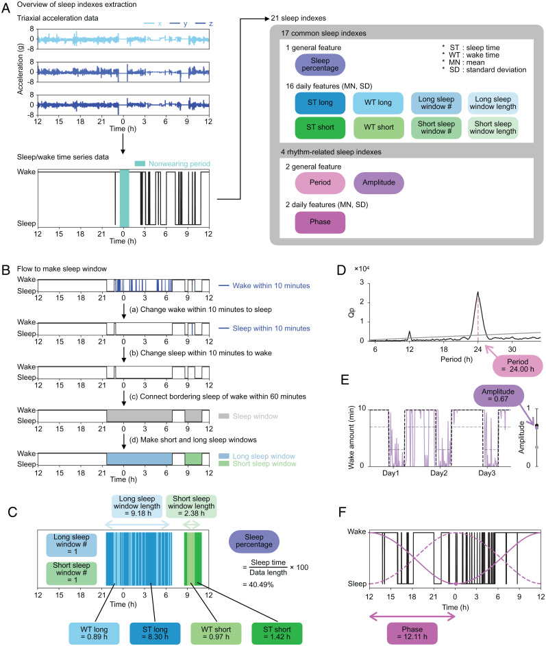
SignificanceHuman sleep phenotypes are diversified by genetic and environmental factors, and a quantitative classification of sleep phenotypes would lead to the advancement of biomedical mechanisms underlying human sleep diversity. To achieve that, a pipeline of data analysis, including a state-of-the-art sleep/wake classification algorithm, the uniform manifold approximation and projection (UMAP) dimension reduction method, and the density-based spatial clustering of applications with noise (DBSCAN) clustering method, was applied to the 100,000-arm acceleration dataset. This revealed 16 clusters, including seven different insomnia-like phenotypes. This kind of quantitative pipeline of sleep analysis is expected to promote data-based diagnosis of sleep disorders and psychiatric disorders that tend to be complicated by sleep disorders.

Keywords: UMAP; clustering; insomnia; sleep; sleep landscape.


Conflict of interest statement

Competing interest statement: M.K., S.S., K.L.O., and H.R.U. have filed a patent application regarding the sleep/wake classification algorithm. H.R.U. is the founder and Chief Technology Officer of ACCELStars Inc.

Figures

Fig. 1.
Fig. 1.
Overview. About 100,000 triaxial acceleration datasets stored in the UK Biobank were converted to the sleep/wake time series data through the sleep/wake classification and the nonwear detection algorithms. The sleep/wake time series data were then converted to 21 sleep indexes. Lastly, the landscape of human sleep phenotypes was classified by clustering methods based on the sleep indexes.
Fig. 2.
Fig. 2.
Sleep index extraction. (A) The overview of sleep indexes extraction. Each set of axial data is shown in the three panels in Upper Left (row 1: x; row 2: y; row 3: z). The sleep/wake time series data are shown in the same format as in Fig. 1. Twenty-one sleep indexes converted from the sleep/wake time series data, including 17 common sleep indexes and four rhythm-related sleep indexes. The sleep indexes, calculated as a single value throughout the measurement period, were named general features (oval icons). From the daily features (rectangle icons), both MN and SD were included in the sleep indexes. (B) The procedures to make the sleep window. We changed epochs of continuous wake or sleep for less than 10 min to sleep or wake, respectively. The sleep window was created by connecting sleep epochs, ignoring waking epochs of 60 min or less. Long sleep windows (blue) and short sleep windows (green) are made based on the length of the sleep window. (C) An example of noon-to-noon data and common sleep indexes calculated for a day. (D) The result of the chi-square periodogram. The black line shows the Qp values (a statistic of chi-square), and the gray line shows 0.01 levels of statistical significance ranging from 5.00 to 35.00 h. The pink dashed line shows the point when the difference between Qp and the significant value is at its maximum, and its value, in this case 24.00 h, is used as the period. (E) The purple line shows wake amount per 10 min. The black and gray dashed lines represent a 24-h periodic square wave signal with 1/3 duty in the range from 0 to 10 min and from 3 to 7 min, respectively. The dots on the right bar show the amplitudes of the three lines that are calculated as the coefficient of variation SD/mean. The purple dot plotted at 0.67 is the amplitude of this example data. (F) The black line shows the sleep/wake time series data. The dashed and solid magenta lines are the van der Pol limit cycles. The dashed line is the curve with the minimum point at noon. The solid line is a fitted curve to the sleep/wake time series data, and the dot is the minimum point of this curve. The duration between the minimum point and the last noon is calculated as the phase: in this case, 12.11 h.
Fig. 3.
Fig. 3.
Distribution of sleep indexes. (A) The flow of data exclusion for large-scale sleep analysis. Nonwearing periods (emerald green) were calculated for noon-to-noon data. The noon-to-noon data with less than 5 h of nonwearing period and continuing more than 3 d were used for the large-scale sleep analysis (black squares). In this schema, data 1 and 4 are included in the large-scale sleep analysis. (B–G), Left shows the distribution of sleep index, with the mean and the fitted curve shown as the solid lines and solid curves, respectively. The stars show the locations of representative plots (lower or upper 2.28 percentiles) shown as double plots in Right, where ST long, WT long, ST short, and WT short are colored the same color as the icons of sleep indexes in Fig. 2A. The sleep epochs outside long and short sleep windows are shown in gray.
Fig. 4.
Fig. 4.
Clustering analysis revealed five clusters. (A) The flow of clustering. (B) The result of t-SNE and DBSCAN. Individual records are divided into many small clusters. (C) The result of UMAP and DBSCAN. Datasets are divided into five clusters named clusters 1 to 5. (D) Heat map of z score. The names of clusters are shown next to their main features. (E) The size of each cluster. The histogram is colored using the same colors as in C. (F–J), Left represents the result of first clustering, where each individual record is colored corresponding to the heatmap of each sleep index. Right shows the histograms of the distribution of each sleep index. The scale of the y axis is the same among clusters and was set based on the range of histogram values. The histogram is colored with the same colors as in C.
Fig. 5.
Fig. 5.
Hierarchical clustering analysis revealed eight clusters. (A) The flow of divisive hierarchical clustering. The same clustering process was repeated three times (SI Appendix). The 17 clusters obtained by divisive hierarchical clustering were regrouped using Ward’s method and named as clusters 1, 2a, 2b, 3a, 3b, 4a, 4b, and 5. (B) Upper shows the result of first-layer clustering, where each individual record was colored by clusters’ colors. The caption summarizes sleep phenotypes of each cluster. Lower Left, Lower Center, and Lower Right are the enlargement figures of clusters 2, 3, and 4, respectively. (C) The size of each cluster. Twenty-seven individual records were detected as noise by DBSCAN. (D–K) The distribution of sleep indexes of (D) clusters 2a and 2b, (G) clusters 3a and 3b, and (J) clusters 4a and 4b and representative plots of (E) cluster 2a, (F) cluster 2b, (H) cluster 3a, (I) cluster 3b, and (K) cluster 4a shown as double plots.
Fig. 6.
Fig. 6.
Clustering analysis of the outlier dataset revealed eight clusters. (A) The flow of data selection for the outlier clustering. Blue marks the lower and upper 2.28 percentiles in six sleep indexes in Center. The individual records with such values colored sky blue are divided as the outlier dataset, while the remaining individual records colored gray are divided as the normal dataset. (B) The result of clustering. The outlier dataset is divided into eight clusters. (C) The size of each cluster. Four hundred fifty-eight individual records were detected as noise by DBSCAN. (D–H) The results of outlier clustering, where each individual record is colored corresponding to the heatmap of each sleep index. (I–P) Representative plots of clusters in the outlier clustering shown as double plots. (Q) The summary of whole clustering and outlier clustering. The radius of each cluster shows the L2 norm between the mean of each cluster and that of whole dataset (the black center point). (R) Sex and age proportions of whole clustering and outlier clustering.

References

    1. Lander E. S., et al. ., Correction: Initial sequencing and analysis of the human genome. Nature 412, 565 (2001). - PubMed
    1. Venter J. C., et al. ., The sequence of the human genome. Science 291, 1304–1351 (2001). - PubMed
    1. Margulies M., et al. ., Genome sequencing in microfabricated high-density picolitre reactors. Nature 437, 376–380 (2005). - PMC - PubMed
    1. Shendure J., et al. ., Accurate multiplex polony sequencing of an evolved bacterial genome. Science 309, 1728–1732 (2005). - PubMed
    1. Vogelstein B., et al. ., Cancer genome landscapes. Science 339, 1546–1558 (2013). - PMC - PubMed