. 2022 Mar;28(3):575-582.
doi: 10.1038/s41591-022-01709-2. Epub 2022 Mar 21.

Deep learning-enabled assessment of cardiac allograft rejection from endomyocardial biopsies

Affiliations

Deep learning-enabled assessment of cardiac allograft rejection from endomyocardial biopsies

Jana Lipkova et al. Nat Med. 2022 Mar.

Abstract

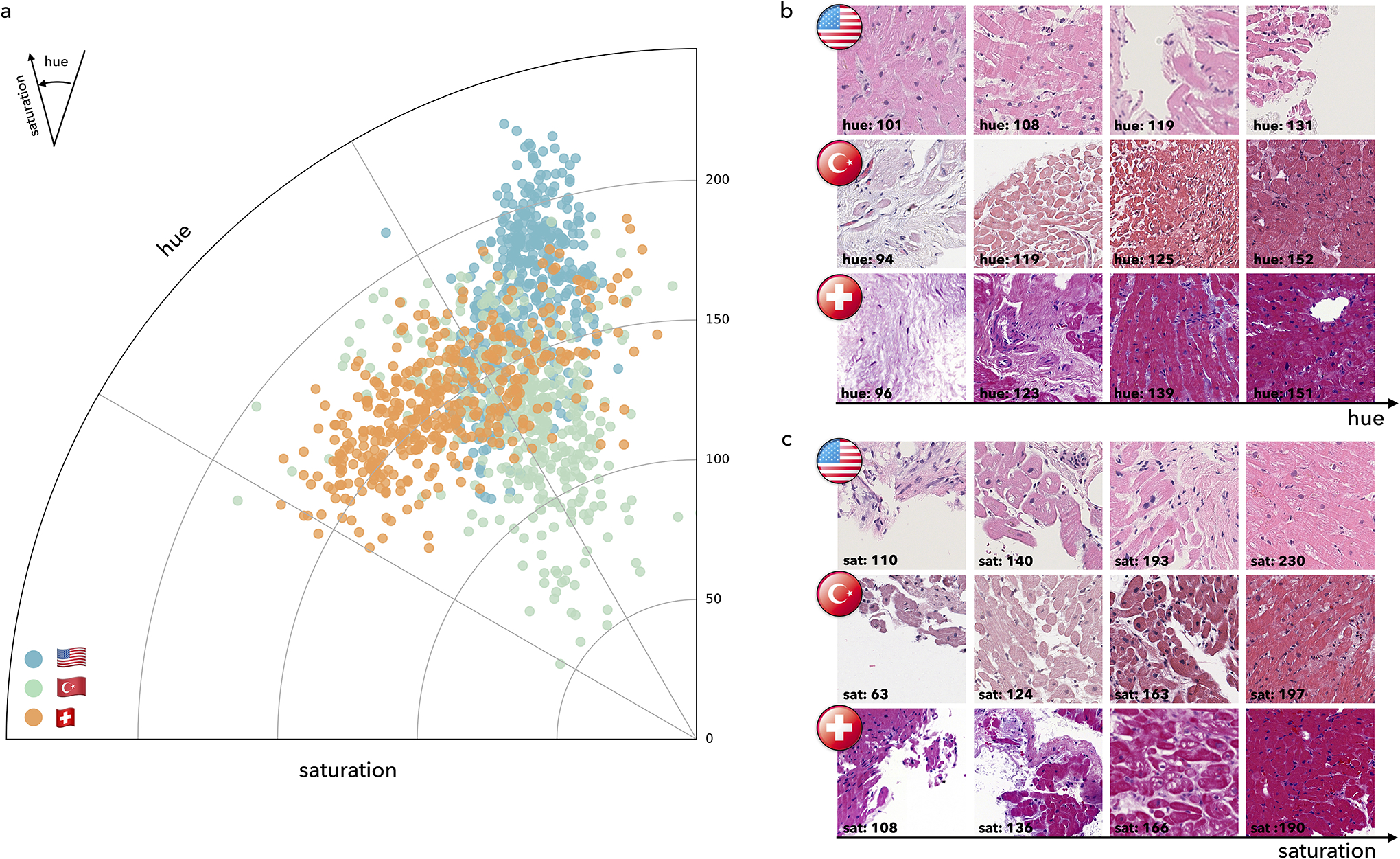
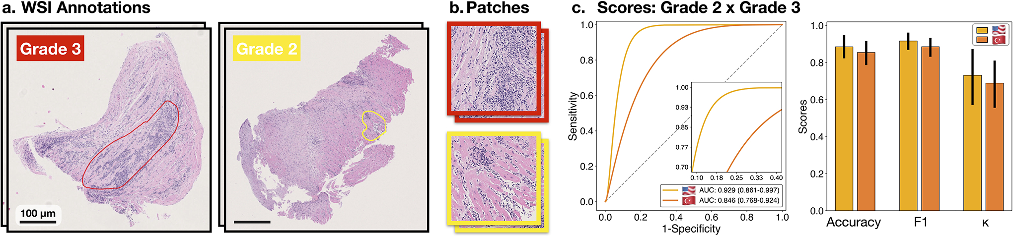
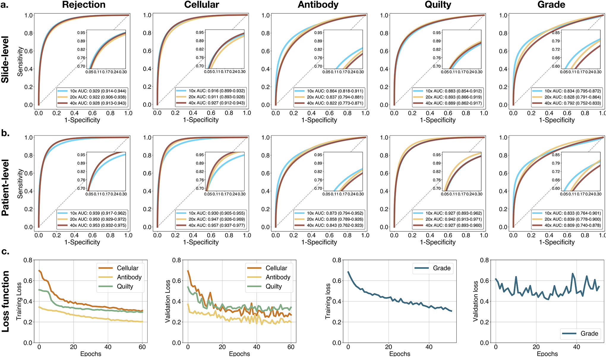
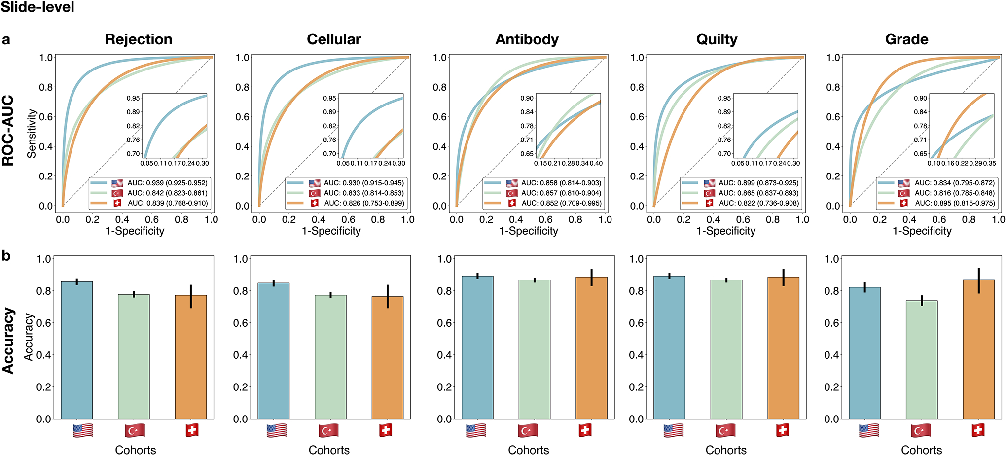
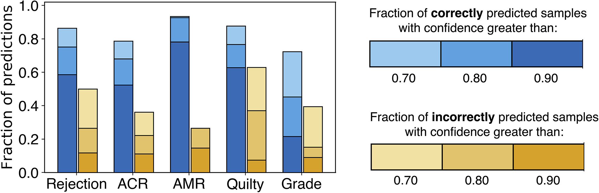
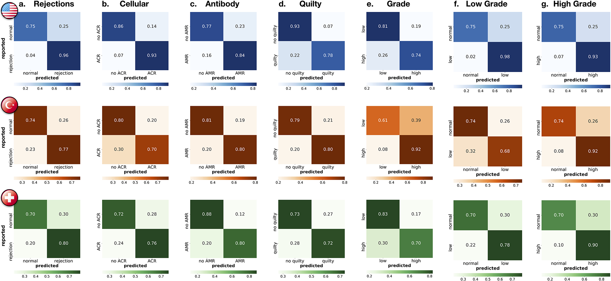
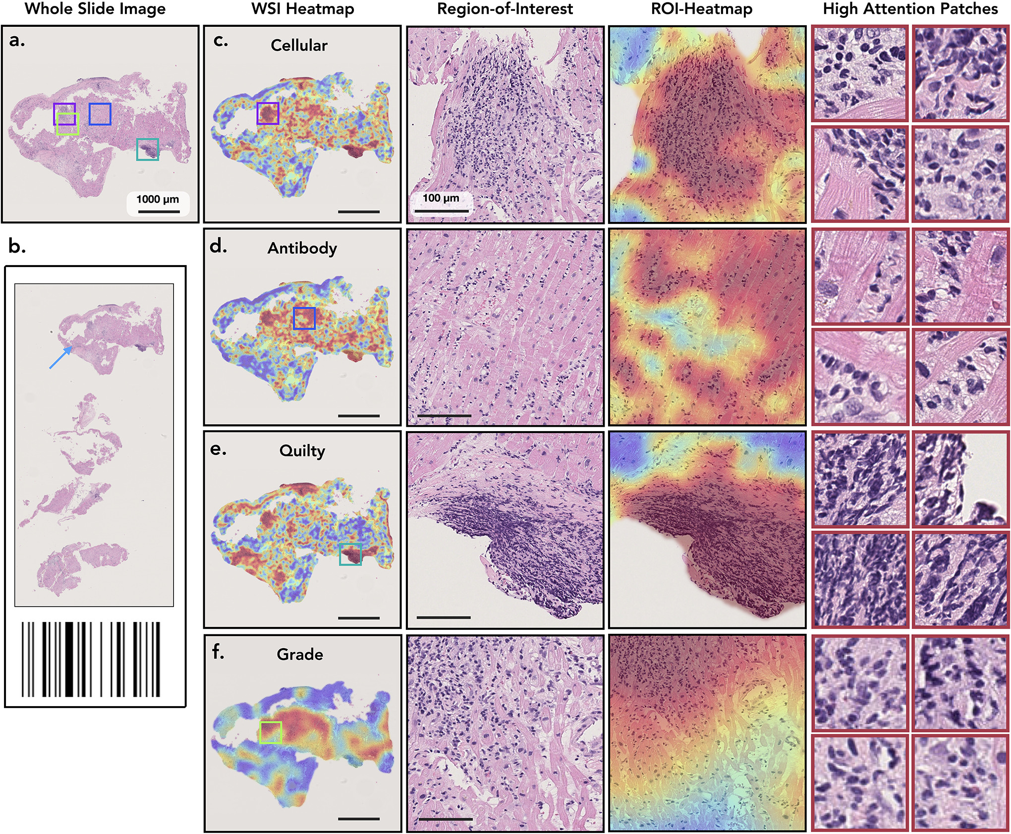
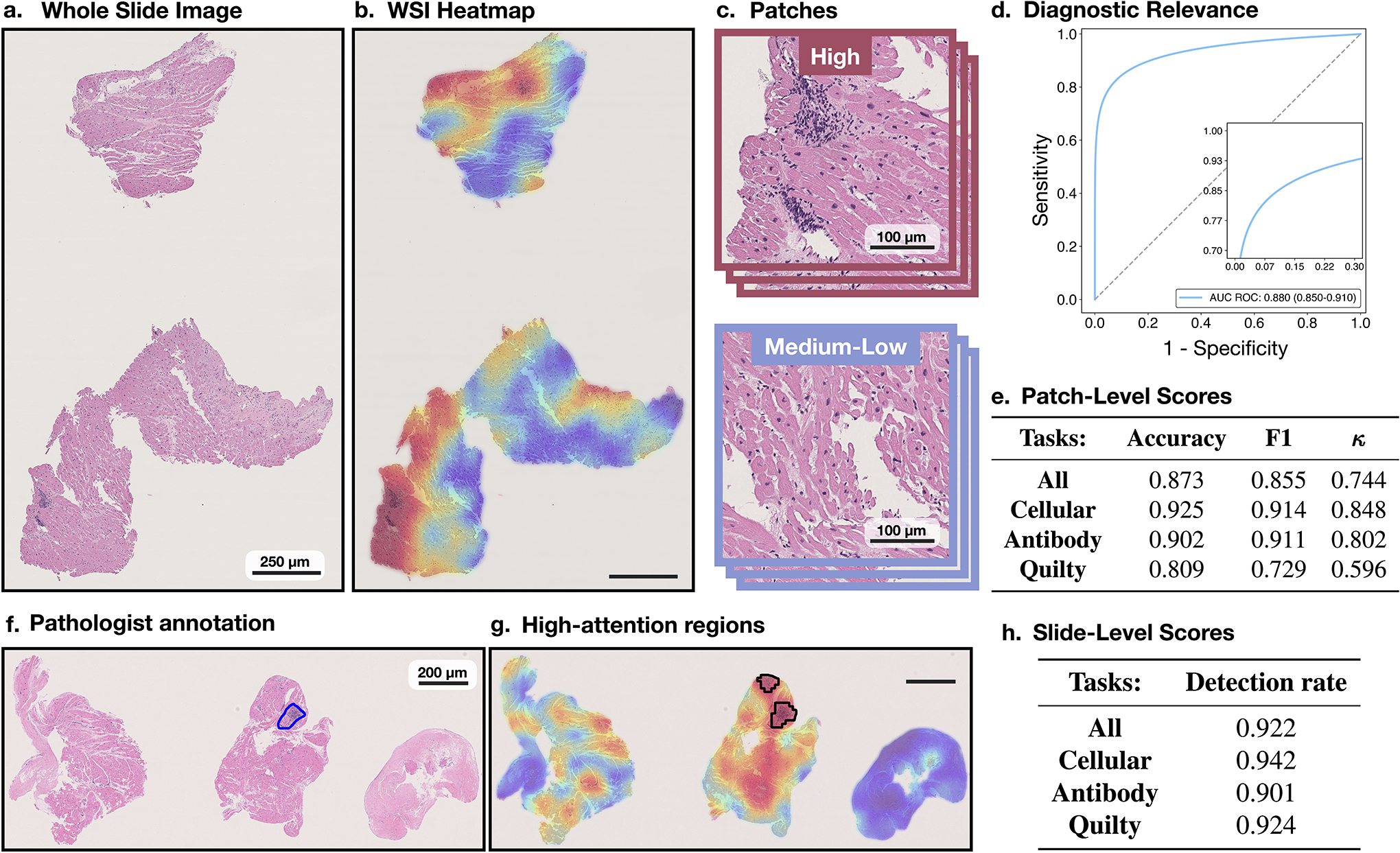
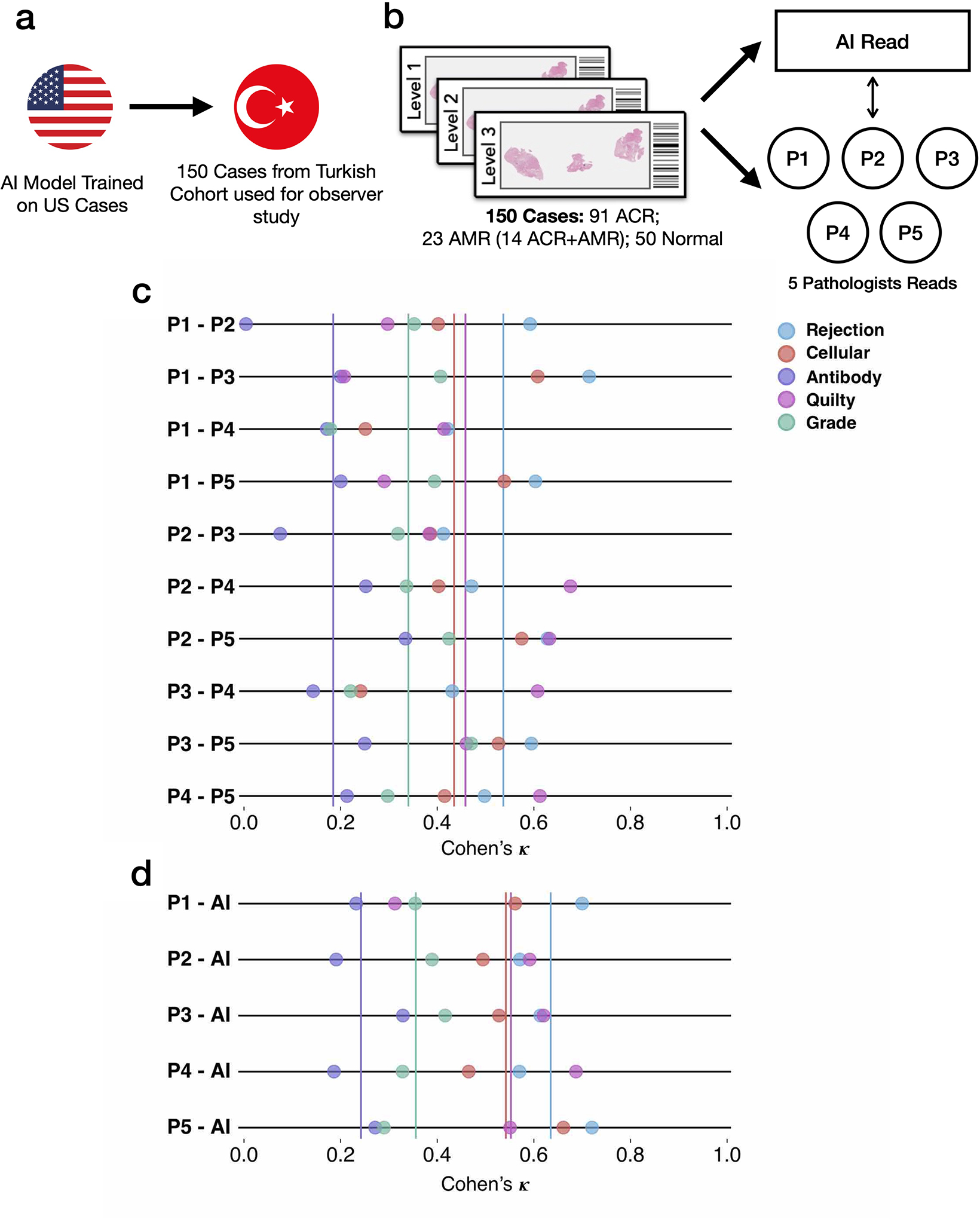
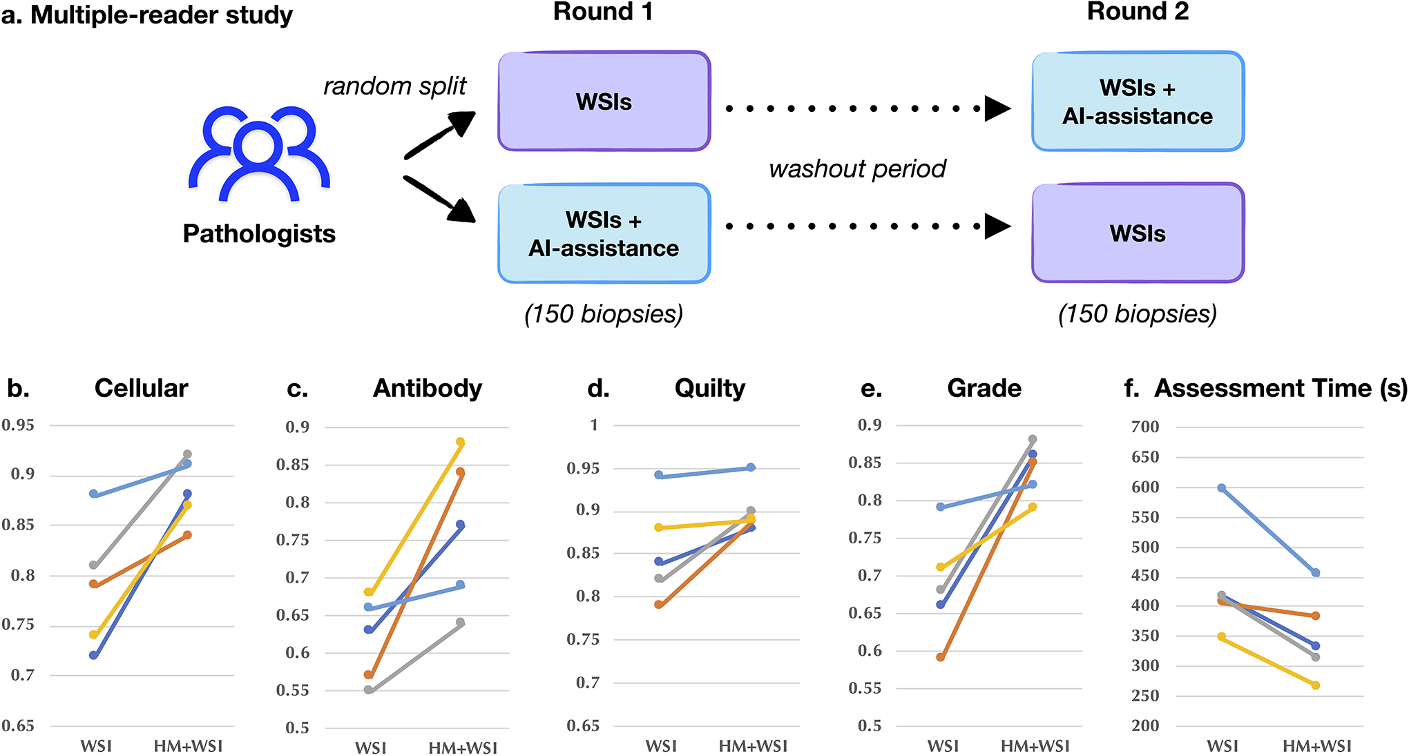
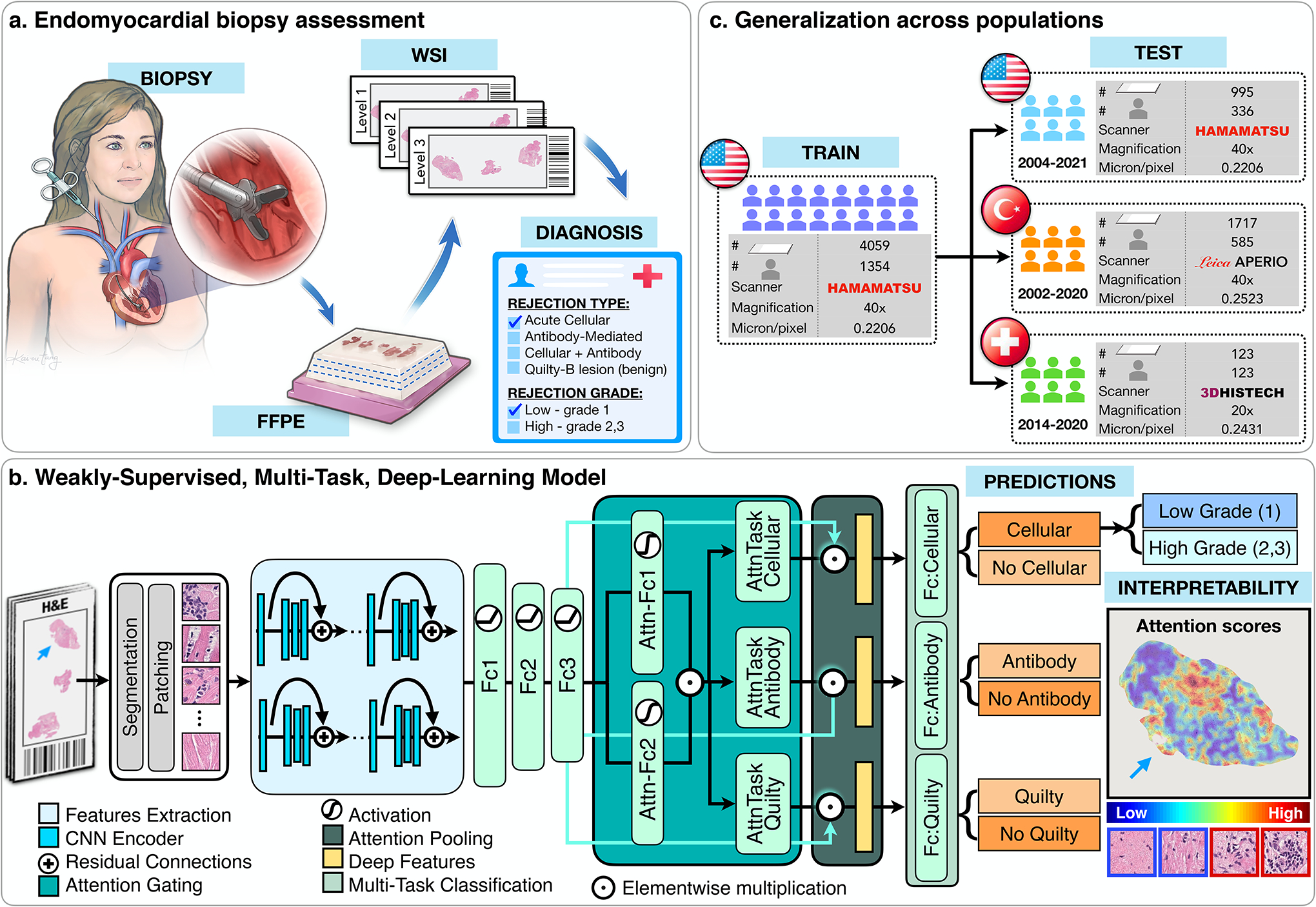
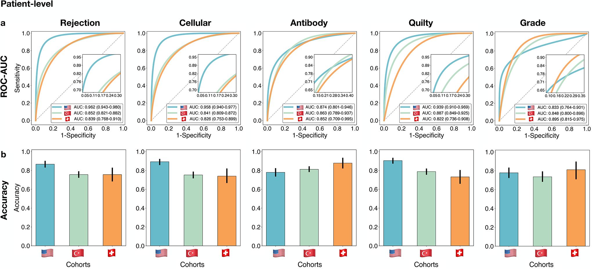
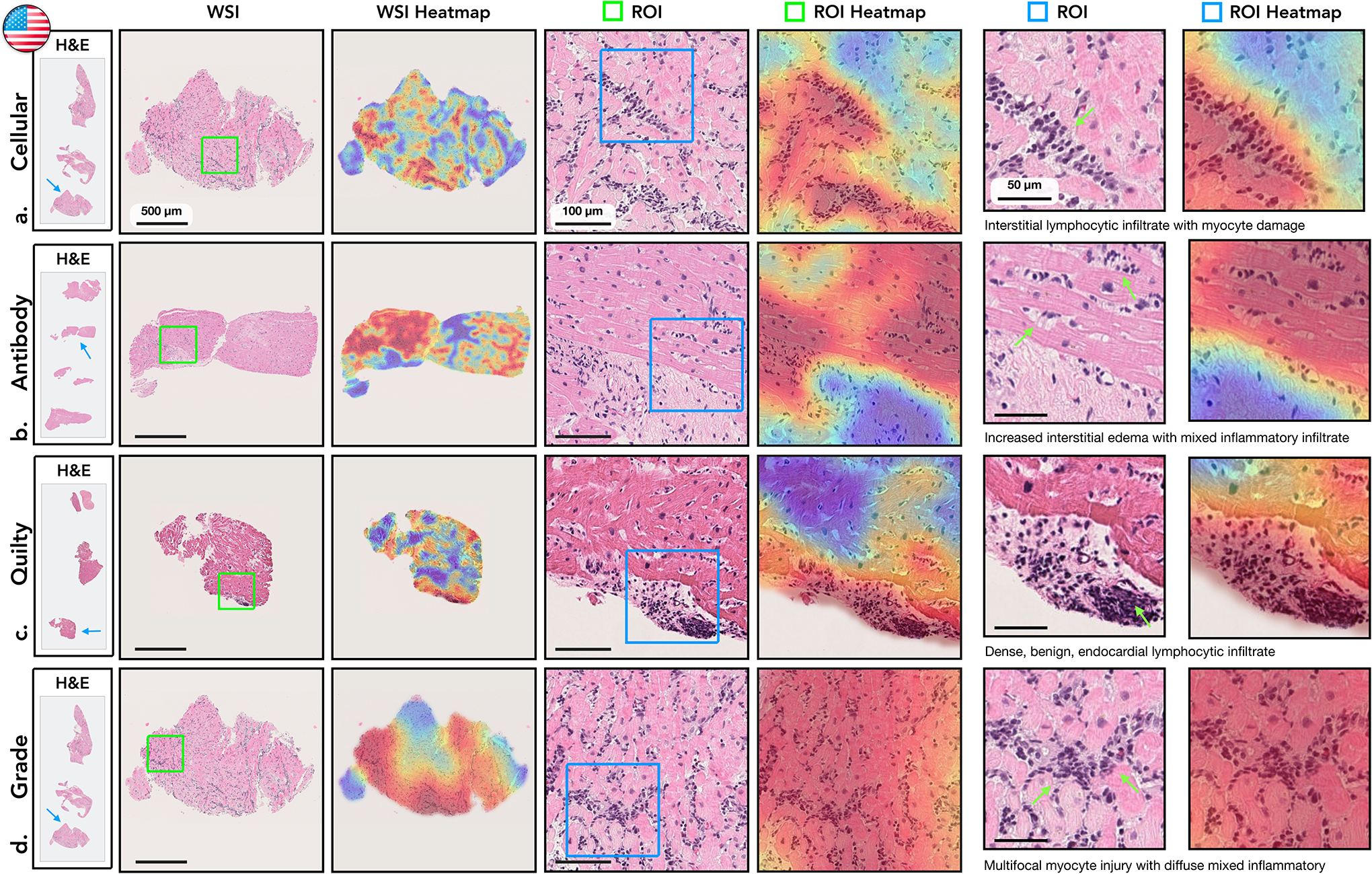
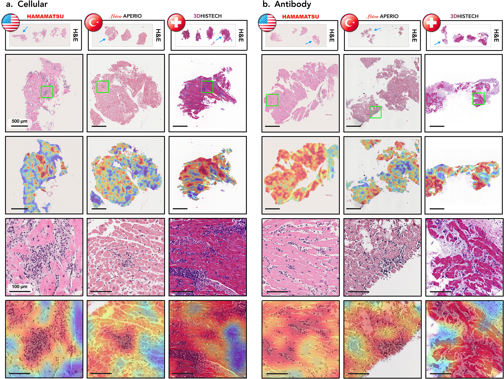
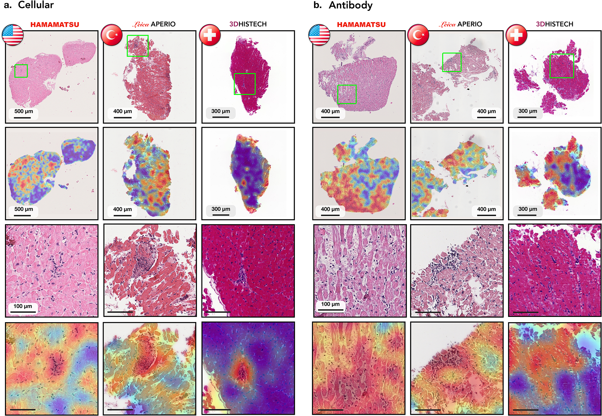
Endomyocardial biopsy (EMB) screening represents the standard of care for detecting allograft rejections after heart transplant. Manual interpretation of EMBs is affected by substantial interobserver and intraobserver variability, which often leads to inappropriate treatment with immunosuppressive drugs, unnecessary follow-up biopsies and poor transplant outcomes. Here we present a deep learning-based artificial intelligence (AI) system for automated assessment of gigapixel whole-slide images obtained from EMBs, which simultaneously addresses detection, subtyping and grading of allograft rejection. To assess model performance, we curated a large dataset from the United States, as well as independent test cohorts from Turkey and Switzerland, which includes large-scale variability across populations, sample preparations and slide scanning instrumentation. The model detects allograft rejection with an area under the receiver operating characteristic curve (AUC) of 0.962; assesses the cellular and antibody-mediated rejection type with AUCs of 0.958 and 0.874, respectively; detects Quilty B lesions, benign mimics of rejection, with an AUC of 0.939; and differentiates between low-grade and high-grade rejections with an AUC of 0.833. In a human reader study, the AI system showed non-inferior performance to conventional assessment and reduced interobserver variability and assessment time. This robust evaluation of cardiac allograft rejection paves the way for clinical trials to establish the efficacy of AI-assisted EMB assessment and its potential for improving heart transplant outcomes.


Conflict of interest statement

Competing Interests

The authors declare no competing financial interests.

Figures

Extended Data Figure 1:
Visualization of color distribution among the three cohorts. a. Polar scatter plot depicts the differences in the train (US) and test (US, Turkish, Swiss) cohorts, each acquired with different scanners and staining protocols. The angle represents the color (i.e. hue) and the polar axis corresponds to the saturation. Each point represents average hue and saturation of an image patch selected from each cohort. To construct the figure, 100 WSIs were randomly selected from each cohort. For each selected slide, 4 patches of size 1024×1024 at ×10 magnification were randomly selected from the segmented tissue regions. A hue–saturation–density color transform is taken to correct for the logarithmic relationship between light intensity and stain amount. The Swiss cohort demonstrates a large variation in both hue and saturation whereas the US and Turkish cohorts have a relatively uniform saturation but variable hue. Examples of patches with diverse hue and saturation from each cohort are shown in subplots b. and c.
Extended Data Figure 2:
Classification of high-grade cellular rejections. A supervised, patch-level classifier is trained to refine the detected high-grade (2 R+ 3 R) cellular rejections into grades 2 and 3. A subplot a. shows manual annotations of the predictive region for each grade as outlined by pathologist. b. Patches extracted from the respective annotation regions serve as input for the binary classifier. Subplot c. shows the model performance at patches extracted from the US (m = 290 patches) and Turkish (m = 131 patches) cohort. Reported are ROC curves with 95% confidence intervals (CIs). The bar plots represent the model accuracy, F1-score, and Cohen’s κ for each cohort. Error bars indicate the 95% CIs while the center is always the computed value of each classification performance metric (specified by its respective axis labels). The slide-level performance is reported in Supplemental Table 6. The Swiss cohort was excluded from the analysis due to the absence of grade 3 rejections.
Extended Data Figure 3:
Model performance at various magnifications. Model performance at different magnifications scales at a. slide-level and b. patient-level. Reported are AUC-ROC curves with 95% CI for 40×, 20× and 10× computed for the US test set (n = 995 WSIs, N = 336 patients). For the rejection detection tasks, the model typically performs better at higher magnification, while the grade predictions benefit from the increased context presented at lower magnifications. To account for the information from different scales, the detection of rejections and Quilty-B lesions is performed from the fusion of the model predictions from all available scales. In comparison, the rejection grade is determined from 10X magnification. c. Model performance during training and validation. Shown is cross-entropy loss for the multi-task model assessing the biopsy state and for the single-task model estimating the rejection grade. Reported is slide-level performance at 40× for the multi-task model, while the grading scores are measured at 10X magnification. The model with the lowest validation loss encountered during the training is used as the final model.
Extended Data Figure 4:
Performance of the CRANE model at slide-level. The CRANE model was evaluated on the test set from the US (n = 995 WSIs, N = 336 patients) and two independent external cohorts from Turkey (n = 1,717, N = 585), and Switzerland (n = 123, N = 123). a. Receiver operating characteristic (ROC) curves for the multi-task classification of EMB and grading at the slide-level. The area under the ROC curve (AUC) scores are reported together with the 95% CIs. b. The bar plots reflect the model accuracy for each task. Error bars (marked by the black lines) indicate 95% CIs while the center is always the computed value for each cohort (specified by the respective axis labels). The results suggest the ability of the CRANE model to generalize across diverse populations, and different scanners and staining protocols, without any domain-specific adaptations. Clinical deployment might benefit from the model’s fine-tuning with the local data and scanners.
Extended Data Figure 5:
Confidence of model’s predictions. The model robustness can be measured through the confidence of the predictions. The models that suffer from overfitting usually reach high performance on the training dataset by memorizing the specifics of the training data rather than learning the task at hand. As a consequence, such models result in incorrect but highly confident predictions during the deployment. The bar plots show the fraction of model predictions achieved with high confidence, for both correctly (blue) and incorrectly (yellow) estimated patient cases. The fraction of highly confident correctly predicted samples is consistently higher than the fraction of confident incorrect predictions across all the tasks. These results indicate the robustness of the model predictions for all tasks.
Extended Data Figure 6:
Patient-level performance for all prediction tasks. Reported are confusion matrices for a. rejection detection (including both ACR and AMR), detection of b. ACRs, c. AMRs, d. Quilty-B lesions, and e. discrimination between low (grade 1) and high (grade 2 + 3) rejections. To assess the model’s ability to detect rejections of different grades, subplots f. shows the distinction between normal cases and low-grade rejections, while g. reports distinction between normal cases and high-grade rejections. In both external cohorts, the model reached higher performance for detecting the more clinically relevant high-grade rejections, whereas in the internal cohort the performance is comparable for both low and high-grade cases. The rows of the confusion matrices show the model predictions and the columns represent the diagnosis reported in the patient’s records. The prediction cut-off for each task was computed from the validation set. For the clinical deployment, the cut-off can be modified and fine-tuned with the local data to meet the desirable false-negative rate. The performance is demonstrated on the US hold-out test set (N = 336 patients with 155 normal cases,181 rejections, 161 ACRs, 31 AMRs, 65 Quilty-B lesions, 113 low-grade, and 68 high-grade), Turkey (585 patients with 308 normal cases, 277 rejections, 271 ACRs, 16 AMRs, 74 Quilty-B lesions, 166 low-grade, and 111 high-grade) and Swiss (N = 123 patients with 54 normal cases, 69 rejections, 66 ACRs, 10 AMRs,18 Quilty-B lesions, 59 low-grade and 10 high-grade). Details on each cohort are reported in Supplemental Table 1.
Extended Data Figure 7:
Analysis of case with concurrent cellular, antibody-mediated rejection, and Quilty-B lesions. a-b. The selected biopsy region and the corresponding H&E stained WSI. Attention heatmaps are computed for each task (c,d,e) and the grade (f). For the cellular task (c.), the high-attention regions correctly identified diffuse, multi-focal interstitial inflammatory infiltrate, predominantly comprised of lymphocytes, and associated myocyte injury. For the antibody heatmap (d.), the high-attention regions identified interstitial edema, endothelial swelling, and mild inflammation, consisting of lymphocytes and macrophages. For the Quilty-B heatmap (e.), the high-attention regions highlighted a focal, dense collection of lymphocytes within the endocardium, with mild crush artifact. For the grade (f.), the high-attention regions identified areas with diffuse, interstitial lymphocytic infiltrate with associated myocyte injury, corresponding to high grade cellular rejection. The high-attention regions for both types of rejection and Quilty-B lesions appear similar at the slide level at low power magnification, since all three tasks assign high-attention to regions with atypical myocardial tissue. However, at higher magnification, the highest attention in each task comes from regions with the task-specific morphology. The image patches with the highest attention scores from each task are shown in the last column. This example also illustrates the potential of CRANE to discriminate between ACR and similarly appearing Quilty-B lesions.
Extended Data Figure 8:
Quantitative assessment of attention heatmaps’ interpretability. While the attention scores provide only relative importance of each biopsy regions for the model predictions, we attempted to quantify their relevance for diagnostic interpretability at patch- and slide-level. From the internal test set, we randomly selected 30 slides from each diagnosis and computed the attention heatmaps for each task (a-b,f-g).For the patch-level assessment, we selected 3 non-overlapping patches from the highest attention region in each slide. Since the regions with the lowest attention scores often include just a small fraction of tissue, we randomly selected 3 non-overlapping patches from the regions with medium-to-low attentions (i.e. attention scores<0.5). We randomly remove 5% of the patches to prevent pathologist from providing an equal amount of diagnoses, resulting in a total of 513 patches. A pathologist evaluated each patch as relevant or non-relevant for the given diagnosis. The pathologist’s scores are compared against the model predictions of diagnostically relevant (high-attention) vs non-relevant (medium-to-low attention) patches. The subplot shows AUC-ROC scores across all patches, using the normalized attention scores as the probability estimates. The accuracy, F1-score, and Cohen’s κ, computed for all patches and for the specific diagnoses, are reported in e. These results suggest a high agreement between the model and pathologist’s interpretation of diagnostically relevant regions. For the slide-level assessment, we compare concordance in the predictive regions used by the model and pathologists. A pathologist annotated in each slide the most relevant biopsy region(s) for the given diagnosis f. The regions with the top 10% highest attentions scores in each slide are used to determine the most relevant regions used by the model g. These are compared against the pathologist’s annotations. The detection rate for all slides, and the individual diagnosis, are reported in h. Although the model did not use any pixel-level annotations during training these results imply relatively high concordance in the predictive regions used by the model and pathologist. It should be noted that the attention heatmaps are always normalized and not absolute, hence, the highest attended region is considered for the analysis similar to 17.
Extended Data Figure 9:
Inter-observer variability analysis. The design of the reader study is depicted in a-b. The subplot c. shows the agreement between each pair of pathologists, while the agreement between the AI model and each pathologist is shown in d. The average agreement for each task is plotted as a vertical solid line. The analysis was performed on a random subset of 150 cases randomly selected from the Turkey test cohort: 91 ACR, 23 AMR cases (including 14 concurrent ACR and AMR cases) and 50 normal biopsies. The AI model was trained on the US cohort. For evaluation purposes, the pathologists assessed each case using the H&E slides only. It should be noted that the assessment presented here is based on Cohen’s κ and is not the absolute agreement. Cohen’s κ is a metric which runs between −1 and 1 and takes into account agreement by chance.
Extended Data Figure 10:
AI-assisted biopsy assessment. An independent reader study was conducted to assess the potential of the CRANE to serve as an assisting diagnostic tool. Subplot a. illustrates the study design. A panel of five cardiac pathologists from an independent center was asked to assess 150 EMBs randomly selected from the Turkey cohort, the same set of slides as used for the assessment of interobserver variability presented in Extended Data Fig. 9. The pathologists were randomly split into two groups. In the first round, the readers from the first group used WSIs only, while the readers from the second group also received assistance from the CRANE in the form of attention heatmaps (HMs) plotted on the top of H&E slides. Following a washout period, the pathologists repeated the task. In the second round, the readers from the first group received WSIs and AI assistance, while the second group used WSIs only. Subplots b-e. report accuracy and assessment time (f.) of the readers without and with AI assistance marked as (WSI) and (HM + WSI), respectively. The ground truth labels were constructed based on the pathologists’ consensus from the reader-study presented in Extended Data Fig. 9. The ability of the CRANE to mark diagnostically relevant regions has increased the accuracy of manual biopsy assessment for all tasks and all readers, as well as reduce the assessment time. These results support the feasibility of CRANE in reducing the interobserver variability and increasing the efficiency of manual biopsy reads.
Figure 1:
Figure 1:. Cardiac Rejection Assessment Neural Estimator (CRANE) workflow.
a. Fragments of endomyocardial tissue are formalin fixed and paraffin embedded (FFPE). Each paraffin block is cut into slides with three consecutive levels and stained with H&E. Each slide is digitized and served as an input for the model. b. CRANE first segments tissue regions in the WSI and patches them into smaller sections. Pretrained encoder was used to extract features from the image patches, which are further fine-tuned through a set of three fully-connected layers, marked as Fc1, Fc2, and Fc3. A weakly supervised multi-task, multi-label network was constructed to simultaneously identify normal tissue and different rejection conditions (cellular, antibody, and/or Quilty-B lesions). The attention scores, reflecting relevance of each image region towards the model prediction, can be visualized in the form of whole-slide attention heatmaps. c. The model was trained on the USA cohort, using 70% cases for training and 10% for validation and model selection. Evaluation of the model was conducted on the internal USA dataset using the remaining held-out 20% cases and two external cohorts from Turkey, and Switzerland. Detailed breakdown of these datasets is presented in Supplemental Table 1.
Figure 2:
Figure 2:. Performance of the CRANE model at patient-level.
The CRANE model was evaluated on the test set from the USA (n=995 WSIs, N=336 patients) and two independent external cohorts from Turkey (n=1,717, N=585), and Switzerland (n=123, N=123). a. Receiver operating characteristic (ROC) curves for the multitask classification of EMB evaluation and grading at the patient-level. The area under the ROC curve (AUC) is reported together with the 95% confidence intervals (CIs) for each cohort. b. The bar plots reflect the model accuracy for each task. Error bars (marked by the black lines) indicate 95% CIs and the center is always the computed value for each cohort (specified by the respective axis labels).
Figure 3:
Figure 3:. Visualisation of the attention heatmaps.
Sample of WSIs of EMBs with different diagnosis are shown in the first column. The second column displays a closer view to the cardiac tissue samples marked by blue arrows in the first column. An attention heatmap corresponding to each slide was generated by computing the attention scores for each predicted diagnosis (third column). A zoom-in-view of the regions of interest (ROIs) marked by green squares in the second column are shown in fourth column, while the corresponding attention heatmaps are displayed in the fifth column. The last two columns depict a zoom-in-view of the ROIs marked by the blue square together with the corresponding attention heatmap. Green arrows highlight specific morphology corresponding to the textual description. The colormap of the attention heatmaps range from red (high-attention) to blue (low-attention). a. Cellular Rejection. The highest attention scores identified regions with increased interstitial lymphocytic infiltrates and associated myocyte injury, while the adjacent, lower attention scores identified healthier myocytes without injury. b. Antibody-Mediated Rejection. The highest attention scores determined regions with edema within the interstitial spaces in addition to increased mixed inflammatory infiltrate, comprised of eosinophils, neutrophils, and lymphocytes. The adjacent lower attention scores identified background fibrosis, stroma, and healthier myocytes. c. Quilty-B Lesion. The highest attention scores distinguished a single, benign focus lymphocytes within the endocardium, without injury or damage to the myocardium. The lower attention scores correspond to background and healthy myocytes. d. Cellular Grade. The highest attentions identified diffuse, prominent interstitial lymphocytic infiltrates with associated myocyte injury, representing severe rejection. The lower attention regions identified background fibrosis and unaffected, healthier myocytes.
Figure 4:
Figure 4:. Analysis of attention-heatmaps in the three independent test cohorts.
Displayed are cases with cellular (a.) and antibody-mediated rejections (b.) sourced from three cohorts: US (left columns), Turkish (middle columns), and Swiss (right columns). The types of scanners used for each cohort are indicated. The first row depicts WSIs from corresponding center, while the second row shows closer views on cardiac tissue samples marked by the blue arrows in the first row. The corresponding attention heatmaps are depicted in the third row. The colormap of the attention heatmaps range from red (high-attention) to blue (low-attention). The last two rows show a zoom-in-view of ROIs marked by the green squares in the second row along with the corresponding attention heatmaps.
Figure 5:
Figure 5:. Analysis of failure cases using attention heatmaps in the three independent test cohorts.
Displayed are cases with cellular (a.) and antibody mediated rejections (b.) which were incorrectly identified as normal by the model. Results are shown for the US (left columns), Turkish (middle columns), and Swiss (right columns) cohorts. The types of scanners used for each cohort are indicated. The WSIs from each center and the corresponding attention heatmap are shown in the first and the second row, respectively. The third row shows zoom-in-views in the ROIs marked by the green squares, while the accompanying attention heatmaps are shown in the last row.

Similar articles

Cited by

References

    1. Ziaeian Boback and Fonarow Gregg C. “Epidemiology and aetiology of heart failure”. In: Nature Reviews Cardiology 13.6 (2016), pp. 368–378. - PMC - PubMed
    1. Benjamin Emelia J et al. “Forecasting the future of cardiovascular disease in the United States: a policy statement from the American Heart Association.” In: Circulation 137.12 (2018), e67–e492. - PubMed
    1. Badoe Nina and Shah Palak. “History of Heart Transplant”. In: Contemporary Heart Transplantation (2020), pp. 3–12.
    1. Orrego Carlos M et al. “Usefulness of routine surveillance endomyocardial biopsy 6 months after heart transplantation”. In: The Journal of heart and lung transplantation 31.8 (2012), pp. 845–849. - PubMed
    1. Lund Lars H et al. “The Registry of the International Society for Heart and Lung Transplantation: thirtyfourth adult heart transplantation report—2017; focus theme: allograft ischemic time”. In: The Journal of Heart and Lung Transplantation 36.10 (2017), pp. 1037–1046. - PubMed

Publication types