Interpolation of Point Prevalence Rate of the Highly Pathogenic Avian Influenza Subtype H5N8 Second Phase Epidemic in South Korea
- PMID: 35324867
- PMCID: PMC8954420
- DOI: 10.3390/vetsci9030139
Interpolation of Point Prevalence Rate of the Highly Pathogenic Avian Influenza Subtype H5N8 Second Phase Epidemic in South Korea
Abstract
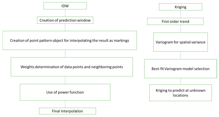
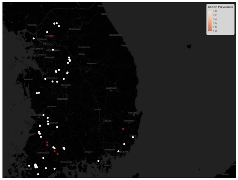
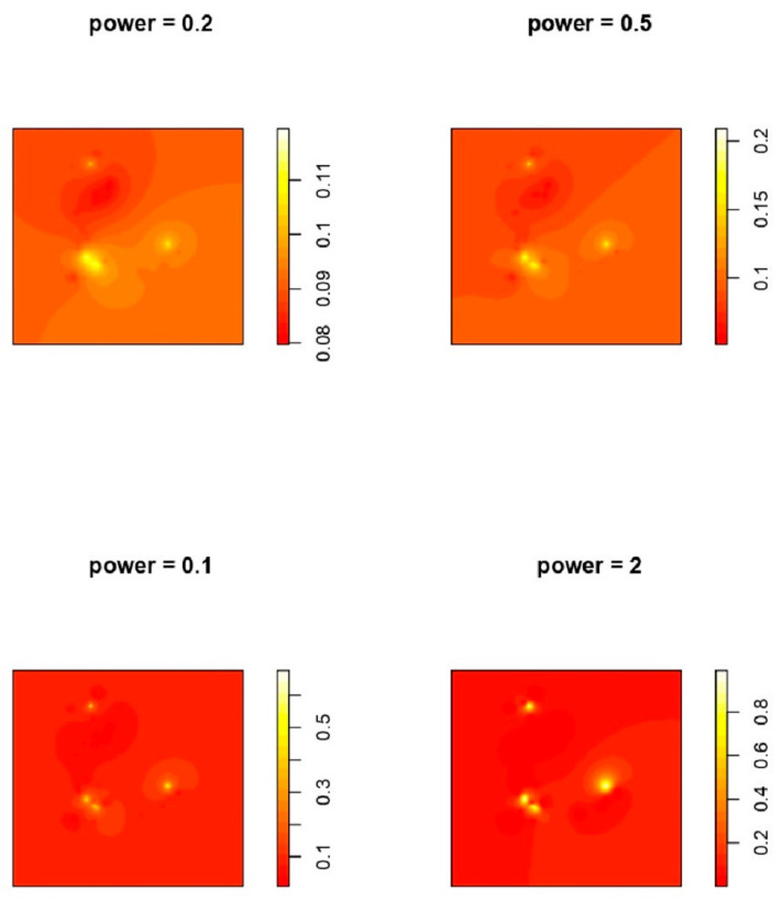
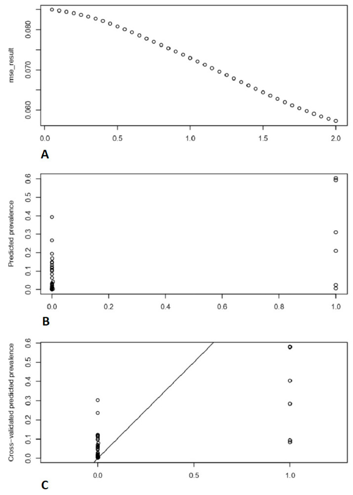
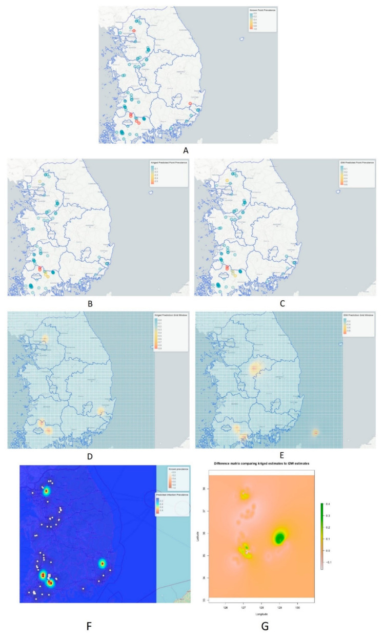
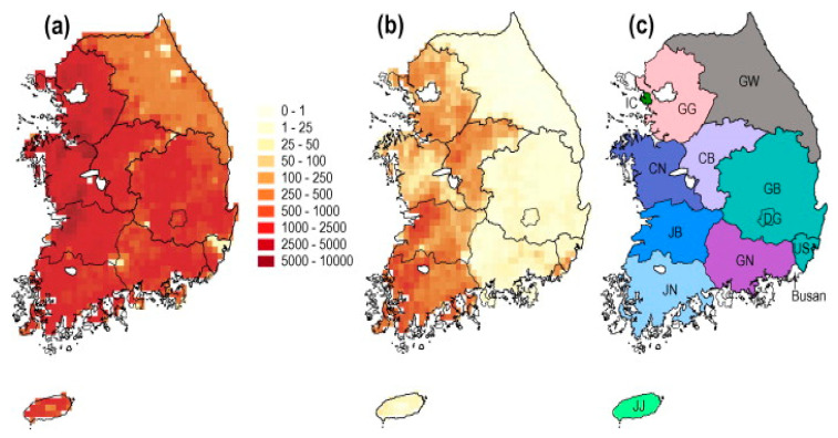
Humans and animals are both susceptible to highly pathogenic avian influenza (HPAI) viruses. In the future, HPAI has the potential to be a source of zoonoses and pandemic disease drivers. It is necessary to identify areas of high risk that are more vulnerable to HPAI infections. In this study, we applied unbiased predictions based on known information to find points of localities with a high probability of point prevalence rate. To carry out such predictions, we utilized the inverse distance weighting (IDW) and kriging method, with the help of the R statistical computing program. The provinces of Jeollanam-do, Gyeonggi-do, Chungcheongbuk-do and Ulsan have high anticipated risk. This research might aid in the management of avian influenza threats associated with various potential risks.
Keywords: highly pathogenic avian influenza; inverse distance weighting; kriging; predictions; prevalence.
Conflict of interest statement
The authors do not have any conflict of interest to declare.
Figures
Similar articles
-
Spatial Variation in Risk for Highly Pathogenic Avian Influenza Subtype H5N6 Viral Infections in South Korea: Poultry Population-Based Case-Control Study.Vet Sci. 2022 Mar 15;9(3):135. doi: 10.3390/vetsci9030135. Vet Sci. 2022. PMID: 35324863 Free PMC article.
-
Spatiotemporal Dynamics of Highly Pathogenic Avian Influenza Subtype H5N8 in Poultry Farms, South Korea.Viruses. 2021 Feb 10;13(2):274. doi: 10.3390/v13020274. Viruses. 2021. PMID: 33579009 Free PMC article.
-
Highly Pathogenic and Low Pathogenic Avian Influenza H5 Subtype Viruses in Wild Birds in Ukraine.Avian Dis. 2019 Mar 1;63(sp1):235-245. doi: 10.1637/11880-042718.1. Avian Dis. 2019. PMID: 31713401
-
The genetics of highly pathogenic avian influenza viruses of subtype H5 in Germany, 2006-2020.Transbound Emerg Dis. 2021 May;68(3):1136-1150. doi: 10.1111/tbed.13843. Epub 2020 Sep 29. Transbound Emerg Dis. 2021. PMID: 32964686 Review.
-
Evolution, global spread, and pathogenicity of highly pathogenic avian influenza H5Nx clade 2.3.4.4.J Vet Sci. 2017 Aug 31;18(S1):269-280. doi: 10.4142/jvs.2017.18.S1.269. J Vet Sci. 2017. PMID: 28859267 Free PMC article. Review.
Cited by
-
Development of an Effective Oral Vaccine Dissemination Strategy against Classical Swine Fever for Wild Boar in Gifu Prefecture, Japan.Transbound Emerg Dis. 2023 Feb 22;2023:9484441. doi: 10.1155/2023/9484441. eCollection 2023. Transbound Emerg Dis. 2023. PMID: 40303696 Free PMC article.
References
-
- Moriguchi S., Onuma M., Goka K. Potential risk map for avian influenza A virus invading Japan. Divers. Distrib. 2012;1:78–85. doi: 10.1111/ddi.12006. - DOI
-
- Lever C. The Mandarin Duck. Bloomsbury Publishing; London, UK: 2013.
-
- Kwon J.-H., Lee D.-H., Swayne D., Noh J.-Y., Yuk S.-S., Erdene-Ochir T.-O., Hong W.-T., Jeong J.-H., Jeong S., Gwon G.-B., et al. Highly Pathogenic Avian Influenza A(H5N8) Viruses Reintroduced into South Korea by Migratory Waterfowl, 2014–2015. Emerg. Infect. Dis. 2016;22:507–510. doi: 10.3201/eid2203.151006. - DOI - PMC - PubMed
LinkOut - more resources
Full Text Sources