. 2022 Mar 11;11(6):745.
doi: 10.3390/plants11060745.

GXP: Analyze and Plot Plant Omics Data in Web Browsers

Affiliations

GXP: Analyze and Plot Plant Omics Data in Web Browsers

Constantin Eiteneuer et al. Plants (Basel). .

Abstract

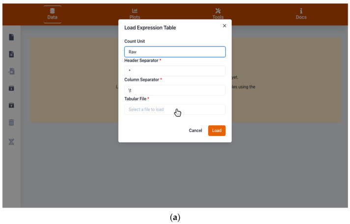
Next-generation sequencing and metabolomics have become very cost and work efficient and are integrated into an ever-growing number of life science research projects. Typically, established software pipelines analyze raw data and produce quantitative data informing about gene expression or concentrations of metabolites. These results need to be visualized and further analyzed in order to support scientific hypothesis building and identification of underlying biological patterns. Some of these tools already exist, but require installation or manual programming. We developed "Gene Expression Plotter" (GXP), an RNAseq and Metabolomics data visualization and analysis tool entirely running in the user's web browser, thus not needing any custom installation, manual programming or uploading of confidential data to third party servers. Consequently, upon receiving the bioinformatic raw data analysis of RNAseq or other omics results, GXP immediately enables the user to interact with the data according to biological questions by performing knowledge-driven, in-depth data analyses and candidate identification via visualization and data exploration. Thereby, GXP can support and accelerate complex interdisciplinary omics projects and downstream analyses. GXP offers an easy way to publish data, plots, and analysis results either as a simple exported file or as a custom website. GXP is freely available on GitHub (see introduction).

Keywords: Mapman; Mercator; RNA sequencing; cluster analysis; correlation; data visualization; metabolomics; overrepresentation analysis; principal component analysis; scientific plotting.


Conflict of interest statement

The authors declare no conflict of interest.

Figures

Figure 1
Figure 1
Screenshot images of Gene Expression Plotter (GXP) showing interfaces for data input. (a) shows the quantitative data table file import form, triggered by the first document button in the upper left panel. This form is used to load a quantification table such as the one shown in (b). (c) shows the transcript information table file import form, triggered by the second document icon in the left panel. This form is used to load an optional information table (see Section 1) like the one shown in (d). After successful import, the user can search for genes or their annotations in the “gene browser” (helix icon on the lower left panel). In the shown example, the user searched for “chalcone synthase”, a polyketide synthase involved in flavonoid biosynthesis. In (e) the user now inspects this gene’s expression quantifications (highlighted foreground) and additional information such as the logarithmic fold changes of gene expression assessed for various comparisons of control and stress treatments (lightly faded out background). Furthermore, as shown in (f), by using the GXP export function triggered by the fifth, upward arrow on the box icon in the left panel, GXP enables the user to save the current state, i.e., all imported data, generated plots, and analysis results for later continuation or to share it with other researchers.
Figure 1
Figure 1
Screenshot images of Gene Expression Plotter (GXP) showing interfaces for data input. (a) shows the quantitative data table file import form, triggered by the first document button in the upper left panel. This form is used to load a quantification table such as the one shown in (b). (c) shows the transcript information table file import form, triggered by the second document icon in the left panel. This form is used to load an optional information table (see Section 1) like the one shown in (d). After successful import, the user can search for genes or their annotations in the “gene browser” (helix icon on the lower left panel). In the shown example, the user searched for “chalcone synthase”, a polyketide synthase involved in flavonoid biosynthesis. In (e) the user now inspects this gene’s expression quantifications (highlighted foreground) and additional information such as the logarithmic fold changes of gene expression assessed for various comparisons of control and stress treatments (lightly faded out background). Furthermore, as shown in (f), by using the GXP export function triggered by the fifth, upward arrow on the box icon in the left panel, GXP enables the user to save the current state, i.e., all imported data, generated plots, and analysis results for later continuation or to share it with other researchers.
Figure 2
Figure 2
Screenshots of plots visualizing and comparing quantified gene expression between different treatments, experimental conditions, and genes: (a) bar plot, (b) individual lines plot and (c) stacked lines plot, are different modes of how Gene Expression Plotter (GXP) visualizes the expression profile of the example gene Solyc05g053550.3.1 (CHALCONE SYNTHASE). The three plots highlight how the expression of the example CHALCONE SYNTHASE responds to the experimental conditions. This CHALCONE SYNTHASE’s expression is up-regulated in S. lycopersicum but conversely not in S. pennellii following stress treatments of nitrogen deficiency (N-) and in combination with chilling temperatures (cold) and elevated light intensity (eL). Plot (d) compares the genetic response of this CHALCONE SYNTHASE with another gene of interest Solyc08g075570.4.1 (UREA PROTON SYMPORTER). In contrast to the expression of CHALCONE SYNTHASE, gene expression of the UREA PROTON SYMPORTER is relatively low in both S. pennellii and S. lycopersicum.
Figure 2
Figure 2
Screenshots of plots visualizing and comparing quantified gene expression between different treatments, experimental conditions, and genes: (a) bar plot, (b) individual lines plot and (c) stacked lines plot, are different modes of how Gene Expression Plotter (GXP) visualizes the expression profile of the example gene Solyc05g053550.3.1 (CHALCONE SYNTHASE). The three plots highlight how the expression of the example CHALCONE SYNTHASE responds to the experimental conditions. This CHALCONE SYNTHASE’s expression is up-regulated in S. lycopersicum but conversely not in S. pennellii following stress treatments of nitrogen deficiency (N-) and in combination with chilling temperatures (cold) and elevated light intensity (eL). Plot (d) compares the genetic response of this CHALCONE SYNTHASE with another gene of interest Solyc08g075570.4.1 (UREA PROTON SYMPORTER). In contrast to the expression of CHALCONE SYNTHASE, gene expression of the UREA PROTON SYMPORTER is relatively low in both S. pennellii and S. lycopersicum.
Figure 3
Figure 3
Screenshots of plots investigating likeliness of gene expression assessed in different biological replicates. Plot (a) shows the result of correlation-based hierarchical clustering in the form of a dendrogram and a correlation heatmap. In the top left corner, a scale color-codes the calculated correlation coefficients. In the top middle, the dendrogram represents the result of hierarchical clustering of all loaded biological replicates. In this example, the plot informs the user of their choice to z-transform the data before the calculation of correlation (lower left corner). Upon hovering with the mouse over single cells of the correlation matrix, the user is presented with the respective correlation value between the two biological replicates represented by the cell’s row and column, respectively. This example shows how Gene Expression Plotter (GXP) helps the user to assess how well the applied experimental conditions and treatments are reflected in terms of quantified gene expression. Here, serving as a quality check, the statistical factors “species” and “stress treatments” mostly imply the grouping of biological replicates, highlighting that the experimental setup and bioinformatics analysis yielded data fit to carry out the original biological question of the study, namely to elucidate the genetic responses to the applied stress treatments and subsequently compare these genetic responses between the two studied species of tomato. A plot highlighting similar patterns is shown in (b). Here, a principal component analysis (PCA) has been carried out on z-transformed data. The resulting scatter plot of the two most important principal components (PC) confirms that the color-coded biological replicates (legend in the top right corner) mostly group by the factors “species” and “stress treatment”, i.e., are found in close proximity within the scatter plot. When hovering with the mouse over single data points, the user is presented with the exact PC values and the name of the respective biological replicate represented by the data point. Using the axes labels, the user is informed about how much of the observed variation is explained by the two respective principal components PC1 (here: approx 25.6 %) and PC2 (here: approx. 17.3 %). As in (a), the PCA and resulting scatter plot indicate that biological replicates group well together, implying that within this example study, the influence of treatment and genotype on gene expression is well distinguishable from the biological background noise.
Figure 4
Figure 4
Screenshots of Mapman plots [1,2] used to visualize the genetic response to experimental stimuli in the form of metabolic sketches. Genes are mapped to areas in the sketches according to their molecular function. This gene function is directly extracted from the respective Mapman Bins [36] the genes are assigned to [3]. Each gene is represented by a single-colored box, where the color represents a numeric value, in this example the logarithmic fold change of gene expression (log-FC) between control and stress treatment. A legend in the top-right corner informs about the color-scale used to represent these numeric values. At the bottom of each Mapman plot, a summary statistic informs the user about the distribution of the respective numerical values, here the log-FC, shown in the plot. An interactive control in the bottom-right corner allows the user to adjust the sizes of the boxes, each representing one gene. Plot (a) shows a metabolic overview sketch and highlights how in the example data the expression of genes associated with photosynthesis is down regulated in S. lycopersicum following stress treatments (blue boxes in the respective top-right corner matrices). This down-regulation particularly affects genes of the light reaction, calvin cycle, and photorespiration pathways. Plot (b) sheds more light on this genetic response and zooms into the effect of stress treatments on the expression of genes associated with Photosystem I and II. Another detailed representation of the observed genetic response to stress treatment is shown in plot (c), elucidating how the expression of genes involved in terpene and carotene synthesis is down-regulated in S. lycopersicum.
Figure 4
Figure 4
Screenshots of Mapman plots [1,2] used to visualize the genetic response to experimental stimuli in the form of metabolic sketches. Genes are mapped to areas in the sketches according to their molecular function. This gene function is directly extracted from the respective Mapman Bins [36] the genes are assigned to [3]. Each gene is represented by a single-colored box, where the color represents a numeric value, in this example the logarithmic fold change of gene expression (log-FC) between control and stress treatment. A legend in the top-right corner informs about the color-scale used to represent these numeric values. At the bottom of each Mapman plot, a summary statistic informs the user about the distribution of the respective numerical values, here the log-FC, shown in the plot. An interactive control in the bottom-right corner allows the user to adjust the sizes of the boxes, each representing one gene. Plot (a) shows a metabolic overview sketch and highlights how in the example data the expression of genes associated with photosynthesis is down regulated in S. lycopersicum following stress treatments (blue boxes in the respective top-right corner matrices). This down-regulation particularly affects genes of the light reaction, calvin cycle, and photorespiration pathways. Plot (b) sheds more light on this genetic response and zooms into the effect of stress treatments on the expression of genes associated with Photosystem I and II. Another detailed representation of the observed genetic response to stress treatment is shown in plot (c), elucidating how the expression of genes involved in terpene and carotene synthesis is down-regulated in S. lycopersicum.
Figure 5
Figure 5
Screenshot of the result of an enrichment analysis (EA) carried out on the example data. This analysis is available in the “Tools” menu (screwdriver and wrench icon in the top panel). In the lightly faded-out background, the carried-out enrichment analysis can be seen. If more such analyses were done by clicking on the round plus icon in the bottom-right corner, they would also appear in this list. Clicking on the respective analysis opens the table shown in the highlighted foreground overlay. In it, the user is presented with significant results, while the button in the bottom-right corner “Show all Entries” enables the inspection of all, not only the annotations significantly tested for overrepresentation. In the shown example, the EA identified molecular gene functions overrepresented among genes whose expression is down-regulated in S. lycopersicum in response to the applied stress treatments, a combination of nitrogen deficiency (N-), chilling temperatures (cold), and elevated light intensity (eL). In this case, the results support the observation made for the example data earlier in Figure 4a,b, i.e. the response to stress treatments in the form of down-regulation of genes associated with (i) photosynthesis and (ii) terpene and carotene biosynthesis. Among the down-regulated genes, the molecular functions (i) “Chlorophyll a-b binding protein” in the “LHC-II complex” (Mapman Bin 1.1.1.1.1) and (ii) “UmamiT solute transporter” (Mapman Bin 24.2.1.5), a “sesquiterpene synthase”, and “diterpene synthase” (Mapman Bin 9.1.4.2) are significantly overrepresented (all adjusted p-values < 0.006). Thus the Mapman plots and enrichment analyses truly help to elucidate the genetic response in S. lycopersicum to the stress treatments applied in the example study.

References

    1. Bolger M., Schwacke R., Usadel B. MapMan Visualization of RNA-Seq Data Using Mercator4 Functional Annotations. Methods Mol. Biol. 2021;2354:195–212. - PubMed
    1. Usadel B., Poree F., Nagel A., Lohse M., Czedik-Eysenberg A., Stitt M. A guide to using MapMan to visualize and compare Omics data in plants: A case study in the crop species, Maize. Plant Cell Environ. 2009;32:1211–1229. doi: 10.1111/j.1365-3040.2009.01978.x. - DOI - PubMed
    1. Lohse M., Nagel A., Herter T., May P., Schroda M., Zrenner R., Tohge T., Fernie A.R., Stitt M., Usadel B. Mercator: A fast and simple web server for genome scale functional annotation of plant sequence data. Plant Cell Environ. 2014;37:1250–1258. doi: 10.1111/pce.12231. - DOI - PubMed
    1. The InterPro Consortium. Mulder N.J., Apweiler R., Attwood T., Bairoch A., Bateman A., Binns D., Biswas M., Bradley P., Bork P., et al. InterPro: An integrated documentation resource for protein families, domains and functional sites. Brief. Bioinform. 2002;3:225–235. doi: 10.1093/bib/3.3.225. - DOI - PubMed
    1. Ashburner M., Ball C.A., Blake J.A., Botstein D., Butler H., Cherry J.M., Davis A.P., Dolinski K., Dwight S.S., Eppig J.T., et al. Gene ontology: Tool for the unification of biology. The Gene Ontology Consortium. Nat Genet. 2000;25:25–29. doi: 10.1038/75556. - DOI - PMC - PubMed

LinkOut - more resources