Demonstrating an approach for evaluating synthetic geospatial and temporal epidemiologic data utility: results from analyzing >1.8 million SARS-CoV-2 tests in the United States National COVID Cohort Collaborative (N3C)
- PMID: 35357487
- PMCID: PMC8992357
- DOI: 10.1093/jamia/ocac045
Demonstrating an approach for evaluating synthetic geospatial and temporal epidemiologic data utility: results from analyzing >1.8 million SARS-CoV-2 tests in the United States National COVID Cohort Collaborative (N3C)
Abstract
Objective: This study sought to evaluate whether synthetic data derived from a national coronavirus disease 2019 (COVID-19) dataset could be used for geospatial and temporal epidemic analyses.
Materials and methods: Using an original dataset (n = 1 854 968 severe acute respiratory syndrome coronavirus 2 tests) and its synthetic derivative, we compared key indicators of COVID-19 community spread through analysis of aggregate and zip code-level epidemic curves, patient characteristics and outcomes, distribution of tests by zip code, and indicator counts stratified by month and zip code. Similarity between the data was statistically and qualitatively evaluated.
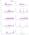
Results: In general, synthetic data closely matched original data for epidemic curves, patient characteristics, and outcomes. Synthetic data suppressed labels of zip codes with few total tests (mean = 2.9 ± 2.4; max = 16 tests; 66% reduction of unique zip codes). Epidemic curves and monthly indicator counts were similar between synthetic and original data in a random sample of the most tested (top 1%; n = 171) and for all unsuppressed zip codes (n = 5819), respectively. In small sample sizes, synthetic data utility was notably decreased.
Discussion: Analyses on the population-level and of densely tested zip codes (which contained most of the data) were similar between original and synthetically derived datasets. Analyses of sparsely tested populations were less similar and had more data suppression.
Conclusion: In general, synthetic data were successfully used to analyze geospatial and temporal trends. Analyses using small sample sizes or populations were limited, in part due to purposeful data label suppression-an attribute disclosure countermeasure. Users should consider data fitness for use in these cases.
Keywords: COVID-19; data sharing; data utility; electronic health records; synthetic data.
© The Author(s) 2022. Published by Oxford University Press on behalf of the American Medical Informatics Association. All rights reserved. For permissions, please email: journals.permissions@oup.com.
Figures


Update of
-
Demonstrating an approach for evaluating synthetic geospatial and temporal epidemiologic data utility: Results from analyzing >1.8 million SARS-CoV-2 tests in the United States National COVID Cohort Collaborative (N3C).medRxiv [Preprint]. 2021 Jul 8:2021.07.06.21259051. doi: 10.1101/2021.07.06.21259051. medRxiv. 2021. Update in: J Am Med Inform Assoc. 2022 Jul 12;29(8):1350-1365. doi: 10.1093/jamia/ocac045. PMID: 34268525 Free PMC article. Updated. Preprint.
References
-
- The National COVID Cohort Collaborative: Clinical Characterization and Early Severity Prediction | medRxiv. https://www.medrxiv.org/content/10.1101/2021.01.12.21249511v3 Accessed March 1, 2021. - DOI
-
- HIPAA Privacy Rule and its Impacts on Research. https://privacyruleandresearch.nih.gov/pr_08.asp Accessed March 17, 2021.
Publication types
MeSH terms
Grants and funding
- U54 GM104938/GM/NIGMS NIH HHS/United States
- U54 GM115516/GM/NIGMS NIH HHS/United States
- UL1 TR002649/TR/NCATS NIH HHS/United States
- U01 AT002550/AT/NCCIH NIH HHS/United States
- UL1 TR002378/TR/NCATS NIH HHS/United States
- U54 GM115458/GM/NIGMS NIH HHS/United States
- UL1 TR003096/TR/NCATS NIH HHS/United States
- UL1 TR003015/TR/NCATS NIH HHS/United States
- U54 GM115677/GM/NIGMS NIH HHS/United States
- UL1 TR003107/TR/NCATS NIH HHS/United States
- U54 GM115428/GM/NIGMS NIH HHS/United States
- UL1 TR003098/TR/NCATS NIH HHS/United States
- U54 GM104940/GM/NIGMS NIH HHS/United States
- UL1 TR003017/TR/NCATS NIH HHS/United States
- UL1 TR002319/TR/NCATS NIH HHS/United States
- U24 TR002306/TR/NCATS NIH HHS/United States
LinkOut - more resources
Full Text Sources
Medical
Miscellaneous

