. 2022 May;54(5):660-669.
doi: 10.1038/s41588-022-01041-y. Epub 2022 Apr 18.

Breast tumor microenvironment structures are associated with genomic features and clinical outcome

Affiliations

Breast tumor microenvironment structures are associated with genomic features and clinical outcome

Esther Danenberg et al. Nat Genet. 2022 May.

Abstract

The functions of the tumor microenvironment (TME) are orchestrated by precise spatial organization of specialized cells, yet little is known about the multicellular structures that form within the TME. Here we systematically mapped TME structures in situ using imaging mass cytometry and multitiered spatial analysis of 693 breast tumors linked to genomic and clinical data. We identified ten recurrent TME structures that varied by vascular content, stromal quiescence versus activation, and leukocyte composition. These TME structures had distinct enrichment patterns among breast cancer subtypes, and some were associated with genomic profiles indicative of immune escape. Regulatory and dysfunctional T cells co-occurred in large 'suppressed expansion' structures. These structures were characterized by high cellular diversity, proliferating cells and enrichment for BRCA1 and CASP8 mutations and predicted poor outcome in estrogen-receptor-positive disease. The multicellular structures revealed here link conserved spatial organization to local TME function and could improve patient stratification.


Conflict of interest statement

C.C. is a member of AstraZeneca’s iMED External Science Panel and Illumina’s Scientific Advisory Board and a recipient of research grants (administered by the University of Cambridge) from Genentech, Roche, AstraZeneca and Servier. B.B. holds a patent relevant to this work entitled ‘A method for determining the likelihood of a patient being responsive to cancer immunotherapy’ (publication number WO2020207771A1). E.P. has received honoraria from Roche and Novartis for speaking at meetings and Inflection Point Biomedical Advisors for participating in an advisory panel. The other authors declare no competing interests.

Figures

Fig. 1
Fig. 1. High-dimensional imaging of the breast TME.
a,Left to right: Antibody panel used for analyses of 693 METABRIC tumors, multitiered image analyses and correlation with genomic and clinical features. b, Representative examples of image data (cropped to fit) for proteins of interest (red), pan-cytokeratin (green) and DNA (blue). Scale bars, 50 µm. c, Distribution of clinical variables and molecular subtypes among tumors analyzed. IntClust, integrative cluster.
Fig. 2
Fig. 2. Phenotyping of single cells in situ by IMC.
a, Analytical workflow for distinguishing epithelial from non-epithelial cells, and proteins used for clustering by compartment. b, Scatter plot of uniform manifold approximation and projection (UMAP) dimensions computed from single-cell profiles (random selection of 10% of cells per image per compartment). c, Median expression profiles of final cell phenotypes. d, Estimates from linear models comparing cell phenotype Shannon diversity of normal versus tumor tissue and among breast cancer molecular subtypes separately for epithelial and TME cells. For comparisons of Shannon diversity in adjacent normal versus tumor tissue, samples were from 655 tumors for epithelial and 660 tumors for TME cells. For comparisons of Shannon diversity between breast cancer molecular subtypes, a total of 546 tumors were included. Values printed on gray bars indicate the number of tumors (or independent normal samples as appropriate) that belong to the group labeled on the y axis. Horizontal lines represent 95% confidence intervals. Circles represent point estimates; colored circles indicate estimates associated with an adjusted P < 0.05 from two-sided tests for the linear model regression term; P values were adjusted for multiple testing using the Benjamini–Hochberg method. Antigen processing machinery, APM; T cell exhaustion, Tex.
Fig. 3
Fig. 3. Cell phenotypic transitions at tissue interfaces.
a, Example image illustrating identification of tumor–stroma interface. Scale bar, 100 µm. b, Estimates from generalized linear models of cell types enriched at the tumor–stroma interface. Horizontal lines are 95% confidence intervals, and circles are point estimates. Circles with a colored outline indicate estimates associated with an adjusted P < 0.05; from two-sided tests for the linear model regression term; P values were adjusted for multiple testing using the Benjamini–Hochberg method. Circle size is inversely proportional to the standard error. Analyses were limited to tumors that contained the cell phenotype of interest; the number of tumors included in each model is depicted in the adjacent bar chart. c, Example image illustrating the perivascular interface. Scale bar, 100 µm. d, Same as b but for cell types enriched in the perivascular space. Horizontal lines are 95% confidence intervals, and circles are point estimates.
Fig. 4
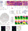
Fig. 4. Mapping the landscape of recurrent multicellular structures in the breast TME.
a, Schematic illustration of community detection of spatial cell networks to identify discrete structures. b, Connectivity profiles of ten recurrent TME structures as heatmaps ordered by hierarchical clustering within each structure for the discovery and validation datasets. c, Example of TME structures mapped to annotated tissue schematic. Scale bar, 100 µm. d, Comparison of number of cells and cell diversity across TME structures for n = 616 tumors as box plots (boxes show 25th, 50th and 75th centiles; whiskers indicate 75th centile plus 1.5× interquartile range and 25th centile less 1.5× interquartile range; data beyond whiskers are outliers). e, Schematic illustration of the principle of vertex degree (number of incident edges or interactions per cell). f, Stacked area plots of cell compositions across different categories of vertex degree per TME structure. g,h, Example images and schematics of cell phenotype illustrating B cell aggregation compared to diffuse T cell distributions. Scale bars, 100 µm.
Fig. 5
Fig. 5. Genomic breast cancer subtypes and driver somatic alterations are associated with TME structures.
a,b, Scatter plots of AUC receiver-operating characteristic statistics for performance of different categories of predictors in classifying genomic breast cancer subtypes in an out-of-sample dataset. b, Same as a but with tumor subtypes substituted for driver somatic alterations. Depicted are predictors with AUCs of >0.7 for at least one model.
Fig. 6
Fig. 6. Prognostic impact of TME structures.
a, Hazard ratios for all TME structures separately by estrogen receptor status (427 patients with ER-positive disease and 113 with ER-negative disease) and adjusted for HER2 status. Circles represent point estimates of hazard ratios, circle size is inversely proportional to the standard error and horizontal lines depict 95% confidence intervals. The grey and black text distinguishes between statistically significant and non-significant associations. b, Survival plots for TME structures where tumors were classified according to whether the structure was present or absent. All depicted P values are from log-rank tests for n = 483 patients.
Extended Data Fig. 1
Extended Data Fig. 1. Examples of raw and processed IMC data.
a, Example of raw IMC data for all channels represented as RGB images. b, Processed data for images shown in panel a, depicted as segmented cells colored by mean expression value (data normalized across entire study). c, Segmented cell mask for the sample shown in panels a and b colored according to cell phenotype. Scale bars represent 100 µm.
Extended Data Fig. 2
Extended Data Fig. 2. Cell phenotype counts and proportions.
Stacked bar plots illustrating the number and proportion of cells by cell phenotype per tissue image. Bars ordered by hierarchical clustering.
Extended Data Fig. 3
Extended Data Fig. 3. Subclustering of ambiguous cell phenotypes.
a, Heatmaps of median expression values for five subclusters within each cell phenotype (z-score scaled within each cell phenotype; clipped at -2 and 2). b, Example of CD38+ cells that also express CD31-vWF (yellow pixels; white arrows). Most of these cells are not adjacent to blood vessels (outlined in red) indicating that coexpression of CD38 and CD31-vWF is not explained by proximity to endothelial cells. Epithelial (tumor) mask outlined in white. Scale bars represent 100 µm.
Extended Data Fig. 4
Extended Data Fig. 4. Comparison of cell phenotypic composition among 52 tumors represented by more than one sample.
a, Stacked bar plots of cell phenotypic composition (separately for epithelial and TME cells). Columns are paired by tumor for comparison. Tumor order (x axis) is arbitrary. b, Box plots of proportion differences (as positive values) computed separately for epithelial and TME cells (n = 52 tumors). c, Box plots of proportion difference rescaled to between zero and one within each cell phenotype (n = 52 tumors). For box plots, boxes are 25th, 50th, and 75th centiles; whiskers are 75th centile plus 1.5x interquartile range and 25th centile less 1.5x interquartile range. Data points beyond whiskers are outliers.
Extended Data Fig. 5
Extended Data Fig. 5. Comparison of expression profiles by cell presence or absence from tissue interfaces.
Heatmaps of cell phenotype expression profiles separately for cells present at a tissue interface and those absent from an interface (columns are z-score scaled and clipped at -2 and 2).
Extended Data Fig. 6
Extended Data Fig. 6. Consensus clustering and examples of tumor microenvironment structures.
a, Scatter plot of the change in cumulative density function (CDF) between clustering solutions (‘k’ on the x axis). A decrease in CDF indicates an increase in clustering consensus. b, TME structures depicted as colored spatial graphs on schematic maps of two METABRIC tumors. Scale bars represent 100 µm.
Extended Data Fig. 7
Extended Data Fig. 7. Cell-centric trends of phenotypic composition by number of cell interactions (vertex degree).
Stacked area plots for each TME cell phenotype depicting trends of phenotypic composition by the number of cells contacting the cell phenotype of interest.
Extended Data Fig. 8
Extended Data Fig. 8. Associations between TME structures and molecular breast cancer subtypes.
a, Bar charts of distributions of TME connectivity by TME structure for breast cancer intrinsic subtypes (n = 545 tumors). Bubble plots represent coefficients from linear models. Size is inversely proportional to the precision of the estimate; colored circles are significantly enriched TME structures; black outlines denote an adjusted p-value of < 0.05 for that term; p-values are for two-sided tests and were adjusted for multiple testing using the Benjamini–Hochberg method; horizontal lines are 95% confidence intervals. b, Bar charts of distributions of TME connectivity by TME structure by IntClust subtypes (n = 545 tumors). Bubble plots represent coefficients from linear models. Size is inversely proportional to the precision of the estimate; colored circles are significantly enriched TME structures; black outlines denote an adjusted p-value of < 0.05 for that term; p-values are for two-sided tests and were adjusted for multiple testing using the Benjamini–Hochberg method; horizontal lines are 95% confidence intervals. For reference, the stacked bar to the right of each plot illustrates the composition of tumors within that IntClust subtype by PAM50 subtypes.
Extended Data Fig. 9
Extended Data Fig. 9. Associations between TME structures and driver somatic alterations.
Top ten most enriched somatic alterations per TME structure (n = 545 tumors for copy-number aberrations and n = 530 tumors for mutations). Bubble plots where circles depict generalized linear model coefficients. Size is inversely proportional to the precision of the estimate. Black outlines denote an adjusted p-value of < 0.05; p-values are for two-sided tests and were adjusted for multiple testing using the Benjamini–Hochberg method. Horizontal lines (where visible) indicate 95% confidence intervals. Bar charts illustrate the proportion of analyzed samples that harbor the alteration.

References

    1. Wagner J, et al. A single-cell atlas of the tumor and immune ecosystem of human breast cancer. Cell. 2019;177:1330–1345. doi: 10.1016/j.cell.2019.03.005. - DOI - PMC - PubMed
    1. Azizi E, et al. Single-cell map of diverse immune phenotypes in the breast tumor microenvironment. Cell. 2018;174:1293–1308. doi: 10.1016/j.cell.2018.05.060. - DOI - PMC - PubMed
    1. Cabrita R, et al. Tertiary lymphoid structures improve immunotherapy and survival in melanoma. Nature. 2020;577:561–565. doi: 10.1038/s41586-019-1914-8. - DOI - PubMed
    1. Helmink BA, et al. B cells and tertiary lymphoid structures promote immunotherapy response. Nature. 2020;577:549–555. doi: 10.1038/s41586-019-1922-8. - DOI - PMC - PubMed
    1. Petitprez F, et al. B cells are associated with survival and immunotherapy response in sarcoma. Nature. 2020;577:556–560. doi: 10.1038/s41586-019-1906-8. - DOI - PubMed

Publication types