. 2022 Jun:39:100564.
doi: 10.1016/j.epidem.2022.100564. Epub 2022 Apr 22.

Bayesian sequential data assimilation for COVID-19 forecasting

Affiliations

Bayesian sequential data assimilation for COVID-19 forecasting

Maria L Daza-Torres et al. Epidemics. 2022 Jun.

Abstract

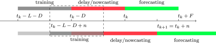
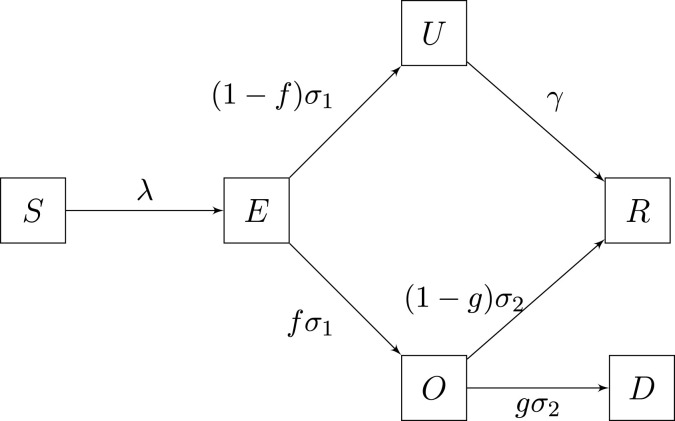
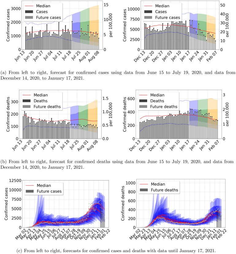
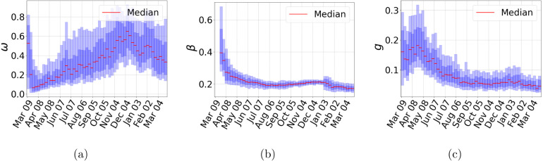
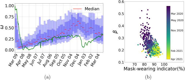
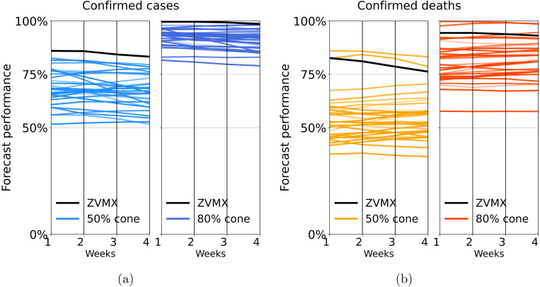
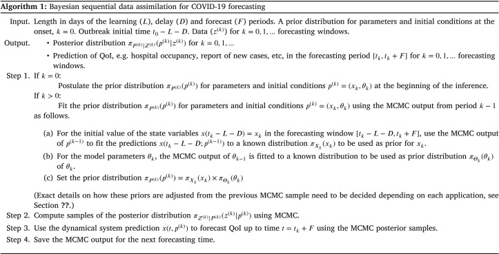
We introduce a Bayesian sequential data assimilation and forecasting method for non-autonomous dynamical systems. We applied this method to the current COVID-19 pandemic. It is assumed that suitable transmission, epidemic and observation models are available and previously validated. The transmission and epidemic models are coded into a dynamical system. The observation model depends on the dynamical system state variables and parameters, and is cast as a likelihood function. The forecast is sequentially updated over a sliding window of epidemic records as new data becomes available. Prior distributions for the state variables at the new forecasting time are assembled using the dynamical system, calibrated for the previous forecast. Epidemic outbreaks are non-autonomous dynamical systems depending on human behavior, viral evolution and climate, among other factors, rendering it impossible to make reliable long-term epidemic forecasts. We show our forecasting method's performance using a SEIR type model and COVID-19 data from several Mexican localities. Moreover, we derive further insights into the COVID-19 pandemic from our model predictions. The rationale of our approach is that sequential data assimilation is an adequate compromise between data fitting and dynamical system prediction.

Keywords: Bayesian inference; COVID-19; Data assimilation; SEIRD.


Conflict of interest statement

The authors declare that they have no known competing financial interests or personal relationships that could have appeared to influence the work reported in this paper.

Figures

Fig. 1
Fig. 1
Bayesian Sequential data assimilation. We propose a Bayesian filtering method that predicts along the dynamical system (1). The model is fitted with data in the training period and this is used to make predictions during the reporting delay period (nowcasting) and a forecasting period. The training window is updated and moved n days forward, to update all forecasts and the former posterior becomes the prior, in the next window. Further details are described in Algorithm 1.
Fig. 2
Fig. 2
A SEIR type model that into account both observed and unobserved infections.
Fig. 3
Fig. 3
Forecast results for Mexico city metropolitan area, using data from March 8 to April 12, 2020. (a) Confirmed cases (b) Confirmed deaths. Central red lines indicate the median incidence forecast. The darker shaded region indicates the interquartile forecast range, and the lighter shaded region indicates the 5–95th percentile range. The colors blue, green, and orange represent the forecast 1, 2, and 3 weeks ahead, respectively. Total population 21,942,666 inhabitants. (For interpretation of the references to color in this figure legend, the reader is referred to the web version of this article.)
Fig. 4
Fig. 4
Outbreak analysis for Mexico City metropolitan area. From left to right, confirmed cases and deaths. Central red lines indicate the median incidence forecast. The darker shaded region indicates the interquartile forecast range, and the lighter shaded region indicates the 5–95th percentile range. All displayed forecast durations are 21 days from the point of prediction. We stress that nowcasting is very accurate throughout examples presented here and in the SM. (For interpretation of the references to color in this figure legend, the reader is referred to the web version of this article.)
Fig. 5
Fig. 5
Outbreak analysis for Mexico City metropolitan area. From left to right, confirmed cases and deaths. Central red lines indicate the median incidence forecast. The darker shaded region indicates the interquantile forecast range, and the lighter shaded region indicates the 5–95th percentile range. All displayed forecast duration are 20 days from the point of prediction. (For interpretation of the references to color in this figure legend, the reader is referred to the web version of this article.)
Fig. 6
Fig. 6
Outbreak analysis for Mexico City metropolitan area. (a) Proportion of the effective population (ω), (b) contact rate (β), and (c) fraction observed infected individuals dying (g). Central red lines indicate median incidence forecast. Darker shaded region indicates forecast interquartile range, and lighter shaded region indicates 5–95th percentile range. (For interpretation of the references to color in this figure legend, the reader is referred to the web version of this article.)
Fig. 7
Fig. 7
In panel (a), we present a plot of the predicted effective population proportion (ω) together with the social media-based unique mobility index (green line). Correlation between changes in both quantities is evident. Panel (b), we plot weekly estimated contact rates (β) for all 32 states against the UMD Global CTIS mask-wearing index (Social data science center, 2020) for available data. Color code represents time evolution starting in May 2020. (For interpretation of the references to color in this figure legend, the reader is referred to the web version of this article.)
Fig. 8
Fig. 8
We present a slope-graph of the average weekly forecast performance for all 32 states in Mexico. Panel (a) and panel (b) correspond to confirmed cases and confirmed deaths, respectively. Each line connects a state’s average performance for 1 to 4 weeks forecast. Darker and lighter colors correspond to the performance measured for the 50% and 80% prediction cones, respectively. We also include ZVMX performance in black color. In all cases, the forecast’s performance decreases slightly with the prediction length. The 50% cone has a performance value between 50 and 80 percent, and the 80% cone has a corresponding value between 80% and 100% for confirmed cases. In the case of deaths, the 50% and 80% cones have performance values between 40% and 60% and between 60% and 100%, respectively. (For interpretation of the references to color in this figure legend, the reader is referred to the web version of this article.)
None

References

    1. Asher Jason. Forecasting Ebola with a regression transmission model. Epidemics. 2018;22:50–55. - PubMed
    1. Bertozzi Andrea L., Franco Elisa, Mohler George, Short Martin B., Sledge Daniel. 2020. The challenges of modeling and forecasting the spread of COVID-19. arXiv preprint arXiv:2004.04741. - PMC - PubMed
    1. Bi Qifang, Wu Yongsheng, Mei Shujiang, Ye Chenfei, Zou Xuan, Zhang Zhen, Liu Xiaojian, Wei Lan, Truelove Shaun A, Zhang Tong, et al. 2020. Epidemiology and transmission of COVID-19 in shenzhen China: Analysis of 391 cases and 1,286 of their close contacts. MedRxiv. - PMC - PubMed
    1. Brooks Logan C., Ray Evan L., Bien Jacob, Bracher Johannes, Rumack Aaron, Tibshirani Ryan J., Reich Nicholas G. Comparing ensemble approaches for short-term probabilistic COVID-19 forecasts in the US. Int. Inst. Forecasters. 2020
    1. Capistran Marcos A., Capella Antonio, Christen J. Andrés. Forecasting hospital demand in metropolitan areas during the current COVID-19 pandemic and estimates of lockdown-induced 2nd waves. PLoS One. 2021;16(1):1–16. doi: 10.1371/journal.pone.0245669. - DOI - PMC - PubMed

Publication types