

Health effects of kiwi wine on rats: an untargeted metabolic fingerprint study based on GC-MS/TOF
- PMID: 35519589
- PMCID: PMC9063974
- DOI: 10.1039/c9ra02138h
Health effects of kiwi wine on rats: an untargeted metabolic fingerprint study based on GC-MS/TOF
Abstract
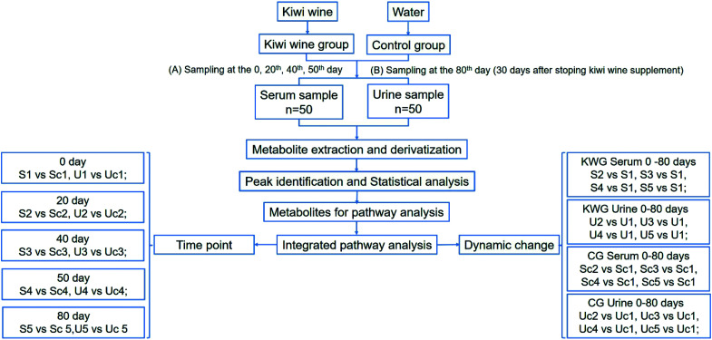
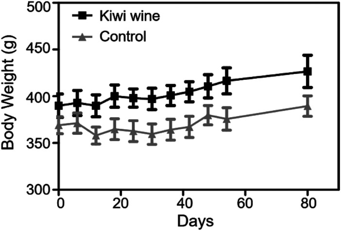
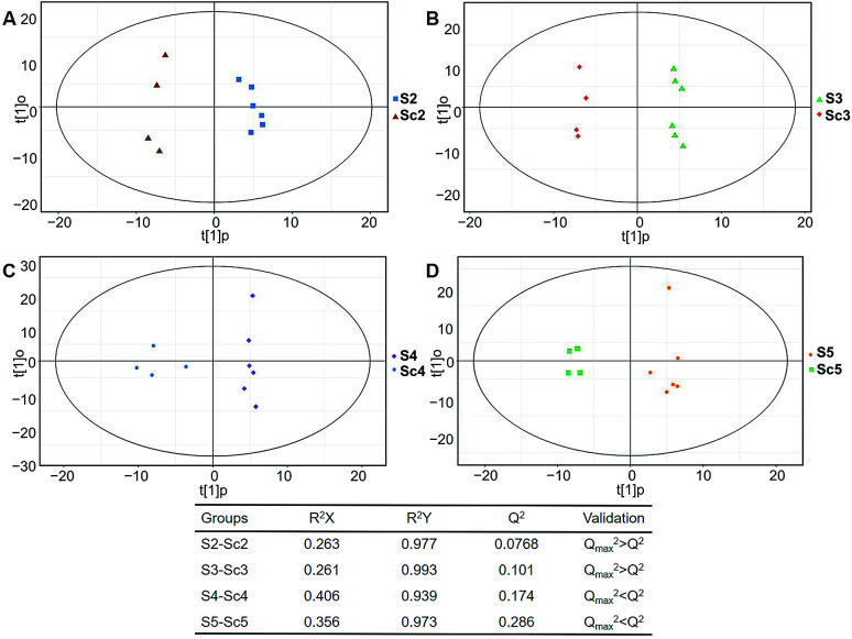
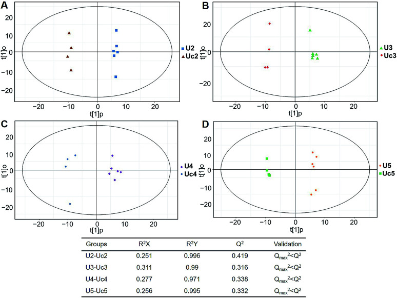
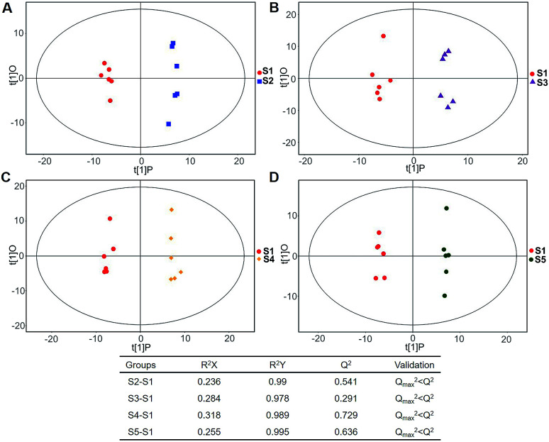
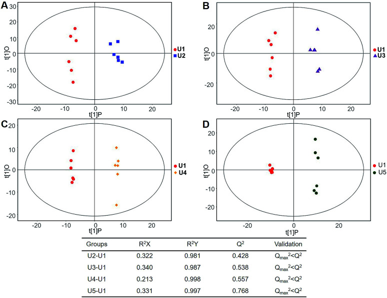
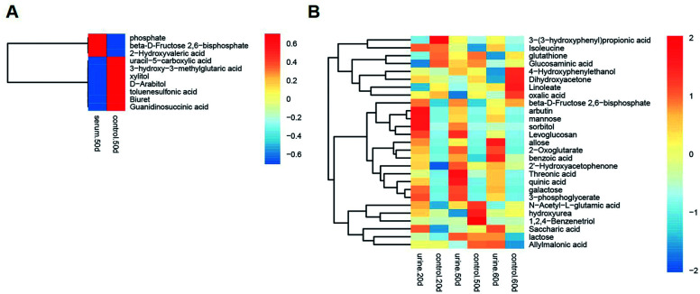
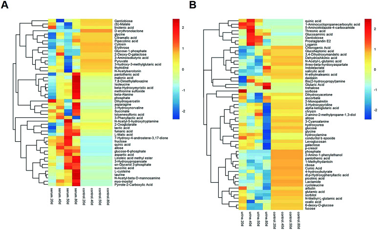
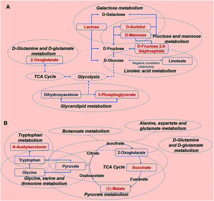
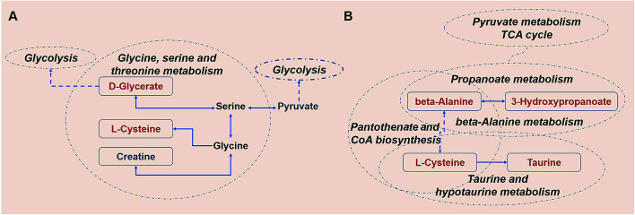
Kiwi wine is a popular fermentation product of kiwi fruit in Asian countries. To better understand the potential health effects of kiwi wine, an untargeted gas chromatography-mass spectrometer (GC-MS) approach was taken to assess the metabolic fingerprint of rats after dietary ingestion of kiwi wine. 7 differentially expressed endogenous metabolites from serum and 8 from urine were enriched in carbohydrate metabolism, amino acid metabolism pathway, fat metabolism and other metabolisms and selected from the KEGG. The above results showed that kiwi wine mainly led to a pronounced perturbation of energy metabolism (especially carbohydrate metabolism) during the consumption period. After stopping the supply of kiwi wine 30 days later, 6 and 3 endogenous metabolites from serum and urine respectively were screened and involved in a small part of carbohydrate related amino acid metabolism and fat metabolism, which indicated that the effect of kiwi wine sustained a lasting effect on energy metabolism, amino acid metabolism and lipid metabolism after stopping the supply. Thus, kiwi wine might have a positive function on health associated with the metabolism of its constituents. To the best of our knowledge, this study provides a nutrition field view for the development of the kiwi wine agricultural industry via an untargeted GC-MS metabolomic approach.
This journal is © The Royal Society of Chemistry.
Conflict of interest statement
There are no conflicts to declare.
Figures
Similar articles
-
Effect of Skin Maceration Treatment on Aroma Profiles of Kiwi Wines Elaborated with Actinidia deliciosa "Xuxiang" and A. chinensis "Hort16A".J AOAC Int. 2019 Mar 1;102(2):683-685. doi: 10.5740/jaoacint.18-0290. Epub 2018 Nov 15. J AOAC Int. 2019. PMID: 30442222
-
Global and untargeted metabolomics evidence of the protective effect of different extracts of Dipsacus asper Wall. ex C.B. Clarke on estrogen deficiency after ovariectomia in rats.J Ethnopharmacol. 2017 Mar 6;199:20-29. doi: 10.1016/j.jep.2017.01.050. Epub 2017 Jan 26. J Ethnopharmacol. 2017. PMID: 28132861
-
Multivariate analysis reveals effect of glutathione-enriched inactive dry yeast on amino acids and volatile components of kiwi wine.Food Chem. 2020 Nov 1;329:127086. doi: 10.1016/j.foodchem.2020.127086. Epub 2020 May 18. Food Chem. 2020. PMID: 32516706
-
A Feasibility Study on Monitoring Residual Sugar and Alcohol Strength in Kiwi Wine Fermentation Using a Fiber-Optic FT-NIR Spectrometry and PLS Regression.J Food Sci. 2017 Feb;82(2):358-363. doi: 10.1111/1750-3841.13604. Epub 2017 Jan 19. J Food Sci. 2017. PMID: 28103396
-
Characterisation of hybrid yeasts for the production of varietal Sauvignon blanc wine - A review.J Microbiol Methods. 2019 Oct;165:105699. doi: 10.1016/j.mimet.2019.105699. Epub 2019 Aug 22. J Microbiol Methods. 2019. PMID: 31446037 Review.
Cited by
-
Metabolites comparison in post-fermentation stage of manual (mechanized) Chinese Huangjiu (yellow rice wine) based on GC-MS metabolomics.Food Chem X. 2022 May 6;14:100324. doi: 10.1016/j.fochx.2022.100324. eCollection 2022 Jun 30. Food Chem X. 2022. PMID: 35586029 Free PMC article.
-
A Serum Metabolic Profiling Analysis During the Formation of Fatty Liver in Landes Geese via GC-TOF/MS.Front Physiol. 2020 Dec 14;11:581699. doi: 10.3389/fphys.2020.581699. eCollection 2020. Front Physiol. 2020. PMID: 33381050 Free PMC article.
-
Pre- and post-transformation changes in two mulberry varieties for semi-sweet wine production.Food Chem X. 2025 Jul 11;29:102728. doi: 10.1016/j.fochx.2025.102728. eCollection 2025 Jul. Food Chem X. 2025. PMID: 40698370 Free PMC article.
-
Evaluation of the color and aroma characteristics of commercially available Chinese kiwi wines via intelligent sensory technologies and gas chromatography-mass spectrometry.Food Chem X. 2022 Aug 12;15:100427. doi: 10.1016/j.fochx.2022.100427. eCollection 2022 Oct 30. Food Chem X. 2022. PMID: 36211771 Free PMC article.
-
Study on the dynamic changes and formation pathways of metabolites during the fermentation of black waxy rice wine.Food Sci Nutr. 2020 Mar 27;8(5):2288-2298. doi: 10.1002/fsn3.1507. eCollection 2020 May. Food Sci Nutr. 2020. PMID: 32405386 Free PMC article.
References
LinkOut - more resources
Full Text Sources
Miscellaneous