Potent neutralization by monoclonal human IgM against SARS-CoV-2 is impaired by class switch
- PMID: 35548920
- PMCID: PMC9253785
- DOI: 10.15252/embr.202153956
Potent neutralization by monoclonal human IgM against SARS-CoV-2 is impaired by class switch
Abstract
To investigate the class-dependent properties of anti-viral IgM antibodies, we use membrane antigen capture activated cell sorting to isolate spike-protein-specific B cells from donors recently infected with SARS-CoV-2, allowing production of recombinant antibodies. We isolate 20, spike-protein-specific antibodies of classes IgM, IgG, and IgA, none of which shows any antigen-independent binding to human cells. Two antibodies of class IgM mediate virus neutralization at picomolar concentrations, but this potency is lost following artificial switch to IgG. Although, as expected, the IgG versions of the antibodies appear to have lower avidity than their IgM parents, this is not sufficient to explain the loss of potency.
Keywords: B cells; MACACS; antibodies; class switch; membrane antigen.
© 2022 The Authors. Published under the terms of the CC BY 4.0 license.
Figures
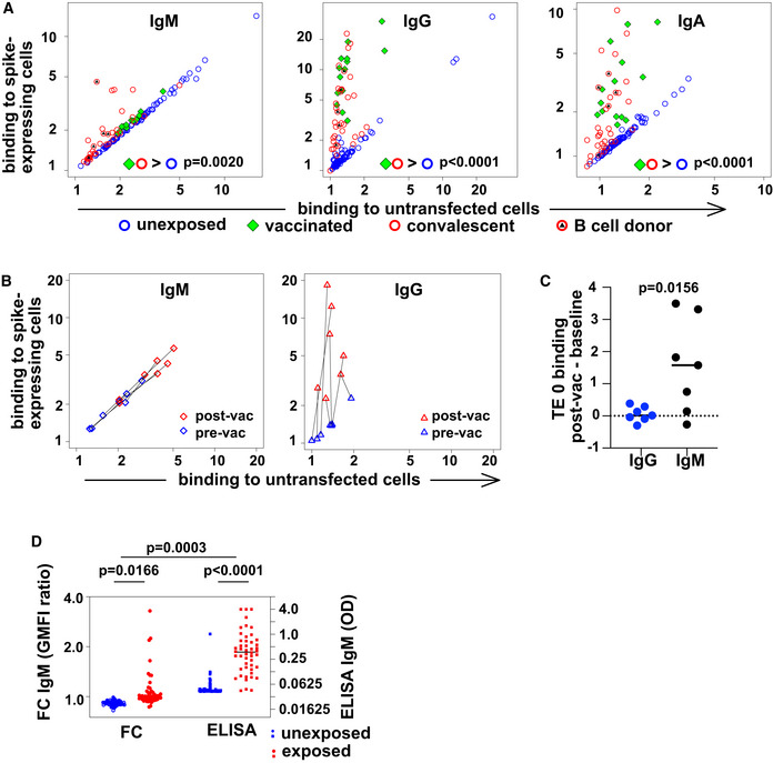
Spike‐binding antibodies in serum. Binding by antibodies of classes M, G, and A is detected with secondary antibodies conjugated to different fluorochromes, and the results are shown on the left, middle, and right plots, respectively. Binding (geometric mean fluorescence intensity—GMFI—of corresponding secondary antibody) to TE cells expressing SARS‐CoV‐2 spike protein is plotted on the vertical axis, and binding to untransfected cells on the horizontal axis. Each point represents a value from one donor. Samples from donors with no known exposure to SARS‐CoV‐2 antigens (n = 86) are plotted with blue circles, recently infected donors (n = 34) with red circles, and vaccinated donors (n = 14) with green diamonds. Red circles with black triangles correspond to donors from whose B cells monoclonal antibodies were isolated (n = 5, Appendix Table S2). P values are derived from a two‐way analysis of variance followed by Tukey's test to compare the specific binding, that is (binding to spike‐expressing cells)/(binding to untransfected cells) between conditions (convalescent or vaccinated against unexposed) within each antibody class. The experiment was independently repeated three times, and results shown come from the third replicate.
Change in antibody binding following vaccination against SARS‐CoV‐2. Binding of antibodies from sera assessed in the experiment shown in (A) is shown for two samples of serum from each of 7 donors. Data are plotted as in (A) with binding to spike‐expressing cells on the vertical axis, and to untransfected cells on the horizontal, using blue symbols for samples from before vaccination, and red symbols for samples from 15 to 29 days after the first vaccination (but before any second vaccination). Black lines connect points corresponding to pre/post pairs of samples from each donor. Left plot shows results for IgM and right plot for IgG.
Comparison of post‐vaccination increase in binding to untransfected cells between IgG and IgM. The increase in binding to untransfected TE 0 cells between pre‐ and post‐vaccination samples is shown on the left with blue symbols for IgG and on the right with black symbols for IgM. The horizontal line at y = 0 is the expected result when no increased binding is observed. P value is derived from a two‐tailed, Wilcoxon matched pairs signed rank test.
Comparison of spike‐specific IgM, as measured by flow cytometry or ELISA. The left two “FC” are the results of flow cytometry, and the left vertical axis shows the ratio of serum IgM binding to spike‐expressing cells, vs binding to non‐expressing control cells, as plotted in A. The right two columns show spike‐RBD‐specific IgM as measured by an IgM‐capture ELISA, and the right vertical axis shows the optical densities (OD). P values are calculated by two‐way analysis of variance, followed by Sidak's multiple comparisons test. The entire experiment was repeated three times, and the data shown are derived from the third replicate.
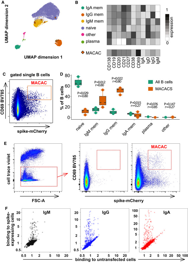
Phenotypes of blood B cells. B cells from 15 ml of peripheral blood from each of three convalescent donors were isolated by negative selection with magnetic beads, exposed to adherent cells expressing spike‐mCherry for 3 h, then retrieved and labeled with fluorescent antibodies shown in Appendix Table S4 and measured by flow cytometry. (A) UMAP algorithm (5,000 randomly selected cells/sample) was used to depict the major B cell subsets clustered according to marker expression. FlowSOM‐based B cell subpopulations are overlaid as a color dimension, and the colors of the clusters are shown on the left of heatmap (B). Cells falling in the MACAC gate (see below) are marked with red rhombi.
Heatmap showing mean population expression levels of markers used for UMAP visualization and FlowSOM‐clustering. Colors shown in the legend on the left are also used in the UMAP representation in (A).
Gating strategy to define CD69‐high, mCherry‐high, spike‐capturing B cells (i.e., membrane antigen capture activated cells, MACAC, red box). Dot plot shows CD69 and mCherry fluorescence for B cells from one of three donors gated by forward and side scatter, and negative for the dye used to mark the antigen donor cells.
Relative fractions of different B cell subpopulations, from three donors, as shown in A‐B, in all B cells compared to within MACAC B cells. P values are based on two‐tailed t‐tests between the groups. Correlation coefficients (r) were calculated from the z‐statistic of the Wilcoxon–Mann–Whitney test. A black horizontal line represents the median. Boxplots represent the interquartile range (IQR). Whiskers extend to the farthest data point within a maximum of 1.5× IQR. Every point represents one donor.
Gating strategy in MACAC sorting. Single cells are selected based on scatter, antigen‐expressing TE spike‐mCherry cells excluded on Cell Trace Violet label, and the spike‐capturing (mCherry‐high), activated (CD69‐high) B cells (population labeled “MACAC” in red on the right‐most plot) are sorted. The middle plot shows B cells that did not adhere to the TE‐spike‐cherry antigen‐expressing cells (putatively antigen‐irrelevant), and the right plot those that did (putatively antigen‐recognizing). Plots show data from one of five convalescent donors (those whose serum results are labeled with black triangles in Fig 1A). Cells in the MACAC gate were singly distributed into wells of 384‐well plates and cultured for 9 days with IL‐21 and CD40L, and then, the single well culture supernatants were screened for anti‐spike antibody binding and virus neutralization as described below.
Results of single well supernatant screening for antibody binding to SARS‐CoV‐2 spike protein. Results from 3266 wells from 5 donors are shown for IgM (left), IgG (middle), and IgA (right). Screening and plotting methods are the same as in (Fig 1A).
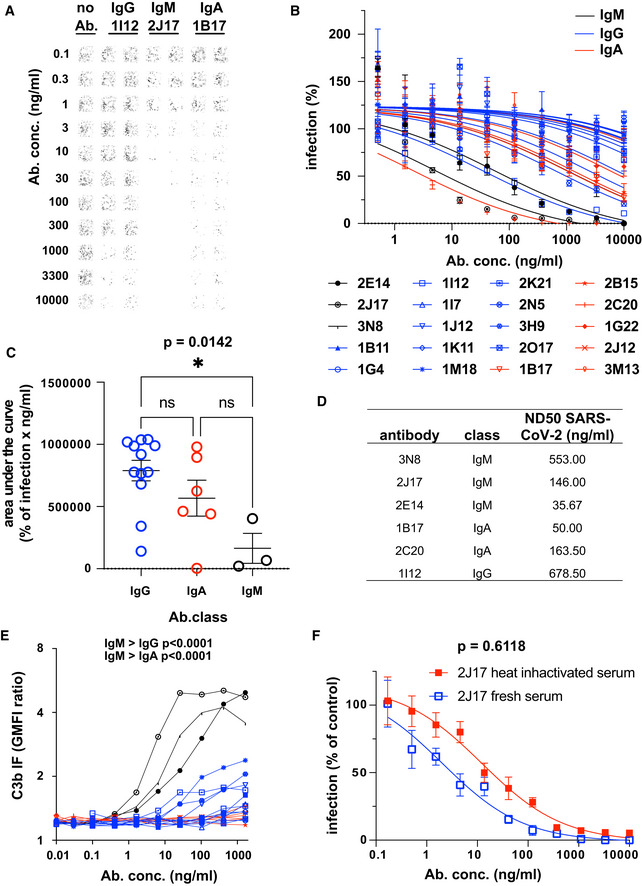
Example of neutralization of chimeric VSV*ΔG‐SΔ21 by donor‐derived IgG, IgM and IgA antibodies. 100 pfu VSV*ΔG‐SΔ21 was mixed with antibody at specified concentrations for 1 h and then added to Vero cells. After 24 h, the cells were imaged and infected wells identified by GFP expression, here pseudocolored with GFP‐bright shown in black against a white background. Virus neutralization is manifested as reduction in GFP. Images shown here come from wells infected with virus alone (left column), virus pre‐incubated with the moderately neutralizing IgG 1I12 (second and third columns), the potent neutralizing IgM 2J17 (fourth and fifth columns), or with the moderately potent IgA 1B17 (sixth and seventh columns). Each antibody was tested in the range of concentrations shown to the left of the images, from 10,000 down to 0.1 ng/ml.
Neutralization curves from each of the cloned antibodies using plaque reduction assay of VSV*ΔG‐SΔ21. The horizontal axis shows the serial dilution of the antibodies. The vertical axis shows, for each well exposed to antibody, the ratio of infected cell plaque count to the corresponding value from control wells without antibody. Each point is the mean of 9 values pooled from three independent experiments each with triplicate wells. Error bars indicate standard error. Antibodies tested are listed below the figure and include 3 IgM (black lines and symbols), 11 IgG (blue lines and symbols), and 6 IgA (red lines and symbols).
Quantification of results from (B). Area under the curve is plotted for every antibody and compared between different antibody classes by one‐way ANOVA followed by Tukey's test (mean from three biological replicates and SEM). Area under the curve was chosen as a measure of neutralization capacity, rather than ND50 (as used in subsequent figures), because some antibodies included in this figure exhibited no neutralization at the concentrations tested, precluding the calculation of an ND50.
SARS‐CoV‐2 Neutralization Test. Antibodies that showed neutralization of the chimeric VSV*ΔG‐SΔ21 were tested for neutralization of wild‐type SARS‐CoV‐2 virus. Concentrations of antibodies needed to neutralize100 pfu are expressed as ND50 (mean from two independent experiments, each with quadruplicate wells, or 3 independent experiments for 2E14 and 2J17). The ND50 of 2E14 was lower than 2J17 in three independent experiments although this difference was not significant by paired two‐tailed t‐test (P = 0.3876).
Flow cytometric determination of antibody‐dependent complement deposition on cells. Cells expressing SARS‐CoV‐2 spike protein and untransfected control cells were incubated with various concentrations of antibody in the presence of fresh human serum (from a SARS‐CoV‐2 unexposed donor). Activation of the complement cascade was measured by flow cytometric assessment of complement component C3b deposition on the surface of the cells. Results for the 3 IgM, (black), 11 IgG, (blue), and 6 IgA antibodies (red) are shown. P values were calculated by two‐way analysis of variance, followed by Tukey's test.
Influence of complement on virus neutralization. A plaque reduction neutralization assay like that shown in Fig 3A–C was conducted with IgM 2J17 in the presence of either fresh, complement‐sufficient human serum, or heat‐inactivated serum. The concentration of 2J17 is shown on the horizontal axis. The vertical axis shows, for each well exposed to antibody, the ratio of infected cell plaque count to the corresponding value from control wells with serum (either fresh or inactivated) but without antibody. The points plotted with filled red symbols corresponds to the condition with heat‐inactivated serum, and the open blue symbols results with fresh serum. Each symbol corresponds to the mean of nine wells pooled from three independent experiments, each with triplicate wells. Error bars correspond to standard error. P value was calculated using a paired, two‐tailed t‐test.
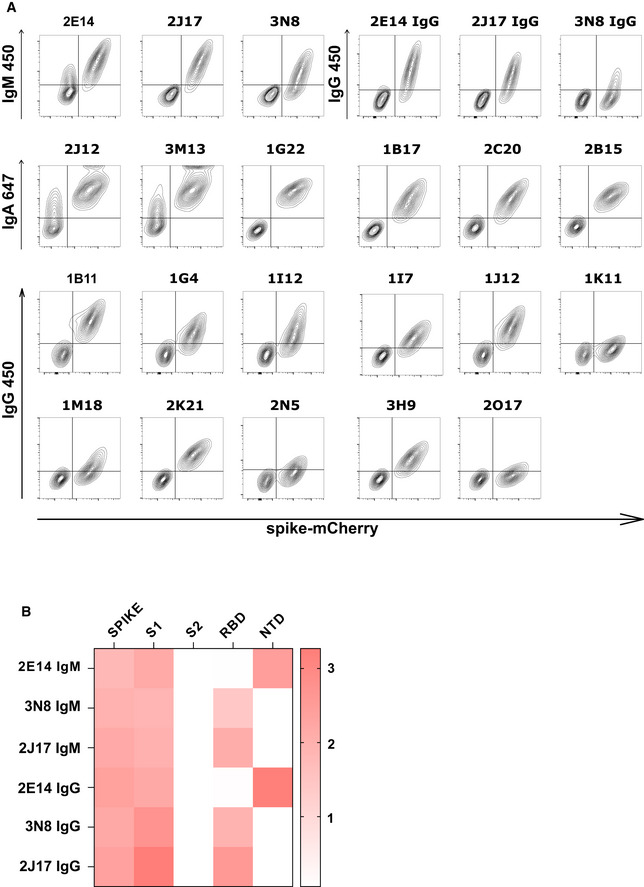
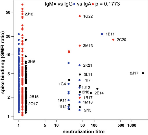
Spike recognition by monoclonal antibodies assessed by flow cytometry. Each contour plot shows mCherry on the horizontal axis, so that spike‐mCherry expressing cells are on the right of the plot, and TE 0 cells on the left. Vertical axes show signal of secondary antibodies used to detect IgM, IgA, or IgG.
Heatmap of antibody binding to spike protein subdomains (complete spike extracellular domain "spike", S1, S2, RBD and NTD) in ELISA. Color gradient correspond to the OD of each sample. The top three rows show binding of native IgM. The lower three rows show binding of the same antibodies, expressed as IgG1.
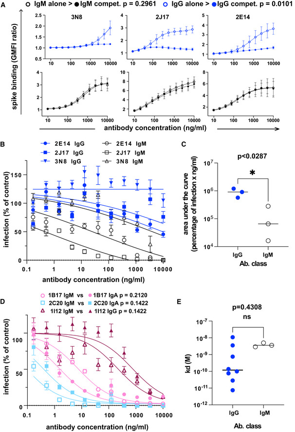
The effect of competition on concentration versus binding curves of three spike‐specific, class‐switched antibodies. Antibodies were expressed either as IgM, as originally isolated (black symbols and lines), or artificially switched to IgG1 (blue lines and symbols). For each antibody, identified by name at the top of each plot, the binding of the antibody alone (“alone”, open symbols), or the competitive binding of the antibody in a mixture of IgM and IgG1 (“compet.”, filled symbols) is shown. In the competition scenario, each of the two classes of the antibody were added together at the concentration shown on the horizontal axis. The vertical axis shows the ratio of geometric mean fluorescence of human IgM, or IgG on spike‐expressing cells divided by the corresponding signal on spike‐non‐expressing control cells. Each point shows the mean of 3 values from three independent experiments. Error bars show standard error. P value was calculated by comparing the area under the curve of each antibody class in the “alone” condition with the binding of the “competition” condition by paired, two‐tailed t‐test.
Virus neutralization by antibodies expressed as IgM or IgG1. A plaque reduction neutralization assay as described in Fig 3A and B was used to measure neutralization by the three, donor‐derived IgM (black lines and open symbols) and their artificially class‐switched IgG1 equivalents (blue lines and filled symbols). Horizontal axis shows the antibody concentration and the vertical axis shows the level of infection expressed as percentage GFP expression compared to control wells with no antibody added. Each point shows the mean of nine replicate values pooled from three independent experiments, each with triplicate wells. Error bars show standard error.
Comparison of virus neutralization by antibodies expressed as IgM or IgG1 shown in B. Area under the curve was calculated from each of the three independently performed experiments. P was calculated by paired, two‐tailed t‐test.
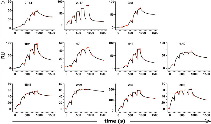
Affinities of donor‐derived spike‐binding IgG1 (n = 8) and donor‐derived IgM (n = 3) expressed as IgG1, measured by surface plasmon resonance. P value was calculated by unpaired two‐tailed t‐test. The Kd derived from each antibody measurement are shown in Appendix Table S5. Sensograms of each tested antibody are shown in Fig EV2.
Virus neutralization by antibodies artificially class switched from IgA or IgG1 to IgM. A plaque reduction neutralization assay as described in Fig 3A and B was used to measure neutralization by the two donor‐derived IgA (pink and light blue lines) and one donor‐derived IgG (Bordeaux lines). The antibodies expressed in their original classes (IgA or IgG) are plotted with filled symbols of the same colors as the lines, and their artificially class‐switched IgM equivalents are plotted with open symbols. Horizontal axis shows the antibody concentration and the vertical axis shows the level of infection expressed as percentage GFP expression compared to control wells with no antibody added. Each point shows the mean of nine replicate values pooled from three independent experiments, each with triplicate wells. ND50 was calculated from each of the three independently performed experiments. P was calculated by paired, two‐tailed t‐test for each antibody pair.
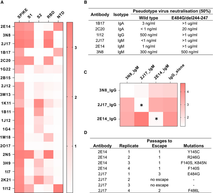
Heatmap of antibody binding to spike protein subdomains (complete spike extracellular domain “spike”, S1, S2, RBD and NTD in ELISA. Color gradient shown on right represents optical density at 450 nm (OD). Values are mean OD from two independent experiments. Analogous ELISA results for 3 IgM and their IgG1‐class‐switched derivatives are shown in Fig EV2B.
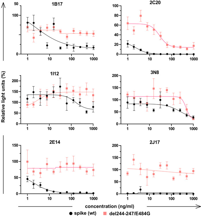
Susceptibility of different neutralizing antibodies to spike protein mutations. A neutralization assay was performed with 3 IgM, 1 IgG and 2 IgA using VSV*ΔG(FLuc) pseudotyped with wild‐type (wt) spike protein or with spike variant harboring the deletion of amino acids 244–247, located in the NTD, and the substitution E484G, located in the RBD, from a SARS‐CoV‐2 isolate from an immunosuppressed COVID‐19 patient (del244‐247/E484G). ND50 values were determined from quadruplicate wells, from an experiment performed once. Neutralization curves are shown in Fig EV4.
Flow‐cytometric epitope binning of monoclonal IgM, utilizing competitive displacement of IgG by IgM with identical variable region (as shown in Fig 4A). Cells expressing SARS‐CoV‐2 spike protein and untransfected control cells were incubated with each of 3 neutralizing IgM antibodies artificially switched to IgG1, either alone, or mixed with one of the 3 antibodies expressed as IgM. The binding of each IgG1 alone is shown in the last column of the heatmap, and in competition with each other IgM in columns 1‐3. Color shade represents the specific IgG binding (ratio of GMFI on TE spike‐mCherry cells to TE 0 cells). Values are mean GMFI ratios from three independent experiments. When IgM binds the same epitope as the IgG (automatically the case when the source antibody is the same), the IgM will displace the IgG, resulting in a reduction in the IgG signal. Asterisks mark those combinations of antibodies with a statistically significant decrease in binding of the IgG1 in the presence of IgM, compared to the IgG alone across 3 independent experiments, (*P < 0.05, two‐way analysis of variance, followed by Tukey's test).
Summary of escape mutations induced by potent neutralizing IgM 2E14 and 2J17. Vero cells in 24‐well plates were infected with VSV*ΔG‐SΔ21, in the presence of serial dilutions from 10 µg per ml of neutralizing antibody (or without antibody as control), and 2 days later, virus from the well containing the highest concentration of antibody that still showed some virus proliferation was used to infect fresh wells of Vero cells, again in the presence of antibody in a serial dilution. The process was repeated for three passages, and at the last passage, the cells were lysed, RNA extracted, reversed transcribed and sequenced, and consensus spike gene reads extracted and aligned against the reference SARS‐CoV‐2 genome MN908947.3. The table shows de novo amino acid mutations that arose in each of four replicates with each of the two neutralizing antibodies, as well as the number of passages needed for the escape mutant to emerge. In two of the replicates with 2J17, no escape was observed. Consensus sequences of spike genes from each replicates and from control wells with no antibody added are shown in Dataset EV2.
References
-
- Batista FD, Iber D, Neuberger MS (2001) B cells acquire antigen from target cells after synapse formation. Nature 411: 489–494 - PubMed
-
- Batista FD, Neuberger MS (1998) Affinity dependence of the B cell response to antigen: a threshold, a ceiling, and the importance of off‐rate. Immunity 8: 751–759 - PubMed
Publication types
MeSH terms
Substances
LinkOut - more resources
Full Text Sources
Other Literature Sources
Medical
Research Materials
Miscellaneous