. 2022 Jun;25(6):749-759.
doi: 10.1038/s41593-022-01081-x. Epub 2022 May 30.

Individual variability in brain representations of pain

Affiliations

Individual variability in brain representations of pain

Lada Kohoutová et al. Nat Neurosci. 2022 Jun.

Abstract

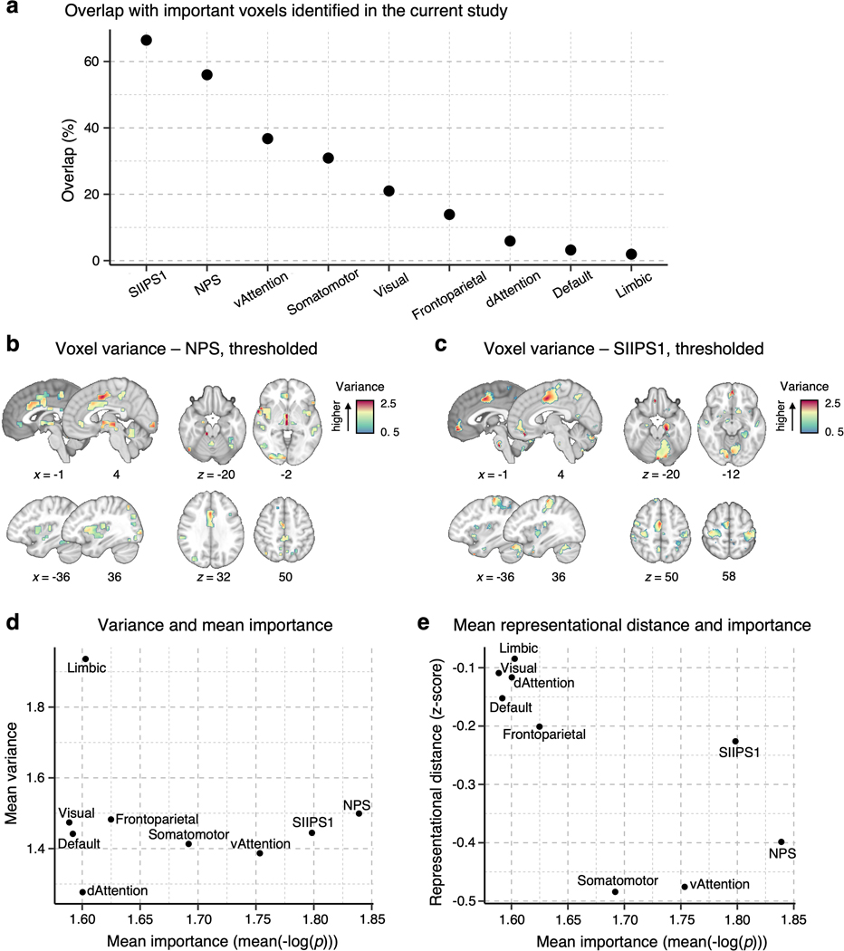
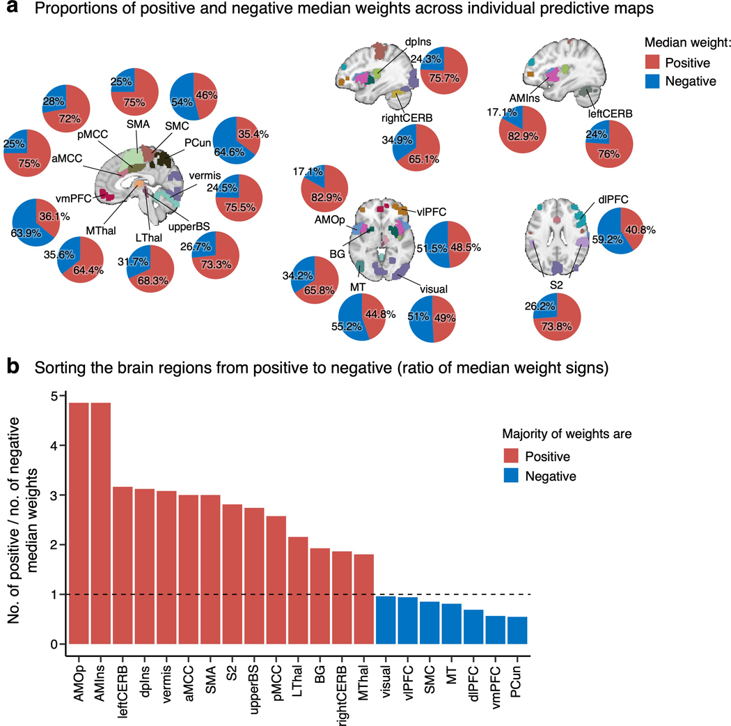
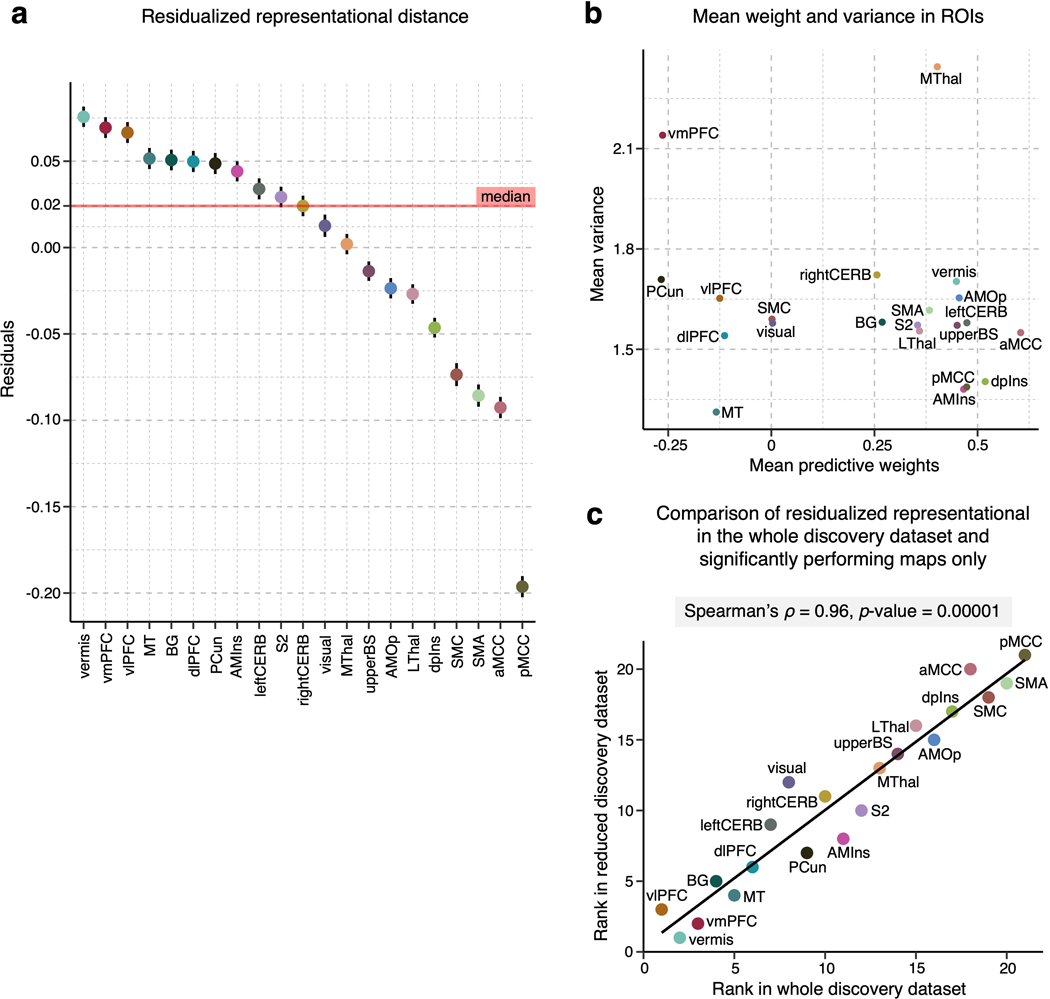
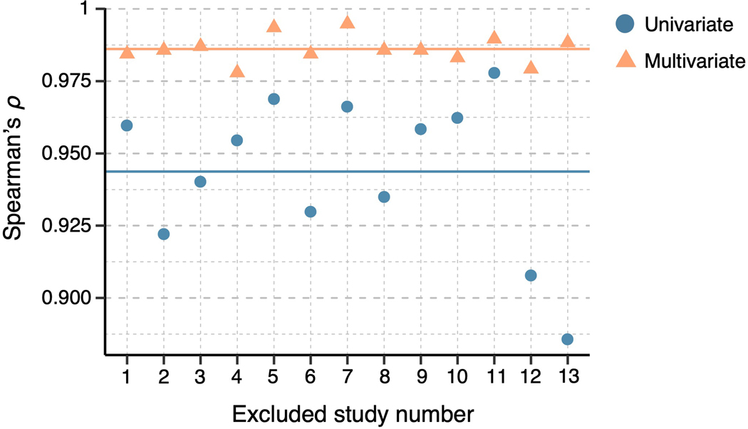
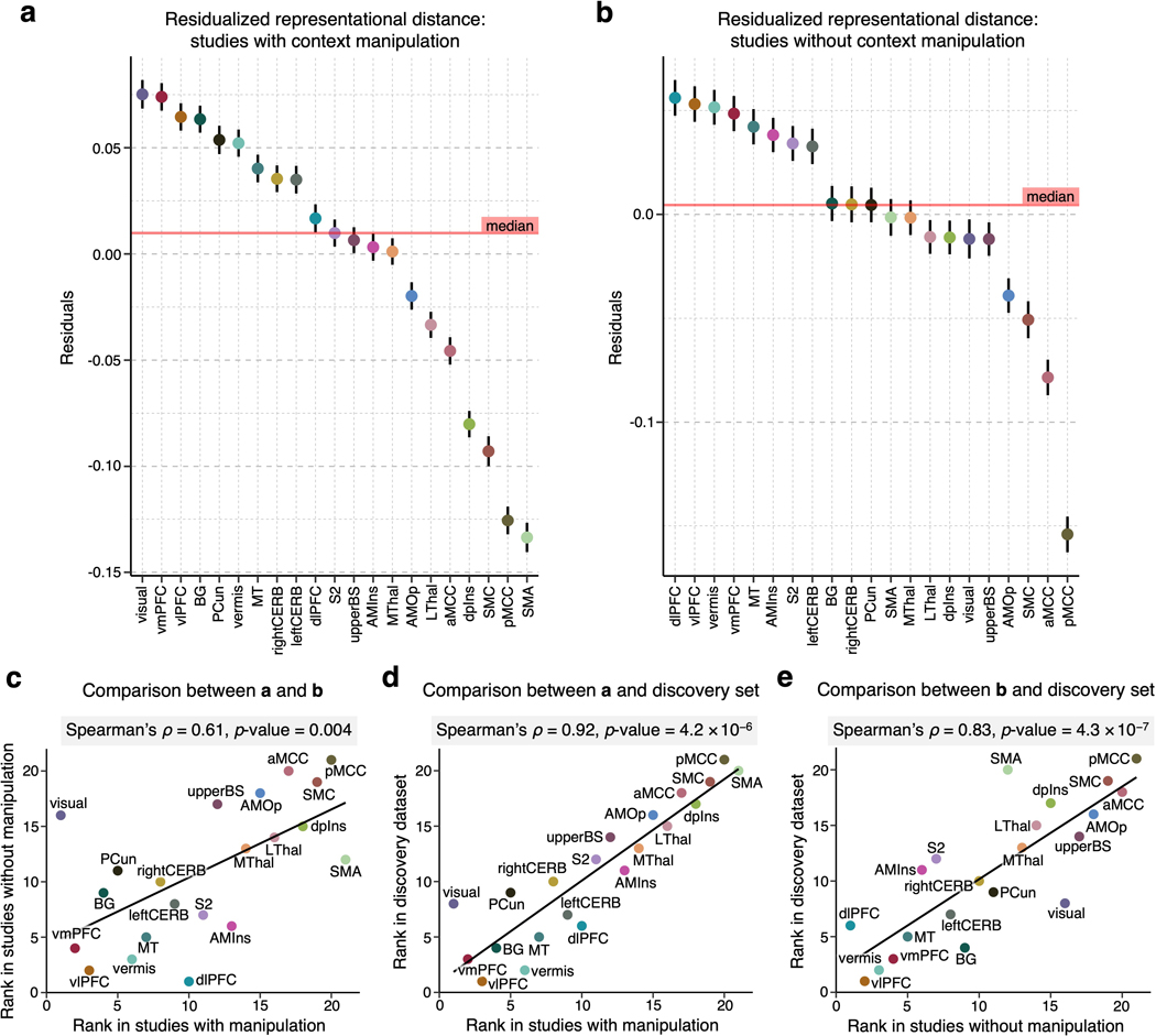
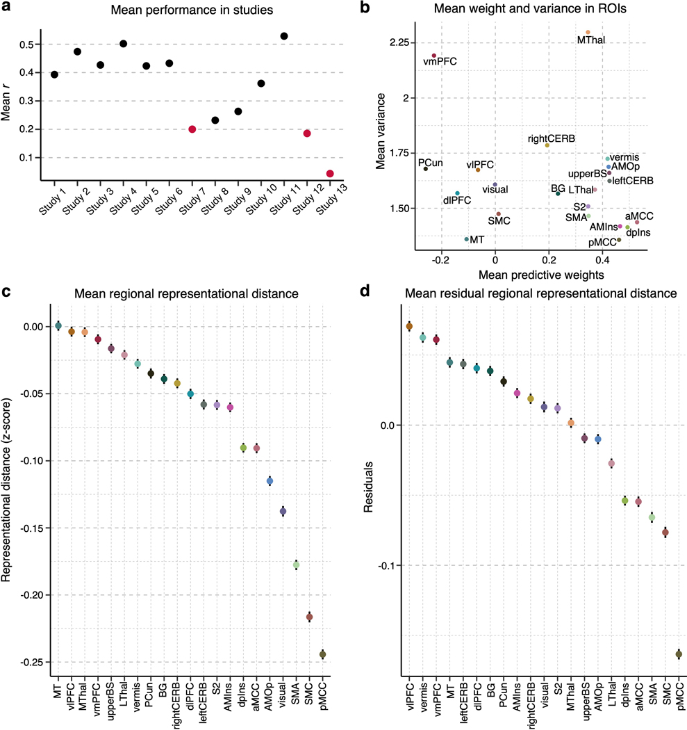
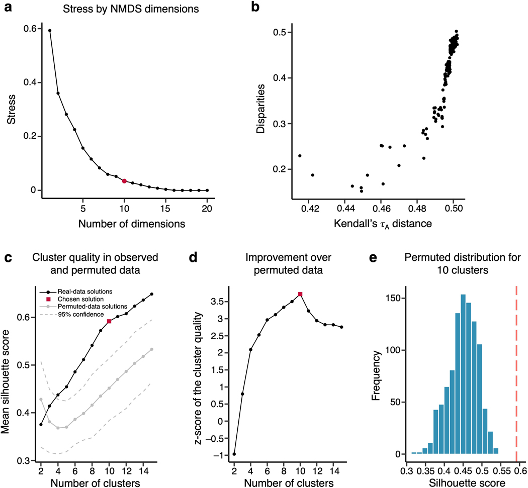
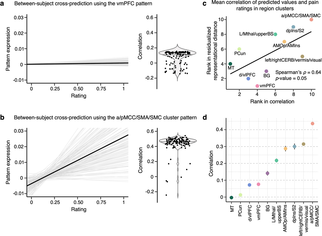
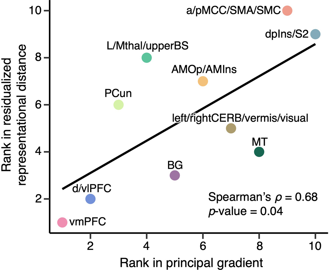
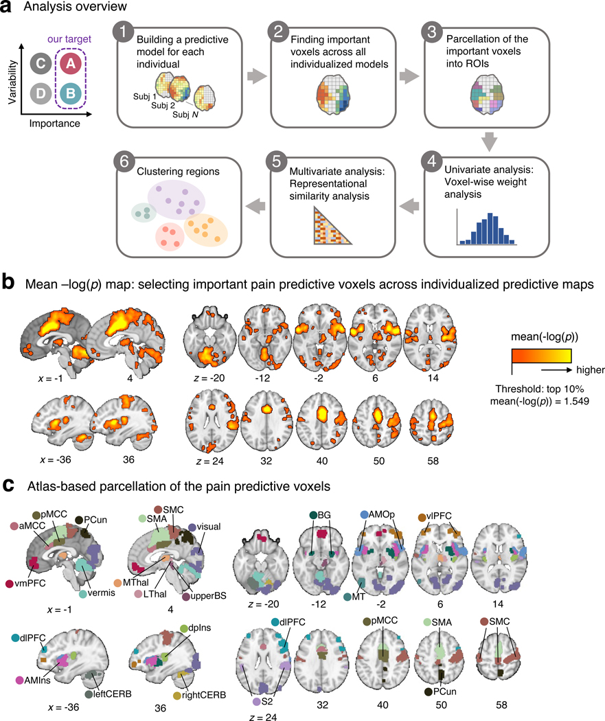
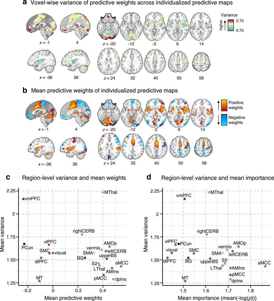
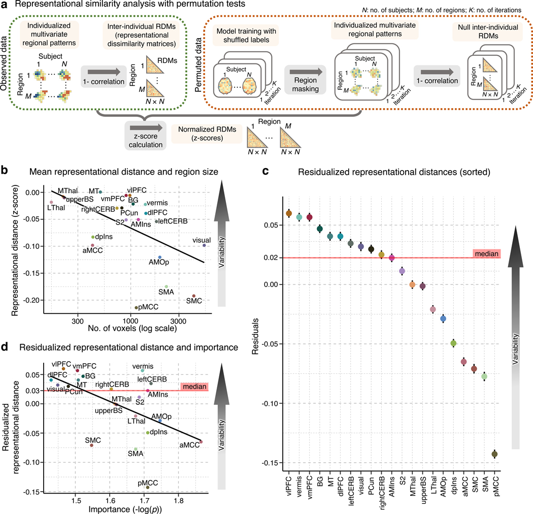
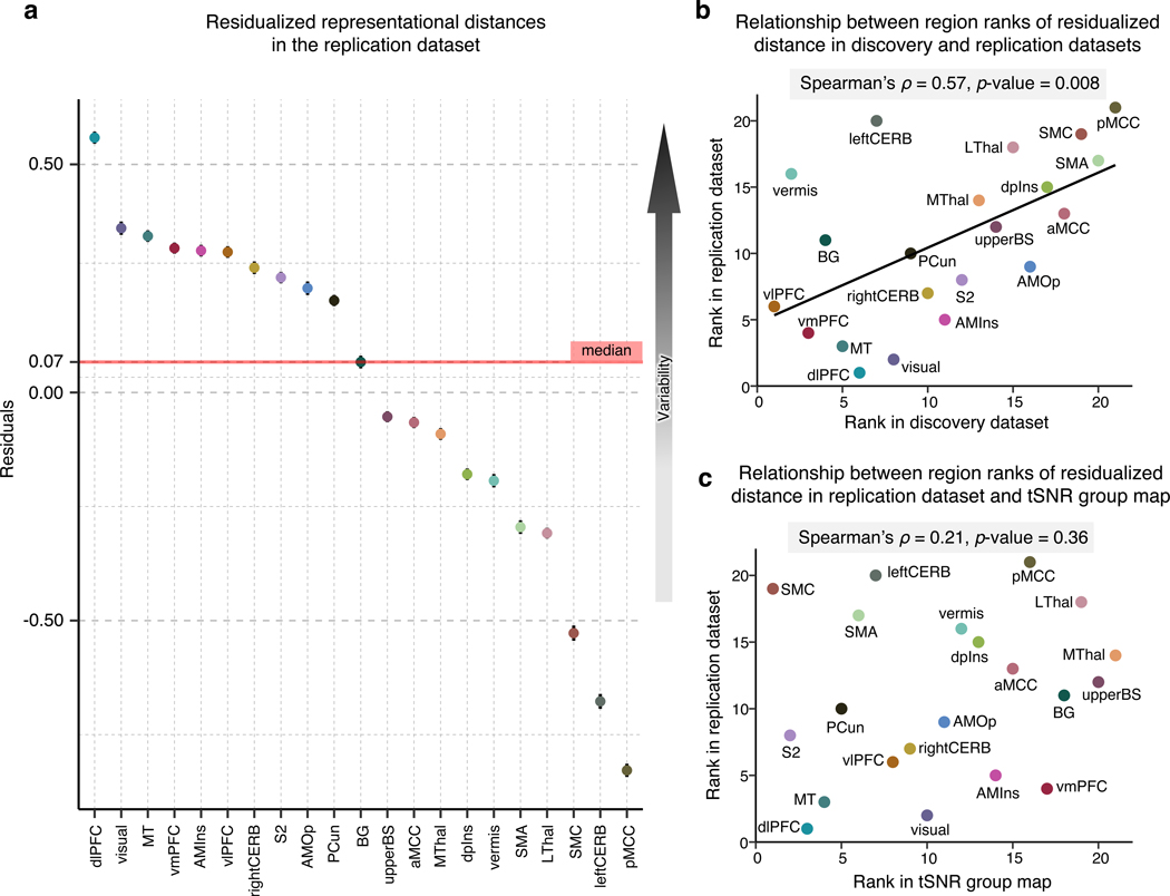
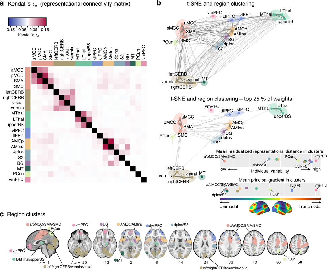
Characterizing cerebral contributions to individual variability in pain processing is crucial for personalized pain medicine, but has yet to be done. In the present study, we address this problem by identifying brain regions with high versus low interindividual variability in their relationship with pain. We trained idiographic pain-predictive models with 13 single-trial functional MRI datasets (n = 404, discovery set) and quantified voxel-level importance for individualized pain prediction. With 21 regions identified as important pain predictors, we examined the interindividual variability of local pain-predictive weights in these regions. Higher-order transmodal regions, such as ventromedial and ventrolateral prefrontal cortices, showed larger individual variability, whereas unimodal regions, such as somatomotor cortices, showed more stable pain representations across individuals. We replicated this result in an independent dataset (n = 124). Overall, our study identifies cerebral sources of individual differences in pain processing, providing potential targets for personalized assessment and treatment of pain.


Figures

Extended Data Fig. 1
Extended Data Fig. 1. Reference results based on pain signatures and large-scale functional networks.
To provide a reference to other commonly used brain parcellations and existing pain signatures, we performed the analyses presented in the manuscript with the NPS, SIIPS1 (thresholded at q < 0.05, false discovery rate [FDR] correction), and seven large-scale resting-state functional networks as masks. (a) The plot shows the proportions of the overlapping voxels of the pain signature and network masks with the area of the important voxels identified in the current study. (b) and (c) show the voxel-wise variance across the individuals from the discovery dataset in the thresholded NPS and SIIPS1 masks, respectively. (d) In each signature and network mask, we calculated the mean importance with mean(-log(p)) (based on two-tailed p-values) and the mean voxel-wise variance. The results suggest that the limbic network showed the highest mean variance, while the dorsal attention network showed the lowest mean variance (e) We also performed the multivariate analysis. we calculated the inter-individual representational dissimilarity matrix (RDM) using the correlation-based distance for each masked area, performed the permutation tests with 1,000 samples, as we did in the main analyses, and calculated the normalized RDMs (z-scores), as we did in the main analysis (see Fig. 3a in the main manuscript). The results suggest that the limbic and visual networks showed the highest mean normalized representational distance (i.e., highest inter-individual variability), while the somatomotor and ventral attention networks showed the lowest distance (i.e., lower inter-individual variability). dAttention, dorsal attention network; vAttention, ventral attention network
Extended Data Fig. 2
Extended Data Fig. 2. Proportions of the signs of median predictive weights.
(a) We found the median weight across voxels for each participant in each region and calculated the proportion of positive and negative median weights across all subjects. The pie charts display the percentage of median positive weights in red and negative weights in blue. (b) The bar plot shows the ratio of the number of positive to the number of negative median weights in each region. The red bars depict the regions with more positive median weights, and the blue bars mark the regions with more negative median weights.
Extended Data Fig. 3
Extended Data Fig. 3. Results after removing predictive maps with non-significant prediction performance.
To examine the effects of individuals with poor prediction performance on the inter-individual variability, we conducted the same analyses only with the individualized models with significant performance after correction for multiple comparisons using FDR correction at q < 0.05. All analyses shown here were performed on a reduced dataset of n = 248 after removing n = 156 with non-significant prediction performance. (a) The plot shows the mean representational distance after regressing out the effects of the region size. The error bar indicates the standard error of the mean. This corresponds to Fig. 3c of the main manuscript, which used the whole discovery dataset. (b) The scatter plot depicts the univariate analysis result, that is, the mean voxel weight and variance in each region. This corresponds to Fig. 2c of the main manuscript. (c) We assigned ranks to each region based on the residualized representational distance in both the original result based on the whole dataset and in the result based on the reduced dataset presented here. The two sets of results were significantly correlated at Spearman’s ρ = 0.96, p = 0.00001, two-tailed.
Extended Data Fig. 4
Extended Data Fig. 4. Inspection of potential study-specific effects on results.
To evaluate any potential study-specific effects on our results, we compared the final results (both univariate and multivariate) with the results with one study removed. For the comparisons, we calculated Spearman’s ρ using the rank orders of the brain regions’ individual variability between the results from the full versus reduced datasets. The blue dots show the results of the univariate analysis, ranging from 0.86 to 0.98, while the orange triangles are the results of the multivariate analysis, ranging from 0.98 to 0.99. The straight lines mark the mean Spearman’s ρ for both cases with respective colors.
Extended Data Fig. 5
Extended Data Fig. 5. Results of the representational similarity analysis for studies with and without context manipulation.
We performed the representational similarity analysis and controlled for the region size in the discovery dataset divided into studies (a) with context manipulation (e.g., placebo and cognitive regulation; studies 1, 4, 6, 7, 8, 11, and 12; n = 229) and (b) without context manipulation (studies 2, 3, 5, 9, 10, and 13; n = 175). The figures show the mean residualized representational distance and the standard error of the mean. (c) We found a significant correlation between region ranks in (a) and (b) of Spearman’s ρ = 0.61, p = 0.004, two-tailed. When compared with the region ranks in the discovery set, both (d) result in studies with context manipulation and (e) result in studies without context manipulation showed significant correlations of ρ = 0.92, p = 4.2 × 10⁻⁶, and ρ = 0.83, p = 4.3 × 10⁻⁷, respectively, all two-tailed.
Extended Data Fig. 6
Extended Data Fig. 6. Results after excluding the studies that showed low prediction performance.
(a) The plot shows the average prediction performance of the individualized whole-brain SVR models across 13 studies. Studies 7, 12 and 13 (marked in red) had the lowest performance, mean r = 0.20, 0.19, and 0.04, respectively. To test whether these studies with low performance affected the results, we re-did the analysis without these studies, i.e., on n = 285 individuals. (b) The scatter plot shows the mean predictive weight and variance across the individualized maps for each region after the exclusion of the three studies. (c) The plot displays the mean representational distance (z-scores) and standard error of the mean in each region based on all pair comparisons of individuals, i.e., C(285, 2) = 40,470. (d) The residuals of the representational distance after removing the effects of the region size and the standard error of the mean based on all pair comparisons of individuals, i.e., C(285, 2) = 40,470, are plotted.
Extended Data Fig. 7
Extended Data Fig. 7. tSNR map.
The group average of tSNR is visualized on a brain underlay with brighter colors depicting higher tSNR values, i.e., better tSNR.
Extended Data Fig. 8
Extended Data Fig. 8. Nonmetric multidimensional scaling-based hierarchical clustering analysis.
(a) For the clustering of pain-predictive regions, we first ran the nonmetric multidimensional scaling (NMDS) on the Kendall’s τA distance matrix, which was calculated as (1 – Kendall’s τA)/2. Based on the stress metric and scree method, we selected 10 dimensions (marked in red). (b) The x-axis of the scatter plot shows the input Kendall’s τA distance between regions, and the y-axis shows the Euclidean distance between the regions scaled into 10 dimensions after the NMDS. (c) We performed the hierarchical clustering with average linkage on the selected NMDS results and used permutation tests to choose the final number of clusters, k. For the permutation tests, we shuffled the NMDS scores, applied the clustering algorithm, and assessed the clustering quality of the permuted data at each iteration. We ran a total of 1,000 iterations, and the plot shows the mean cluster quality of both the observed (solid black line) and permuted (solid gray line) data, as well as the 95% confidence interval (gray dashed lines) for the permuted cluster quality. The red square marks the selected solution with a Silhouette score of 0.59. (d) The plot shows the z-scores that indicate an improvement of the cluster quality of the observed data compared to the permuted null data. The highest improvement was achieved with the 10 cluster solution (shown as the red square) with a z-score of 3.72, p = 0.0002, two-tailed. (e) The histogram depicts the observed cluster quality of the 10 cluster solution (red dashed line) versus the null distribution from the permutation test (blue histogram).
Extended Data Fig. 9
Extended Data Fig. 9. Cross-individual pain prediction.
To further illustrate the inter-individual variability in pain representations across different region clusters, we conducted cross-individual prediction of pain using pain predictive patterns of region clusters in Study 14. The panels (a) and (b) show examples of the cross-prediction using the vmPFC (the most variable region cluster) and a/pMCC/SMA/SMC (the most stable region cluster) cluster patterns, respectively. The gray lines in the line plots show the mean regression lines of pain prediction in others using an individual’s predictive map (i.e., each line indicates the prediction using one participant’s pain prediction model). The black lines show the global average of all the individual regression lines. The violin plots show the mean correlation between the predicted and actual pain ratings in cross-individual pain prediction. Each dot represents mean prediction-outcome correlation using one participant’s pain prediction model. (c) We calculated the global cross-individual prediction performance of each region cluster using prediction-outcome correlations. The top panel shows the relationship between the rank in the mean residualized distance (y-axis), where clusters are ordered from the most variable to the least variable cluster, and the rank in the correlation values (x-axis), where the clusters are ordered from the lowest to the highest cross-individual prediction performance. Together with the examples in (a) and (b), this plot suggests that the cross-individual prediction is more reliable in the clusters with lower inter-individual variability. (d) The plot displays the mean correlation values with the standard error of the mean for each region cluster based on n = 124.
Extended Data Fig. 10
Extended Data Fig. 10. Relationship between the principal gradient of functional connectivity and mean residualized representational distance.
To compare the principal gradient spectrum and mean residualized distance in clusters, we first calculated the principal gradient map using our own resting-state fMRI dataset (n = 56; 7-min resting scan) to create a volumetric principal gradient image and to include the subcortical regions. We assigned ranks to the region clusters based on both the principal gradient value (x-axis) and mean residualized distance (y-axis) and compared them using Spearman’s rank correlation coefficient. We found a significant relationship at Spearman’s ρ = 0.68, p = 0.04, two-tailed.
Figure 1.
Figure 1.. Analysis overview and important pain-predictive regions.
(a) In this study, we aimed to identify brain regions that were important for pain prediction and examine whether they showed variable or stable pattern representations across individuals (“A” and “B” categories; top left). To this end, we conducted a series of analyses that can be divided into six steps. Detailed explanations about the analysis steps can be found in the Results and Methods sections. (b) In the Step 2 analysis, we selected voxels that were important for pain prediction. We operationalized the importance in terms of mean –log(p), where the two-tailed p-values were calculated from the bootstrap tests performed in each individualized predictive map. The selected voxels had mean –log(p) values higher than the top 10% mean –log(p) value (= 1.549). (c) The important voxels were parcellated into 21 regions based on the cortical and cerebellar atlases (see Methods for more details).aMCC, anterior midcingulate cortex; AMIns, anterior middle insula; AMOp, anterior middle operculum; BG, basal ganglia; dlPFC, dorsal lateral prefrontal cortex; dpIns, dorsal posterior insula; leftCERB, left cerebellum; LThal, lateral thalamus; MT, middle temporal area; MThal, middle thalamus; PCun, precuneus; pMCC, posterior midcingulate cortex; rightCERB, right cerebellum; S2, secondary somatosensory cortex; SMA, supplementary motor area; SMC, sensorimotor cortex; upperBS, upper brainstem; visual, visual cortex; vlPFC, ventrolateral prefrontal cortex; vmPFC, ventromedial prefrontal cortex.
Figure 2.
Figure 2.. Univariate analysis of the individual variability of predictive weights.
(a) We first examined the voxel-wise variance of voxel weights across all individualized pain-predictive maps. (b) We also examined the voxel-level mean predictive weights across the individualized maps. The positive weights were shown in warm colors (i.e., positively predictive of pain), and the negative weights (i.e., negatively predictive of pain) were shown in cool colors. (c) The scatter plot shows the region-level summary with the mean predictive weights on the x-axis and mean weight variance on the y-axis. (d) The scatter plot displays the mean weight variance against the mean importance as –log(p) (based on two-tailed p-values).
Figure 3.
Figure 3.. Multivariate analysis of the individual variability of predictive weights using a representational similarity analysis.
(a) To assess the inter-individual variability of the regional multivariate patterns, we performed a representational similarity analysis. A detailed description of the analysis can be found in the Methods section, Multivariate representational similarity analysis. (b) The scatter plot shows the relationship between the mean representational distance based on the permutation tests (y-axis) and region size (displayed in the logarithmic scale on the x-axis). The two variables showed strong negative correlation, r = −0.537, p = 0.012, two-tailed. Higher representational distance values indicate higher pattern-level variability across people. (c) To account for the effects of region size on the representational distance, we regressed out the region size effects from the representational distance. The plot shows the residualized representational distance, sorted from the highest distance, and the standard error of the mean across all pair comparisons of individuals, i.e., C(404, 2) = 81,406. (d) The scatter plot shows the relationship between the residualized representational distance and the mean importance measured by mean -log(p) with Pearson’s r = –0.542, p = 0.011, two-tailed.
Figure 4.
Figure 4.. Replication of the multivariate representational similarity analysis in an independent dataset and tSNR in the dataset.
To validate the previous results, we employed an independent replication dataset acquired under the same experimental settings in the same location. (a) In the replication dataset, we performed a representational similarity analysis and regressed out the effects of region size on the mean representational distance. The plot depicts the residualized representational distance (a measure of inter-individual variability in neural patterns) in each region, with higher values representing higher regional variability. (b) Based on the residualized distance, we assigned ranks to all regions in both the discovery and replication datasets. The scatterplot visualizes the statistically significant relationship between the results in the two datasets. (c) To further inspect whether our results in the replication dataset are influenced by a different tSNR in different regions, we calculated the mean tSNR in all regions. The scatter plot compares the region ranks based on the tSNR and residualized representational distance suggesting that the regional variability in the replication dataset cannot be explained by varying tSNR in regions.
Figure 5.
Figure 5.. Clustering of the pain-predictive brain regions based on the patterns of representational distance.
(a) The heat map shows the representational connectivity matrix (Kendall’s τA) among 21 pain-predictive regions. Higher Kendall’s τA values (shown in darker red) indicate higher similarity between regions. (b) We conducted a hierarchical clustering analysis of brain regions using the 10-dimensional NMDS scores based on the representational connectivity matrix, resulting in 10 region clusters. The plot shows the t-distributed stochastic neighborhood embedding (t-SNE) map based on the 10-dimensional NMDS scores, and the 10 region clusters are shown with different colors. The line widths indicate the relative connectivity strengths among the brain regions. The top panel shows all the connections, while the bottom panel shows only the top 25 % of the connections. The upper bottom right chart displays the mean residualized representational distance of the region clusters (color-coded). Furthermore, in the region clusters we calculated the mean principal gradient that ranges from unimodal to higher-order transmodal areas as suggested by ref.. The lower chart, then, shows the mean principal gradient in the region clusters suggesting that more variable clusters are located at the top of the principal gradient spectrum, while more stable clusters are located at the bottom of the principal gradient. The bottom cortex map visualizes the principal gradient map obtained from an independent dataset (N = 59). (c) The region clusters are visualized on a brain underlay.

References

    1. Coghill RC The Distributed Nociceptive System: A Framework for Understanding Pain. Trends Neurosci, doi:10.1016/j.tins.2020.07.004 (2020). - DOI - PMC - PubMed
    1. Tracey I. & Mantyh PW The cerebral signature for pain perception and its modulation. Neuron 55, 377–391, doi:10.1016/j.neuron.2007.07.012 (2007). - DOI - PubMed
    1. Apkarian AV, Bushnell MC, Treede RD & Zubieta JK Human brain mechanisms of pain perception and regulation in health and disease. Eur J Pain 9, 463–484, doi:10.1016/j.ejpain.2004.11.001 (2005). - DOI - PubMed
    1. Xu A. et al. Convergent neural representations of experimentally-induced acute pain in healthy volunteers: A large-scale fMRI meta-analysis. Neurosci Biobehav Rev 112, 300–323, doi:10.1016/j.neubiorev.2020.01.004 (2020). - DOI - PMC - PubMed
    1. Kucyi A. & Davis KD The dynamic pain connectome. Trends Neurosci 38, 86–95, doi:10.1016/j.tins.2014.11.006 (2015). - DOI - PubMed

Publication types