. 2022 Jun 1:11:e70661.
doi: 10.7554/eLife.70661.

Minian, an open-source miniscope analysis pipeline

Affiliations

Minian, an open-source miniscope analysis pipeline

Zhe Dong et al. Elife. .

Abstract

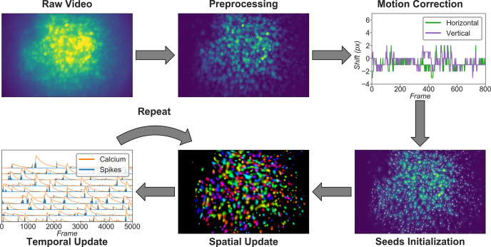
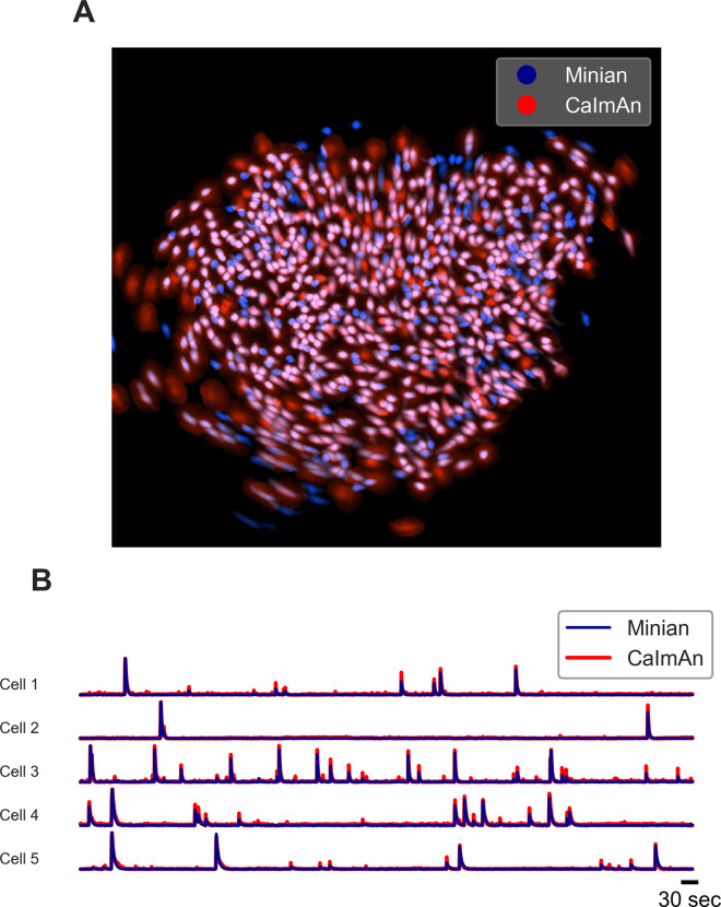
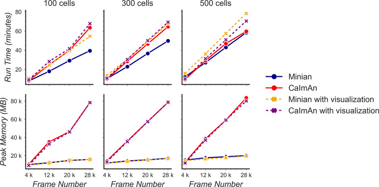
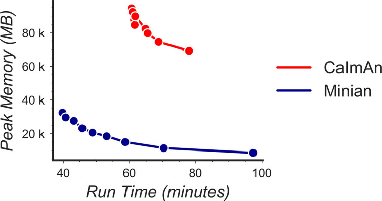
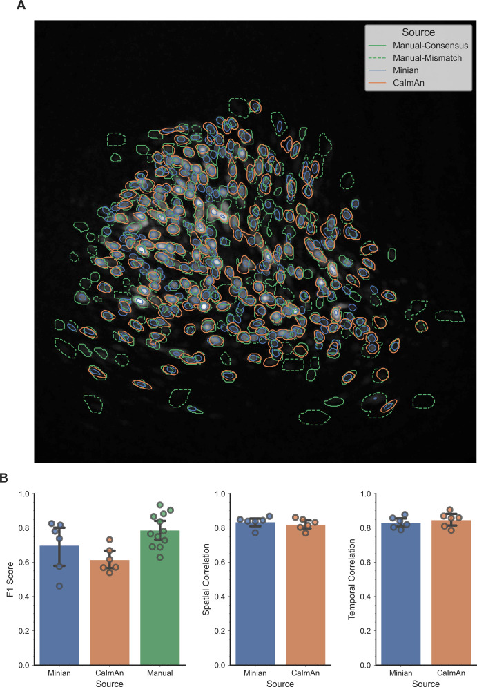
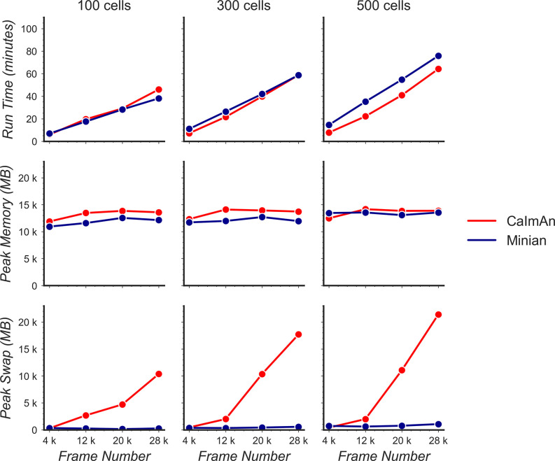
Miniature microscopes have gained considerable traction for in vivo calcium imaging in freely behaving animals. However, extracting calcium signals from raw videos is a computationally complex problem and remains a bottleneck for many researchers utilizing single-photon in vivo calcium imaging. Despite the existence of many powerful analysis packages designed to detect and extract calcium dynamics, most have either key parameters that are hard-coded or insufficient step-by-step guidance and validations to help the users choose the best parameters. This makes it difficult to know whether the output is reliable and meets the assumptions necessary for proper analysis. Moreover, large memory demand is often a constraint for setting up these pipelines since it limits the choice of hardware to specialized computers. Given these difficulties, there is a need for a low memory demand, user-friendly tool offering interactive visualizations of how altering parameters at each step of the analysis affects data output. Our open-source analysis pipeline, Minian (miniscope analysis), facilitates the transparency and accessibility of single-photon calcium imaging analysis, permitting users with little computational experience to extract the location of cells and their corresponding calcium traces and deconvolved neural activities. Minian contains interactive visualization tools for every step of the analysis, as well as detailed documentation and tips on parameter exploration. Furthermore, Minian has relatively small memory demands and can be run on a laptop, making it available to labs that do not have access to specialized computational hardware. Minian has been validated to reliably and robustly extract calcium events across different brain regions and from different cell types. In practice, Minian provides an open-source calcium imaging analysis pipeline with user-friendly interactive visualizations to explore parameters and validate results.

Keywords: Miniscope; analysis pipeline; calcium imaging; mouse; neuroscience.


Conflict of interest statement

ZD, WM, YF, ZP, LC, YZ, KR, TS, DA No competing interests declared, DC Reviewing editor, eLife

Figures

Figure 1.
Figure 1.. Overview of the analysis pipeline.
The analysis is divided into five stages: preprocessing, where sensor noise and background fluorescence from scattered light are removed; motion correction, where rigid motion of the brain is corrected; seeds initialization, where the initial spatial and temporal matrices for later steps are generated from a seed-based approach; spatial update, where the spatial footprints of cells are further refined; and temporal update, where the temporal signals of cells are further refined. The last two steps of the pipeline are iterative and can be repeated multiple times until a satisfactory result is reached.
Figure 2.
Figure 2.. Interactive visualization of raw input video.
One frame is shown in the central panel of the visualization that can be interactively updated with the player toolbar on the top. A histogram of fluorescence intensity of the current frame is shown on the right and will update in response to zooming in on the central frame. A line plot of summary values across time is shown at the bottom. Here, the maximum, mean, and minimum fluorescence values are plotted. These summaries are useful in checking whether there are unexpected artifacts or gaps in the recording. Finally, the user can draw an arbitrary box in the central frame, and the position of this boxed region can be recorded and used as a mask during later steps. For example, during motion correction a subregion of the data containing a stable landmark might provide better information on the motion.
Figure 3.
Figure 3.. General visualization of preprocessing.
The same visualization of input video can be used to visualize the whole video before and after specific preprocessing steps side-by-side. The effect of vignetting correction is visualized here. The image and accompanying histogram on the left side show the original data; the data after vignetting correction are shown on the right side. Any frame of the data can be selected with the player toolbar and histograms are responsive to all updates in the image.
Figure 4.
Figure 4.. Visualization of denoising.
Here, a single frame from the data is passed through the background removal, and both the image and a contour plot are shown for the frame before and after the process. The contour plots show the iso-contour of five intensity levels spaced linearly across the full intensity range of the corresponding image. The plots are interactive and responsive to the slider of the window size on the right, thus the effect of different window sizes for denoising can be visualized.
Figure 5.
Figure 5.. Effect of window size on denoising.
One example frame is chosen from the data, and the resulting images (top row) and contour plots (bottom row) are shown to demonstrate the effect of window size on denoising. Here, a window size of 11 (middle column) is appropriate while both smaller and larger window sizes result in artifacts.
Figure 6.
Figure 6.. Visualization of background removal.
Here, a single frame from the data is passed through background removal, and both the image and a contour plot are shown for the frame before and after the process. The plots are interactive and responsive to the slider of the window size on the right, thus the effect of different window sizes for background removal can be visualized.
Figure 7.
Figure 7.. Effect of window size on background removal.
One example frame is chosen from the data, and the resulting images (top row) and contour plots (bottom row) are shown to demonstrate the effect of window size on background removal. The contour plots show the iso-contour of five intensity levels spaced linearly across the full intensity range of the corresponding image. Here, a window size of 20 pixels (middle column) is appropriate while both smaller and larger window sizes produce unsatisfactory results: a window size too small (left column) artificially limits the size of cells, and a window size too large (right column) does not remove the background effectively.
Figure 8.
Figure 8.. Visualization of noise frequency cutoff.
The cutoff frequency for noise is one of the critical parameters in the pipeline that affects both the seed initialization process and constrained non-negative matrix factorization’s (CNMF’s) temporal update steps. Here, we help the user determine that parameter by plotting temporal traces from six example seeds. In each plot, the raw signal is passed through a high-pass and low-pass filter at the chosen frequency, and the resulting signals are plotted separately as ‘noise’ and ‘signal.’ The plots are responsive to the chosen frequency controlled by the slider on the right. In this way, the user can visually inspect whether the chosen frequency can effectively filter out high-frequency noise without deforming the calcium signal.
Figure 9.
Figure 9.. Example of filtered traces with different frequency cutoffs.
Here, the temporal dynamics of three example seeds are chosen, and the low-pass and high-pass filtered traces with different frequency cutoffs are shown. The low-pass filtered trace corresponds to ‘signal,’ while the high-pass filtered trace corresponds to ‘noise.’ Here, a 1 Hz cutoff frequency is considered appropriate since calcium dynamics and random noise are cleanly separated. A cutoff frequency smaller than 1 Hz left the calcium dynamics in the ‘noise’ trace, while a cutoff frequency larger than 1 Hz let random noise bleed into the ‘signal’ trace (i.e., high-frequency fluctuations are presented in periods where the cells seem to be inactive).
Figure 10.
Figure 10.. Visualization of spatial updates.
Here, 10 cells are randomly chosen to pass through spatial update with different parameters. The resulting spatial footprints, as well as binarized footprints, are plotted. In addition, the corresponding temporal traces of cells are plotted. The user can visually inspect the size and shape of the spatial footprints and at the same time easily determine whether the results are sparse enough by looking at the binarized footprints.
Figure 11.
Figure 11.. Effect of sparseness penalty in spatial update.
Here, the sum projection of the spatial matrix and binarized spatial matrix is shown for three different sparse penalties. A sparseness penalty of 0.1 is considered appropriate in this case. When the sparseness penalty is set lower, artifacts begin to appear. On the other hand, when the sparseness penalty is set higher, cells are dropped out.
Figure 12.
Figure 12.. Visualization of temporal update.
Here, a subset of cells is randomly chosen to pass through temporal updates with different parameters. Only one cell is visualized at a given time, and the cell can be selected using the slider on the right. The raw signal, fitted signal, fitted calcium traces, and spike signals are overlaid in the same plot. In addition, a simulated pulse response based on the estimated autoregressive parameters is plotted with the same time scale. Furthermore, the corresponding spatial footprint of the cell is plotted for cross-reference. With a given set of parameters, the user can visually inspect whether the pulse response captures the typical calcium dynamics of the cell, and whether the timing and sparsity of the spike signal fit well with the raw data. The data shown here was acquired with a frame rate of 30 fps.
Figure 13.
Figure 13.. Effect of the sparseness penalty in temporal update.
Here, three example cells are selected and passed to the temporal update with different sparseness penalties. The ‘Raw Signal’ corresponds to the input video projected onto predetermined spatial footprints. The ‘Fitted Calcium’ and ‘Fitted Spikes’ correspond to the resulting model-fitted calcium dynamics and spike signals. A sparseness penalty of 0.008 (middle column) is considered appropriate in this case. The data shown here was acquired with a frame rate of 30 fps.
Figure 14.
Figure 14.. Interactive visualization of Minian output.
The three images on the top show the spatial footprints of all the cells (left), spatial temporal activities of selected subset of cells (middle), and preprocessed data. The bottom row shows the display control panel (left), temporal dynamics of selected subset of cells (middle), and manual curation panel (right). The field of view, current frame, and selection of cells are all synced across different plots to help user focus on a specific region and time. The users can use the control panel to select groups of cells, change display options for temporal dynamics and spatial temporal activities, and change the current frame or play the movie. In addition, the users can directly select cells from the spatial footprints plot on the top left. The users can also directly jump to frames by double-clicking on the temporal dynamic plots. These interactive features help the users quickly focus on region and time of interests. The manual curation menu on bottom right can be used to assign unit labels to each cell, which indicate whether a cell should be dropped or merged.
Figure 15.
Figure 15.. Validation of Minian with simulated datasets.
Simulated datasets with varying signal level and number of cells are processed through Minian and CaImAn. The F1 score (top), median correlation of spatial footprints (middle), and median correlation of temporal dynamics (bottom) are plotted as a function of signal level. Both pipelines achieve near-perfect (>0.95) F1 scores and spatial footprint correlation across all conditions. The correlation of temporal dynamics is lower when the signal level is 0.2, but remains similar across the two pipelines overall.
Figure 16.
Figure 16.. Validation of deconvolved signal from Minian.
(A) Correlation of deconvolved signals from Minian output with simulated ground truth. The mean correlation across all cells (blue line) and standard deviation (light blue shade) are shown separately for different signal levels and number of cells. The correlation asymptote and approach 1 when signal level is higher than 1. (B) Example deconvolved traces from Minian output overlaid with simulated ground truth. One representative cell is drawn from each signal level. The binary-simulated spikes are shown in green, with the real-valued Minian deconvolved output overlaid on top in blue. The deconvolved signals closely match the ground truth, and the main difference between the two signals is in the amplitude of the deconvolved signals, which tend to be influenced by local background.
Figure 17.
Figure 17.. Example output of Minian and CaImAn with experimental datasets.
(A) An example field of view from one of the experimental datasets. The spatial footprints from Minian and CaImAn are colored as blue and red, respectively, and overlaid on top of each other. Most of the spatial footprints from both pipelines overlap with each other. (B) Five example matched temporal activity from Minian and CaImAn overlaid on top of each other. The extracted temporal activity is highly similar across the two pipelines.
Figure 18.
Figure 18.. Benchmarking of computational performance.
Data with varying number of cells and frames were processed through Minian and CaImAn. The run time (top) and peak memory usage (bottom) were recorded and plotted as a function of frame number. For both pipelines, the run time scales linearly as a function of the number of frames and remains similar across the pipelines. However, the peak memory usage for CaImAn also scales linearly as the number of frames increases, while Minian maintains a relatively constant peak memory usage across different frame numbers and cell numbers.
Figure 19.
Figure 19.. Tradeoff between run time and memory usage.
Simulated data with 500 cells and 28,000 frames were processed through Minian and CaImAn with different numbers of parallel processes. We varied the number of parallel processes from 2 to 10, and the resulting memory usage is plotted as a function of run time. For both pipelines, the curve takes a hyperbola shape, showing the tradeoff between run time and memory usage.
Figure 20.
Figure 20.. Validation of Minian with hippocampal CA1 place cells.
(A) Matching place cells from two recording sessions. The cells are matched from one session to the other using the cross-session registration algorithm and sorted based on place field in the first session. In both sessions, animals run on a 2-m-long linear track with water reward at both ends. The track is divided into 200 spatial bins. The mean ‘firing’ rate calculated from the spike signal for each cell is shown. Cell IDs are assigned by Minian when each session is analyzed independently. (B) Averaged correlations of spatial firing rates with different artificial shifts. We artificially shifted the spatial footprints of the second linear track session, then carried out registration and calculated a mean correlation of spatial firing rates for all place cells. The artificial shifts were relative to the aligned spatial footprints and range from –50 to 50 pixels.
Author response image 1.
Author response image 1.. Validation of Minian with experimental datasets.
An example field of view from one of the experimental datasets is shown in panel A, with contours of detected ROIs overlaid on top. ROIs labeled by human labelers are shown in green, where solid lines indicate ROIs labeled by both labelers (labeled as “Manual-Consensus”) and dashed lines indicate ROIs labeled by one of the labelers (labeled as “Manual-Mismatch”). The F1 scores, spatial footprints correlation and temporal dynamics correlation are plotted for the two pipelines in panel B. The F1 scores of the two human labelers are also included in the plot for comparison (labeled as “Manual”). The F1 scores, spatial footprints correlation and temporal dynamics correlation were all not significantly different across the two pipelines (One-way ANOVA, p > 0.05).
Author response image 2.
Author response image 2.. Benchmarking of computational performance in OS X.
Data with varying number of cells and frames were processed through Minian and CaImAn without visualization. The run time (top) and peak physical memory usage (middle) and peak swap memory usage (bottom) were recorded and plotted as a function of frame number.

References

    1. Aharoni D, Hoogland TM. Circuit Investigations With Open-Source Miniaturized Microscopes: Past, Present and Future. Frontiers in Cellular Neuroscience. 2019;13:141. doi: 10.3389/fncel.2019.00141. - DOI - PMC - PubMed
    1. Aharoni D, Khakh BS, Silva AJ, Golshani P. All the light that we can see: a new era in miniaturized microscopy. Nature Methods. 2019;16:11–13. doi: 10.1038/s41592-018-0266-x. - DOI - PMC - PubMed
    1. Barbera G, Liang B, Zhang L, Li Y, Lin DT. A wireless miniScope for deep brain imaging in freely moving mice. Journal of Neuroscience Methods. 2019;323:56–60. doi: 10.1016/j.jneumeth.2019.05.008. - DOI - PMC - PubMed
    1. Bokeh Development Team Bokeh: Python library for interactive visualization. Bokeh. 2020 https://bokeh.org/
    1. Bradski G. The OpenCV Library. Dr Dobb’s Journal of Software Tools 2020