. 2022 Jun;606(7913):343-350.
doi: 10.1038/s41586-022-04786-y. Epub 2022 Jun 1.

Clonal dynamics of haematopoiesis across the human lifespan

Affiliations

Clonal dynamics of haematopoiesis across the human lifespan

Emily Mitchell et al. Nature. 2022 Jun.

Abstract

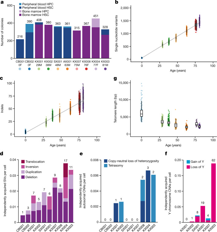
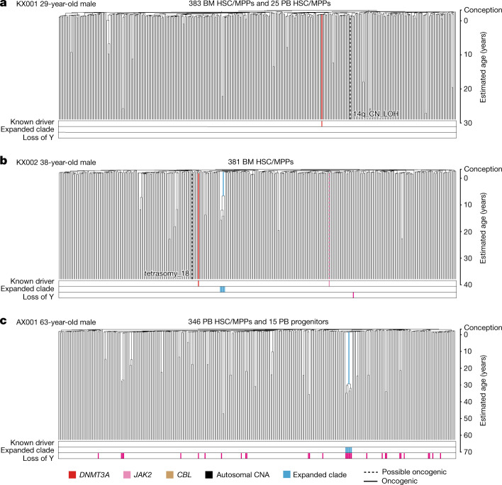
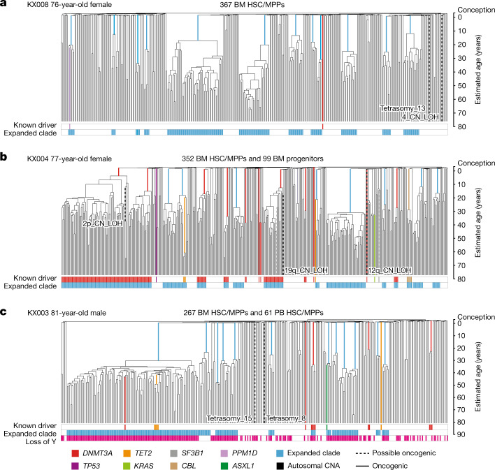
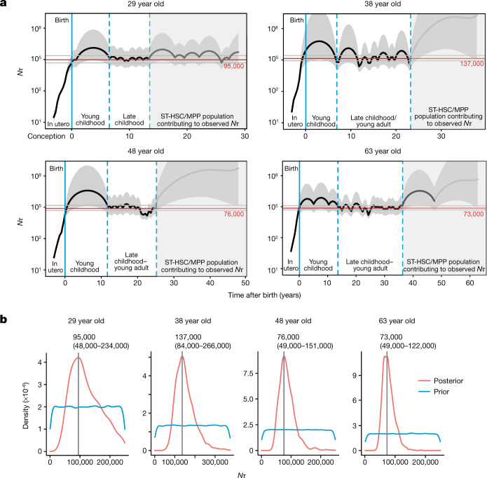
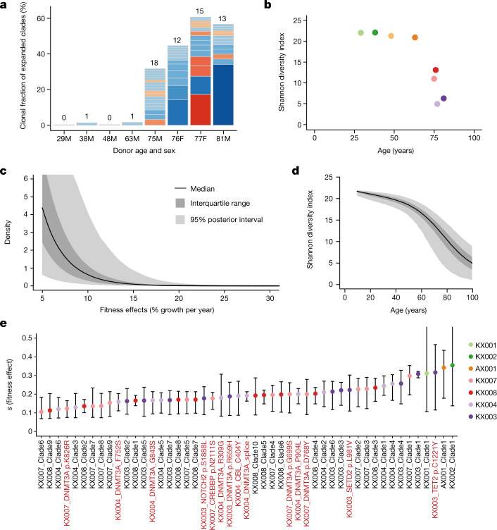
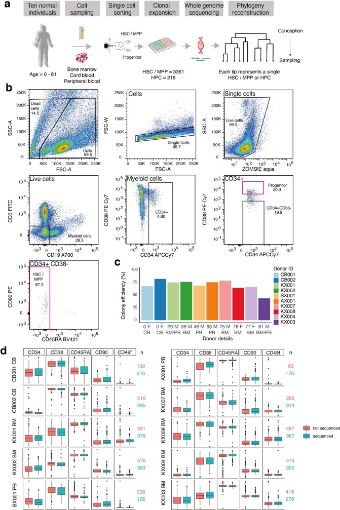
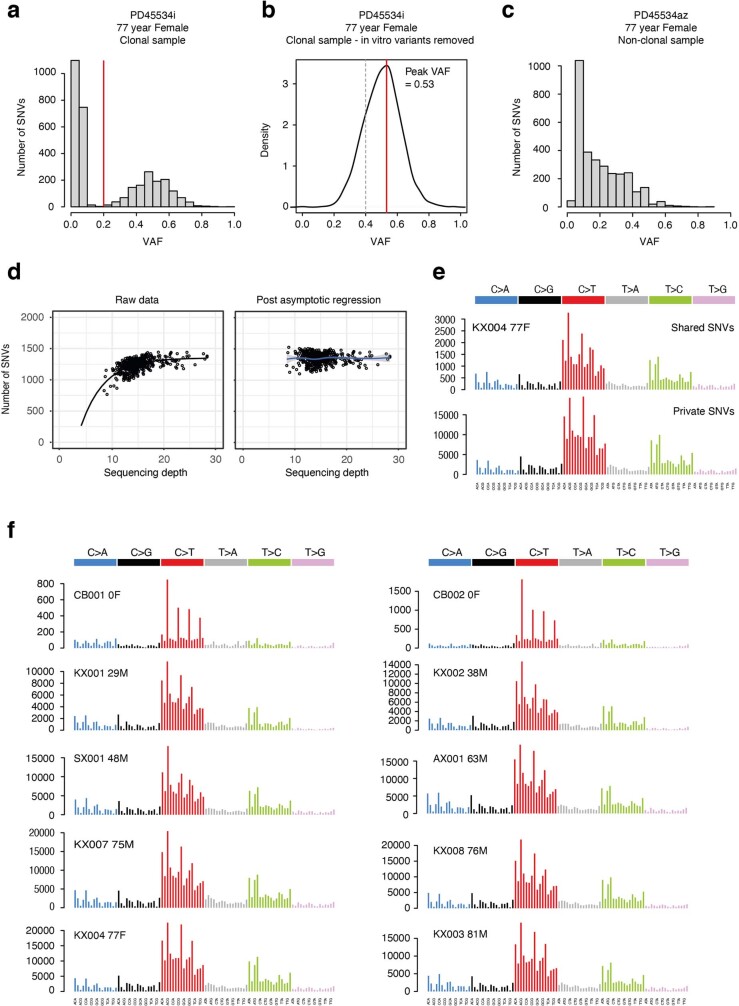
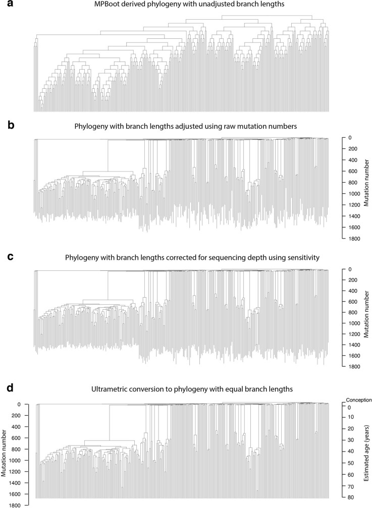
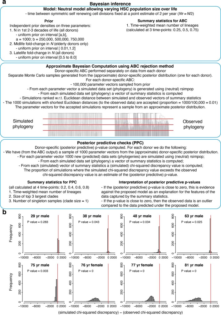
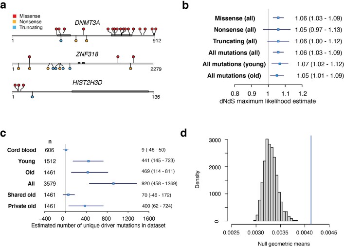
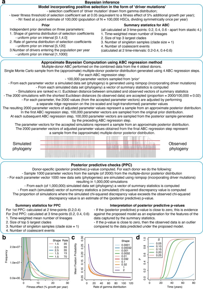
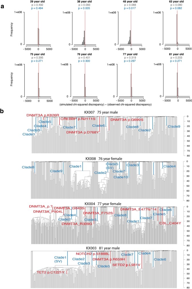
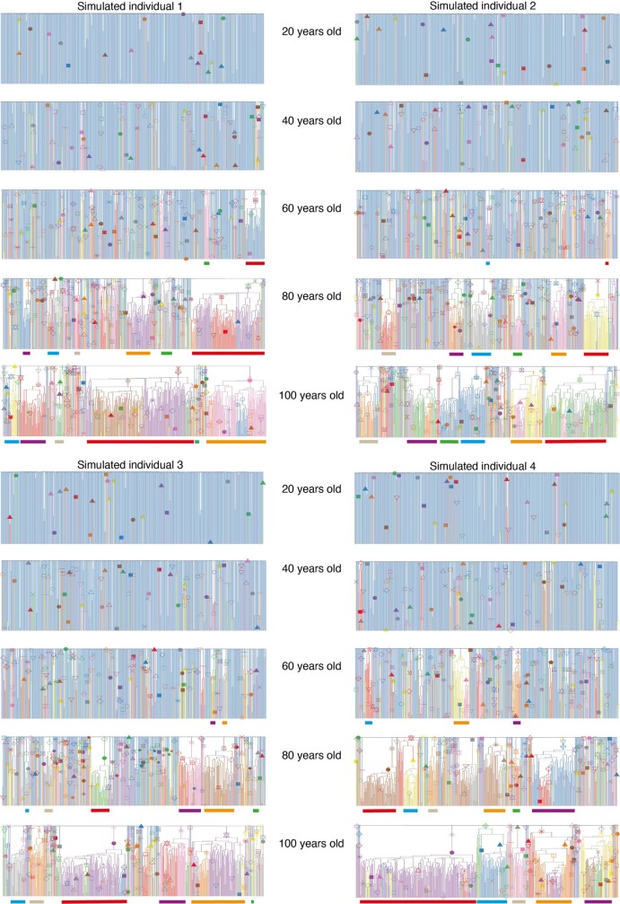
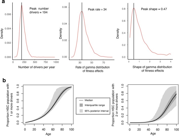
Age-related change in human haematopoiesis causes reduced regenerative capacity1, cytopenias2, immune dysfunction3 and increased risk of blood cancer4-6, but the reason for such abrupt functional decline after 70 years of age remains unclear. Here we sequenced 3,579 genomes from single cell-derived colonies of haematopoietic cells across 10 human subjects from 0 to 81 years of age. Haematopoietic stem cells or multipotent progenitors (HSC/MPPs) accumulated a mean of 17 mutations per year after birth and lost 30 base pairs per year of telomere length. Haematopoiesis in adults less than 65 years of age was massively polyclonal, with high clonal diversity and a stable population of 20,000-200,000 HSC/MPPs contributing evenly to blood production. By contrast, haematopoiesis in individuals aged over 75 showed profoundly decreased clonal diversity. In each of the older subjects, 30-60% of haematopoiesis was accounted for by 12-18 independent clones, each contributing 1-34% of blood production. Most clones had begun their expansion before the subject was 40 years old, but only 22% had known driver mutations. Genome-wide selection analysis estimated that between 1 in 34 and 1 in 12 non-synonymous mutations were drivers, accruing at constant rates throughout life, affecting more genes than identified in blood cancers. Loss of the Y chromosome conferred selective benefits in males. Simulations of haematopoiesis, with constant stem cell population size and constant acquisition of driver mutations conferring moderate fitness benefits, entirely explained the abrupt change in clonal structure in the elderly. Rapidly decreasing clonal diversity is a universal feature of haematopoiesis in aged humans, underpinned by pervasive positive selection acting on many more genes than currently identified.


Conflict of interest statement

D.H.S. has received consultancy fees from Wugen. G.S.V. has received consultancy fees from STRM.BIO and is a remunerated member of AstraZeneca’s Scientific Advisory Board. D.G.K. has received research funding from STRM.BIO.

Figures

Fig. 1
Fig. 1. Mutational burden in normal HSC/MPPs.
a, Bar plot showing the numbers of colonies sequenced from each tissue and cell type for each donor in the study. Age and sex (F, female; M, male) are indicated below the donor ID. b, Burden of single nucleotide variants across the donor cohort. The points represent individual HSC/MPP colonies (n = 3,361) and are coloured by donor as indicated in a. The grey line represents a regression of age with mutation burden, with shading indicating the 95% confidence interval. c, Burden of small indels across the donor cohort. d, Bar plot showing the number of independently acquired structural variants (SVs) per colony sequenced in each donor. The absolute number of structural variants is shown at the top of each bar. e, Bar plot showing the number of independently acquired autosomal copy number aberrations (CNAs) per colony sequenced in each donor. The absolute number of copy number aberrations is shown at the top of each bar. f, Bar plot showing the number of independently acquired Y chromosome copy number aberrations sequenced in each male donor. The absolute number of copy number aberrations is shown at the top of each bar. g, Telomere length across the donor cohort, including only those samples sequenced on the HiSeq X10 platform. Each point represents a single HSC/MPP colony. Two outlying points for CB001 are not shown (telomere lengths 16,037 bp and 21,155 bp). In b, c, g, boxes overlaid indicate the median and interquartile range and whiskers denote the minimum of either the range or 25th and 75th centile plus 1.5× interquartile range.
Fig. 2
Fig. 2. HSPC phylogenies for three young adult donors.
ac, Phylogenies were constructed for a 29-year-old (a), a 38-year-old (b) and a 63-year-old (c) male donor using shared mutation data and the algorithm MPBoot (Methods). Branch lengths are proportional to the number of mutations assigned to the branch—terminal branches have been corrected for sequence coverage, and overall root-to-tip branch lengths have been normalized to the same total length (because all colonies were collected from a single time point). The y-axis is scaled to chronological time using the somatic mutation rate as a molecular clock, with age 0 (representing birth) set at 55 mutations (as estimated from our cord blood colonies). Each tip on a phylogeny represents a single colony, with the respective numbers of colonies of each cell and tissue type recorded at the top. Onto these trees, we have layered clone and colony-specific phenotypic information. We have highlighted branches on which we have identified known oncogenic drivers (solid line) and possible oncogenic drivers (dashed line) in one of 17 clonal haematopoiesis genes (Supplementary Table 4), coloured by gene. Branches with autosomal copy number alterations are highlighted with a black dashed line. A heat map at the bottom of each phylogeny highlights colonies from known driver clades coloured by gene, expanded clades (defined as those with a clonal fraction above 1%) in blue and colonies with loss of the Y chromosome in pink (males only). BM, bone marrow; PB, peripheral blood; CN_LOH, copy-neutral loss of heterozygosity. The phylogeny of the fourth young adult donor is shown in Extended Data Fig. 5a.
Fig. 3
Fig. 3. HSPC phylogenies for three elderly adult donors.
ac, Phylogenetic trees were constructed for a 76-year-old female donor (a), a 77-year-old female donor (b) and an 81-year-old male donor (c) and presented as described for Fig. 2. The phylogeny of the fourth elderly adult donor included in the study is shown in Extended Data Fig. 5b.
Fig. 4
Fig. 4. Estimating in the human long-term HSC compartment.
a, Trajectory of for human long-term (LT)-HSCs in the four adult donors aged over 65 years, estimated using Bayesian phylodynamics. The black line represents the estimated mean trajectory of LT-HSC , with the shaded grey area on either side representing the 95% credibility interval. The solid blue line is the time of birth. The dashed blue lines enclose the region of time in each individual where the trajectory is at the late childhood–young adult level. The shaded region of the plots represents the period of time before sampling over which it is likely that short-term (ST)-HSC/MPPs are contributing to the observed . The trajectory line is shaded dark grey in the time period where coalescent events are occurring and the trajectory probably represents the combined of both long-term HSC and short-term HSC/MPP compartments. The trajectory line is shaded light grey where there is a complete absence of coalescent events and the estimates are therefore inaccurate. The red line shows the Bayesian (maximum posterior density) estimate of . b, Results from approximate Bayesian inference of population size over the first (non-shaded) part of life for each individual. The blue line represents the prior density of and the red line represents the posterior density. The vertical grey line denotes the peak for each donor; values are shown above each plot.
Fig. 5
Fig. 5. Widespread positive selection in the HSC/MPP compartment of normal individuals.
a, Stacked bar plot of number and size of clades with a clonal fraction above 1% per individual. Blue segments denote clones with no known driver and red ones denote those with a known myeloid gene driver. Numbers above each stack denote the total number of expanded clades in that individual. b, Shannon diversity index calculated for each phylogeny from the number of lineages present at 100 mutations of molecular time (equivalent to the first few years after birth) and their abundance (number of colonies derived from that lineage). c, Distribution of fitness effects for the driver mutations entering the HSC population, as determined using the ABC modelling approach. The point estimate for the shape and rate parameters of the gamma distribution were shape = 0.47 and rate = 34 (univariate marginal maximum posterior density estimates; Supplementary Fig. 14). The black line denotes the median, interquartile range is shown in dark grey and 95% posterior intervals are shown in light grey. d, Median, interquartile range, and 95% posterior intervals for Shannon diversity indices calculated yearly for 10,000 HSC population simulations run with the optimal parameter values from the ABC modelling. e, Fitness effects within the HSC/MPP compartment are estimated for clades with known driver mutations containing four or more HSC/MPP colonies (per cent additional growth per year). Fitness effects are also estimated for expanded clades without known drivers containing five or more HSC/MPP colonies. Error bars show the 95% credibility intervals of inferred fitness effects. Clade numbers are illustrated on the phylogenies in Extended Data Fig. 11b.
Extended Data Fig. 1
Extended Data Fig. 1. Flow-sorting strategy for single HSC/MPP and HPC cells.
a, Experimental approach. b, Sorting of single human HSC/MPP and HPCs from cord blood, peripheral blood and bone marrow. Cells were stained with the panel of antibodies in Supplementary Table 1 then single HSC/MPP or HPCs were index sorted according to the strategy depicted into individual wells of 96 well plates. Image created with FlowJo v10. c, Colony forming efficiency per individual of all single HSPCs sorted. d, Box-and-whisker plots showing fluorescence intensity for different cell surface markers used to define human HSCs, with different patients in rows. CD90 and CD49f are markers used to define the short and long term HSC subsets, which were included in our panel but were not used in sorting. Cells that produced colonies large enough to sequence are shown in teal; cells that did not form large enough colonies to sequence are in orange. The horizontal lines denote the median, the boxes the interquartile range and the whiskers the range. The number (n) of ‘sequenced’ (teal) and ‘not sequenced’ (orange) colonies included for each individual are shown to the right of each panel.
Extended Data Fig. 2
Extended Data Fig. 2. Quality assurance of mutation calls.
a, Histogram of VAFs for a typical sample in the dataset, showing a tight distribution around 50%, as expected for an uncontaminated clonal sample derived from a single cell. The variants with VAFs < 0.2 represent in vitro acquired mutations and sequencing artefacts and were removed using a VAF-based filtering strategy with a cut off of 0.2 (red line). b, VAF distribution of variants after filtering steps had been applied. The red line shows the peak VAF and the dashed grey line shows the threshold peak VAF for excluding samples as being non-clonal / contaminated. c, Histogram of VAFs for a colony that was seeded by 2 cells showing a median VAF around 25%. Colonies showing evidence of non-clonality in this way were excluded from downstream analysis using a peak VAF cut off of 0.4. d, Left-hand plot shows the relationship between raw mutation counts per colony for one individual post filtering and sequencing depth. The black line depicts an asymptotic regression line fitted to the raw data. Right-hand plot shows the adjusted mutation burdens per colony after asymptotic regression correction. e, Trinucleotide context mutation spectra of private (top plot) and shared variants (bottom plot) for one individual. The spectra are extremely similar, showing the variant filtering strategy used is robust and prevents excess artefacts in the private variant set. f, Trinucleotide mutation spectrums for each individual created from all variants post filtering. The results are consistent between the two cord blood donors and all the adult donors.
Extended Data Fig. 3
Extended Data Fig. 3. Approach to phylogeny construction.
a, Raw phylogeny for KX003 (81-year male) derived directly from MPBoot. The input to MPBoot is a genotype matrix of all variant calls shared by more than 1 colony from an individual. b, Phylogeny with edge lengths proportional to the number of mutations assigned to the branch using original count data and the tree_mut package. c, Phylogeny with raw mutation count branch lengths adjusted for sequencing depth of the sample using sensitivity for germline variant calling. d, Phylogeny with adjusted branch lengths converted to ultrametric form (equal branch lengths). One axis shows mutation number, the other axis shows the equivalent estimated age in years, which is possible due to the linear accumulation of mutations in HSPCs with time. All tips end at age 81, the age at the time of sampling.
Extended Data Fig. 4
Extended Data Fig. 4. Mutational burden.
a, Regression of number of single nucleotide variants (SNVs) in HSCs (red line) compared to HPCs (blue line). Grey shading indicates the 95% CI. The estimated difference in burden, together with the t-value is above the plot. The t-value of 1.54 demonstrates non-significance of the difference. b, Phylogenies depicted for the individuals with clonally expanded structural variants (SVs). The bar at the bottom highlights cells with one of the three classes of structural variant. The exact variant breakpoints can be found in Supplementary Table 3. c, Plot showing the percentage of HSC/MPP cells that have outlying telomere lengths per individual. Outliers were identified using the Interquartile Range criterion. There were no outliers with shorter than expected telomeres in any individuals, such that this data only reflects the percentage of cells with longer than expected telomeres. The blue line shows a regression of percentage outlying telomere lengths with age. This shows a significant negative correlation (t-value and p-value shown).
Extended Data Fig. 5
Extended Data Fig. 5. Additional HSPC phylogenies for one young and one elderly adult donor.
Phylogenetic trees were constructed and presented as described for Fig. 2.
Extended Data Fig. 6
Extended Data Fig. 6. Interpretation of young adult HSPC phylogenies.
a, Trajectories of used as input to rsimpop for the simulations to create phylogenies in b. Note the Y axis depicting is on a log scale. b, Phylogenies created by randomly sampling 380 cells from the final full simulated population of between 100,000 cells (Phylogeny 1) and 1,000,000 cells (Phylogeny 4). Phylogenies 1 to 3 are derived from simulations of the HSC population in a 30-year-old, while phylogeny 4 is derived from a simulation of the HSC population in an 80-year-old. Each simulation has an initial of 100. In all cases is the same as the population size (N) as the generation time (τ) in all simulations is fixed at 1. The blue boxes indicate the period of time in which the population size is increased. The phylodyn trajectories to the right of each simulated phylogeny use the pattern of coalescent events to recover the input trajectories for . The blue line marks the time of change in . In all cases the initial part of the trajectory is able to correctly estimate at 100,000. However, in Phylogeny 3 where there is a complete absence of coalescent events once the population size is increased, phylodyn loses resolution and wildly overestimates the value of . c, Real trees with red boxes highlighting the last 10–20 years prior to sampling, where the relative number of coalescent events is decreased (meaning the estimated is larger).
Extended Data Fig. 7
Extended Data Fig. 7. Interpretation of elderly adult HSPC phylogenies.
a, Plots illustrating the timing of acquisition of driver mutations and onset of clonal expansions respectively. These timings are inferred from the timing of the corresponding branches in the phylogenies depicted in Figs. 2, 3 and Extended Data Fig. 5. Bars are colours by gene mutation or blue for expanded clades with no known driver. Age 0 denotes the time of birth and black dots illustrate the age at sampling. b, Phylogenies created by randomly sampling 380 cells from the final full simulated population. As with the previous simulations, ~ population size because the time between symmetric self-renewal divisions is set at 1 year. In both simulated phyologenies the final population is 100,000 cells in size, but Phylogeny 2 has been created from a population that underwent a bottleneck in size to and of 10,000 cells between the ages of 35 and 50. This period of time over which the population size was reduced can be visualised in the blue box which highlights the increased density of coalescent events in this time block. The phylodyn trajectories are able to accurately recover information on changes in of the HSC population over time. c, Real HSC/MPP phylogeny for KX003 (81-year-male) with PB HSC/MPP terminal branches coloured red (BM HSC/MPP branches remain black). The CF of the largest clade is shown for PB and BM cells.
Extended Data Fig. 8
Extended Data Fig. 8. Modelling HSC populations incorporating only changes in , without positive selection.
a, Overview of modelling approach used to estimate alone in the young adult individuals and to investigate whether changes in could explain the observed clade size distribution in the elderly adult individuals. These simulations were run using a neutral model (that is, no acquisition of driver mutations), with being the only parameter to change over time. For the young adult individuals was estimated for two time-blocks (time before and after population increase due to ST-HSC/MPP contribution). For the elderly adult individuals was estimated for three time-blocks as the phylodyn plots predicted a population ‘bottleneck’ (Supplementary Fig. 12) was the most parsimonious way to recreate the observed change in coalescence density over life. b, Plots showing the posterior predictive distribution of the difference between the simulated chi-squared discrepancy and the observed chi-squared discrepancy, for each donor individual under a neutral model incorporating change in population size. For each donor, the posterior predictive distribution of the difference between predictive (simulated) and observed chi-squared discrepancy is represented as a histogram based on a Monte Carlo sample of 1,000,000 simulated phylogenies, drawn from the posterior predictive distribution. The proportion of simulated phylogenies which lie to the right of zero (red line) is a Monte Carlo estimate of the posterior predictive p-value (the probability that the predictive chi-squared discrepancy exceeds the observed chi-squared discrepancy under the neutral model). In the case of the four young adult individuals, the proportion of simulated phylogenies which lie to the right of 0 (red line) is close to 0.5, indicating that the simple neutral models (incorporating changes in Nτ over life) predict trees that have similar clade size distributions to our observed trees. In contrast, for the four elderly adults, the proportion of simulated phylogenies which lie to the right of 0 is very small (Less than 0.05), demonstrating that the neutral models are, on their own, unable to recreate trees with similar clade size distributions to those observed.
Extended Data Fig. 9
Extended Data Fig. 9. Positive selection in blood.
a, Lolliplot plots to show the sites of variants in the dataset in the three genes under significant positive selection according to dN/dS. Thick grey bars denote locations of conserved protein domains. b, dN/dS maximum likelihood estimates for missense, nonsense, truncating and all mutations in the complete dataset (n = 25,888 coding mutations) and for all mutations in the young (individuals aged < 65 year) and old (individuals aged > 75 years) datasets analysed separately. The boxes show the estimate with whiskers showing the 95% CI. The numbers to the left give the numeric values for the estimates with 95%CI in brackets. c, Estimated number of driver mutations in the different datasets. The boxes show the estimate with whiskers showing the 95% CI. The numbers to the left give the numeric values for the estimates with 95%CI in brackets. ‘n’ is the number of cells included in each dataset. d, Results of a randomisation / Monte Carlo test to define the null expected distribution of clade size for cells with loss of Y. This null distribution of geometric means from 2000 simulations is shown (histogram) together with the observed geometric mean of clades with Y loss (vertical blue line). The observed value significantly outlies the expected distribution showing that clades with Y loss are significantly larger than would be expected by chance.
Extended Data Fig. 10
Extended Data Fig. 10. Modelling of HSC populations incorporating positive selection.
a, Overview of modelling approach used to estimate the shape and rate of the gamma distribution of selection coefficients from which ‘driver mutations’ are drawn, and the number of driver mutations drawn from this distribution (using a selection coefficient threshold of > 0.05) that are entering the HSC population per year. For these simulations was fixed at 100,000 and therefore only summary statistics for the first 3 timepoints were used to assess how well a given simulation for an individual resembled the observed tree. b, Plot showing maximum posterior density estimates of the rate and shape parameters of the gamma distribution for selection coefficients (pink line) obtained using Approximate Bayesian computation. Blue/green lines show how altering the rate and shape parameters affect the gamma distribution. c, Plot showing how changing the shape of the gamma distribution of selection coefficients (each line has a different shape) alters the probability of a driver gene fixing in the population. Reducing the shape below 0.1 does not affect the probability of driver gene fixation and therefore was the lower limit of the shape prior. d, Plot showing how the probability of detecting a clone with CF 2.5% changes over time for different selection coefficients. There is only a probability of 0.1 of being able to identify a driver mutation with a selection coefficient of 0.05 that entered the population at birth. We therefore used a lower threshold of 0.05 for the driver mutation selection coefficients.
Extended Data Fig. 11
Extended Data Fig. 11. Driver modelling results and expanded clade annotation.
a, Plots showing the posterior predictive distribution of the difference between the predictive (simulated) chi-squared discrepancy and the observed chi-squared discrepancy, for each donor individual under the simple positive selection model. For the definition of the chi-squared discrepancy, and details of how the posterior predictive p-values are estimated, see Supplementary Information “Posterior predictive model checking (PPC) methods which can be applied to Approximate Bayesian Computations (ABC)”, Sections 1, 2 and 5. In these plots, the chi-squared discrepancy is computed from summary statistics evaluated at the first 3 (out of 4 equally spaced) timepoints on the phylogeny obtained from the specified donor (Extended Data Fig. 8). For each donor, the posterior predictive distribution of the difference between predictive (simulated) and observed chi-squared discrepancy is represented as a histogram based on a Monte Carlo sample of at least 100,000 simulated phylogenies, drawn from the posterior predictive distribution. The proportion of simulated phylogenies which lie to the right of zero (red line) is a Monte Carlo estimate of the posterior predictive p-value (the probability that the predictive chi-squared discrepancy exceeds the observed chi-squared discrepancy under the positive selection model). Those p-values written in grey text are based on chi-squared discrepancies computed from summary statistics evaluated at the first 2 (out of 4 equally spaced) timepoints. Notice that these p-values are all above the 0.05 threshold, indicating that observed phylogenies (up to the second time point) are compatible with the simple positive selection model. Those p-values written in blue text are based on chi-squared discrepancies computed from summary statistics evaluated at the first 3 (out of 4 equally spaced) timepoints. Notice that all but two observed phylogenies (up to the third time point) are compatible with this positive selection model. These p-values indicate that, once the third time point is included, the phylogenies of two of the younger individuals (38 year-old and 48 year-old) are no longer compatible with the positive selection model. Notice that these two donors also exhibit the most striking increase in population size from the middle part of the population trajectory onwards (Fig. 4a). When all four timepoints are included, the phylogenies of 5 out of 8 donors have become incompatible with the positive selection model (data not shown). Only the phylogenies from the donors of ages 77, 76 and 29, remain compatible with the positive selection model. This suggests that the current positive selection model does not adequately account for the population processes towards the time of sampling. b, Phylogenies of the four adults aged > 70 labelled with driver mutations and clade ID annotations as used in Fig. 5d.
Extended Data Fig. 12
Extended Data Fig. 12. Positive selection over life.
Four consecutively simulated phylogenies of 380 cells sampled from a population of 100,000 cells that has been maintained at a constant over life, with incorporation of positively selected ‘driver mutations’. The driver mutations have a fitness effect > 5% (drawn from a gamma distribution with shape = 0.47 and rate = 34) and enter the population at a rate of 200 per year. These are the maximum posterior density estimates of the rate and shape parameters obtained using the ABC method. The inclusion of these driver mutations is able to recapitulate a similar clade size distribution to that observed in the real HSPC phylogenies of the observed individuals across the whole age range. However, including driver mutations does not fully recapitulate the observed lack of coalescent events in the last 10–15 years of life, showing that an increase in over this time is also required to fully recreate the patterns of coalescences in the real phylogenies. Driver mutations are marked with a symbol and their descendent clades are coloured. In all cases is the same as the population size (N) as the generation time (τ) in all simulations is fixed at 1 year. The symbols / colours are not consistent for driver mutations between plots. The largest clades are therefore coloured in a consistent way beneath the plots to show how their size changes over time. The simulated phylogenies illustrate the complex clonal dynamics that can occur in later life as a result of clonal competition. While the majority of clades continue to expand, others stay relatively stable and some reduce in size. The phylogenies also show that by the age of 80 typically > 90% of HSCs in the population carry at least one driver mutation.
Extended Data Fig. 13
Extended Data Fig. 13. Driver modelling parameter and driver acquisition estimates.
a, Posterior distributions for the three driver modelling parameters: 1) Number of ‘driver’ mutations with a fitness effect > 5% entering HSC population of 100,000 cells per year, 2) Rate of gamma distribution of fitness effects, 3) Shape of gamma distribution of fitness effects. Black lines show peak estimates. b, Plot showing the median, interquartile range, and 1st and 99th percentiles for proportion of HSC population with drivers calculated yearly for 10,000 HSC population simulations run utilising the optimal parameter values for driver acquisition rate and fitness effects derived from the ABC modelling approach. The point estimate for the shape and rate parameters of the gamma distribution were shape = 0.47, rate = 34. The point estimate for the number of drivers with s>5% entering population per year = 200.

Comment in

References

    1. Harrison DE. Loss of stem cell repopulating ability upon transplantation. Effects of donor age, cell number, and transplantation procedure. J. Exp. Med. 1982;156:1767–1779. - PMC - PubMed
    1. Guralnik JM, Eisenstaedt RS, Ferrucci L, Klein HG, Woodman RC. Prevalence of anemia in persons 65 years and older in the United States: evidence for a high rate of unexplained anemia. Blood. 2004;104:2263–2268. - PubMed
    1. Castle SC. Clinical relevance of age-related immune dysfunction. Clin. Infect. Dis. 2000;31:578–585. - PubMed
    1. Genovese G, et al. Clonal hematopoiesis and blood-cancer risk inferred from blood DNA sequence. N. Engl. J. Med. 2014;371:2477–2487. - PMC - PubMed
    1. Jaiswal S, et al. Age-related clonal hematopoiesis associated with adverse outcomes. N. Engl. J. Med. 2014;371:2488–2498. - PMC - PubMed