. 2022 Jun;606(7913):335-342.
doi: 10.1038/s41586-022-04785-z. Epub 2022 Jun 1.

The longitudinal dynamics and natural history of clonal haematopoiesis

Affiliations

The longitudinal dynamics and natural history of clonal haematopoiesis

Margarete A Fabre et al. Nature. 2022 Jun.

Abstract

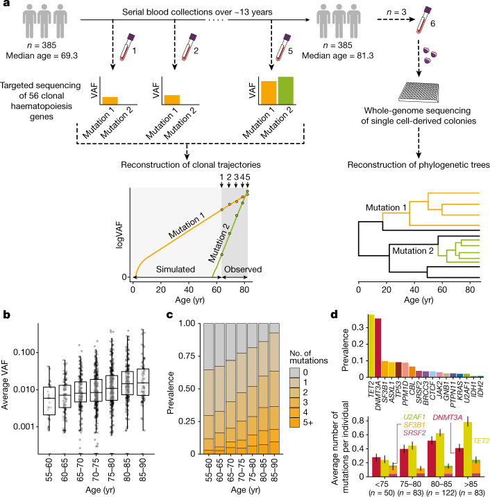
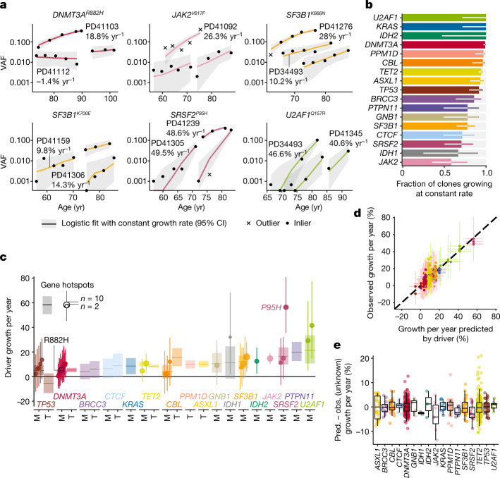
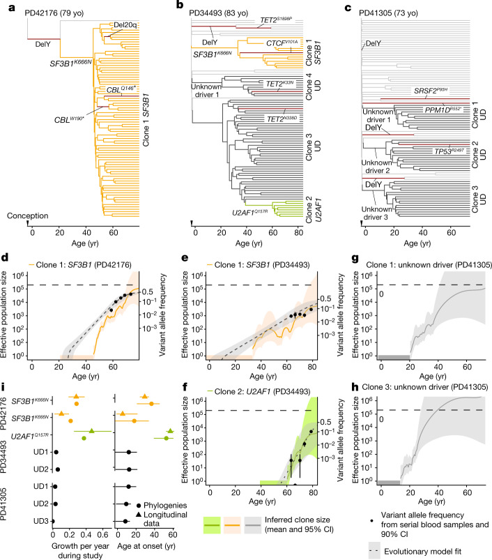
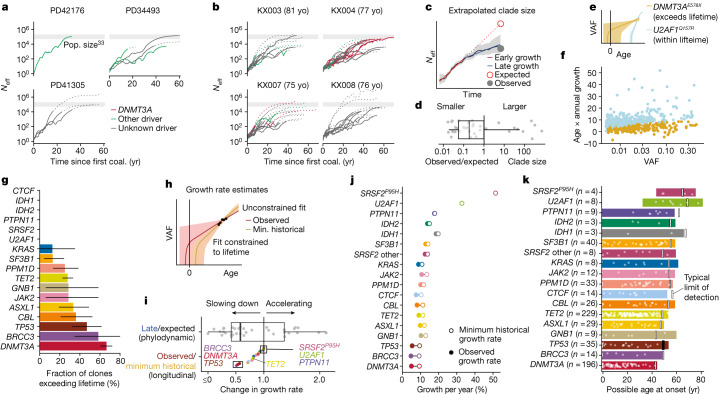
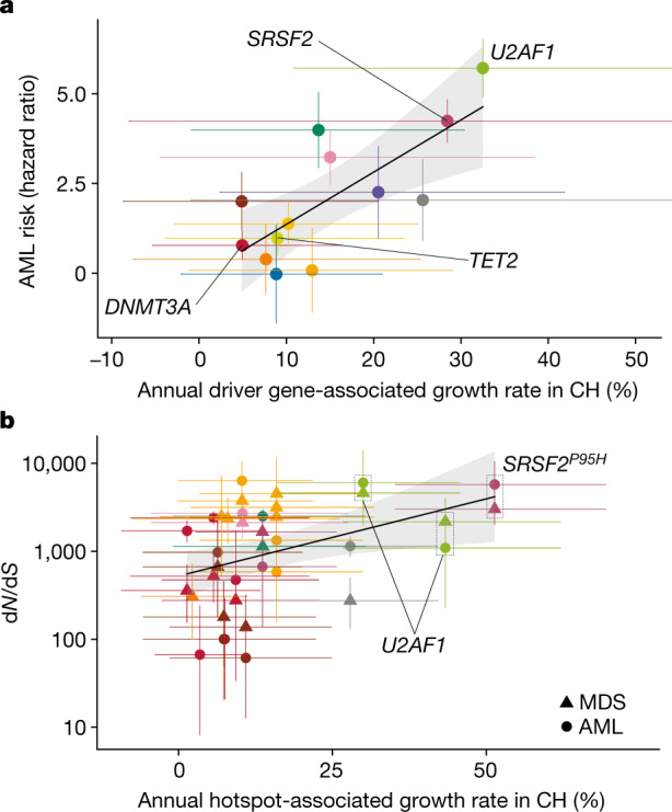
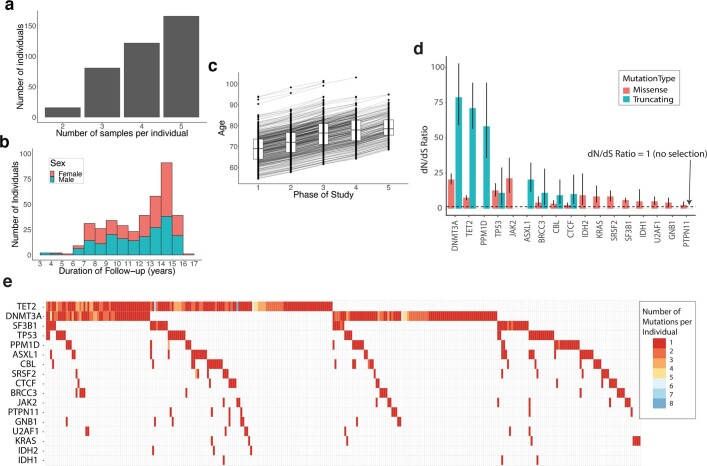
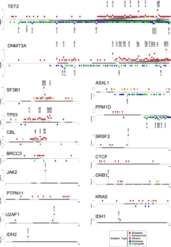
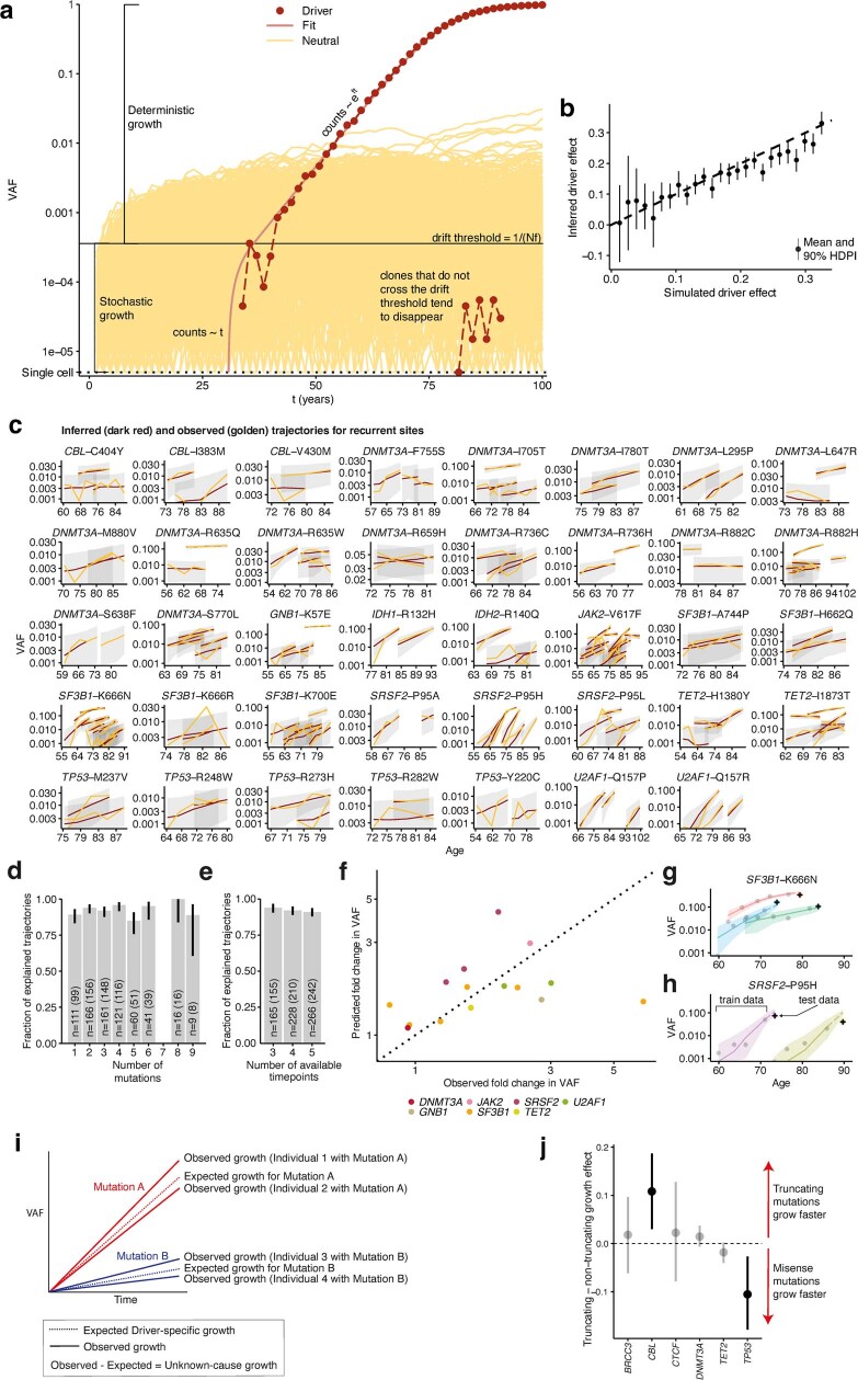
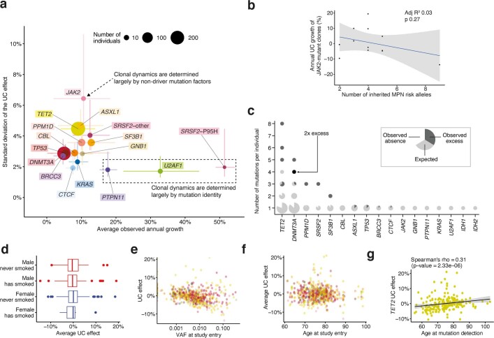
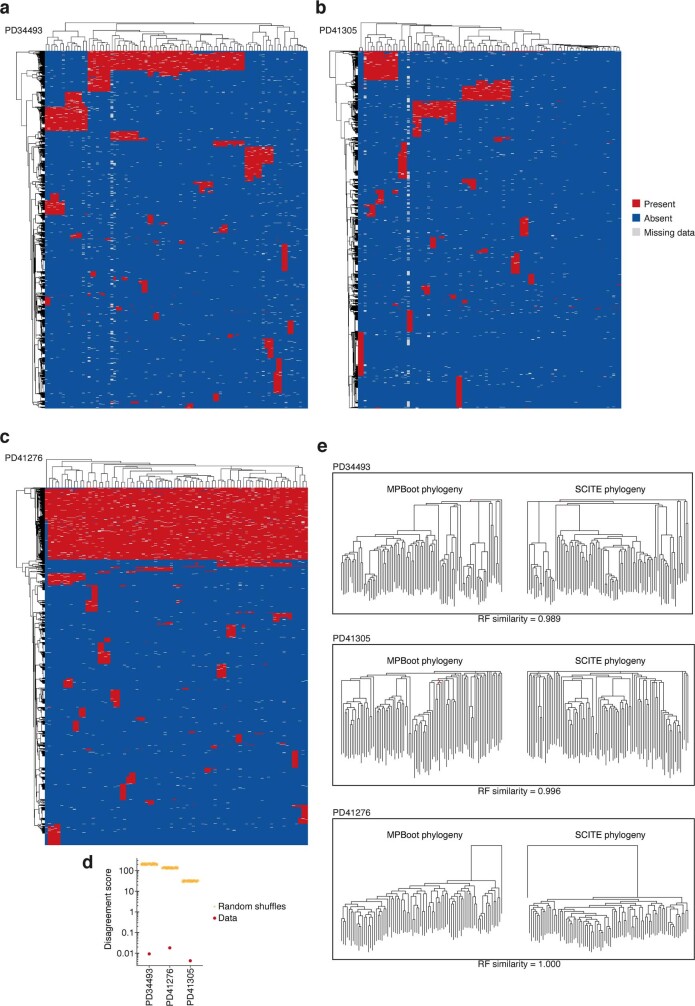
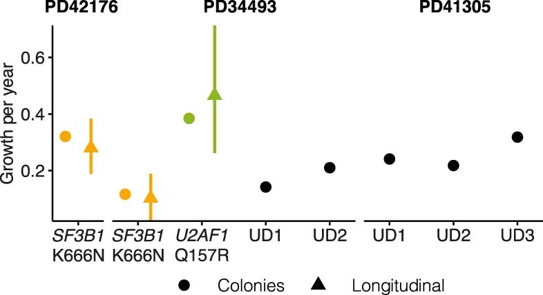
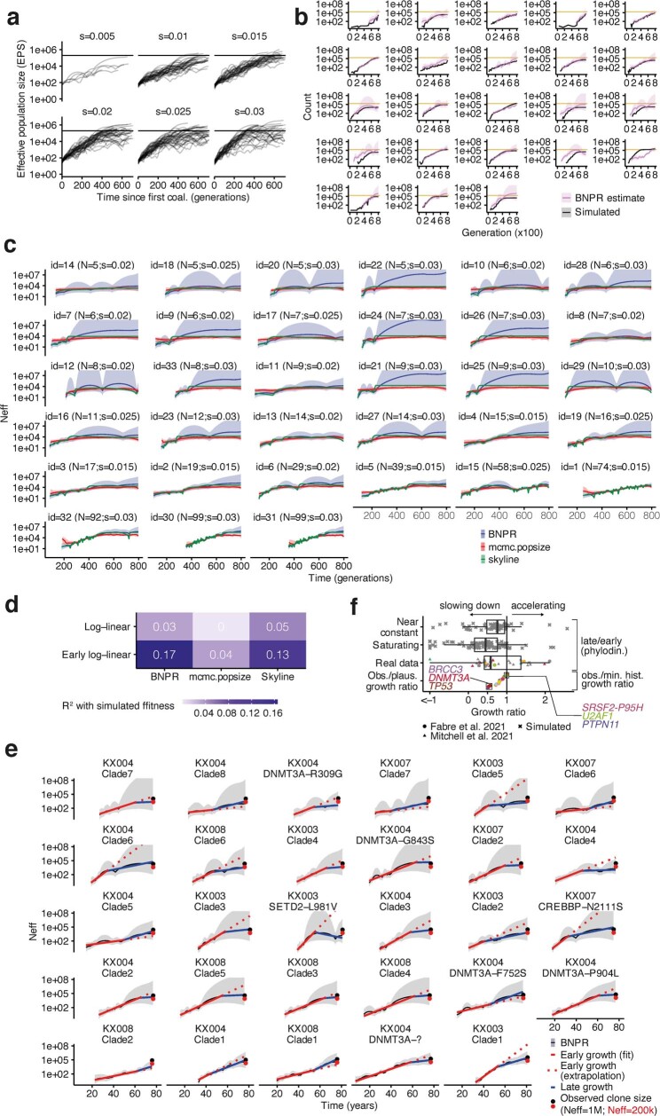
Clonal expansions driven by somatic mutations become pervasive across human tissues with age, including in the haematopoietic system, where the phenomenon is termed clonal haematopoiesis1-4. The understanding of how and when clonal haematopoiesis develops, the factors that govern its behaviour, how it interacts with ageing and how these variables relate to malignant progression remains limited5,6. Here we track 697 clonal haematopoiesis clones from 385 individuals 55 years of age or older over a median of 13 years. We find that 92.4% of clones expanded at a stable exponential rate over the study period, with different mutations driving substantially different growth rates, ranging from 5% (DNMT3A and TP53) to more than 50% per year (SRSF2P95H). Growth rates of clones with the same mutation differed by approximately ±5% per year, proportionately affecting slow drivers more substantially. By combining our time-series data with phylogenetic analysis of 1,731 whole-genome sequences of haematopoietic colonies from 7 individuals from an older age group, we reveal distinct patterns of lifelong clonal behaviour. DNMT3A-mutant clones preferentially expanded early in life and displayed slower growth in old age, in the context of an increasingly competitive oligoclonal landscape. By contrast, splicing gene mutations drove expansion only later in life, whereas TET2-mutant clones emerged across all ages. Finally, we show that mutations driving faster clonal growth carry a higher risk of malignant progression. Our findings characterize the lifelong natural history of clonal haematopoiesis and give fundamental insights into the interactions between somatic mutation, ageing and clonal selection.


Conflict of interest statement

G.S.V. is a consultant for STRM.BIO and receives a research grant from Astrazeneca. The other authors declare no competing interests.

Figures

Fig. 1
Fig. 1. Experimental workflow and clonal haematopoiesis mutation characteristics.
a, Study outline: 1,593 blood DNA samples were obtained from 385 elderly individuals sampled 2–5 times (median 4) over 3.2–16 years (median 12.9) and sequenced for mutations in 56 clonal haematopoiesis genes. Measured VAFs were used to fit observed clonal trajectories and extrapolate the clonal dynamics prior to the period of observation. Additional blood samples from 3 selected individuals were used to generate 288 (that is, 3 × 96) whole-genome-sequenced single cell-derived colonies for phylogeny reconstructions. b, Age distribution of average VAF per individual (n = 1,258 VAF measurements). The boxes represent the 25th, 50th (median) and 75th percentiles of the data; the whiskers represent the lowest (or highest) datum within 1 interquartile range from the 25th (or 75th) percentile. c, Age-stratified prevalence of the number of mutations per individual. d, Prevalence of mutations in driver genes. Top, absolute prevalence in the cohort. Bottom, average number of mutations per individual in DNMT3A, TET2 and splicing genes (SF3B1, SRSF2 and U2AF1) at different ages, with error bars representing bootstrap 90% confidence intervals.
Fig. 2
Fig. 2. The longitudinal dynamics of clonal haematopoiesis in older age.
a, Examples of fitted exponential growth of clones with mutations at six common hotspots. Points represent observed data, coloured lines represent estimated VAF trajectories and grey bands represent the 90% highest posterior density interval (HPDI). Each data point is represented by a dot if it conforms to our model of fixed-rate exponential growth and by a cross otherwise (outlier, defined as tail probability <2.5%). b, Proportion of clonal trajectories showing fixed-rate growth—that is, those with no outlying data-points as defined in a. Bars represent the proportion and error bars represent the 90% beta-distributed confidence interval. c, Annual clonal growth associated with different driver mutations, for both genes and specific sites. For gene-wise growth, truncating (T) and missense (M) mutations are modelled separately for genes where both are enriched. Sites are modelled separately to genes if mutated recurrently within our cohort. Point estimates for growth and 90% HPDI are represented for each site (dot and line, respectively, with dot size proportional to recurrence) and each gene (horizontal line and rectangle, respectively). d, Relationship between clonal growth predicted by the identity of the driver mutation and actual observed growth (points), with 90% HPDI represented by vertical and horizontal lines, respectively. n = 633 clones. e, Distribution of the unknown-cause effect for different genes. Each point represents a single clone and box plots represent the distribution of these effects for each gene. The value of unknown-cause growth is positive for clones growing faster than expected by the identity of the driver mutation, and negative for clones growing slower than expected (n = 633 clones). The boxes represent the 25th, 50th (median) and 75th percentiles of the data; the whiskers represent the lowest (or highest) datum within 1 interquartile range from the 25th (or 75th) percentile. Pred., predicted; obs., observed. CI, confidence interval.
Fig. 3
Fig. 3. Haematopoietic phylogenetic trees.
ac, Haematopoietic phylogenies of participants PD41276 (a), PD34493 (b) and PD41305 (c). Each tree tip is a single cell-derived colony and tips with shared mutations coalesce to an ancestral branch, from which all colonies in such a ‘clade’ arose. Branch lengths are proportional to the number of somatic mutations, which accumulate linearly with age except before birth, at which point approximately 55 mutations have been acquired. Branches containing known driver mutations or chromosomal aberrations are annotated. Clonal expansions are coloured: SF3B1K666N-mutant expansions in orange, U2AF1Q157R-mutant expansions in green, and expansions without identified drivers (unknown driver (UD)) in black. dh, Growth trajectories of each clonal expansion, as determined by phylogenies (effective population size (Neff) estimated using phylodynamic methods) and time-series data (using serial VAF measurements and modelled historical growth, as illustrated in Fig. 2, if available). SF3B1-mutant expansions for PD42176 (d) and PD34493 (e), U2AF1-mutant expansions for PD34493 (f), and unknown driver expansions clone 1 (g) and clone 3 (h) for PD41305. Phylogeny-derived age at clone onset range is represented as a horizontal coloured bar on the x-axis, with the limits of the bar corresponding to the age range of the phylogeny branch along which the corresponding driver mutation was acquired. i, Comparison of the ages at onset (right) and growth rate during the study period (left) derived from phylogenetic trees and longitudinal data. For the age at onset and growth rates derived from longitudinal data, the intervals represent the 90% HPDI; age at onset intervals derived from phylogenies represent the age limits defined by phylogenetic branching patterns. For annual growth estimates using phylogenies, intervals represent the standard error. yo, years old.
Fig. 4
Fig. 4. Evidence for clonal deceleration from single-cell phylogenies and longitudinal data.
a, b, Effective population size (Neff) trajectories inferred from single-cell phylogenies in this paper (a) and in Mitchell et al., using previously determined HSC population size estimates (b). Dotted lines represent parts of the trajectory with high variance (log(var(Neff)) > 5). Coal., coalescence. c, Representation of biphasic fit to Neff estimates and extrapolation from early growth (observed clone size is calculated as the clonal fraction in the phylogeny scaled by an Neff of 200,000 HSCs × yr; comparison with 1,000,000 HSC × yr in Extended Data Fig. 7e). d, Ratio of observed to expected (extrapolated from early growth) clone size from phylogenies (n = 37 expanded clones detected in haematopoietic phylogenies). e, Representation of extrapolated trajectories derived from longitudinal data, assuming stable lifelong growth at the same fixed rate we observed during older age; some projections are not feasible (that is, they exceed lifetime, with onset pre-conception). f, Relationship between age and observed growth rate of clones and VAF (longitudinal data; light blue represents clones with projected onset within lifetime and golden represents those exceeding lifetime). g, Quantification of unfeasible clones (exceeding lifetime) per gene (longitudinal data, n = 633). Intervals represent the beta-distributed 90% confidence interval. h, Representation of the calculation of minimum (min.) historical growth. i, Ratio of observed to historical (longitudinal data) and late to expected (phylogenetic data) growth (n = 37 clones detected in phylogenies (top); n = 633 in longitudinal data (bottom)). j, Differences between the median observed and historical growth per year for each gene. k, Projected ages at onset for all clones, assuming stable lifelong growth at the same fixed rate we observed during older age. Boxes in d, i, represent the 25th, 50th (median) and 75th percentiles of the data; the whiskers represent the lowest (or highest) datum within 1 interquartile range from the 25th (or 75th) percentile.
Fig. 5
Fig. 5. Clonal haematopoiesis dynamics and progression to myeloid disease.
a, Relationship between the growth rate associated with each driver gene in clonal haematopoiesis (CH), and the risk of AML progression associated with that driver gene. b, Relationship between the growth rate associated with each recurrent mutation in clonal haematopoiesis, and the strength of selection of that mutation in AML (circles) and MDS (triangles). In a, b, genes and hotspots that are mentioned in the main text are highlighted. AML risk intervals indicate standard error for the estimate; error bars for dN/dS show 95% confidence intervals; error bars for annual growth show 90% HPDI. The confidence band (shaded region) represents the 95% confidence interval for the association between annual growth rates and AML risk or dN/dS.
Extended Data Fig. 1
Extended Data Fig. 1. Longitudinal cohort characteristics and mutation prevalence and selection across the studied genes.
a, Distribution of the number of serial samples obtained per individual. b, Duration of follow-up per individual. c, Distribution of participants’ ages at each of the five sampling phases of the SardiNIA study. The boxes represent the 25th, 50th (median) and 75th percentiles of the data; the whiskers represent the lowest (or highest) datum within 1 interquartile range from the 25th (or 75th) percentile. d, Observed-to-expected (dN/dS) ratios for the 17 genes with missense and/or truncating mutations under positive selection (with q < 0.1). The dashed line indicates a dN/dS value of 1, which represents neutrality (no selection). Error bars depict 95% CIs. e, Waterfall plot showing the number and distribution of mutations among participants. Each column represents 1 individual, and each row 1 gene. Coloured squares indicate the presence of a mutation with the specific colour indicating the number of distinct mutations in that gene identified in that individual. For individuals with the same mutation identified at multiple serial time-points, the serially-observed mutation is counted only once.
Extended Data Fig. 2
Extended Data Fig. 2. Distribution of somatic mutations within driver genes (previous page).
Lolliplots show the longest protein isoform of each gene, with protein domains depicted by grey rectangles. Each circle represents a somatic mutation. The vertical distance of the circle from the protein cartoon indicates its recurrence in the cohort (quantified on the y-axis). Amino acid codons recurrently mutated (ie. observed in more than one individual) in our cohort are explicitly labelled. Circle colours indicate the mutation type as per key. Non-truncating mutations (missense, inframe, synonymous) are depicted above and truncating mutations (nonsense, frameshift) below the protein cartoon.
Extended Data Fig. 3
Extended Data Fig. 3. Modelling CH dynamics in older age using time-series VAF data (previous page).
a, Representation of a Wright-Fisher simulation, showing two phases of clonal growth. The likelihood of a clone transitioning from stochastic to deterministic growth is inversely proportional to the product of its fitness (f) and the total number of stem cells (N). Clones with no fitness advantage (depicted in yellow) are unlikely to exceed their drift thresholds and tend to disappear or remain undetectable. Fitter clones (depicted in red) are more likely to reach deterministic growth. b, Association between the driver mutation effect used in the Wright-Fisher simulations and the driver effect inferred using our model (R2 = 0.92; n = 270 simulated clones). Error bars represent 90% highest posterior density interval (HDPI). c, Comparison of observed (golden) and inferred (mean estimate; red) trajectories for all recurrently mutated sites. Grey bands represent 95% highest posterior density intervals. d, Relationship between the number of mutations co-occurring within an individual and the proportion of clones growing at a fixed rate over time (n = 685 clones; the number of clones used to calculate each ratio estimate is represented on each bar and in brackets is the number of explained trajectories). e, Relationship between the number of available timepoints in a trajectory and the proportion of clones growing at a fixed rate over time (n = 659 clones; the number of clones used to calculate each ratio estimate is represented on each bar and in brackets is the number of explained trajectories). Error bars represent the beta-distributed 90% confidence intervals (in d and e). f, Association between predicted and observed VAF in additional prospectively-collected samples from 11 individuals with 15 CH driver mutations, not used for growth rate inference. The dotted line depicts theoretical perfect agreement between predicted and observed VAF. g,h, Example trajectories of clones with SF3B1-K666N (f) and SRSF2-P95H (g) mutations. Points represent VAFs used in our model to fit the growth curve (train), and crosses represent prospectively tested VAFs used (test), showing good agreement between predicted and observed VAFs. Bands represent the 95% HPDI. i, Illustration of the determinants of growth in our model. Each mutation drives an expected rate of clonal growth. j, Comparison of growth rate associated with truncating vs non-truncating mutations in genes with both driver types. Points above the dashed line show faster growth for truncating mutations, and points below show faster growth for non-truncating mutations (n = 514 clones). Intervals represent the 90% HPDI for the difference between truncating and non-truncating mutations.
Extended Data Fig. 4
Extended Data Fig. 4. Differences in growth rate between individuals/clones with the same driver.
a, For each gene, we contrast the mean annual growth rate among individuals/clones bearing a mutation in that gene, with the spread in this rate (defined here as the standard deviation of the unknown-cause (UC) growth). Circles represent point estimates, with circle size indicating the number of clones bearing a mutation in that gene, and lines representing the 90% confidence interval (CI). For the standard deviation, the 90% CI was calculated assuming that (n1)s2σ2Chisq(n1), with n being the sample size, s the standard deviation estimate and σ2 the true population variance. SRSF2-P95H mutations are plotted separately to other SRSF2 mutations, as they are associated with significantly different growth dynamics (n = 633 clones). b, Relationship between number of inherited MPN risk alleles and JAK2-mutant clonal growth rate (Pearson R2 = 0.03; p = 0.27 (two-sided)). The grey band represents the 95% confidence interval for the linear regression. c, The number of mutations per individual in each gene is plotted. Each data-point is a pie-chart, the size of which reflects the number of individuals. For each gene, given the observed mutation prevalence in our cohort, the pie is fully light grey if the number of individuals we observed with the specific number of mutations is the same as the number of individuals we expected by chance. The presence of a white segment indicates that we found fewer individuals with that number of mutations than expected. The presence of a dark grey segment indicates that we found an excess of individuals with that number of mutations. We estimate the expected number of mutations in each gene in each individual through Monte Carlo estimation; assuming the prevalence of mutations in the cohort is uniform for each gene across individuals, we simulate 1,000 scenarios where we randomly distribute these mutations given the number of mutations in each individual. d, Association between sex and smoking history and the average UC effect for each individual (n.s.; n = 628 clones). The boxes represent the 25th, 50th (median) and 75th percentiles of the data; the whiskers represent the lowest (or highest) datum within 1 interquartile range from the 25th (or 75th) percentile. e, Association between VAF at study entry and the average UC effect for each individual (R2 = 0.062; CI95% = [0.029,0.107]; p = 2.42*10−9). f, Association between age at study entry and the average UC effect for each individual (n.s.). g, Association between age at mutation detection and UC effect for each TET2-mutant clone (Spearman’s rho = 0.31; p = 2.33*10−6 (two-sided)). The grey band represents the 95% confidence interval for the linear regression.
Extended Data Fig. 5
Extended Data Fig. 5. Data quality and validation of phylogenetic trees.
a–c, Heatmaps of the genotype data used for tree inference for the three individuals for which trees were derived in our study (PD34493, PD41305 and PD41276, respectively), with colours corresponding to the presence (red), absence (blue) and uncertainty (grey) of each genotype (rows) across all colonies (columns). For both colonies and genotypes, dendrograms derived from the hierarchical clustering of each are shown and are not representative of the derived phylogenetic trees. d, Internal consistency of the shared mutation data for each individual as determined by the disagreement score. A perfect phylogeny has a score of zero. We compare scores for the data with scores for random shuffles of the genotype data at each locus. e, Comparison of phylogenetic trees built by alternative phylogeny-inference algorithms, MPBoot and SCITE, for each of the 3 individuals. For all three we present the Robinson-Fould (RF) similarity between trees built by the two methods, with 0 representing completely different trees and 1 representing identical trees. Branching events that are different between trees constructed using the two methods are highlighted in red.
Extended Data Fig. 6
Extended Data Fig. 6. Lifelong growth in phylogenetic trees.
Comparison between annual growth derived from phylogenies and growth observed in longitudinal data. For the phylogenies this was obtained by fitting an exponential growth curve to the entire phylodynamic trajectory. For growth rates derived from longitudinal data, error bars represent the 90% HPDI; for growth rates derived from phylogenies (colonies), error bars represent +/− the standard error.
Extended data Fig. 7
Extended data Fig. 7. Examples and consistency of clonal deceleration from simulations and real data.
a, Simulated BNPR trajectories from Wright-Fisher simulations with a fixed population size across 800 generations for a range of fitness effects (0.005, 0.010, 0.015, 0.020, 0.025, 0.030). b, Comparison between Wright-Fisher simulations (grey) and BNPR estimates from phylogenies obtained from these simulations (pink). The horizontal golden line in each plot represents the HSC population carrying capacity (200,000). c, Representation of effective population size (Neff) trajectories using three distinct methods (BNPR, mcmc.popsize and skyline; details in the Supplementary Methods) for their estimation across a range of clade sizes and fitness effects. d, Quantification of the association between true and inferred fitness values for three distinct methods of Neff estimation. e, Schematic representation of all trajectories from Mitchell et al. and how extrapolating from the initial growth rate leads to the overestimation of the observed clone size (here the observed clone size is obtained by scaling the proportion of tips in a clade by a total Neff of either 200,000 or 1,000,000 HSC x yr). f, Quantification of the deceleration effect from real data and simulations (n = 177/n = 37/n = 633 clones detected in simulated phylogenies (top)/haematopoietic phylogenies (middle)/with targeted sequencing (bottom) respectively). The boxes represent the 25th, 50th (median) and 75th percentiles of the data; the whiskers represent the lowest (or highest) datum within 1 interquartile range from the 25th (or 75th) percentile.
Extended Data Fig. 8
Extended Data Fig. 8. Estimation of the true clone fitness from phylodynamic estimation.
Three fits were tested to estimate the true clone fitness from phylodynamic estimation of the population size and these estimates were plotted as a function of the true fitness size (0.005, 0.010, 0.015, 0.020, 0.025 or 0.030). a, A log-linear fit; b–c, A biphasic fit that estimates an early and a late growth rate and a change-point between both and d, a sigmoidal fit (n = 241 simulated trajectories). e, Coefficient of correlation (R2) for all four inferred coefficients. f, Root mean squared error (RMSE) for all four inferred coefficients. In this figure red represents “low variance trajectories” (the average estimated variance for the logarithm of the trajectory is under 5) and blue represents “all trajectories”. The boxes in a-d represent the 25th, 50th (median) and 75th percentiles of the data; the whiskers represent the lowest (or highest) datum within 1 interquartile range from the 25th (or 75th) percentile.
Extended Data Fig. 9
Extended Data Fig. 9. Age at clone detection and onset.
a, Proportion of clones driven by different driver mutations that were incipient on-study, ie. undetectable at time-point 1 and detectable by the end-of-study. Absolute numbers are given above each bar. b, Relationship between age at onset and observed annual growth rate, with points representing the mean annual growth/median age at onset and intervals representing, respectively, the 90%/95% highest posterior density intervals (HPDI). The black line and grey shaded area represent the theoretical limit of detection at 80 years of age (n = 615 clones). c, Violin plot showing the distribution of projected ages at onset for all clones, assuming stable lifelong growth at the same fixed rate we observed during older age. d, Association between the age at which clones appeared in the simulations and the age at clone foundation inferred using our time-series data (R2 = 0.75). Boxplots show that, while these estimates may have high variance, the distribution of expected values is close to the true value (n = 250 simulated clones). The boxes represent the 25th, 50th (median) and 75th percentiles of the data; the whiskers represent the lowest (or highest) datum within 1 interquartile range from the 25th (or 75th) percentile. e, Sensitivity analysis depicting the median (dot) and the 95% confidence interval of the ages at onset for each gene when considering different population sizes ( 104, 5*104, 105, 2*10and 6*105) and numbers of generations per year (1, 2, 5, 10, 13, 20; n = 615 clones).
Extended Data Fig. 10
Extended Data Fig. 10. Selection in myeloid malignancies.
a, Ratio between AML dN/dS and MDS dN/dS for different genes and mutation types (missense, truncating). If this ratio is >1 there is a bias towards AML, if it is <1 there is a bias towards MDS. Error bars depict 95% CIs.

Comment in

References

    1. Jaiswal S, et al. Age-related clonal hematopoiesis associated with adverse outcomes. N. Engl. J. Med. 2014;371:2488–2498. - PMC - PubMed
    1. Genovese G, et al. Clonal hematopoiesis and blood-cancer risk inferred from blood DNA sequence. N. Engl. J. Med. 2014;371:2477–2487. - PMC - PubMed
    1. McKerrell T, et al. Leukemia-associated somatic mutations drive distinct patterns of age-related clonal hemopoiesis. Cell Rep. 2015;10:1239–1245. - PMC - PubMed
    1. Xie M, et al. Age-related mutations associated with clonal hematopoietic expansion and malignancies. Nat. Med. 2014;20:1472–1478. - PMC - PubMed
    1. Abelson S, et al. Prediction of acute myeloid leukaemia risk in healthy individuals. Nature. 2018;559:400–404. - PMC - PubMed