. 2022 Jul:81:104082.
doi: 10.1016/j.ebiom.2022.104082. Epub 2022 Jun 1.

The host response in different aetiologies of community-acquired pneumonia

Affiliations

The host response in different aetiologies of community-acquired pneumonia

Alex R Schuurman et al. EBioMedicine. 2022 Jul.

Abstract

Background: Community-acquired pneumonia (CAP) can be caused by a variety of pathogens, of which Streptococcus pneumoniae, Influenza and currently SARS-CoV-2 are the most common. We sought to identify shared and pathogen-specific host response features by directly comparing different aetiologies of CAP.

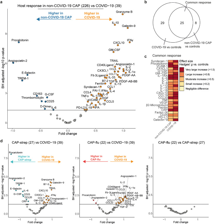
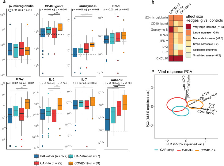
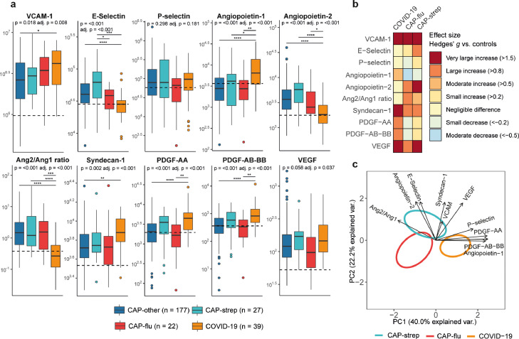
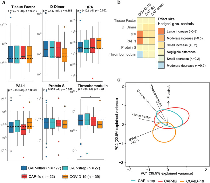
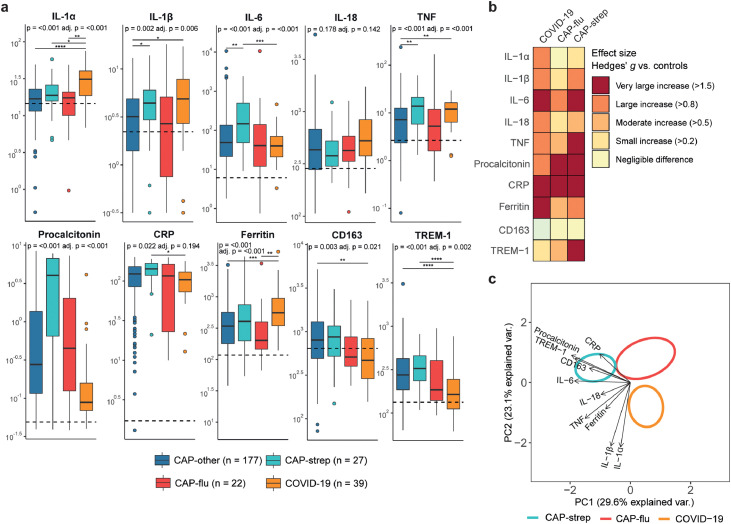
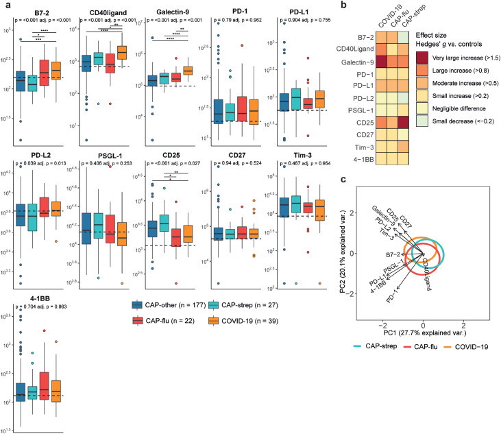
Methods: We measured 72 plasma biomarkers in a cohort of 265 patients hospitalized for CAP, all sampled within 48 hours of admission, and 28 age-and sex matched non-infectious controls. We stratified the biomarkers into several pathophysiological domains- antiviral response, vascular response and function, coagulation, systemic inflammation, and immune checkpoint markers. We directly compared CAP caused by SARS-CoV-2 (COVID-19, n=39), Streptococcus pneumoniae (CAP-strep, n=27), Influenza (CAP-flu, n=22) and other or unknown pathogens (CAP-other, n=177). We adjusted the comparisons for age, sex and disease severity scores.

Findings: Biomarkers reflective of a stronger cell-mediated antiviral response clearly separated COVID-19 from other CAPs (most notably granzyme B). Biomarkers reflecting activation and function of the vasculature showed endothelial barrier integrity was least affected in COVID-19, while glycocalyx degradation and angiogenesis were enhanced relative to other CAPs. Notably, markers of coagulation activation, including D-dimer, were not different between the CAP groups. Ferritin was most increased in COVID-19, while other systemic inflammation biomarkers such as IL-6 and procalcitonin were highest in CAP-strep. Immune checkpoint markers showed distinctive patterns in viral and non-viral CAP, with highly elevated levels of Galectin-9 in COVID-19.

Interpretation: Our investigation provides insight into shared and distinct pathophysiological mechanisms in different aetiologies of CAP, which may help guide new pathogen-specific therapeutic strategies.

Funding: This study was financially supported by the Dutch Research Council, the European Commission and the Netherlands Organization for Health Research and Development.

Keywords: Aetiology; COVID-19; Community-acquired pneumonia; Host response; Influenza; Streptococcus pneumoniae.


Conflict of interest statement

Declaration of interests JS was on the Data Safety Monitoring Board of the Pointer trial (ISRCTN33682933), and is the Vice President of the European Society of Gastrointestinal and Abdominal Radiology. All other authors declare no conflict of interests.

Figures

Fig 1
Figure 1
Common and distinct host response biomarkers in patients with community-acquired pneumonia with different microbial aetiologies. a) Volcano plot comparing plasma biomarkers between patients with non-COVID-19 CAP (n=226) and patients with COVID-19 (n=39). X-axis depicts the fold change of Box-Cox transformed values between groups, Y-axis depicts the Benjamini-Hochberg adjusted P-value. b) Venn-Euler plot showing the number of biomarkers that are significantly different from the non-infectious control group, either specific for COVID-19, specific for non-COVID-19 CAP or common between the two disease groups. c) Heatmap depicting the Hedges’ g, a measure of effect size, between the disease groups and controls for all biomarkers in the common response. d) Volcano plots showing plasma biomarkers for CAP-strep (n=27) versus COVID-19 (n=39), CAP-flu (n=22) versus COVID-19 (n=39), and CAP-flu (n=22) versus CAP-strep (n=27). X-axis depicts the fold change of Box-Cox transformed values between groups, Y-axis depicts the Benjamini-Hochberg adjusted p-value.
Fig 2
Figure 2
Biomarker levels reflective of cell-mediated antiviral responses in patients with community-acquired pneumonia with different microbial aetiologies. a) Boxplots comparing cell-mediated antiviral response markers between the CAP groups. The Y-axis depicts biomarker concentrations in pg/ml (prior to Box-Cox transformation). The median value for control subjects is shown as a dashed line. The p-value listed in each boxplot is obtained from the White-adjusted ANOVA, the adjusted (adj.) P-value was obtained from the White-adjusted ANCOVA model including age, sex, and disease severity scores as covariates. The stars depict the significance of the post-hoc pairwise Games-Howell tests performed after a significant ANOVA. *P<0·05, **P<0·01, ***P<0·001, ****P<0·0001. b) Heatmap depicting the Hedges’ g between the disease groups and controls for all antiviral response markers. c) Principal component analysis (PCA) of all viral response markers. X-axis label shows the percentage of explained variance on principal component 1, Y-axis label shows the percentage of explained variance on principal component 2. The ellipse indicates the central 10% of the groups. The arrows indicate the direction (arrow orientation) and strength (arrow length) of the correlation between each marker and the principal components.
Fig 3
Figure 3
Biomarker levels reflective of vascular responses and function in patients with community-acquired pneumonia with different microbial aetiologies. a) Boxplots comparing markers of the endothelial response between the CAP groups. The Y-axis depicts biomarker concentrations in pg/ml (prior to Box-Cox transformation). The median value for control subjects is shown as a dashed line. The P-value listed in each boxplot is obtained from the White-adjusted ANOVA, the adjusted (adj.) P-value was obtained from the White-adjusted ANCOVA model including age, sex, and disease severity scores as covariates. The stars depict the significance of the post-hoc pairwise Games-Howell tests performed after a significant ANOVA. *P<0·05, **P<0·01, ***P<0·001, ****P<0·0001. Pairwise Tukey's post-hoc tests using the adjusted means from the ANCOVA for VEGF did not result significantly different groups. b) Heatmap depicting the Hedges’ g between the disease groups and controls for all biomarkers of the endothelial response. c) Principal component analysis of all biomarkers of the endothelial response. X-axis label shows the percentage of explained variance on principal component 1, Y-axis label shows the percentage of explained variance on principal component 2. The ellipse indicates the central 10% of the groups. The arrows indicate the direction (arrow orientation) and strength (arrow length) of the correlation between each marker and the principal components.
Fig 4
Figure 4
Biomarker levels reflective of coagulation in patients with community-acquired pneumonia with different microbial aetiologies. a) Boxplots comparing markers of coagulation between the CAP groups. The Y-axis depicts biomarker concentrations in pg/ml (prior to Box-Cox transformation). The median value for control subjects is shown as a dashed line. The P-value listed in each boxplot is obtained from the White-adjusted ANOVA, the adjusted (adj.) P-value was obtained from the White-adjusted ANCOVA model including age, sex, and disease severity scores as covariates. The stars depict the significance of the post-hoc pairwise Games-Howell tests performed after a significant ANOVA. *P<0·05, **P<0·01. b) Heatmap depicting the Hedges’ g between the disease groups and controls for all markers of coagulation. c) Principal component analysis of all markers of coagulation. X-axis label shows the percentage of explained variance on principal component 1, Y-axis label shows the percentage of explained variance on principal component 2. The ellipse indicates the central 10% of the groups. The arrows indicate the direction (arrow orientation) and strength (arrow length) of the correlation between each marker and the principal components.
Fig 5
Figure 5
Biomarker levels reflective of systemic inflammation in patients with community-acquired pneumonia with different microbial aetiologies. a) Boxplots comparing markers of systemic inflammation between the CAP groups. The Y-axis depicts biomarker concentrations (prior to Box-Cox transformation) in pg/ml for all markers except for ferritin, procalcitonin, CD163 (ng/ml) and CRP (mg/L). The median value for control subjects is shown as a dashed line. The P-value listed in each boxplot is obtained from the White-adjusted ANOVA, the adjusted (adj.) P-value was obtained from the White-adjusted ANCOVA model including age, sex, and disease severity scores as covariates. The stars depict the significance of the post-hoc pairwise Games-Howell tests performed after a significant ANOVA. *P<0·05, **P<0·01, ***P<0·001, ****P<0·0001. b) Heatmap depicting the Hedges’ g between the disease groups and controls for all markers of systemic inflammation. c) Principal component analysis of all markers of systemic inflammation. X-axis label shows the percentage of explained variance on principal component 1, Y-axis label shows the percentage of explained variance on principal component 2. The ellipse indicates the central 10% of the groups. The arrows indicate the direction (arrow orientation) and strength (arrow length) of the correlation between each marker and the principal components.
Fig 6
Figure 6
Immune checkpoint markers in patients with community-acquired pneumonia with different microbial aetiologies. a) Boxplots comparing immune checkpoint markers between the CAP groups. The Y-axis depicts biomarker concentrations in pg/ml (prior to Box-Cox transformation). The median value for control subjects is shown as a dashed line. The P-value listed in each boxplot is obtained from the White-adjusted ANOVA, the adjusted (adj.) P-value was obtained from the White-adjusted ANCOVA model including age, sex, and disease severity scores as covariates. The stars depict the significance of the post-hoc pairwise Games-Howell tests performed after a significant ANOVA. *P<0·05, **P<0·01, ***P<0·001, ****P<0·0001. b) Heatmap depicting the Hedges’ g between the disease groups and controls for all checkpoint markers. c) Principal component analysis of all immune checkpoint markers. X-axis label shows the percentage of explained variance on principal component 1, Y-axis label shows the percentage of explained variance on principal component 2. The ellipse indicates the central 10% of the groups. The arrows indicate the direction (arrow orientation) and strength (arrow length) of the correlation between each marker and the principal components.

References

    1. GBD 2016 Lower Respiratory Infections Collaborators Estimates of the global, regional, and national morbidity, mortality, and aetiologies of lower respiratory infections in 195 countries, 1990-2016: a systematic analysis for the Global Burden of Disease Study 2016. Lancet Infect Dis. 2018;18(11):1191–1210. - PMC - PubMed
    1. Torres A, Cilloniz C, Niederman MS, et al. Pneumonia. Nat Rev Dis Prim. 2021;7(1) - PubMed
    1. Shoar S, Musher DM. Etiology of community-acquired pneumonia in adults: a systematic review. Pneumonia. 2020;12(1):11. - PMC - PubMed
    1. Dong E, Du H, Gardner L. An interactive web-based dashboard to track COVID-19 in real time. Lancet Infect Dis. 2020;20(5):533–534. - PMC - PubMed
    1. Wu D, Lu J, Cao L, et al. Positive effects of COVID-19 control measures on pneumonia prevention. Int J Infect Dis. 2020;96:548–549. - PMC - PubMed